Ruby Rose The Bulldog Steals the Show
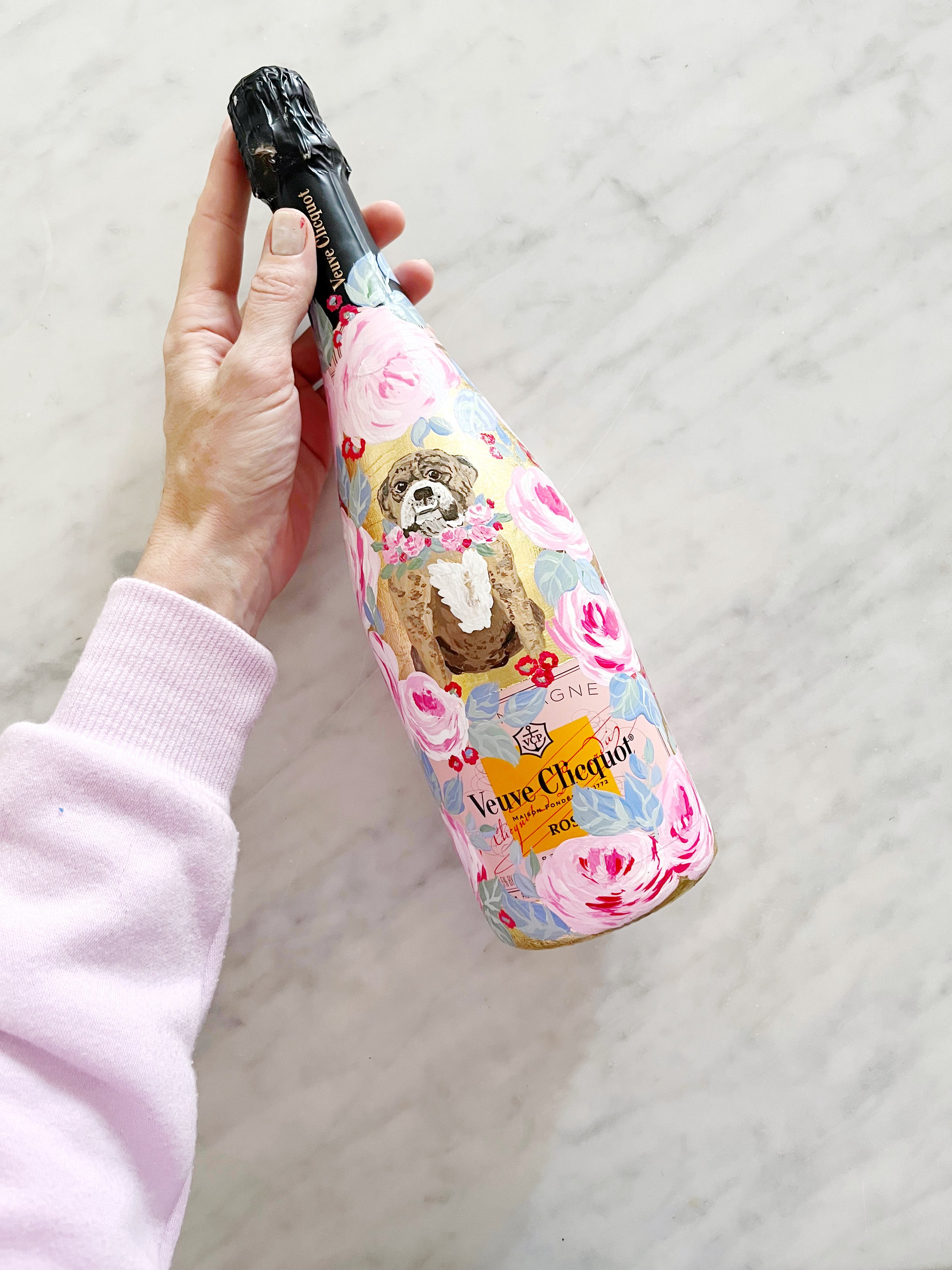
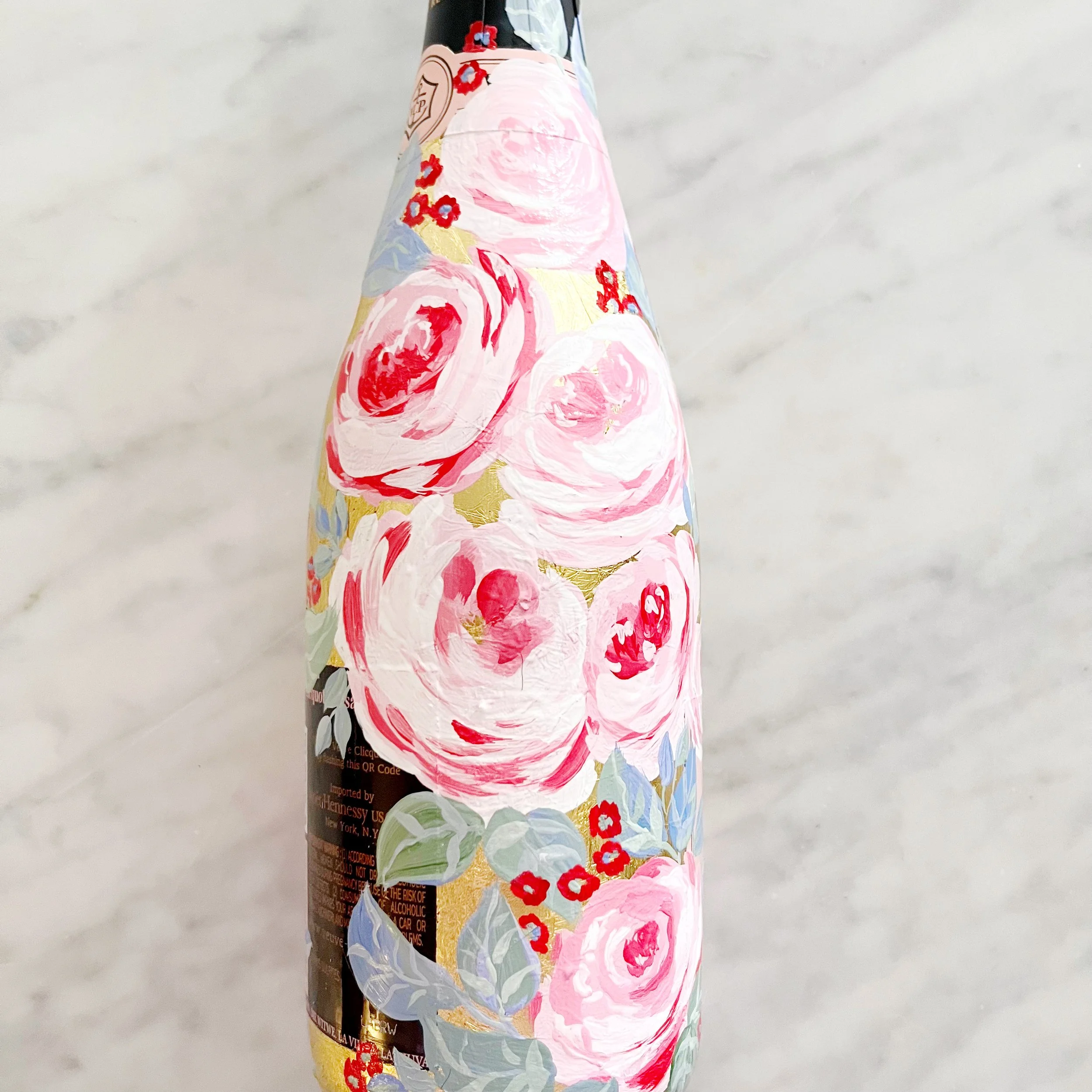
A bulldog named Ruby Rose with a collar of roses is the star of this gorgeous bottle, surrounded with pink roses and pale sage leaves.
Vintage Postage for an Ojai Valley Inn Wedding
I LOVE designing postage to compliment the wedding invitation design!
This suite included both vintage postage and current issue postage to compliment the overall design as well as create a high enough postage denomination to ensure the heavy and oversized invitations got safely through the mail.
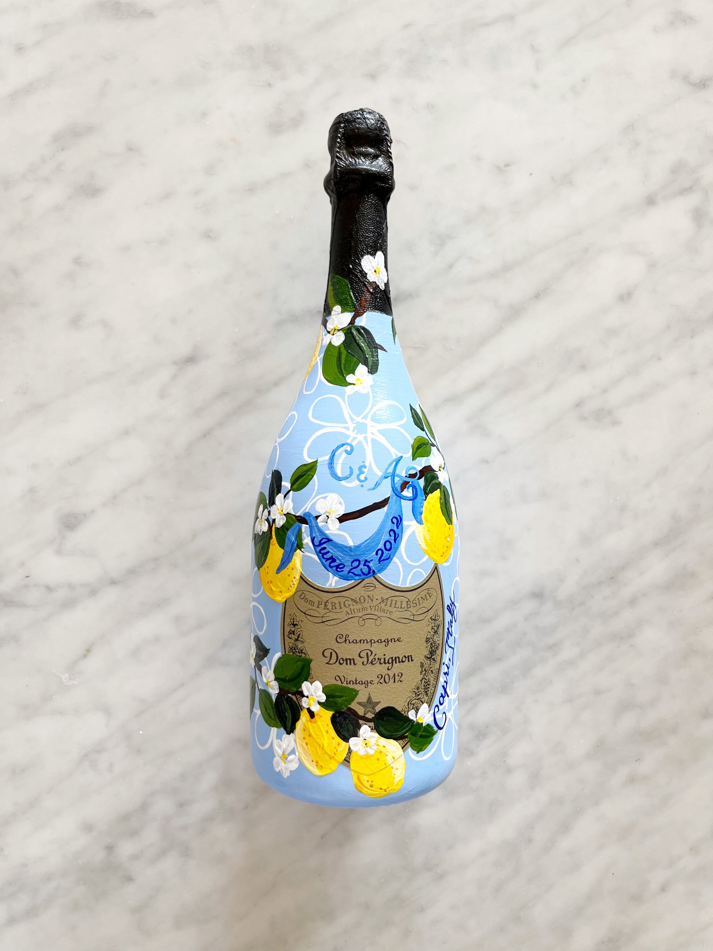
Dom Perignon for a Capri Wedding
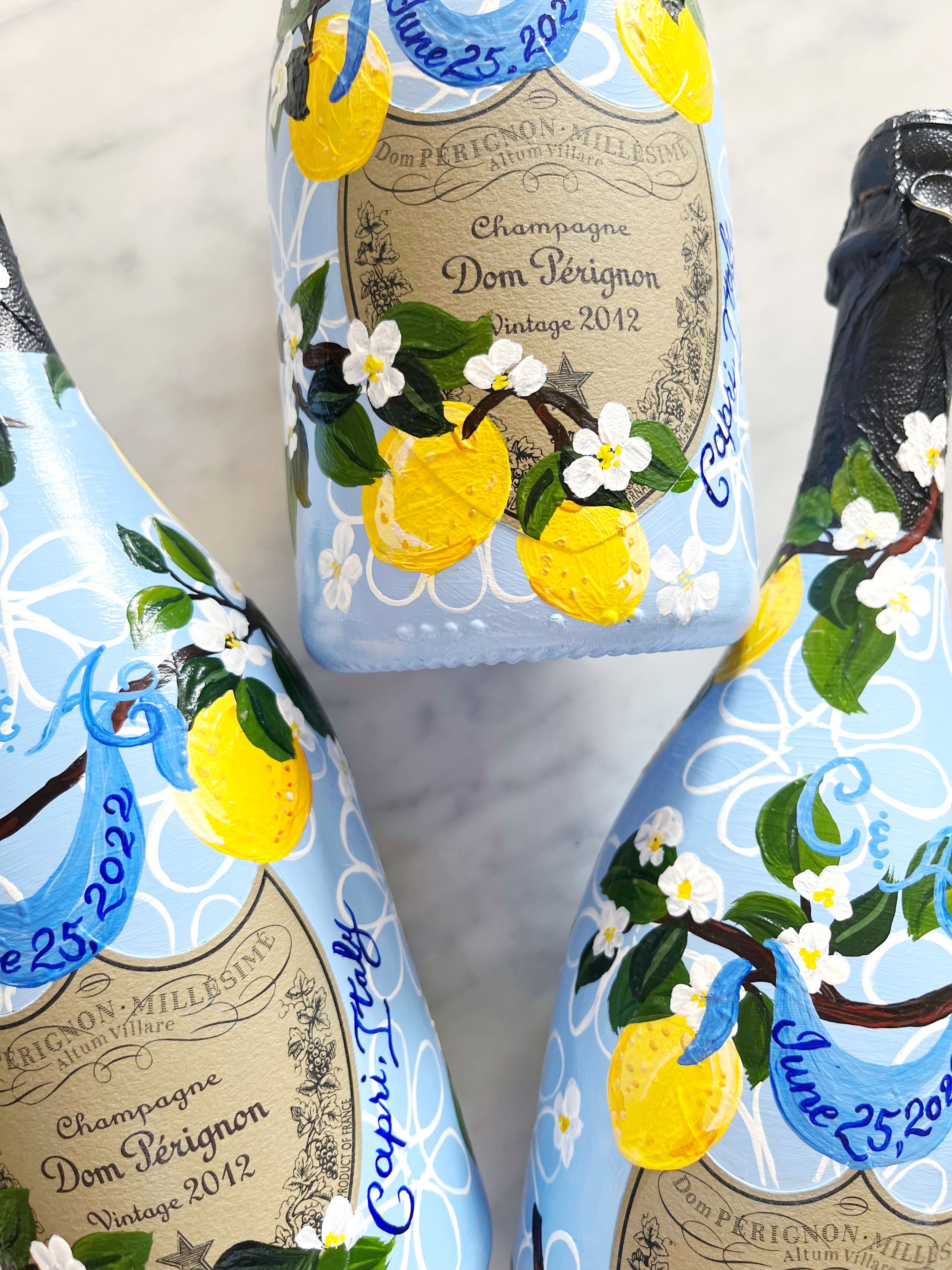
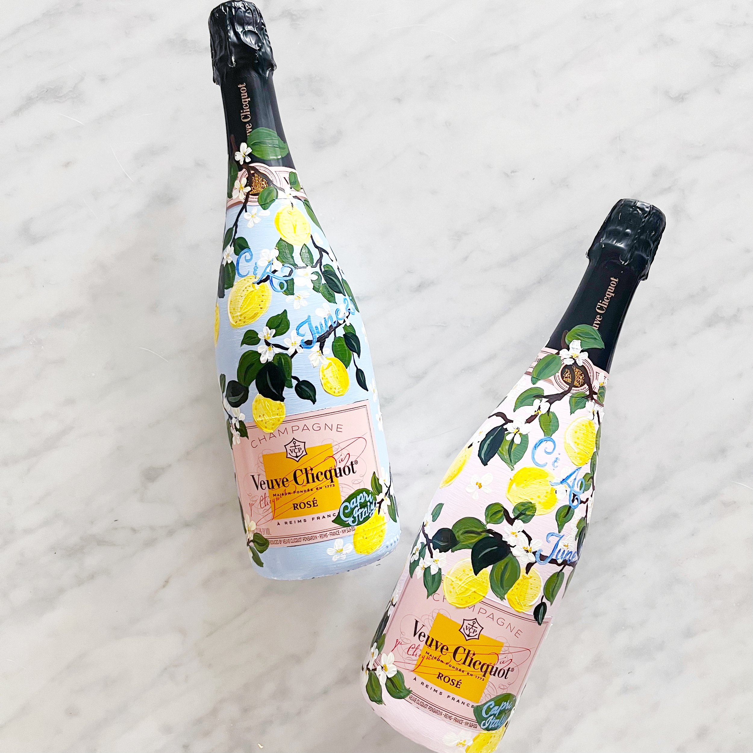
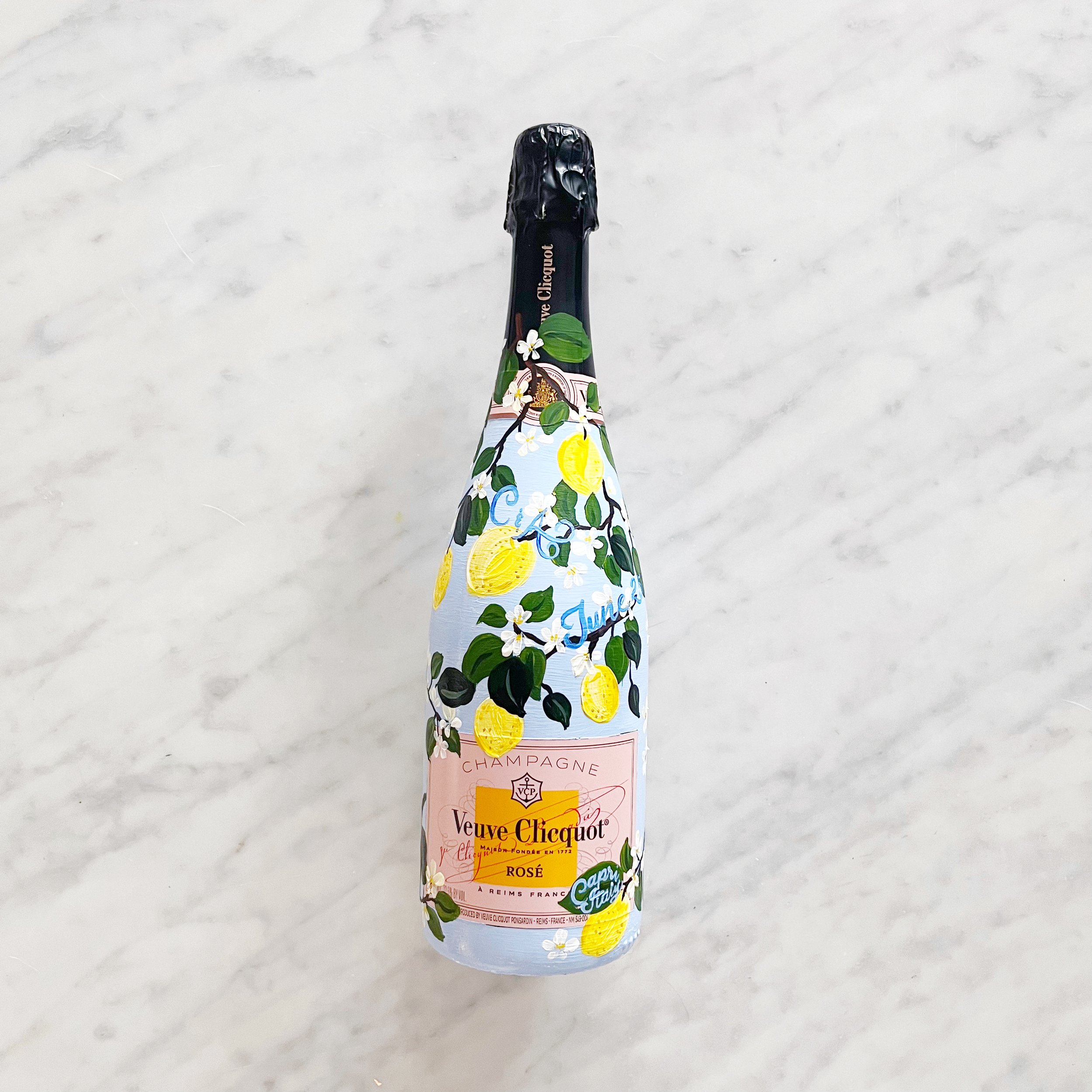
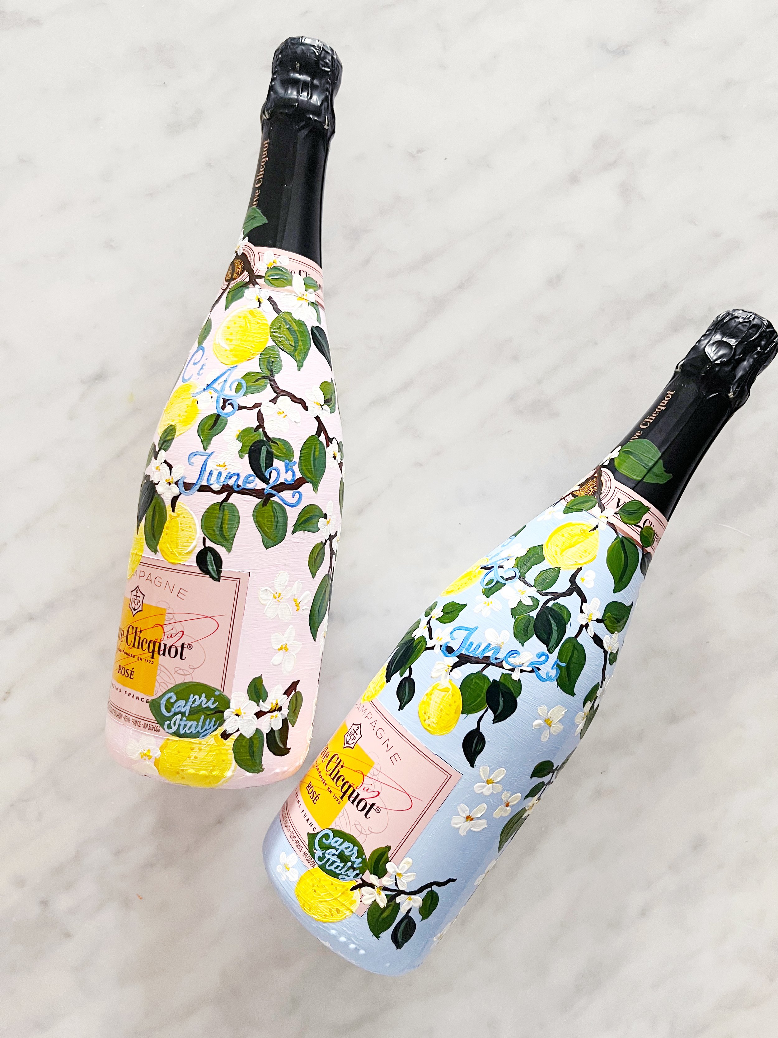
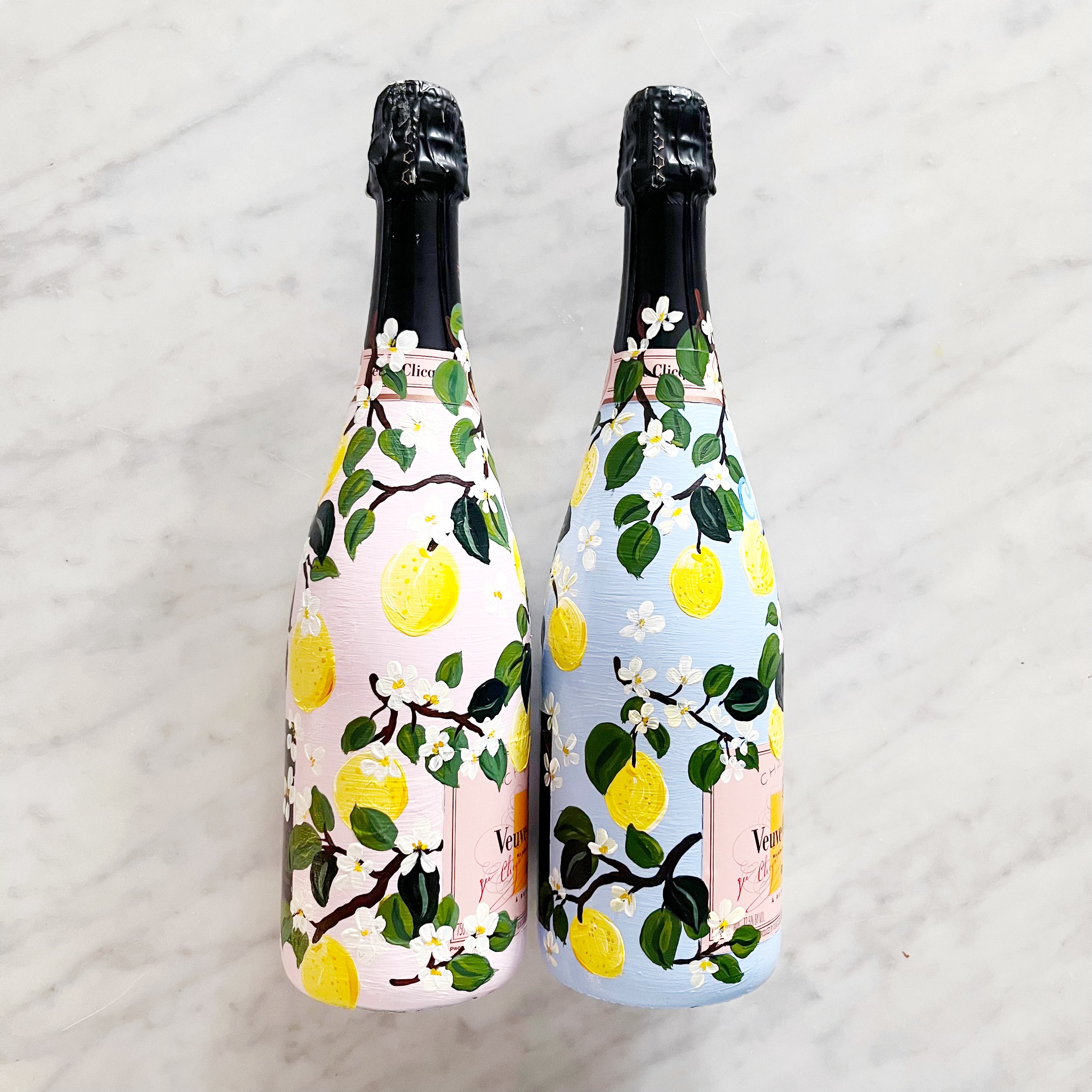
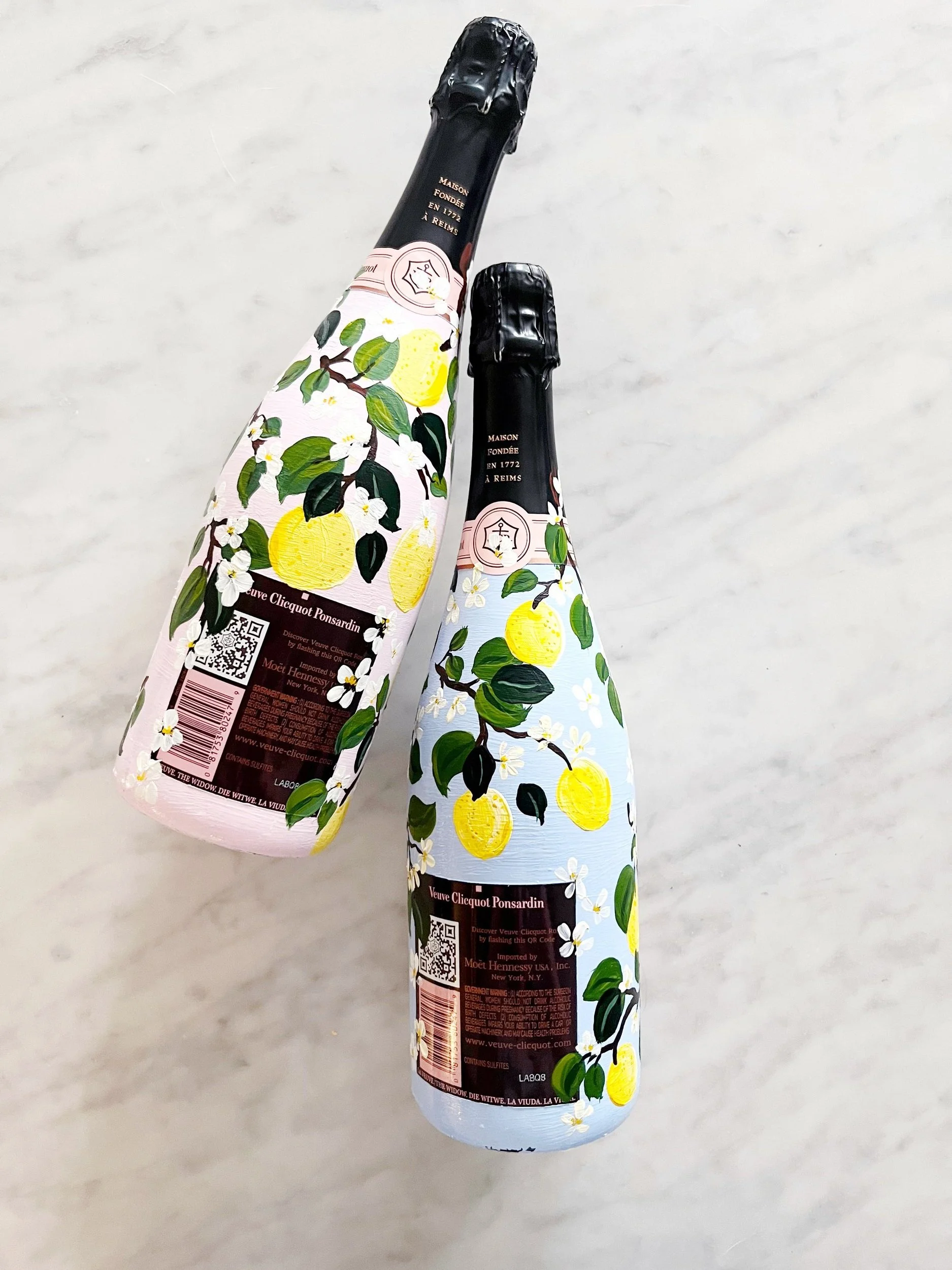
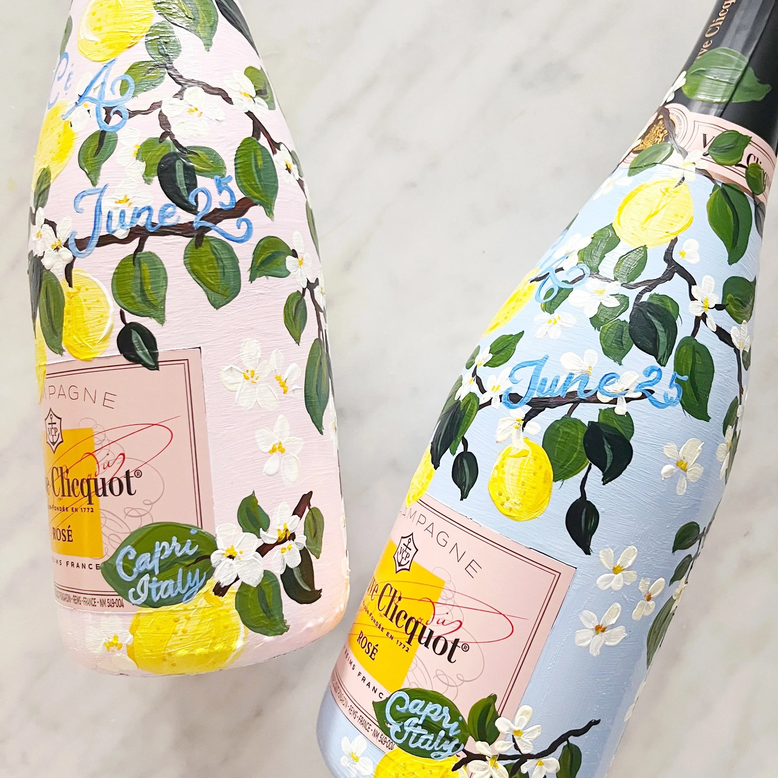
Capri lemons and citrus blooms cover these gorgeous bottles of Dom Perignon for a summer wedding in Capri, Italy. These bottles were specifically painted for the bride and her bridesmaids while they got ready the morning of the wedding and I designed the pattern in the background to reflect the wallpaper in the suite where they were getting ready.
Embossed Custom Envelope Liners
I love these envelope liners designed for a breathtaking wedding at the Ojai Valley Inn. Vines climb up these custom liners in white ink with an embossed pattern of climbing vines over the top.
A Summer Wedding in the Mountains
With wildflowers and blooms from the mountain fields surrounding the reception space, this gorgeous handpainted bottle was the perfect way to celebrate their late summer wedding.
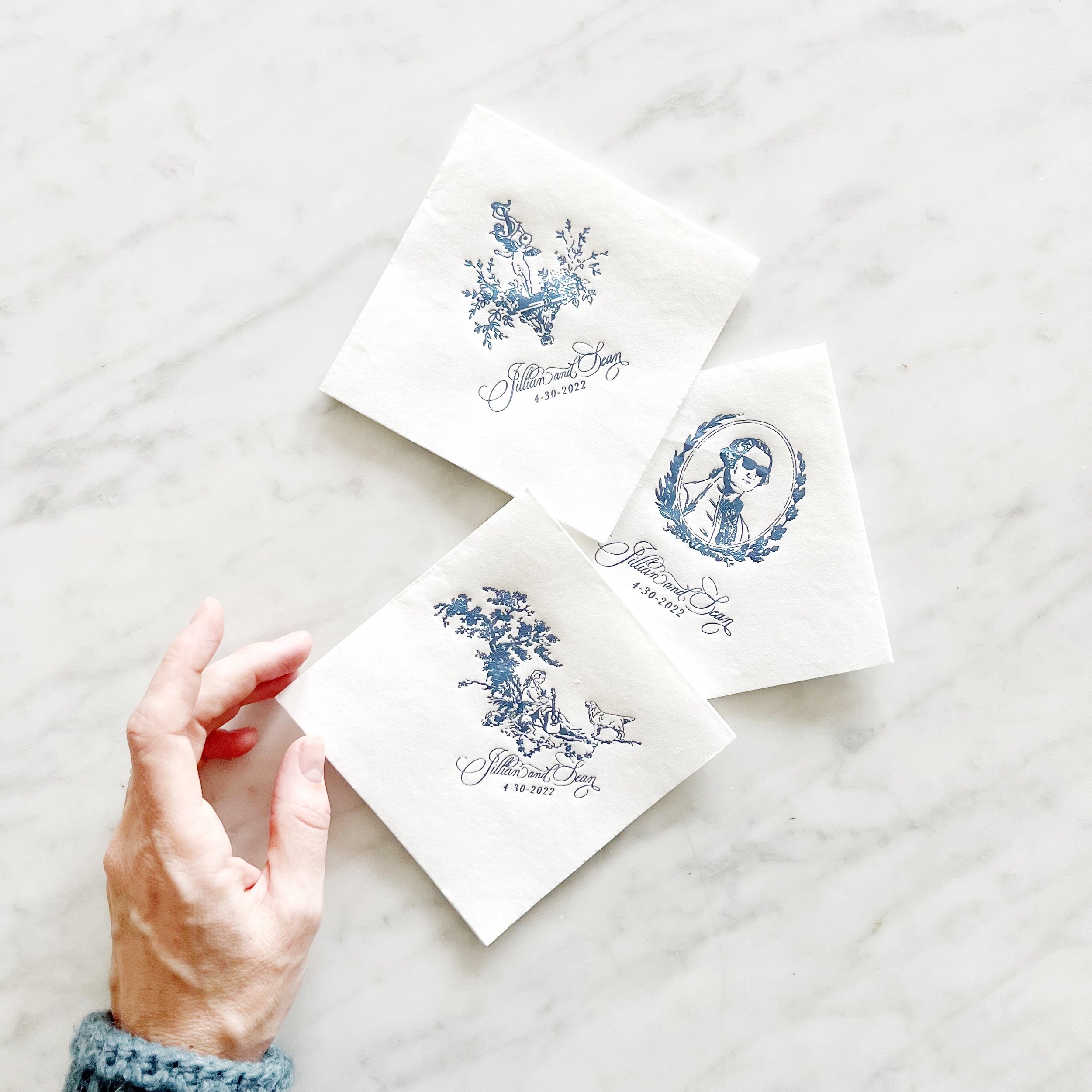
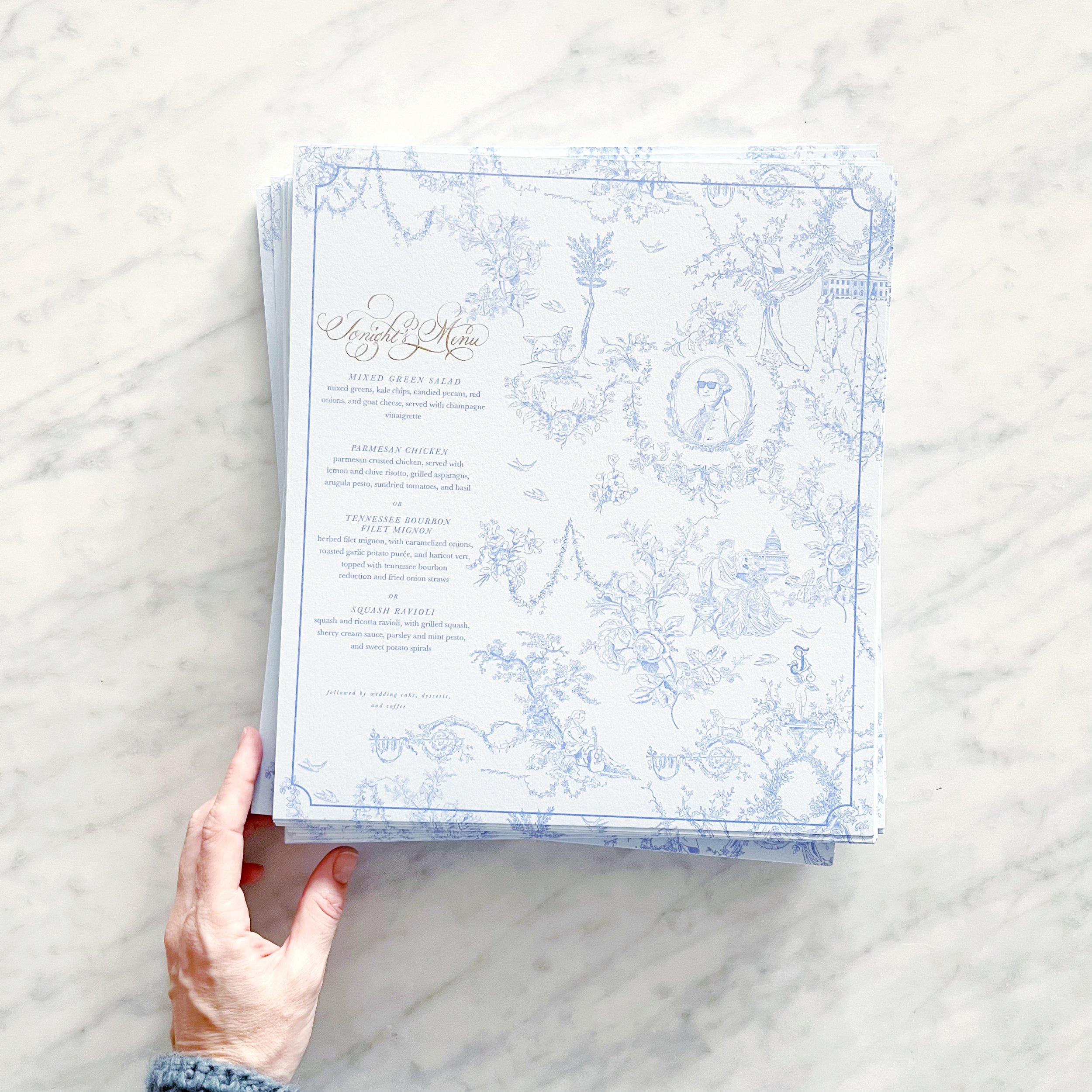
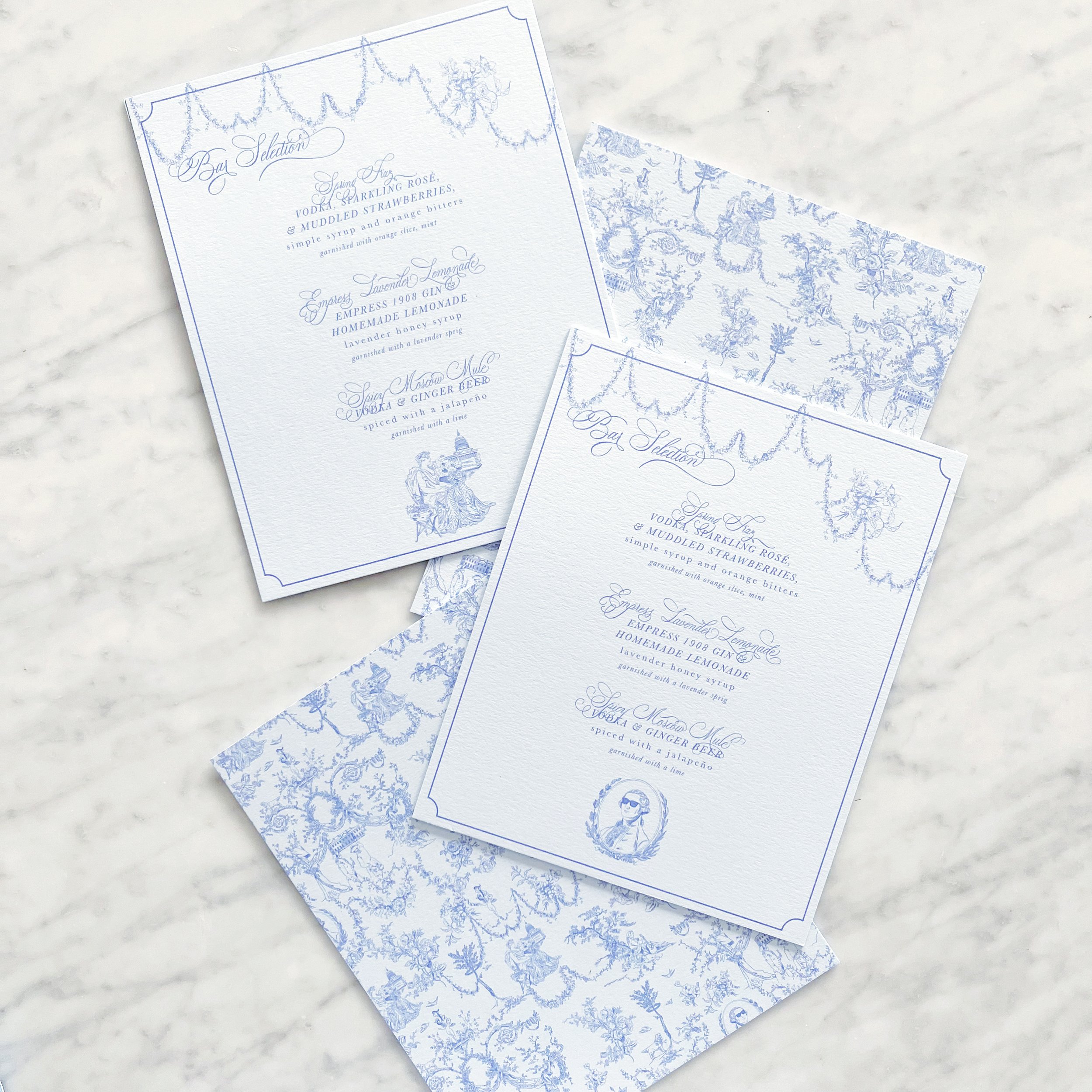
A Custom Toile Pattern for a Historic DC Wedding
A reception for the ages….and rare that I get to help set up in person!
Pro Pics (which these are not!) are from Jen Fariello, Florals by Springvale Floral, Coordination by Cheers, Darling.
Handpainted Bottles of Dom Perignon
Heading to a summer wedding in Capri, these gorgeous bottles will be painted with details from the breathtaking hotel the bride is getting ready in and paired with the classic Capri lemons
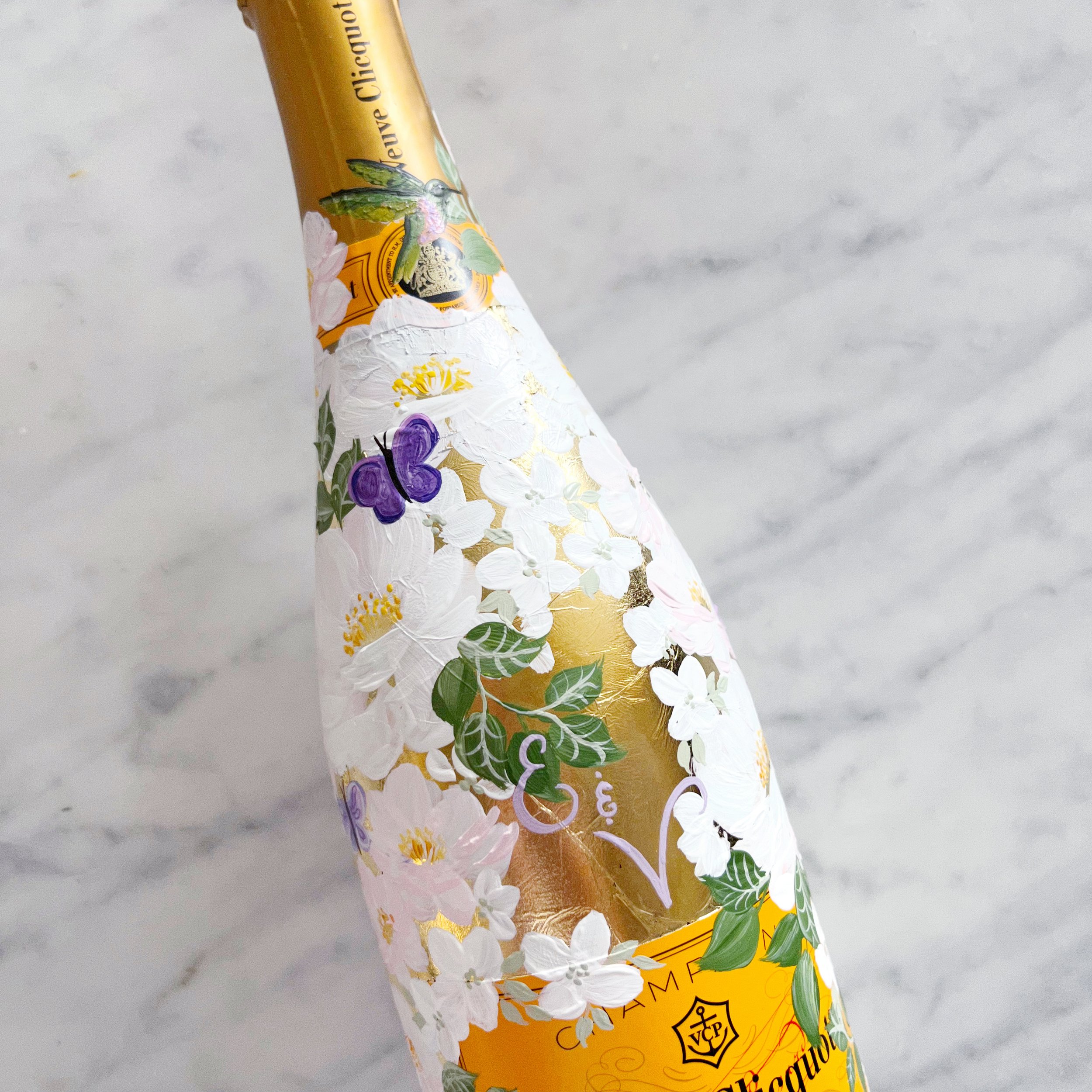
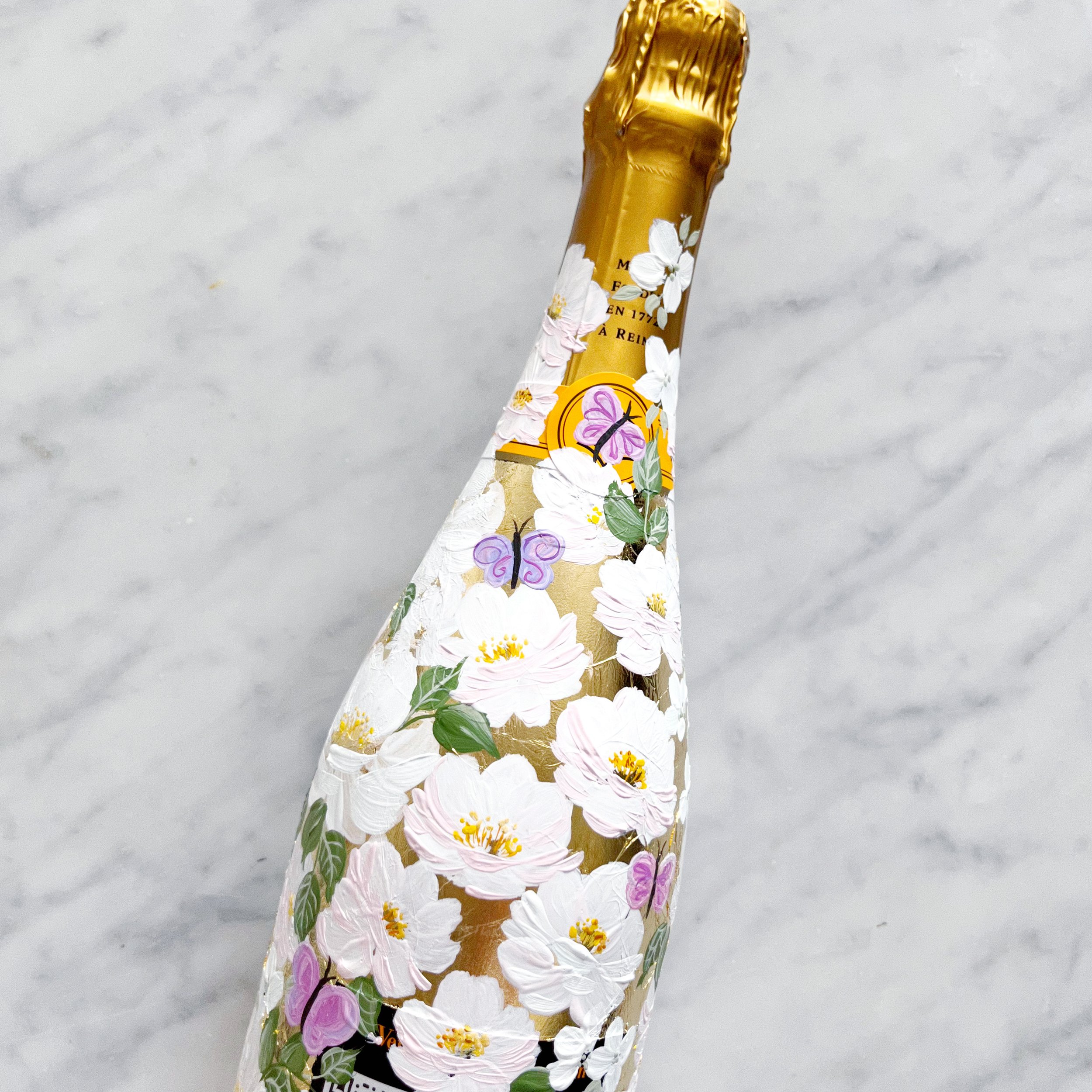
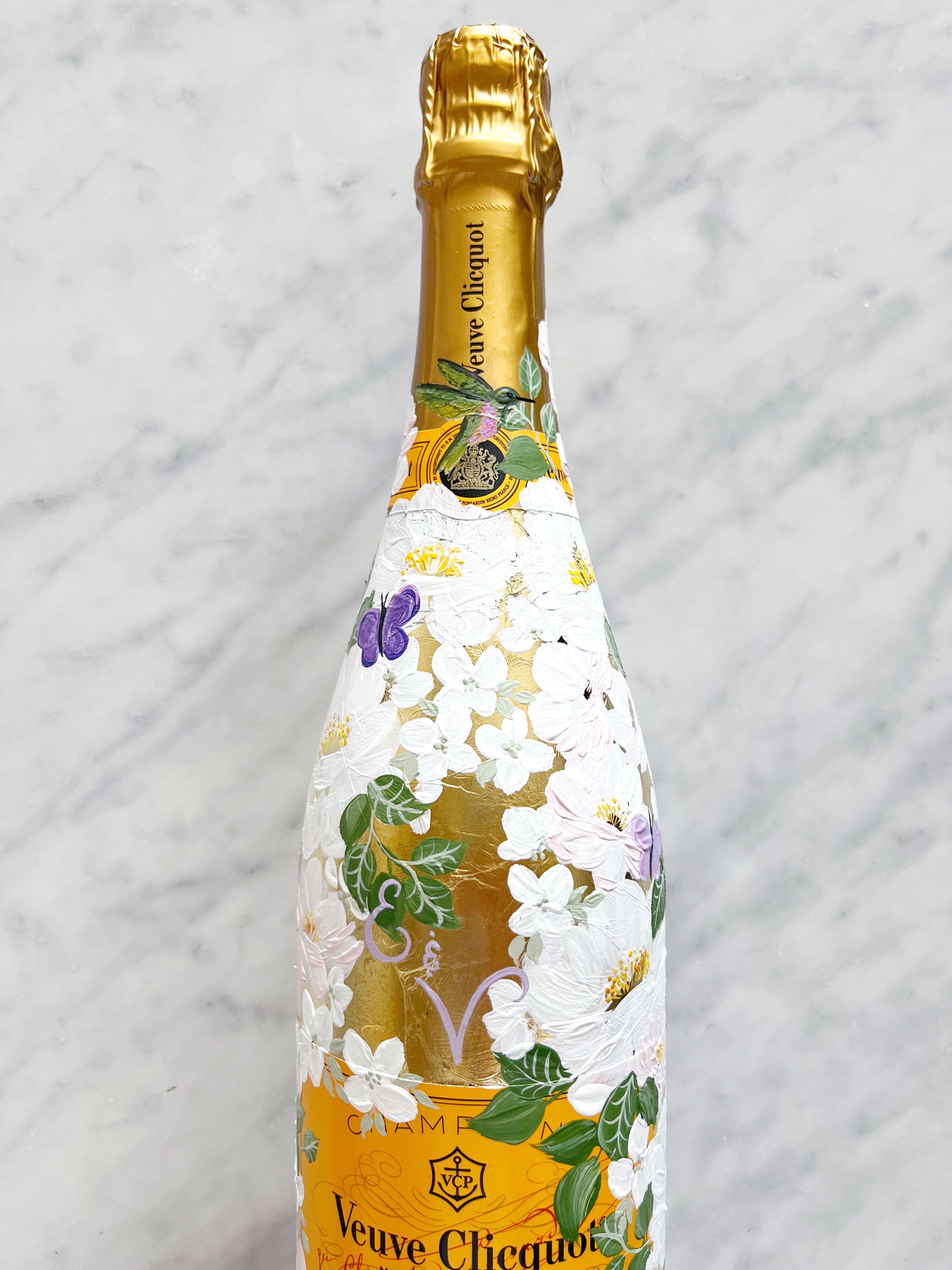
Gilded Veuve Clicquot
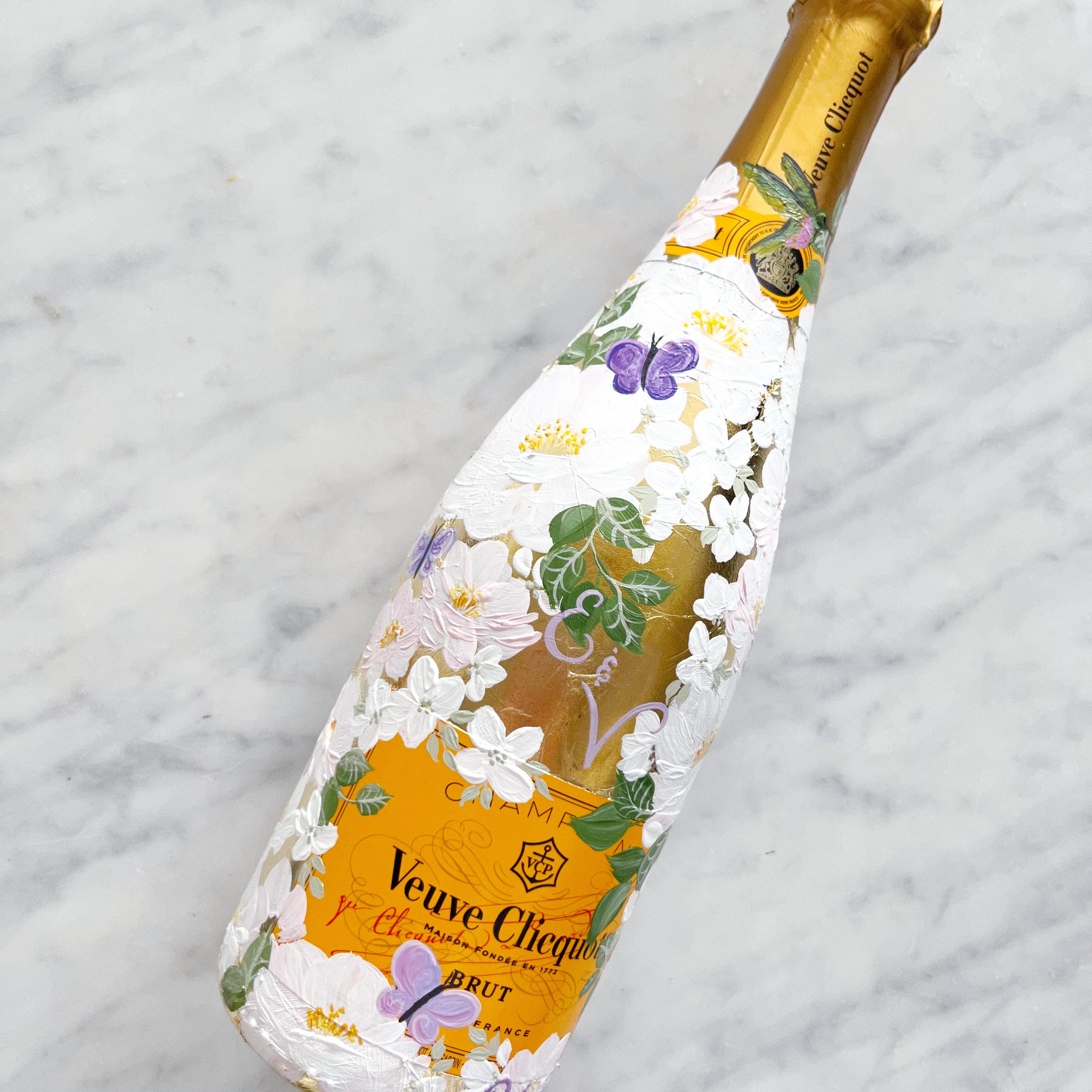
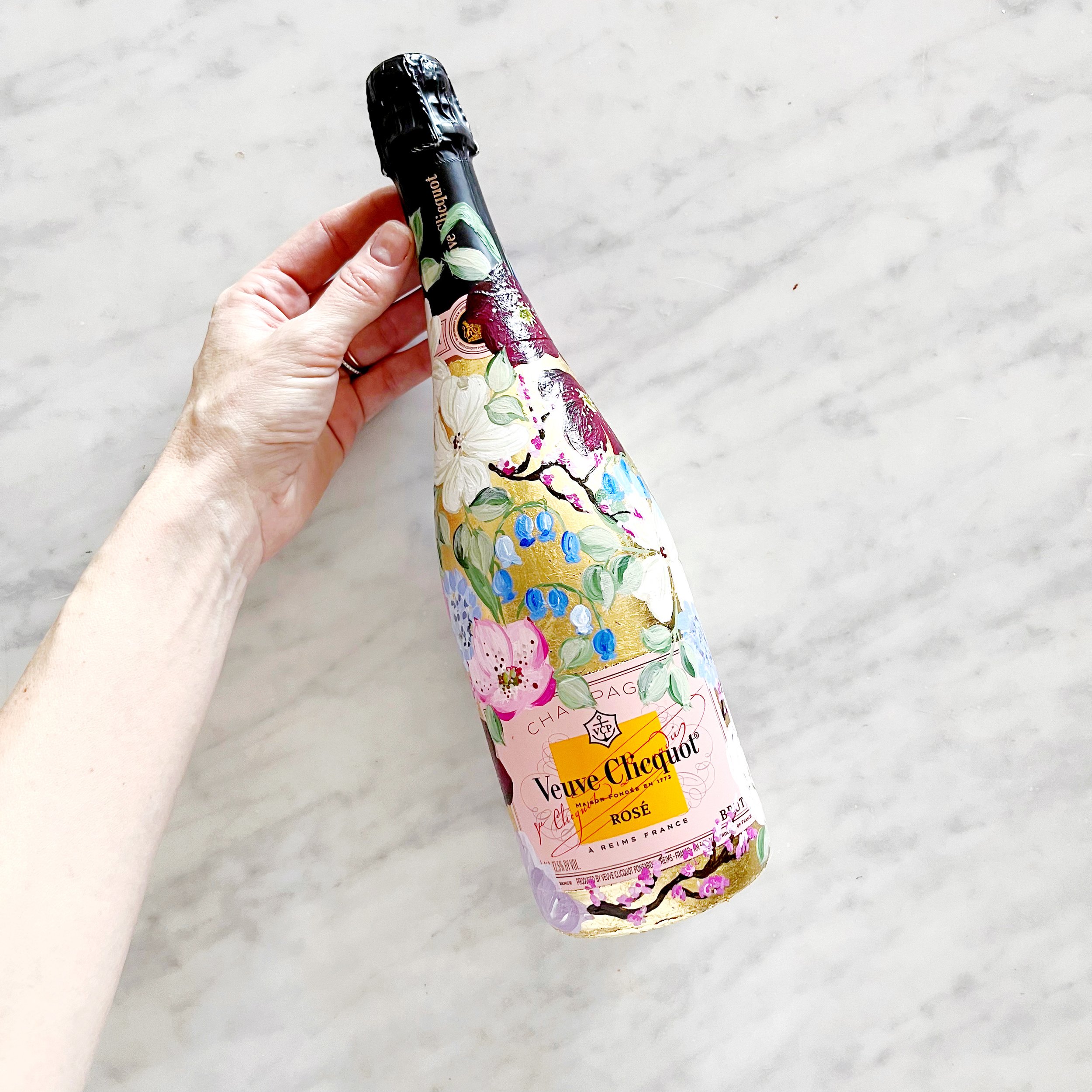
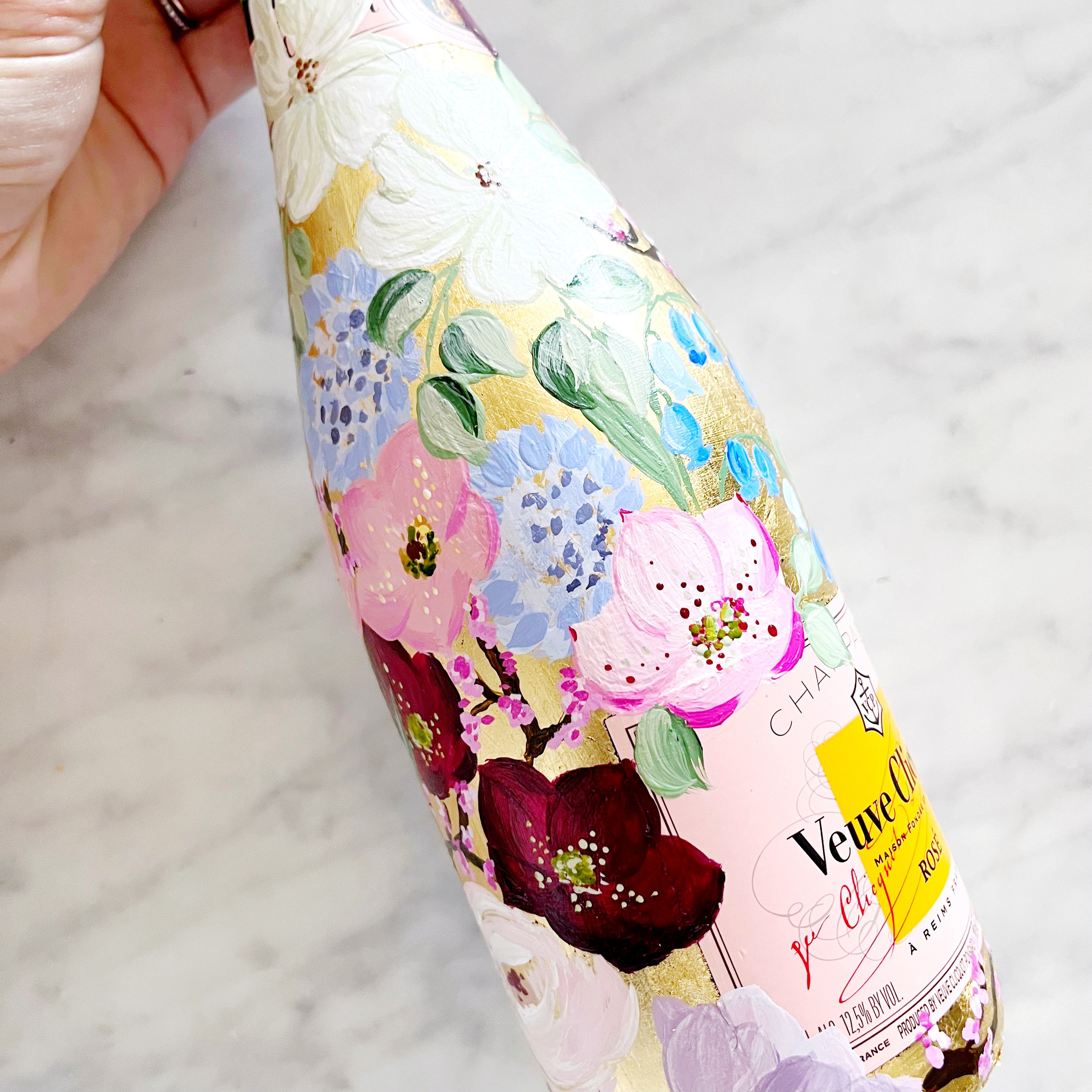
Gilded in gold and silver leaf, these bottles will each have a design painted on top of their metallic leafing.
Handpainted Bottles for a Capri Wedding
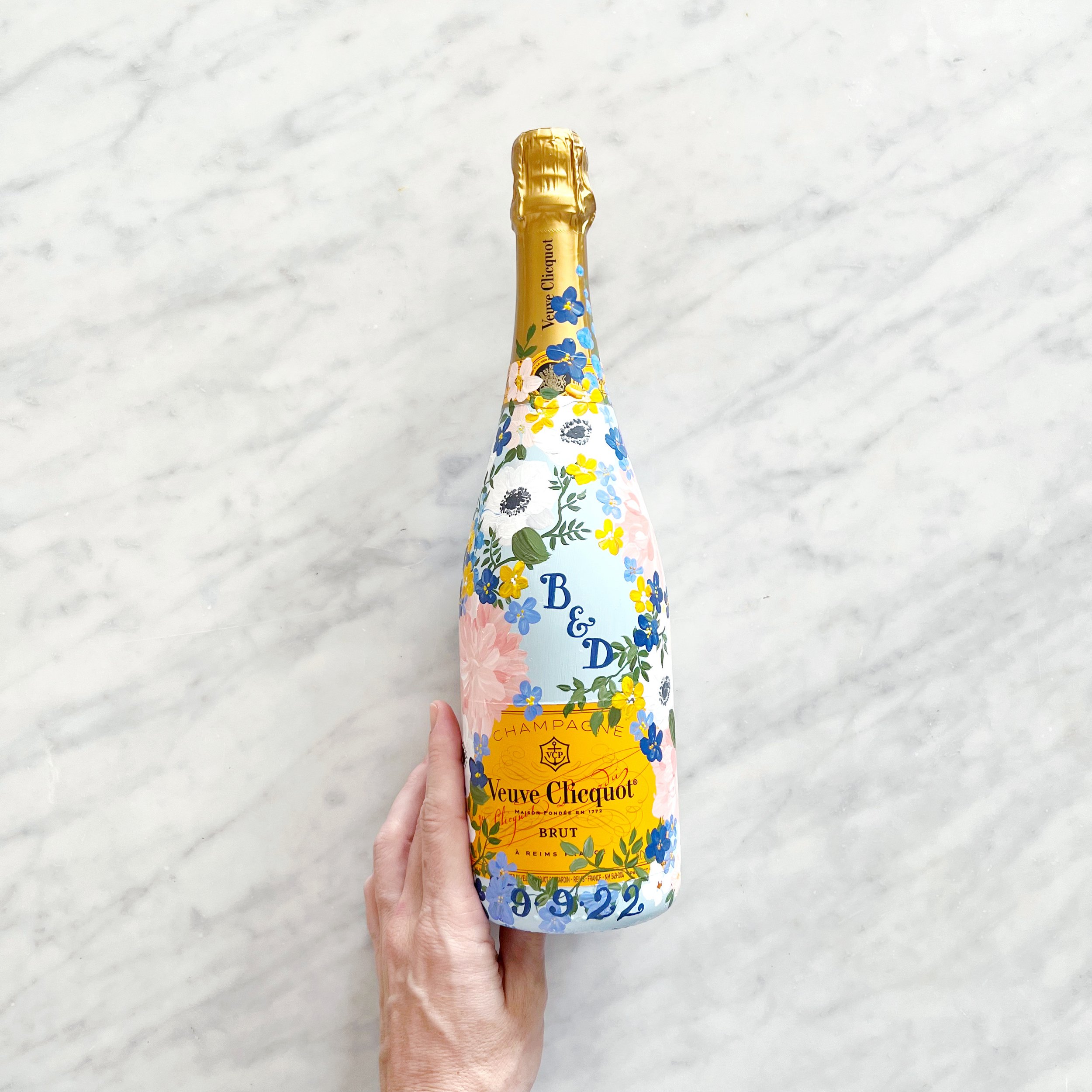
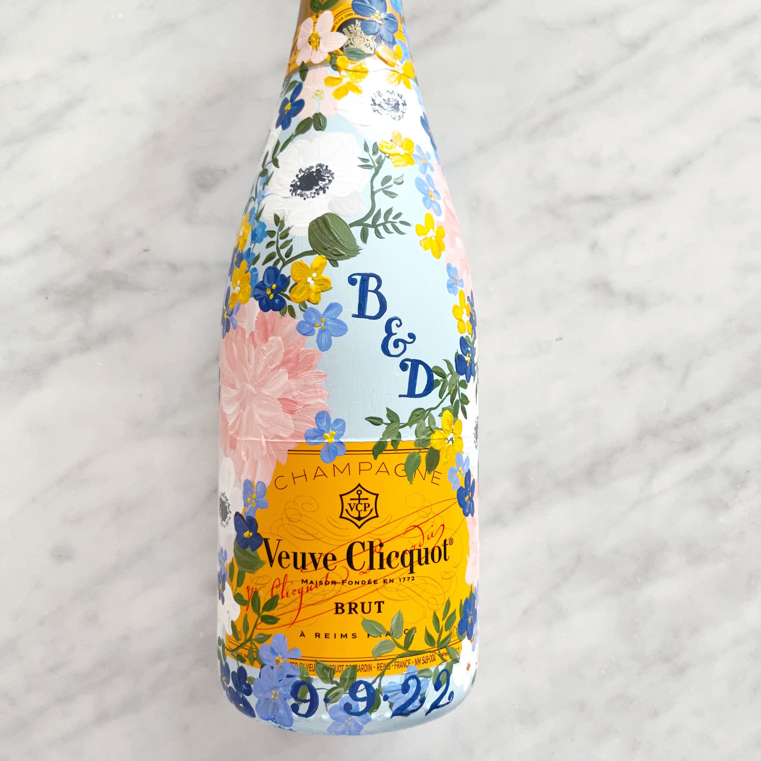
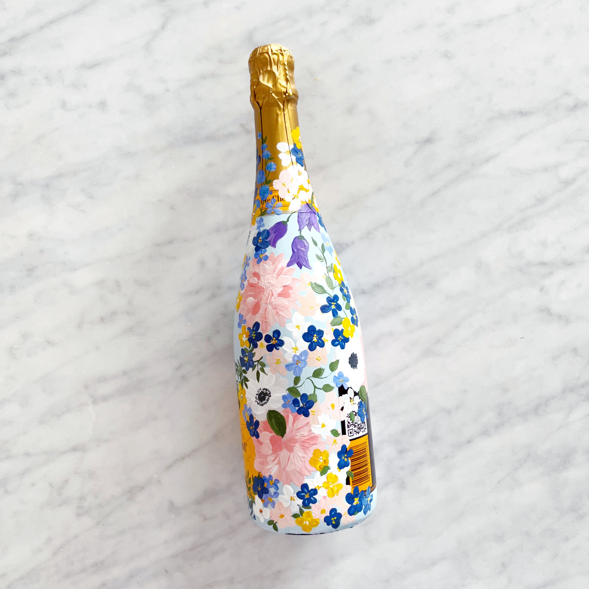
Since there will be multiple events in the week leading up to the wedding, we selected to paint the bottles to match, but with different backgrounds. One blush and one blue, the bottles pair beautifully with the classic Capri lemons. The bottles also held the couple’s monogram, date of their wedding, and Capri, Italy.
A Custom Toile Pattern - Handpainted Veuve Bottle
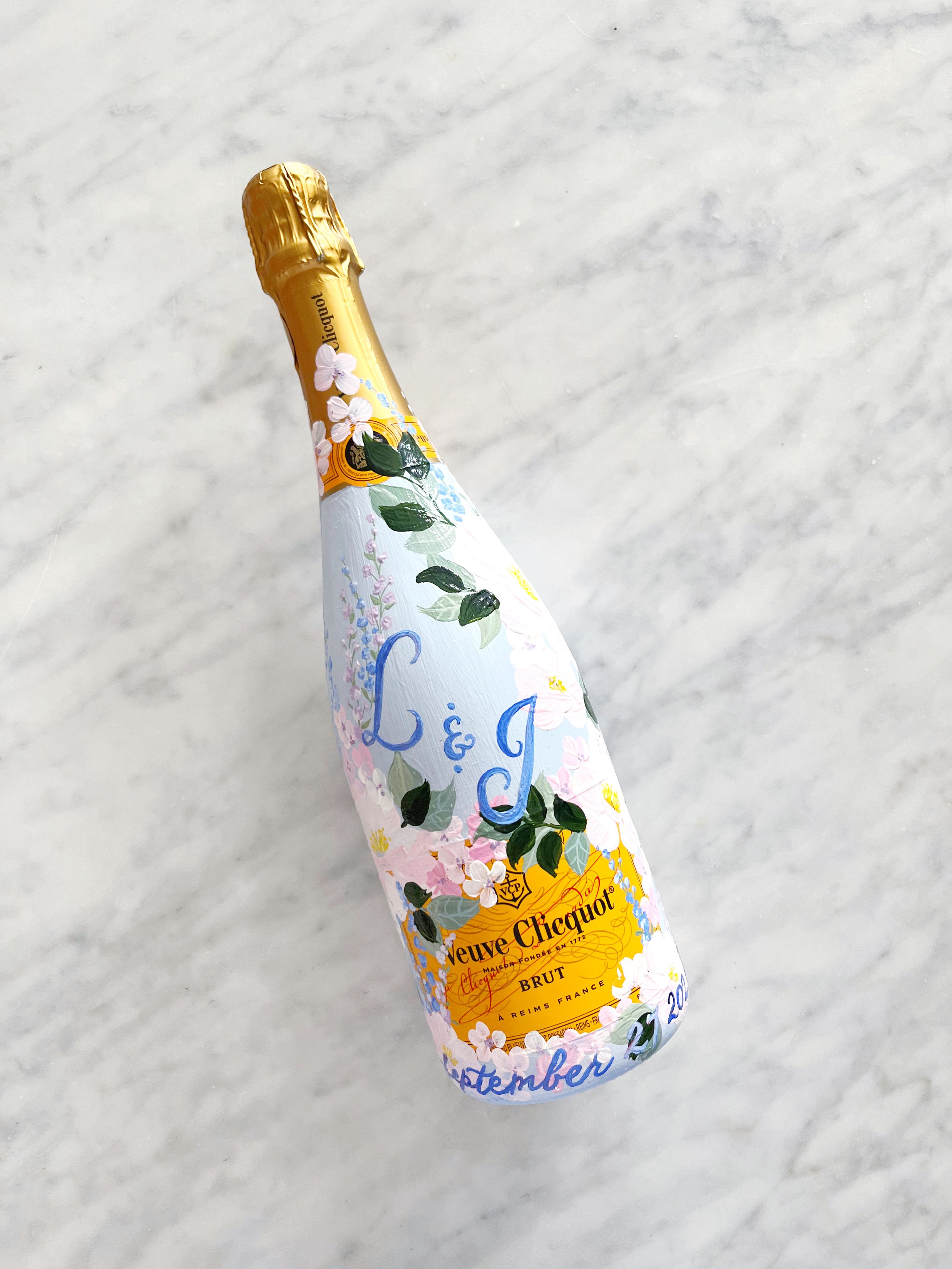
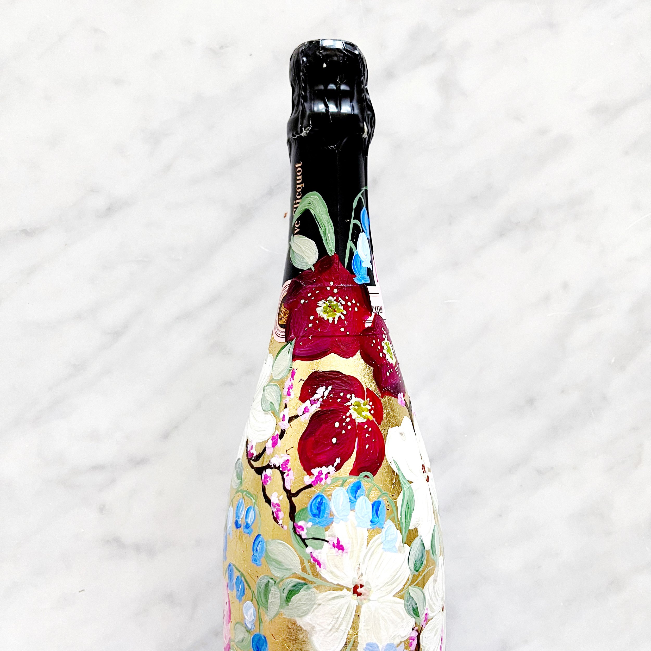
It wouldn’t be a Design House of Moira wedding without a custom-painted champagne bottle! Rather than going with her toile, I opted to paint her bottle to match her centerpieces and gold details. Her blooms included dogwood, clematis, forget-me-nots, bluebells, and hellebore over a gold leaf gilded bottle of Veuve Clicquot.
This particular bottle also had its own wooden box with the bride and groom’s names on top.
A Custom Toile Pattern - Reception
The reception was held a the GORGEOUS DAR in DC, with so many historic details and the most stunning and dramatic columns.
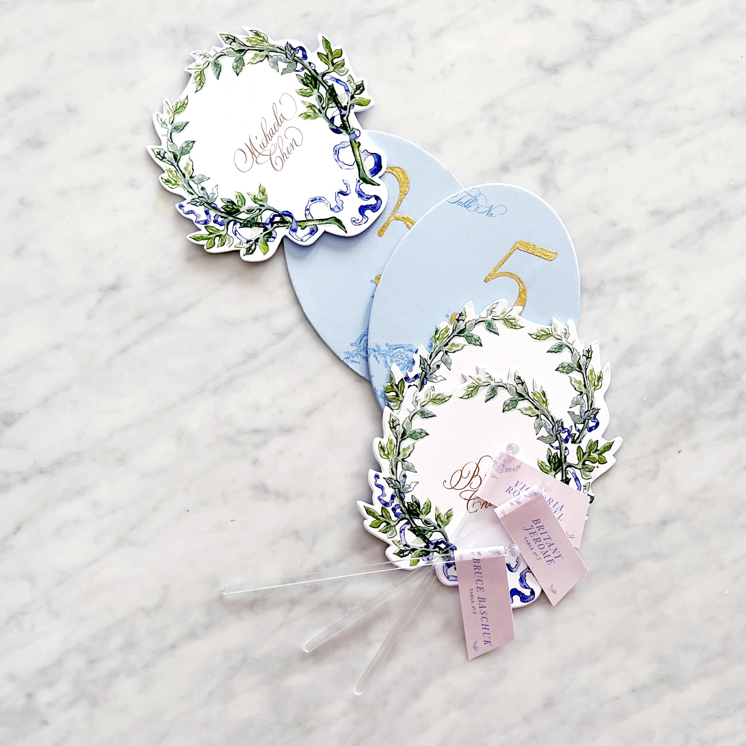
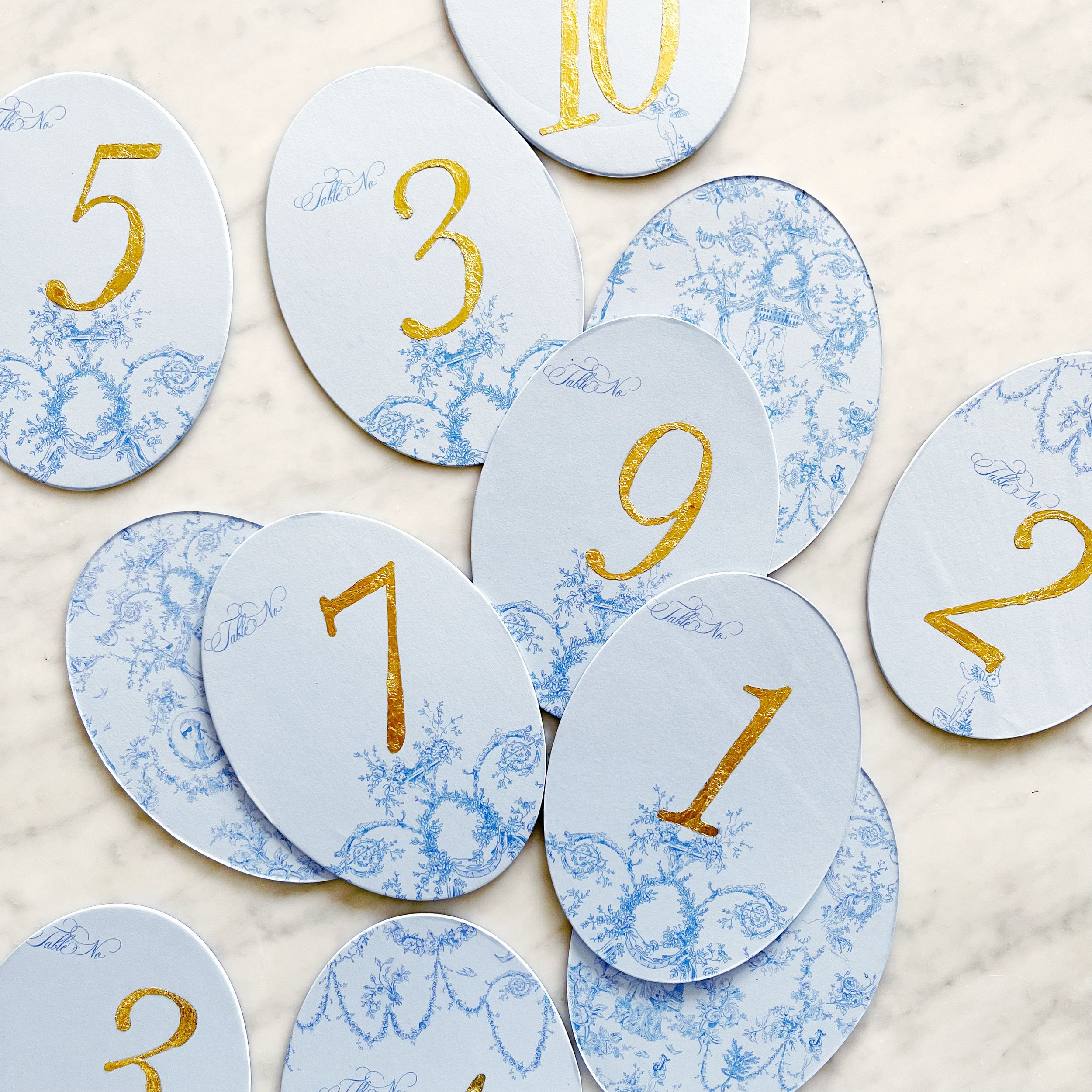
For her reception details, we added a few touches of gold here and there. We started with gold gilded table numbers, then went to gold calligraphy for the place card calligraphy, and gold calligraphy detail on the menus.
The menus were unusually large and designed to sit under the plates at each place setting with the napkins and placecards on top.
A Custom Toile Pattern for a DC Wedding - Assembly Details
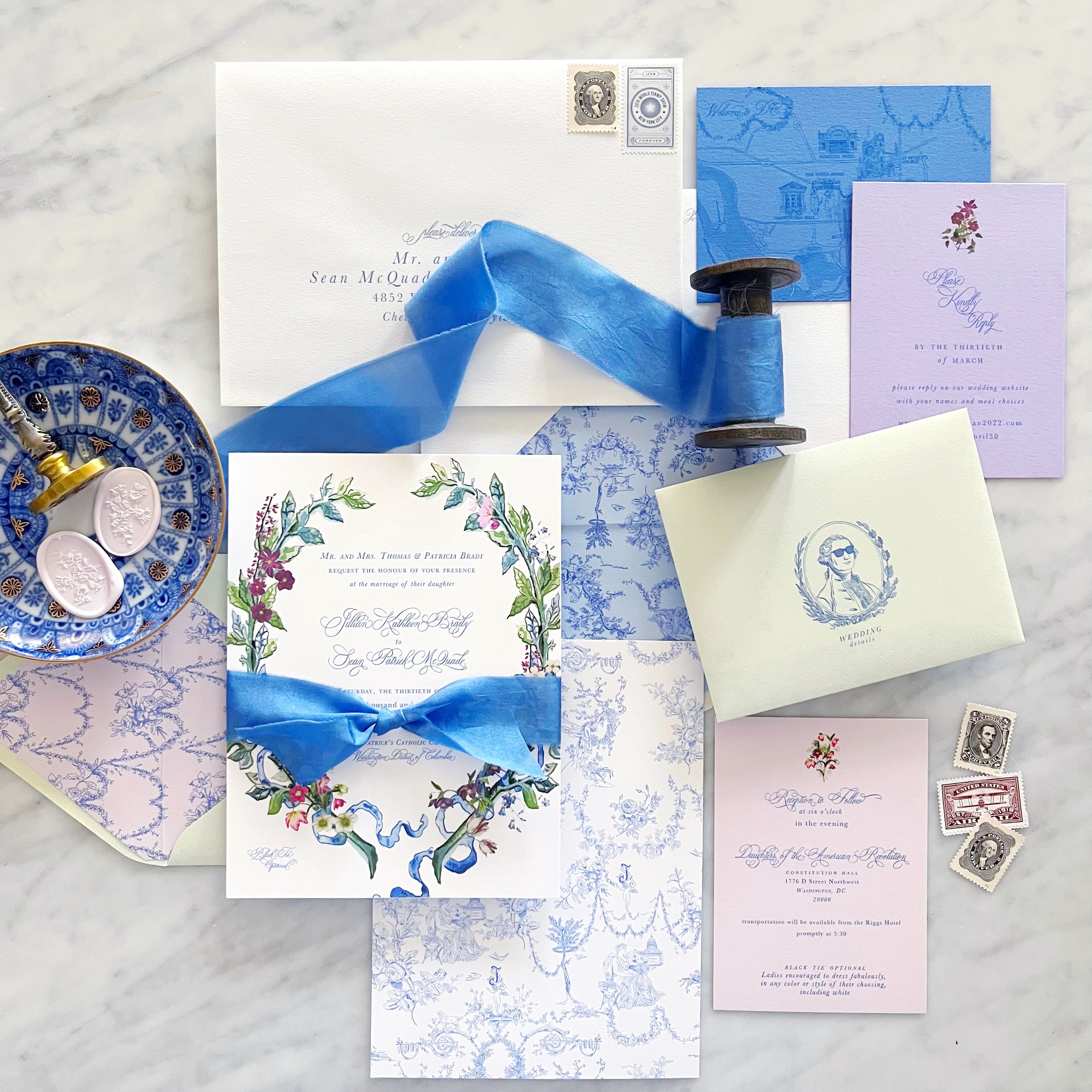
Between the shortages throughout the industry and the very distinctive shade of blue I was looking for, we ended up going with a custom-dyed silk ribbon to hold all our pieces together. We paired it with a pale pink custom wax seal and vintage styled postage.
A Handpainted bottle that says Thank You!
As a thank you for a lovely vacation in Cabo, this bottle was designed with details of the house they stayed in and the many margaritas they drank!
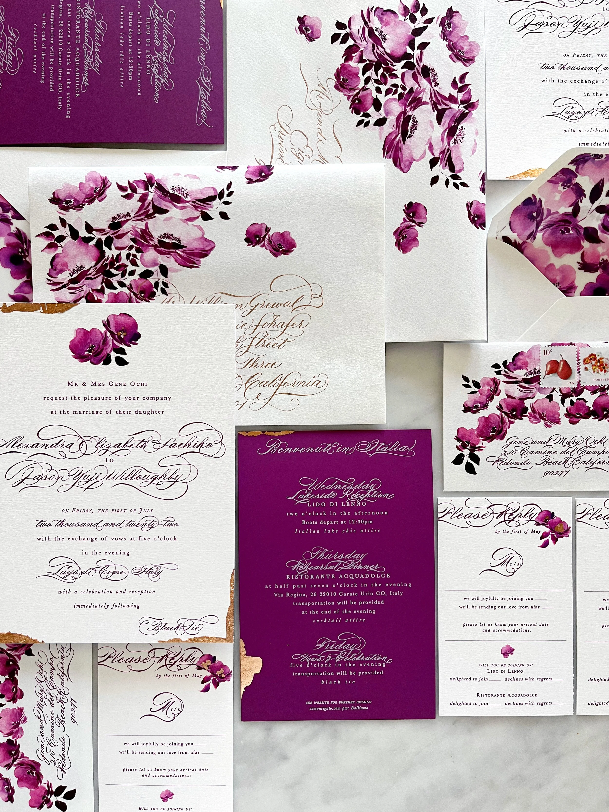
A Suite in Raspberry
Lake Como, Italy
Vintage, saturated, floral, elegant
Our amazing bride, Alexandra, requested two things….a bold, saturated, monochromatic color palette, and florals. We were all over that. I also added touches of rose gold foil and calligraphy throughout the suite to elevate the overall formality of her Black Tie wedding in Italy.
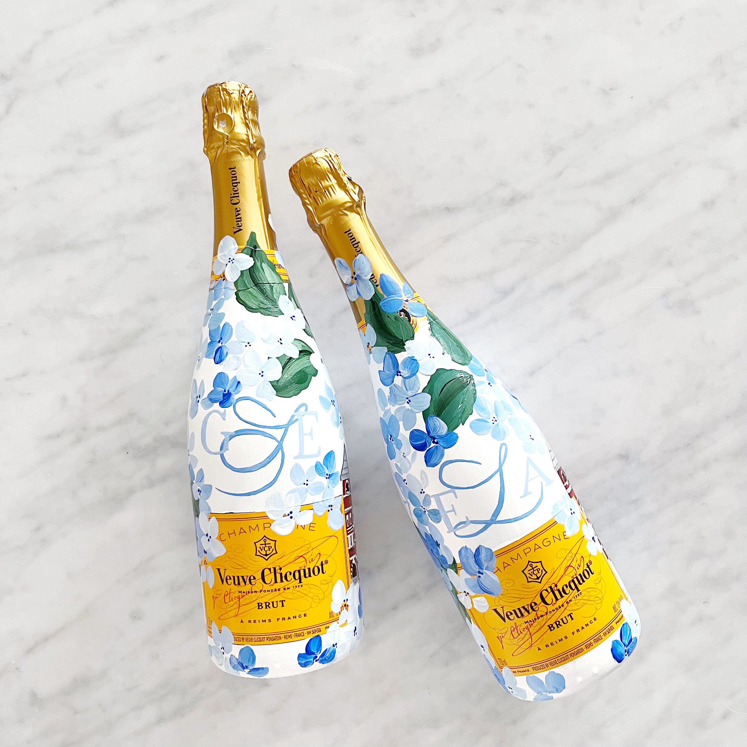
Graduation Handpainted Veuve Clicquot
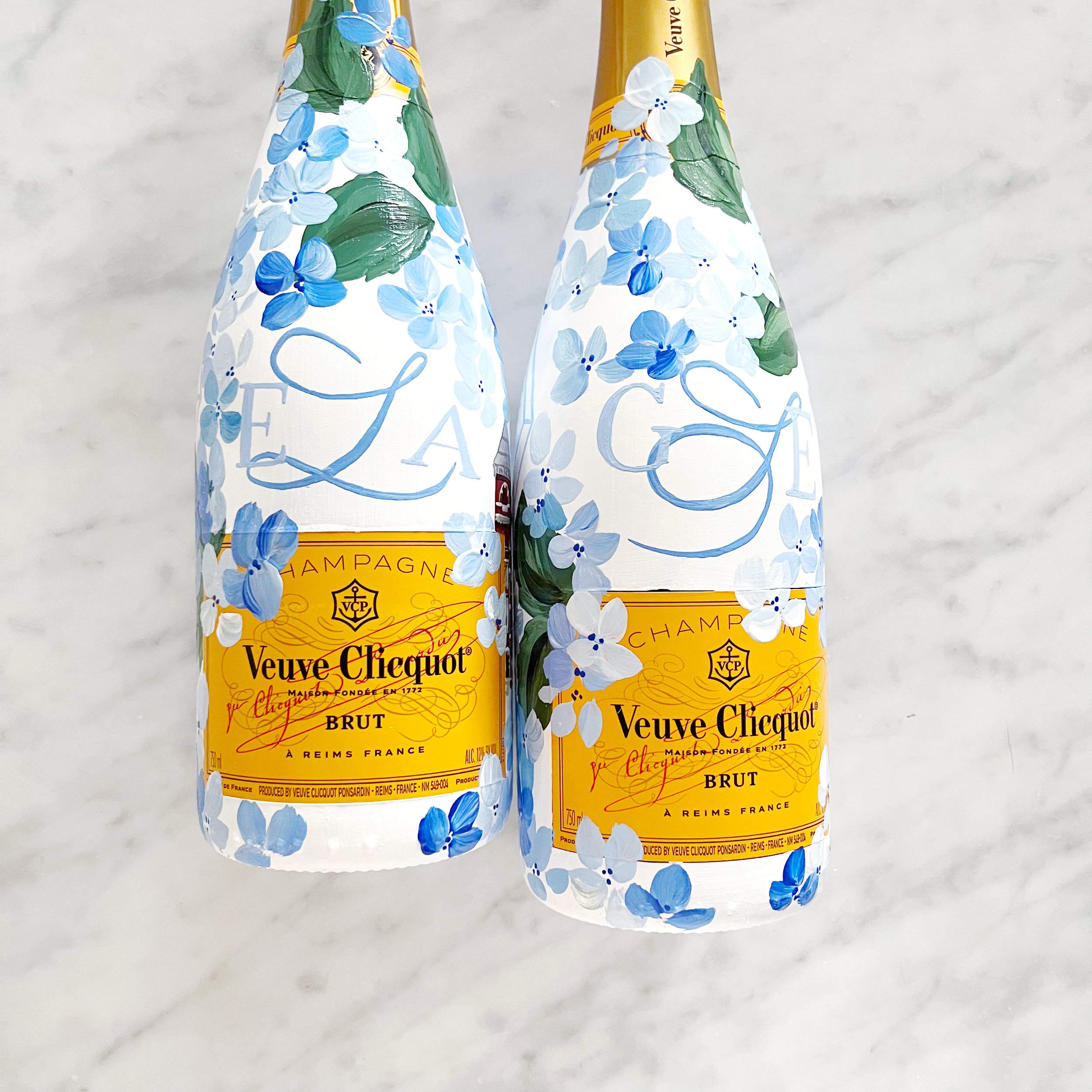
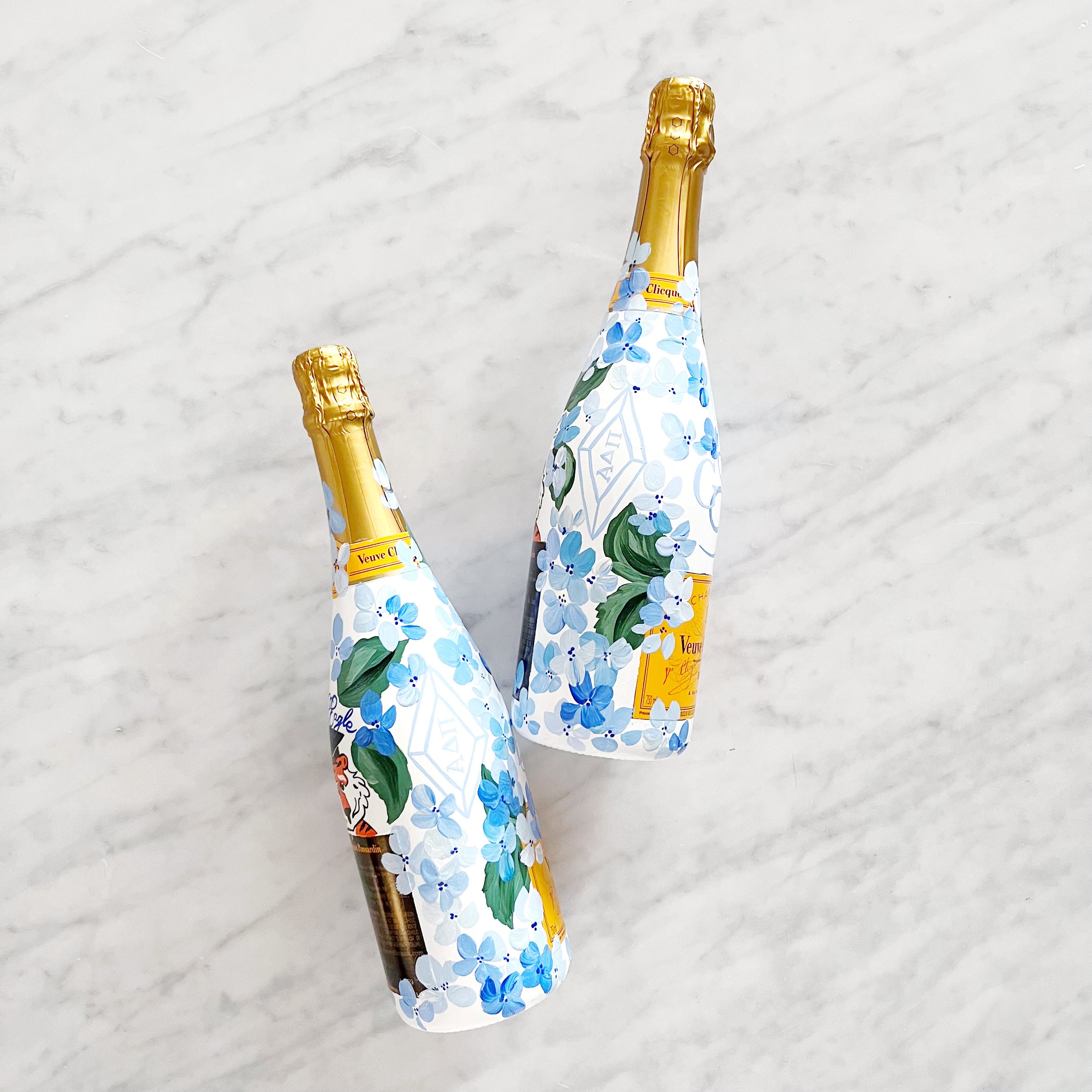
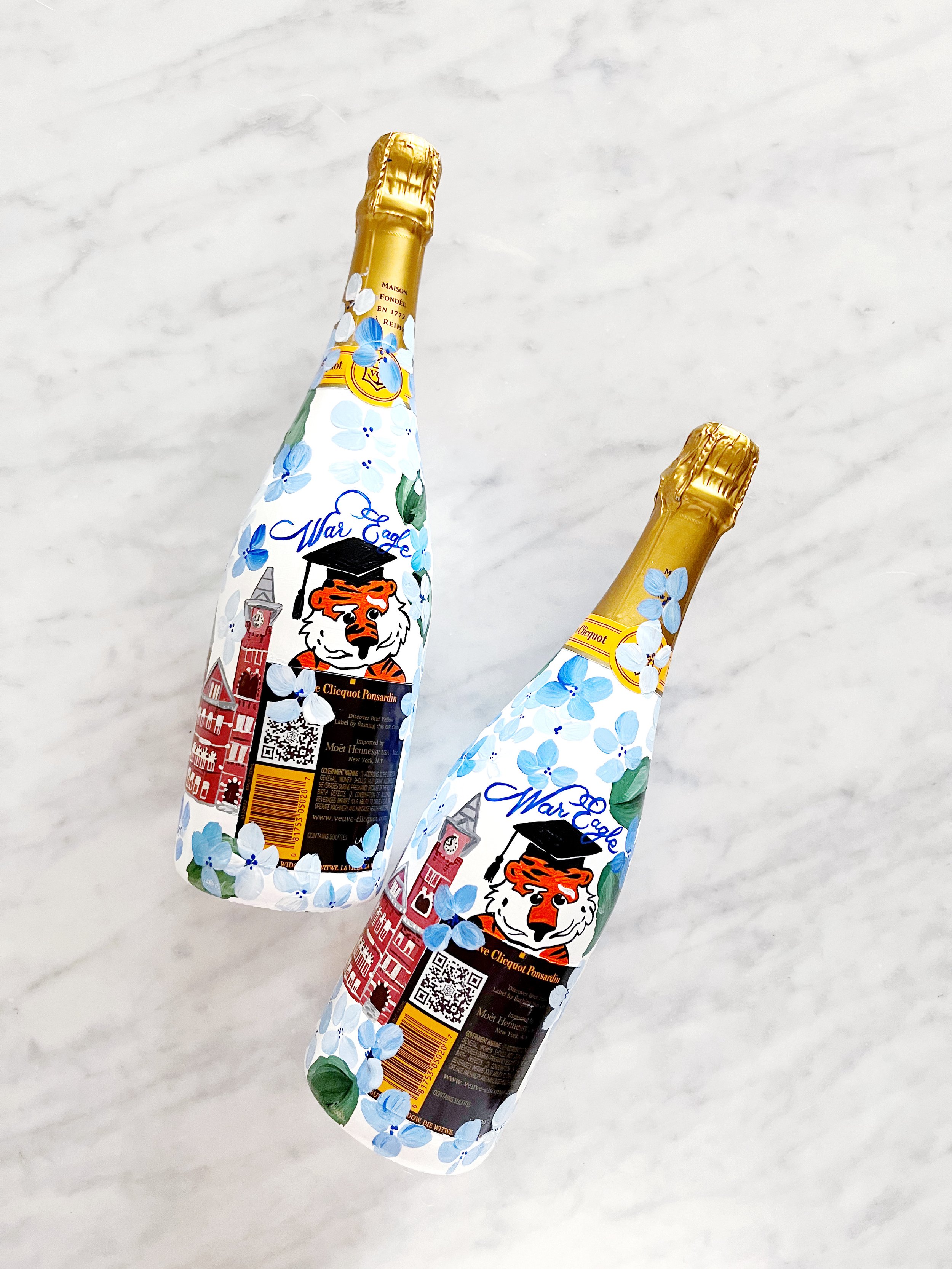
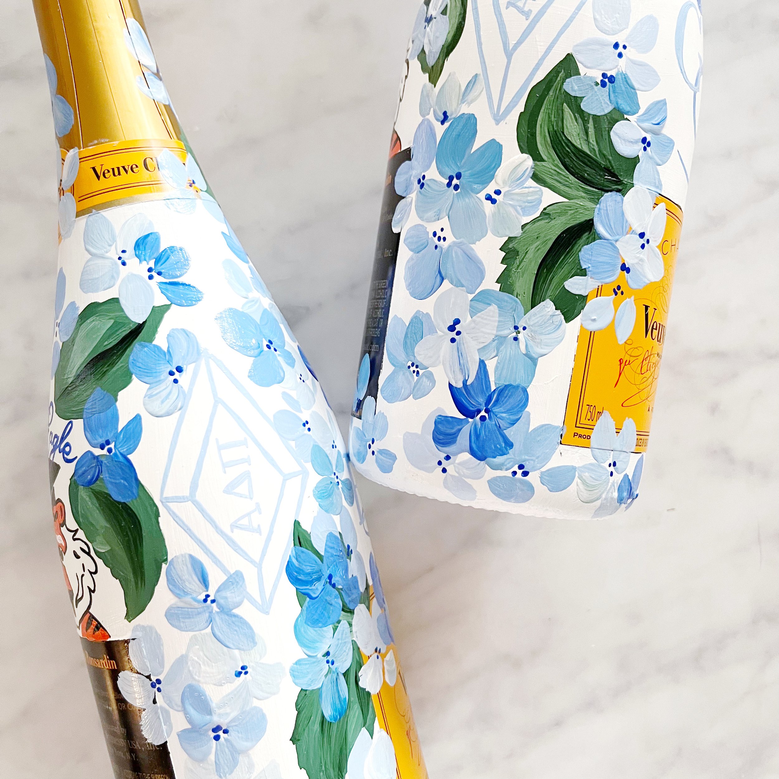
A perfect graduation gift! Each bottle had details of their girls’ college journey, with their initials, iconic building from the Auburn campus, their mascot, and their sorority. All the personal details were surrounded by hydrangea blooms in shades of blue.
A Custom Toile Pattern for a DC Wedding - Colors
I love getting a project where I get to work with a ton of colors! Granted, the shortages we’re seeing throughout the paper industry right now didn’t make it easy, but I was up for the challenge.
We wanted to go with spring pastels without feeling too much like an Easter church service. I selected very specific shades, including a cool pink, medium rosy purple, spring green, pale blue, and a distinctive shade of cornflower blue.
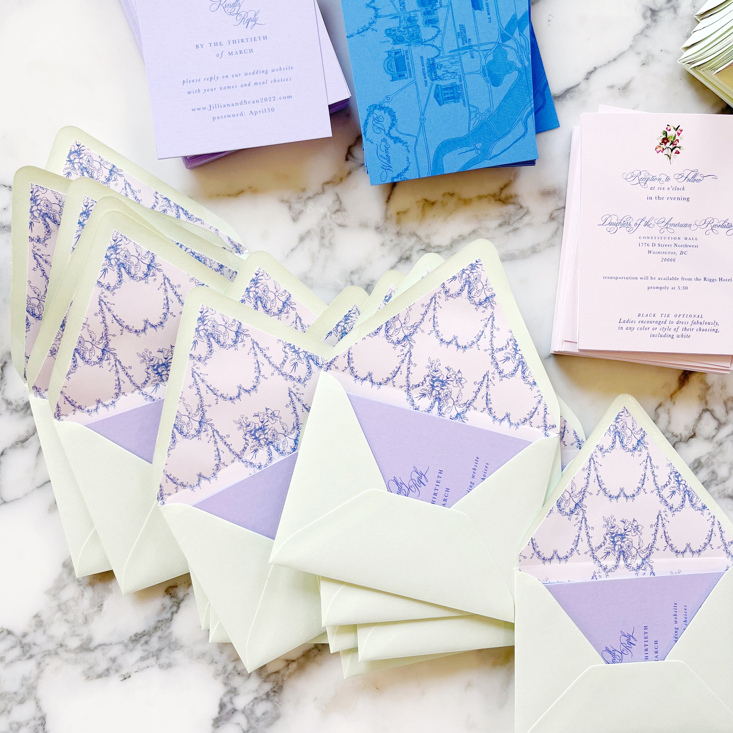
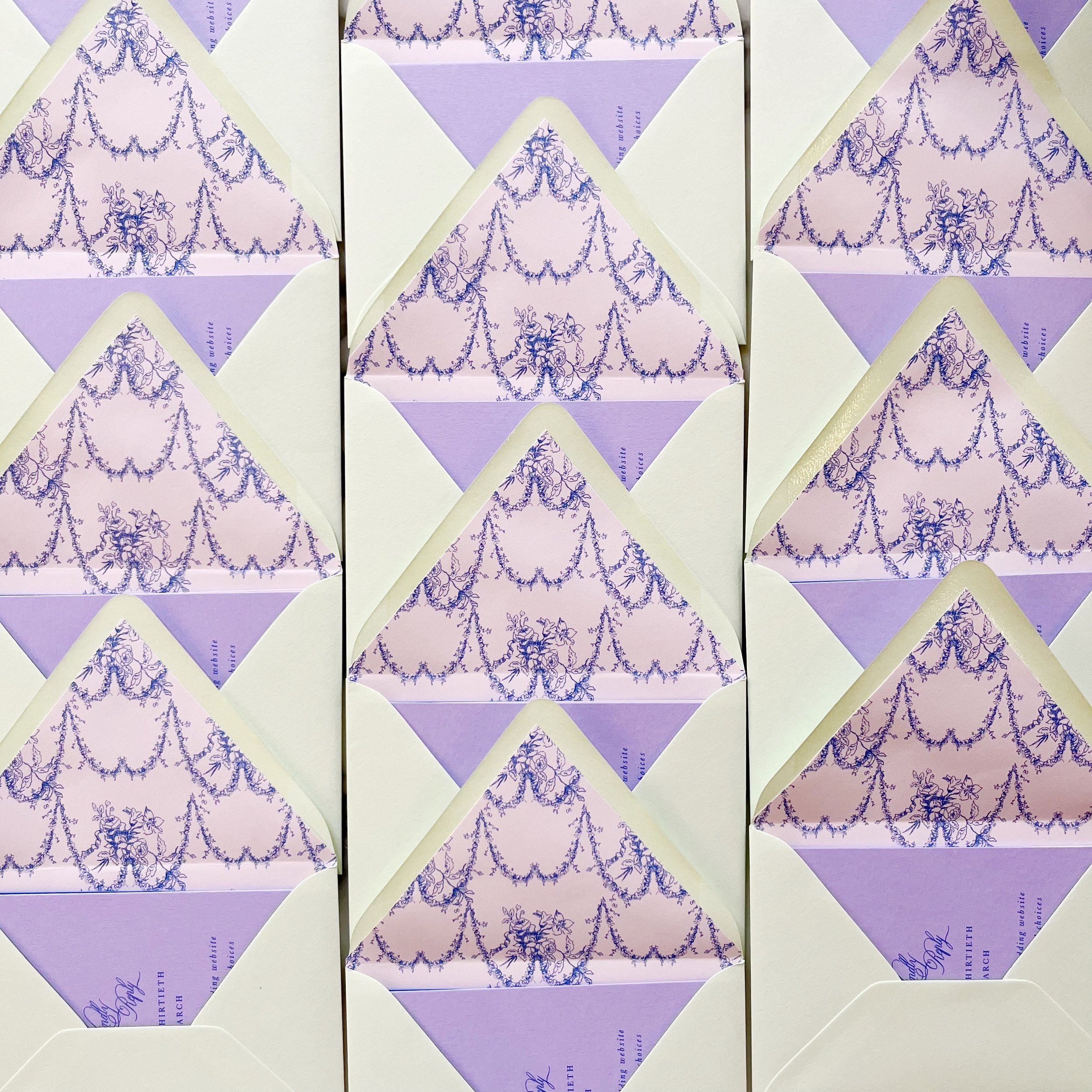
A Custom Toile for a DC Wedding - Envelope Liners
We had two different envelope liners for this project - one featured the overall toile pattern that we created for the bride, and the second was a sweeping, romantic pattern created from some of the floral festoons pulled from the main toile pattern.
