Sneak Peek - Art Nouveau Wedding Invitations
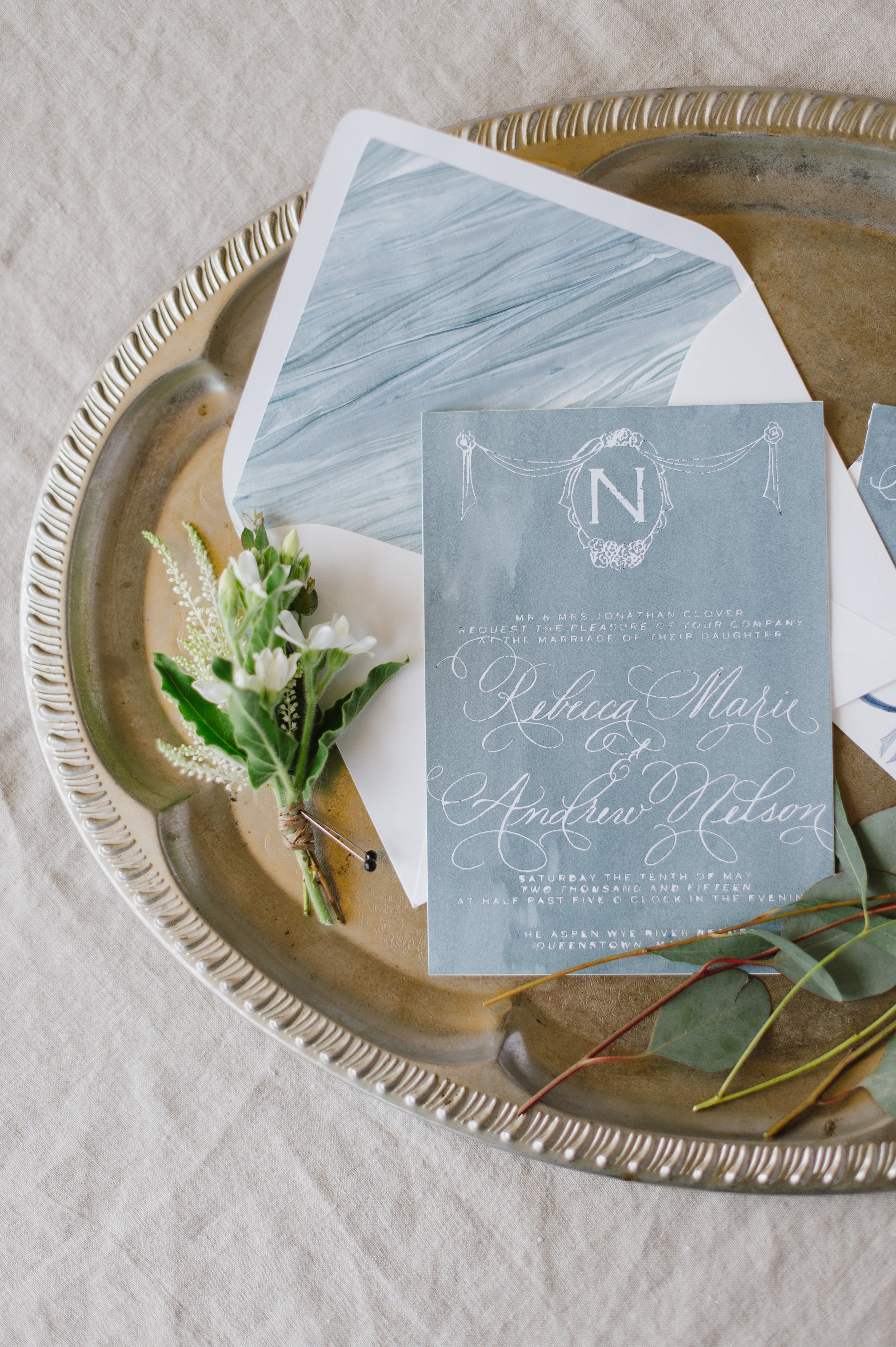
Romantic, pale, textured, unexpected, handmade paper, tactile, art nouveau
an invitation suite for a wedding at:
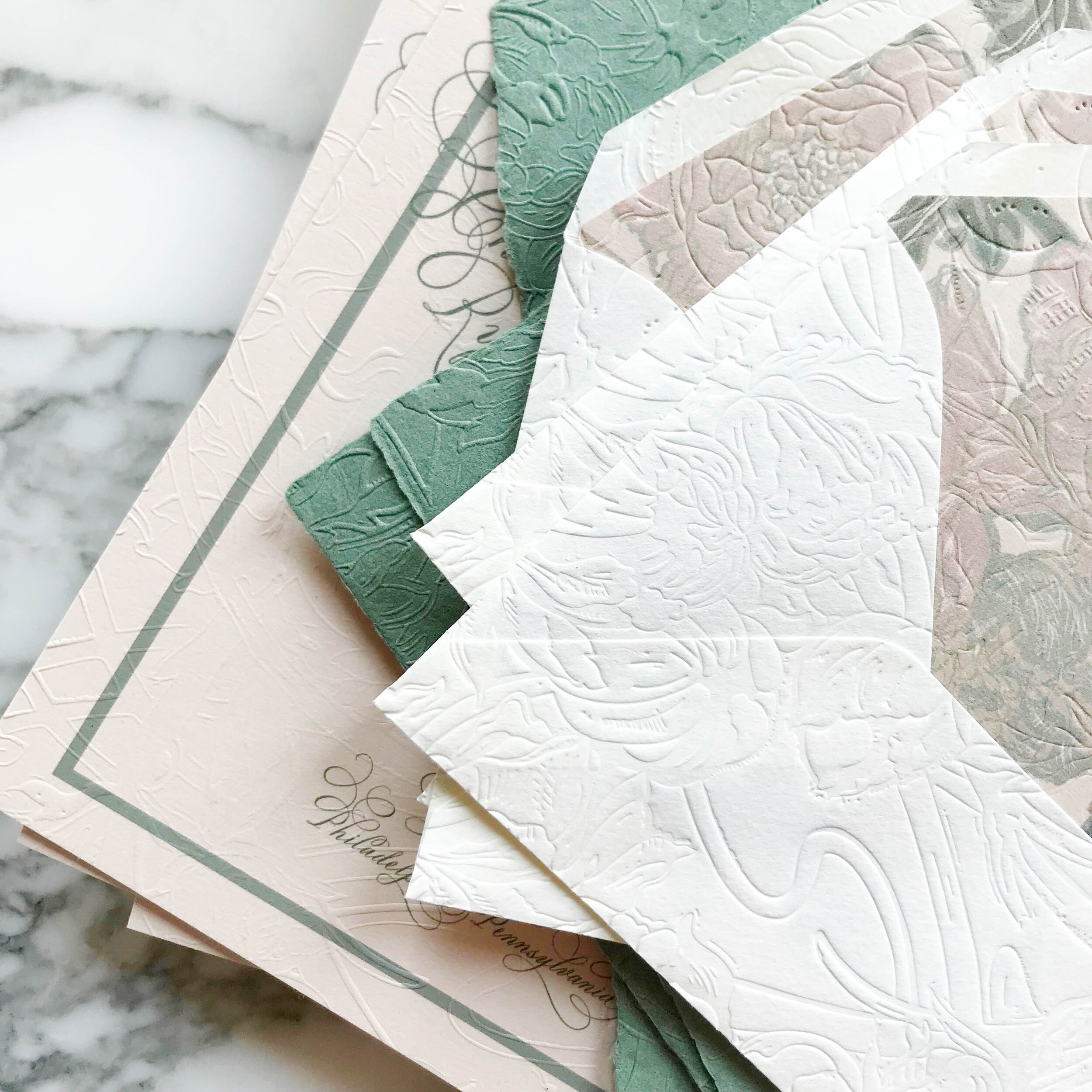
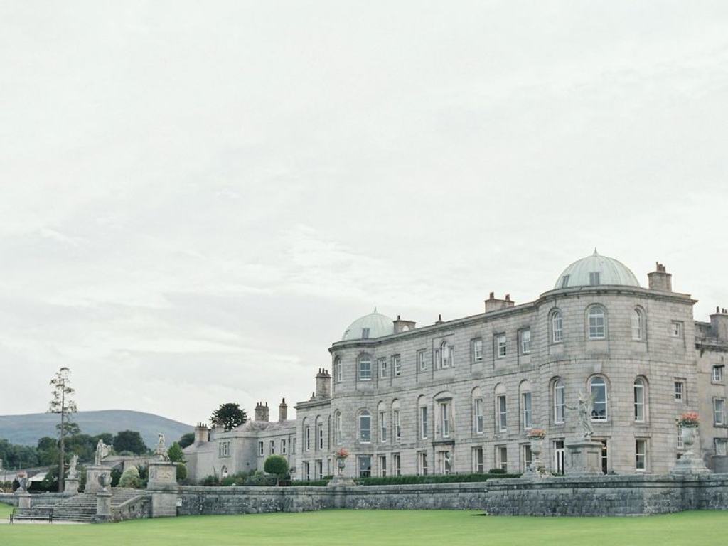
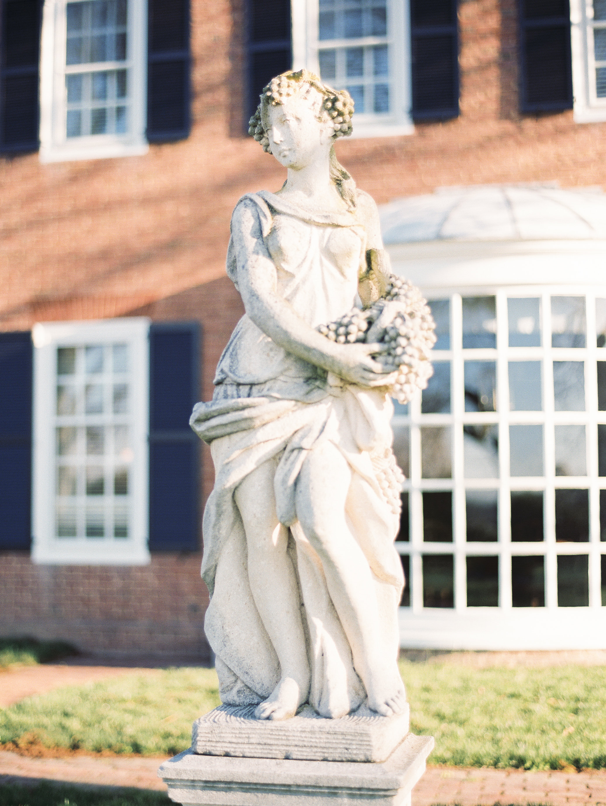
Glen Foerd Mansion | Philadelphia, Pennsylvania
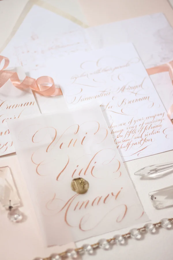
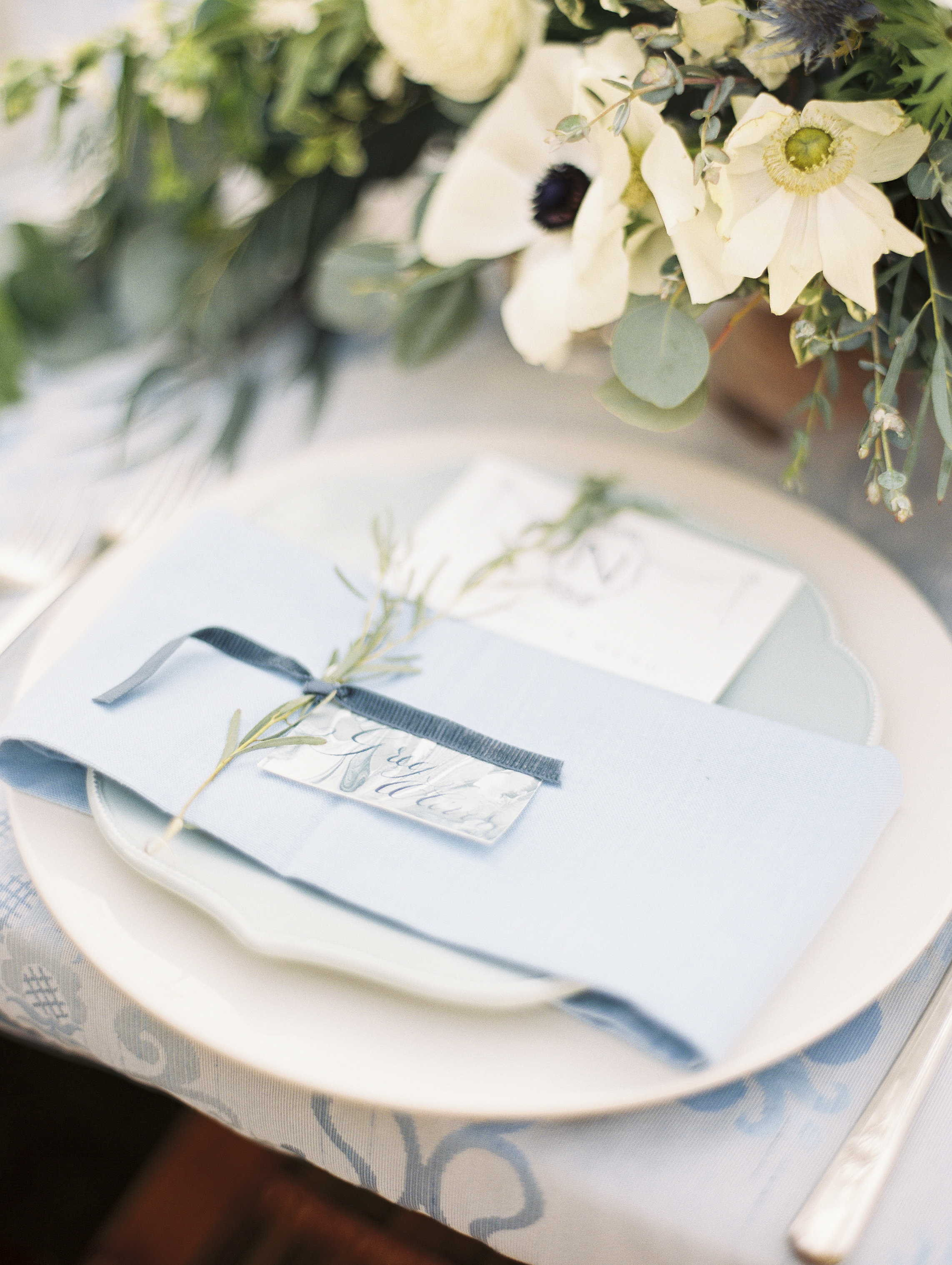
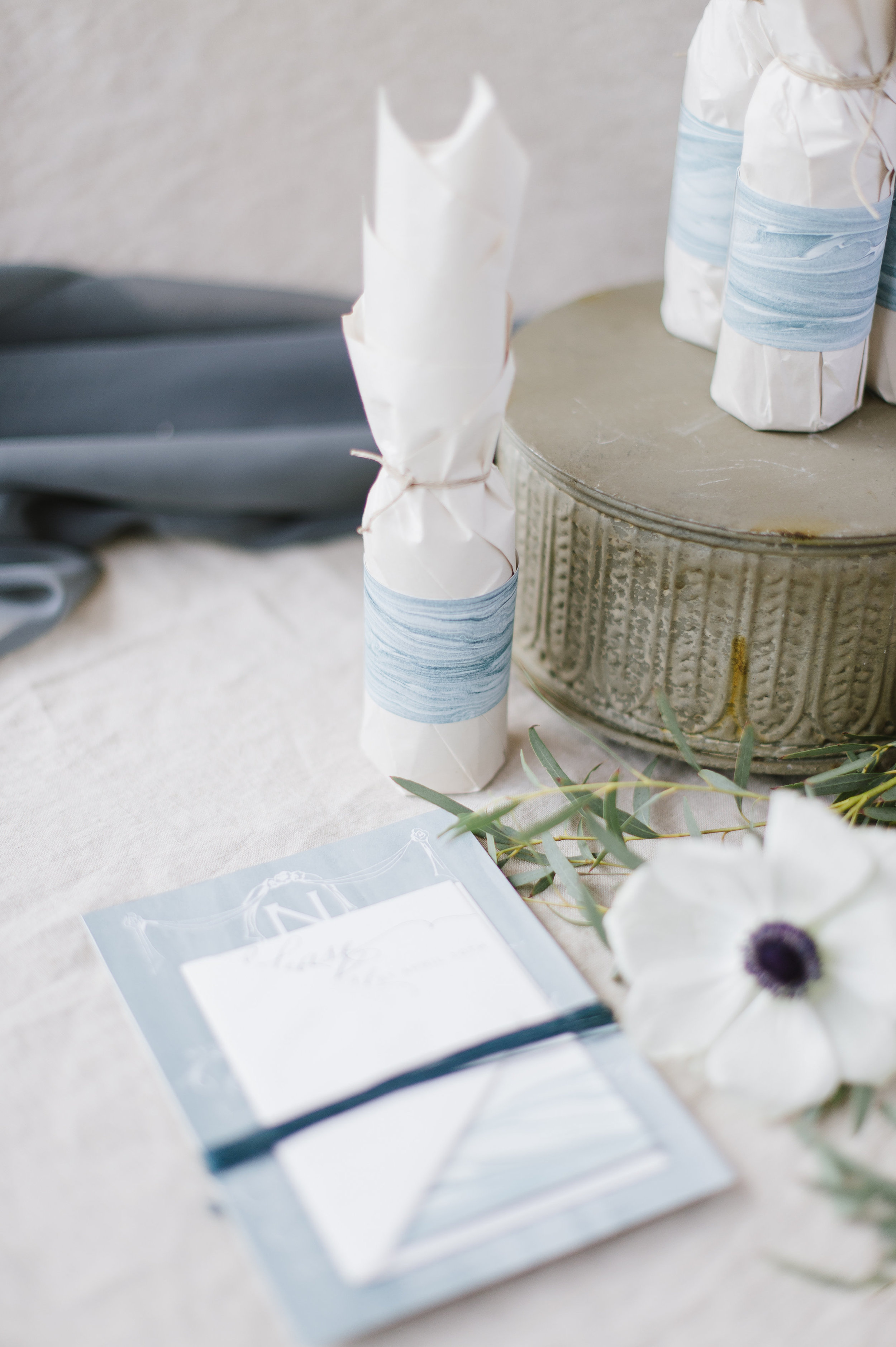
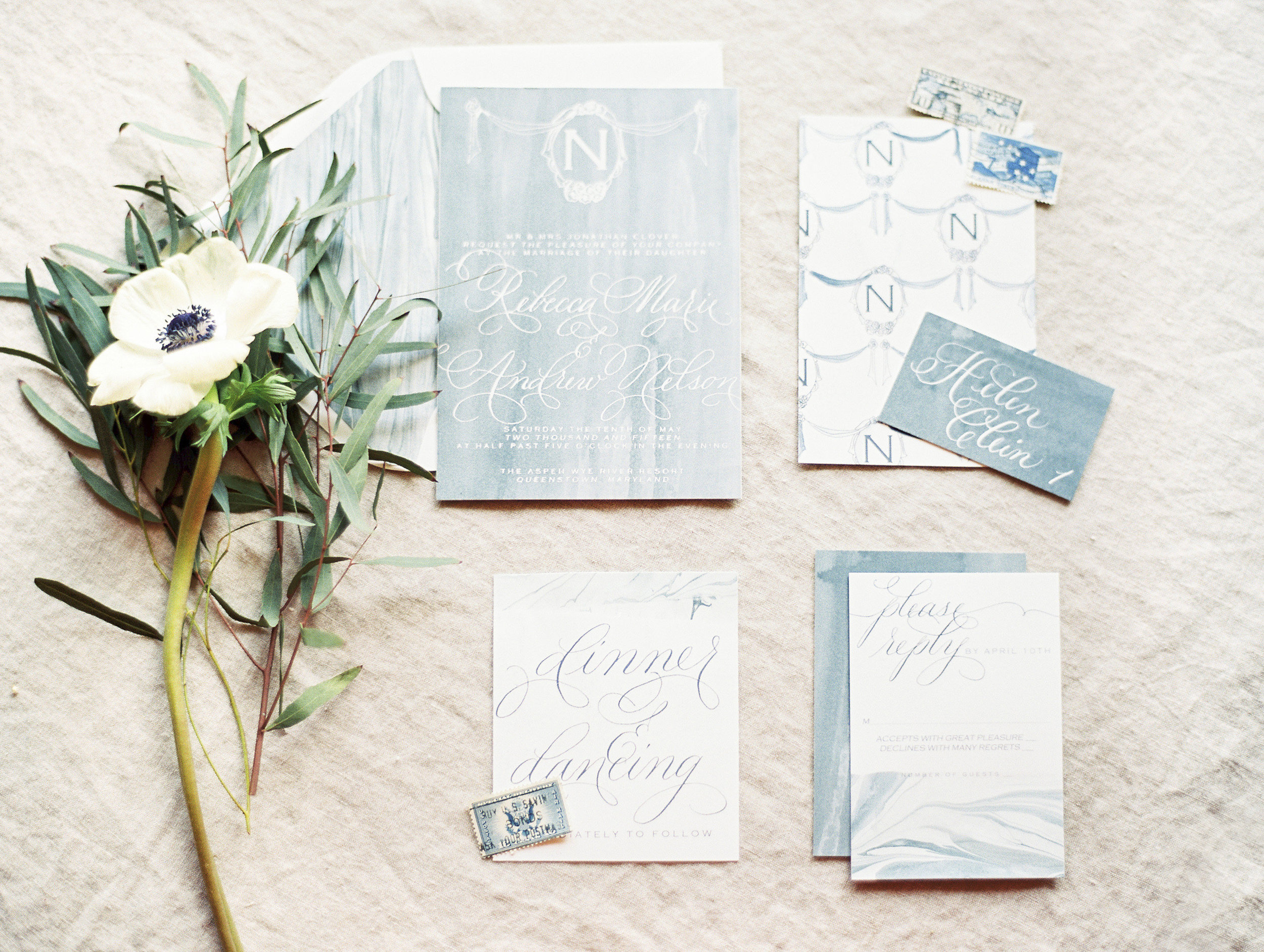
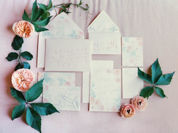
pale shades of nude and sage, with classic art nouveau texture and artwork, saturated with heavy texture emobossed onto pillowy soft papers.
Bespoke | Italian Destination
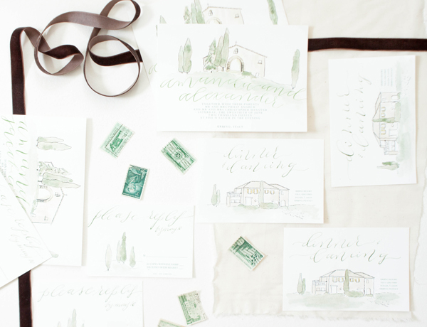
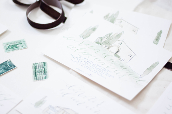
When you run away and get married in Italy trailing your entire family and group of friends with you, you might as well go big. We created these invitations to reflect the amazing venue, complete with cypress trees, old masonry and yellow shutters.
Bespoke | Elopement
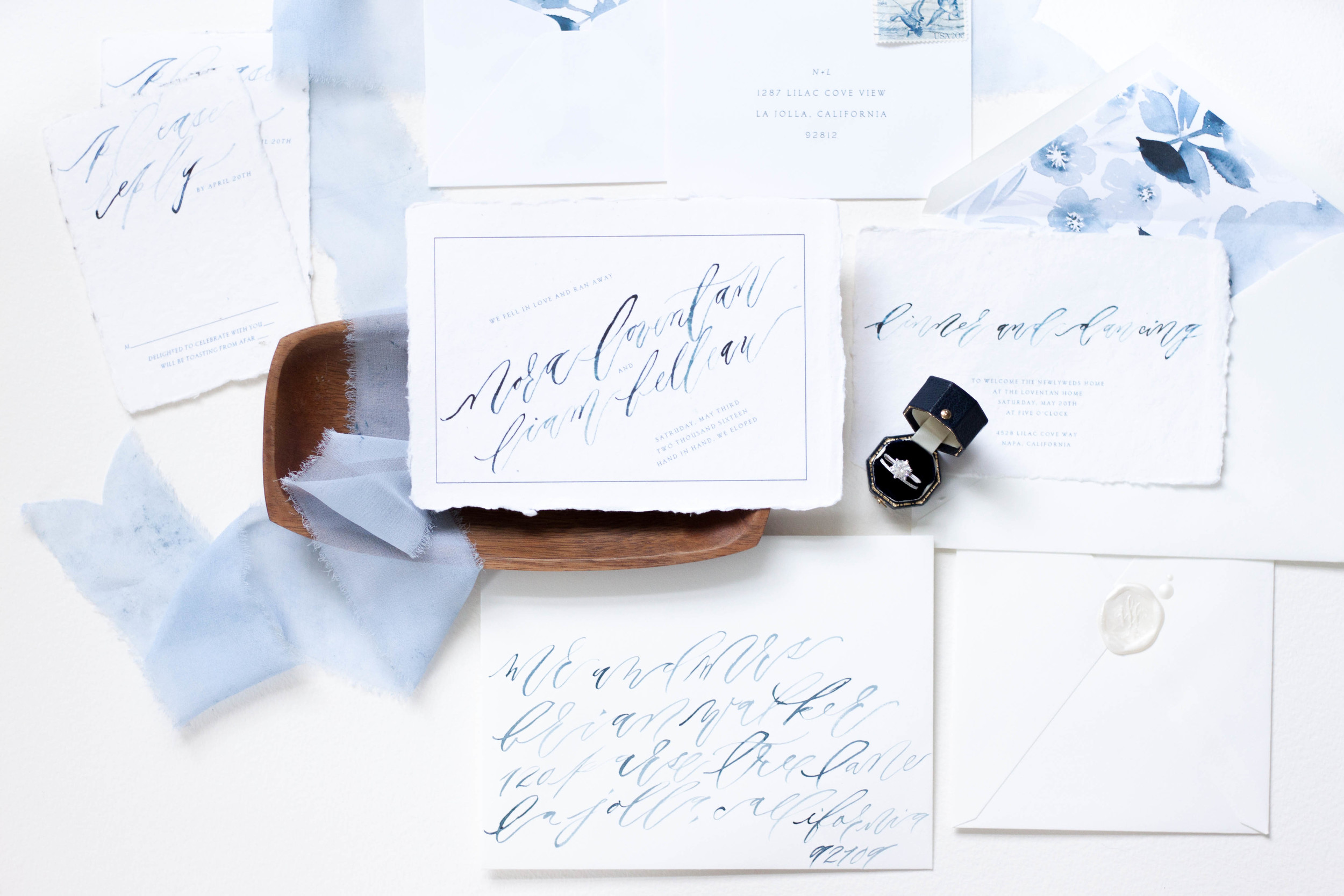
"we fell in love so we ran away"
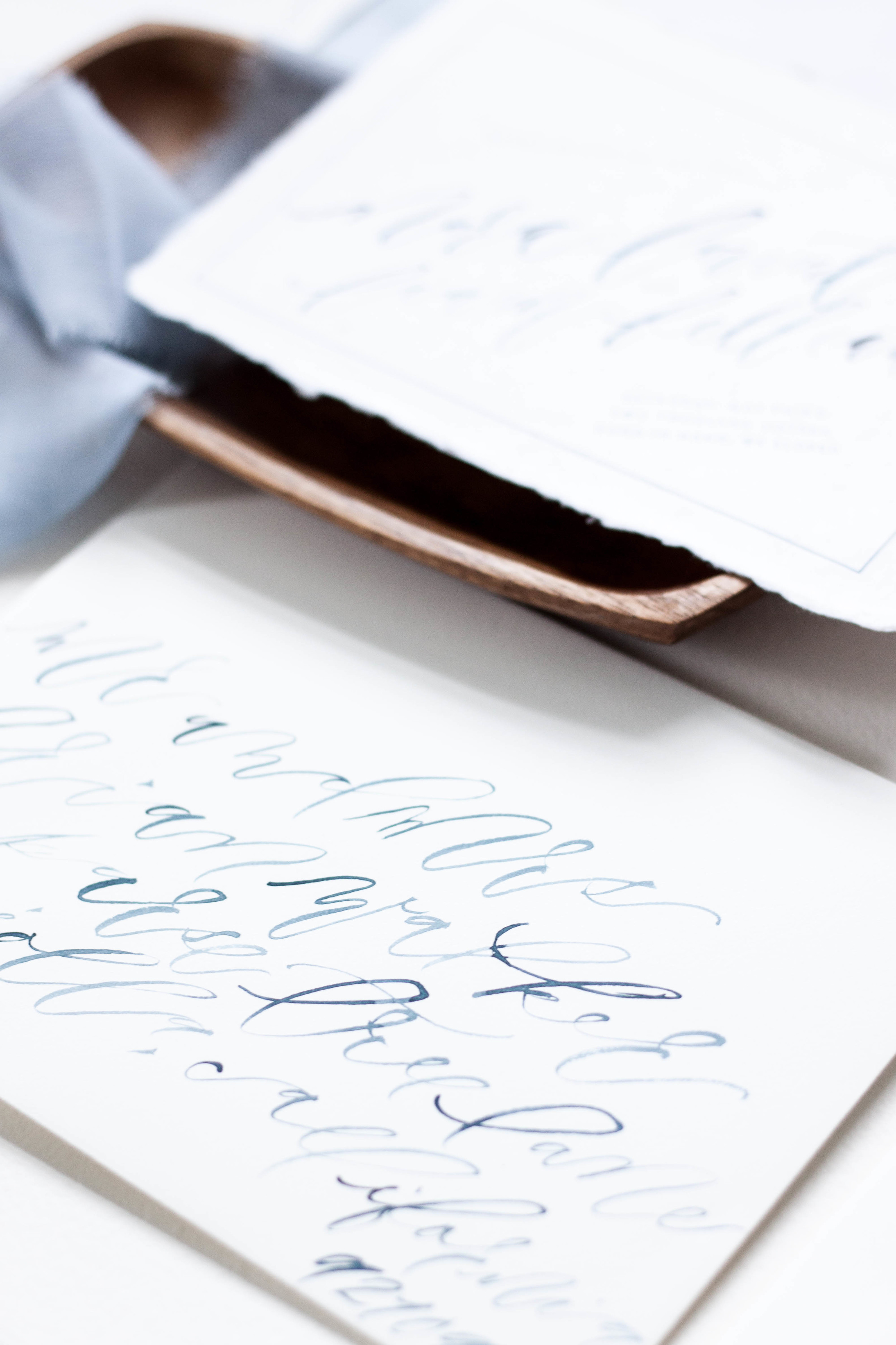
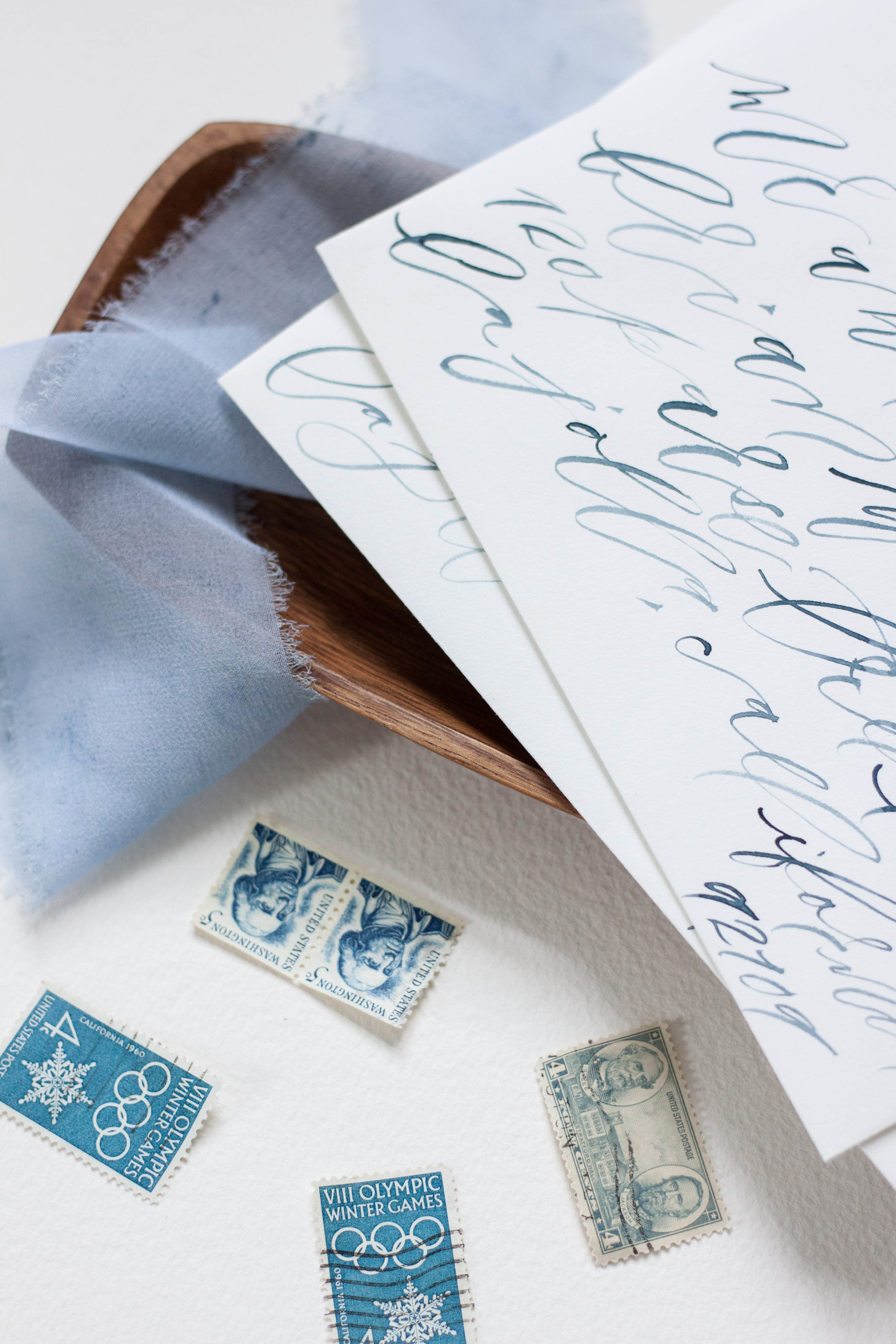
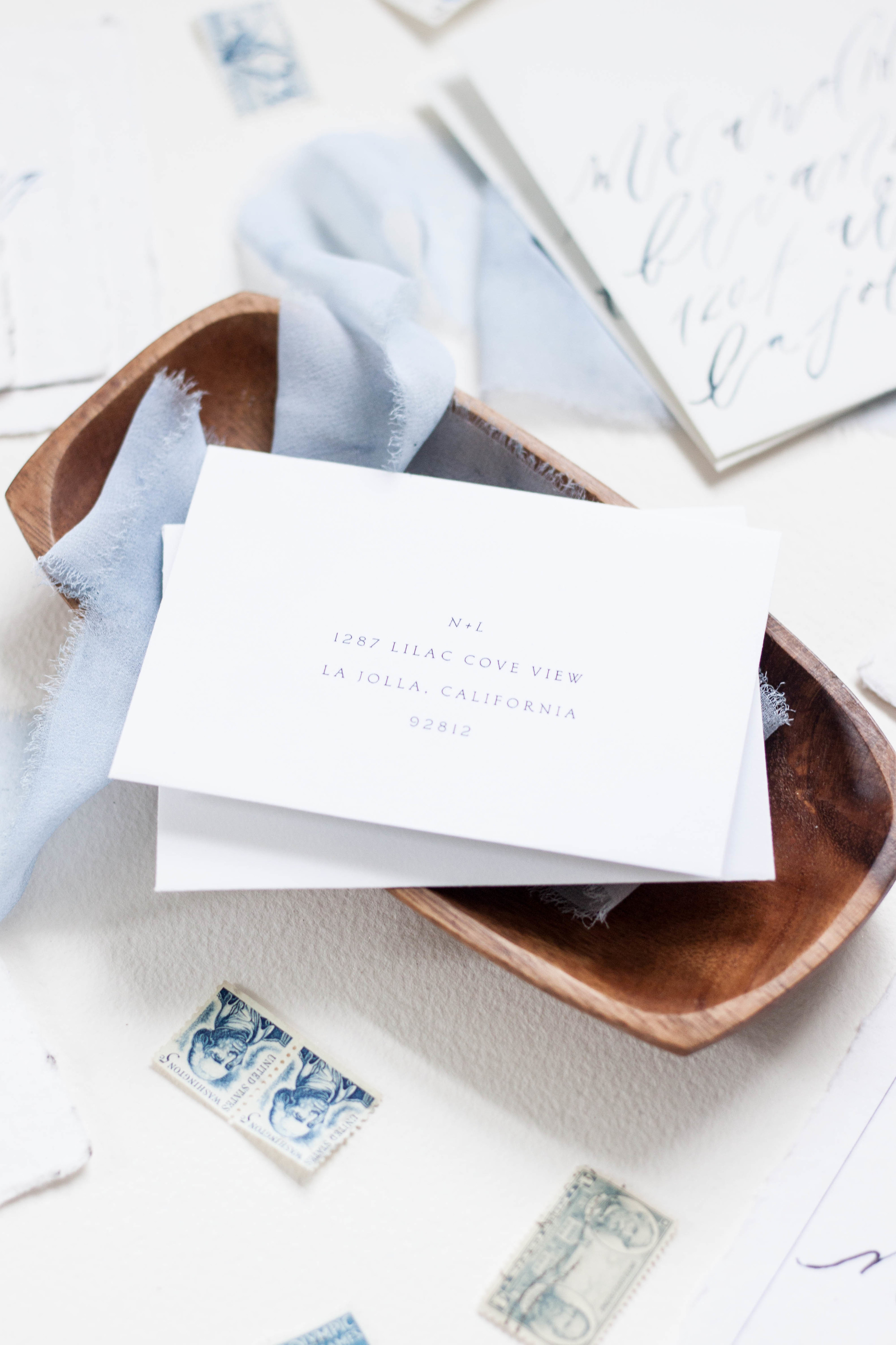
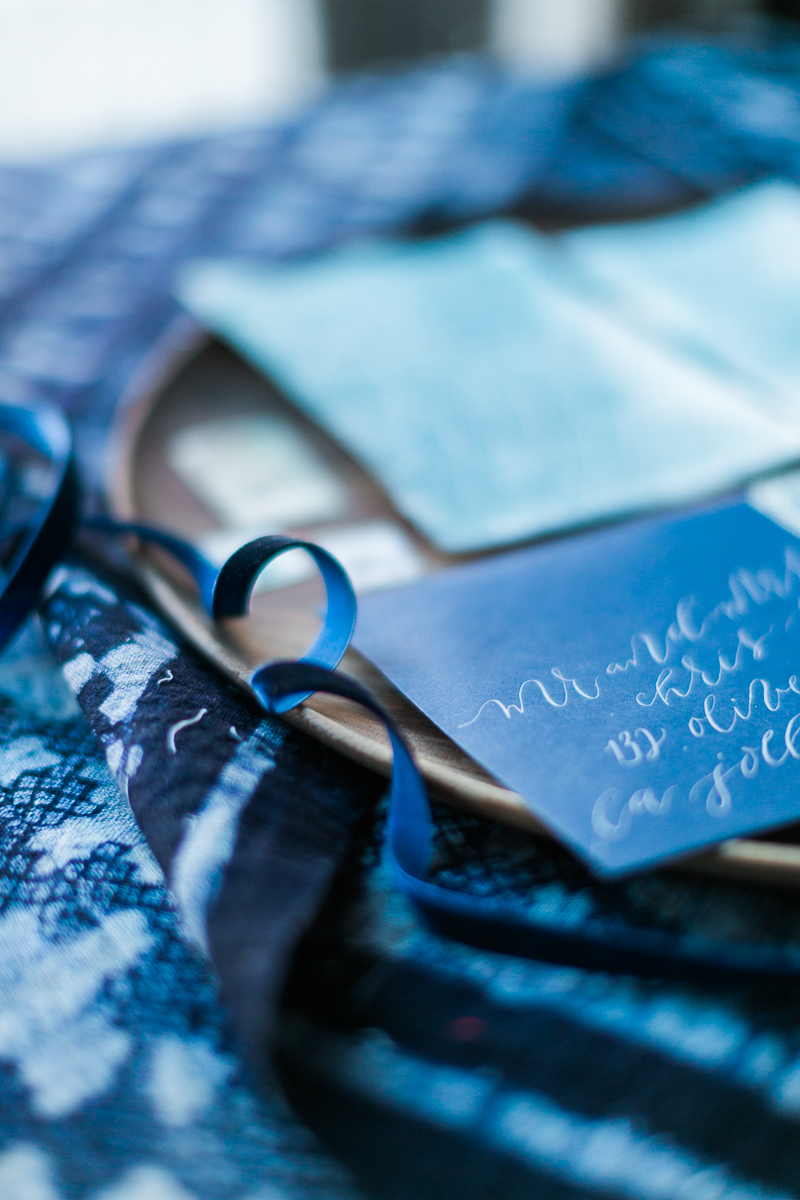
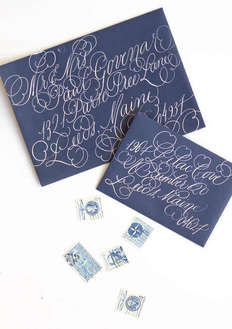
Two people fell in love, eloped and got married! To announce their marriage, we created a main piece with the date they tied the knot, paired with a reception card announcing a celebration thrown by the brides parents. I created the suite with handwritten, contemporary brush calligraphy and printed the entire suite on handmade cotton rag paper. The envelopes were both lined with monochromatic indigo florals, and addressed in the same looping indigo lettering. The entire suite was wrapped in hand dyed silk ribbon.
Featured | Style me Pretty
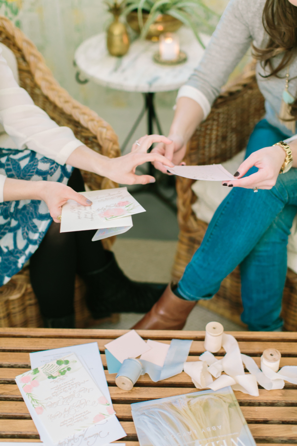
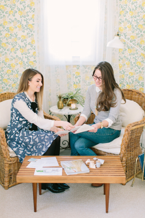
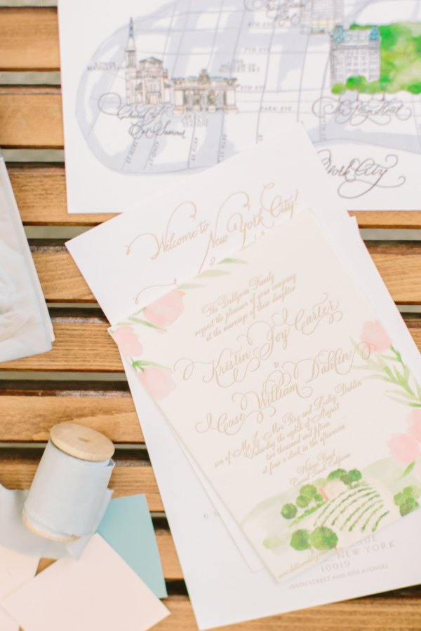
One of my favorite clients (I say 'favorite' but all my clients are pretty fricken awesome!), Miss Jess Galfo, fashion blogger of Dressed by Jess and blogger bride at Style Me Pretty met up with her completely fab event designer to have a sit down recently to chat about style, paper, and all details weddings! Paige from Gilded Lily Events is working with Jess on her wedding design, and I have the pleasure of creating her paper pieces for her. They cozied up in Paige's darling office to pour over paper options, printing methods and wedding details. The lovely afternoon was then shot by Love & Light Photography and was featured on Style Me Pretty today! Jess turned the tables a bit and put on her hat as blogger and picked Paige's brain a bit about owning a wedding design company and working with clients. Check out her full interview the rest of the gallery
From Paige:
There are plenty of ways to showcase your personality on your wedding day, but what elements are the most important?
I truly believe that love is in the details. However, couples can easily get weighed down by all of these “little” things. I like to remind brides-to-be that it is important to really zoom in on the areas that will make the most impact. If you think back on a picture of a wedding that you loved, you probably didn’t notice everything that was going on around it. Focus on what is the most important and highlight it. For an overall beautiful, cohesive look, I believe the flowers and paper goods are the most important elements. They carry the wedding day story and are usually the first and last thing that your guests will take note of.
Invitations are the guests’ first peek at the formality of the wedding along with the type of event being thrown. How can brides keep them creative, yet cohesive?
Save the Dates and invitations are the first connections that your guests will have with your wedding and it sets the tone for what to expect for your day. Before you send out your invitations, make sure you have a good idea of the color palette and key design elements that you are going to use throughout your wedding day. Custom invitations are the way to go and are not just a luxury item. Be clear with your graphic designer or artist of what you want and how they can work within your budget to make your invitation dreams come true.
Check out more from Paige on Style Me Pretty!
Bespoke | Samantha & Stuart
I've been pretty obsessed with marbling lately, and this suite is nothing short of all sorts of marbled goodness.
Gold engraved lettering, pale silk ribbon, and marbling in shades of grey, it just doesn't get any better!
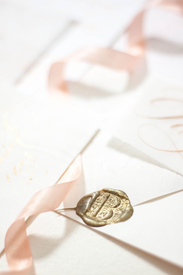
The entire suite was topped off with a gold wax seal, bringing in formality and tradition.
Featured | Engaged! Magazine | Ireland Nuptuals
A destination affair with Strawberry Milk Events, Laura Gordon and Engaged! Magazine in the Emerald Aisle produced some really dreamy images! I had the pleasure of collaborating with these lovely ladies on a gorgeous invitation suite, featuring lots of calligraphy, gold and teal foil printing, custom wine bottle labels and tags, and vintage postage. Check out the full magazine feature here!
Featured | Engaged! Magazine | Ireland Nuptuals
So I'm a little behind in showcasing some of the features I've had the pleasure of working with. Ok, a lot behind. Later this week, I have the full feature from Engaged! Magazine featuring this invitation suite, but for now we'll take a look at some of the paper details!
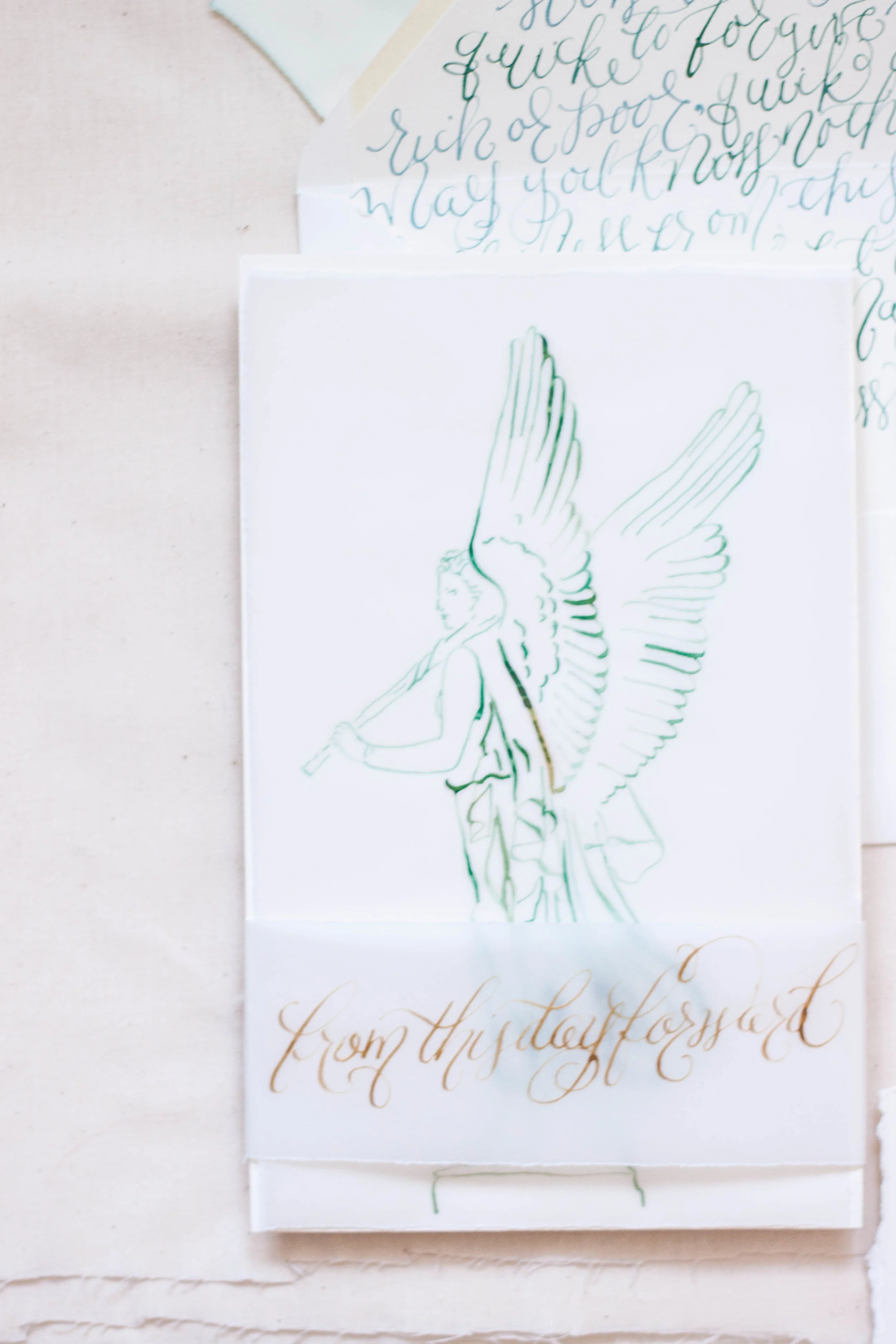
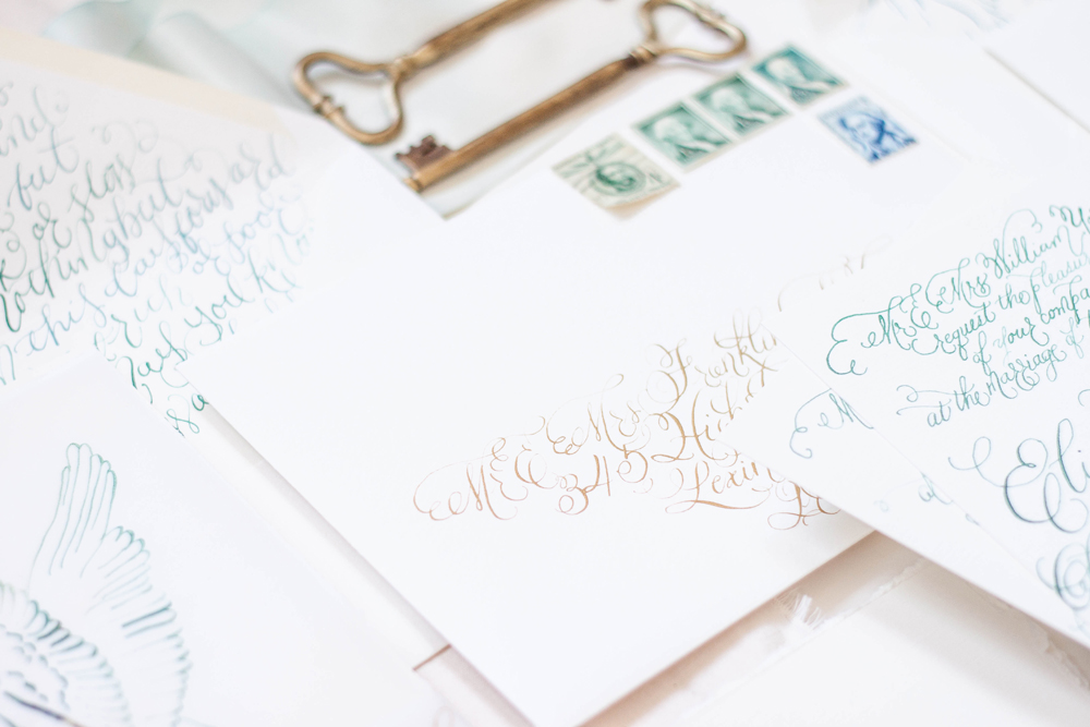
The suite is foil printed in a pale antique gold and teal on cotton paper with deckled edges. We alternated the colors on each piece, keeping the overall look balanced. The final suite was stacked up and topped with a thin piece of velum with an illustrated angel, a statue featured at the castle. The whole thing was then wrapped with a thin piece of parchment reading "from this day forward." I also created tags for the guest welcome baskets and custom wine labels to follow the same design. The place cards also featured deckled edges and gold ink. Stay tuned this week to see the whole feature from the magazine!
First photo from the lovely Laura Gordon.
Bespoke | Indigo
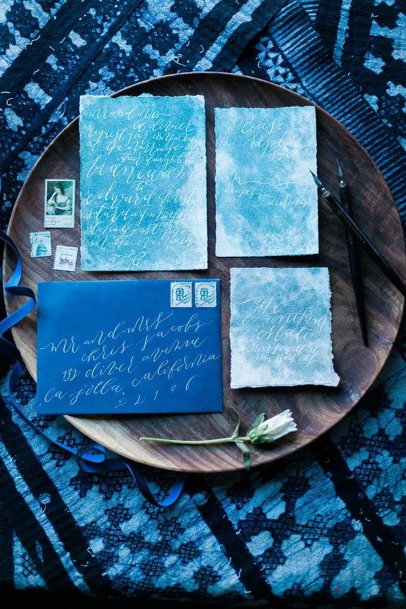
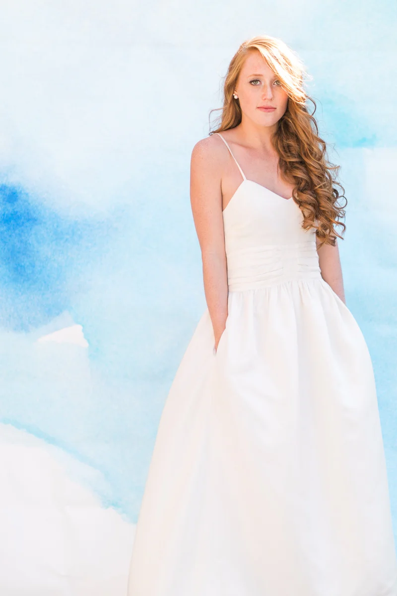
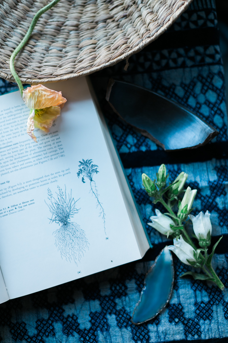
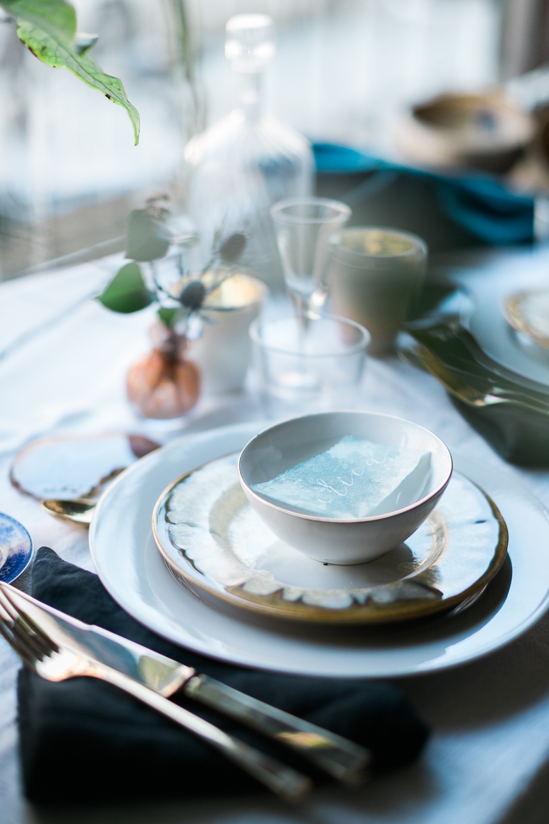
From our amazing photographer on the project, Cadence Kennedy, "As an artist and photographer, I am constantly inspired by color, light and art. I started dreaming of an "indigo" inspired styled shoot after learning of "Cyanotypes" a few years back. Cyanotypes are deep blue photographic prints which originated during the 1800's. They are created by laying botanicals or objects on top of light sensitive paper, exposed to the sun, then developed."
Photography: Cadence Kennedy // Florals: Aurora Botanica // Styling: L 'atelier Vert // Calligraphy: Design House of Moira // Curation: Orchard + Broome // Dresses: Stone Fox Bride // Backdrop: Starling On Bond // Hair: Hair by Tiffany Hayden // Makeup: Jillian Cleary
Featured | Bayside Workshop
Vendors: Photography: Natalie Franke // Styling: Kruse & Vieira Events // Florals: Intrigue Designs // Invite Suite & Paper Goods & lettering for table: Design House Of Moira // Calligraphy: Poppy & Scooter // Linens: BBJ Linens // Rentals: Select Event Group // Cake: Wildflour Fine Baking Co.// Welcome Basket: Marigold & Grey // Hair & Makeup: Behind The Veil // Gown: Kate McDonald Bridal // Tux: The Black Tux
Featured | Martha Stewart Weddings
Michelle Leo of Michelle Leo Events is one of the amazing leaders in our industry, so when she approached me to create a suite for her bride, Sara, I was honored! The suite we created is one of my all time favorites (I know I say that a lot, but how could I possibly pick a true favorite?!).
We wanted to keep the suite classic, elegant, and interesting with some texture and gold. The suite was printed in gold foil on 220lb stock in a pale ivory and a textured aubergine. The main invitation was adorned with antique lace appliqued in the corners, each hand cut from a larger lace piece (on the plus side, it didn't take nearly as long as I thought it would!). The envelopes were both lined with pale fall leaves and the suite was tied up with thin velvet ribbon. The aubergine envelopes were then addressed in flourished gold, and into the post they went!
The overall wedding was simply spectacular and it was such a joy to work with such an amazing team!
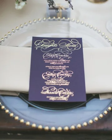
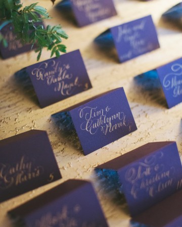
For the menus, we kept with the moody aubergine stock - we loved the way the color stood out against the taupe linens. The main lettering was all done by hand in calligraphy, then mixed with a classic and clean block type. The place cards continued the moody color scheme with each guests name in flourished gold ink.
Photography: Alixann Loosle Photography
Location: High Star Ranch
Event Planning: Michelle Leo Events
Catering: Culinary Crafts
Flowers: Urban Chateau Floral
Videography: Chris McClain
Officiant: Rev. Kamrin Carver
Stationery and Calligraphy: Moira Designs
Cake: One Sweet Slice
Music: Joe Muscolino Band
Rentals: Diamond Rental
Hair and Makeup: Studio Enizio
Featured | Style me Pretty
I had the pleasure of working with Luica and David, along with Joseba Sandoval of Sandoval Studio Photography and Romance Weddings to create this luscious and romantic wedding held at a private villa in Spain. I was approached by Joseba to meet with his bride who was looking for something lush, organic, blush and peach, and intimate. The villa created a private retreat for their small wedding and their over the top florals were perfectly framed by the architecture of the space.
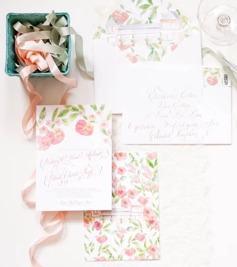
For their stationery (which will have more details posting this week), I created a pattern based on the Spanish tile that was featured through out the villa. I paired that with the fluffy garden roses and ranunculus used throughout their florals. We choose to keep the calligraphy contemporary to reflect the couples style, and wrapped the suite in antique lace. I added touches of rose gold by hand to each invitation suite, and I still swoon over the final pieces. The brides pale peach gown was just to die for!
Photography: Sandoval Studios Photography | Wedding Gown: Chaviano Couture | Wedding Cake:Sweet Things By Fi | Belt Gown: Carlee Sizemore | Bride Shoes: Chinese Laundry | Candy Bar: Dulce Serendipia | Catering : El Gastor | Chairs And Linen: Pedro Navarro | Cheesecake Design And Cheesecake Table Decor: Reviva Weddings | Creative Direction And Overall Styling: Mar Sandoval From Romance Weddings | Flowers And Ceremony Decor: Pedro Navarro | Groom Suite: Hugo Boss | Stationery Design And Escort Cards: Design House Of Moira | Venue: Villa | Wedding Favors And Drink Stirres: Mar Sandoval From Romance Weddings | Wedding Planning And Coordination: Reviva Weddings | Wedding Rings: Lujan Jewelry
Bespoke | Emma
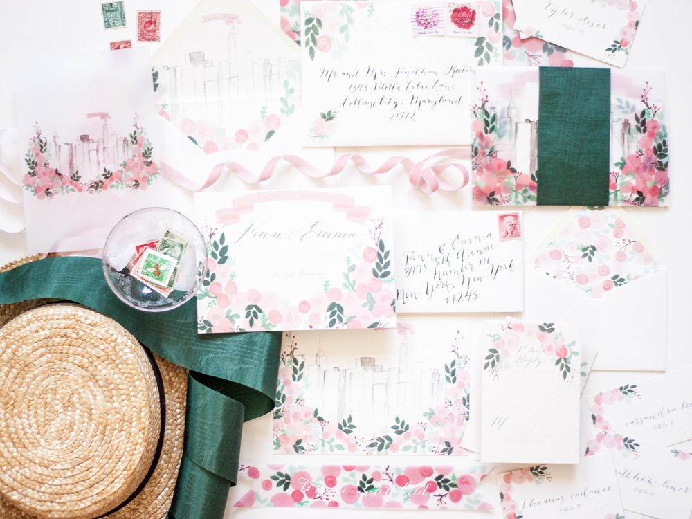
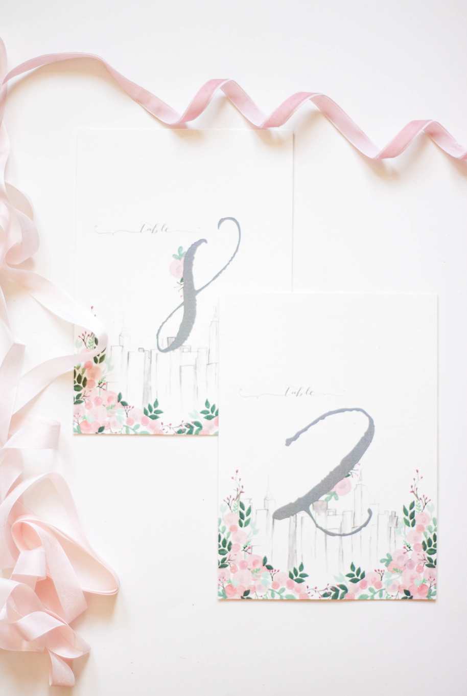
central park | floral | Manhattan | moire | skyline | boathouse | laurel | summer | boater hats | white attire
Bespoke | Elisie
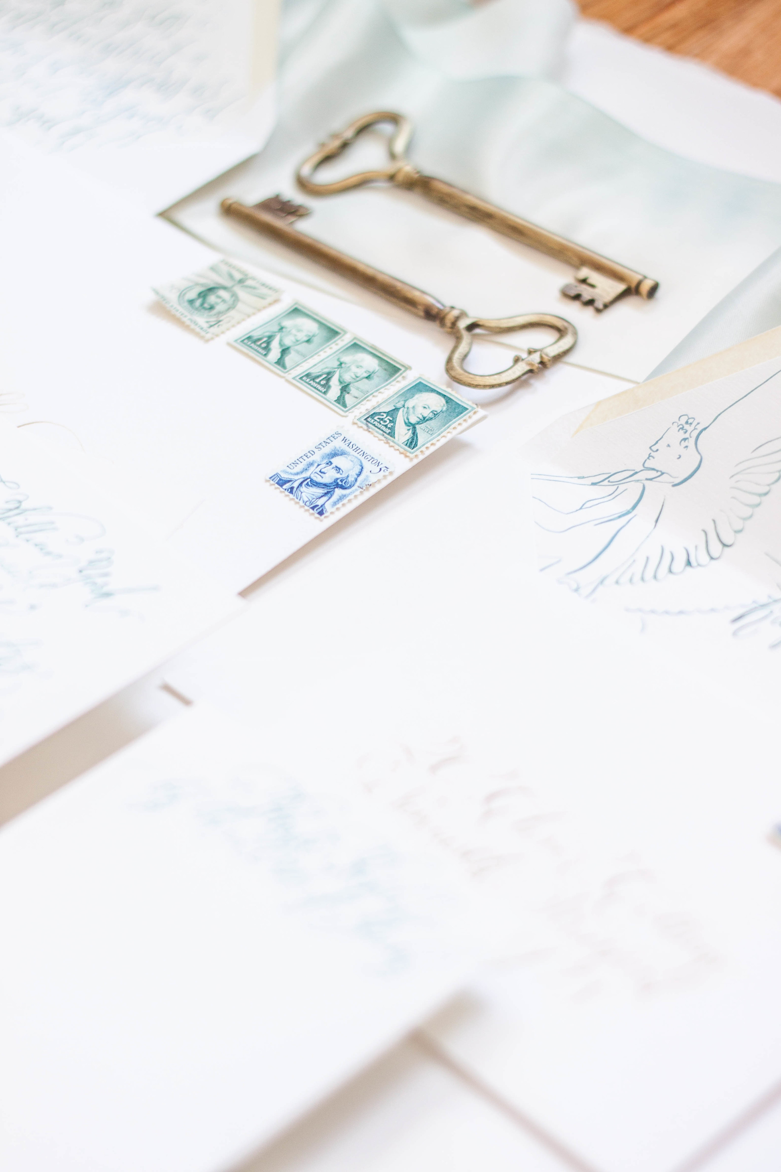
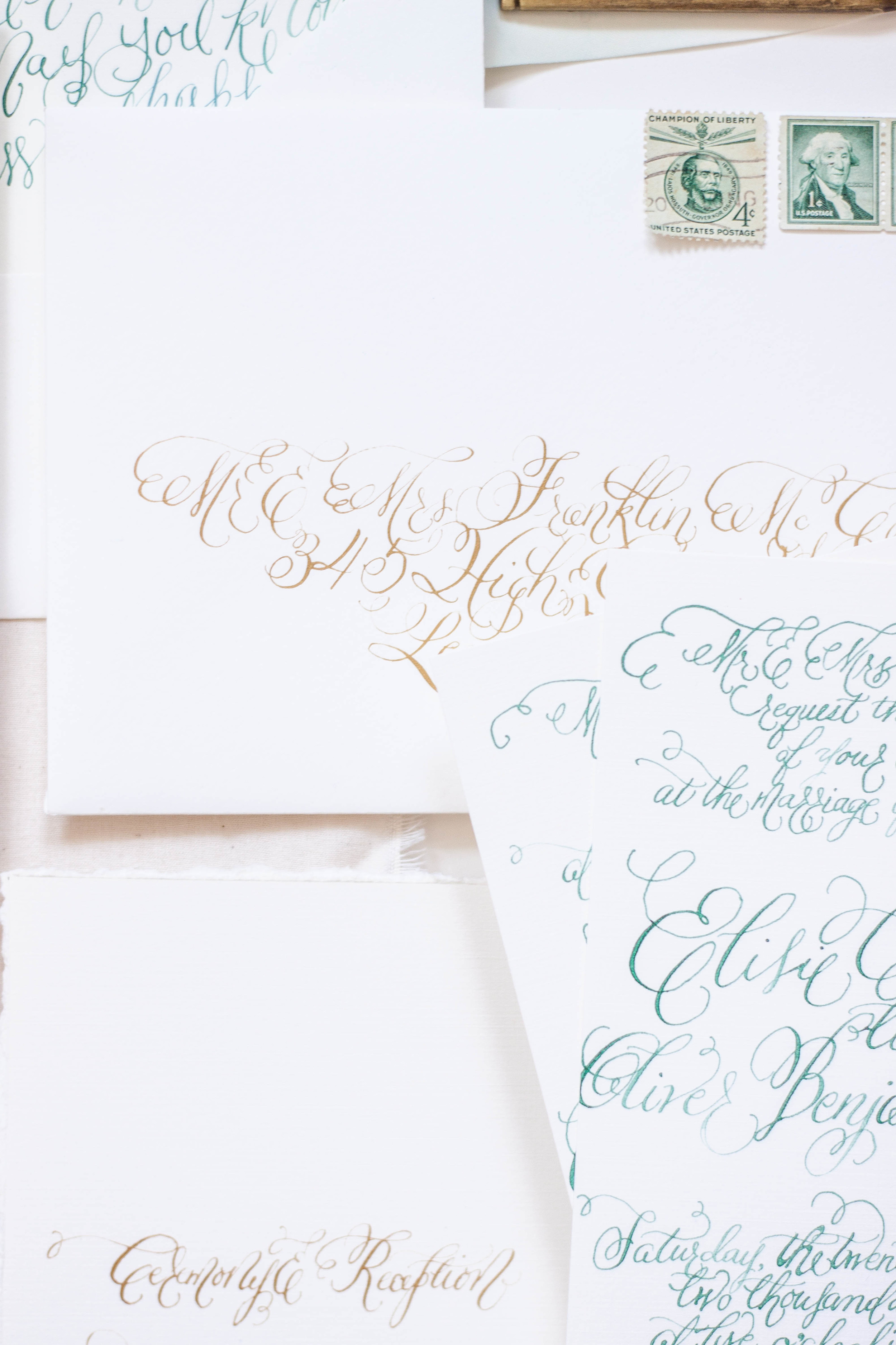
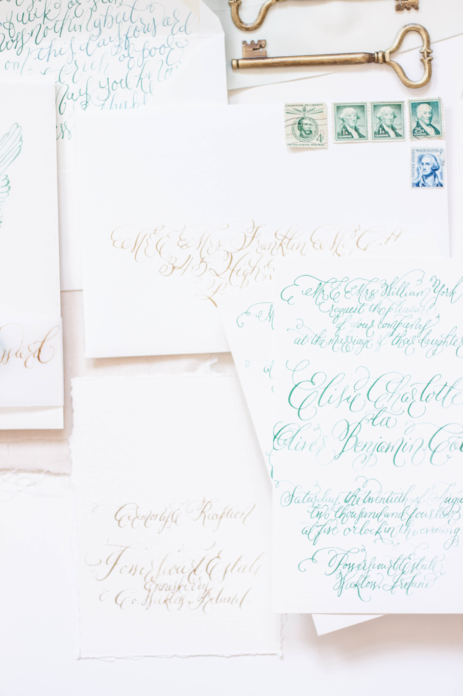
private estate | angelic sculpture | calligraphy | pale | elegant | black tie | silk | deckled edge | gold
Coming Soon | estate & sculpture
...a suite inspired by an angelic sculpture and a private estate coming to the blog soon!
Coming Soon | sea breeze & sapphires
a lovely suite inspirited by the sea breeze and sapphires coming to the blog soon!
Bespoke | O'dessa
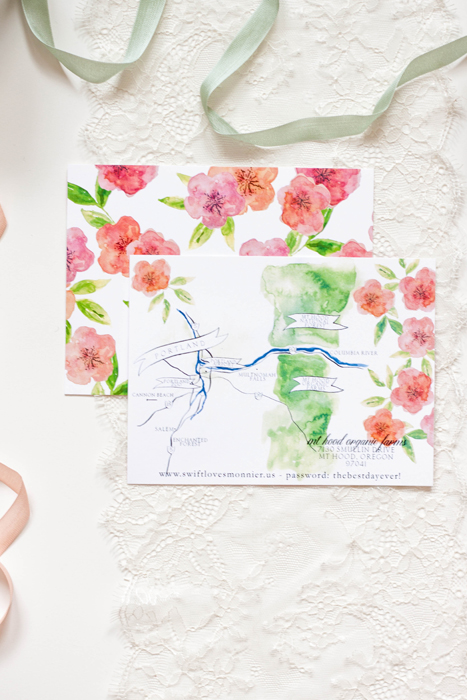
orchard | rose gold | mt hood | organic | bright | formal | apples | blossom
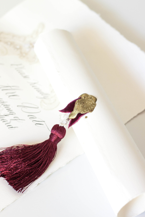
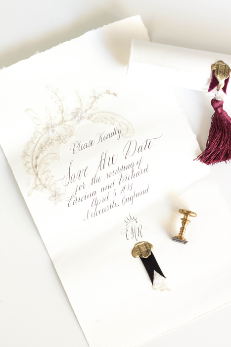
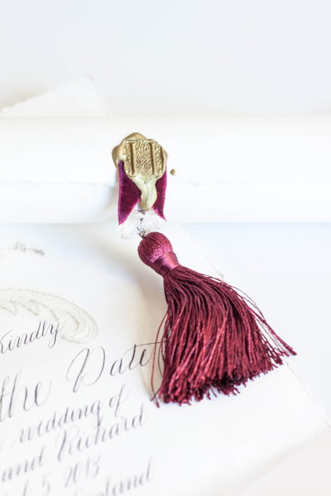
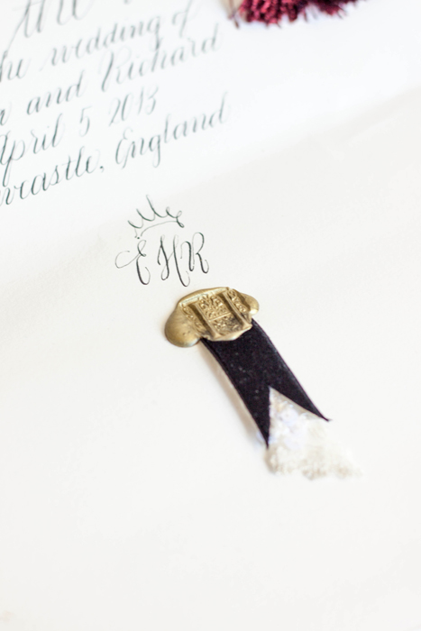
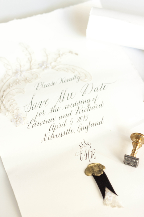
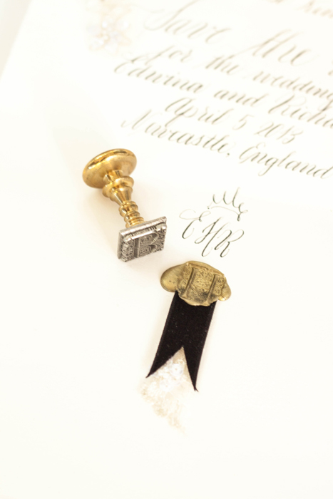
Bespoke | classic calligraphy suite
calligraphy | save the date | wax seal | tassel | elegant | antique lace | deckled edge | classic | traditional
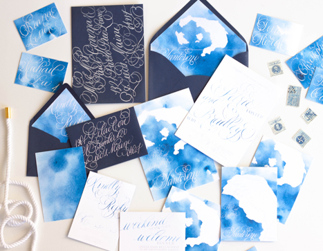
Bespoke...Santorini Destination Wedding Invitations
When approached to create a suite for a destination wedding in Santorini, I jumped at the opportunity!
This suite differs from our typical work a tad...when building the ideas and design elements that this suite would be created around, I toyed with the idea of creating an illustration that embodied the classic Santorini buildings. We also wanted to incorporate the distinctive blues of both the classic Santorini rooftops as well as the surrounding piercing blue ocean. In the end, we nixed the building idea and decided to keep it a bit more simple and focus on the blues and the movement of the ocean.
I used a watercolor wash as a base in a vibrant cerulean blue, letting the wash be uneven in saturation. I then illustrated a map of the island itself and used that as an overlay for both the backers as well as envelope liner. I used a fairly flourished calligraphy style to balance out the simplicity of the suite.
Featured...Ruffled Blog
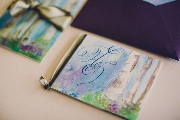
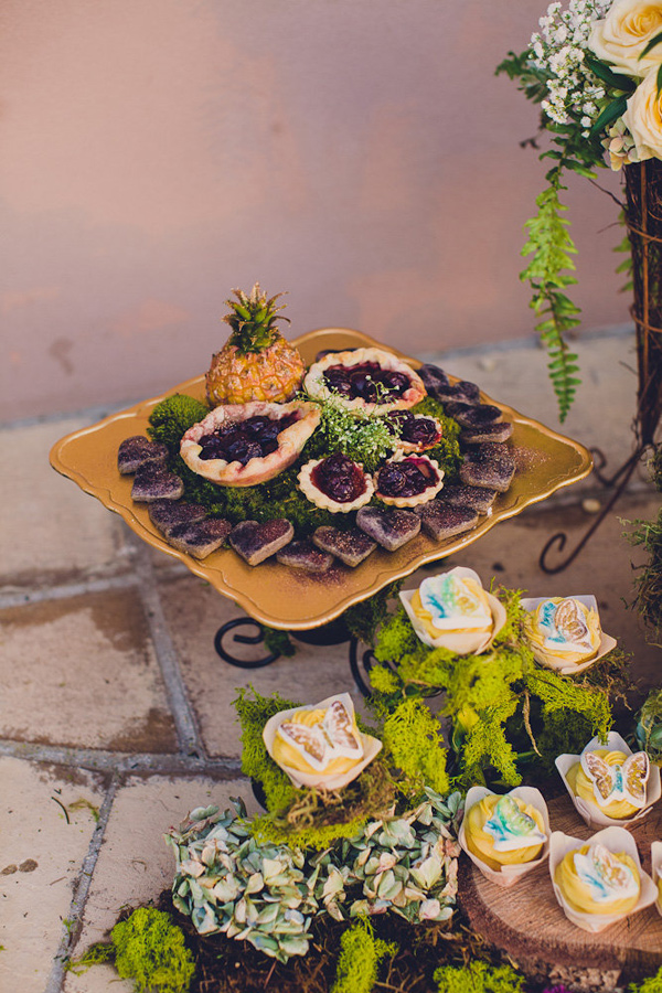
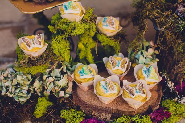
We had such a wonderful time collaborating with Absolutely Events on this suite inspirited by Shakespeare’s A Midsummer Night’s Dream. We've walked you through the process we went though in creating the suite, now you get to see it in action!
Design: Absolutely Events
Florals: Rae Florae
Photography: Jackie Wonders
