Sneak Peek - Formal Wedding in the Hamptons
Formal | Calligraphy | Dramatic | Personalized | 1920’s
Inspired by the invitations of years past, elegant train travel, and a level of formality that we don’t see very often anymore.
Art Nouveau Wedding Invitations
art nouveau, pale greens and nudes, elegant, overall texture, soft, unexpected, soothing, formal
Glen Foerd Mansion | Philadelphia, Pennsylvania
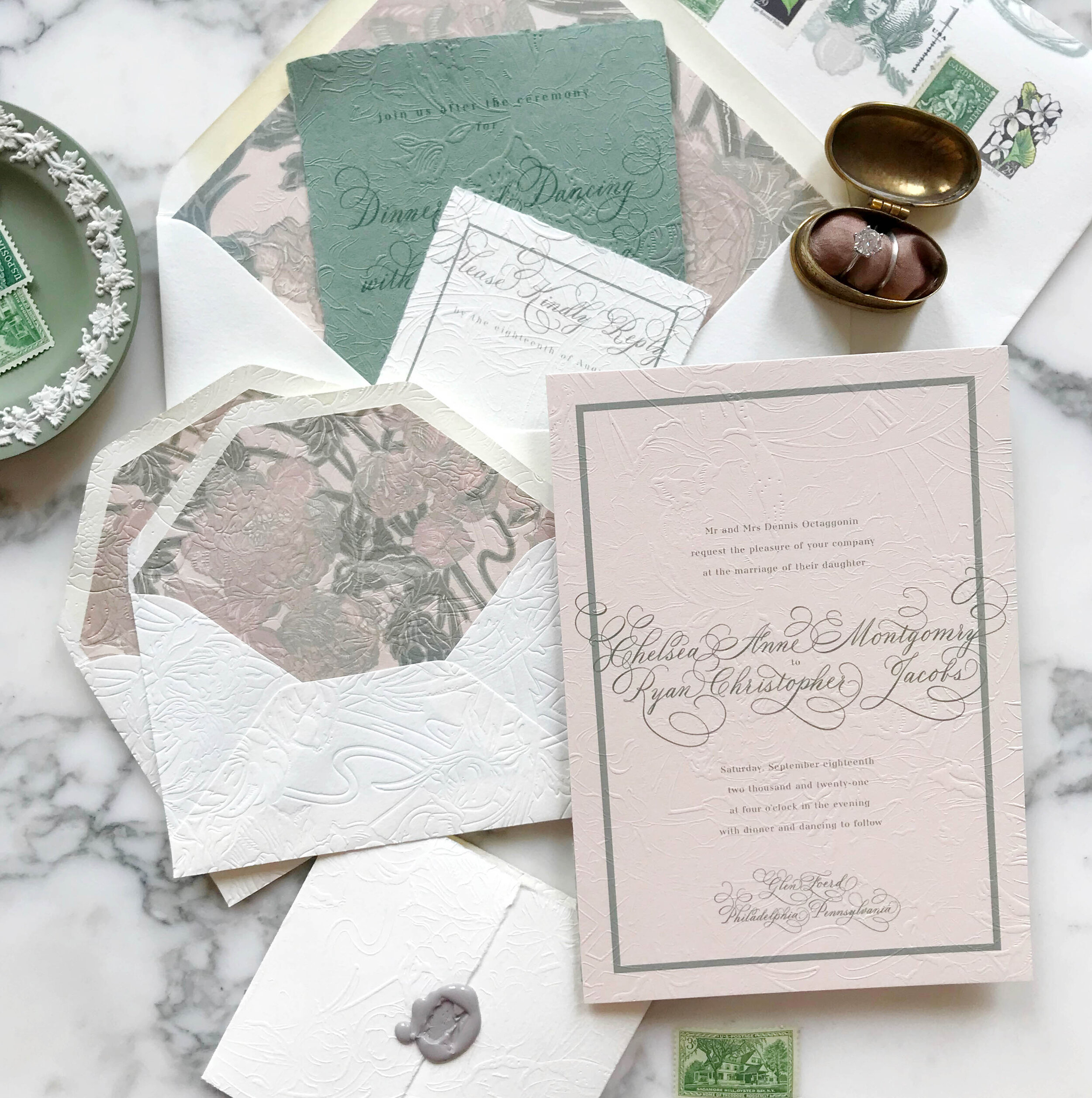
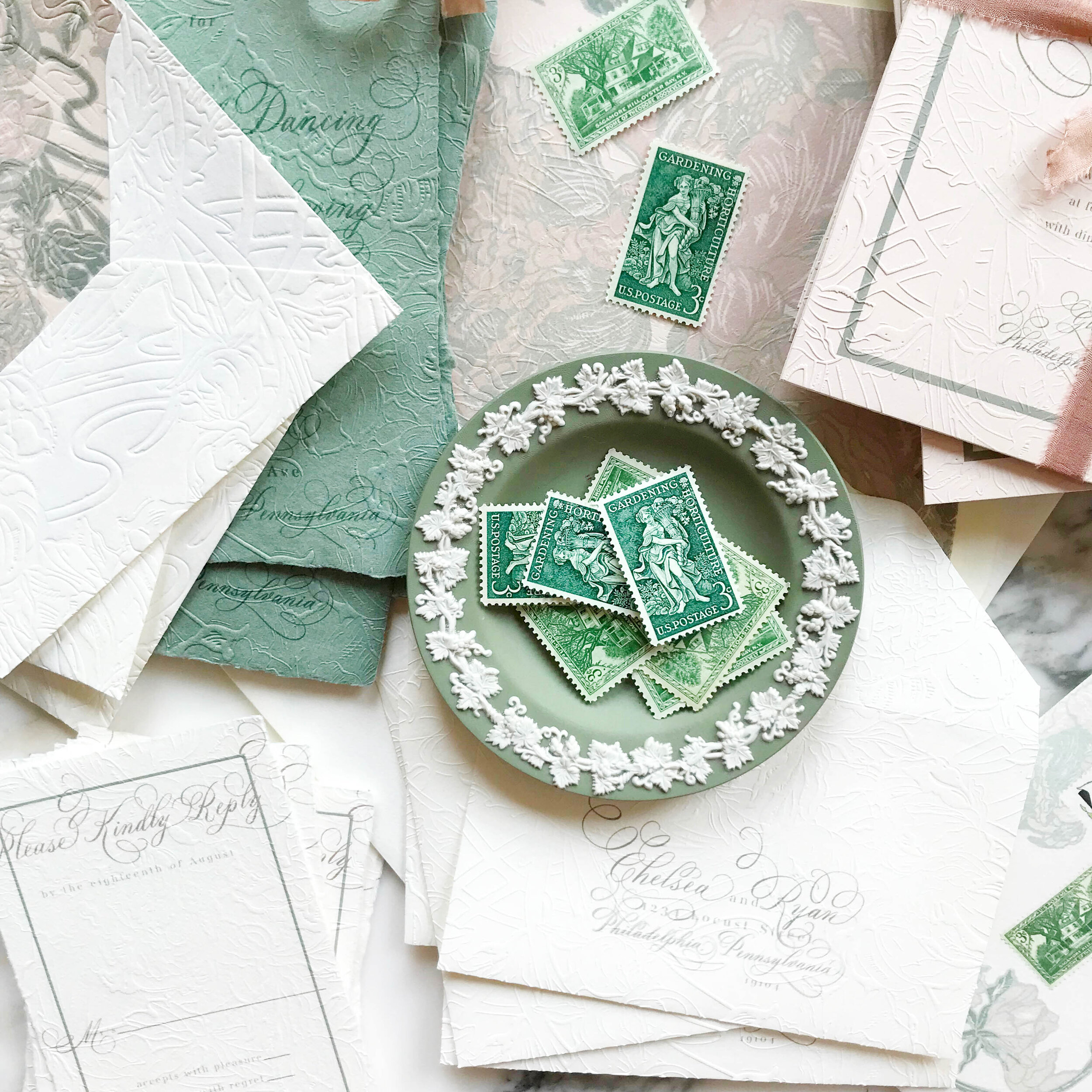
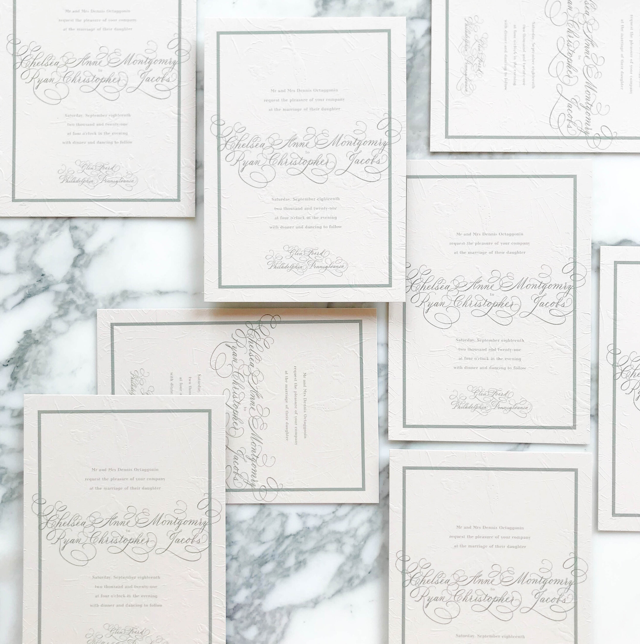
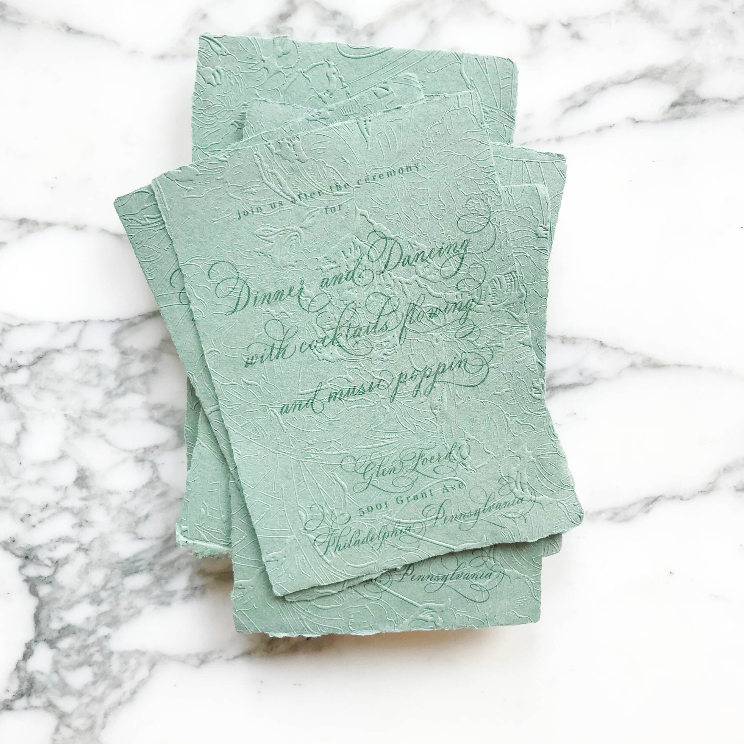
We wanted to bring in the graceful and soothing vibes of the Art Nouveau era with pale neutrals, smooth greens, and impressive overall texture. We selected artwork inspired by antique wall paper to start our design work. Working with the artwork and palette of nudes and greens, we developed our overall look and feel, a perfect fit for the gorgeous Philadelphia mansion of Glen Foerd.
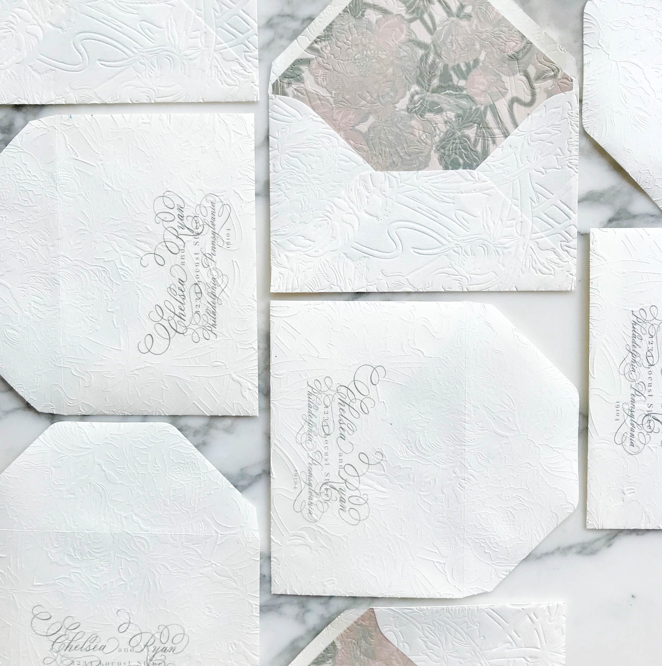
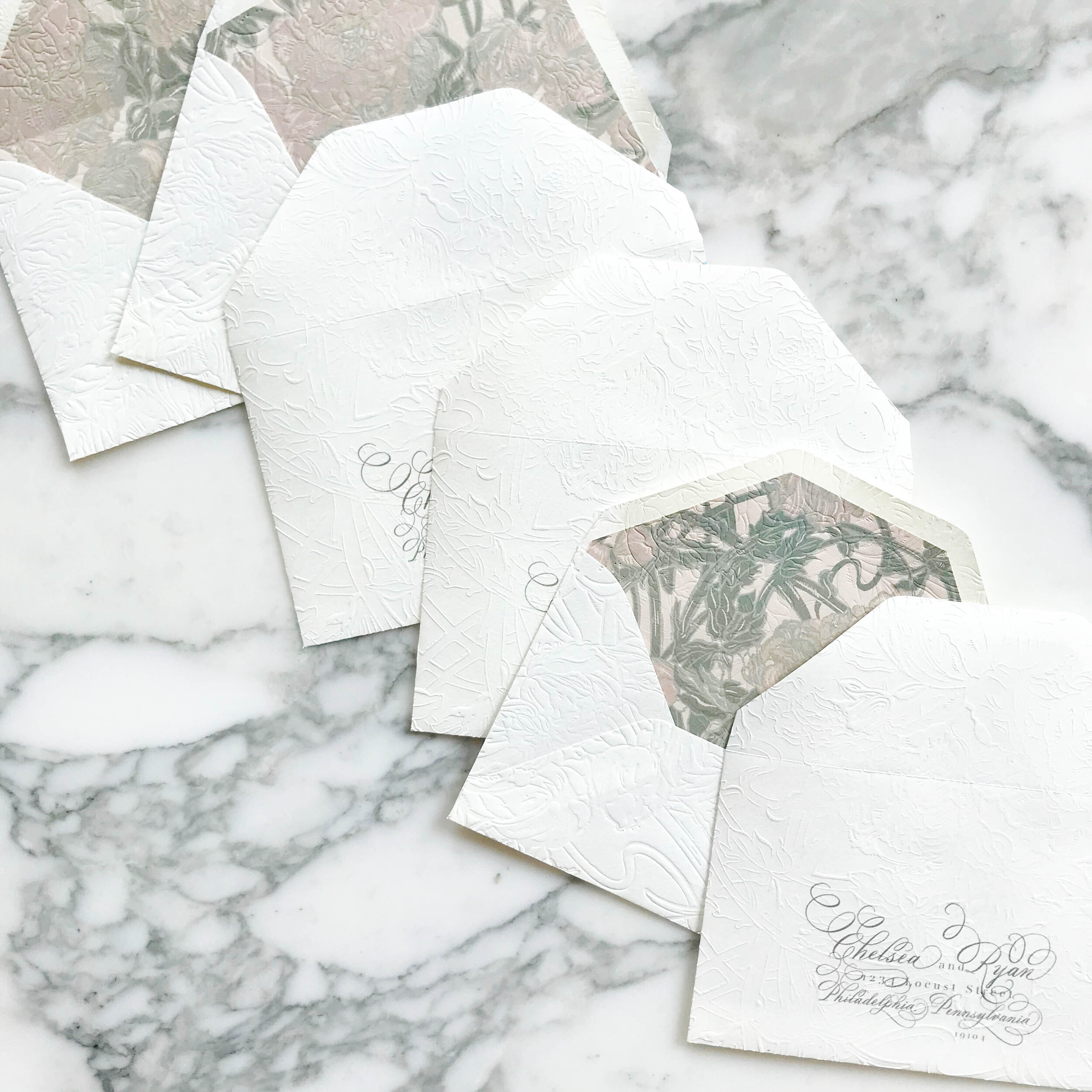
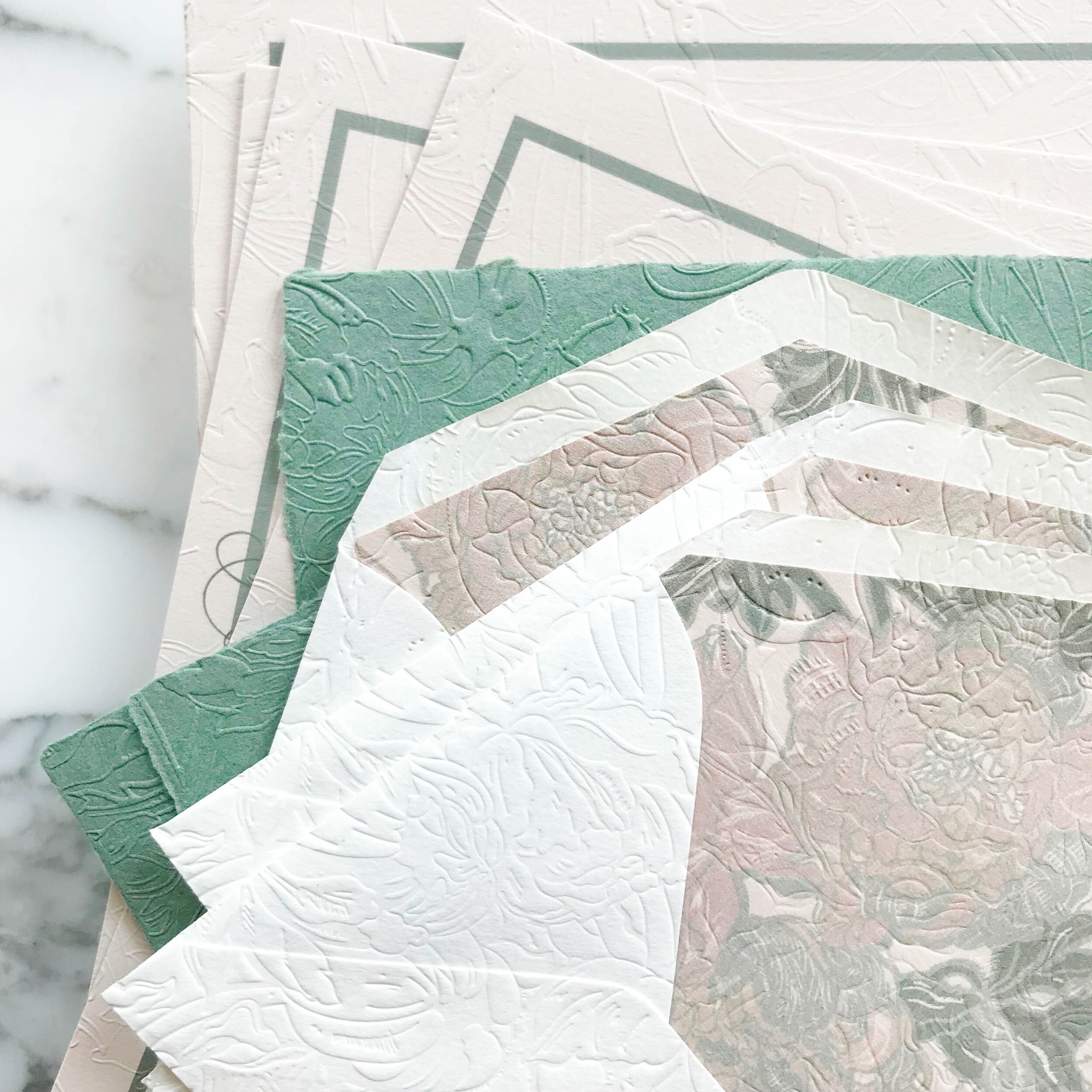
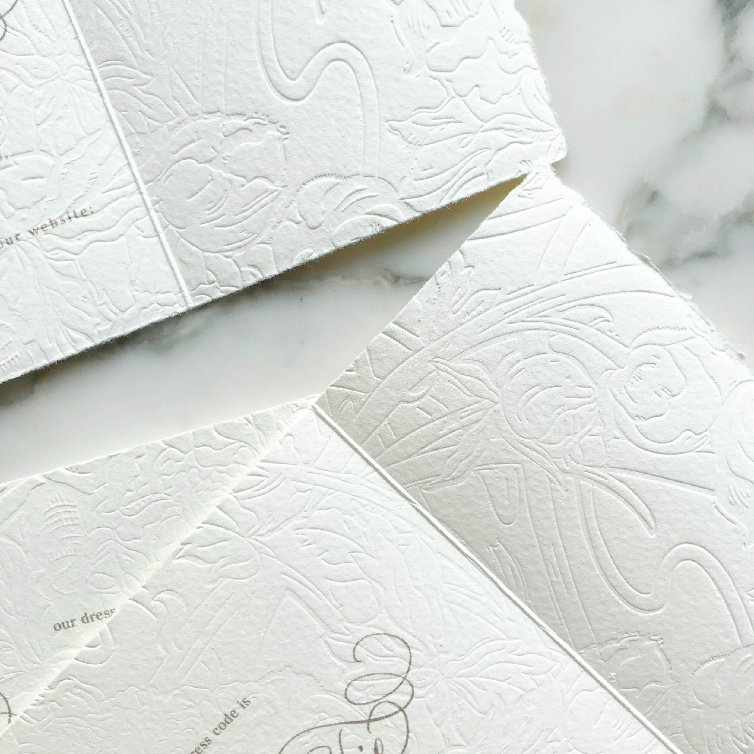
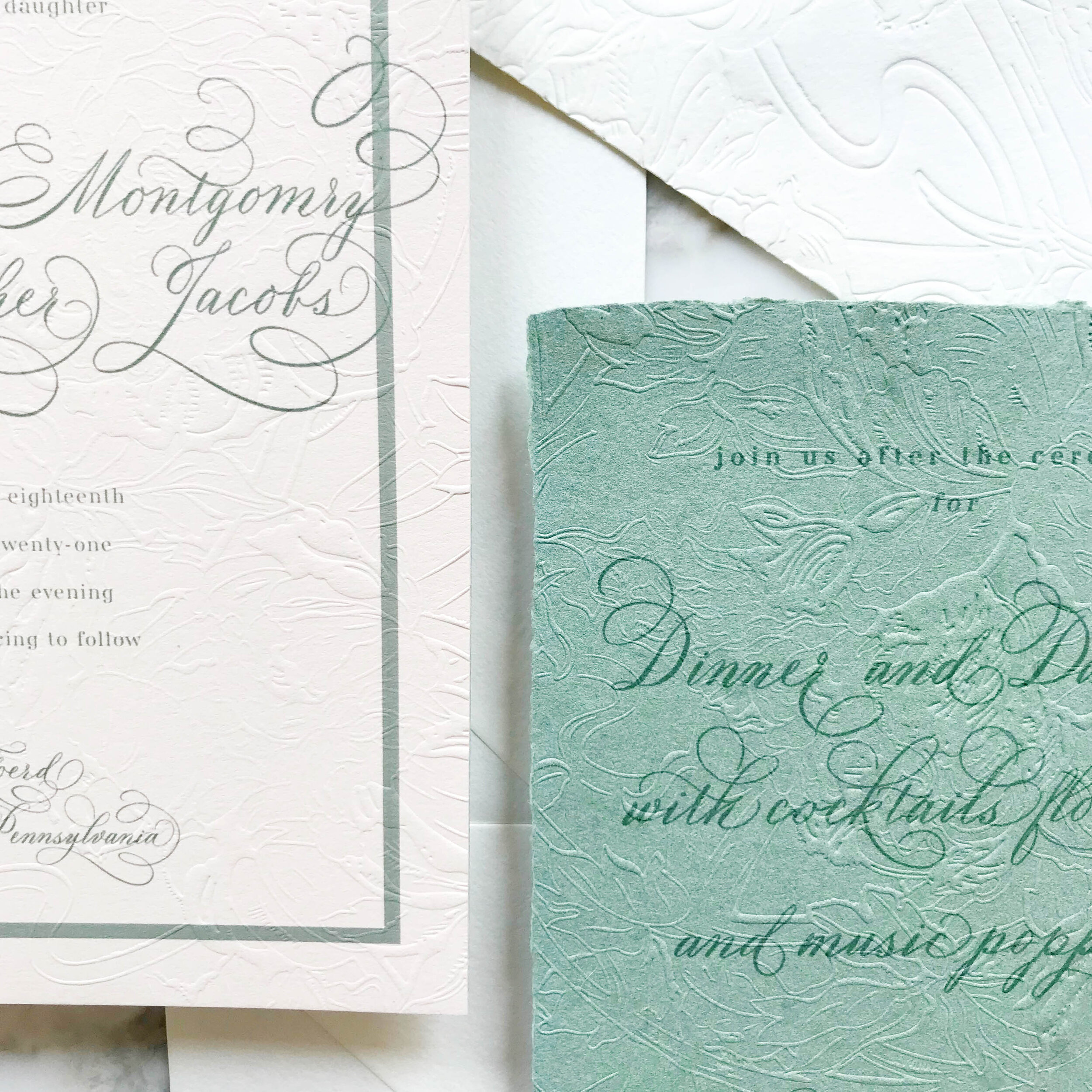
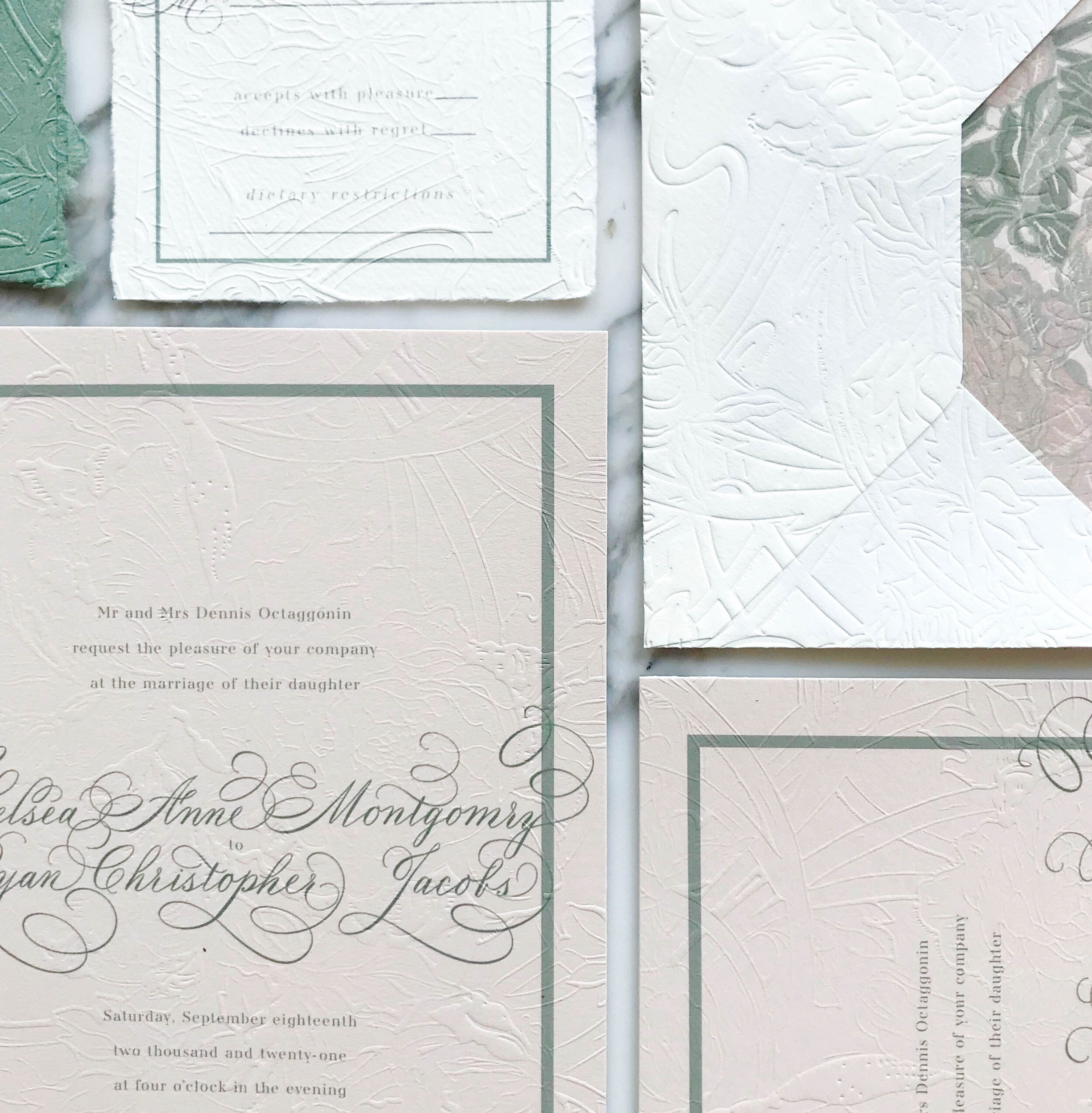
The most striking element of the design is the texture. Each piece was embossed with a glorious overall texture for a pillowy and tactile feel.
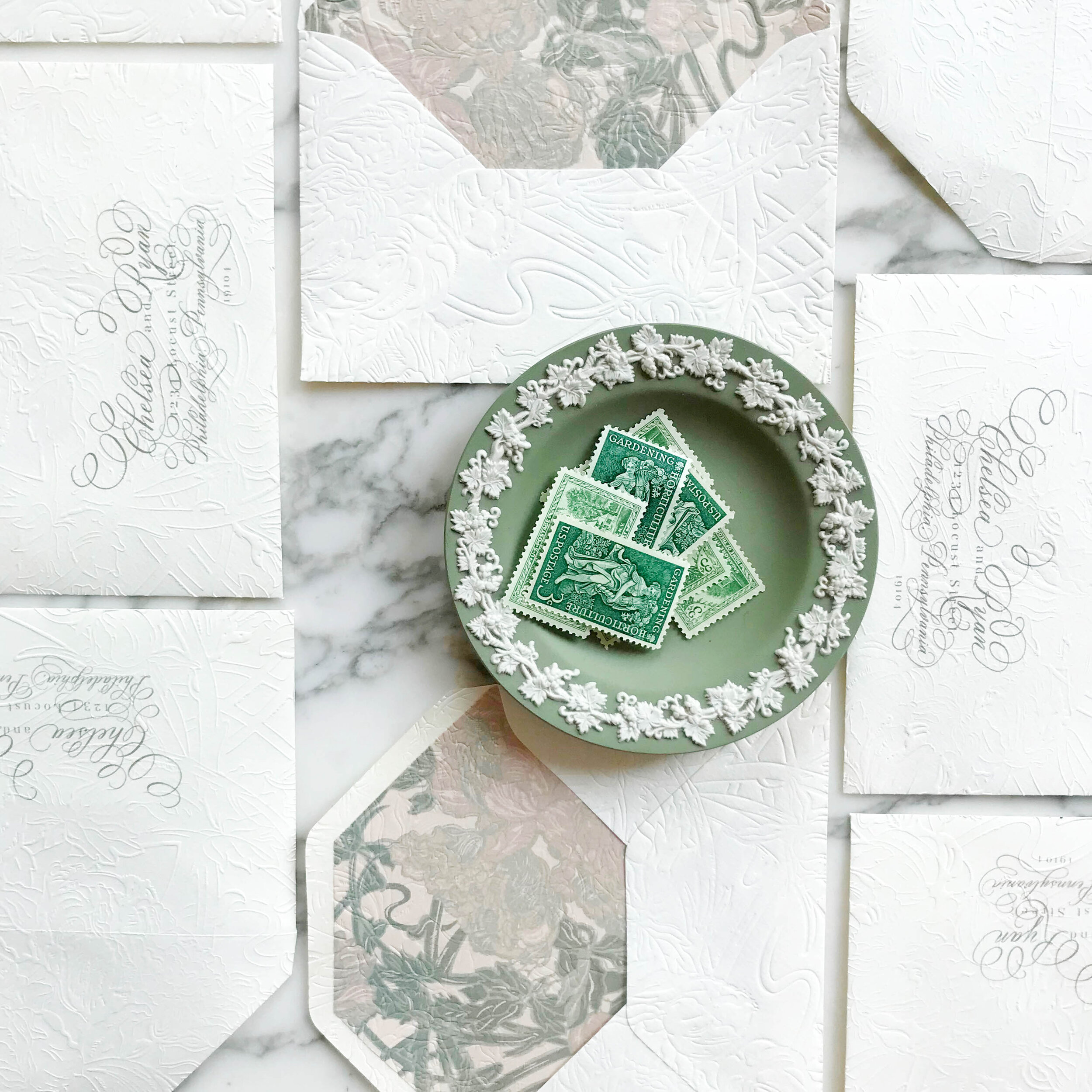
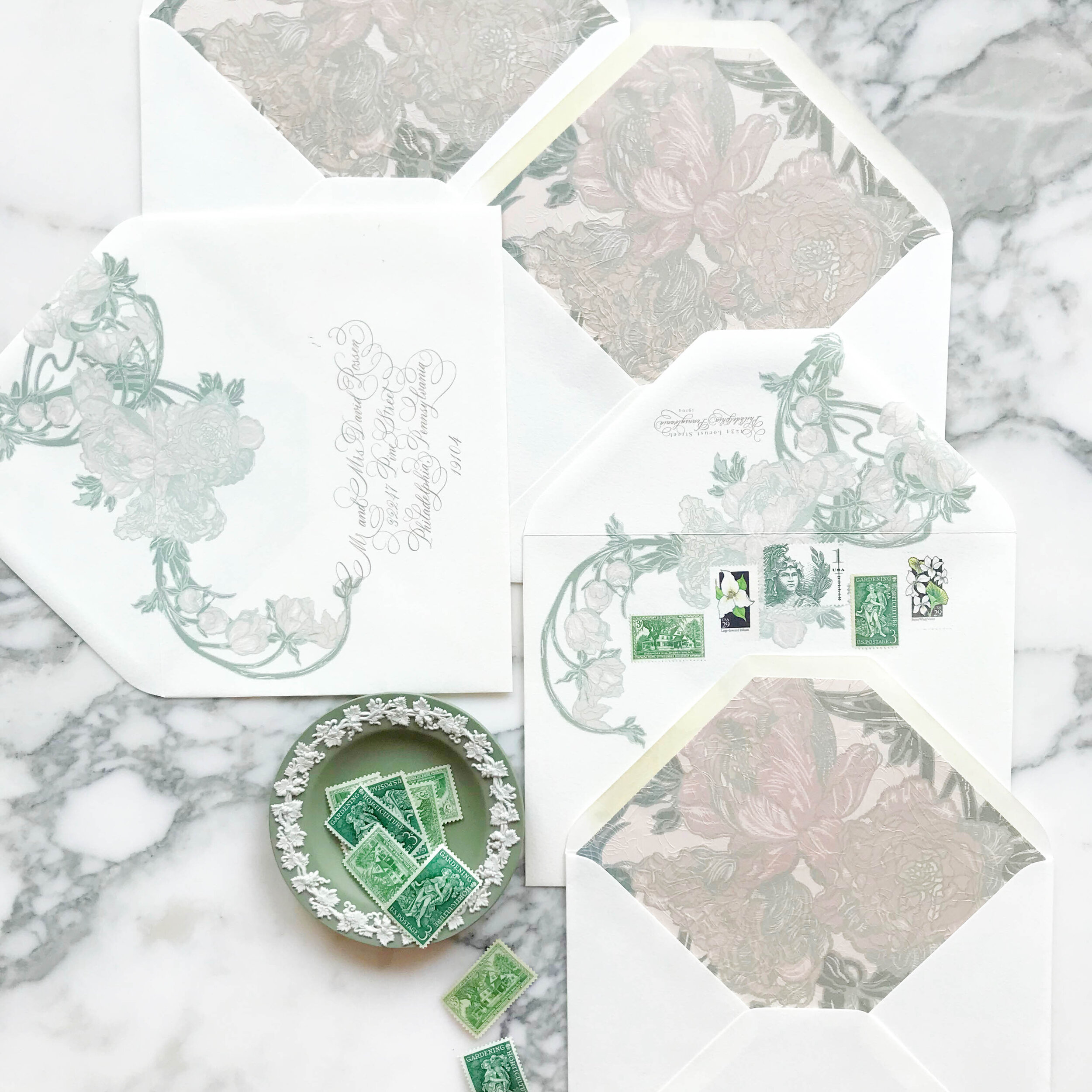
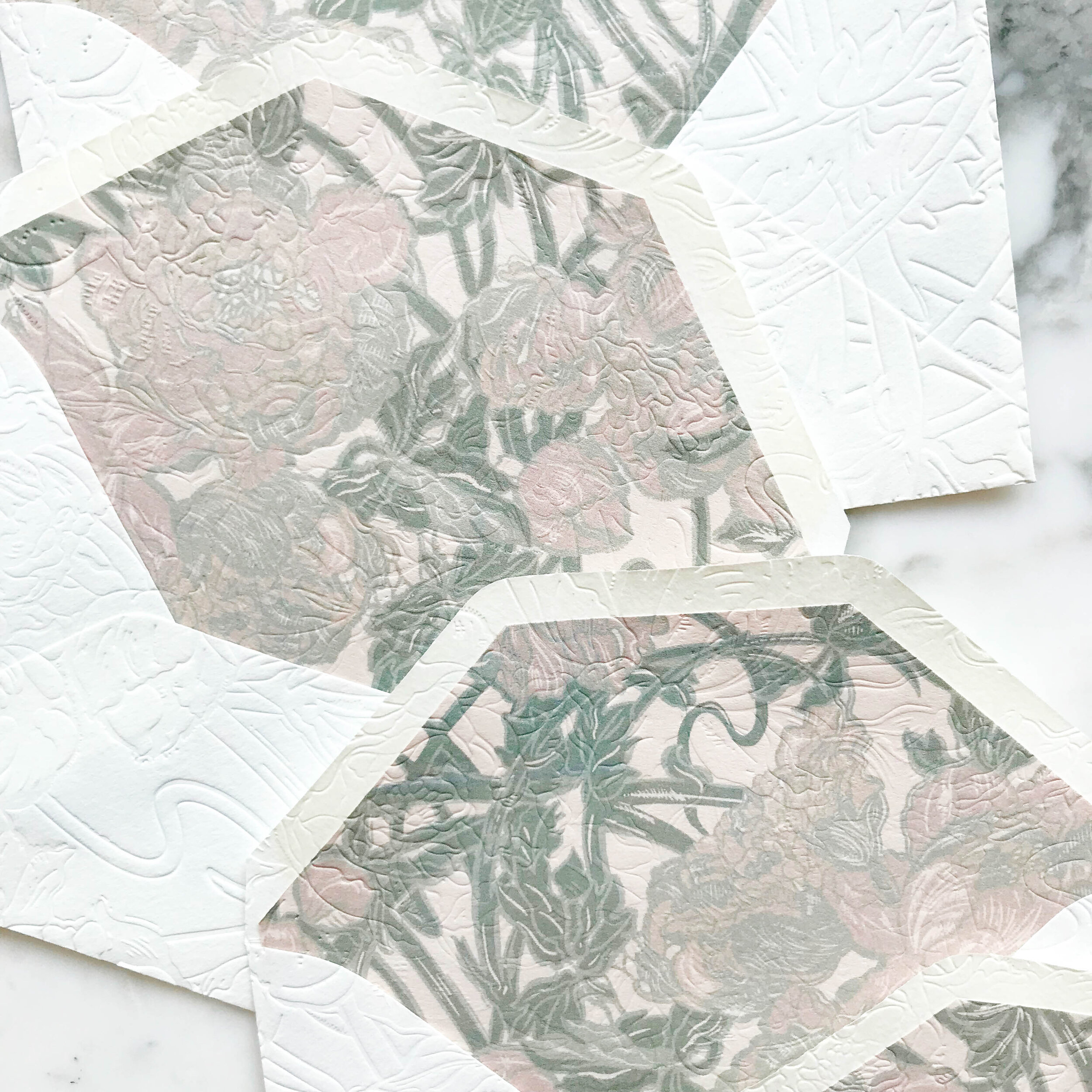
My personal favorite piece of the suite are the reply envelopes. We embossed the envelopes after they were lined, so the liners as well as the fronts and back of the envelopes all had a contiguous embossed pattern.
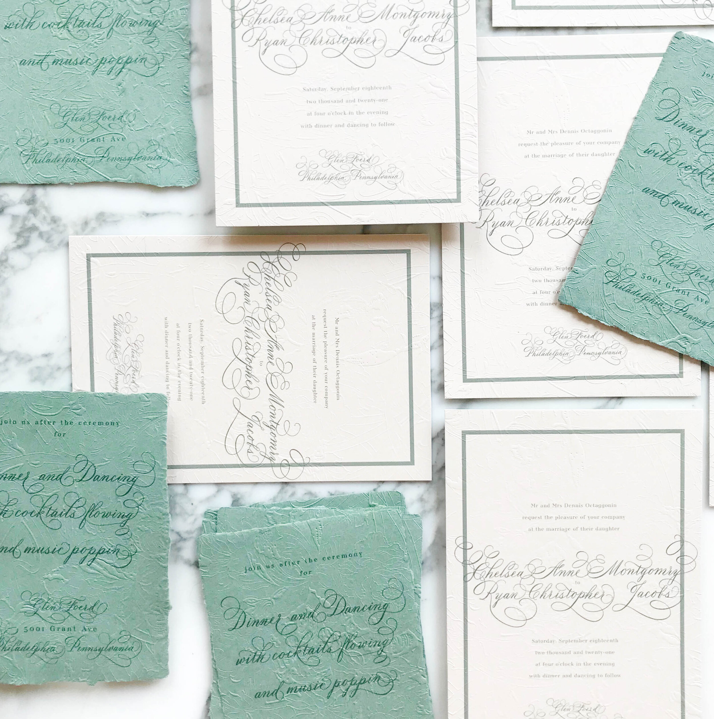
Like most of our projects, we combined several different paper types to come to our finished design. For this particular suite, we ended up with six different types of papers, including both machined and handmade.
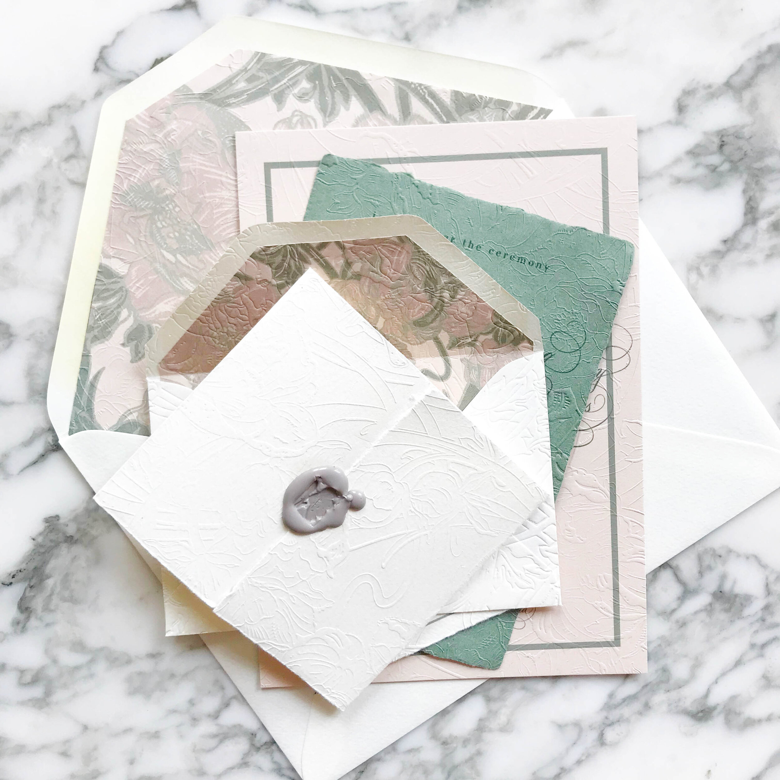
The art nouveau design includes three handmade papers for the green reception card, reply card, and dress code tri-fold. The invitation consisted of two different machined papers, the first in a nude, then backed with a pale green. Our envelopes were both a gorgeous cream, and our envelopes liners were on the same rich nude as the invitations.
Our darling little tri-folded cards of handmade paper were sealed closed with a tiny wax seal in a taupe grey and embossed with the pattern showing on both sides.
