Handpainted Bottles for a Capri Wedding
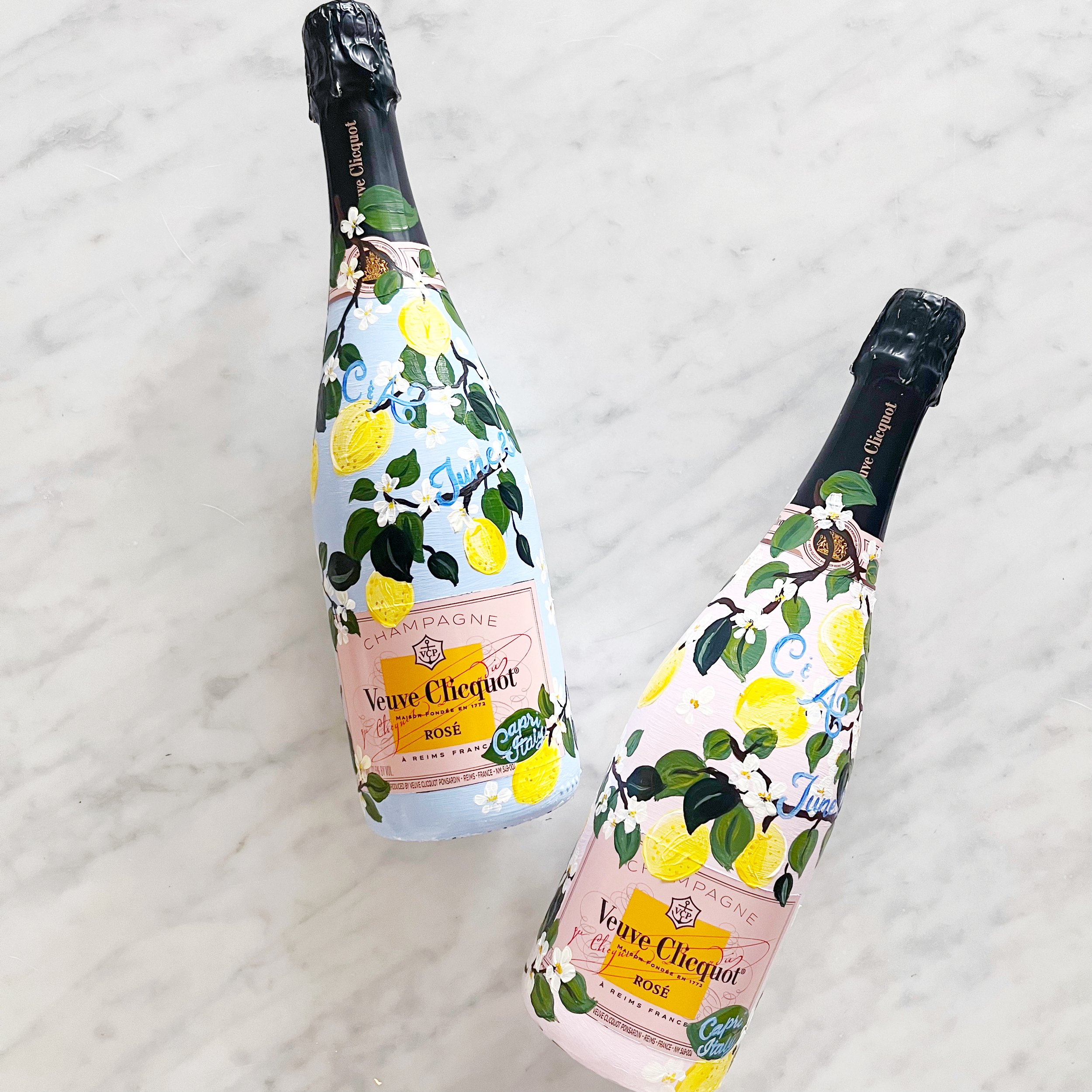
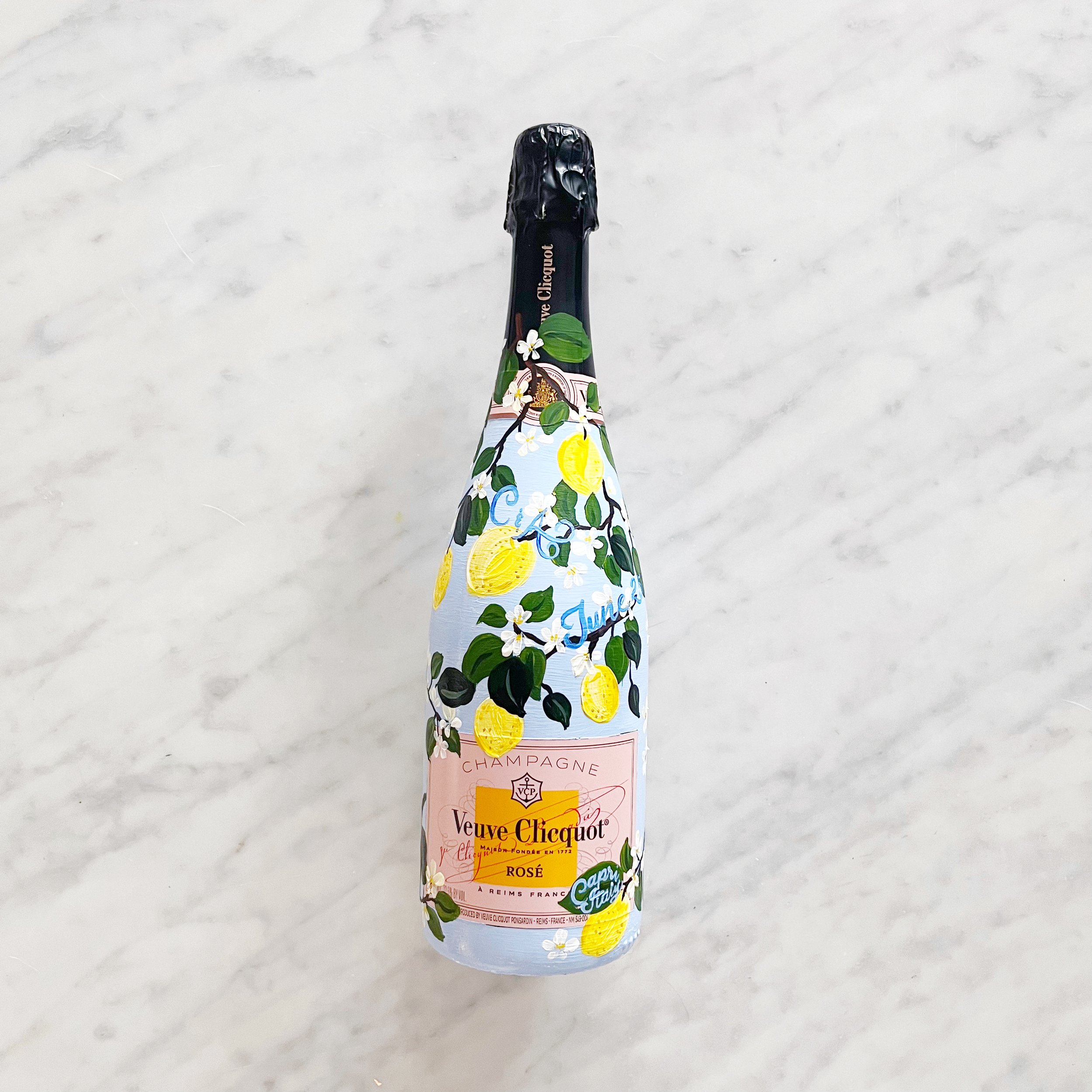
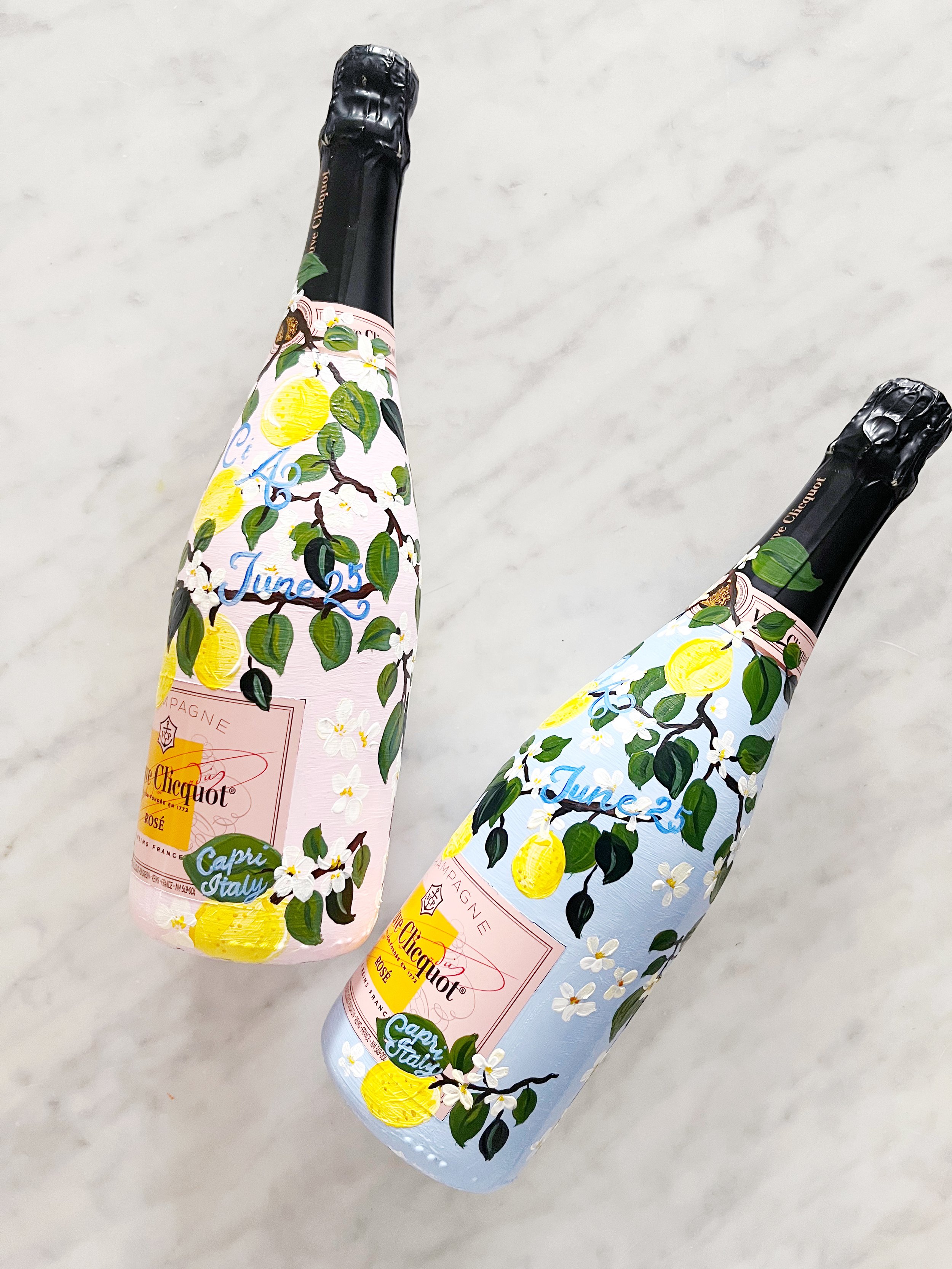
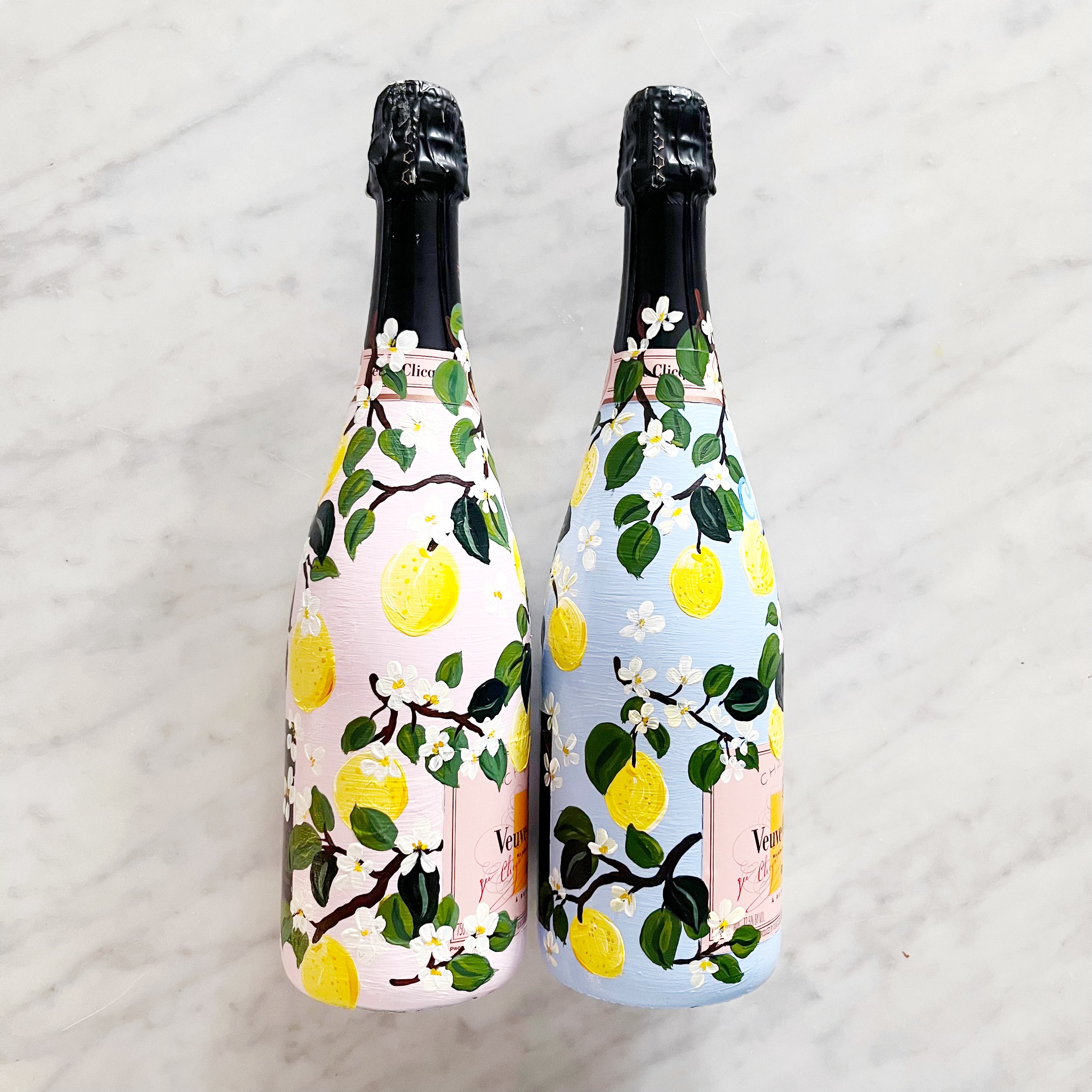
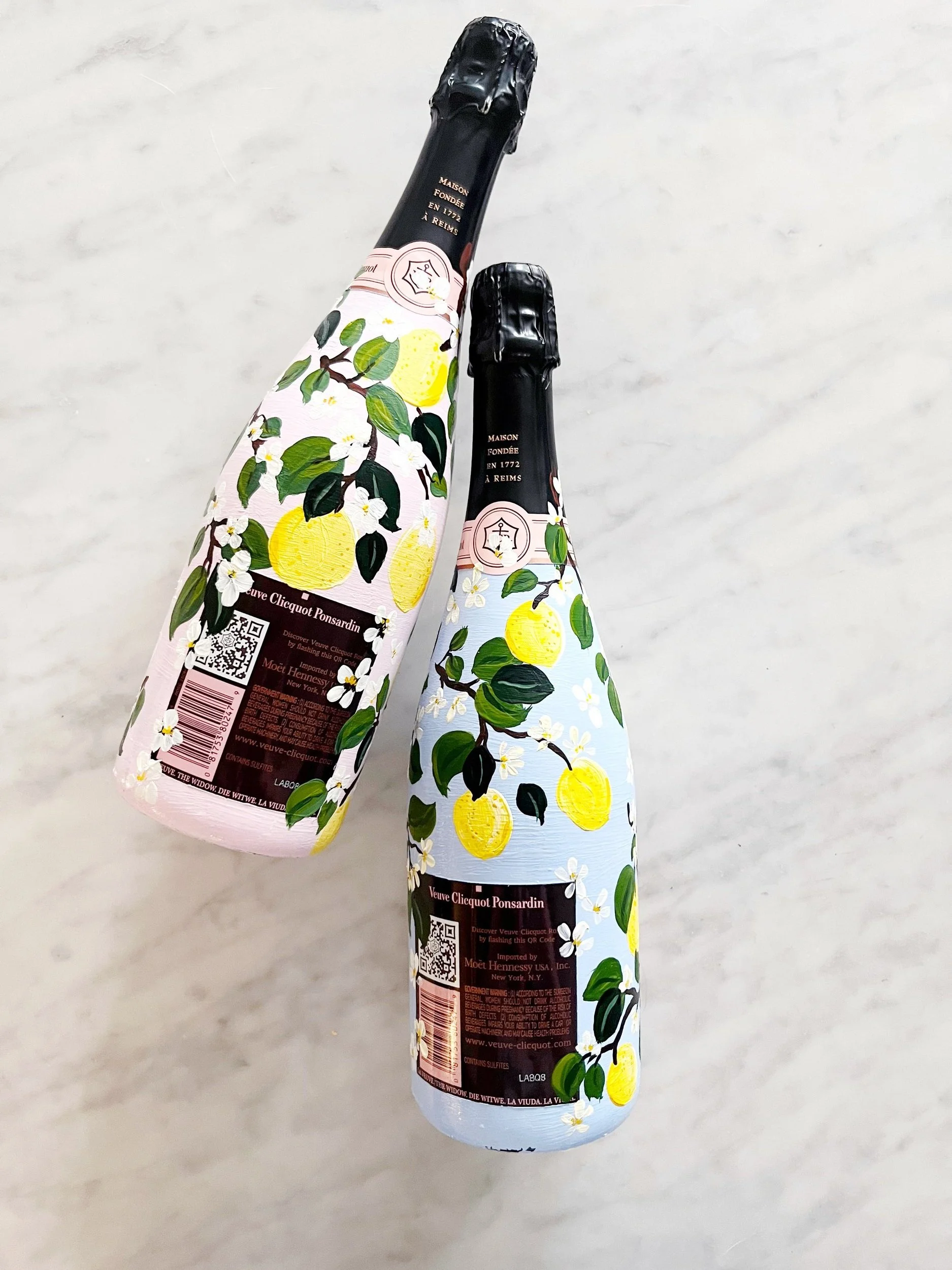
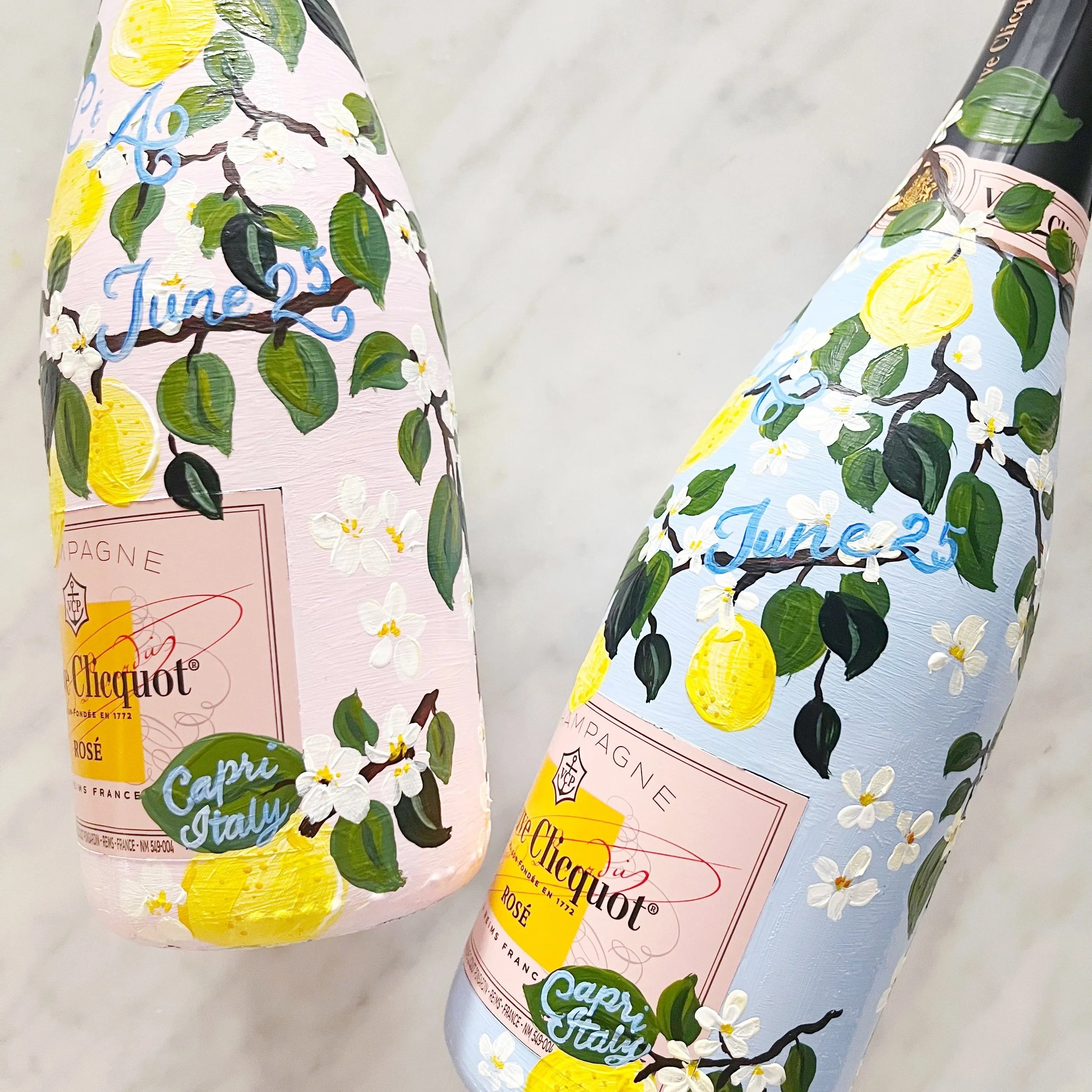
Since there will be multiple events in the week leading up to the wedding, we selected to paint the bottles to match, but with different backgrounds. One blush and one blue, the bottles pair beautifully with the classic Capri lemons. The bottles also held the couple’s monogram, date of their wedding, and Capri, Italy.
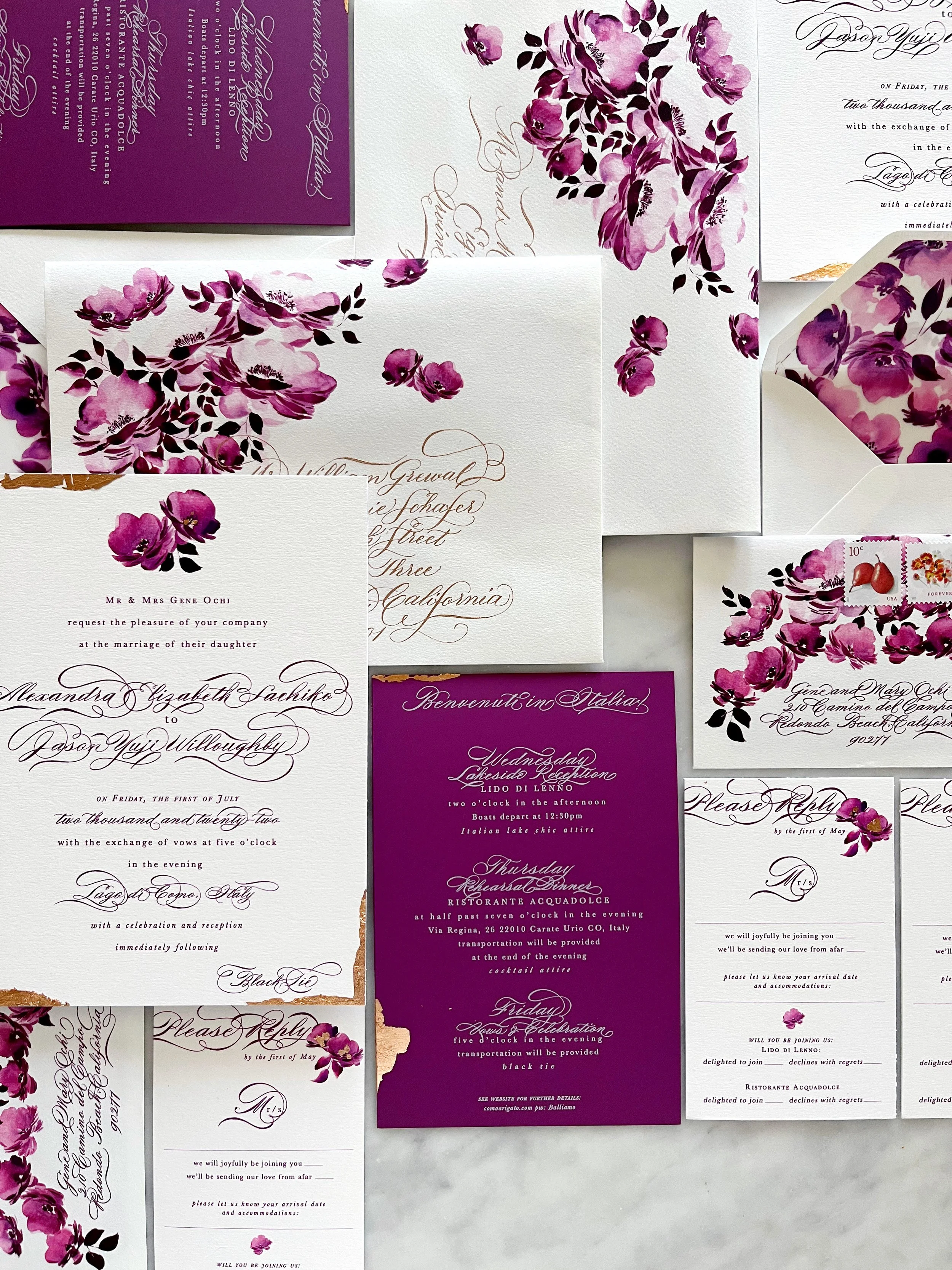
A Suite in Raspberry
Lake Como, Italy
Vintage, saturated, floral, elegant
Our amazing bride, Alexandra, requested two things….a bold, saturated, monochromatic color palette, and florals. We were all over that. I also added touches of rose gold foil and calligraphy throughout the suite to elevate the overall formality of her Black Tie wedding in Italy.
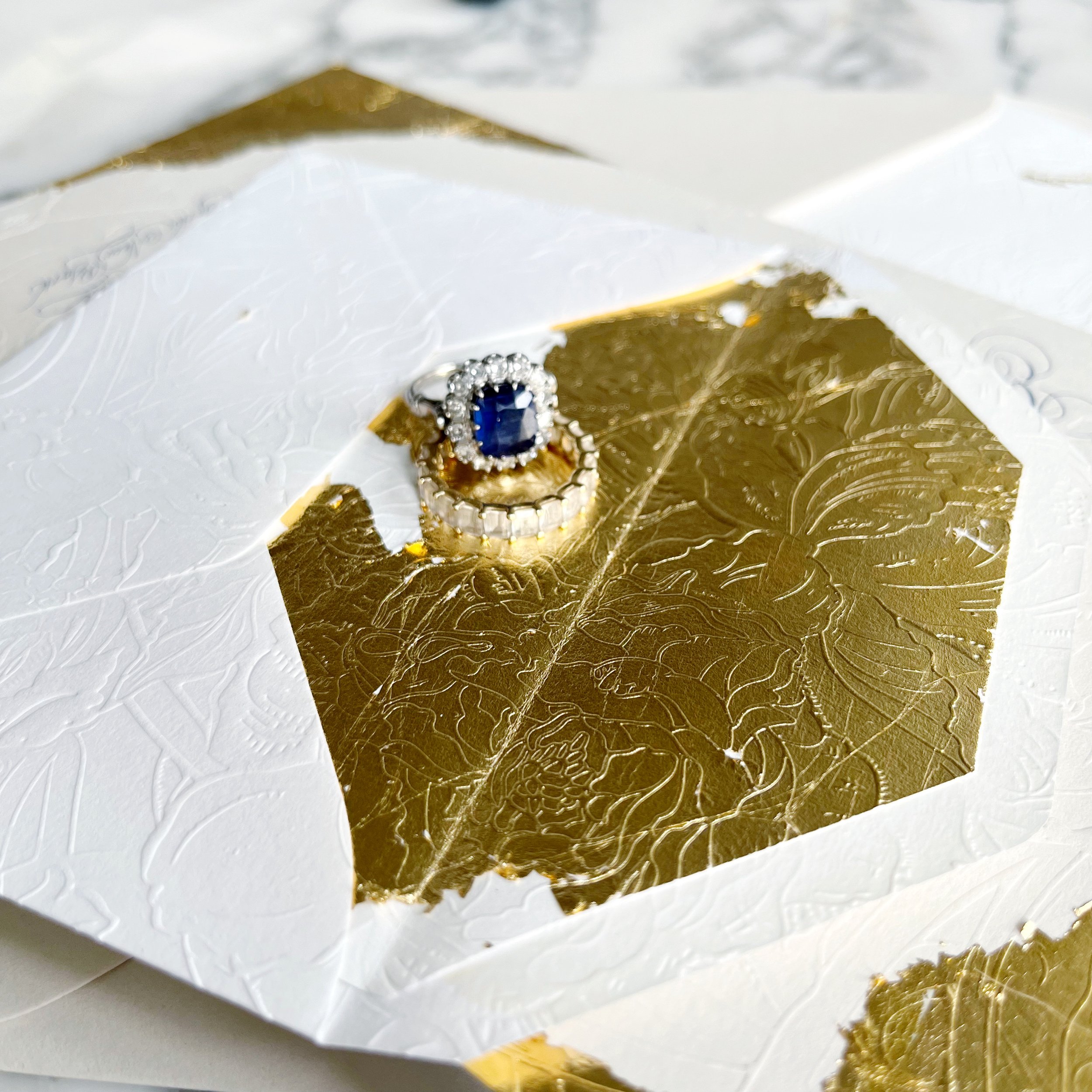
Gold Gilded & Embossed Invitation
elegant | regal | Gold | old-world | dramatic
an invitation suite for a wedding at:
the beekman hotel | new york, new york
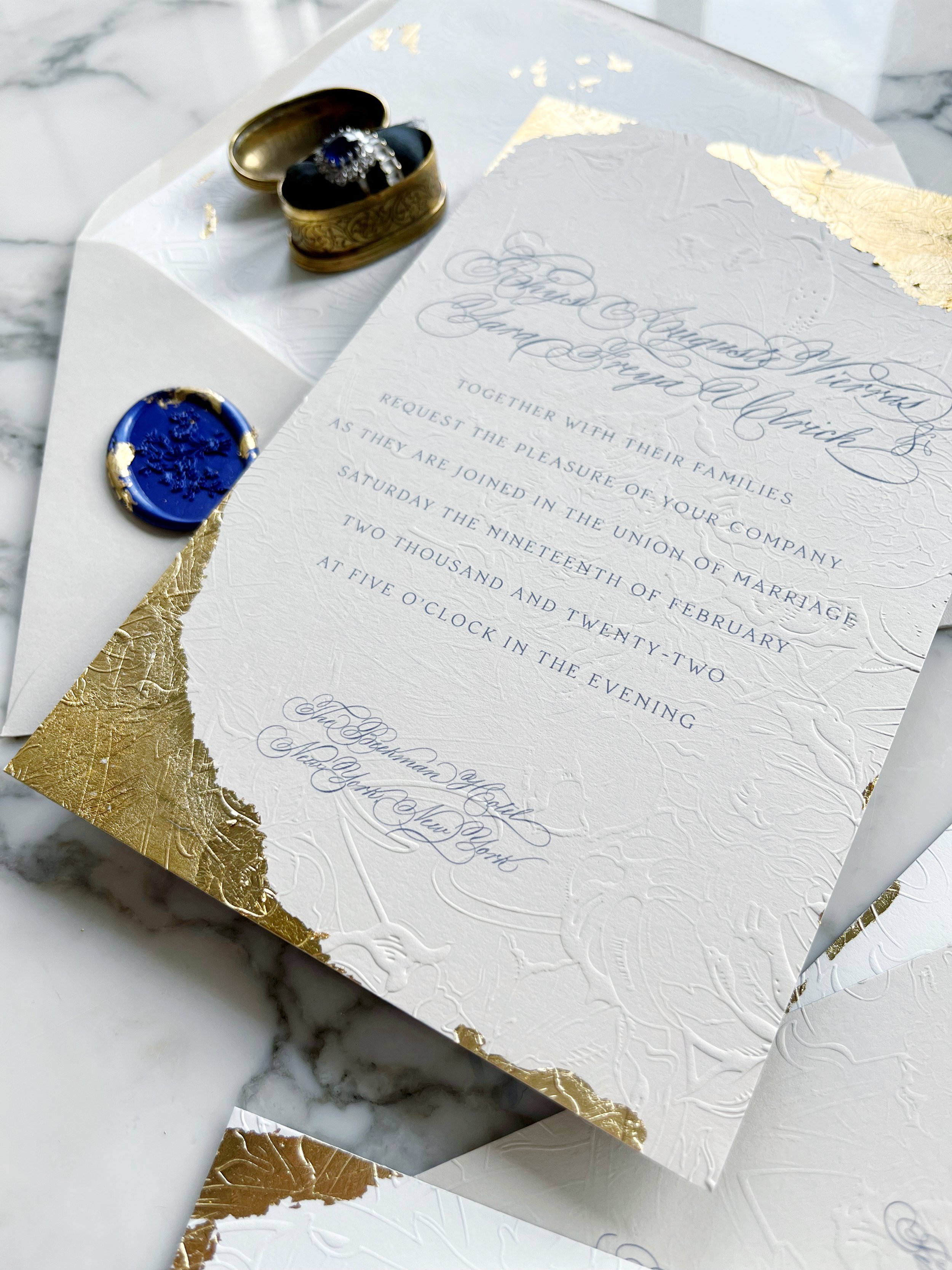
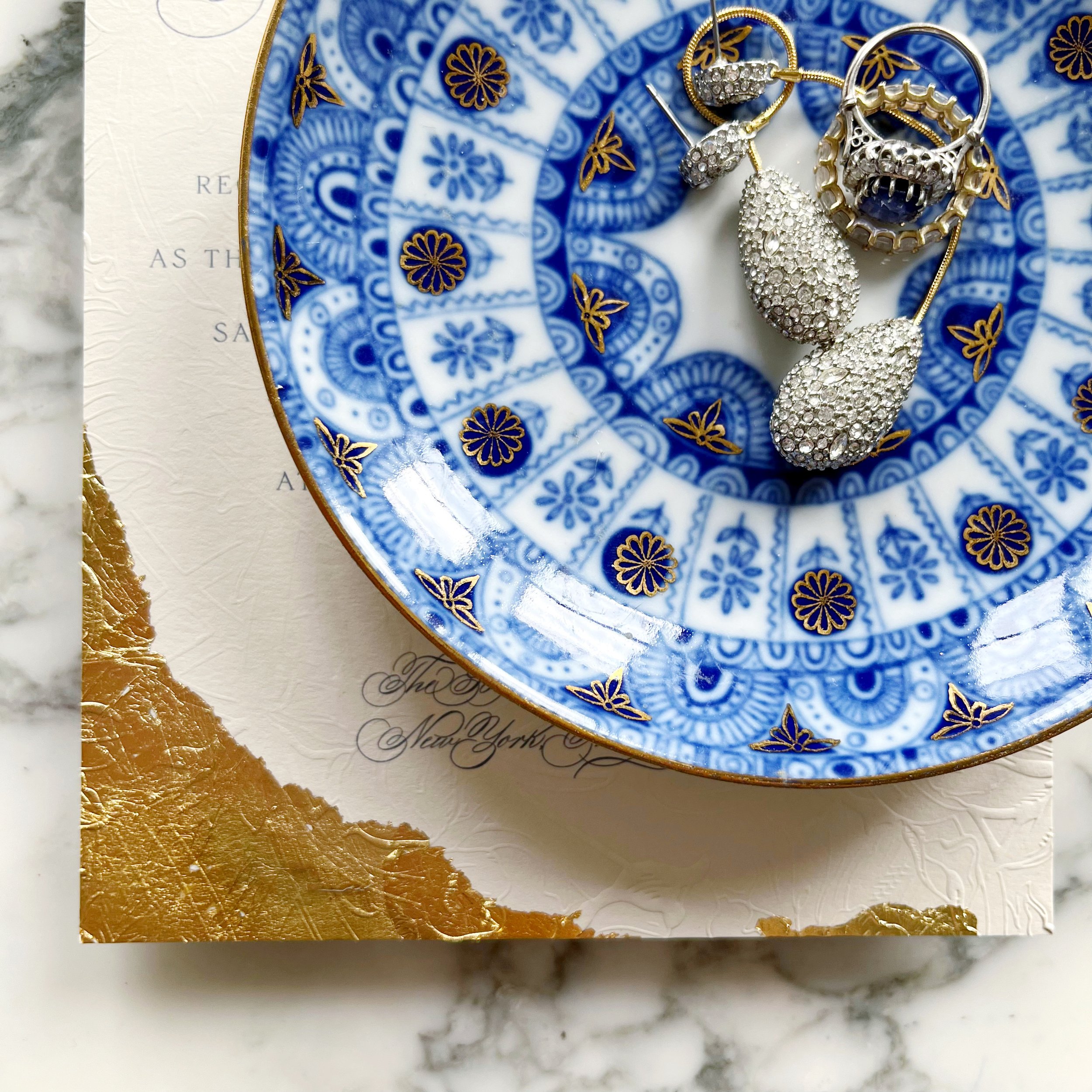
We used so many details of the Beekman Hotel as we played with design ideas for Yara. She knew she wanted bits of gold and embossing, and we wanted to pull color inspiration from her beautiful sapphire engagement ring. We also wanted to echo some of the overall textures and feelings of the hotel, like the dark moody lighting and all the velvet upholstery.
We also selected not to go with all white paper, instead, we selected a warm white and a taupe.
Our bride was looking for old-world drama, and I think we delivered!
She had seen so many examples of “old-world” invitations that were pale and beautiful, but hardly any that were dark and moody, like the hotel that was hosting their nuptials.
Each piece of the suite had gold gilding applied by hand. The invitation had the most dramatic gilding, followed by the reception card. Our additional insert card just had touches of gold around the edges.
We always want each piece to feel unique and not like a cookie-cutter of the other pieces in the suite. but have their own personality!
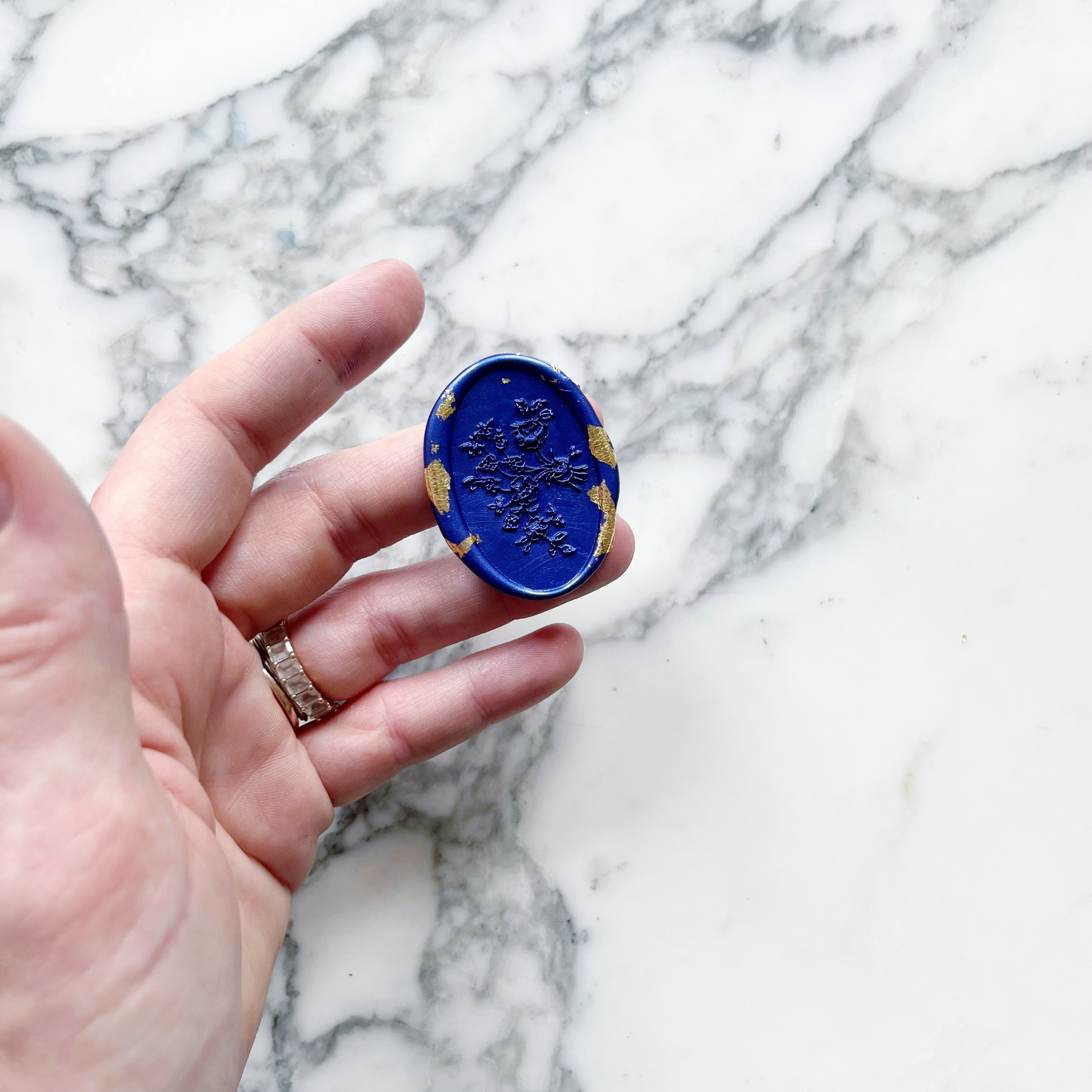
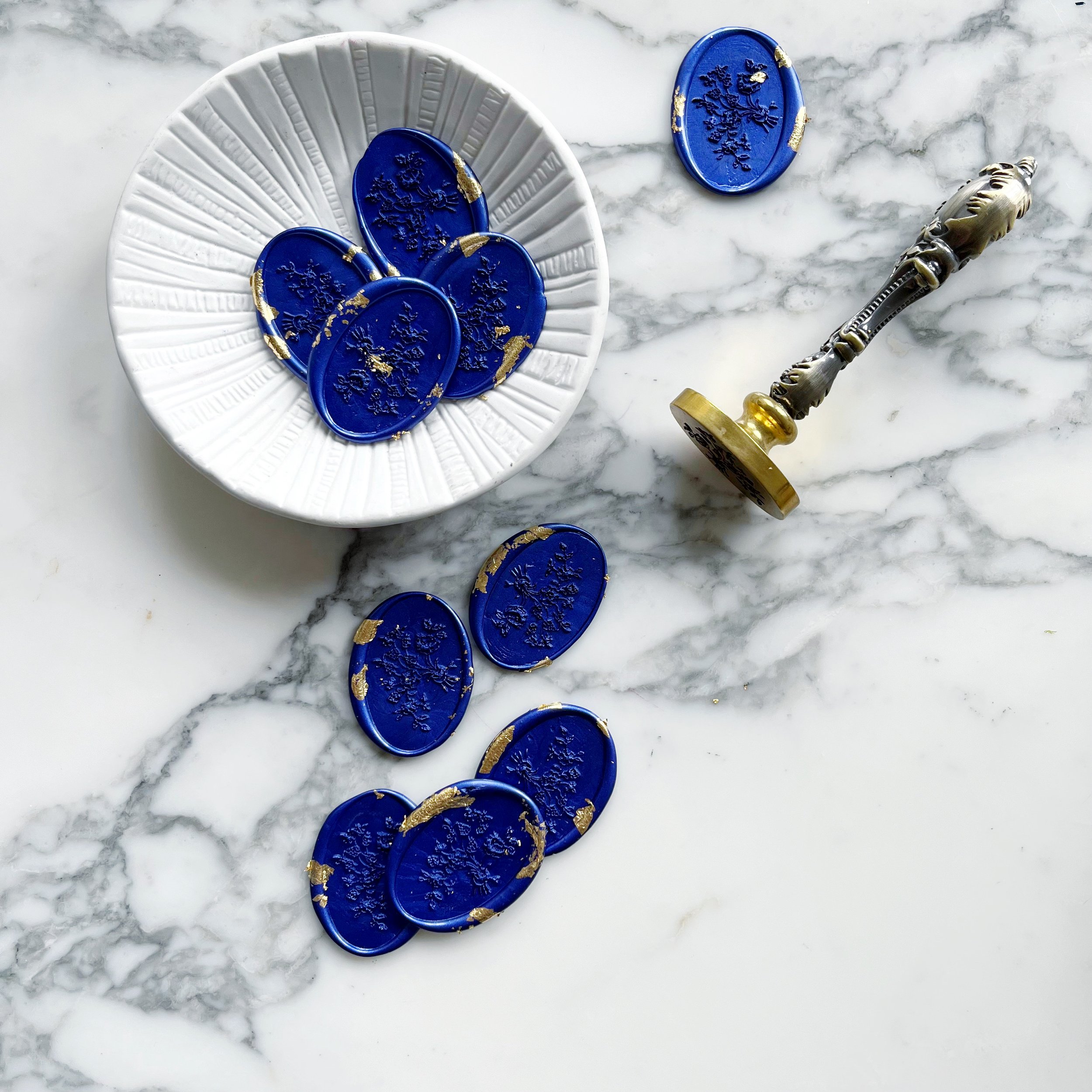
The taupe mailing envelopes also had gilded detail rounding the return address, as well as gilded details on the deep sapphire blue wax seals.
Another high-impact moment is the reply envelope. Fully embossed and lined with gold gilding, it’s a dramatic piece with so much texture and wow factor! The fronts of each reply envelope also featured a bit of old-world magic with tiny pieces of gilding.
The oval floral wax seals we designed for Yara’s suite also had bits and pieces of gilding in the sapphire blue wax. We used the wax seals to hold closed our taupe mailing envelopes.
The embossing is definitely the highlight of the suite with the embossed pattern covering several of the pieces. The tactile experience and visual beauty are like nothing else! These invitations were designed to truly set the mood for Yara and Rhys’ wedding!
Pastel & Embossed Destination Wedding
Pastel | Textured | Modern Romance
an invitation suite for a wedding at:
Private Residence, Oahu, Hawaii
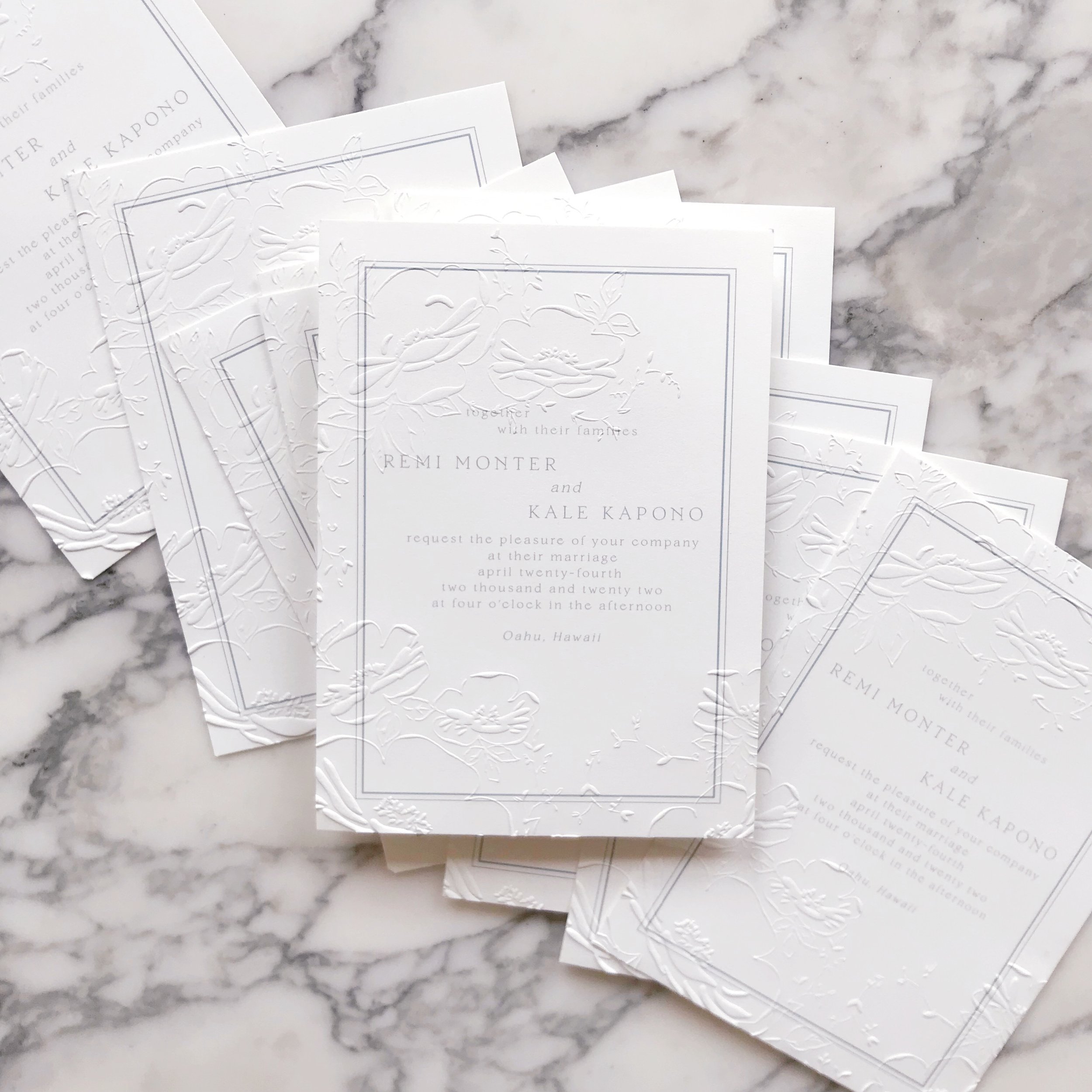
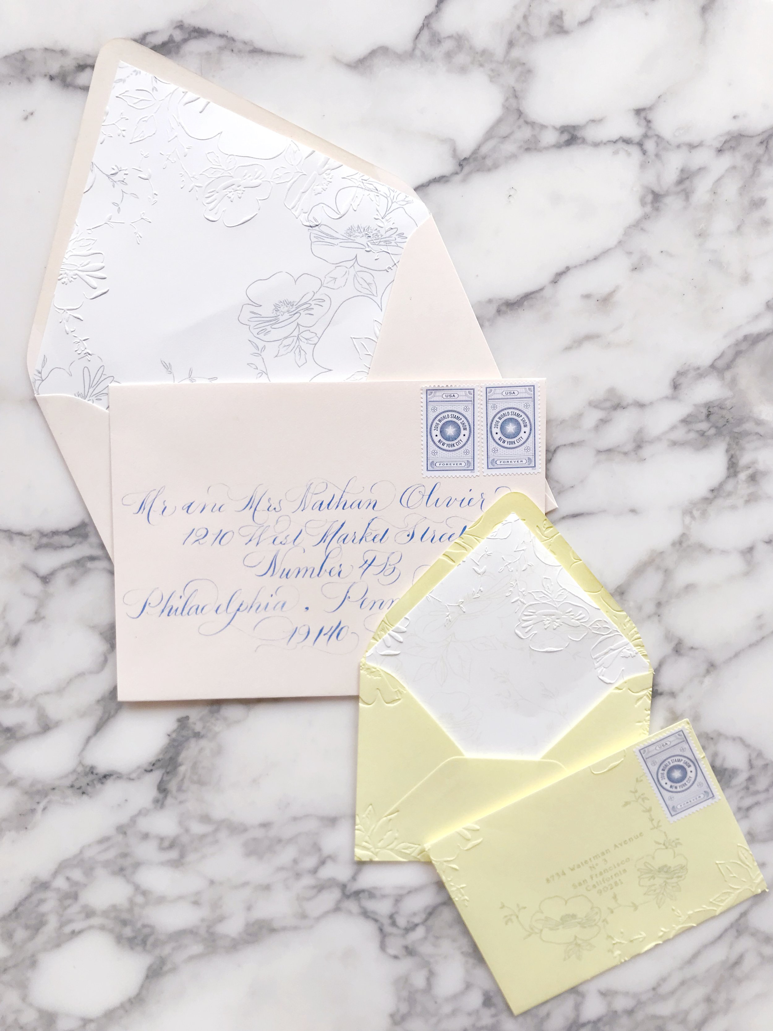
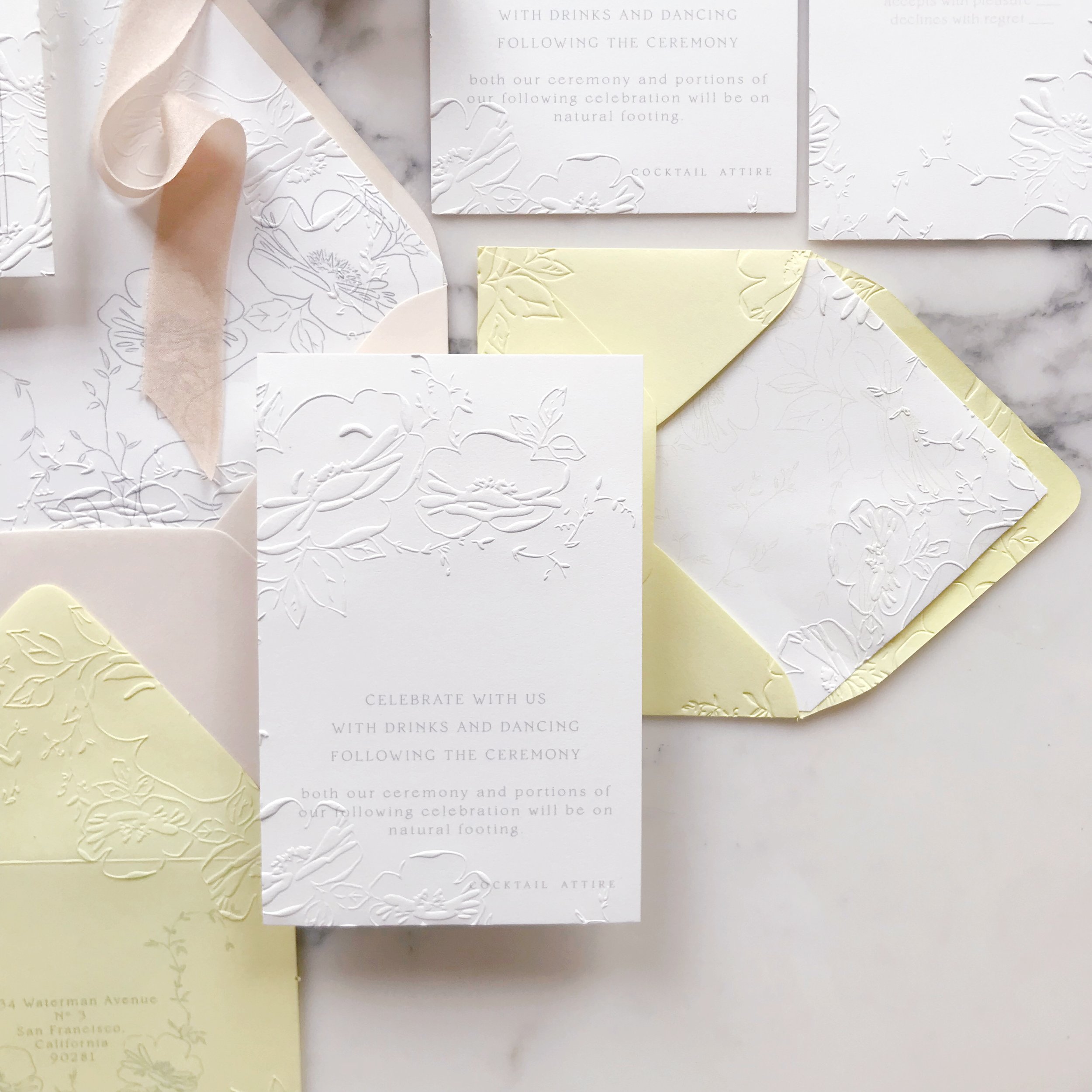
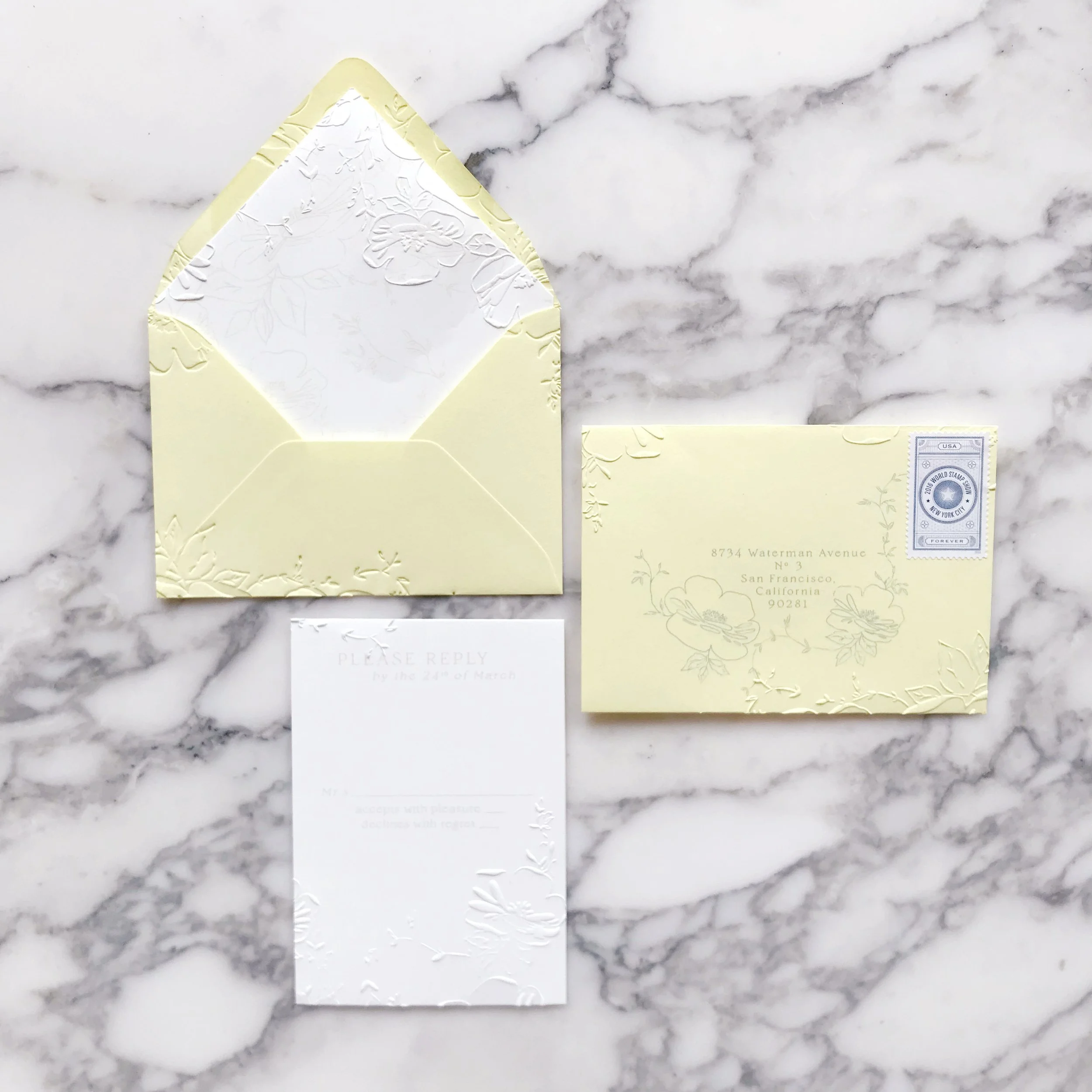
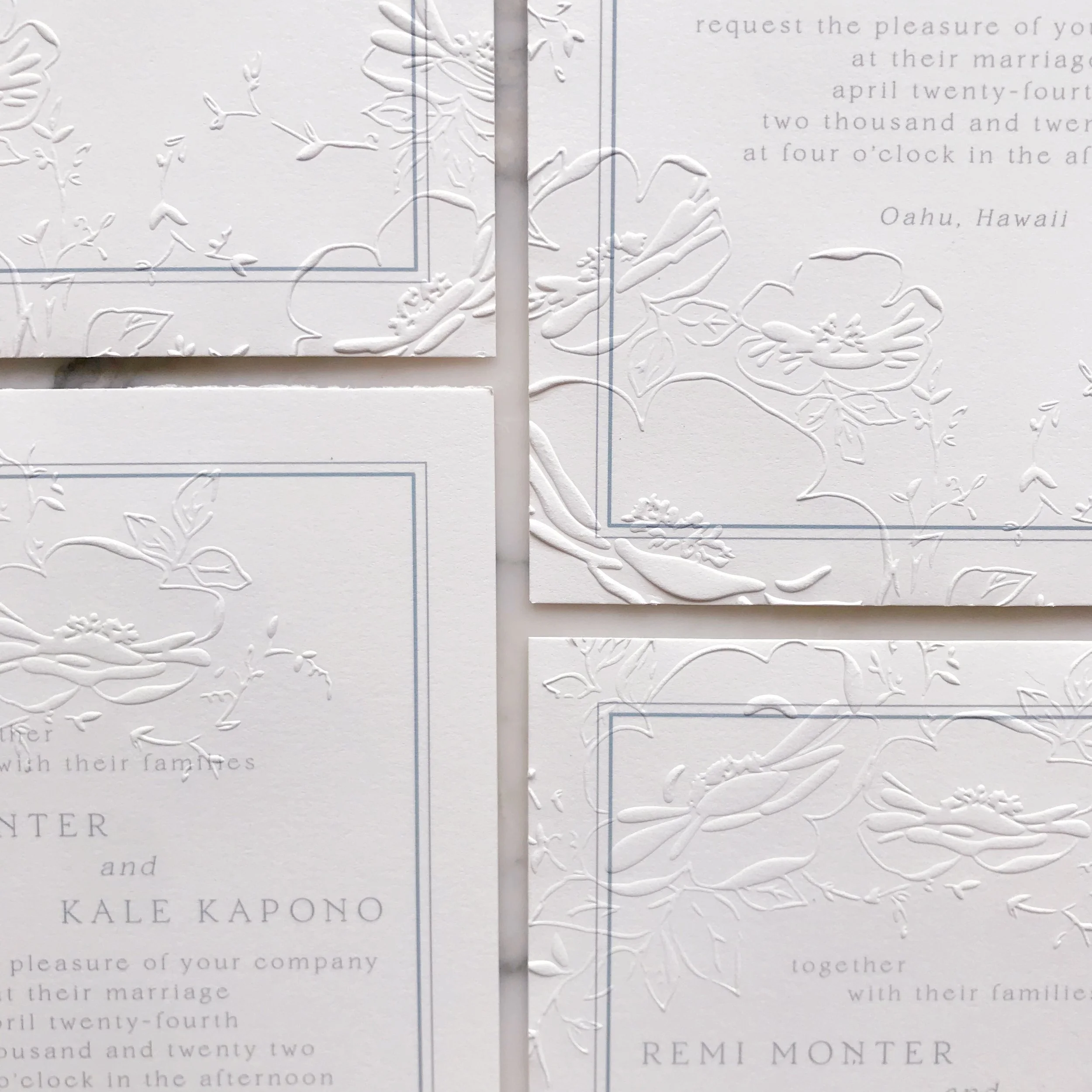
Our bride wanted a soft and romantic feel to her wedding invitation suite, incorporating a pale french blue, buttercup yellow, and blush.
She also knew that she loved the embossed texture we’ve been showing a lot of lately, but wanted to create more negative space with hers.
We chose two main methods for elevating the overall design:
Linen bound folio to house the suite
and
Overall embossed pattern
The linen bound folio in a natural linen color was carried throughout the suite. We backed several pieces in the same linen and layered it into our menus as well.
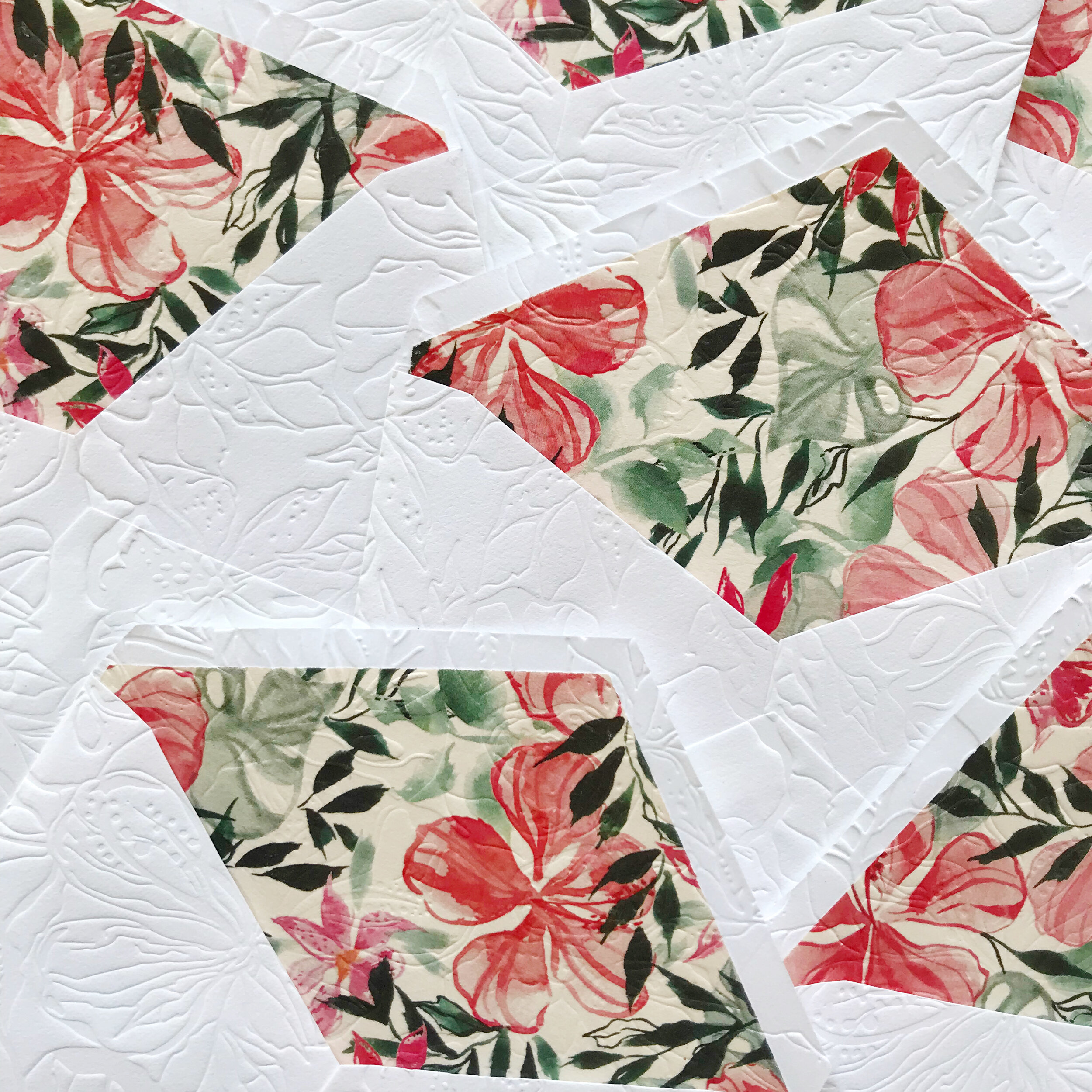
You know how much we love embossing, so we created an embossing pattern based on the watercolor and embossed everything. Embossing is such an elegant and unusual way to add texture and elevate the overall suite.
We selected a thin silk ribbon in a light bush to tie the whole suite together. Each invitation was tied with a simple bow over the semi-transparent vellum layer with blush roses printed on it.
One of the design elements we wanted to work with was negative space. We do a lot of design work that has an overall embossed pattern, but for this design, we wanted to eco the asymmetry that the bride was using throughout the wedding.
The invitations had negative space in the middle with roses and vines tumbling in a semi-circle around the wording.
We also see the same asymmetrical design work on all the other pieces, my favorite being the reply envelopes.
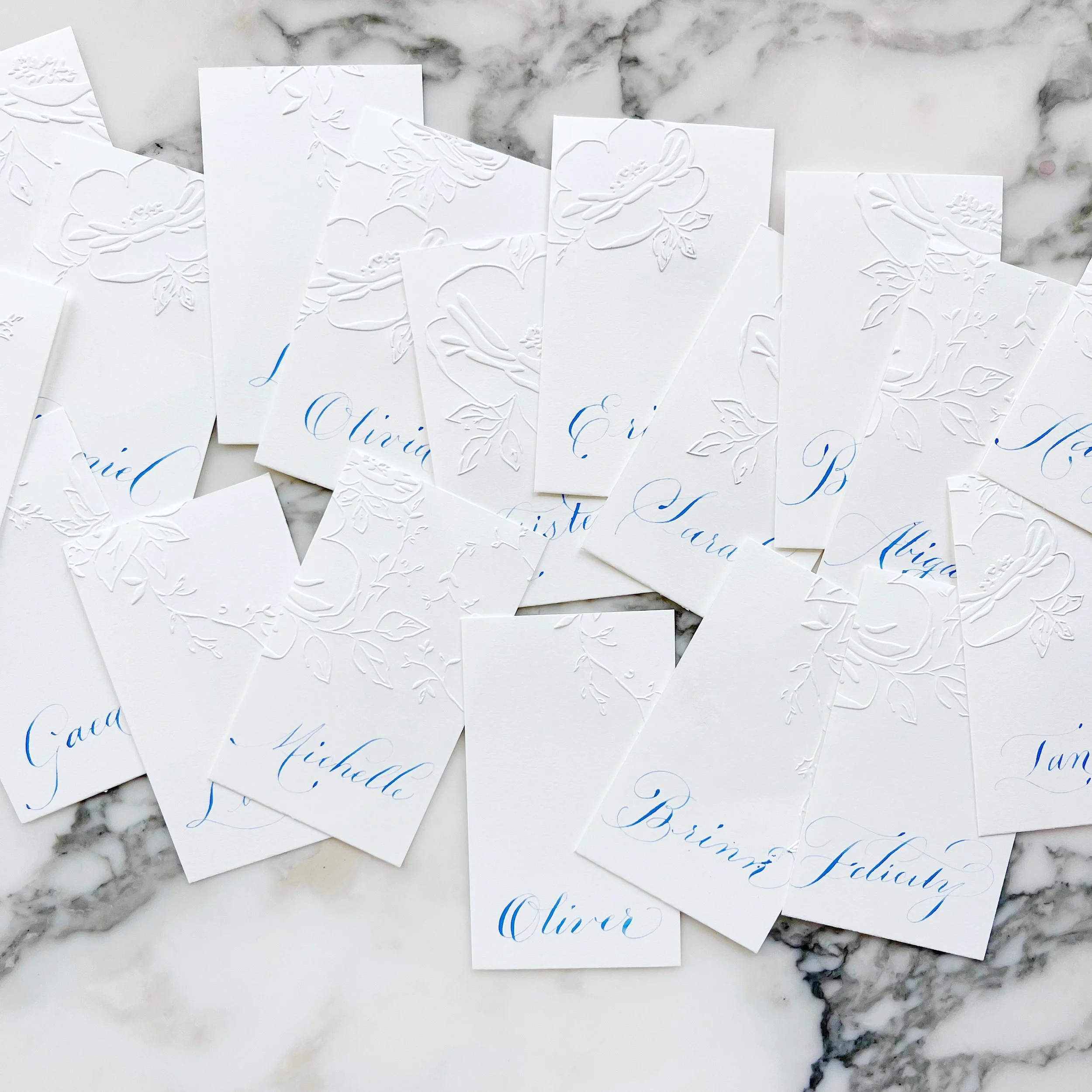
We used the same asymmetry and negative space on the menus and place cards with bits of the floral pattern and vine work peaking in along the edges of the menu cards.
The place cards were a simple cards with different aspects of the floral embossing on each card, complete with blue calligraphy.
Destination Wedding in Hawaii at The Four Seasons
Tropical | Bright | Elegant | Linen
an invitation suite for a wedding at:
The Four Seasons, Oahu, Hawaii
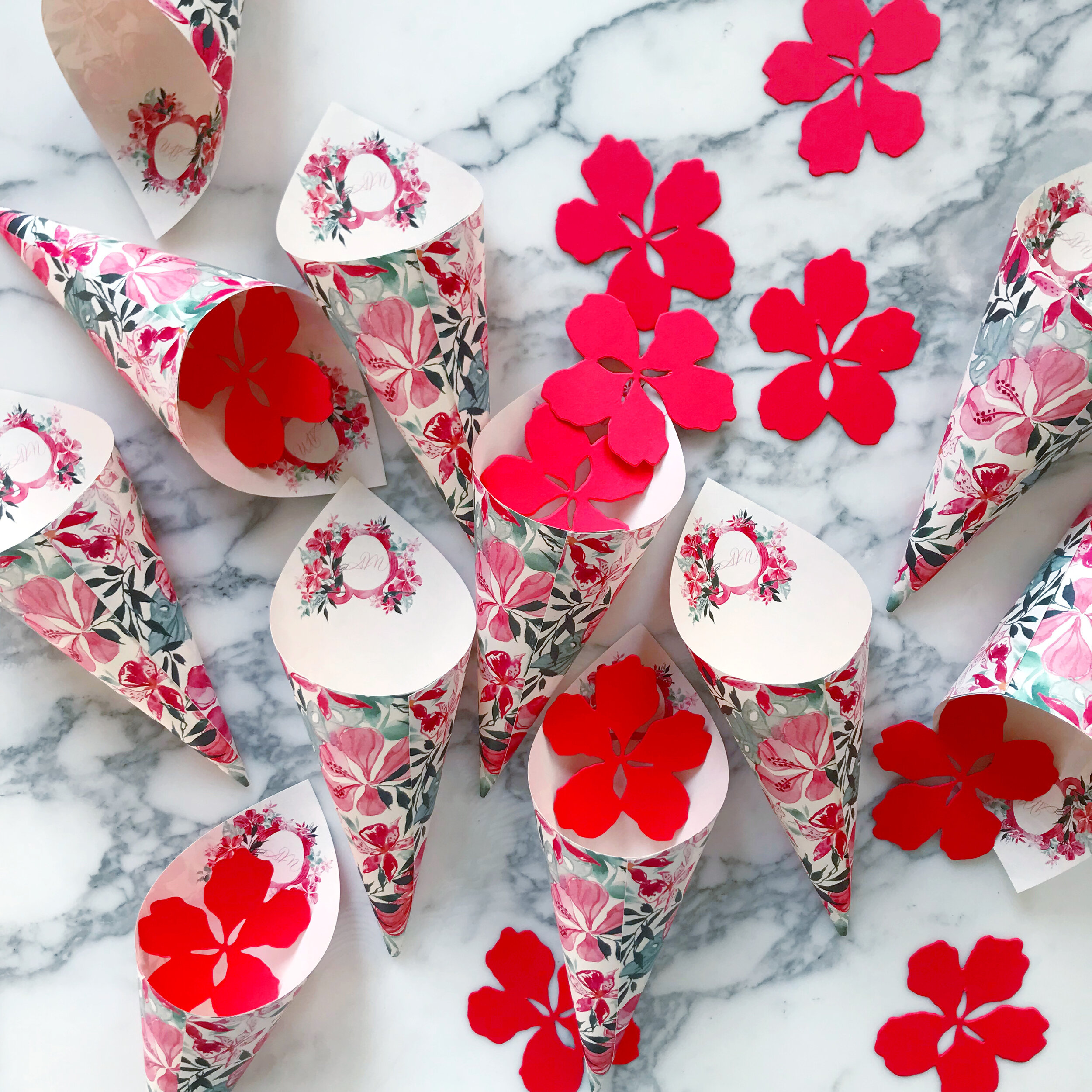
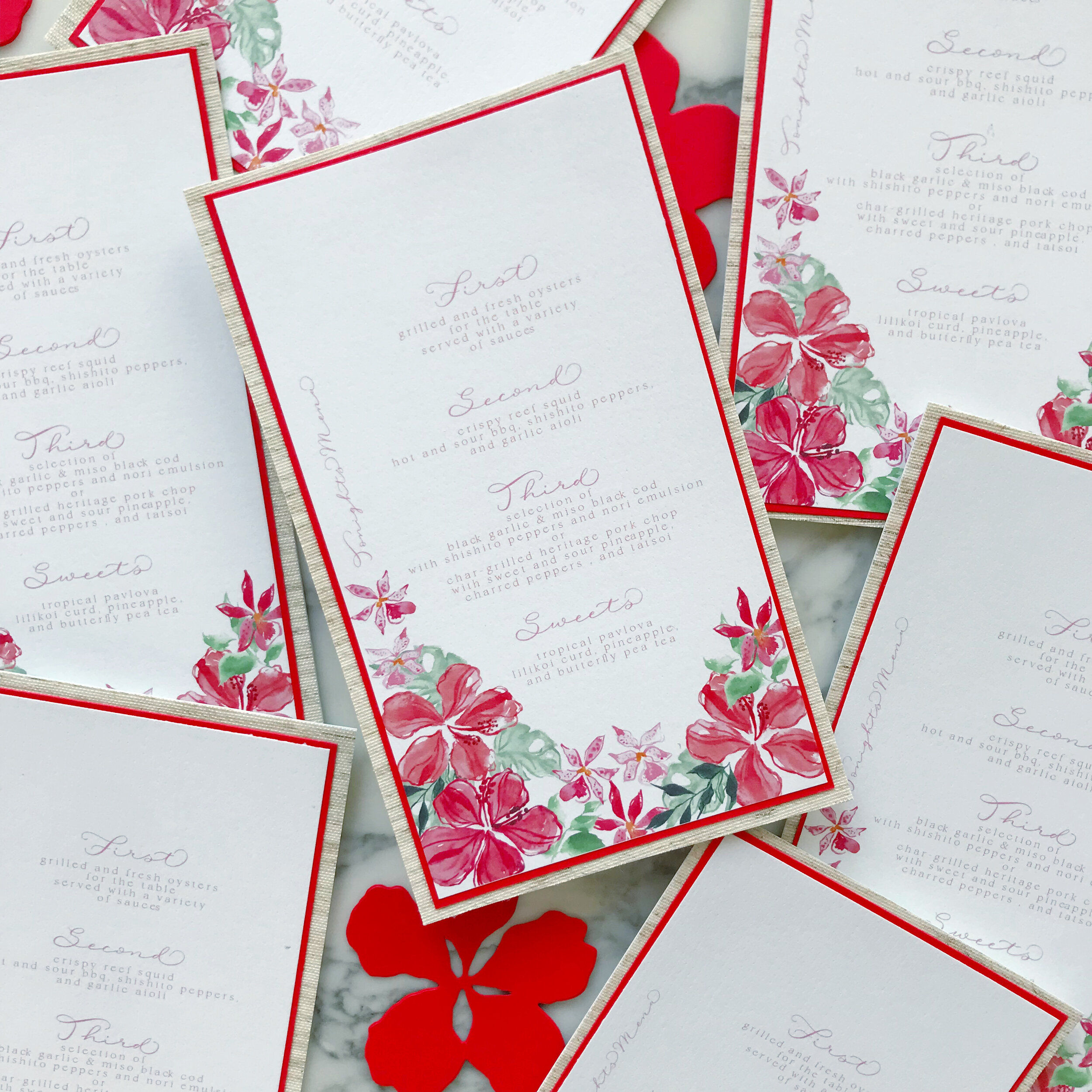
We wanted to create a bold, tropical pattern that could be used throughout the paper and reception spaces in varying ways. We were aiming for tropical but wanted to create a feeling that was slightly more upscale and elegant alongside the more casual island feel.
We chose two main methods for elevating the overall design:
Linen bound folio to house the suite
and
Overall embossed pattern
The linen bound folio in a natural linen color was carried throughout the suite. We backed several pieces in the same linen and layered it into our menus as well.
You know how much we love embossing, so we created an embossing pattern based on the watercolor and embossed everything. Embossing is such an elegant and unusual way to add texture and elevate the overall suite.
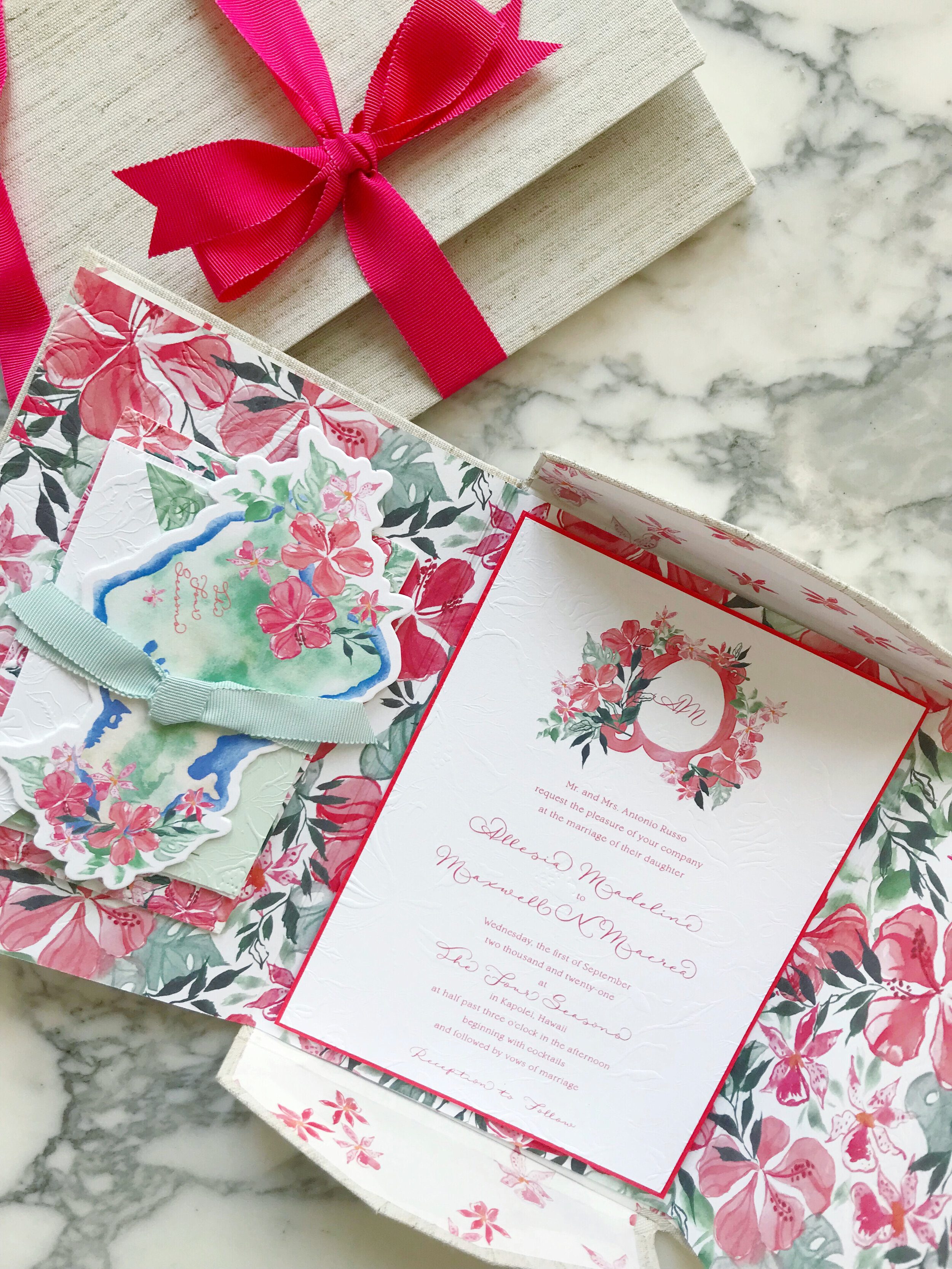
We also had to die-shapes created for this project - one in the shape of the island of Oahu, and one in the shape of the hibiscus flower we used throughout the suite.
The island was used as an insert for the invitation, as well as tags for our welcome bags. The flowers we used everywhere else!
Now that we have all our elements laid out, let’s talk about the invitation itself.
Elegant and on the simple side, our invitation was printed with the couple’s crest on top of bright white cotton. The invitation was then backed in a bright pink and the entire piece was embossed with an overall texture, front and back.
We then created our folios, which we shaped line envelopes. The inside of each linen-bound folio was lined in custom-printed mulberry paper to match the suite.
The left hand side held the stack of a reply card and envelope, reception card, and info card, all tied together with seafoam green grosgrain ribbon.
Our finishing details included a second color of vintage grosgrain ribbon, lots of linen, tons of texture, and an invitation that rewards you for interacting with it!
Summer Wedding Invitation Inspiration
Summer weddings are all about those bold colors, full of sunshine and exuberance. I love everything from the seaside blues to sunflower yellows!
Cheerful yellows, bright oranges, leafy greens, and summer sky blues are all over this time of year! I love outdoor weddings, and the summer season is all about parasols and the bright hues of the season.
So let’s talk about summer invitations, and we’ll start with the summer invitation inspiration in this post!
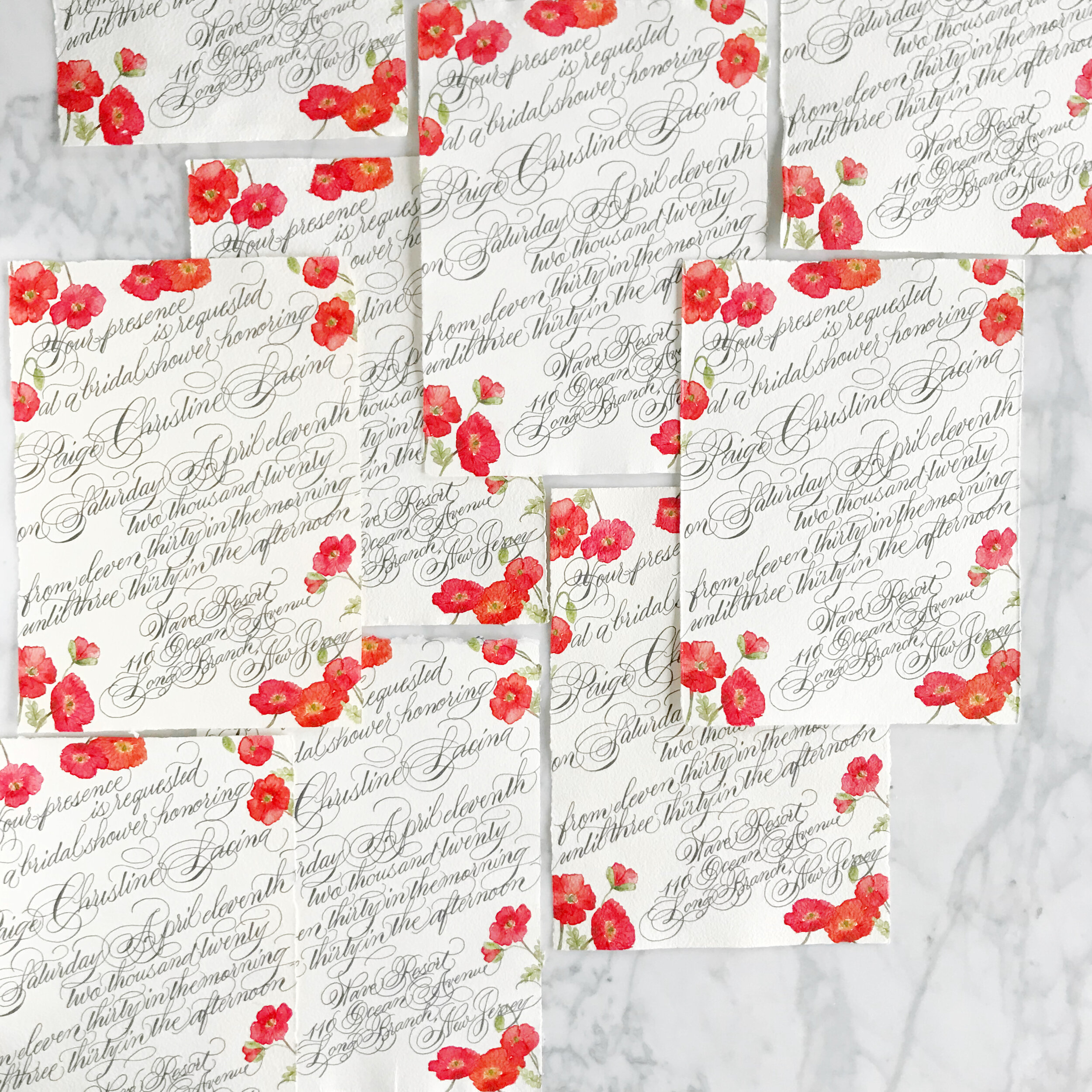
Poppies are such a summer staple, and the Icelandic poppies for these bridal shower invitations are no exception! Printed on handmade paper and covered edge to edge in gorgeous formal calligraphy, these bridal shower invites take your shower game to the next level! We went way over the top with the calligraphy for this suite, pouring the flourishes over the deckled edges.
The simple save the dates, layered with Japanese cane paper and handmade paper, for a Bermuda destination wedding are pale and understated. I love the idea of going off the beaten path, so taking on the tropical vibe while foregoing blues and bright colors is definitely my type of project. The amazing tactile texture of the cane paper was exactly what our bride was looking for. We paired it with a sage green handmade paper with a deckled edge to add in even more texture.
Can we say holy cow envelope game? I loved this project! The bride got married at her parent’s property in Sun Valley, Utah, surrounded by tall grasses and wildflowers. We spent some time researching the varietals that would be blooming at the time of her wedding and built her entire suite around those, bringing in bright yellows, shades of oranges and blues, leaf greens, and pale pinks and peaches (I shocked myself with how many colors I was able to build into this suite!) Bits of line botanicals peak out from the corners, creating some interesting negative space. At some point, we’ll also look at the suite of woodland creatures we also created for this suite (owls, foxes, and bears, oh my!).
These summer invitation suites have such different looks and feel to their aesthetic. I love the directions each of these brides went to reflect their personal style in their wedding!
Featured | Oh So Beautiful Paper
It's Monday morning and I'm greeted by a featured post of my work on Oh So Beautiful Paper! That's a perfect way to start a week! You can view the featured post here!
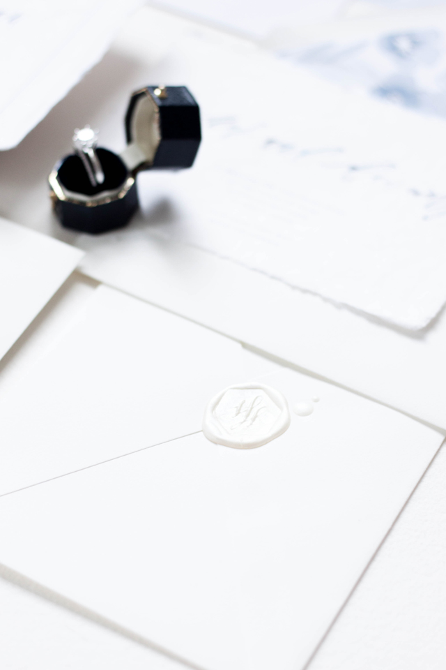
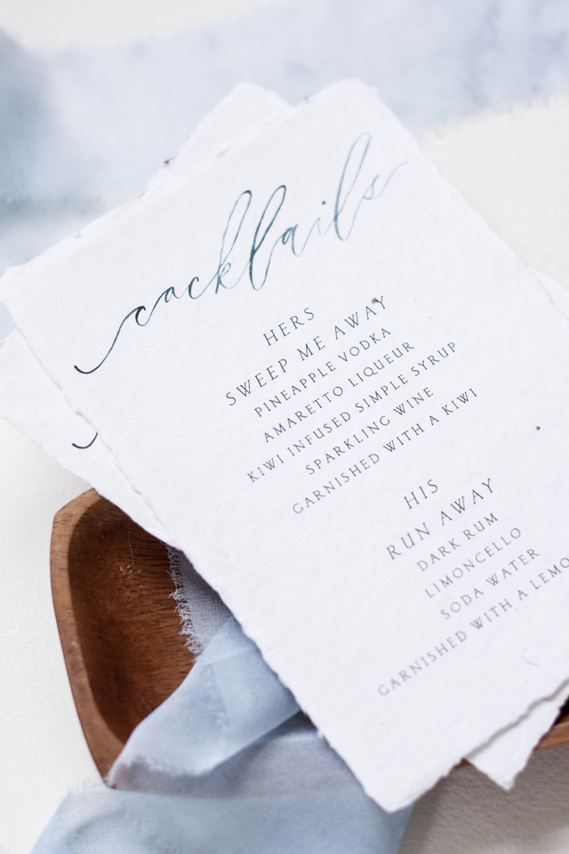
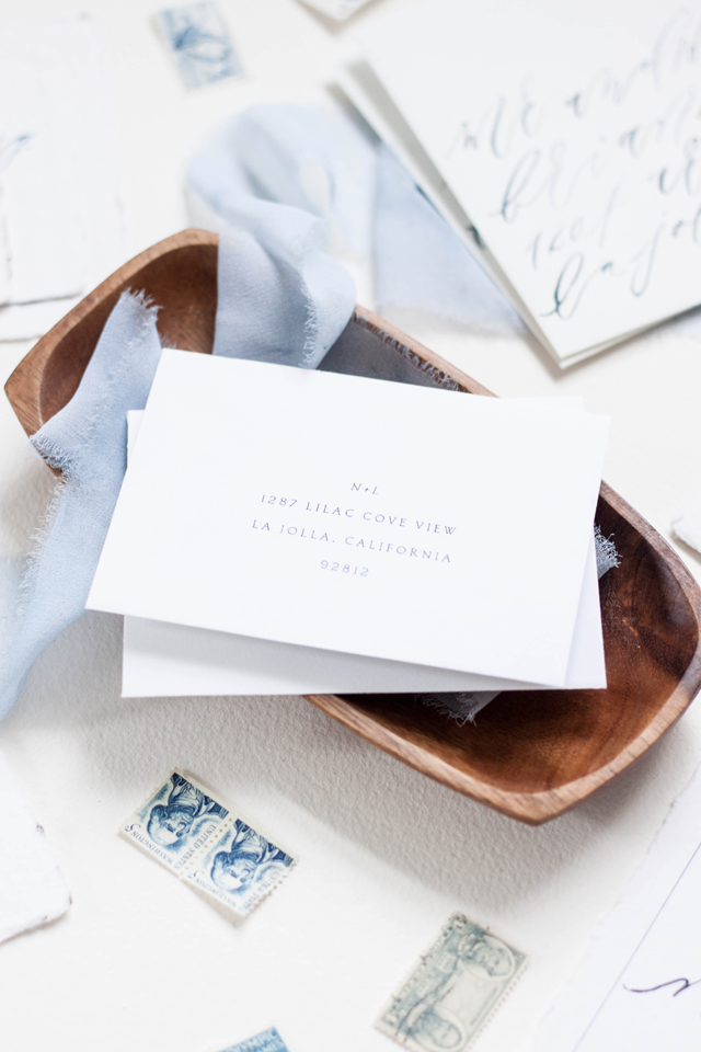
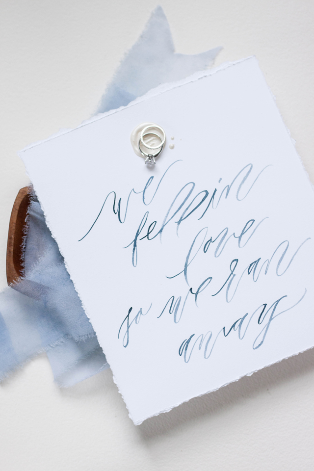
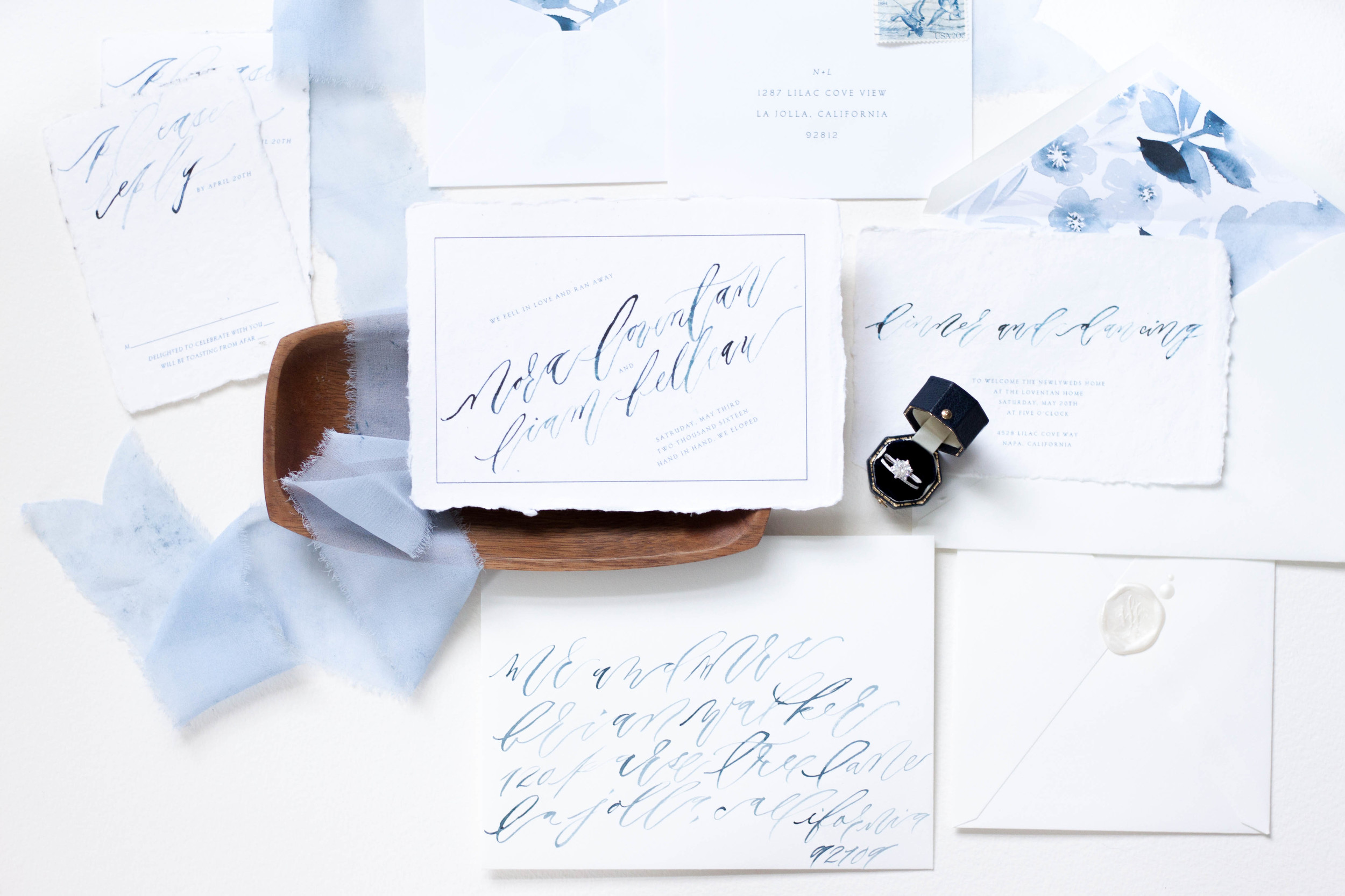
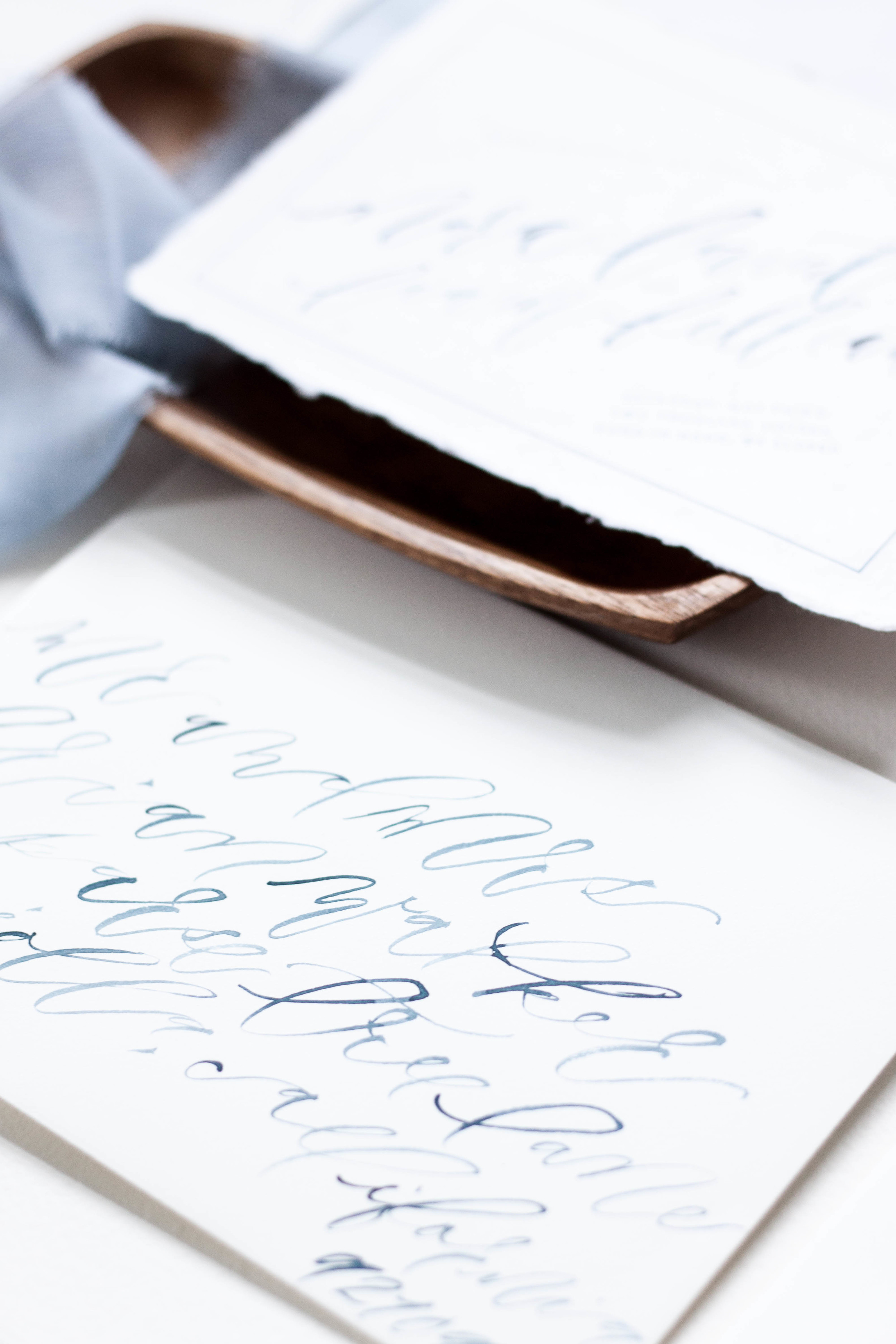
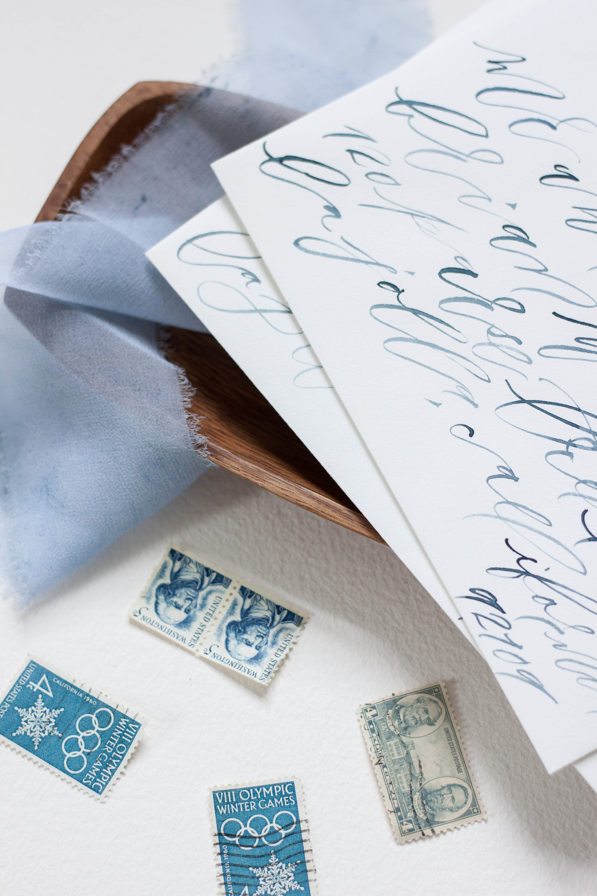
Working with Marina from Bustle Events, we designed this suite for an elopement celebration, using the phrase “we fell in love, so we ran away” as the theme. We really wanted to embrace the destination aspect of the celebration, tying in natural edges and shades of blue. The invitation itself announces their elopement and invites guests to join them at the bride’s parents home upon their return home. We really loved the idea of using paper with a raw edge and choose to go with handmade 100% cotton rag paper from Fabulous Fancy Pants. We paired the handmade paper with slooping brush lettering, and paired it with a formal serif font.
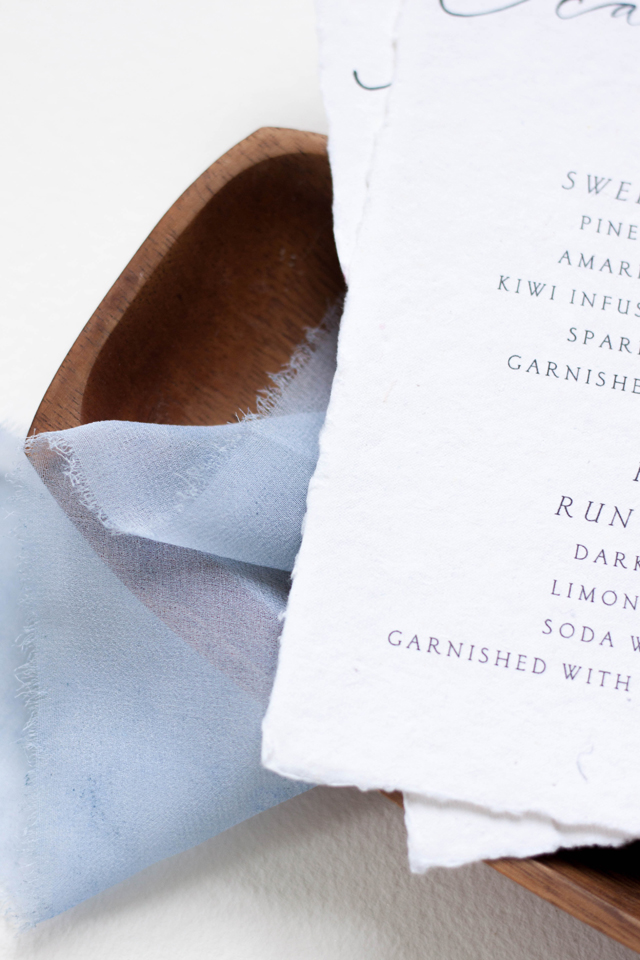
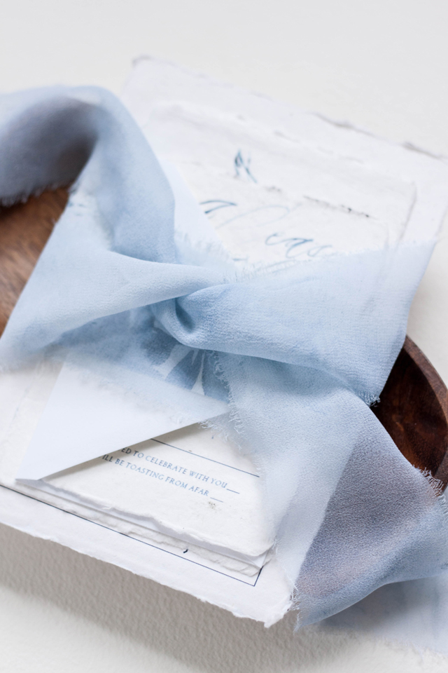
I also hand painted a large piece of artwork for the bride in monochromatic blues, and used that artwork to be printed as their envelope liners. Each invitation suite was wrapped in hand dyed, hand frayed silk ribbon and tucked into a crisp white cotton envelope. The cocktail menus were printed on the same 100% cotton rag paper and featured a “his & hers” signature cocktail. We also created a larger scale artwork piece of the quote we used in the suite featuring the couple’s wax seal.
Design, printing and production: Design House of Moira
Ring box: Lang Antiques
Paper: Fabulous Fancy Pants
Photography: Design House of Moira
Bespoke | Italian Destination
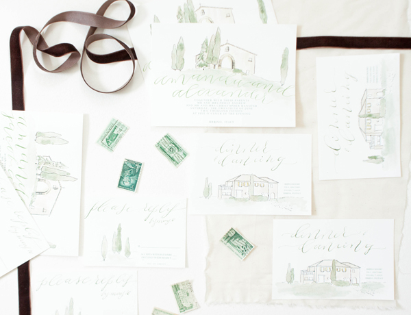
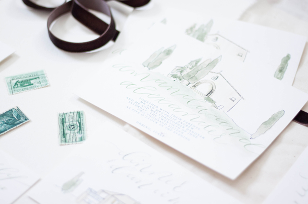
When you run away and get married in Italy trailing your entire family and group of friends with you, you might as well go big. We created these invitations to reflect the amazing venue, complete with cypress trees, old masonry and yellow shutters.
Bespoke | Elopement
"we fell in love so we ran away"
Two people fell in love, eloped and got married! To announce their marriage, we created a main piece with the date they tied the knot, paired with a reception card announcing a celebration thrown by the brides parents. I created the suite with handwritten, contemporary brush calligraphy and printed the entire suite on handmade cotton rag paper. The envelopes were both lined with monochromatic indigo florals, and addressed in the same looping indigo lettering. The entire suite was wrapped in hand dyed silk ribbon.
Featured | Engaged! Magazine | Ireland Nuptuals
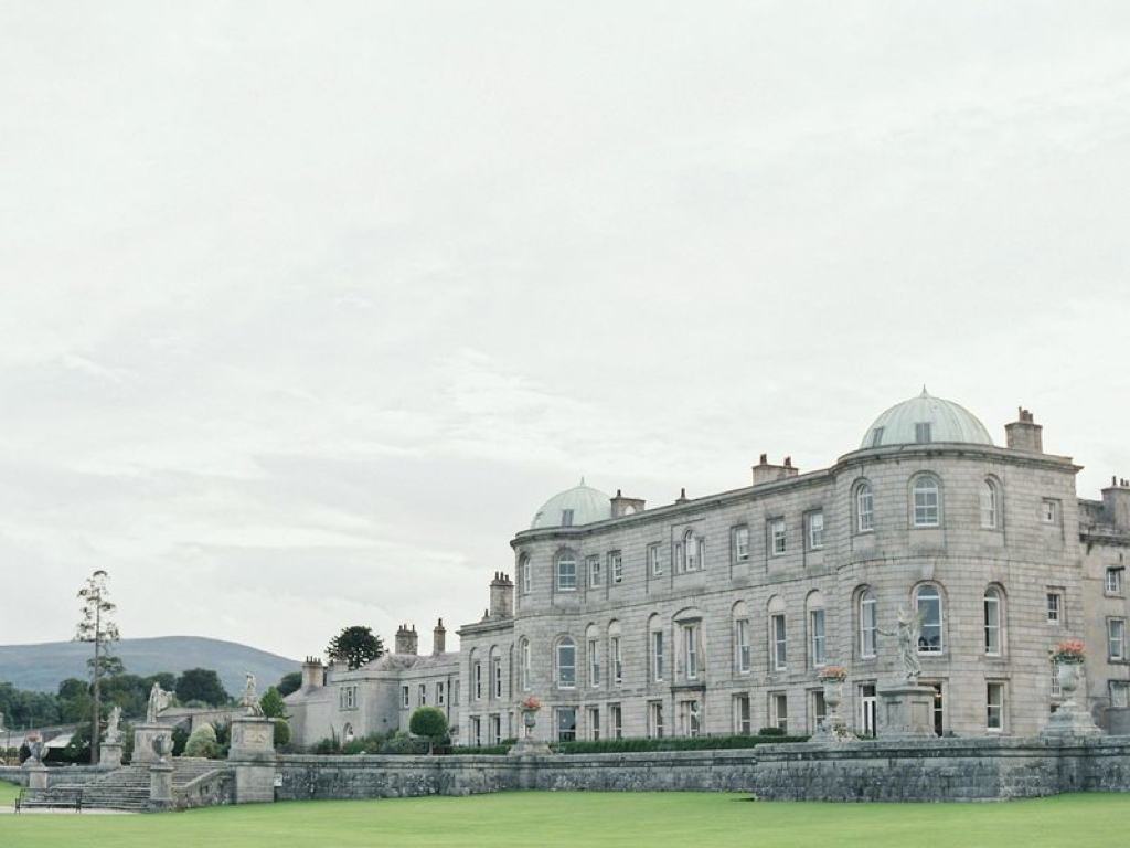
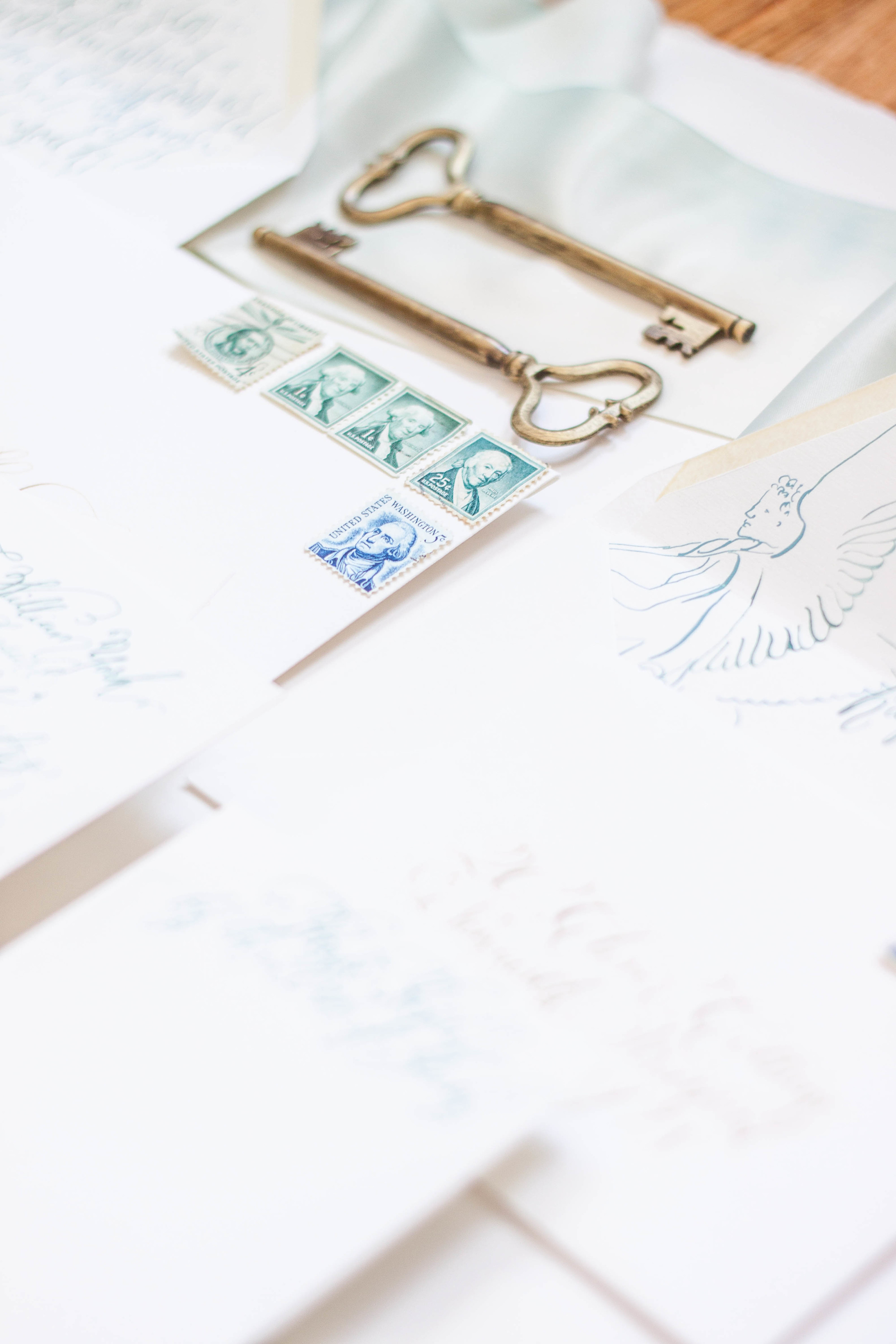
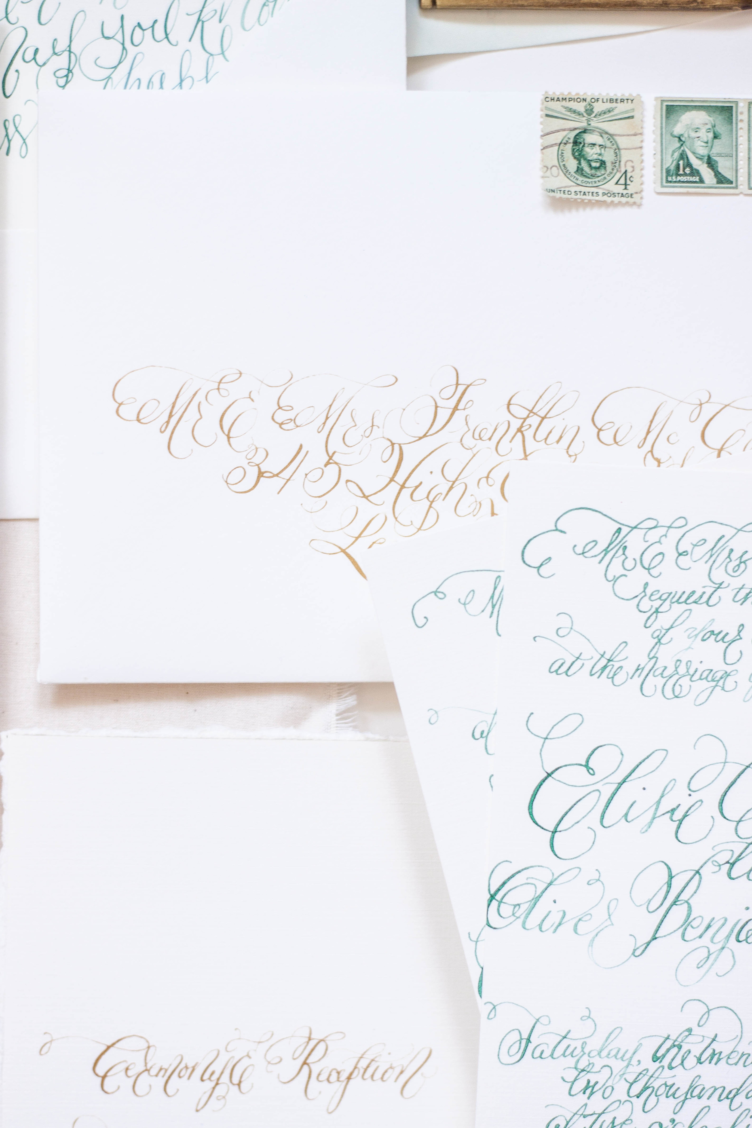
A destination affair with Strawberry Milk Events, Laura Gordon and Engaged! Magazine in the Emerald Aisle produced some really dreamy images! I had the pleasure of collaborating with these lovely ladies on a gorgeous invitation suite, featuring lots of calligraphy, gold and teal foil printing, custom wine bottle labels and tags, and vintage postage. Check out the full magazine feature here!
Featured | Engaged! Magazine | Ireland Nuptuals
So I'm a little behind in showcasing some of the features I've had the pleasure of working with. Ok, a lot behind. Later this week, I have the full feature from Engaged! Magazine featuring this invitation suite, but for now we'll take a look at some of the paper details!
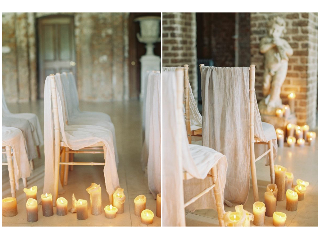
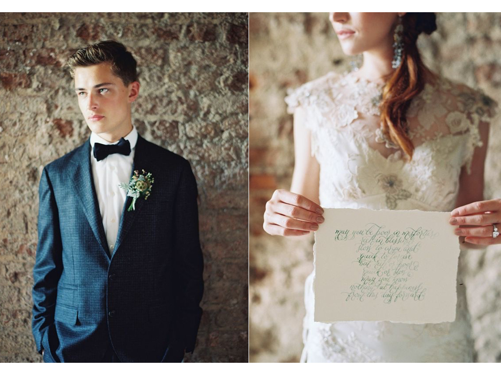
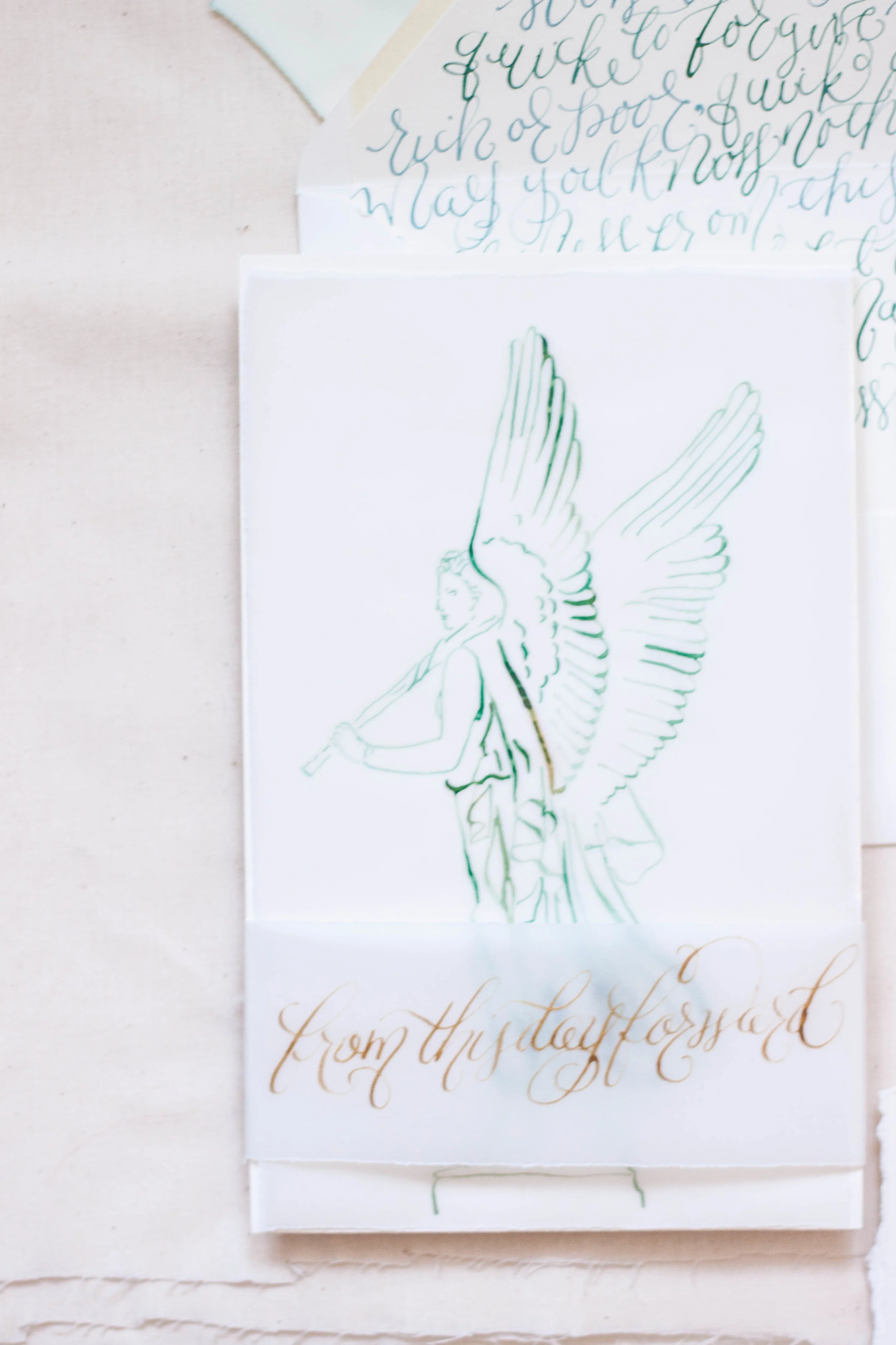
The suite is foil printed in a pale antique gold and teal on cotton paper with deckled edges. We alternated the colors on each piece, keeping the overall look balanced. The final suite was stacked up and topped with a thin piece of velum with an illustrated angel, a statue featured at the castle. The whole thing was then wrapped with a thin piece of parchment reading "from this day forward." I also created tags for the guest welcome baskets and custom wine labels to follow the same design. The place cards also featured deckled edges and gold ink. Stay tuned this week to see the whole feature from the magazine!
First photo from the lovely Laura Gordon.
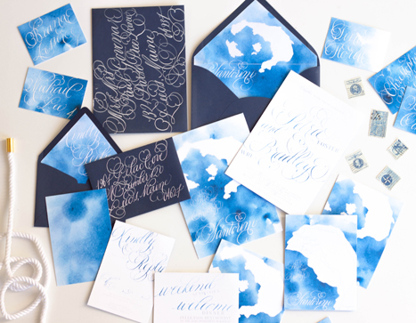
Bespoke...Santorini Destination Wedding Invitations
When approached to create a suite for a destination wedding in Santorini, I jumped at the opportunity!
This suite differs from our typical work a tad...when building the ideas and design elements that this suite would be created around, I toyed with the idea of creating an illustration that embodied the classic Santorini buildings. We also wanted to incorporate the distinctive blues of both the classic Santorini rooftops as well as the surrounding piercing blue ocean. In the end, we nixed the building idea and decided to keep it a bit more simple and focus on the blues and the movement of the ocean.
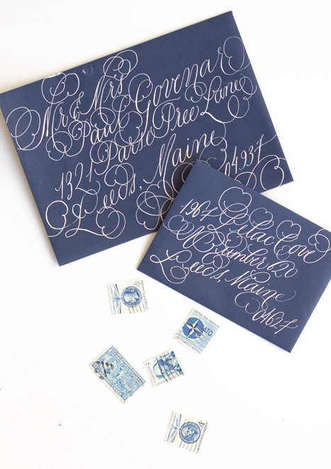
I used a watercolor wash as a base in a vibrant cerulean blue, letting the wash be uneven in saturation. I then illustrated a map of the island itself and used that as an overlay for both the backers as well as envelope liner. I used a fairly flourished calligraphy style to balance out the simplicity of the suite.
