Art Nouveau Wedding Invitations
art nouveau, pale greens and nudes, elegant, overall texture, soft, unexpected, soothing, formal
Glen Foerd Mansion | Philadelphia, Pennsylvania
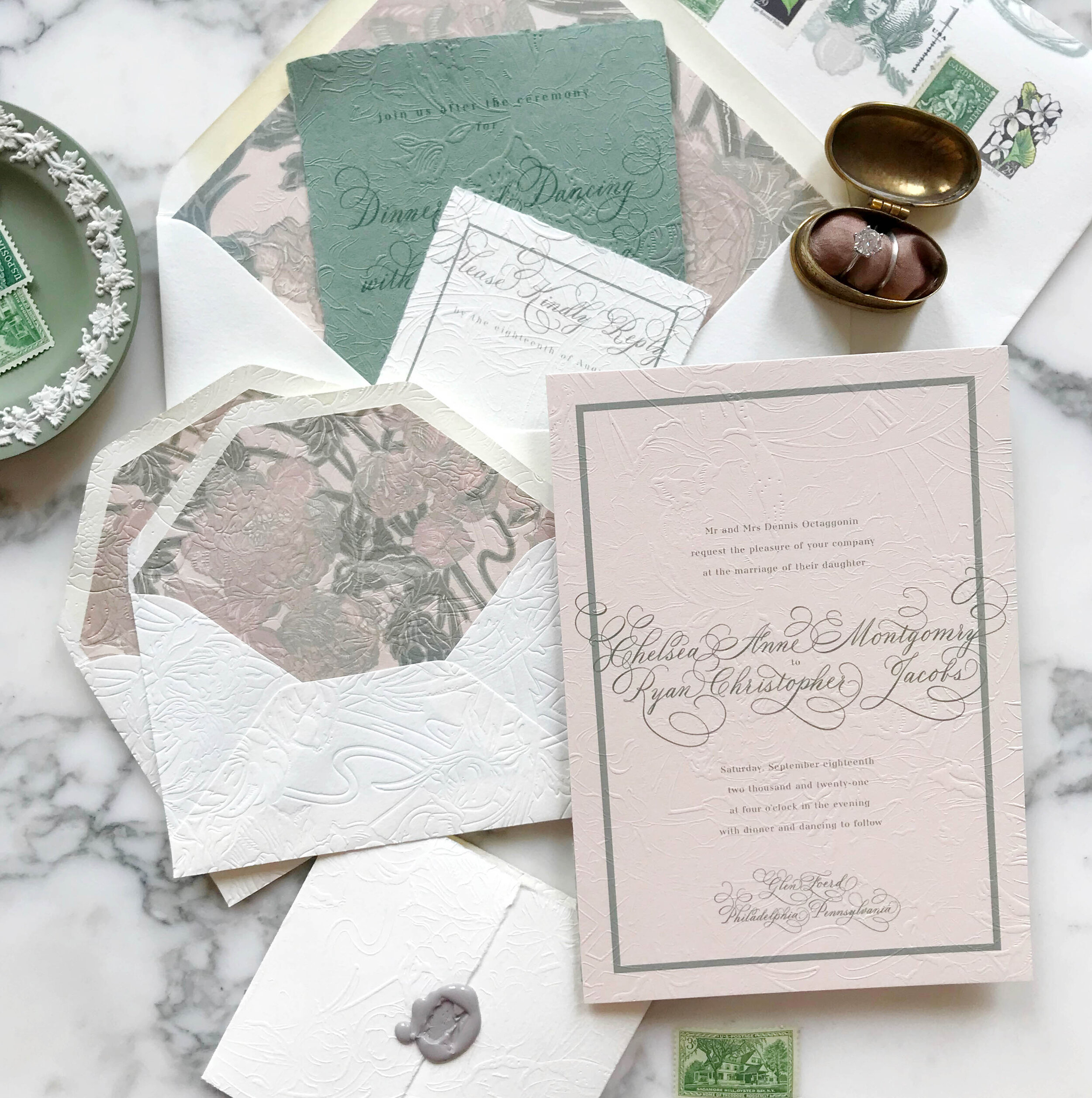
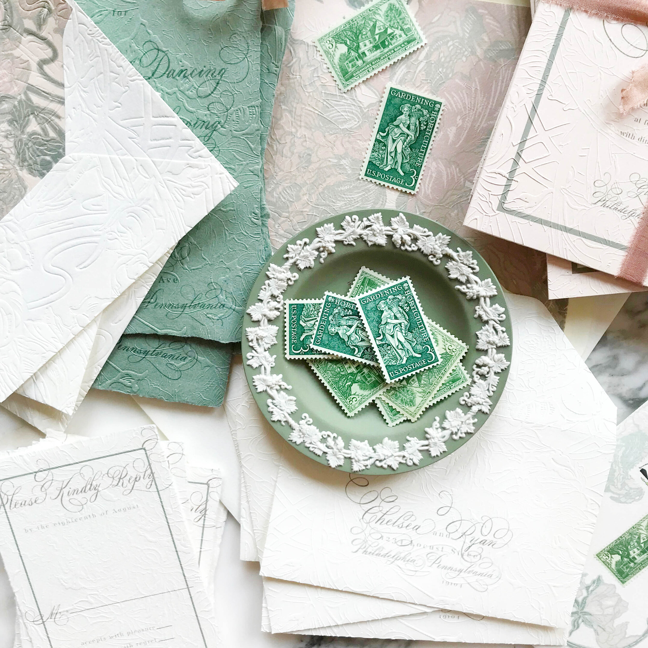
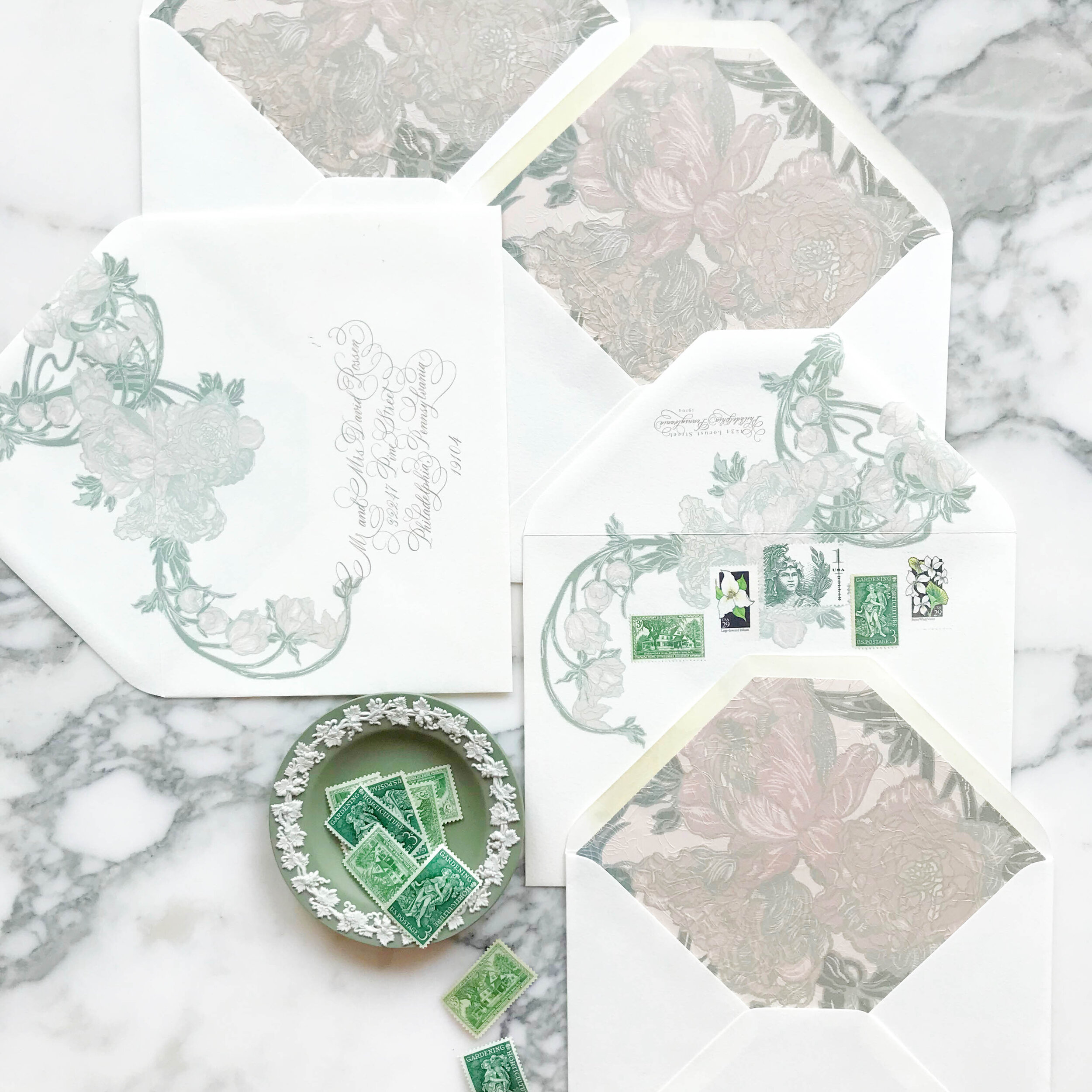
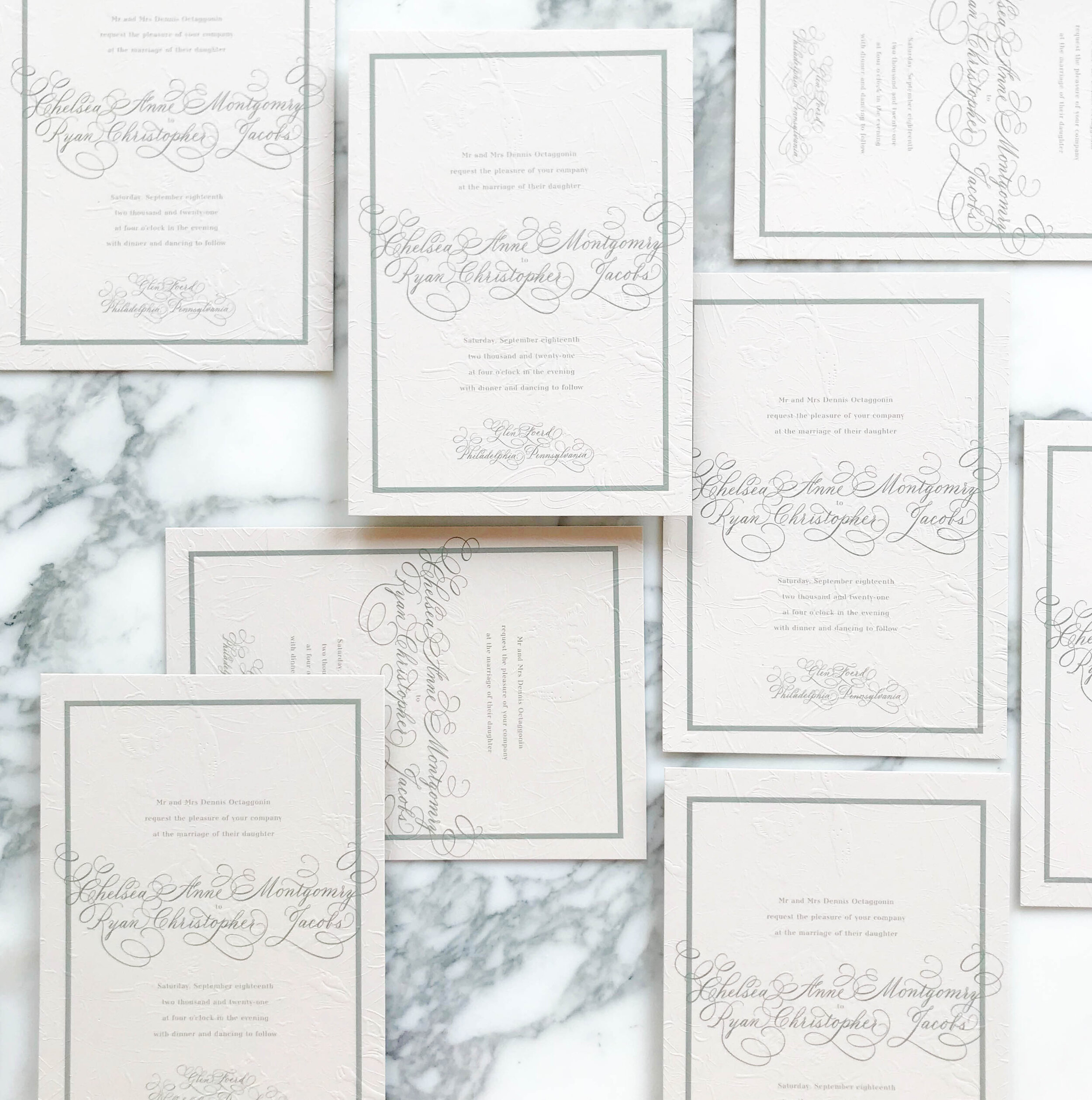
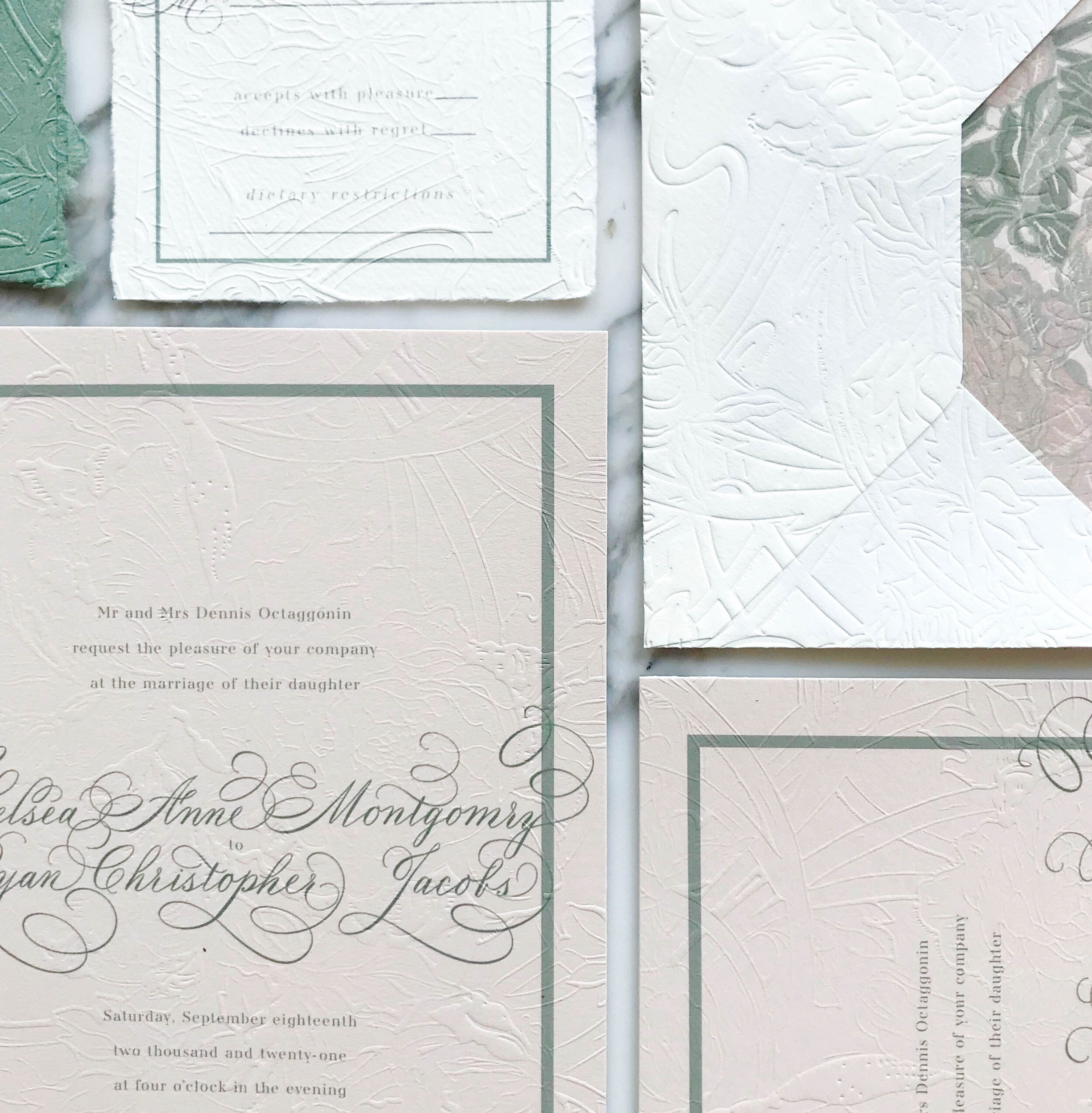
We wanted to bring in the graceful and soothing vibes of the Art Nouveau era with pale neutrals, smooth greens, and impressive overall texture. We selected artwork inspired by antique wall paper to start our design work. Working with the artwork and palette of nudes and greens, we developed our overall look and feel, a perfect fit for the gorgeous Philadelphia mansion of Glen Foerd.
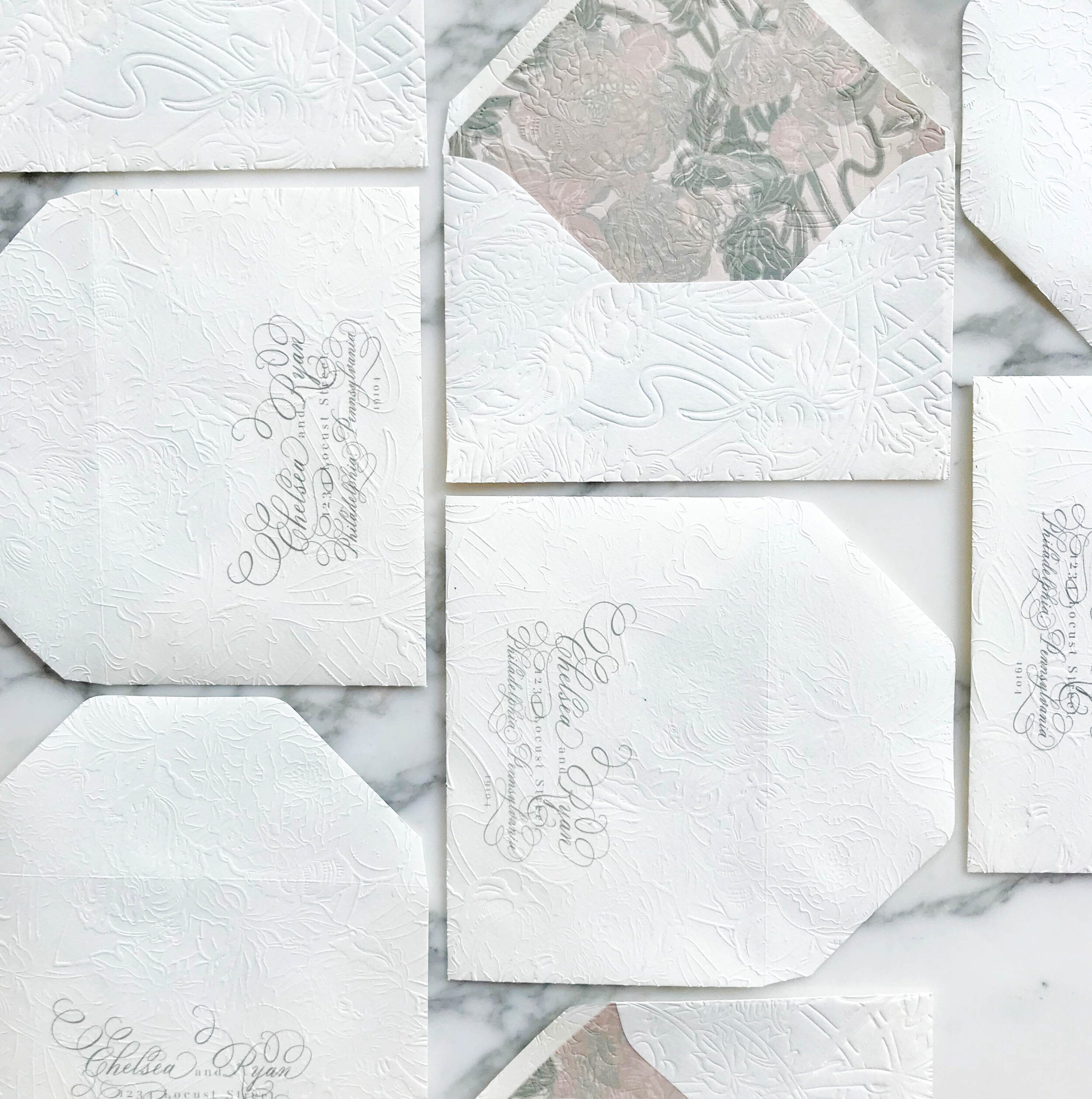
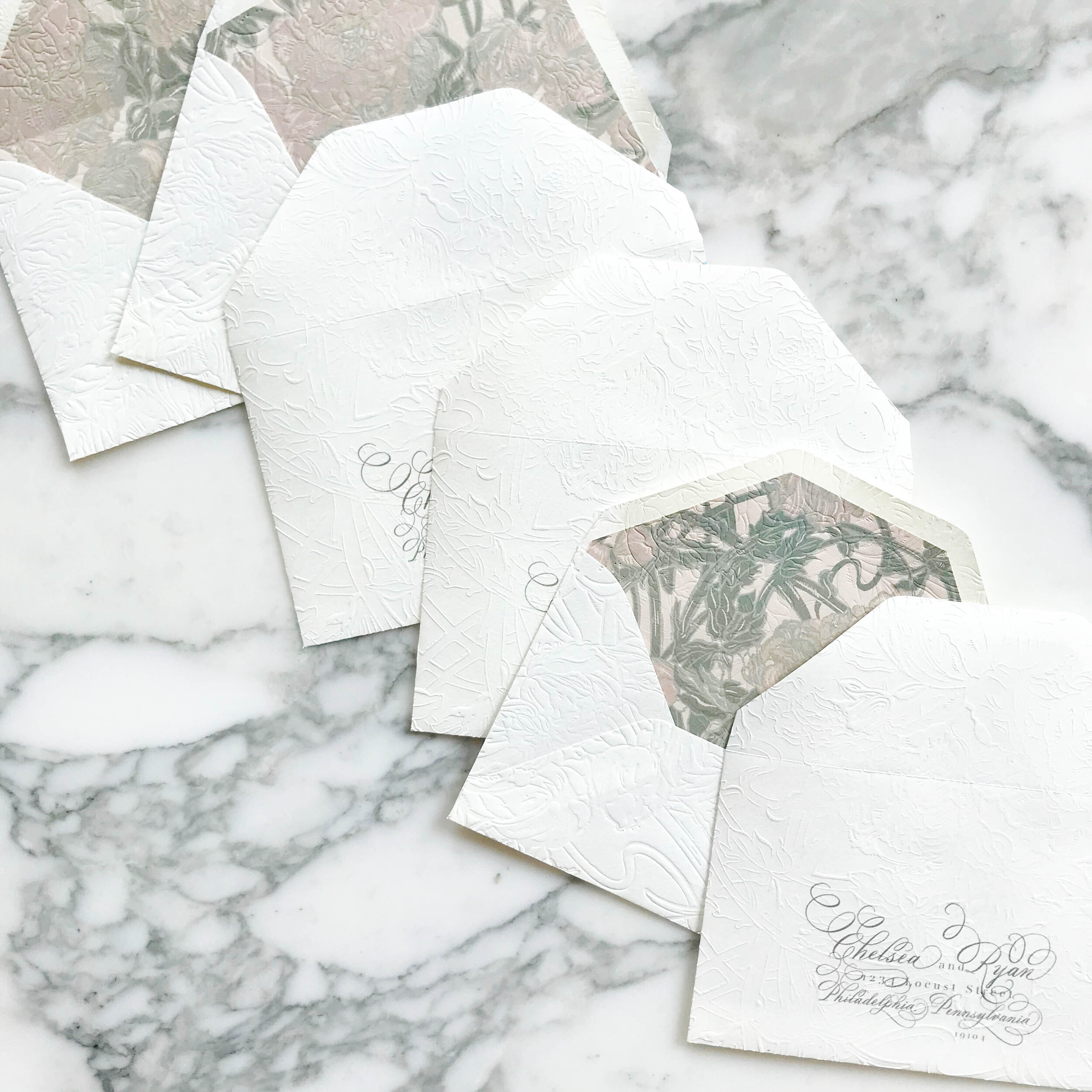
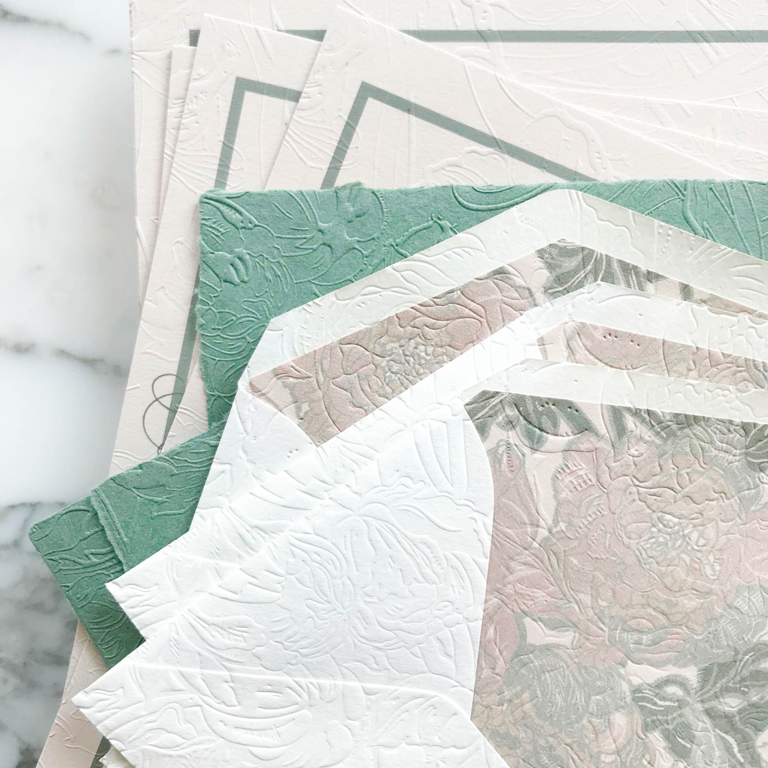
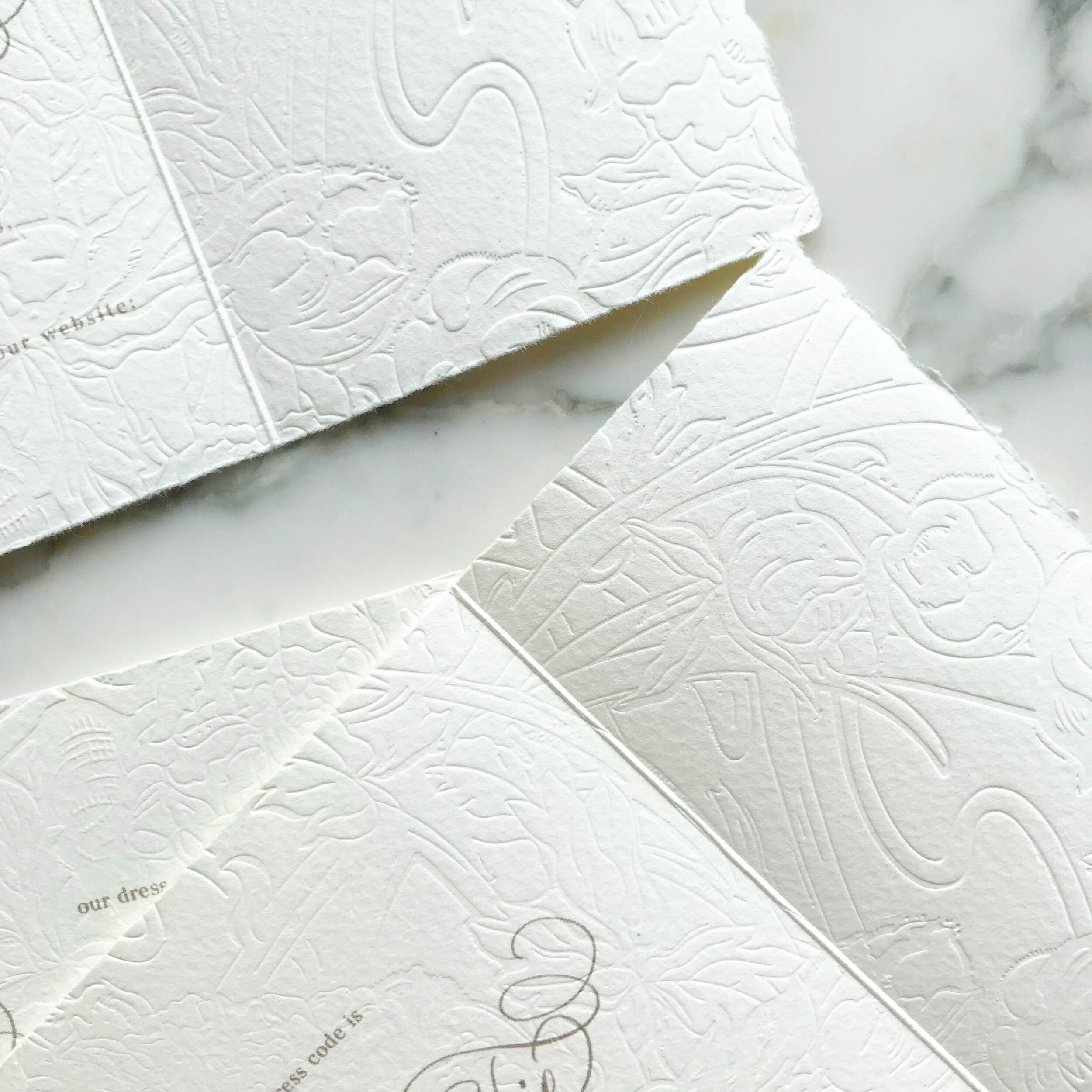
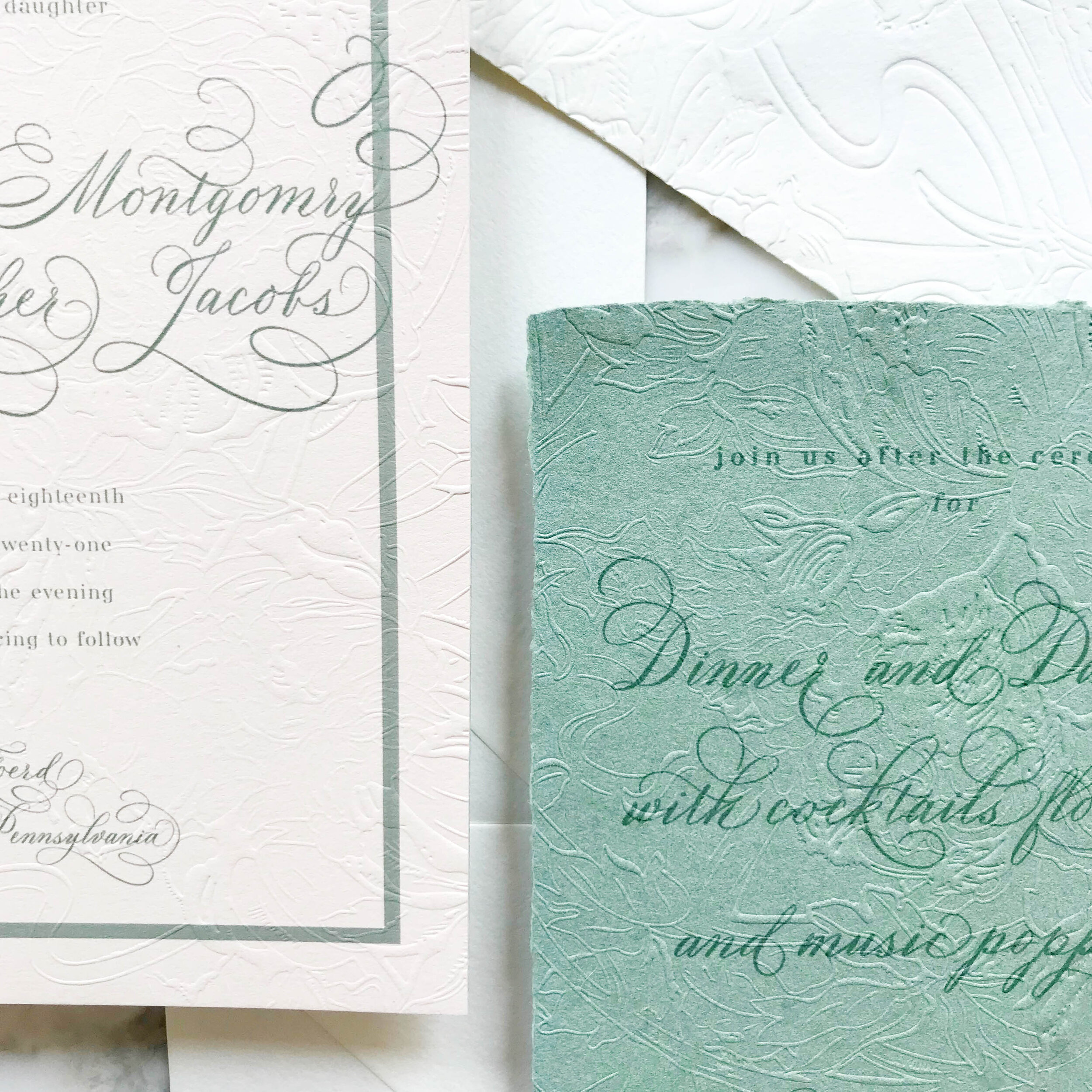
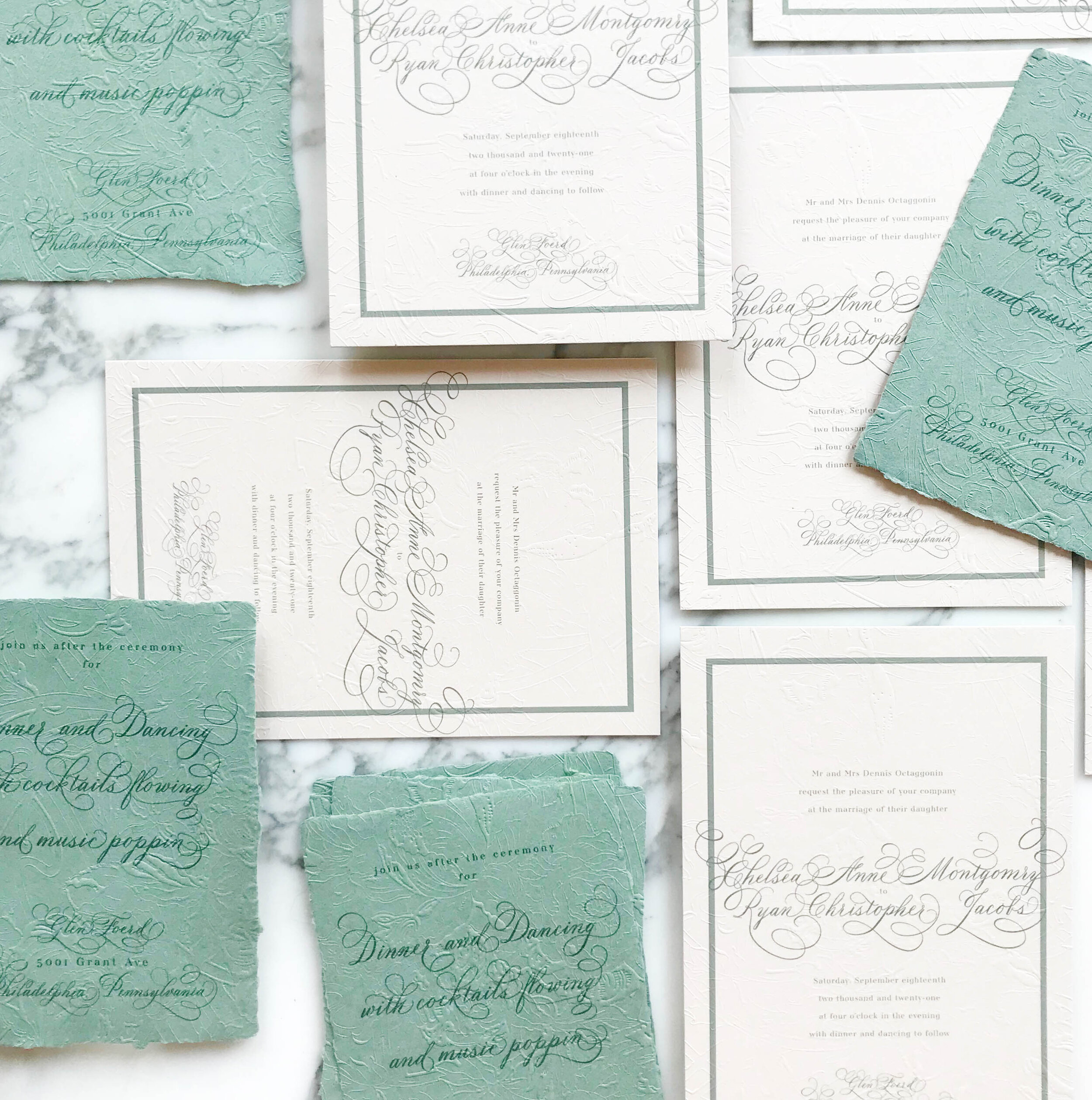
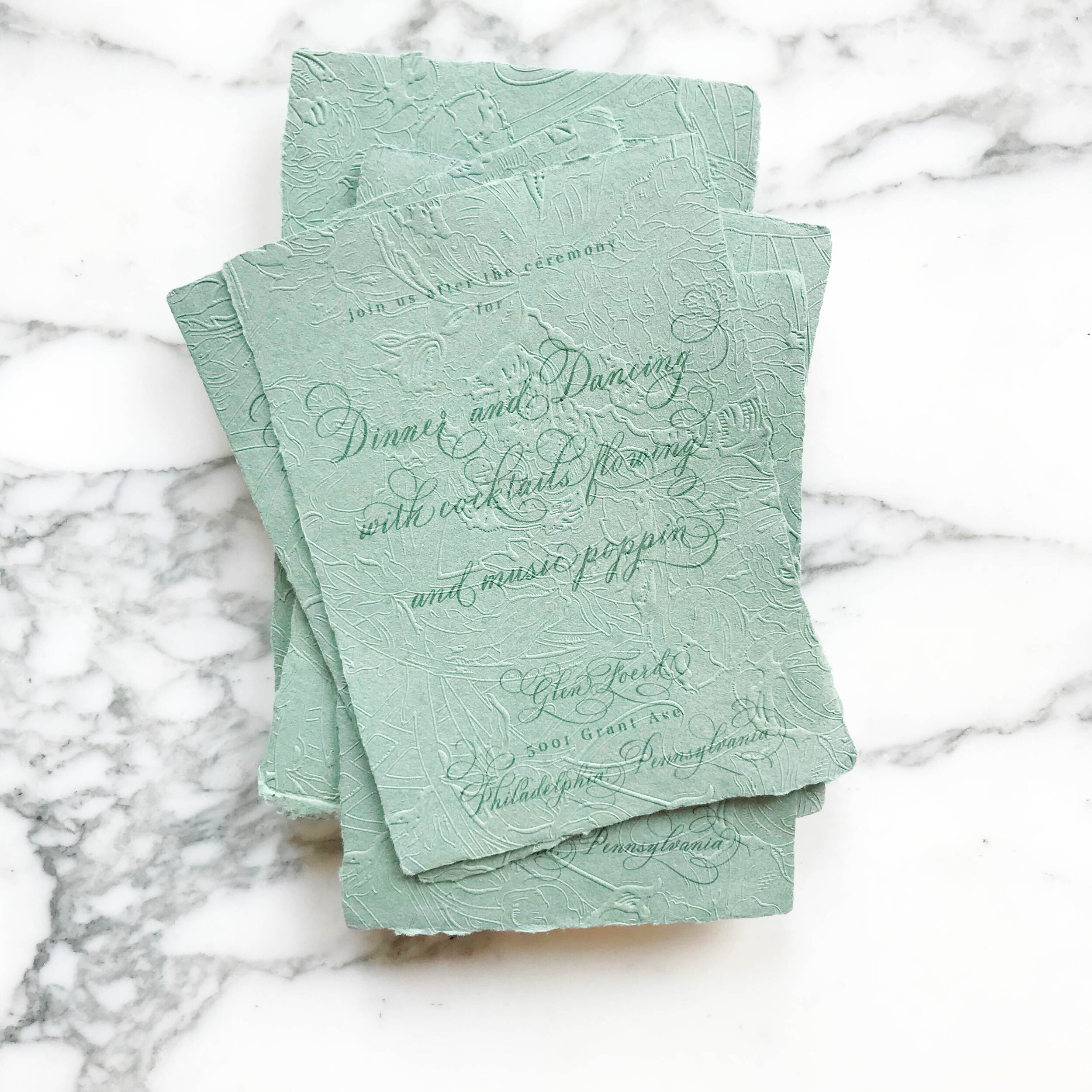
The most striking element of the design is the texture. Each piece was embossed with a glorious overall texture for a pillowy and tactile feel.
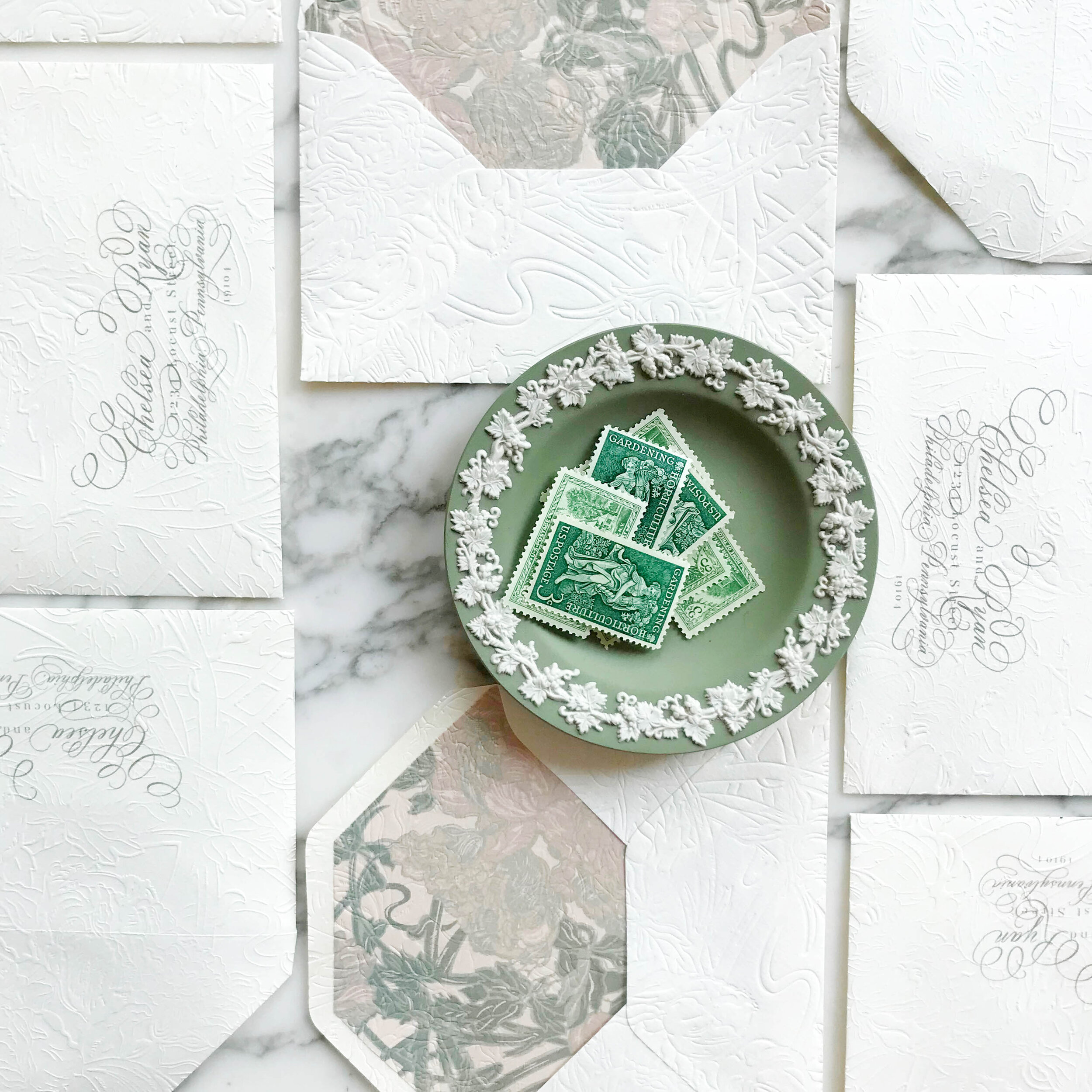
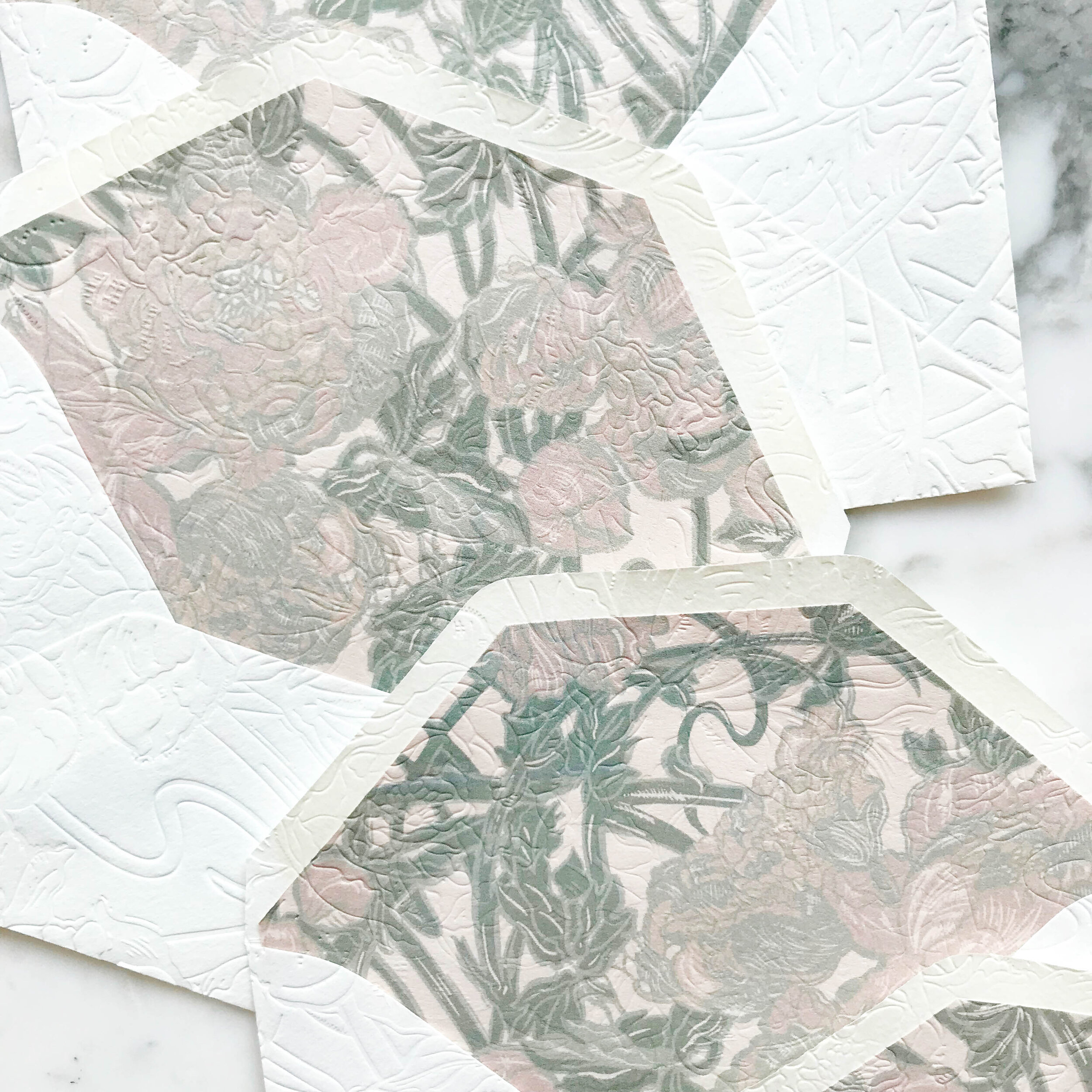
My personal favorite piece of the suite are the reply envelopes. We embossed the envelopes after they were lined, so the liners as well as the fronts and back of the envelopes all had a contiguous embossed pattern.
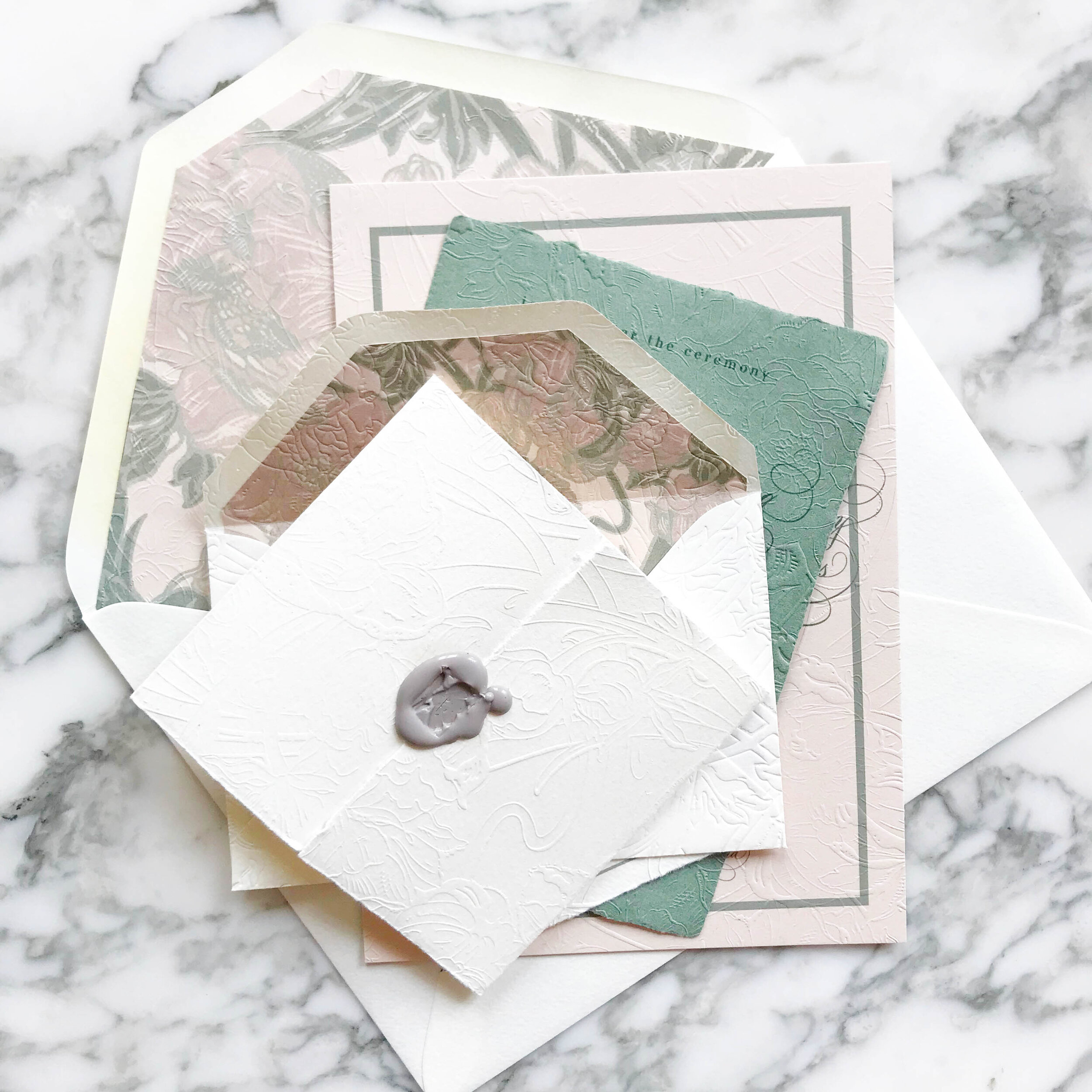
Like most of our projects, we combined several different paper types to come to our finished design. For this particular suite, we ended up with six different types of papers, including both machined and handmade.
The art nouveau design includes three handmade papers for the green reception card, reply card, and dress code tri-fold. The invitation consisted of two different machined papers, the first in a nude, then backed with a pale green. Our envelopes were both a gorgeous cream, and our envelopes liners were on the same rich nude as the invitations.
Our darling little tri-folded cards of handmade paper were sealed closed with a tiny wax seal in a taupe grey and embossed with the pattern showing on both sides.
Bespoke invitation ... hot air balloon baby shower
My little sister called me one day (on a side note, my sister is truly an incredible person)...her best friend was having a baby and she asked me to create the invitations for her baby shower and to design the shower itself. No pressure or anything. Working for a friend is difficult, working for family is even worse! The expectations are high; they're familiar with all your work and know what your levels of creativity and capability are. Thankfully, my sister knew when she said, "do something over the top and sparkly" that I totally had this.
I started with a few ideas (the background and artwork details to follow at some point). We knew we wanted something slightly whimsical, pastel, pink, sparkle and I knew I wanted to ship it in a box. I loved the idea of incorporating hot air balloons; the historic kind with laurels, fanciful rope work and pennants streaming off the baskets. I also knew I wanted to create something more that just the balloons themselves, something to give them depth and perspective. I drew out a city skyline in simple ink pen, keeping the city itself simple and used the combination of the city layered with the balloons.
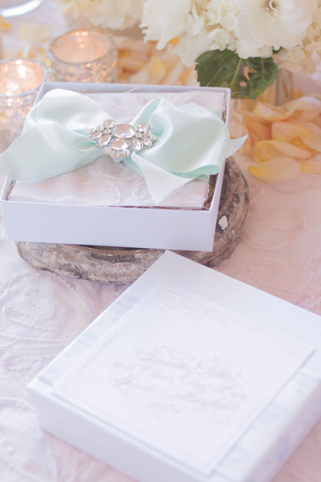
The names of the mommy-to-be and her new baby girl were done in calligraphy, appropriately with a good deal of flourishing. The entire suite was printed on crystal white shimmer paper. The second card bore their registry information, additional calligraphy, and hot air balloons. The entire suite was wrapped up in a pale pink fabric with a lovely floral applique on it. I then used a 3 inch pale mint satin ribbon to tie them up and topped the entire set with a large brooch. The entire suite was popped in a beautiful box in matching white shimmer, a matching address label with matching calligraphy wrapped around the box, keeping it closed through the post.
Bespoke Invitation...circus baby shower
...today we're going to chat a bit about the design process behind this darling little shower invitation.
I adore working with a bride and groom to create something for their wedding...dont get me wrong. Every couple is different and presents a slightly different aesthetic...however, its quite fun to be able to branch out and do something a bit different sometimes.
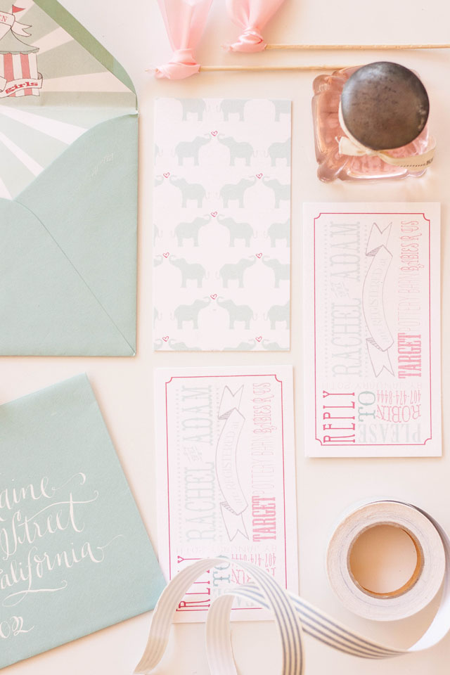
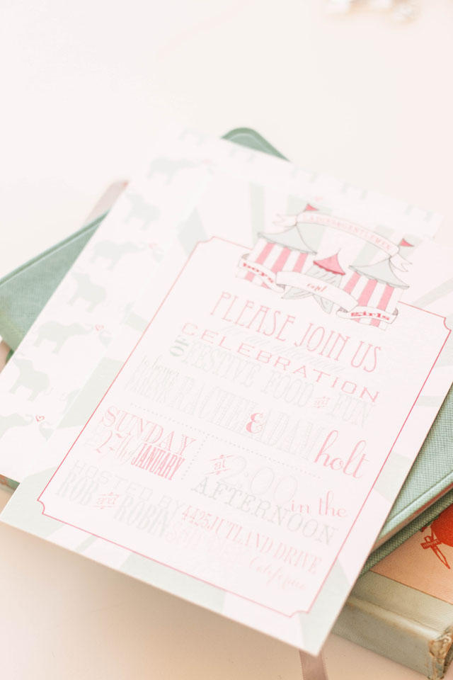
This lovely invitation was created for a circus themed baby shower. My client (Miss Robin) wanted to incorporate pool blue and shades of blush as well as a slight nod to the typical typography one would find on the vintage show posters.
The one draw back about shower invitations is that there are less pieces... we love more pieces...it gives us the ability of incorporating more elements, especially in the backers. For this project, I knew I wanted to create a pattern using elephants and hearts.
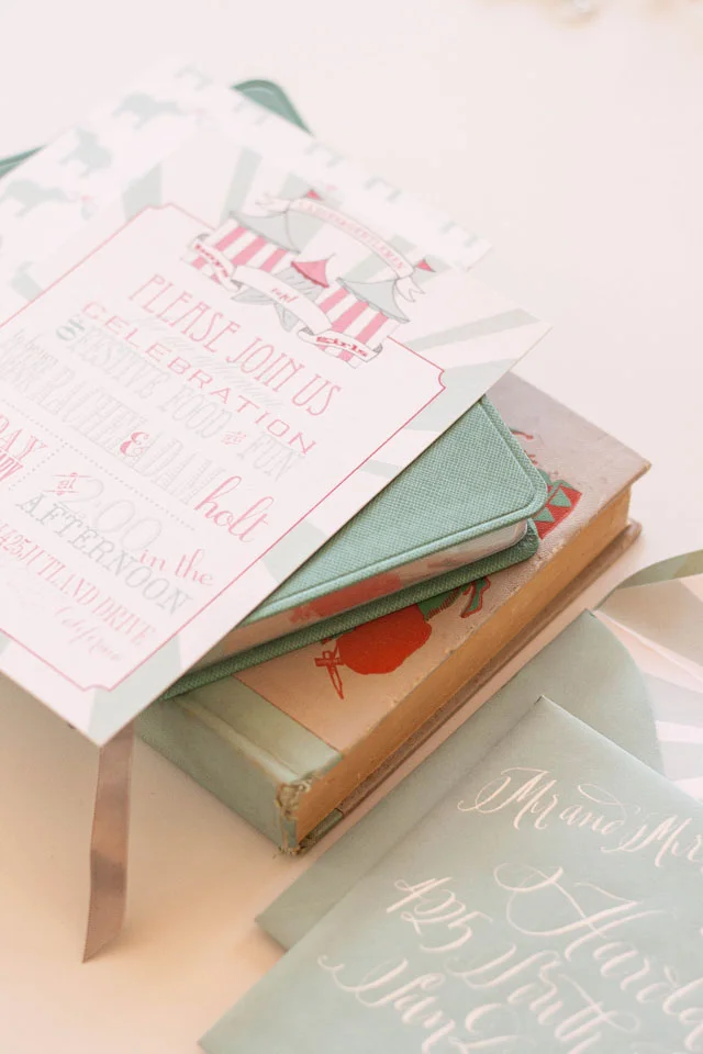
Lets chat about this tent for a moment...you simply cant have a circus themed anything without a tent. I hand drew the tent itself, and layered it with banners.
We kept with the typographical lettering for the insert card, which included the mommy-to-be's registry information as well reply directions for the guests. We backed it with the matching elephant and hearts backer.
...you know how much I just adore envelope liners... how could you not?? We incorporated the same tent as the invitations and repeated the color burst. All the envelopes were then addressed in white calligraphy using our Helena font.
this suite was created through our bespoke process.
real wedding ... Taylor & Justin
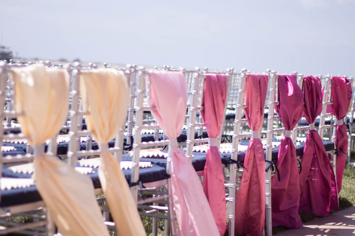
...a sneak peek of Justin and Taylor's wedding at the Scripps Forum in La Jolla...
