Coming Soon | sea breeze & sapphires
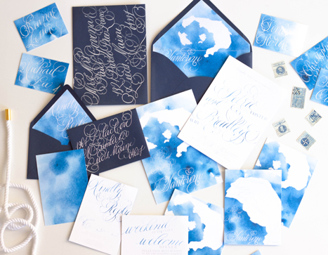
a lovely suite inspirited by the sea breeze and sapphires coming to the blog soon!
Bespoke | O'dessa
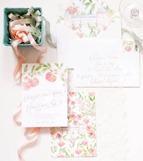
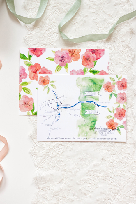
orchard | rose gold | mt hood | organic | bright | formal | apples | blossom
Featured | ruffled blog
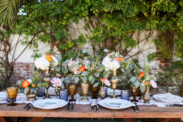
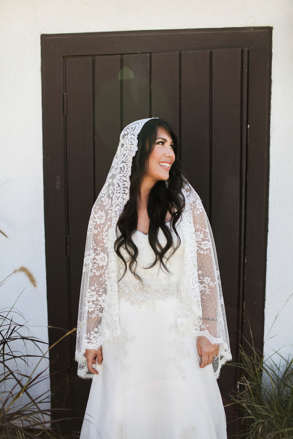
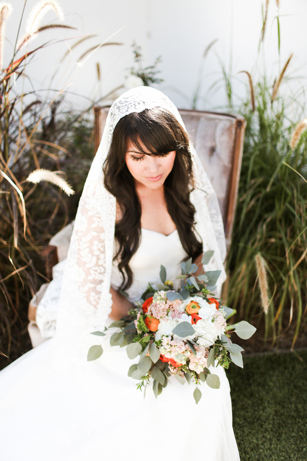
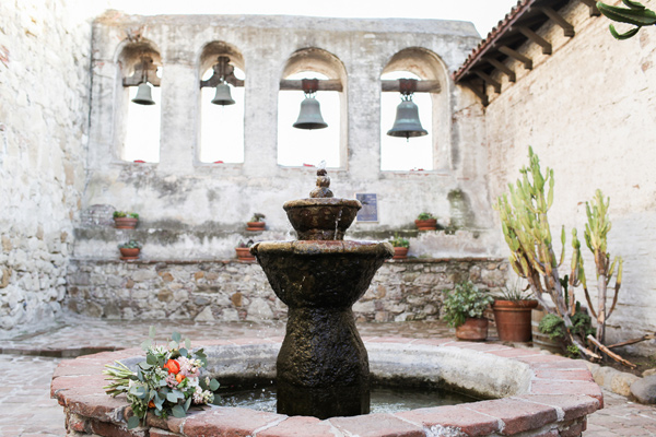
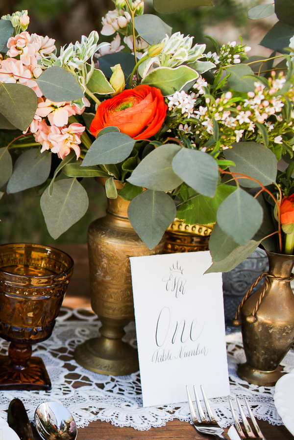
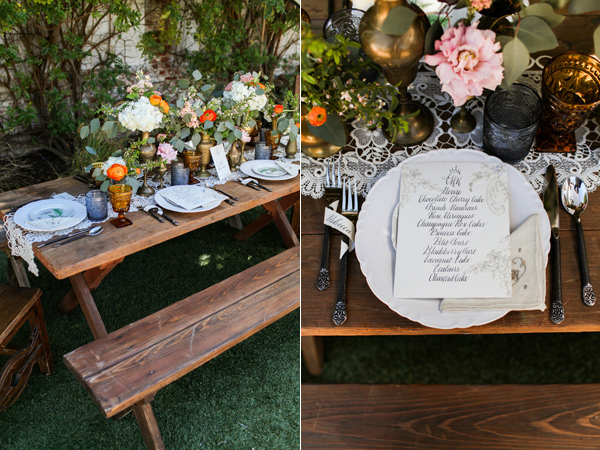
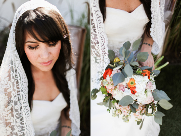
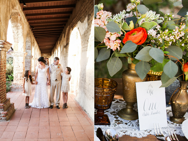
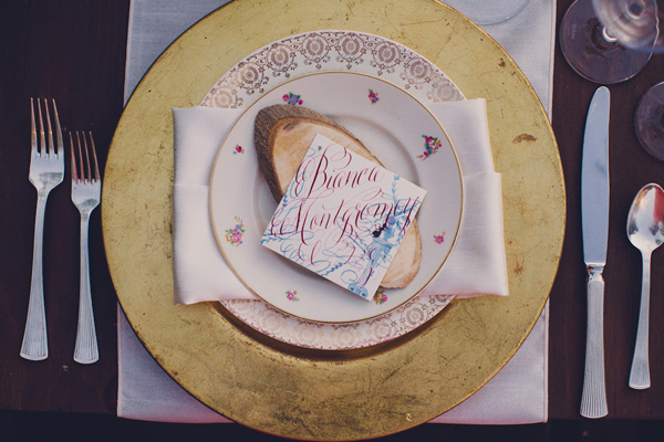
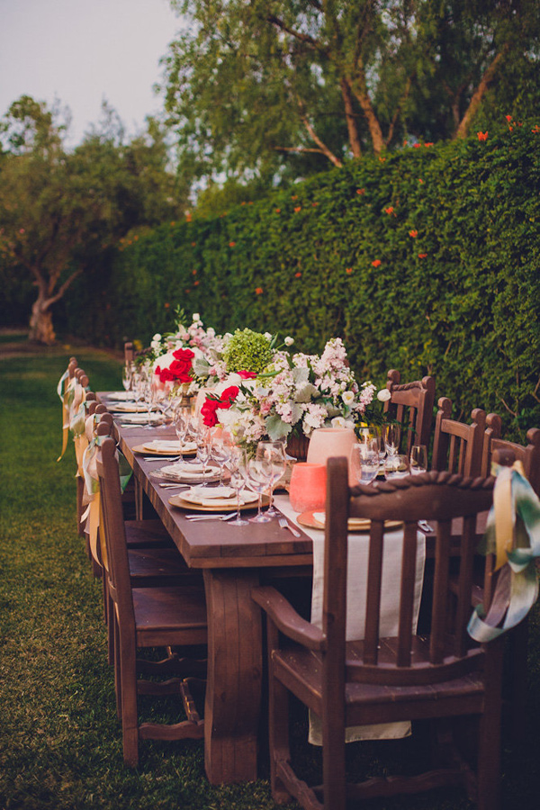
rustic | spanish | lace | velvet | fall | wine | calligraphy | elegant | formal
photographer: Chris Wojdak Photography
designer: Franchine Ribeau Events
calligraphy & invitations: Moira Design Studio
florals: Il Profumo Dei Fiori
Featured | style me pretty!
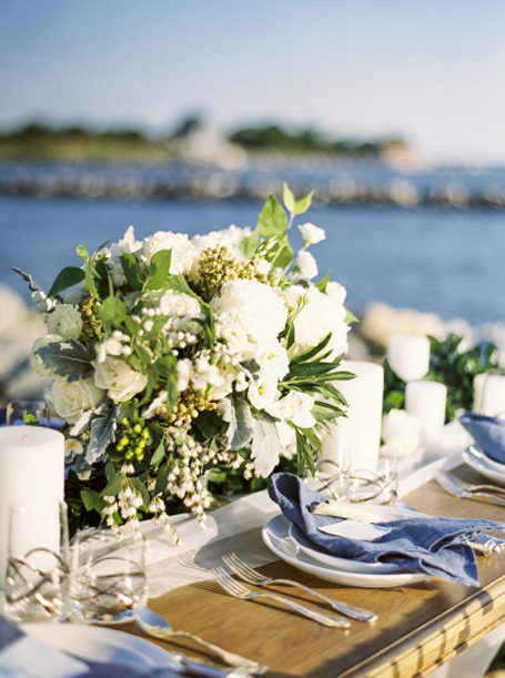
seaside | calligraphy | watercolor | sea breeze | antique stamps | silver flatware | rope | quote | white | pale blue | gauzy | airy | light
photography: Krista A Jones
design: Alex Meyer
stationary & calligraphy: Moira Design Studio
flowers: The Floral Studio
"...In you I wrap a thousand onward years."
Logo Design | Annie Parish Photography
calligraphy | hand written | simple | elegant | extended | hunter | monogram
Logo Design | Jessica Morrisy Photography
playful | floral | calligraphy | lettering | feminine | watercolor | sketch
Logo Design | Simone Lennon Events
calligraphy | branding | elegant | traditional | clean | simple | fair
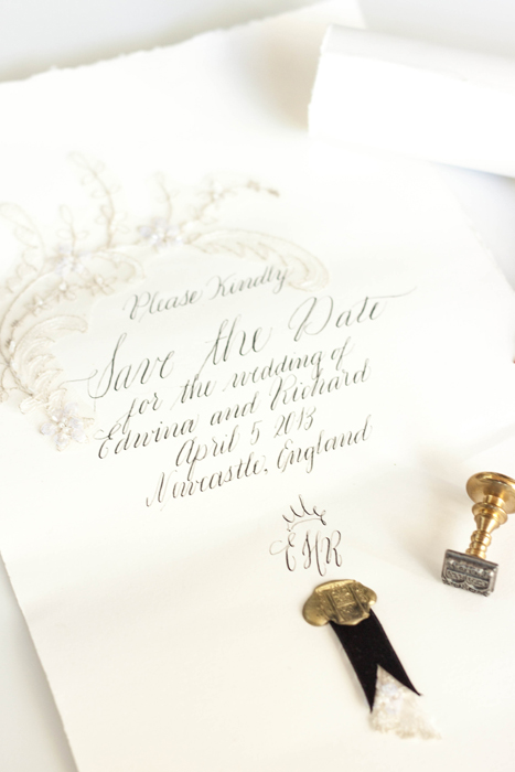
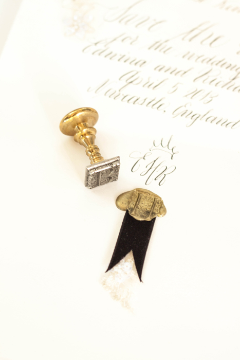
Bespoke | classic calligraphy suite
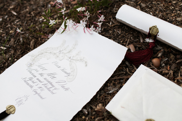
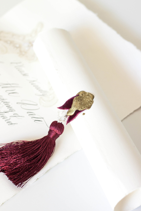
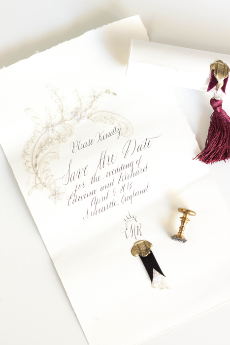
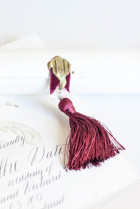
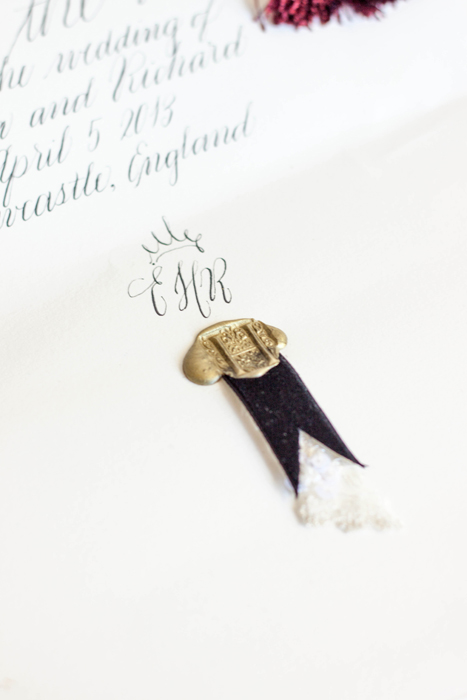
calligraphy | save the date | wax seal | tassel | elegant | antique lace | deckled edge | classic | traditional
workshop | west elm summer series
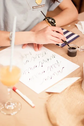
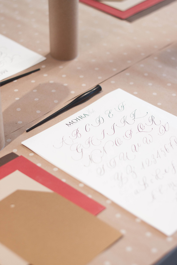
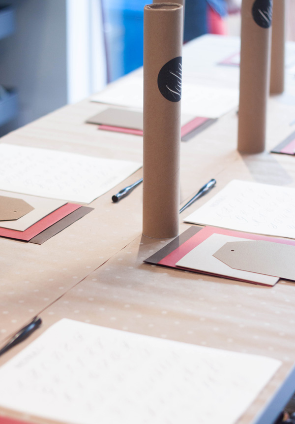
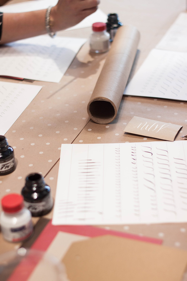
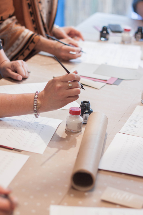
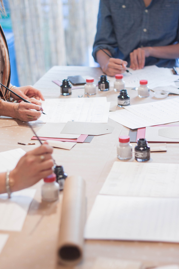
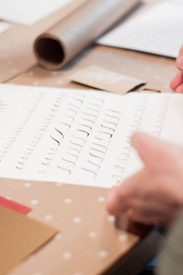
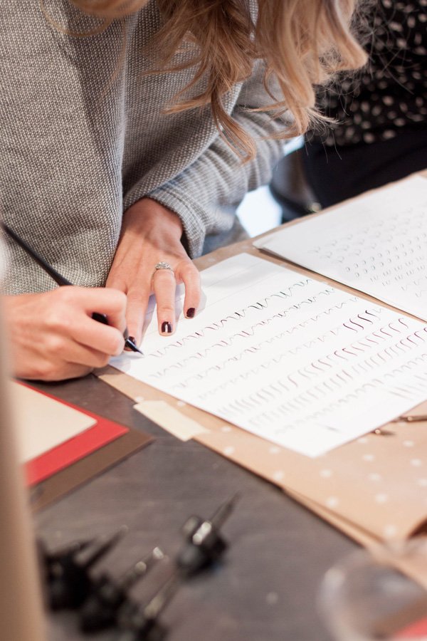
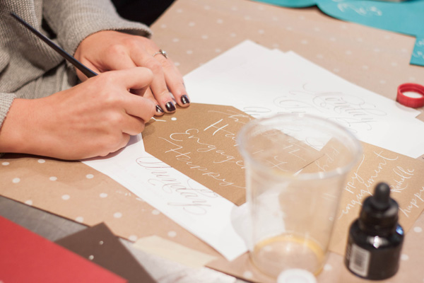
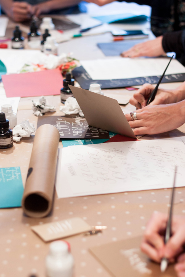
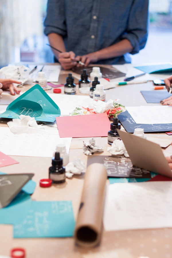
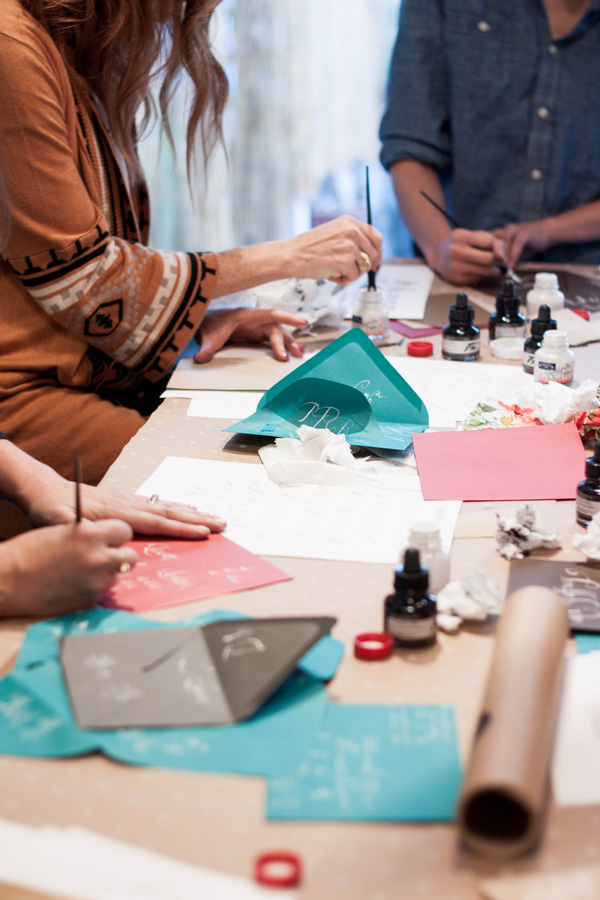
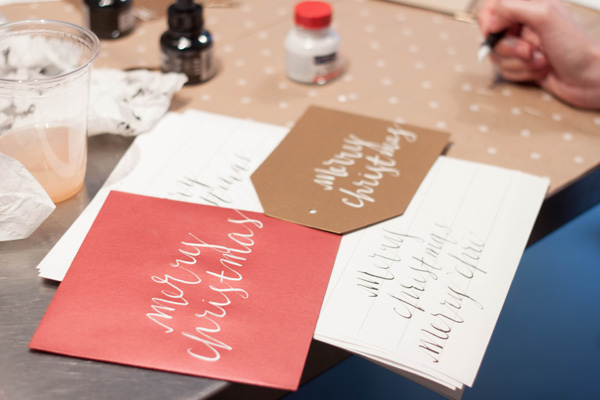
i am so thrilled to partner with west elm this summer for a series of workshops! for my first workshop, i did a quick fire calligraphy class. the workshops are designed to build on one another, so i'll actually be doing another calligraphy workshop in a few weeks so students can take one or both.
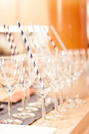
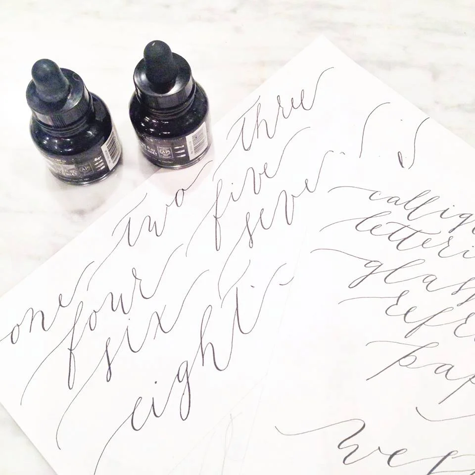
students were greeted with some tasty treats and guava jasmine tea prior to the class. for this particular style of workshop, i taught two specific fonts styles and a set of specific words that are applicable to the overall workshop series.
Instagram Weekly
This week on Instagram...this is such a gorgeous suite that I have the pleasure of creating. It included a watercolor pattern of gorgeous blown open roses and buds and it was mixed with a pale watercolor stripe. The suite itself was all hand lettered on deckled edge paper, tied up with thread and assembled with a wax monogram seal. More to come!
Featured...Style Me Pretty Living!
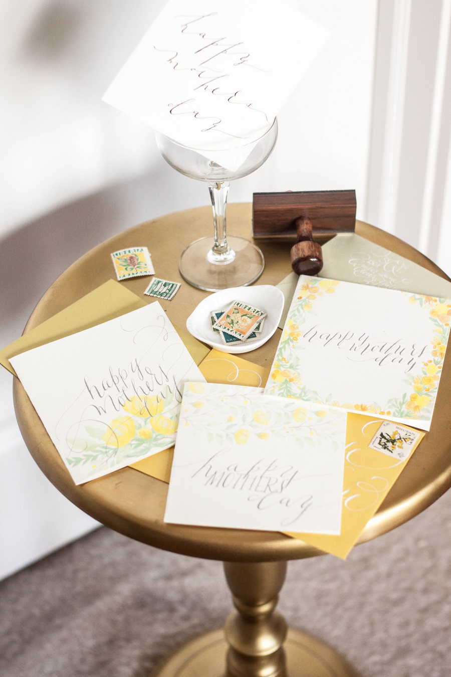
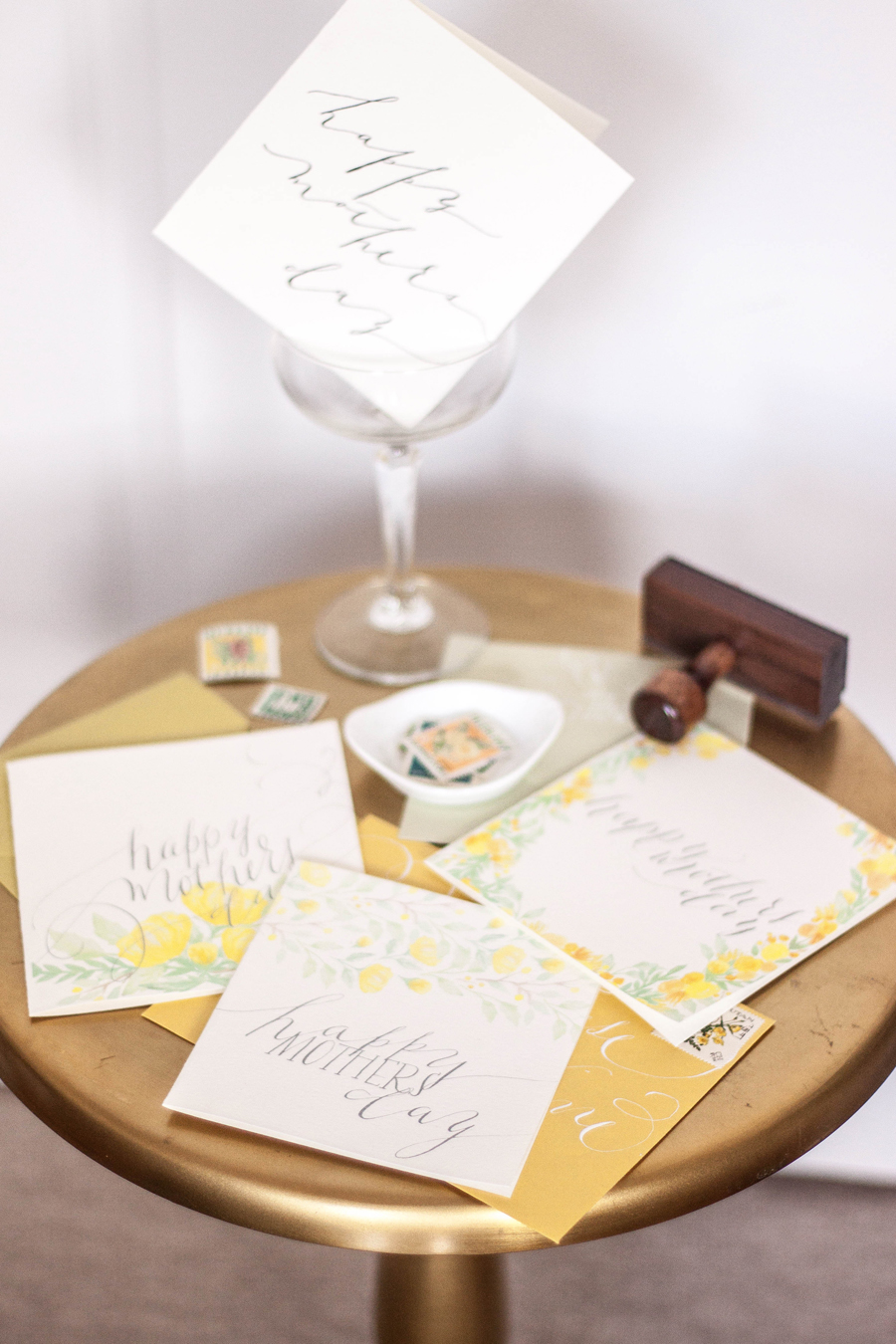
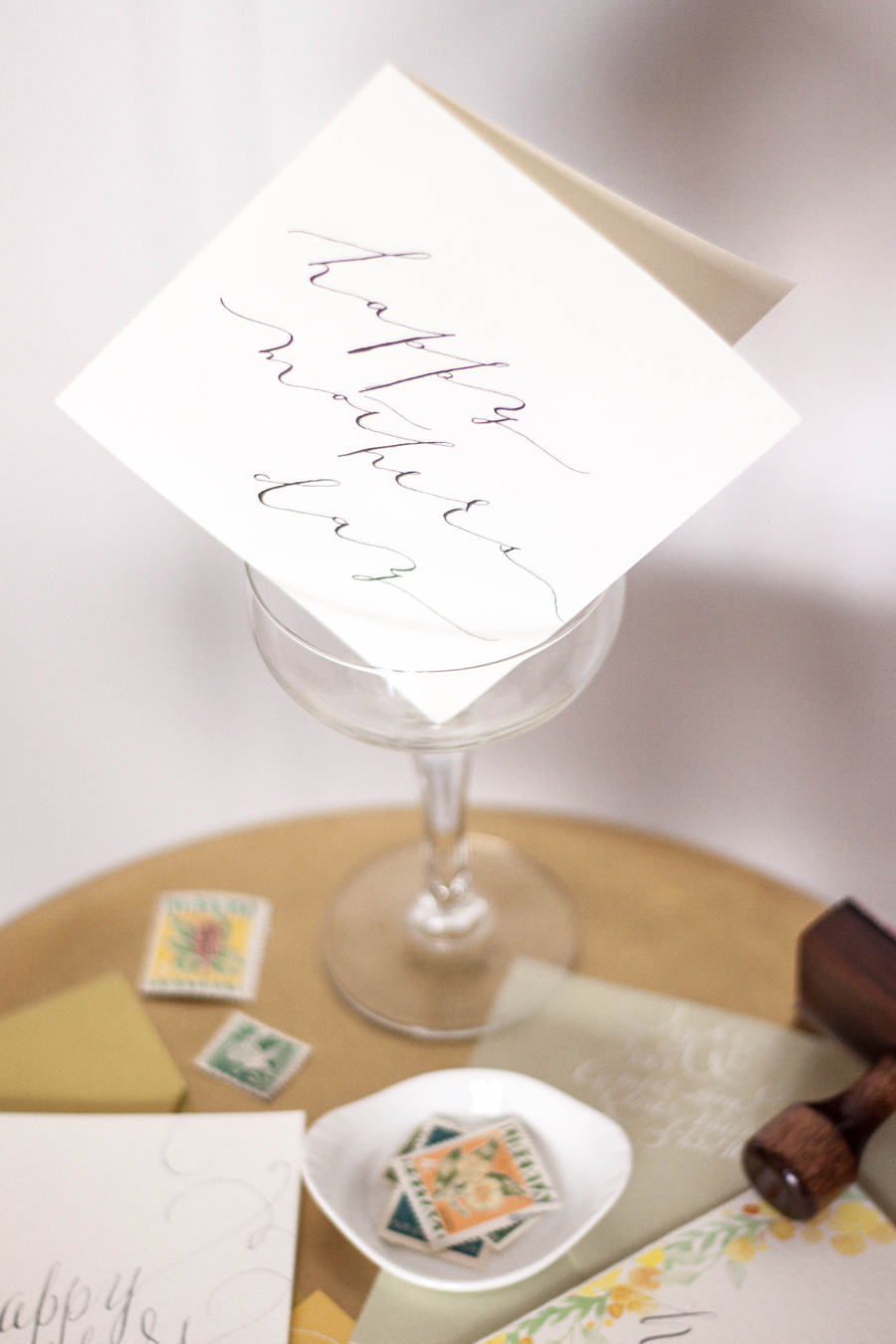
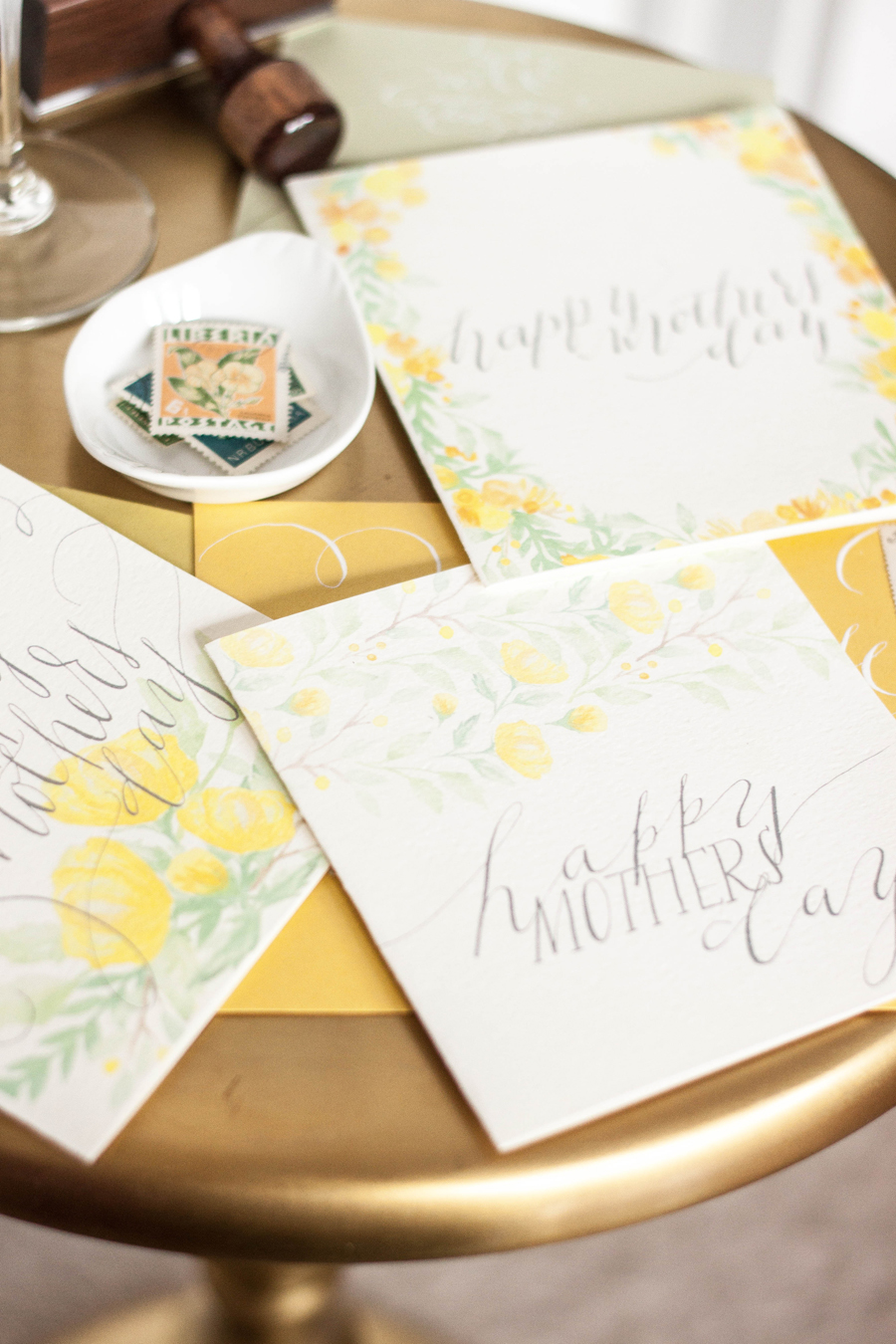
I've begun offering some sort of little holiday goodie in the form of a free downloadable and printable pieces, and our Mother's Day printables are featured on Style Me Pretty Living today! You can check out the entire post here.
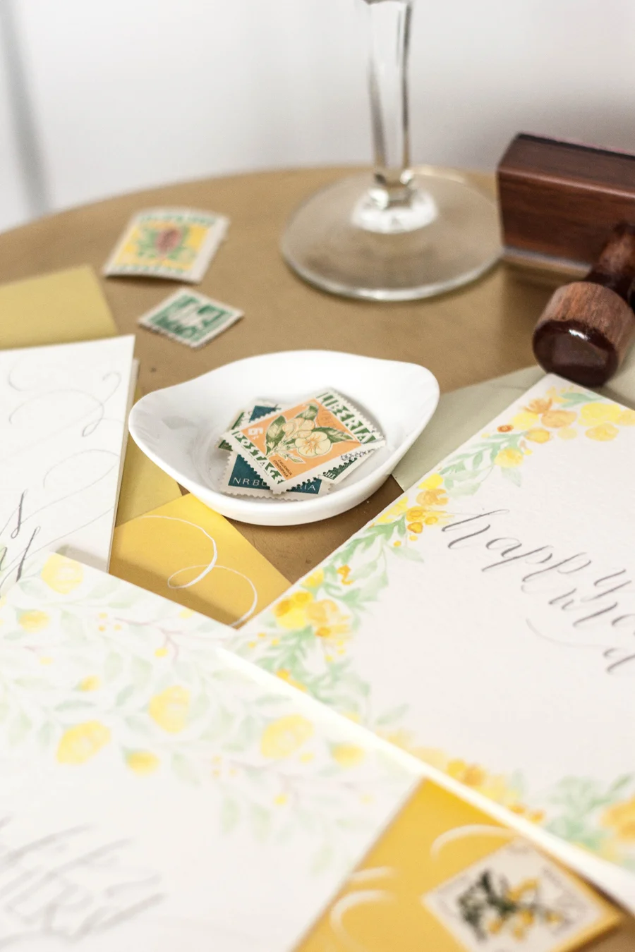
The collection of designs feature calligraphy and hand lettering, as well as springy yellow floral pieces. You can download the designs through the Studio Shoppe here! I did feature one design that was lettering only as well, in case anyone wants to keep it simple. For the Style Me Pretty feature, the designs were paired with envelopes from Paper Source in their colors Curry, Leaf and Chartreuse. I also paired the pieces with some vintage stamps from my own collection for a little added detail (little known fact, did you know that I have an extensive stamp collection?). Enjoy!
Instagram weekly
This week on instagram Im playing around a bit with a new font style that I've been working on and developing over the past few months...it still is nameless, but Im really liking it. It is long and sloopy with extending tails on either end. I'll be doing some workups on the most recently added calligraphy fonts for my sample packs and will post some more pictures of this style in action soon.
...in process - behind the scenes
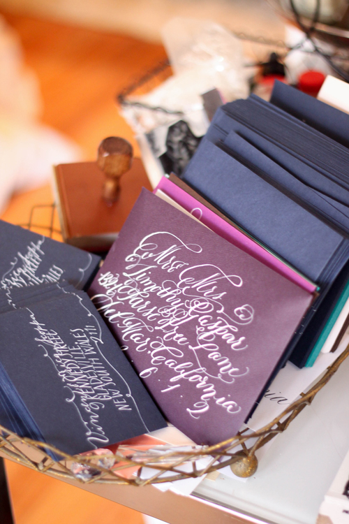
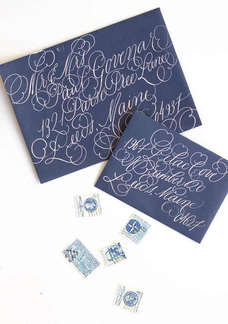
There are always lots of projects going on around the studios. At the moment, the Philadelphia studio is working with Bespoke Letterpress in Australia on some envelopes in white ink on navy, and we're just starting a project with white ink on aubergine. I know I'm not alone in finding calligraphy beautiful, but sometimes I just love observing the simple beauty of works in progress...
Bespoke...Santorini Destination Wedding Invitations
When approached to create a suite for a destination wedding in Santorini, I jumped at the opportunity!
This suite differs from our typical work a tad...when building the ideas and design elements that this suite would be created around, I toyed with the idea of creating an illustration that embodied the classic Santorini buildings. We also wanted to incorporate the distinctive blues of both the classic Santorini rooftops as well as the surrounding piercing blue ocean. In the end, we nixed the building idea and decided to keep it a bit more simple and focus on the blues and the movement of the ocean.
I used a watercolor wash as a base in a vibrant cerulean blue, letting the wash be uneven in saturation. I then illustrated a map of the island itself and used that as an overlay for both the backers as well as envelope liner. I used a fairly flourished calligraphy style to balance out the simplicity of the suite.
Featured...Ruffled Blog
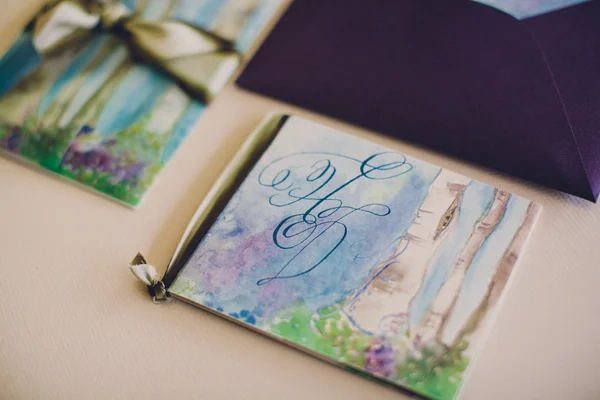
We had such a wonderful time collaborating with Absolutely Events on this suite inspirited by Shakespeare’s A Midsummer Night’s Dream. We've walked you through the process we went though in creating the suite, now you get to see it in action!
Design: Absolutely Events
Florals: Rae Florae
Photography: Jackie Wonders
Featured...Ceremony Magazine 2014
We did some lovely calligraphy work in our Rilla style for a shoot for Ceremony Magazine. We always just adore white ink on blue paper! Florals by Adrianne Smith Floral and Photography by Jennifer Dery.
Studio Shoppe - all you need is less print
"all you need is less" print, hand scribed in a simple calligraphy font by our lovely Miss Jenny, makes a wonderful addition to any gallery wall!
...in process - behind the scenes
Part of our process is amassing several bespoke invitation suites, all their artwork and sketches, and shooting them all at once for the website, the blog, and any submissions pieces. This process involves paper, calligraphy, envelopes, liners, cameras, many hands (making for lighter work), step ladders, and coffee. Around here, we drink almond milk lattes.
Calligraphy Workshop San Francisco
We had such a lovely and amazing time teaching our first San Francisco calligraphy workshop! We had the beautiful Natalie from Natalie Bowen Design host us at her darling new studio in SOMA. Her studio has several workable rooms and a large patio out back. The entire studio is bathed in gorgeous natural light with an amazing collection of curated vases and florist tools...plus the MOST amazing wallpaper in her powder room!
For this particular workshop, we taught a specific font style. The kits included a white ink, black ink, pen holder, and 4 nibs. We also included a full lettering exemplar of the letter with several phrases and words done in the font as examples. We topped the whole thing off with some envelope and paper products from our favorite Paper Source.
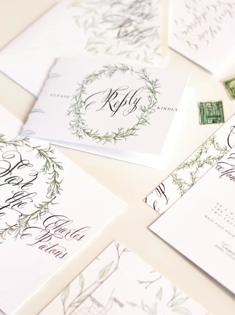
Bespoke Invitation ... sage & rosemary
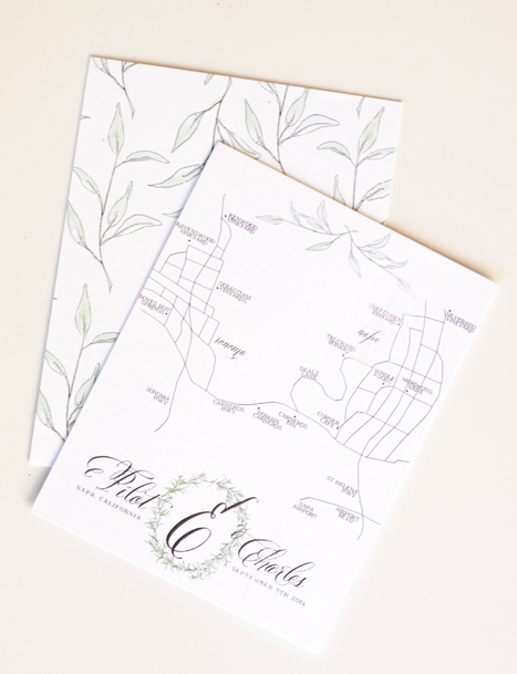
I loved working on this suite...hand drawn rosemary and sage, with touches of gold. The suite was designed around the wedding's venue, hosted at the Carneros Inn in Napa, California. We wanted to incorporate the feeling of the countryside and farm-to-table without leaning too far into the "winery" look and feel of things.
I always choose a group of descriptors for a design, whether its a wedding, invitation, or a home. For this suite, we choose: organic, rustic, elegant, easy, airy, herbal, farm to table, calligraphic,
I created a laurel from sketched and painted rosemary to incorporate through several pieces in the suite as well as their monogram. We then used it on the invitation, backer, velum wrap, save the date, front of the reply card, table numbers and the monogram on their hand drawn map. The other darling little design element of this suite that I really loved was the idea of taping herbs to a page and jotting their names on the tape...I really haven't any clue where the idea came from, I just thought it was a creative way of using the pieces. The "taped herbs" were used as backers for several of the pieces and also along the bottom of the reception card.
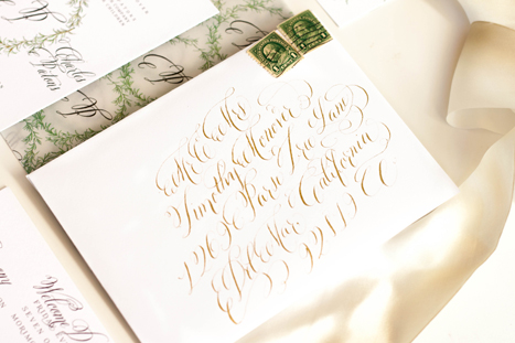
after the suite was printed, we had each piece run with gold foil to add little bits of gold sparkle into the watercolor elements. We decided against doing gold for the letter as we liked the look of the heavy black contrast. Naturally, all the envelopes were addressed in gold calligraphy ink.


