Formal Calligraphy
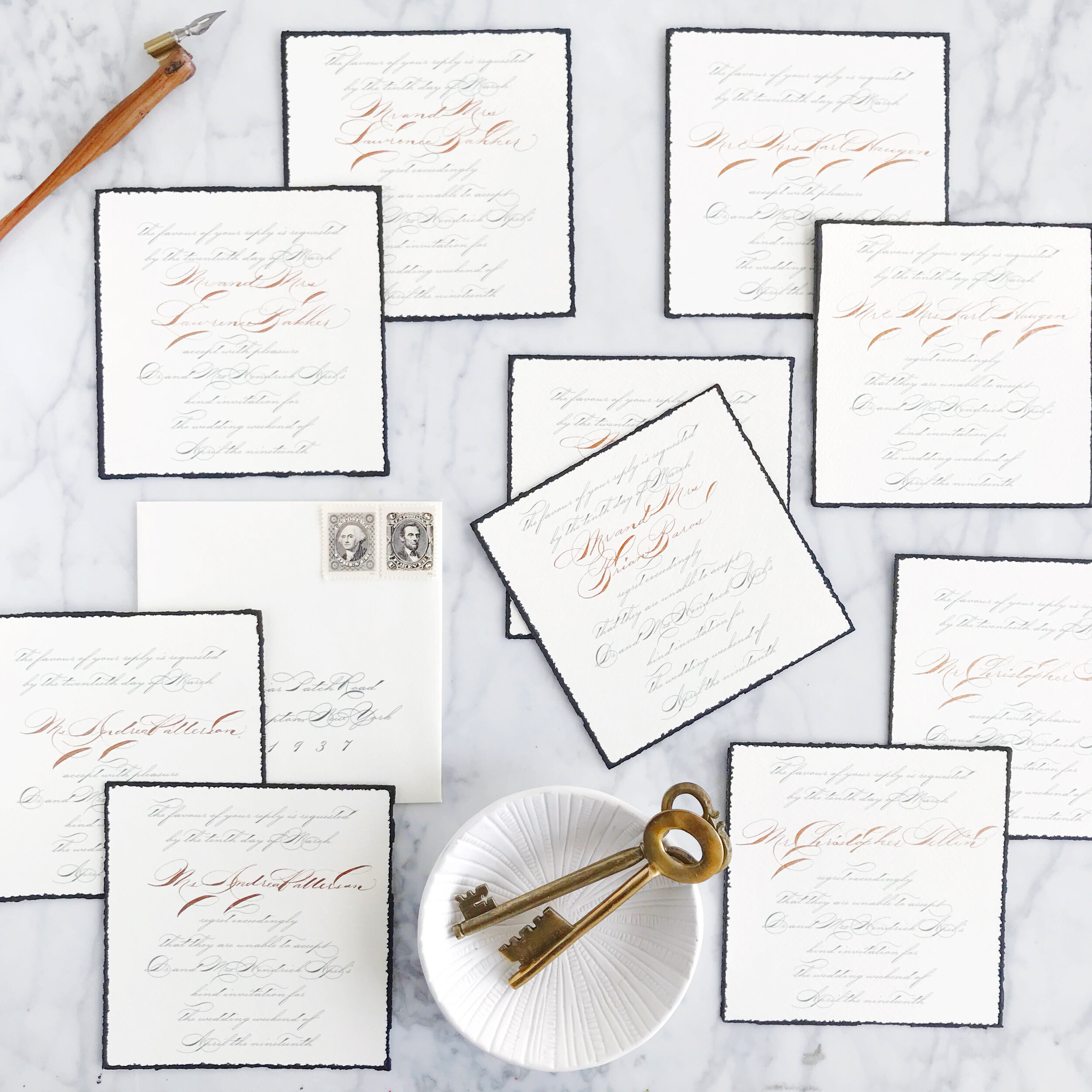
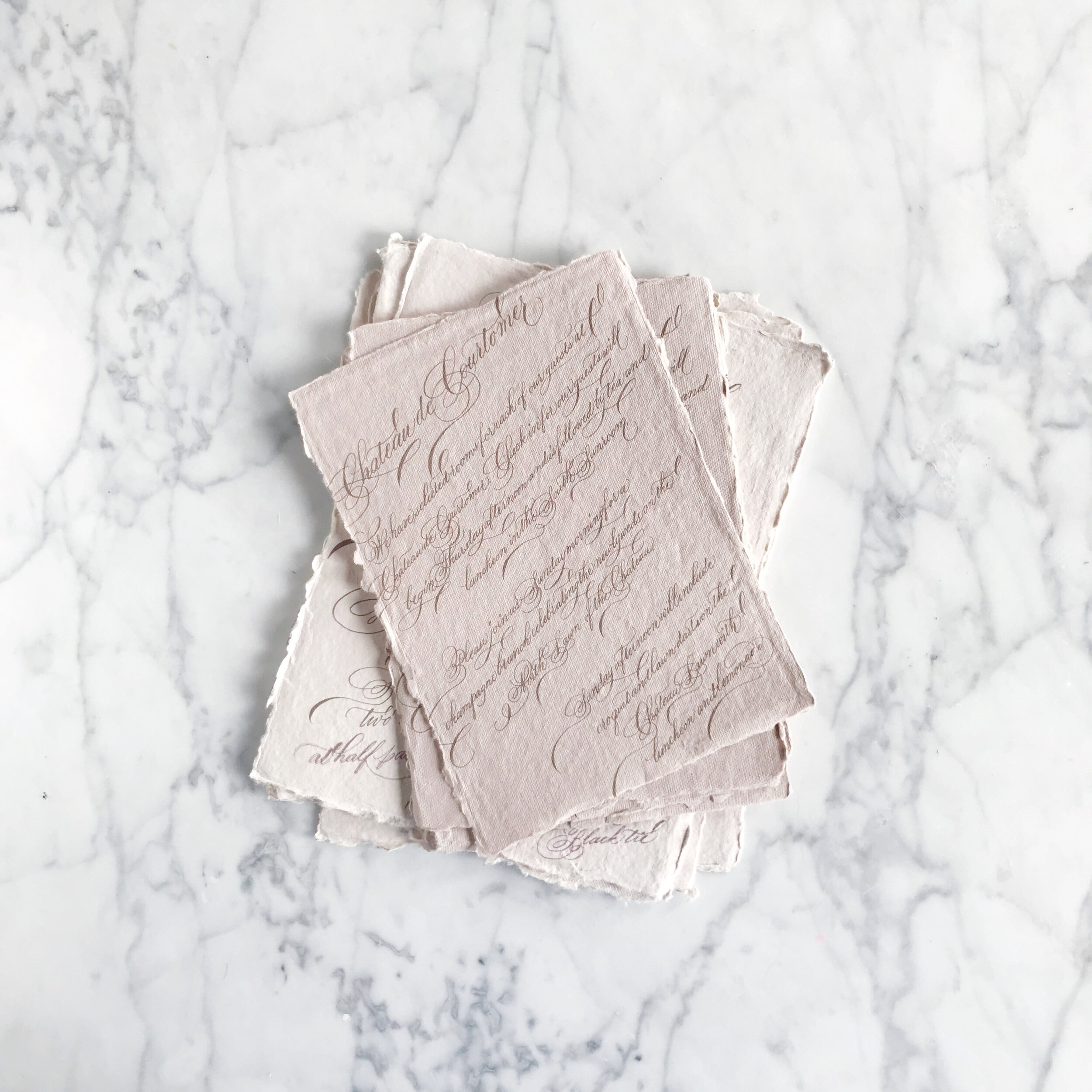
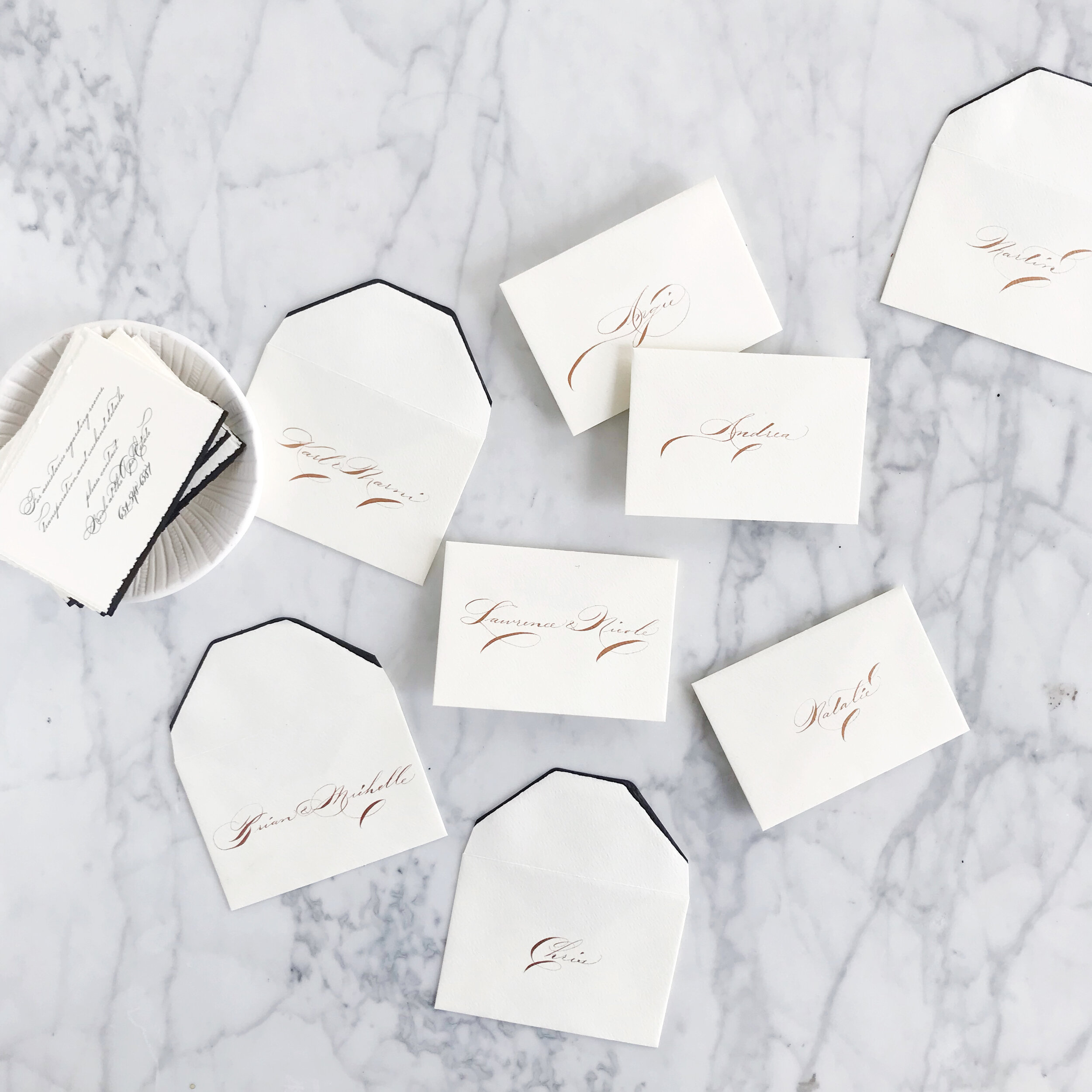
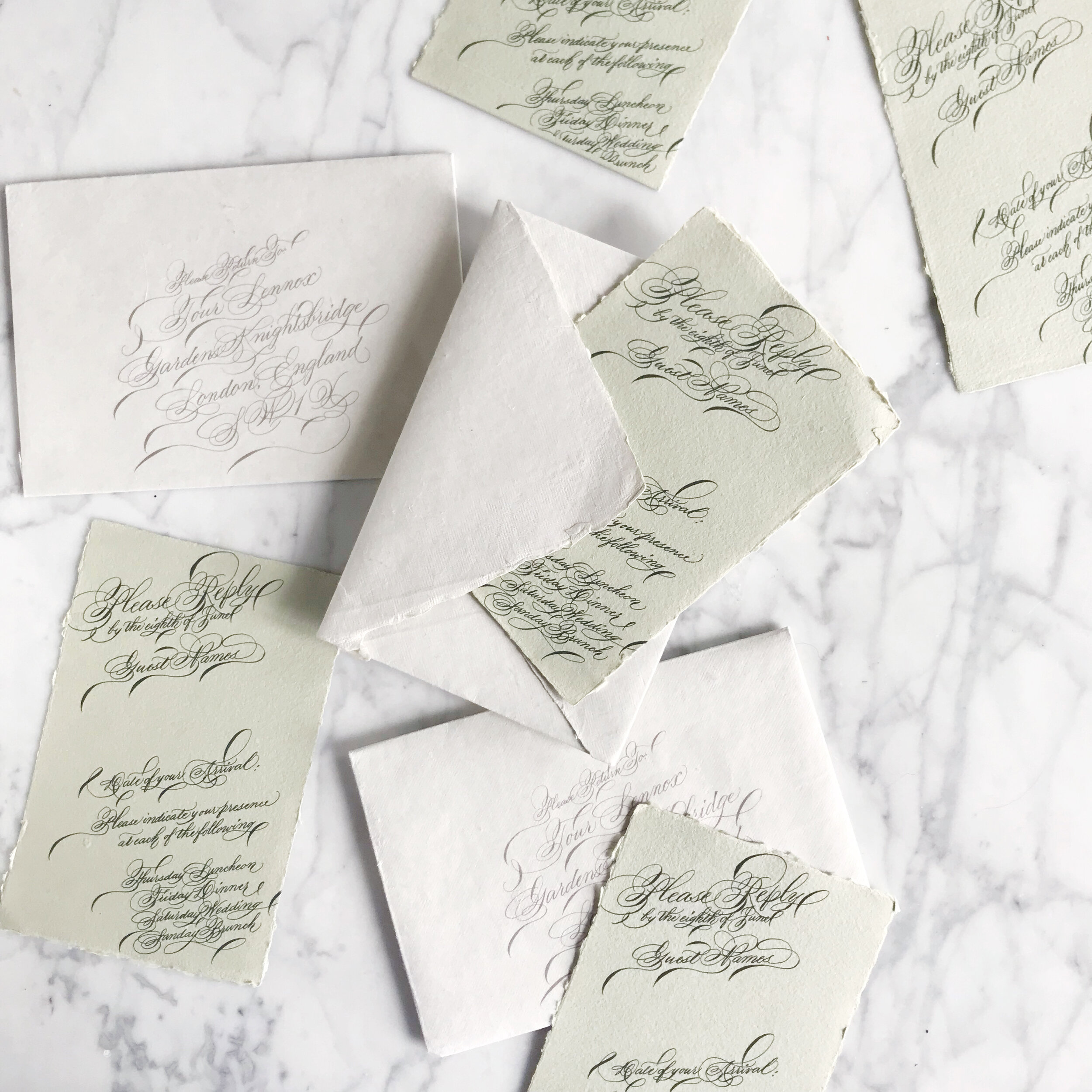
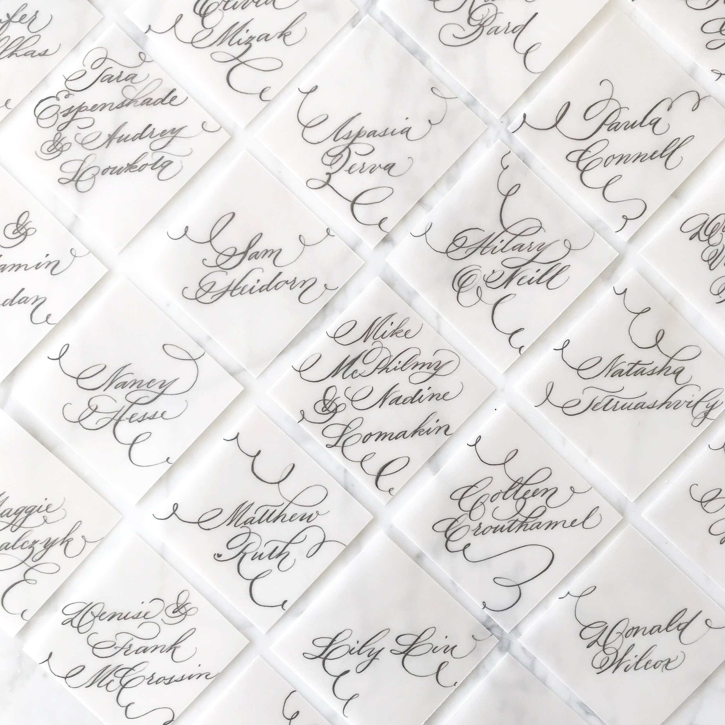
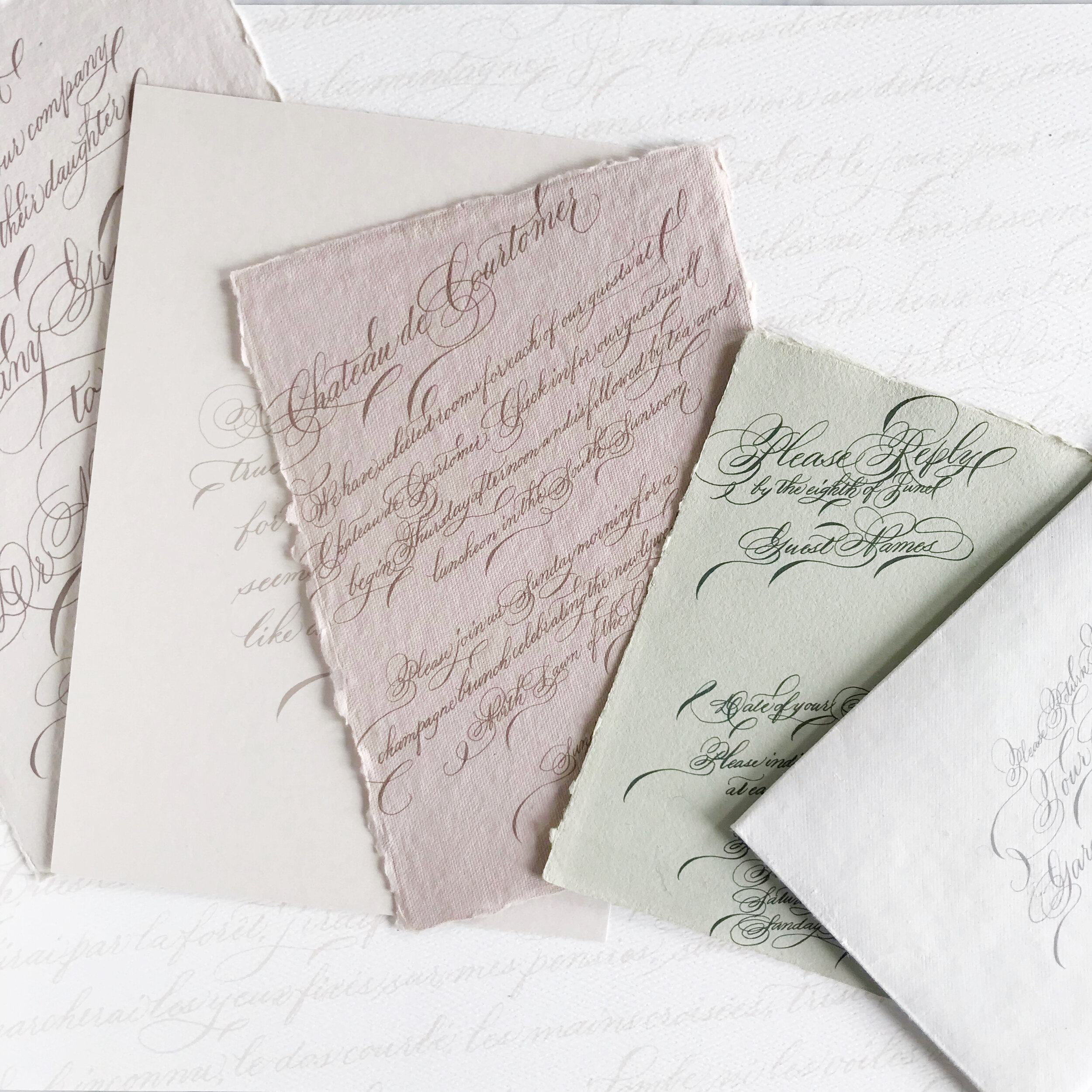
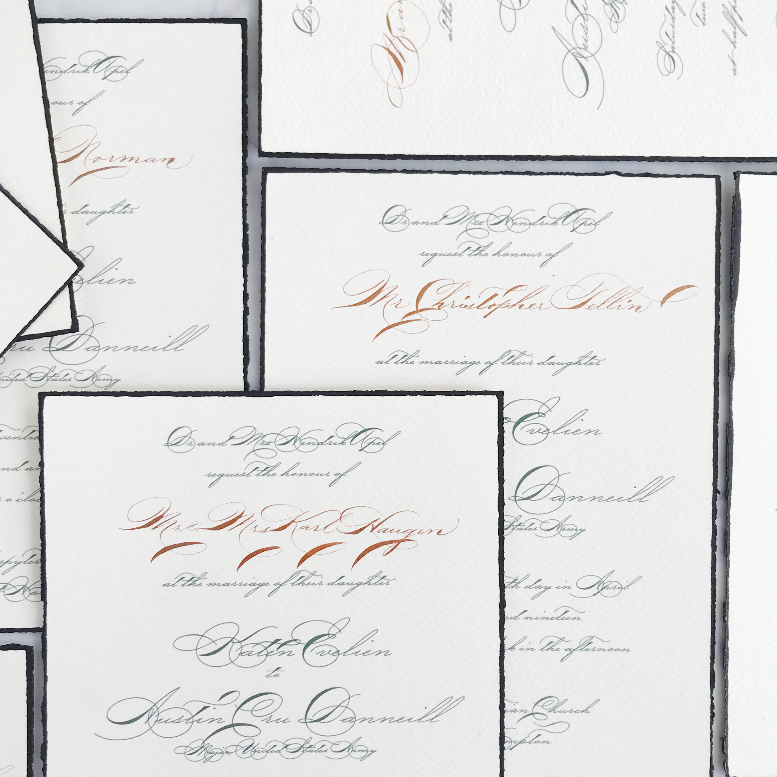
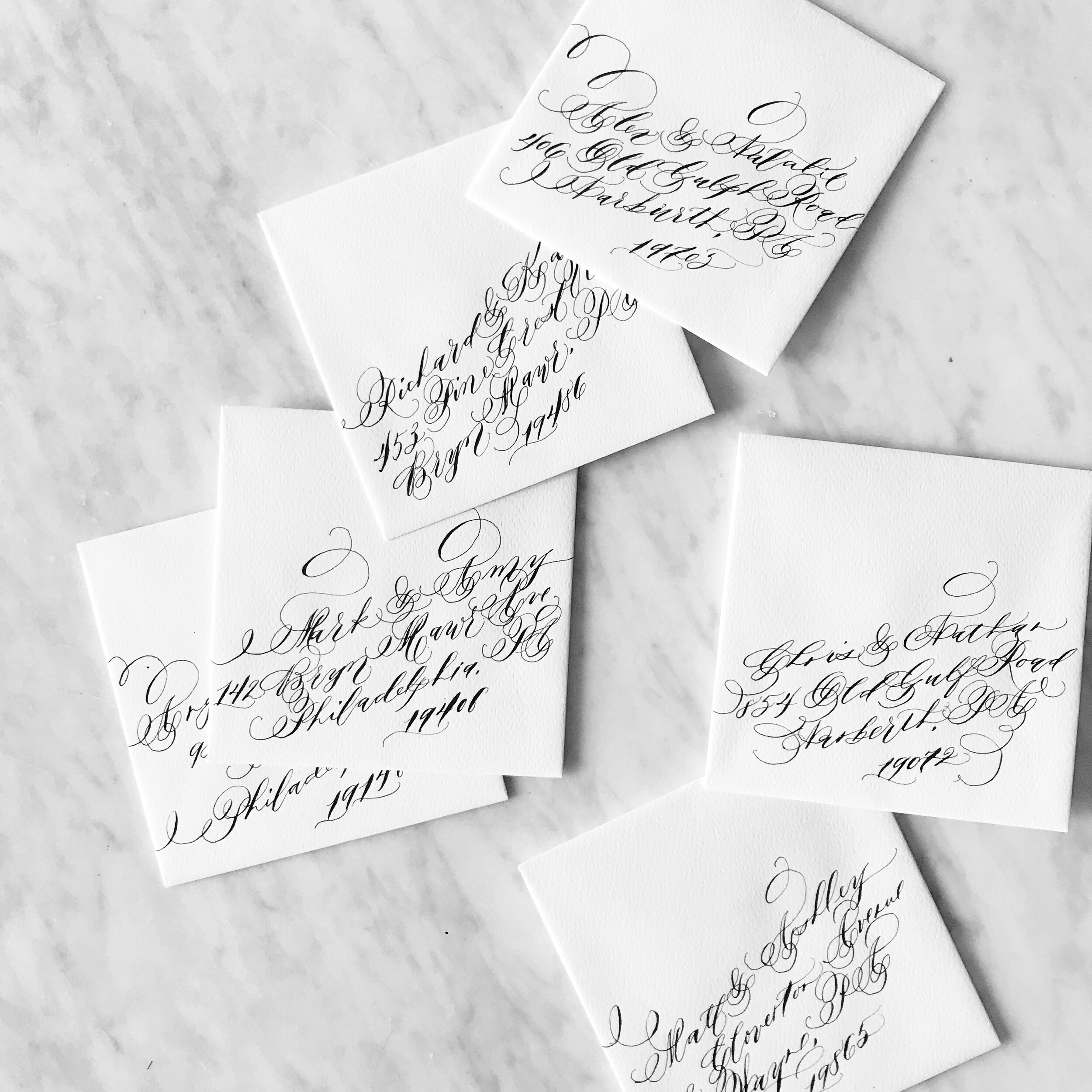
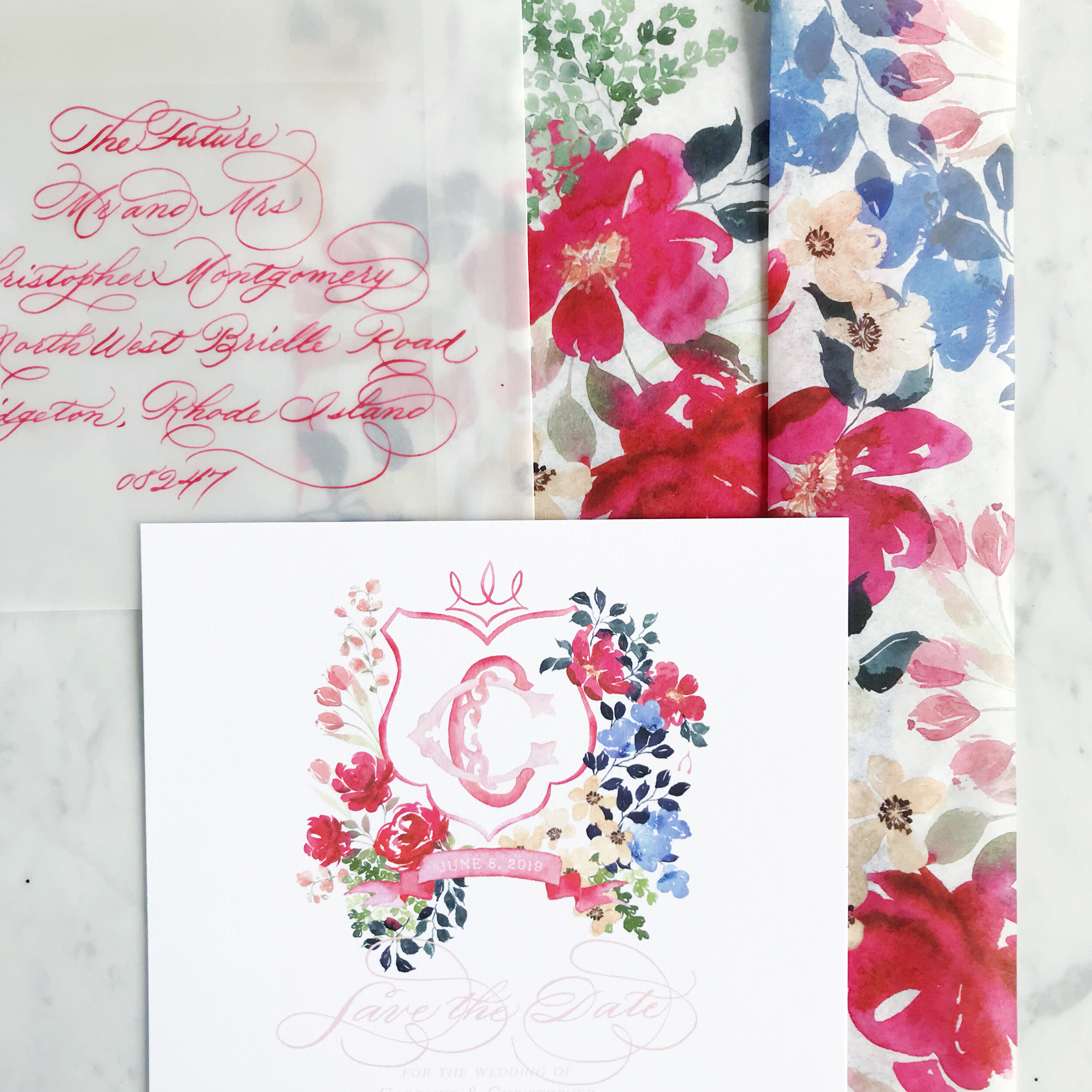
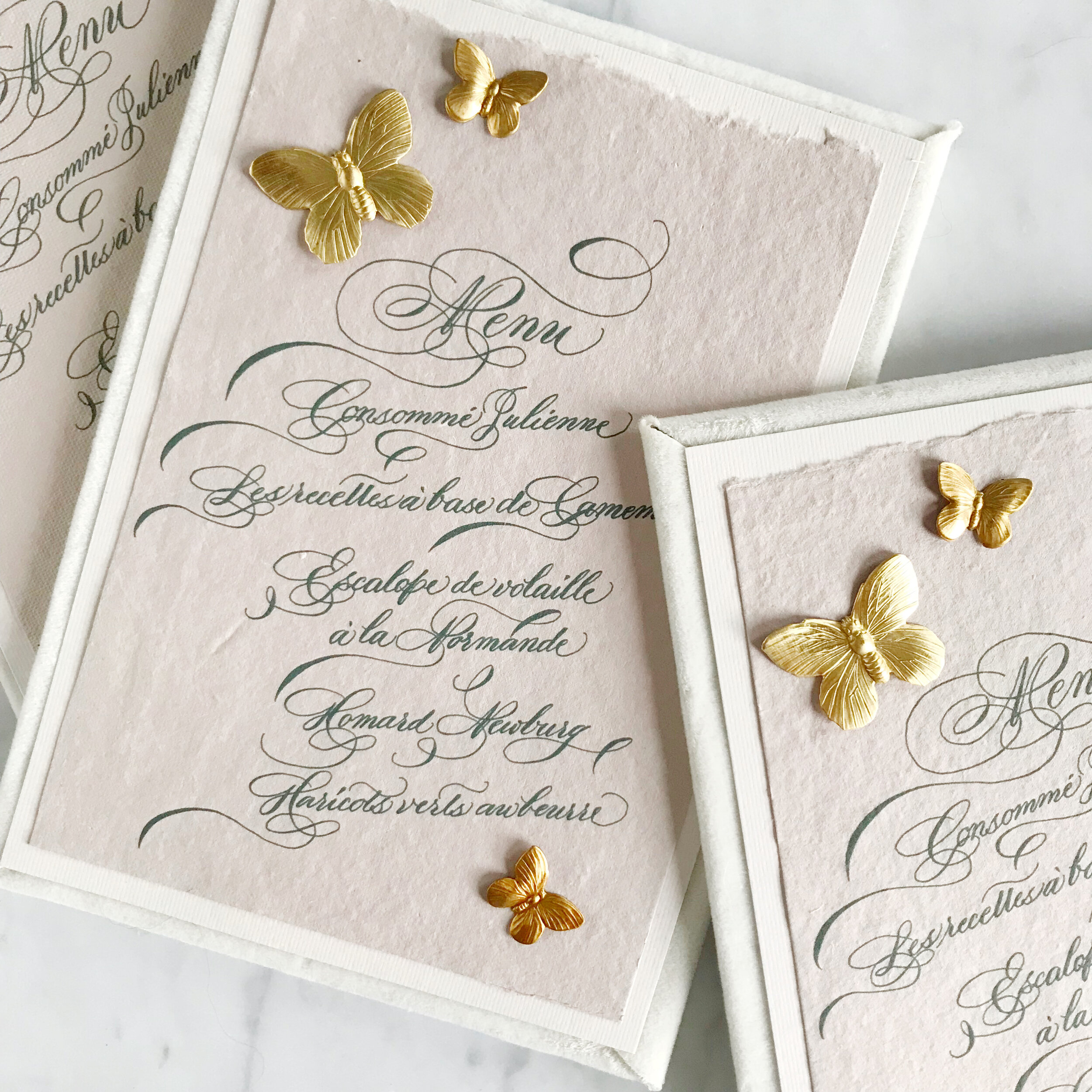
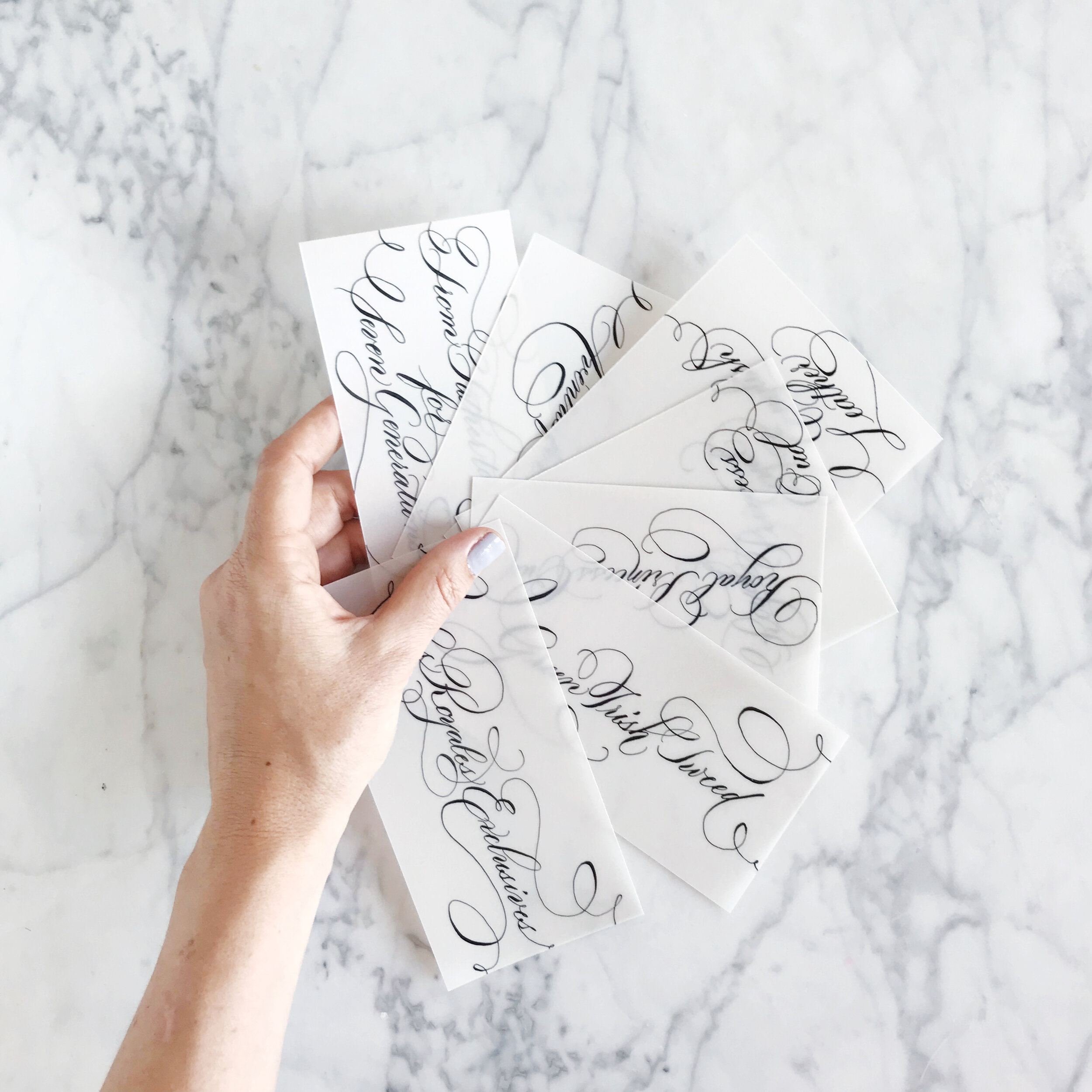
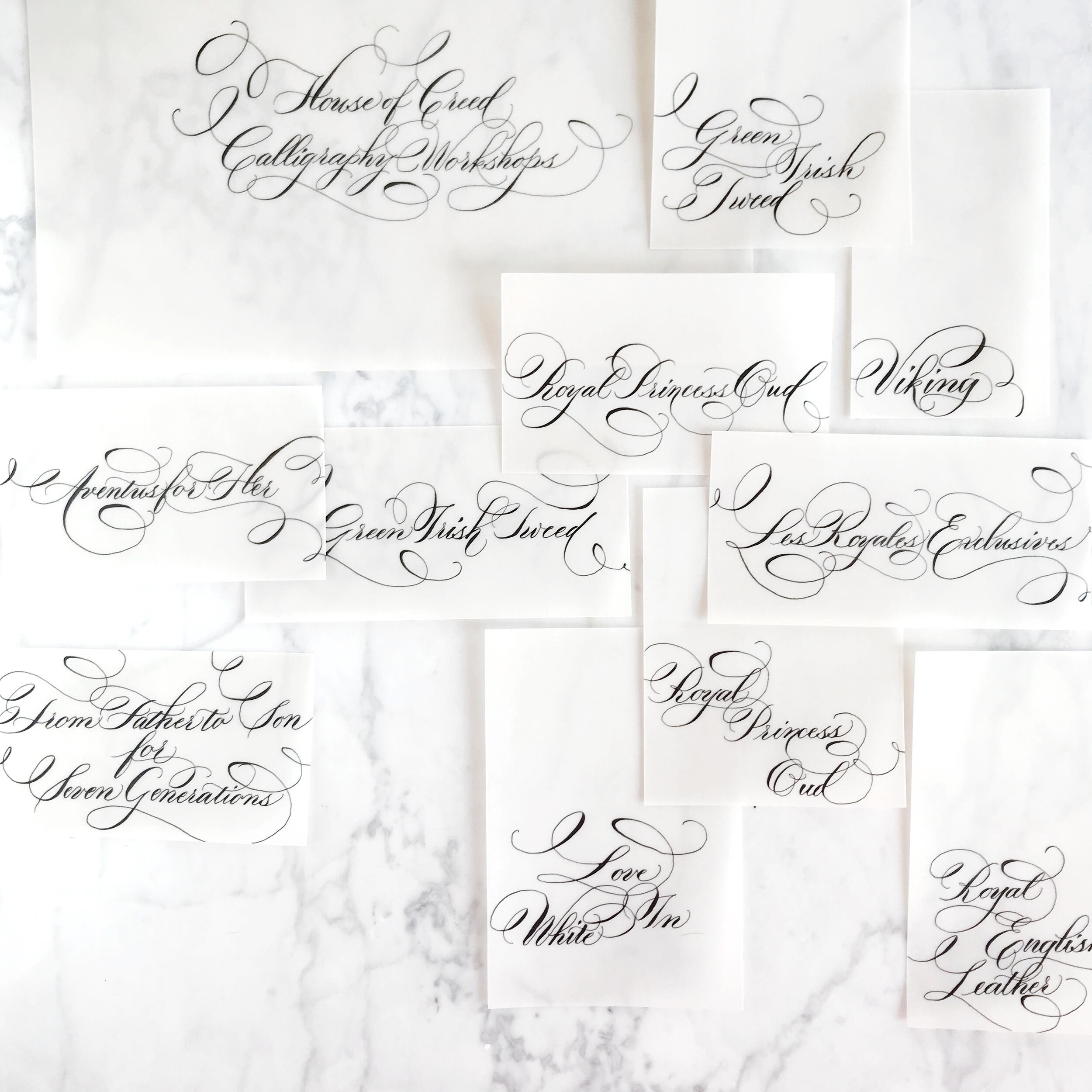
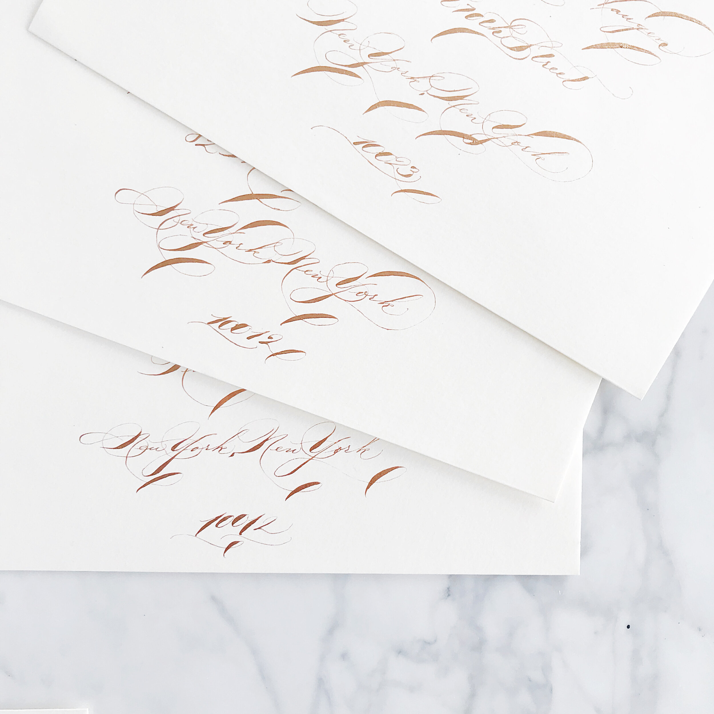
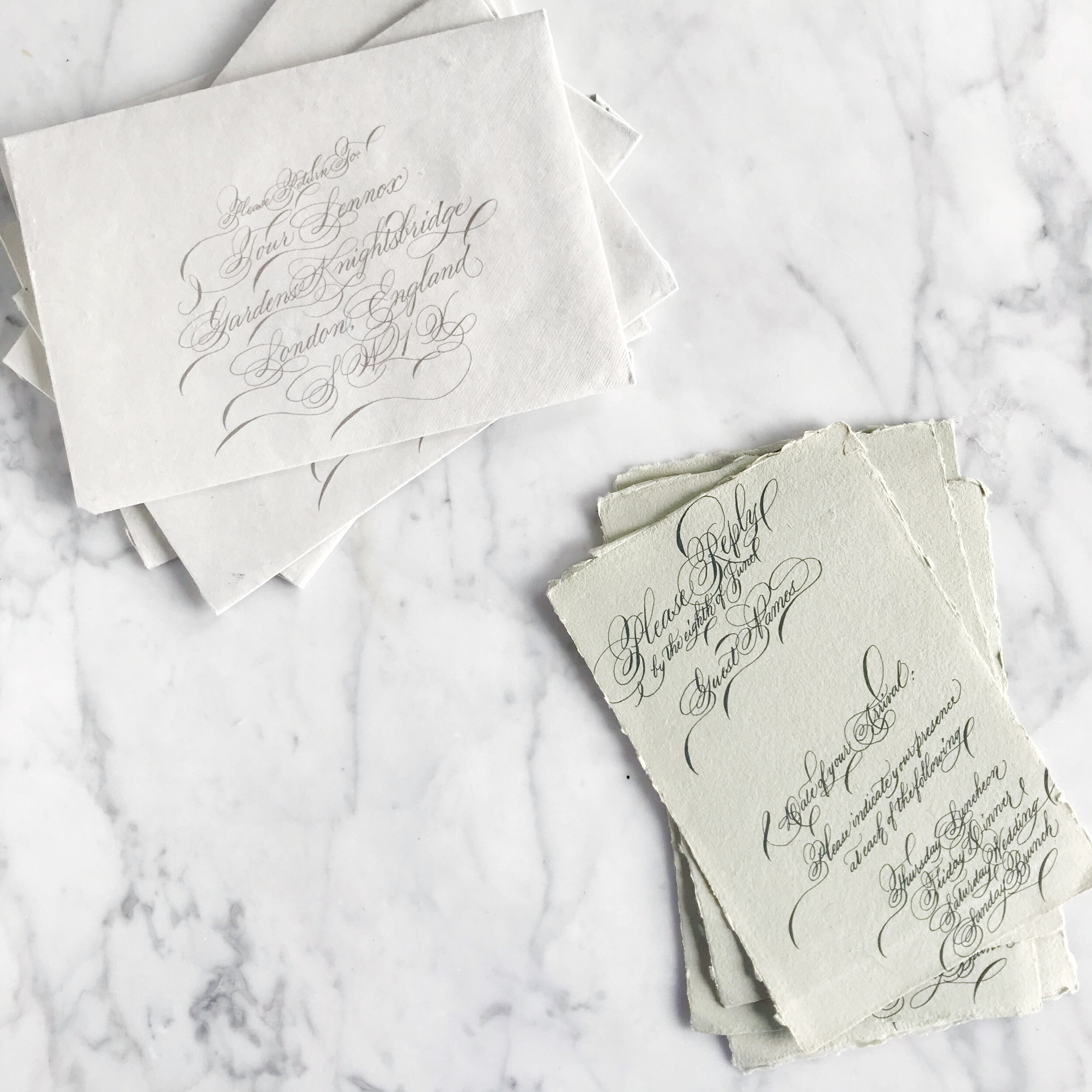
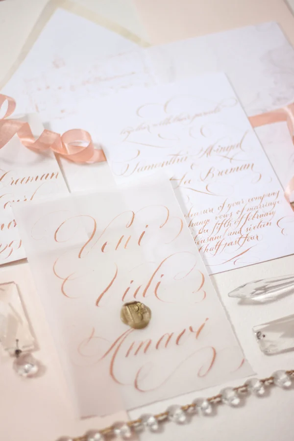
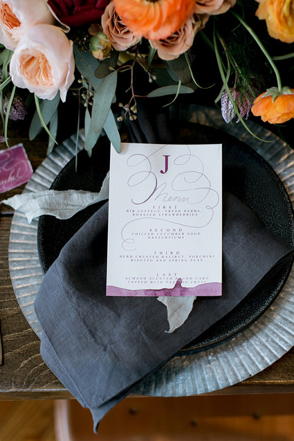
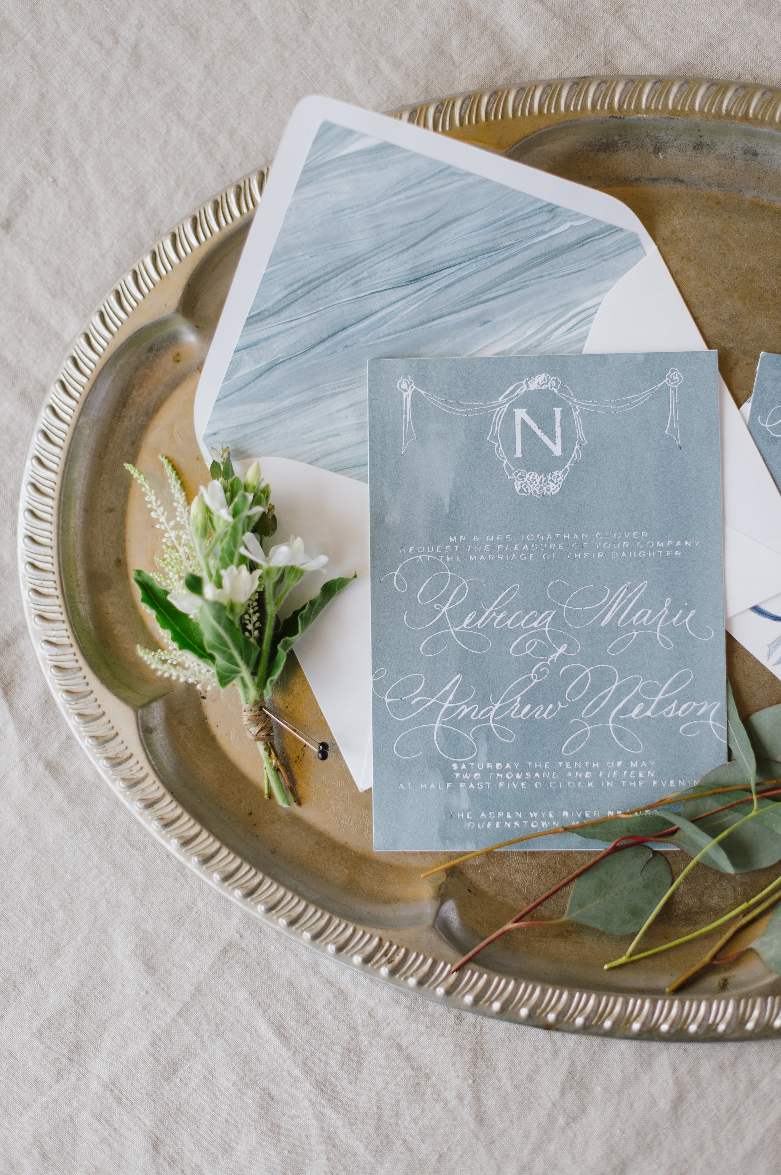
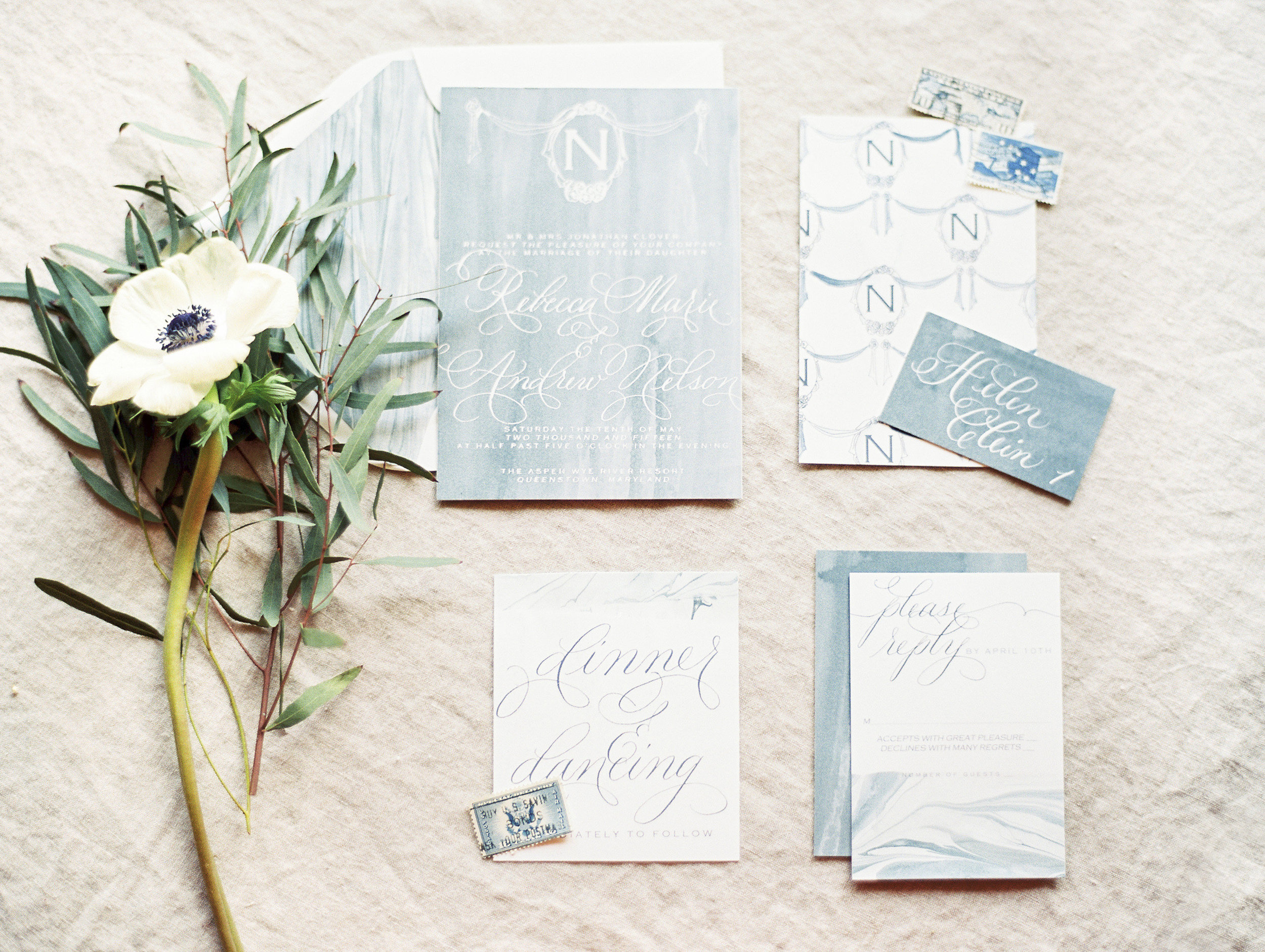
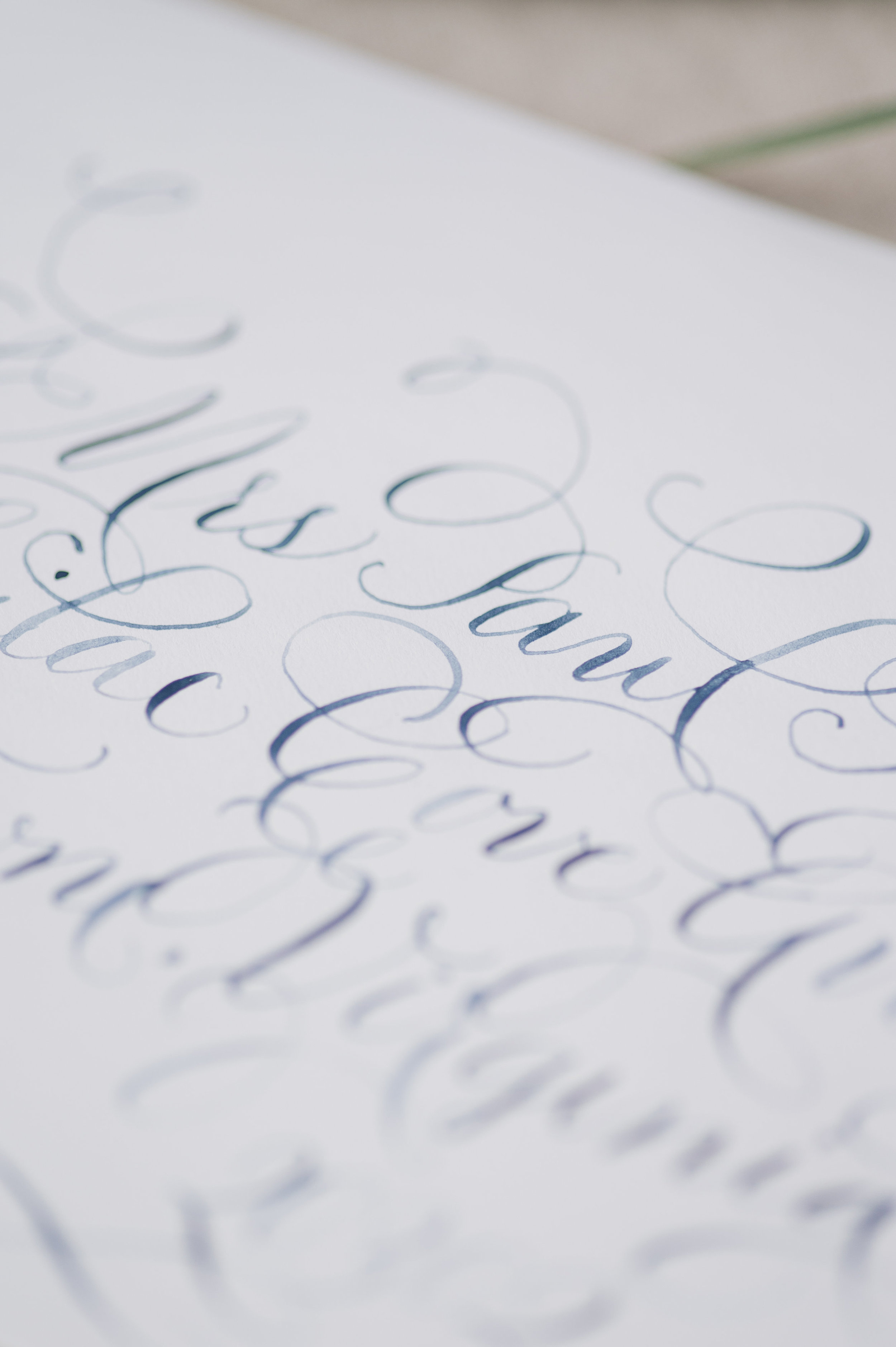
Formal calligraphy is the epitome of formality and tradition. it’s elegant style and grace lends itself perfectly for a formal wedding or a black tie evening.
There really is no such thing as “perfect etiquette” when it comes to weddings anymore. Nowadays, weddings are all about the merging of two people and everything those two individuals encompass.
However, formal will always be formal, and what better way to introduce your guests to your formal affair than with gorgeous formal calligraphy?
Wedding calligraphy comes in so many styles, from brush calligraphy to modern, flourished to drawn out and simplistic. Today we’re looking at the formal end of the calligraphy pool, which also happens to be my favorite end to swim in.
Like all calligraphy, formal wedding calligraphy can be used as spot calligraphy (titles and names) or the whole invitation entirely in calligraphy.
Things to keep in mind when selecting a calligrapher and calligraphy style:
Make sure the style you like is legible, especially if you love the look of the entire suite in calligraphy! Your guests need to be able to read what it says!
Not all calligraphers are created equal. Some have years and years of experience, and some are new to the scene. Like with most professions, you may find that more seasoned veterans have a more streamlined process and are able to help you select a style with ease. Typically, formal styles take longer to develop and learn, so you’re more likely to come across someone with a bit more experience under their belts when looking for a formal calligrapher.
Although some of these invitations are written entirely in calligraphy, they are not written individually in calligraphy. Formal calligraphy is a graceful and time-consuming art that takes time. Is it possible to have each one handwritten? Certainly, but be prepared to pay for it! Each invitation suite written entirely and individually by hand can take anywhere between an hour to several hours, so be prepared to see pricing north of $150 per suite (for example, I would charge $350+ for each suite). However, there’s good news! Most calligraphers have a much simpler and cost-friendly alternative! We handwrite each suite once, scanning the calligraphy into an editing software (I use Photoshop) to make any alterations and corrections and get the calligraphy into the invitation design. We then print each suite, rather than writing each one individually. I have seen many a bride asking for each suite handwritten not knowing the difference, so hopefully, this clears it up!
When shopping for calligraphy invitations, you can either pair up with a designer who then hires a calligrapher with/for you, or you can select a designer that also does calligraphy (like me!). When working with more than one artist on a project, look for a seasoned designer who can take the helm in finding a calligapher/printer/suppliers that fit your aesthetic and budget to make your invitation process smooth and stress-free!
Summer Wedding Invitation Inspiration
Summer weddings are all about those bold colors, full of sunshine and exuberance. I love everything from the seaside blues to sunflower yellows!
Cheerful yellows, bright oranges, leafy greens, and summer sky blues are all over this time of year! I love outdoor weddings, and the summer season is all about parasols and the bright hues of the season.
So let’s talk about summer invitations, and we’ll start with the summer invitation inspiration in this post!
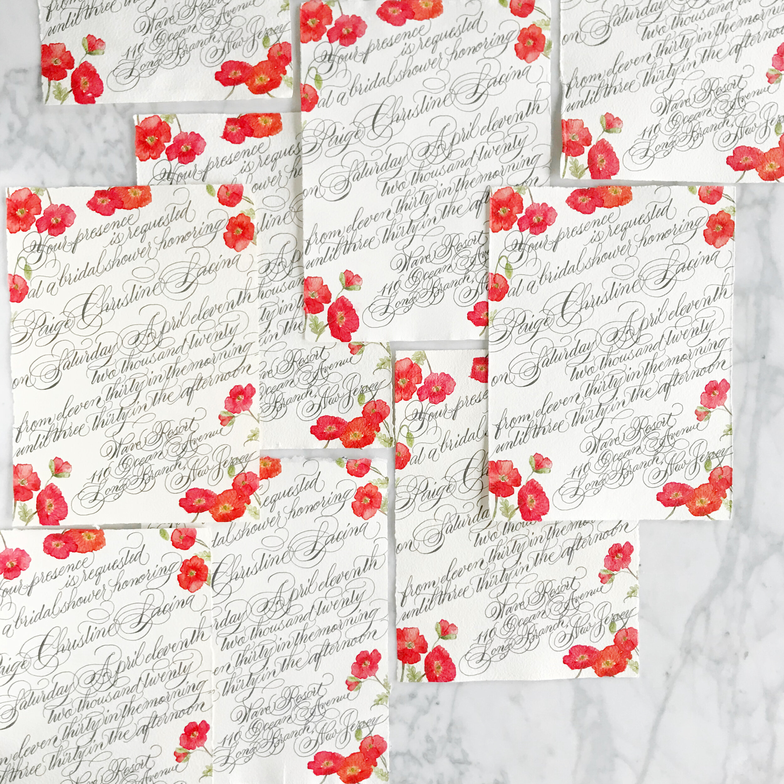
Poppies are such a summer staple, and the Icelandic poppies for these bridal shower invitations are no exception! Printed on handmade paper and covered edge to edge in gorgeous formal calligraphy, these bridal shower invites take your shower game to the next level! We went way over the top with the calligraphy for this suite, pouring the flourishes over the deckled edges.
The simple save the dates, layered with Japanese cane paper and handmade paper, for a Bermuda destination wedding are pale and understated. I love the idea of going off the beaten path, so taking on the tropical vibe while foregoing blues and bright colors is definitely my type of project. The amazing tactile texture of the cane paper was exactly what our bride was looking for. We paired it with a sage green handmade paper with a deckled edge to add in even more texture.
Can we say holy cow envelope game? I loved this project! The bride got married at her parent’s property in Sun Valley, Utah, surrounded by tall grasses and wildflowers. We spent some time researching the varietals that would be blooming at the time of her wedding and built her entire suite around those, bringing in bright yellows, shades of oranges and blues, leaf greens, and pale pinks and peaches (I shocked myself with how many colors I was able to build into this suite!) Bits of line botanicals peak out from the corners, creating some interesting negative space. At some point, we’ll also look at the suite of woodland creatures we also created for this suite (owls, foxes, and bears, oh my!).
These summer invitation suites have such different looks and feel to their aesthetic. I love the directions each of these brides went to reflect their personal style in their wedding!
Spring Wedding Invitation Inspiration
The spring season is all about the emergence from winter, flowers blooming, and the world exploding into color. A spring wedding, regardless of venue and locale, can feel the same way!
Pastel florals, delicate blooms, pale pinks and peaches, all exude the feeling of the season.
So let’s talk about spring invitations, and we’ll start with the spring invitation inspiration in this post!
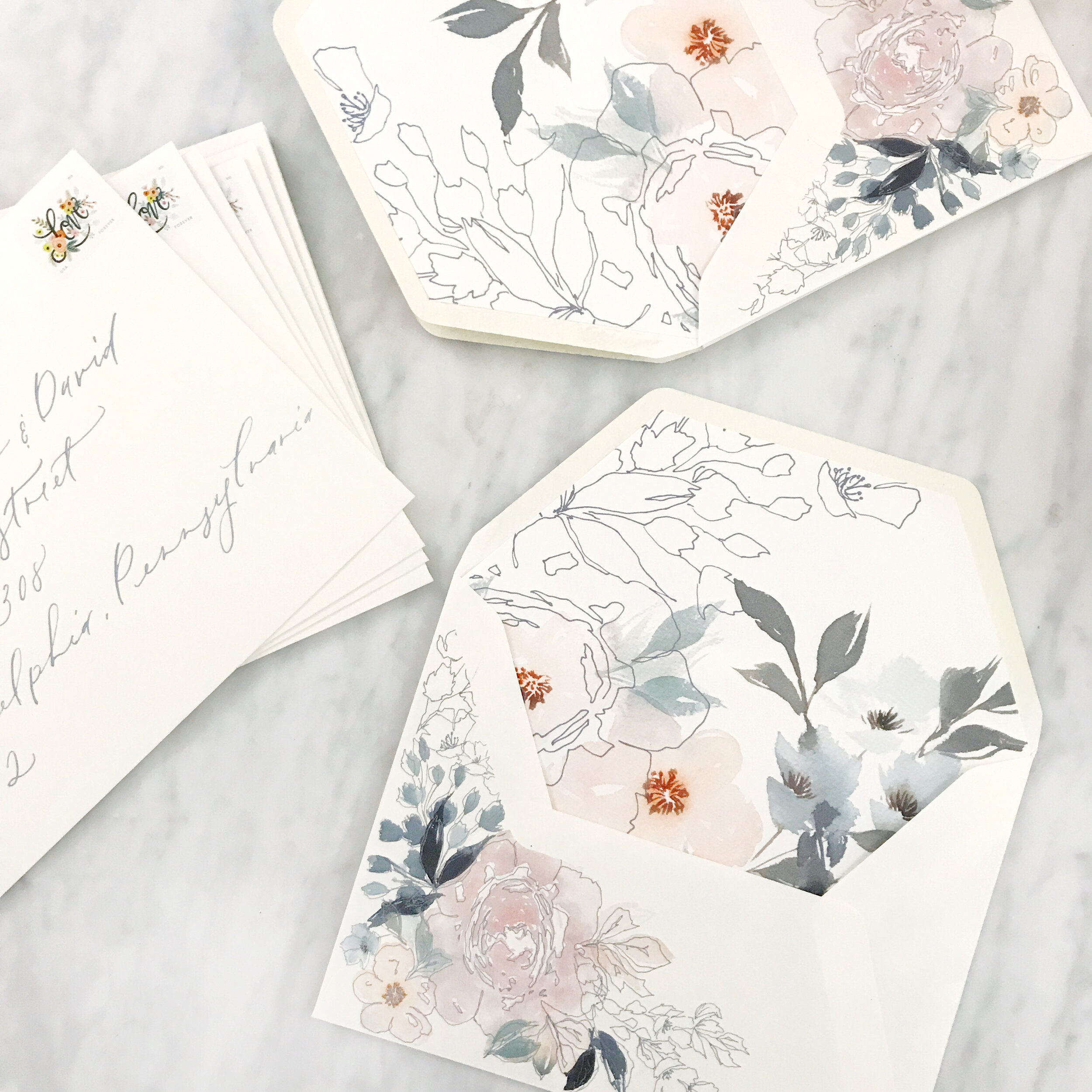
The first image on the left above features pastel pinks and blushes, pale blues, muted olive greens, and dark blues. We balanced the watercolor florals with the negative space created by line botanicals on both the custom printed artwork on a warm white envelope as well as the envelope liner. The envelopes were addressed in a pale blue modern calligraphy style that was designed for the client’s suite.
The center image above is one of my personal favorites. It has a different feel than the watercolor artwork suites that have become our signature, but I love the variety of textures that we achieved in mixing papers together. This suite features more traditional artwork, printed in deep rust, rose pink, olive green, and dark and light blues. The paper featured in this suite features warm whites, deep rose, pumpkin orange, pastel blush, and light blue, all handmade paper. The invitation was blind pressed for an overall texture on paper created in India by a female-owned, operated, and staffed company that pays a living wage to all their employees (this is important to us!). The additional paper selections were hand-produced here in the U.S. Handmade paper is such a gorgeous product to work with, but can be a nasty beast to print on (but totally worth it, IMO). Both envelopes were lined in custom envelope liners featuring artwork from the suite, and a pastel blush vellum overall completed the suite.
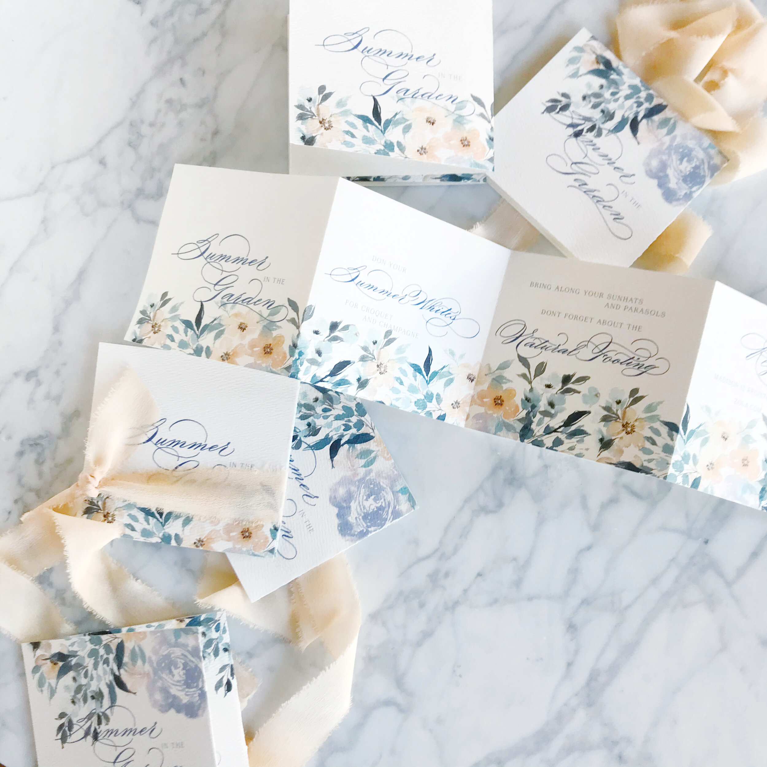
Last but not least in today’s spring invitation inspiration round-up is an accordion-folded save the date on a gorgeous warm white paper with a subtle overall texture. The florals for this suite are built around peach, lavender, pale blues, and muted olive greens. We went with traditional calligraphy with lots of flourishes for this suite. We easily could have brought in a more modern style to create a more playful overall look and feel, but selected the formal to reflect the level of formality of the overall event. The peach spring save the date was tied together with a gorgeous peach silk chiffon ribbon.
It amazes me that these suites are basically all featuring the same color palette (which I only realized as I was typing this and noticed that I had typed the same colors in all three projects!). It shows how different each bride is in how they see their day and how we work with them to develop a design unique to them!
Hand Painted Custom Champagne Bottles
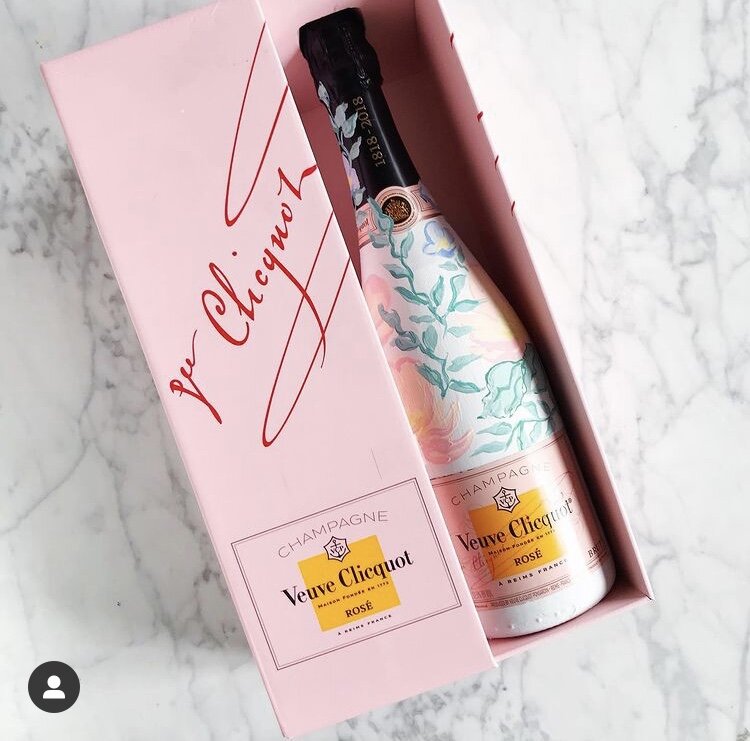
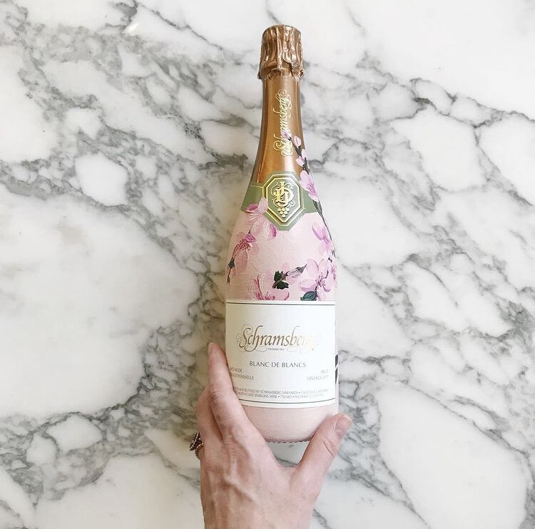
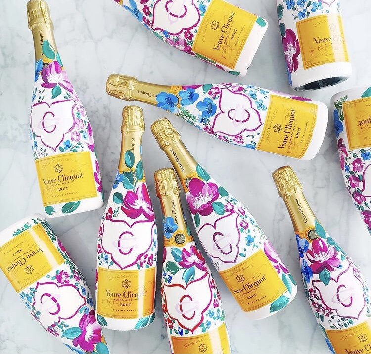
Hand-painted champagne bottles are the perfect custom touch for a gift for your bridal party or adorn your bar for an eye catching detail for your guests.
For these particular projects, each bottle was hand-painted to match the bride’s invitation suites with bright fuchsia blooms and cherry blossoms or pale blues and blushes.
Join me on YouTube channel for a brief video featuring some of our painted work.
If you’re interested in commissioning bottles from us, let us know!
Digitizing Calligraphy - Creative Process with Clients
Walking through our creative process when selecting, writing, digitizing, and using calligraphy in a custom invitation suite.
Digitizing calligraphy used to be part of my job that I loathed. I found it tedious and unpleasant and felt like my time could be better spent doing literally anything. These days, I find it slightly more cathartic.
A few steps: The first thing I do before I even get to this stage is do a sample sheet of calligraphy for my clients. I don't maintain a universal sample sheet for several reasons - first is that I don't want to be locked into any handful of calligraphy styles, and my styles tend to evolve fairly quickly (which also means I don't want to do a new calligraphy sheet once a month). I also want the client to see what their names will look like in each style, so the list of options I provide to them is of their actual names.
Another trick is that I don't give them all the options in the world. We've discussed their style and overall look and feel, and I put together a list based on that. If they're doing a modern affair, I'm not going to show them Spencerian or super flourished Copperplate. I also don't present clients with font selections that are really close to one another - I can tell the difference, but usually, a client can't. I show them a handful of fonts that are all very different from one another.
Ok, so that was all before I even get to writing. Once I have a selected calligraphy style from the client, I do all their spot calligraphy (also note that at this point, I've also completed and they've approved their sketch, so I know where the calligraphy will be needed so I can avoid needing to go back and do more). We then scan, adjust our levels, and correct any mistakes or bumps (ahhhem....too much coffee...oh let's be real, it's not coffee, it's Redbull).
Once we have all out lines smoothed out, I cut apart each line or section and label each layer. I then start a lettering file that I name VERY SPECIFICALLY as _Client Name LETTERING. This places the file at the top of the client folder and the ALL CAPS makes it really easy to spot. We do the same with our ARTWORK and PRINT files which makes everything really easy to see when I'm putting together proofs and dropping lettering and artwork into a million files.
I hope these tips for a professional calligrapher as well as showing you a small example of what's it's like being a working artist and will be useful to you. If you enjoy my artwork and crave more glimpses behind the scenes, please subscribe to my channel and hit the like button. Also, please leave a comment on the video with questions and requests.
Design House of Moira on the Web:
Instagram - www.instagram.com/designhouseofmoira
Websites - www.designhouseofmoira.com | www.designhouseprepschool.com
Real Wedding | Kristen & Sean
Kristen & Sean
A gorgeous destination wedding on the sands of Portugal....
It was our pleasure to create this simple, moody suite for Kristen and Sean's wedding at Areias Do Seixo in A Dos Cunhados, Portugal. Evoke did an absolutely gorgeous job designing the intimate wedding and Kristen's beautiful pale blue gown was a perfect fit for their destination wedding.
Featured | Style Me Pretty
Here are some more lovely shots from Nicole and Matt's gorgeous stable wedding! See the whole feature on Style Me Pretty here!
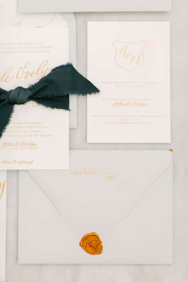
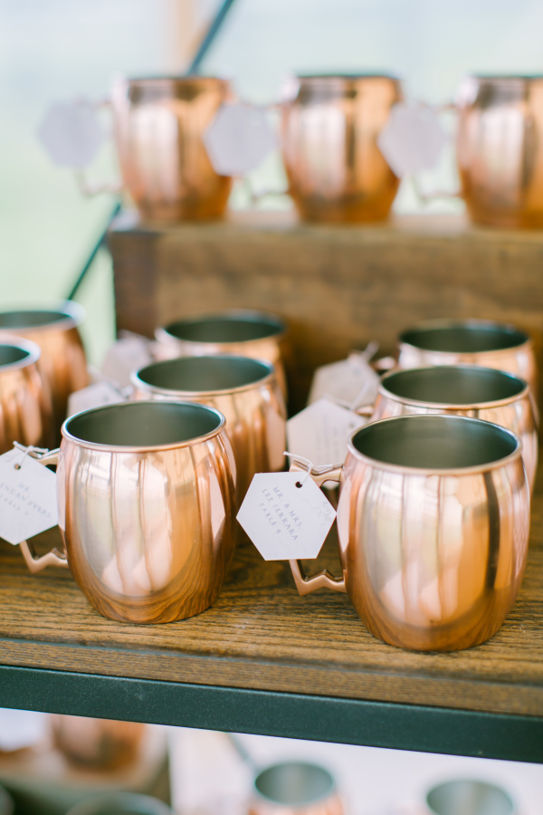
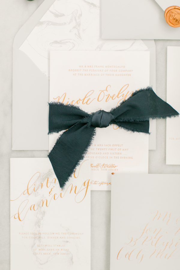
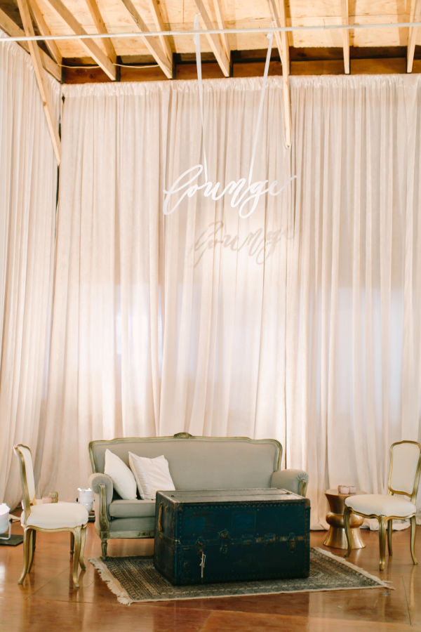
Nicoles invitations and save the dates were all hand marbled on thick cotton paper then printed in copper foil. Her invitation had both marbled details as well as the pales of blush washes. Each invitation suite was tied together with hand frayed navy silk ribbon, tucked inside a marble lined pale grey envelope and sealed with a custom wax seal. All her menus featured the same pale blush wash and their wax seal at the top of each menu. Each guests' place card was a hexagon on the same hand marbled paper, daintily tied onto a copper mug. The rest of the reception details featured lots of carrera marble, such as the marble hexagon table numbers with copper lettering.
Photography: Love & Light Photographs | Cinematography: Between Sleep and Awake | Event Planning + Design: Gilded Lily Events | Floral Design: Blade Floral and Event Designs | Wedding Dress: Reem Acra | Cake: The Vintage Cake | Shoes: Givenchy | Jewelry: Leonardo Jewellers | Bridesmaids' Dresses: Joanna August | Catering: Brennans | Makeup: Make Me Up Eva | Hair: Beautiful Hair by Heather Turner | Band: Hank Lane Music | Groom's Attire: The Black Tux | Venue: Chandelier Grove | Bar + Linen Rentals: Paul David Partywares | Bridal Boutique: Gabriella New York Bridal Salon | Bride's Makeup: Sara Talias | Draping: Drape Kings | Paper + Calligraphy: Design House of Moira | Photo Booth: Premier Event Rentals | Rentals: Party Rental LTD | Rolls Royce Rental: Concorde Worldwide | Tents, Flooring + Lighting: Sperry Tents | The Color Condition Cocktail Hour Swag: Patina | Vintage + Specialty Rentals: Dovetail Vintage Rentals | Welcome Boxes: That's Darlin'
Real Wedding | Jess & Robert
For her programs, we bound white cotton paper with embroidery string in a perfect shade of French blue. Her escort cards bore her large, 2" custom wax seal on pale blue paper, with her guest names in pale gold.
Photography: Love & Light Photographs | Cinematography: Endless Wave Studios | Event Design: Gilded Lily Events | Floral Design: Reynolds | Wedding Dress: Mark Zunino | Cake: Carlo's Bakery | Stationery: Design House Of Moira | Jewelry: Jenny Packham | Bridesmaids' Dresses: Monique Lhuillier | Makeup: Make Me Up Eva | Hair: Up & Out | Band: Almost Easy Band | Groom's Attire: Calvin Klein | Groomsmen's Attire: Calvin Klein | Officiant: Reverend Donald Gebhard | Ceremony Music: Shrewsbury String Quartet | Transportation: ShooBoo Shuttle | Venue: Mallard Island Yacht Club | Bridal Boutique: Kleinfeld Bridal | Bridesmaid's Accessories: Olive + Piper | Bridesmaids' Robes: Cloud Hunter | Cake Topper: Table Setting is My Life | Candleabra Rental: Two of a Kind | Ceremony Lighting: Ocean Tents | Custom Hair Accessories: Foolish Ginger | MOB + MOG Robes: POSY | Maid of Honor Dress: Adrianna Pappell | Rentals: Dovetail Vintage Rentals | Ring Bearer Pillow: JfyBride | Signage: Design House Of Moira | Veil: Mark Zunino | Vintage Hat Box: Trousseau & Co | Welcome Gifts: That's Darlin'
Real Wedding | Jess & Robert
One of my favorite projects last year was creating these gorgeous French blue invitations for Jess and Roberts wedding. We incorporated the same pale shade of blue throughout her wedding stationery. Her invitations were large in size, using a marquis envelope in 7x7 square. Each invitation was hand watercolored with foil printing in pale gold and paired with white cotton cards with French blue printing. Each suite was tucked into it's envelope and sealed shut with a large seal bearing the couples artwork and crest.
View the entire wedding gallery here, featured on Style Me Pretty.
Photography: Love & Light Photographs | Cinematography: Endless Wave Studios | Event Design: Gilded Lily Events | Floral Design: Reynolds | Wedding Dress: Mark Zunino | Cake: Carlo's Bakery | Stationery: Design House Of Moira | Jewelry: Jenny Packham | Bridesmaids' Dresses: Monique Lhuillier | Makeup: Make Me Up Eva | Hair: Up & Out | Band: Almost Easy Band | Groom's Attire: Calvin Klein | Groomsmen's Attire: Calvin Klein | Officiant: Reverend Donald Gebhard | Ceremony Music: Shrewsbury String Quartet | Transportation: ShooBoo Shuttle | Venue: Mallard Island Yacht Club | Bridal Boutique: Kleinfeld Bridal | Bridesmaid's Accessories: Olive + Piper | Bridesmaids' Robes: Cloud Hunter | Cake Topper: Table Setting is My Life | Candleabra Rental: Two of a Kind | Ceremony Lighting: Ocean Tents | Custom Hair Accessories: Foolish Ginger | MOB + MOG Robes: POSY | Maid of Honor Dress: Adrianna Pappell | Rentals: Dovetail Vintage Rentals | Ring Bearer Pillow: JfyBride | Signage: Design House Of Moira | Veil: Mark Zunino | Vintage Hat Box: Trousseau & Co | Welcome Gifts: That's Darlin'
Featured | 100 Layer Cake
Over the summer, I participated in a fun, breezy summer collaboration but never got around to sharing (shame on me!).
From our fearless leader:
At Glow Event Design, we love coming up with new ways for couples to celebrate saying I Do. More and more of our couples are looking for “weekend experiences” they can enjoy with their guests, rather than traditional receptions. We loved the idea of a summer poolside wedding that could be hosted in a backyard or an outdoor venue. We wanted cocktail hour to have an eclectic look that felt more like you were lounging at the couple’s home rather than on rented furniture. We mixed different styles of chairs and cafe tables to create a “collected” look, and layered in pieces from local boutiques and Anthropologie’s home line to make it look more cozy. Signature drinks were dressed up with custom stirrers and multi-colored coasters. In lieu of traditional place cards, each guest would receive a hand painted planter to take home as a favor.
check out the rest of the feature here:http://www.100layercake.com/wedding-inspiration/modern-summer-wedding-inspiration/
Photographer: Michelle Walker Photography / Venue: K Venues / Event Design & Styling: Glow Event Design / Florist: Amanda Vidmar Design / Hair & Makeup: J Beautique / Baker: Indie Cakes & Pastries / Event Rentals: Blueprint Studios / Ceremony Arch: Buzzworthy Events / Stationery: Design House of Moira / Lasercut Names: Letters To U / Escort Card Planters: Sea and Asters / Tabletop & Misc. Décor: Anthropologie / Bride’s Attire: BHLDN / Groom’s Attire: The Black Tux / Tie: Melissa Sloan / Votives: Glassybaby / Male Model: Entire Productions
Featured | Oh So Beautiful Paper
It's Monday morning and I'm greeted by a featured post of my work on Oh So Beautiful Paper! That's a perfect way to start a week! You can view the featured post here!
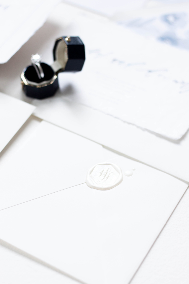
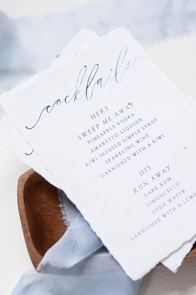
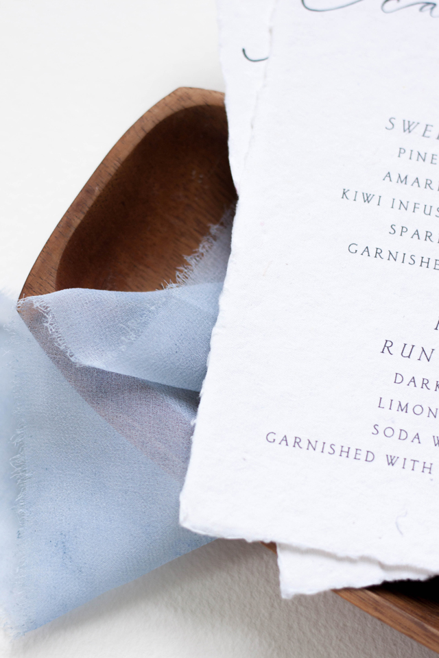
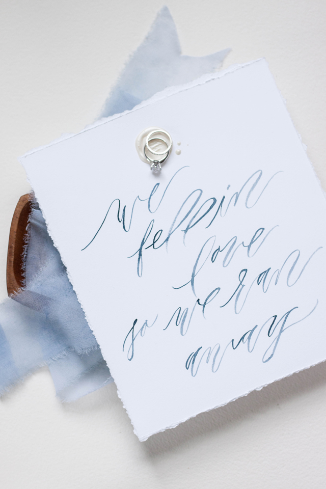
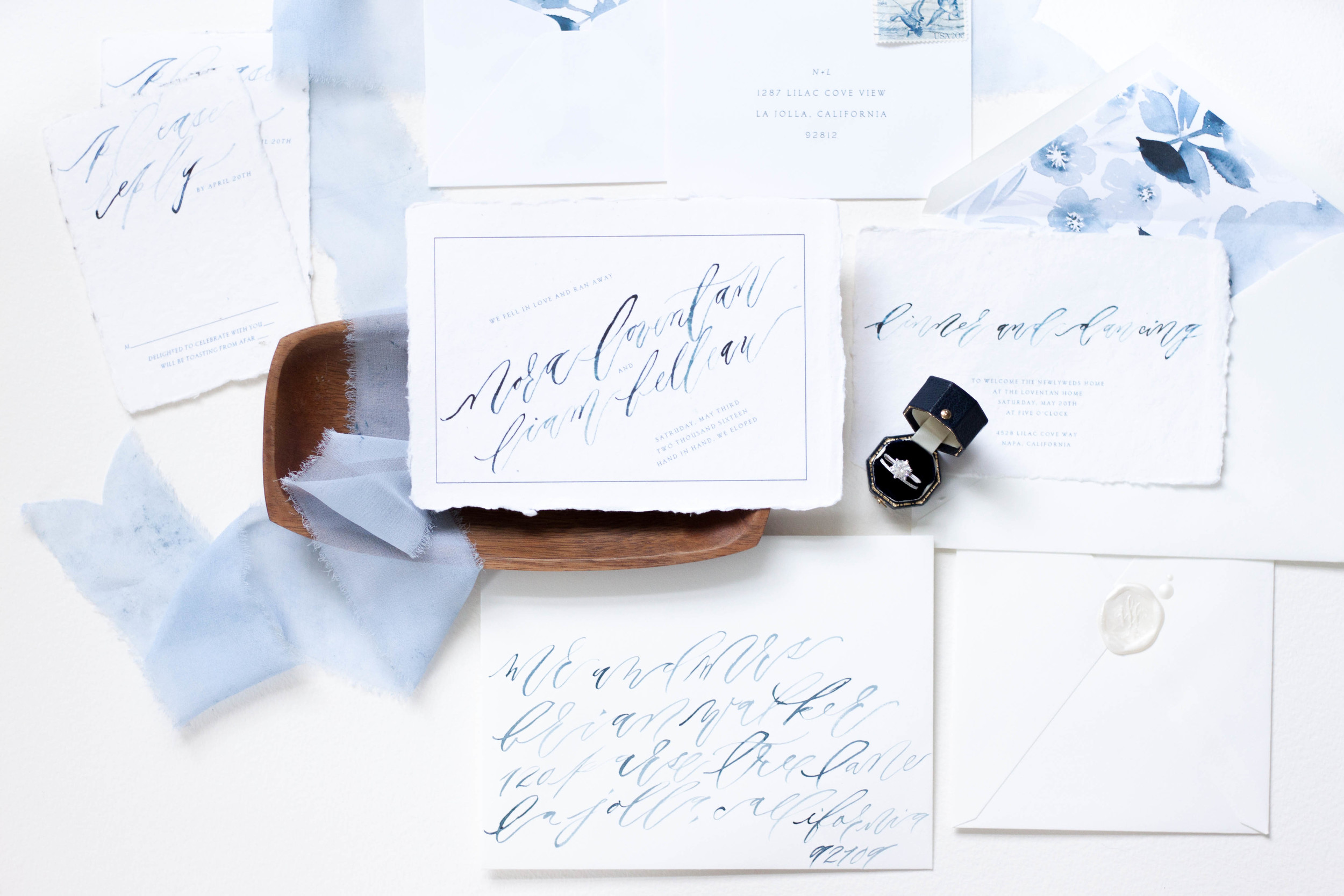
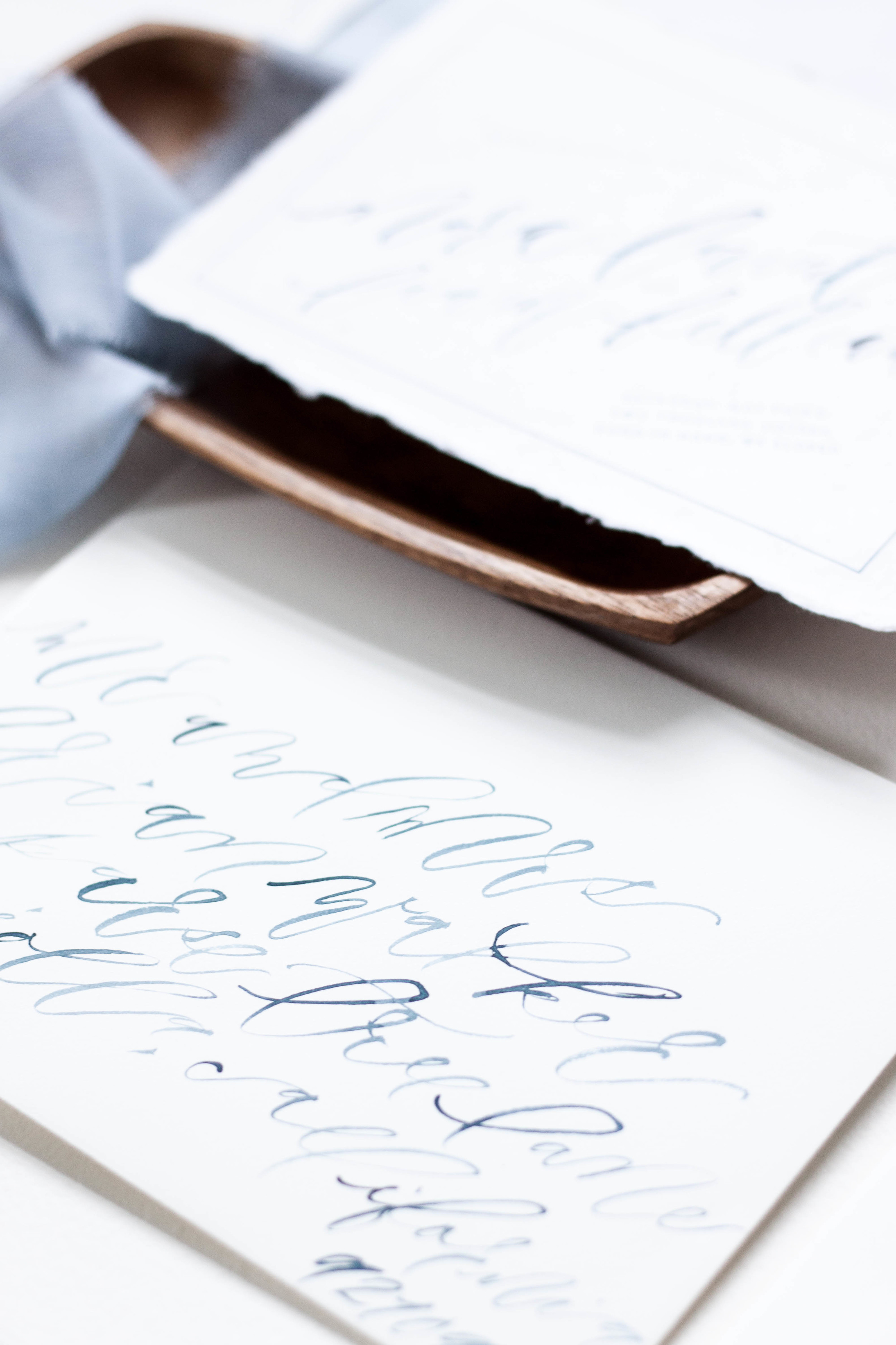
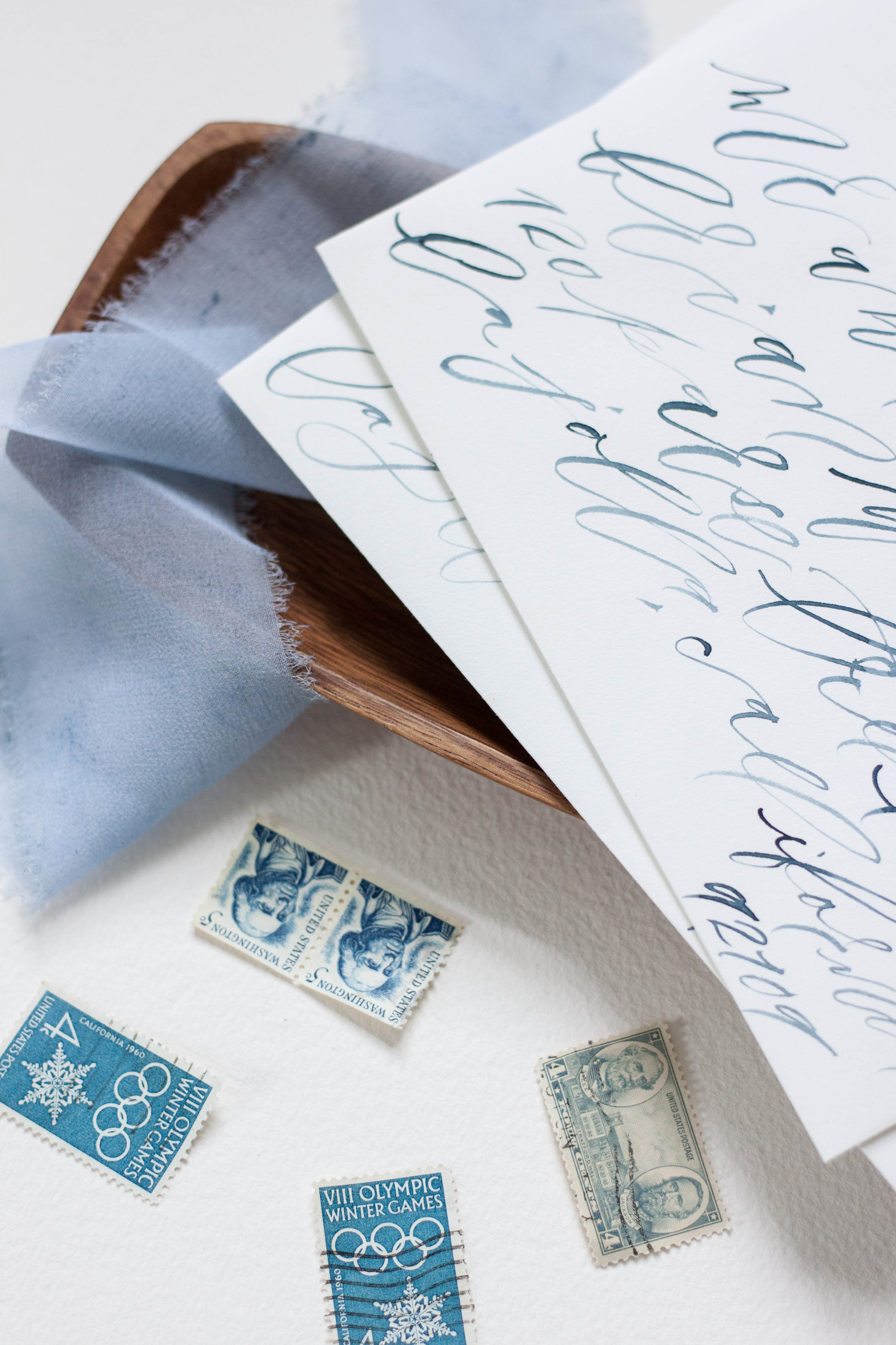
Working with Marina from Bustle Events, we designed this suite for an elopement celebration, using the phrase “we fell in love, so we ran away” as the theme. We really wanted to embrace the destination aspect of the celebration, tying in natural edges and shades of blue. The invitation itself announces their elopement and invites guests to join them at the bride’s parents home upon their return home. We really loved the idea of using paper with a raw edge and choose to go with handmade 100% cotton rag paper from Fabulous Fancy Pants. We paired the handmade paper with slooping brush lettering, and paired it with a formal serif font.
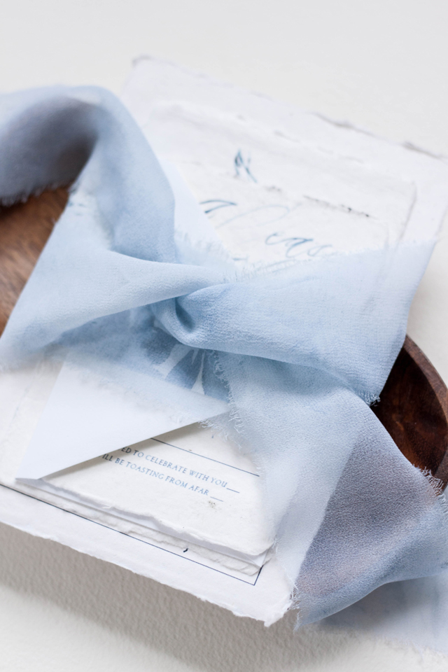
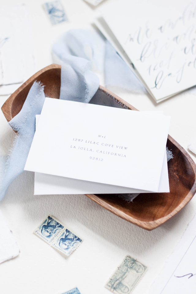
I also hand painted a large piece of artwork for the bride in monochromatic blues, and used that artwork to be printed as their envelope liners. Each invitation suite was wrapped in hand dyed, hand frayed silk ribbon and tucked into a crisp white cotton envelope. The cocktail menus were printed on the same 100% cotton rag paper and featured a “his & hers” signature cocktail. We also created a larger scale artwork piece of the quote we used in the suite featuring the couple’s wax seal.
Design, printing and production: Design House of Moira
Ring box: Lang Antiques
Paper: Fabulous Fancy Pants
Photography: Design House of Moira
Bespoke | Italian Destination
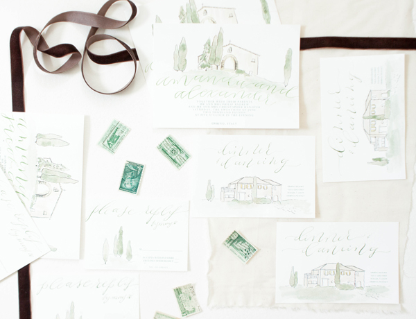
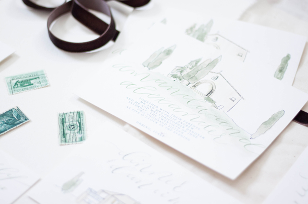
When you run away and get married in Italy trailing your entire family and group of friends with you, you might as well go big. We created these invitations to reflect the amazing venue, complete with cypress trees, old masonry and yellow shutters.
Bespoke | Elopement
"we fell in love so we ran away"
Two people fell in love, eloped and got married! To announce their marriage, we created a main piece with the date they tied the knot, paired with a reception card announcing a celebration thrown by the brides parents. I created the suite with handwritten, contemporary brush calligraphy and printed the entire suite on handmade cotton rag paper. The envelopes were both lined with monochromatic indigo florals, and addressed in the same looping indigo lettering. The entire suite was wrapped in hand dyed silk ribbon.
Bespoke | Samantha & Stuart
I've been pretty obsessed with marbling lately, and this suite is nothing short of all sorts of marbled goodness.
Gold engraved lettering, pale silk ribbon, and marbling in shades of grey, it just doesn't get any better!
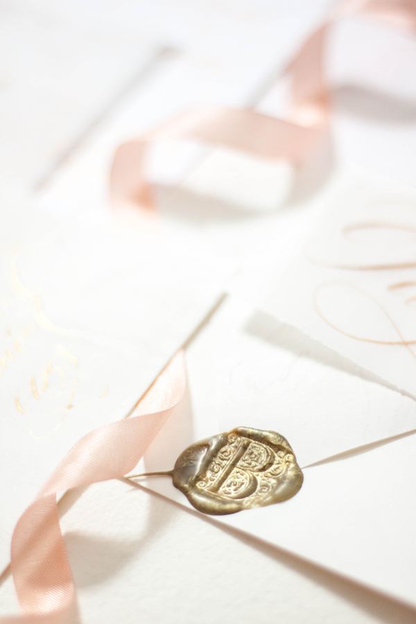
The entire suite was topped off with a gold wax seal, bringing in formality and tradition.
Paper Talk | Why choose custom
Working with a bride and groom to create something this unique and reflective of their wedding day is such a pleasure. Being able to bring in that fine art aspect as well as hand lettering and calligraphy just brings a look and feel so different from anything you can find in the pre-designed realm.
Working with a designer on a custom piece is like watching a dream come to life. Around here, we begin with a sketch to show our ideas of how the artwork with work and play from one piece to another and to help our clients see our vision. I keep every sketch I've ever done - I love being able to flip back trough them! We work together selecting the printing method, paper, assembly detail, calligraphy style and artwork that go into each design, all based on the couple's person story and their style.
One of my main goals is to make this process as painless as possible! All of our clients also have access to our full stamping and stuffing services - meaning, we assemble, stuff, stamp, address, and seal your invitations, so all you need to do is mail them! That's just one of the perks of working with a custom designer. You will also get a bit more guidance on all the little details - like what printing is good for you (how would you know, you've never done this before!) how much your final pieces will weigh for postage, or what wording etiquette should you use - we'll take care of all those details for you and take as much off your plate as we can.
Why choose custom, you ask? Let's talk about it! There are so many options out there for your wedding initiations; they come in all shapes, sized and price points. So how do you decide? Should you print at home? Order a pre-fab design from a reputable website? Go with something you aren't so thrilled about? Take the leap and go for something you love? Dig yourself into the DIY hole? Go crazy and pull out all your hair just trying to decide?
Custom is a really fun option, but it isn't always for everyone. Trust me, you're talking to the queen of DIY - it's how I got into this business in the first place..."puh, this whole graphic design thing cant be that hard, I can totally do this!" I would ALWAYS rather do it myself and figure out the process than have someone else do it, so if you're a DIYer, I feel ya! However, DIY or pre-fab isn't for everyone either.
A few years ago, I had the epiphany that I wanted to limit myself to custom only designs, and I wanted to restrict myself and not offer the "I have something for absolutely everyone" mentality. I had done the graphics approach for about 3 years at that point, and I just wasn't loving it. I wanted to offer something totally unique to myself and my company, so I began offering artwork based designs only. You do see this approach more frequently now, but when I first started playing with the idea about four and a half years ago, there really wasn't anything like it in the market (except Julie Song, who's work makes me swoon!)
A couple who chooes a custom deign usually has a few things about them: They know exactly what they like! They're usually confident in themselves and know that they wants the details of their wedding to totally reflect their personal style. They may be looking for flexibility or something a bit more fun than the invitations they've seen in the past, or wish to have original artwork of their venue created for them. Sometimes it may be that they've never seen something they just love, but know the work of the artist and are confident in building something together.
Give us a shout if you're interested in finding out more about creating a custom design for your wedding!
Featured | 100 layer cake - dutch masters
A bit earlier this year, a project I collaborated was featured on 100 Layer Cake! It was a pleasure to collaborate with Emily Wren on this moody project.
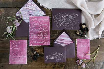
The invitations were a gorgeous, deep aubergine, watercolor washed plum and featured coordinating hand marbled paper as the envelope liners. The over the top flourished calligraphy was printed in white foil and then addressed in matching calligraphy.
Photographer: Emily Wren Photography / Location: Power Plant Productions / Event Design: Confetti & Co. / Floral Design: Kate Farley Design / Hair & Makeup: True Beauty Marks / Calligraphy: Design House of Moira / Desserts: Cake Life Bake Shop / Catering: Birchtree Catering / Rentals: Maggpie Vintage Rentals / Dress: Carol Hannah from Lovely Bride Philadelphia / Jewelry: Egan Day / Models: Gina (owner of True Beauty Marks) & Mike
Featured | Bayside Workshop
Vendors: Photography: Natalie Franke // Styling: Kruse & Vieira Events // Florals: Intrigue Designs // Invite Suite & Paper Goods & lettering for table: Design House Of Moira // Calligraphy: Poppy & Scooter // Linens: BBJ Linens // Rentals: Select Event Group // Cake: Wildflour Fine Baking Co.// Welcome Basket: Marigold & Grey // Hair & Makeup: Behind The Veil // Gown: Kate McDonald Bridal // Tux: The Black Tux
Coming Soon | opals and rose gold
opals, florals and modern calligraphy coming soon to the blog!
Bespoke | Emma
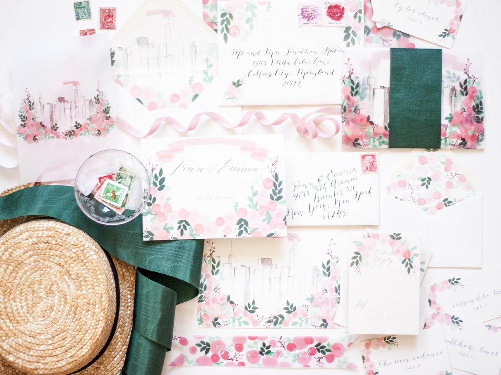
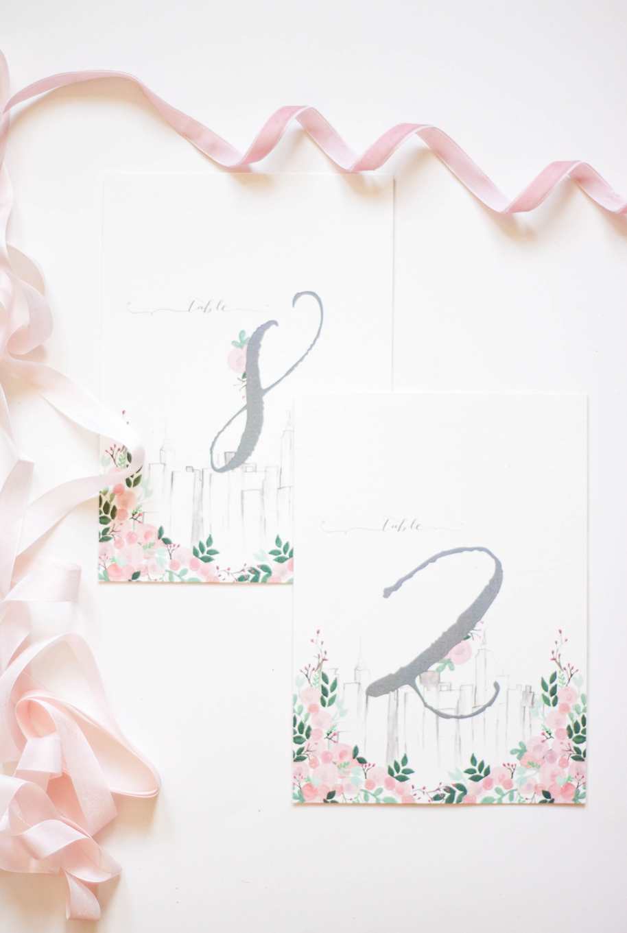
central park | floral | Manhattan | moire | skyline | boathouse | laurel | summer | boater hats | white attire
Coming soon | loeb boathouse suite
a suite created to reflect the spring view from the Loeb Boathouse in Central Park of the city beyond.
