Art Nouveau Wedding Invitations
art nouveau, pale greens and nudes, elegant, overall texture, soft, unexpected, soothing, formal
Glen Foerd Mansion | Philadelphia, Pennsylvania
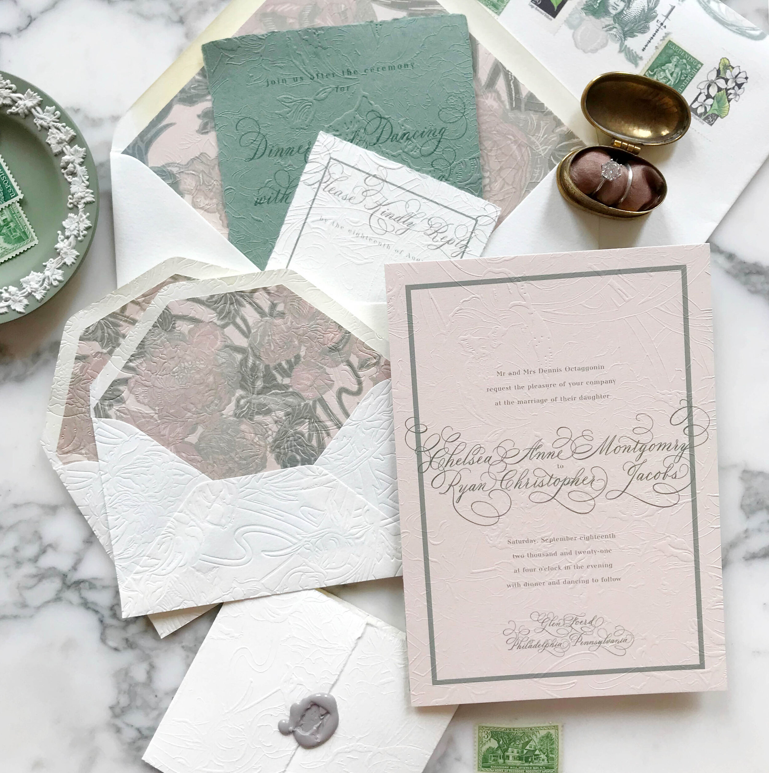
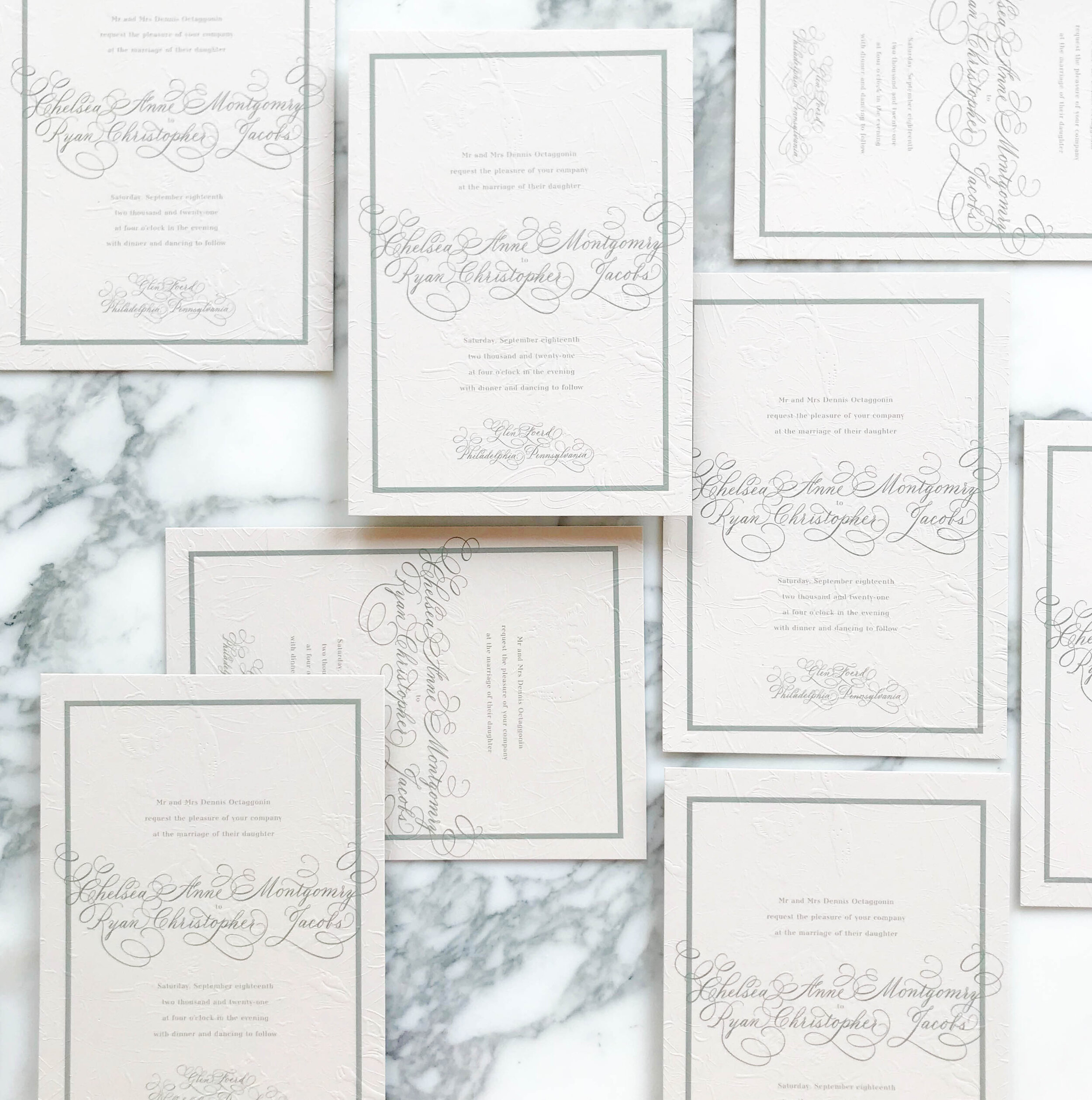
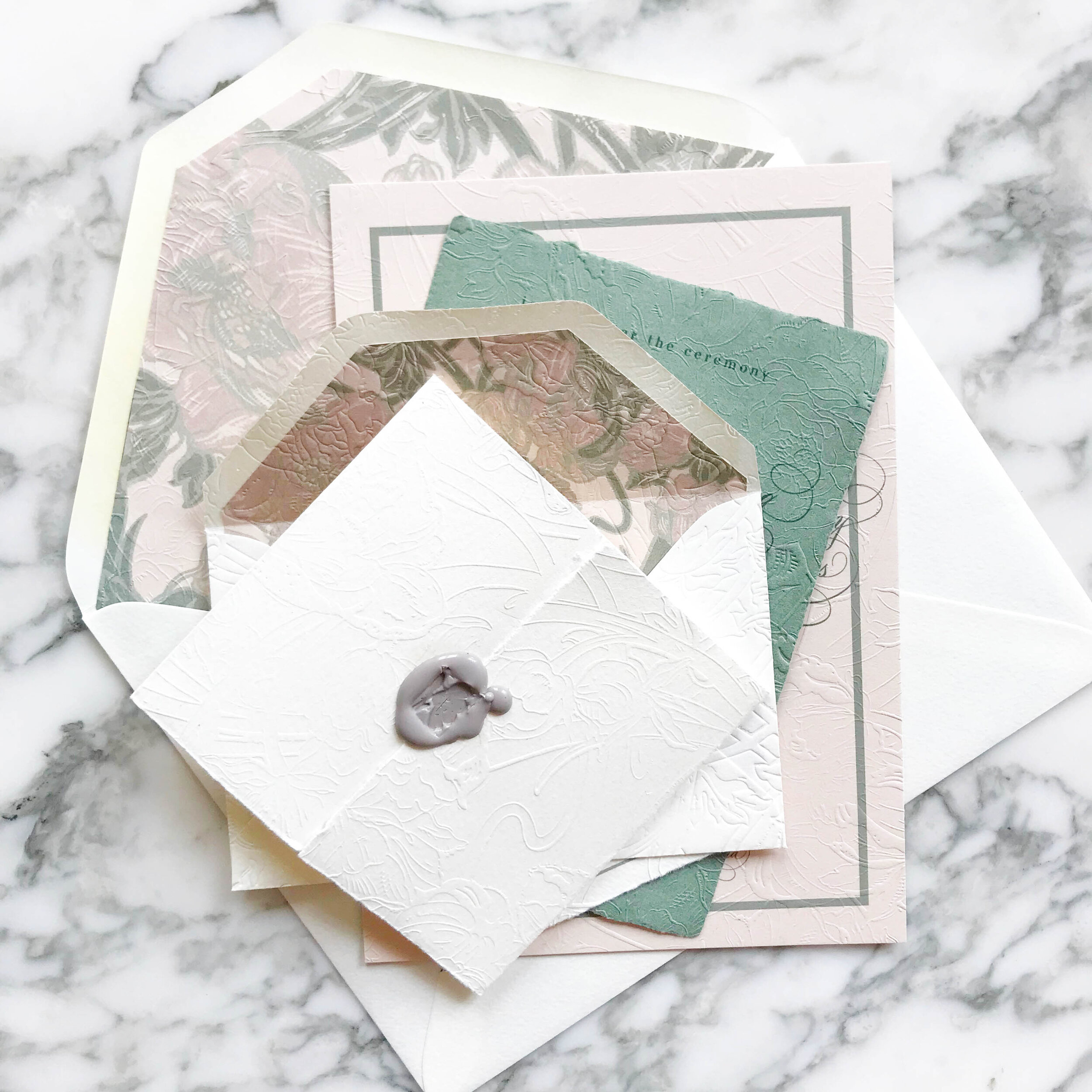
We wanted to bring in the graceful and soothing vibes of the Art Nouveau era with pale neutrals, smooth greens, and impressive overall texture. We selected artwork inspired by antique wall paper to start our design work. Working with the artwork and palette of nudes and greens, we developed our overall look and feel, a perfect fit for the gorgeous Philadelphia mansion of Glen Foerd.

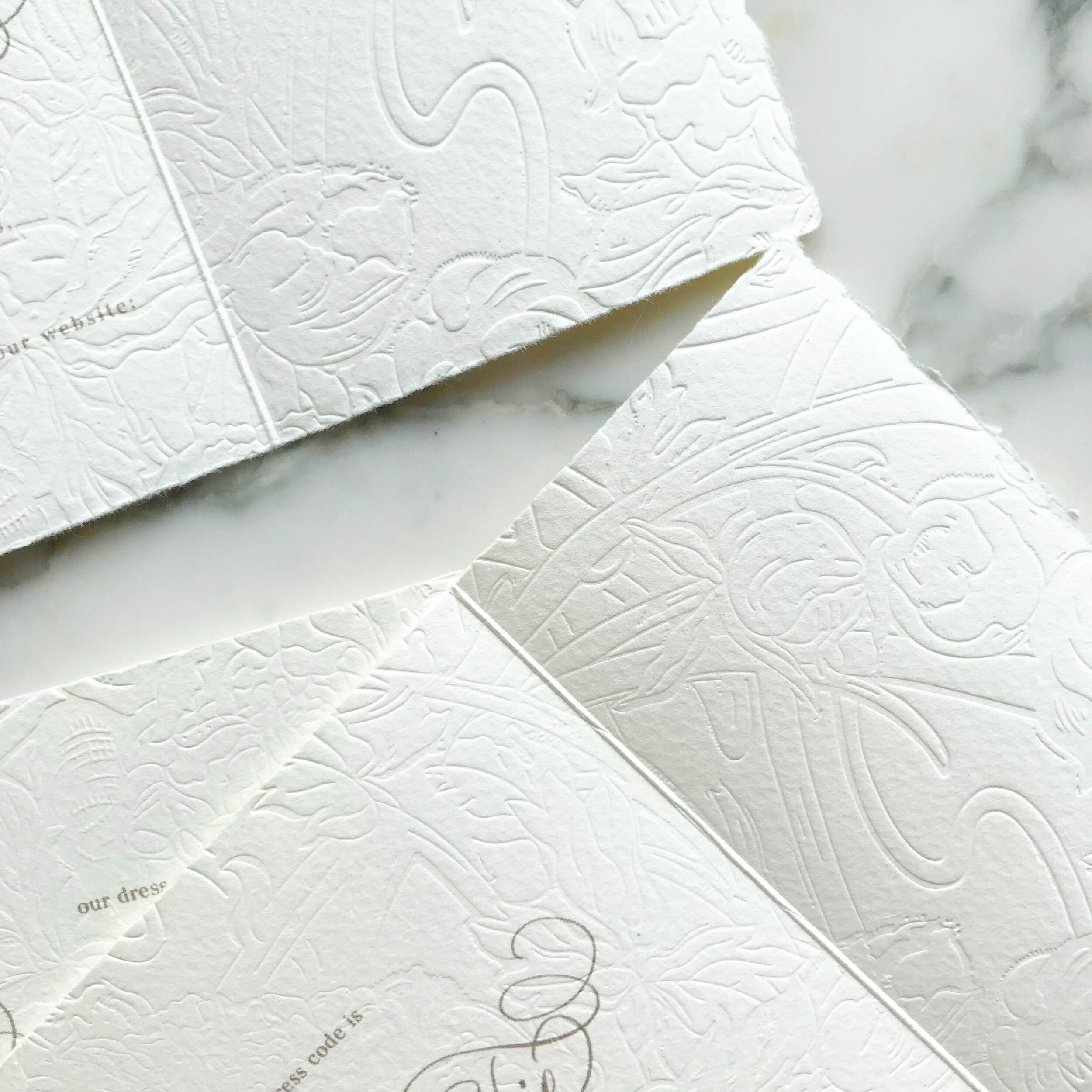
The most striking element of the design is the texture. Each piece was embossed with a glorious overall texture for a pillowy and tactile feel.
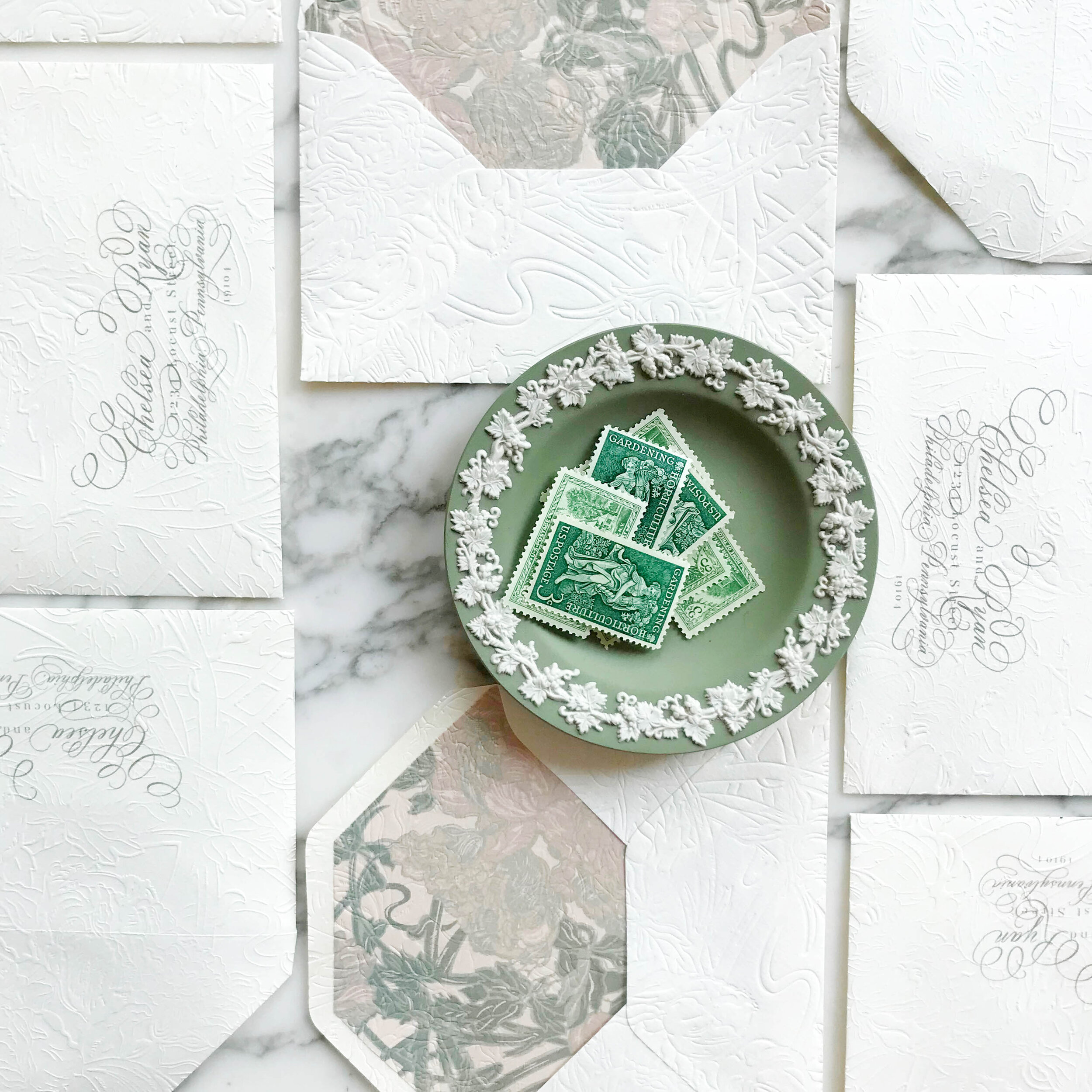
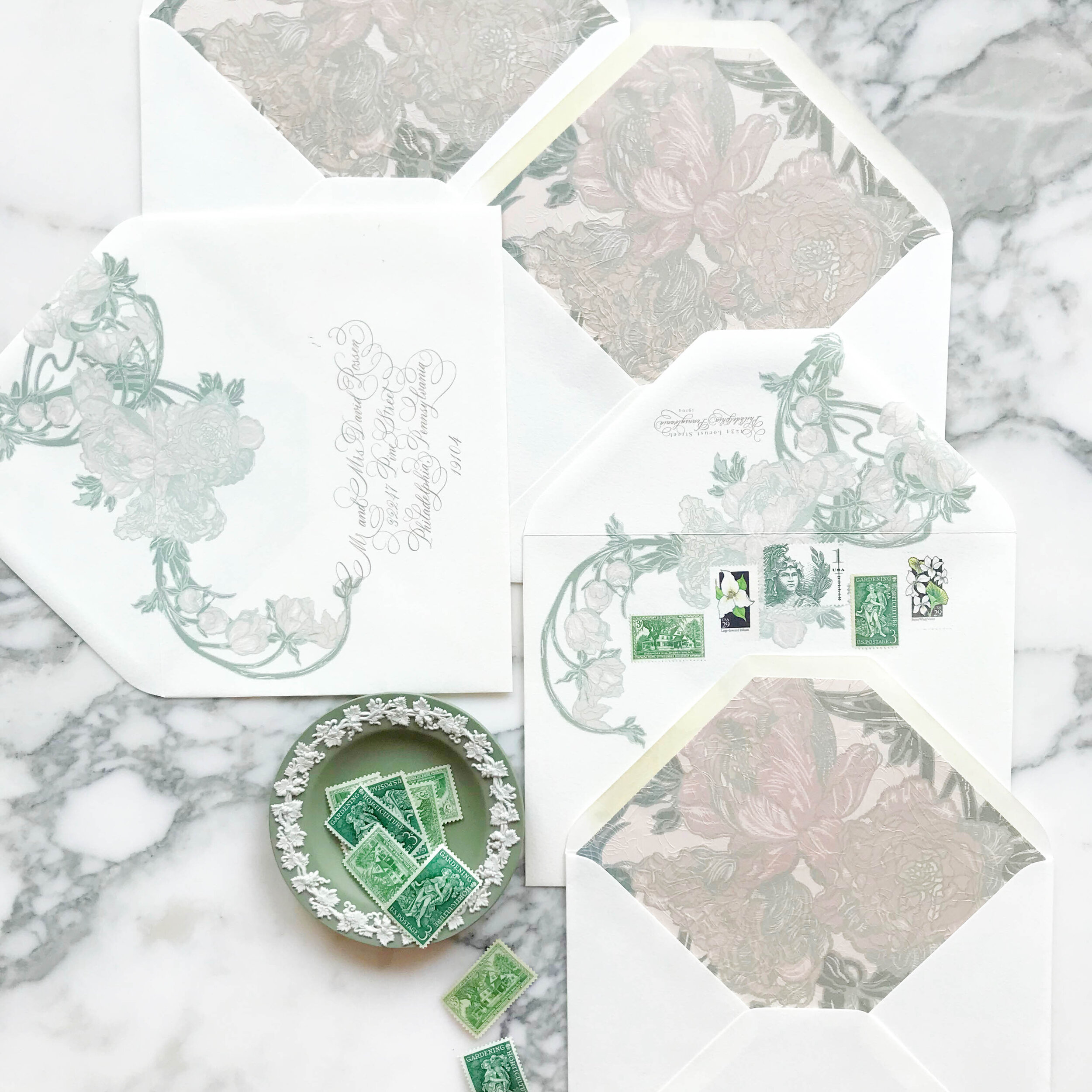
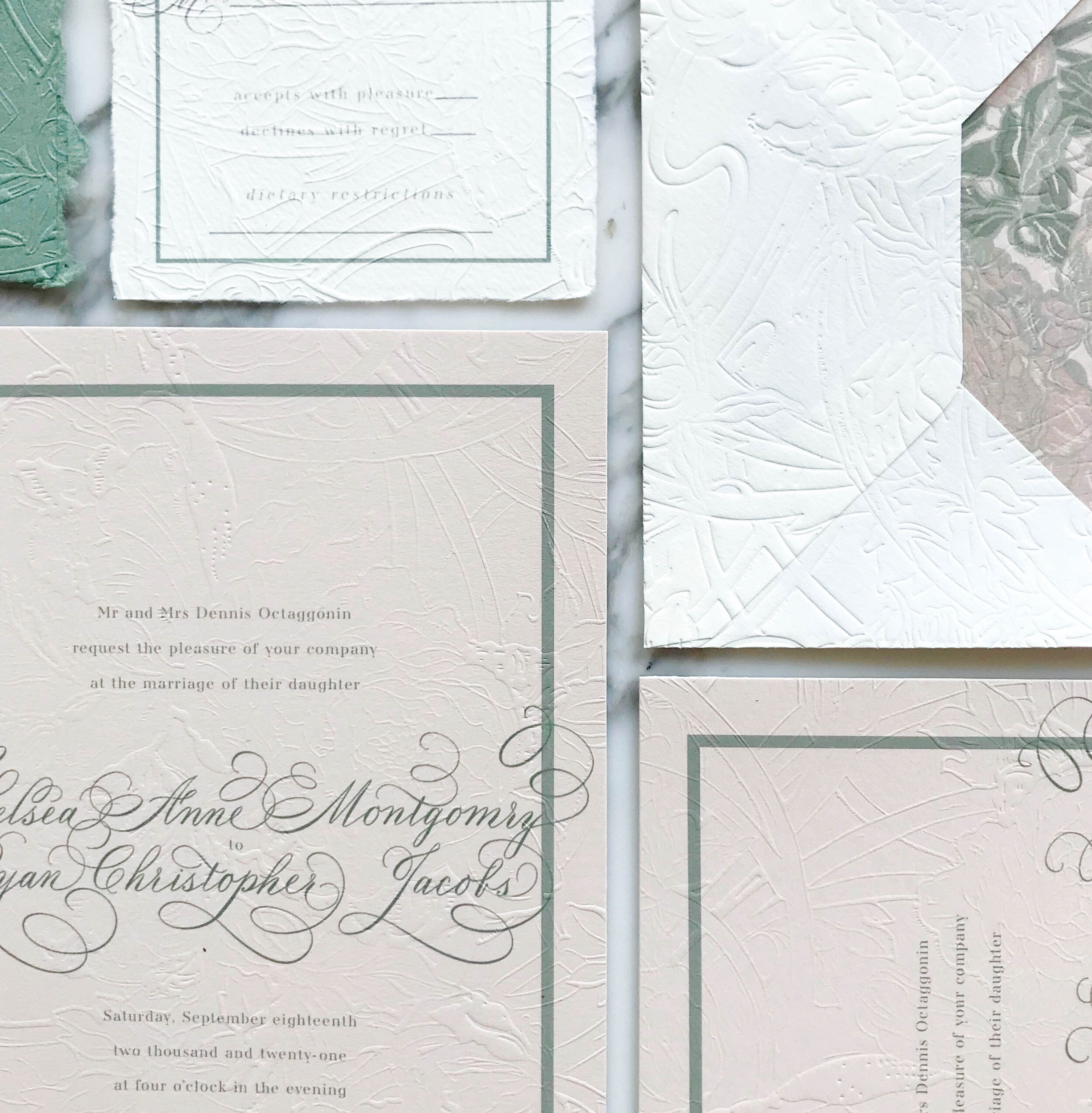
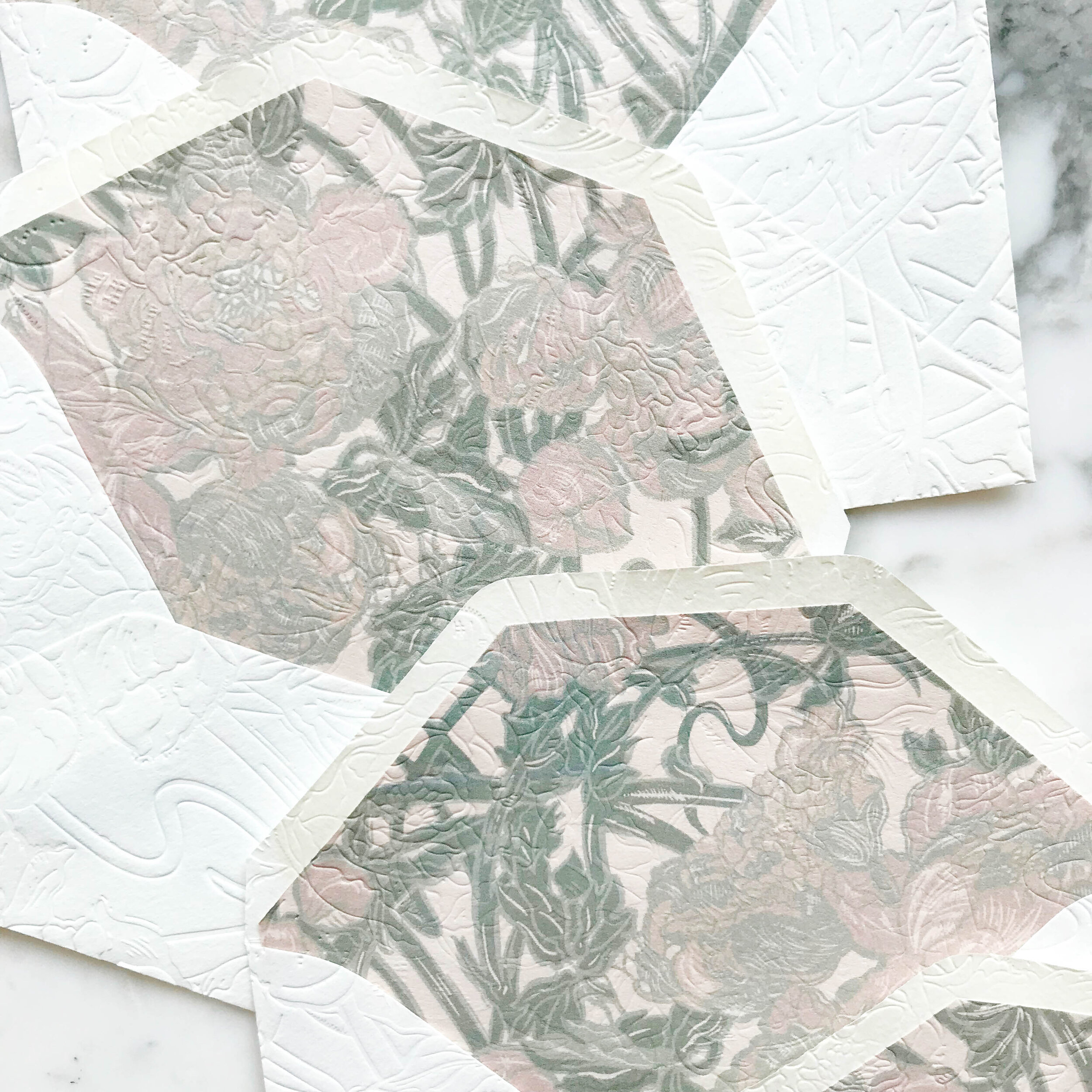
My personal favorite piece of the suite are the reply envelopes. We embossed the envelopes after they were lined, so the liners as well as the fronts and back of the envelopes all had a contiguous embossed pattern.
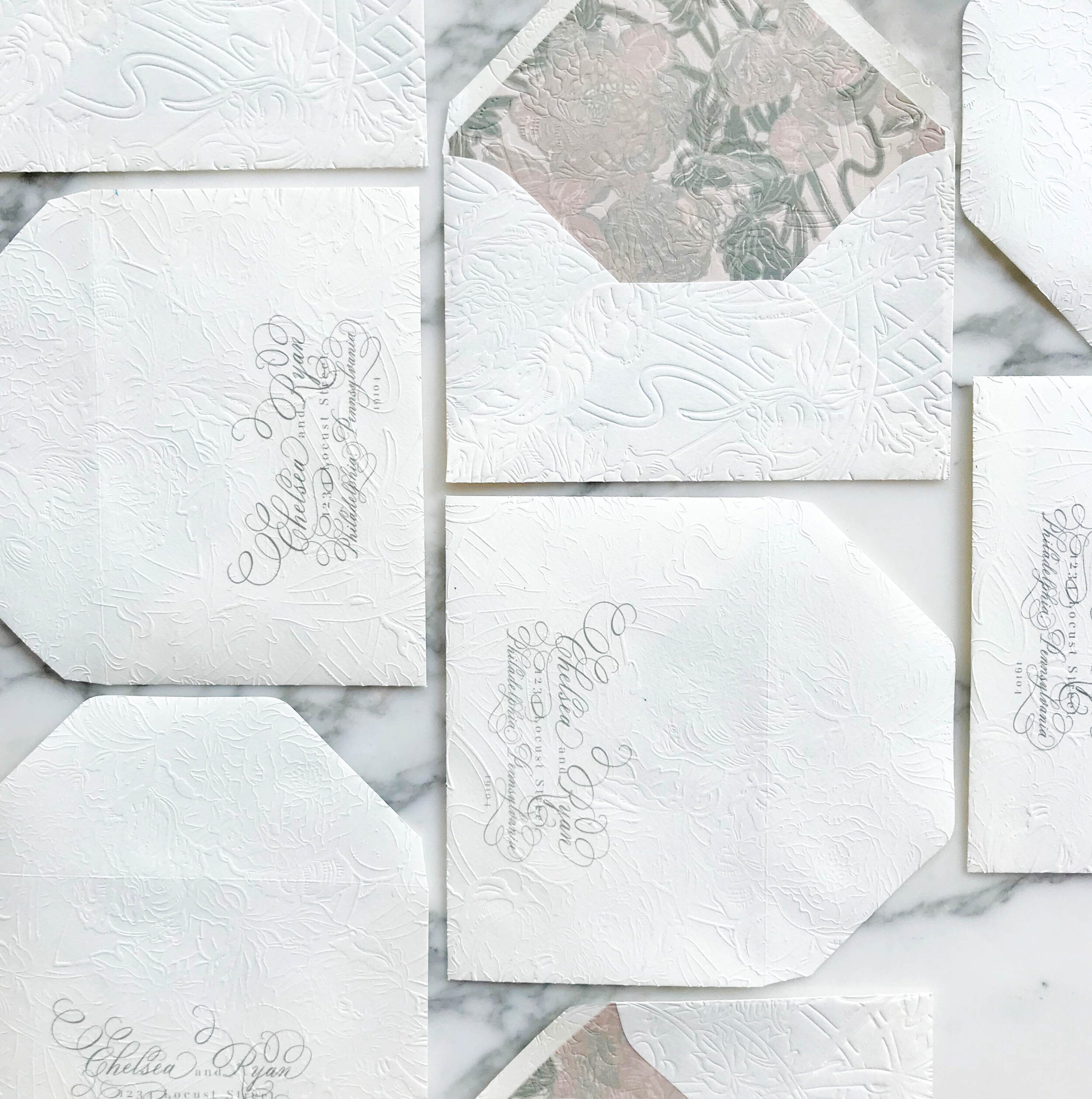
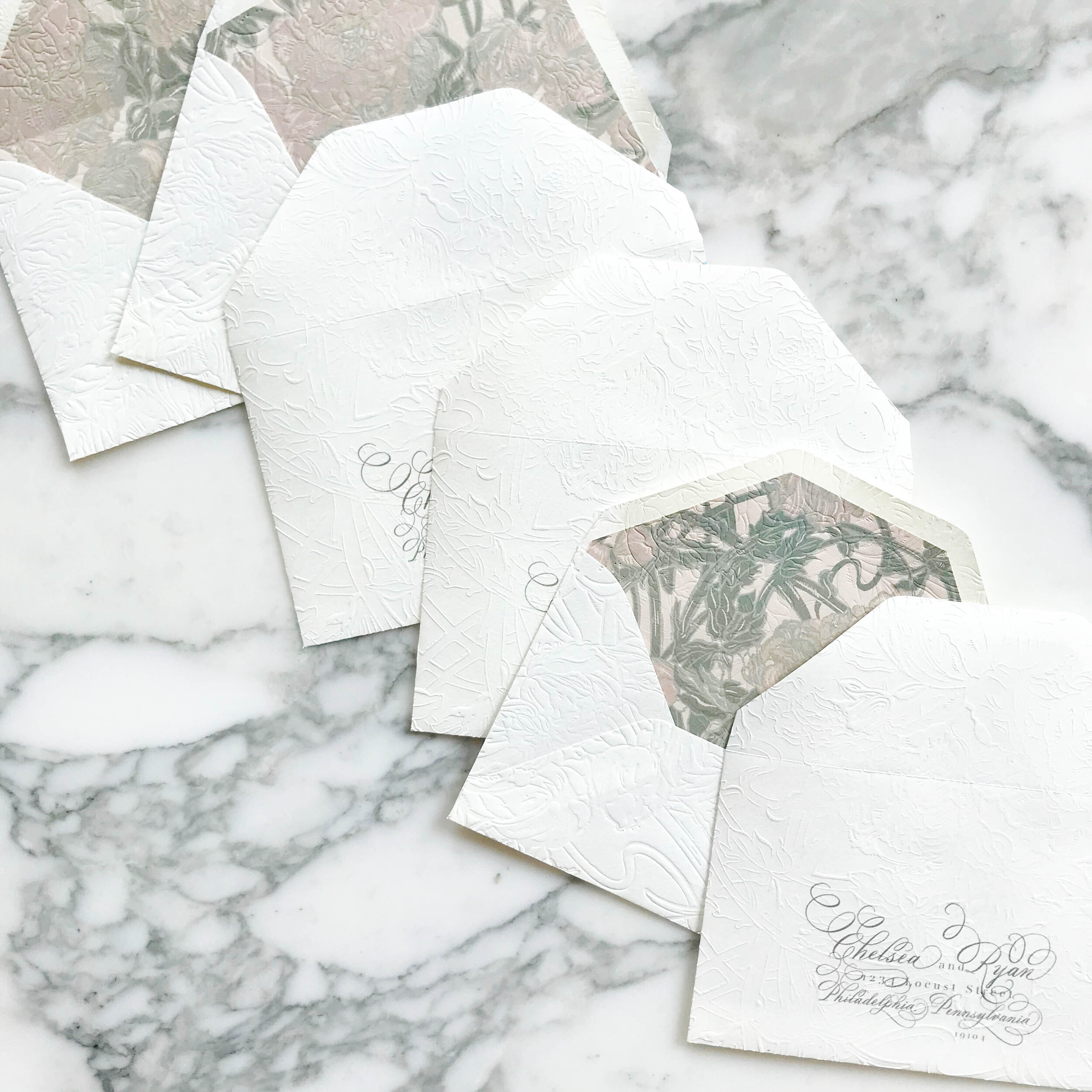

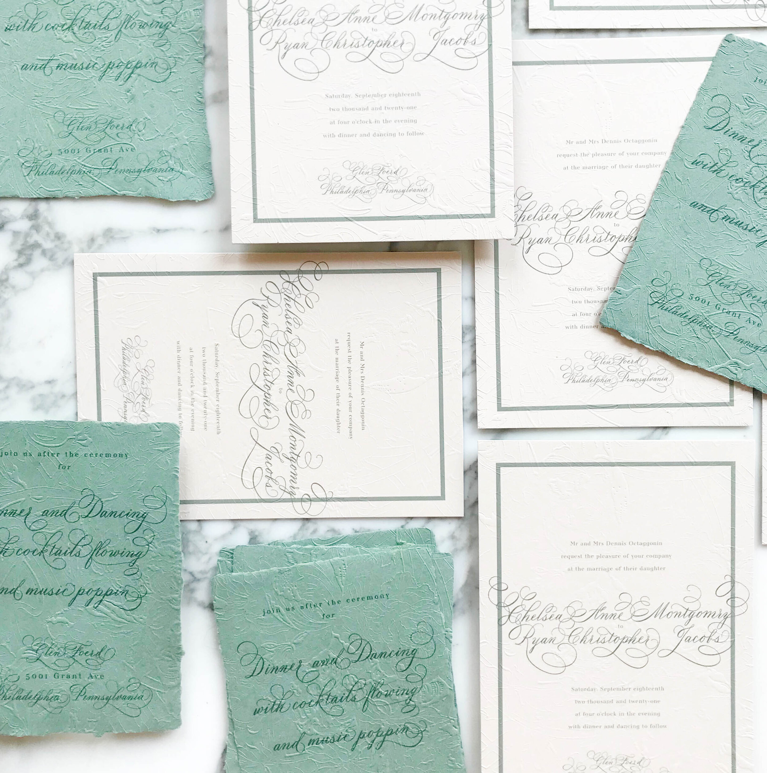
Like most of our projects, we combined several different paper types to come to our finished design. For this particular suite, we ended up with six different types of papers, including both machined and handmade.
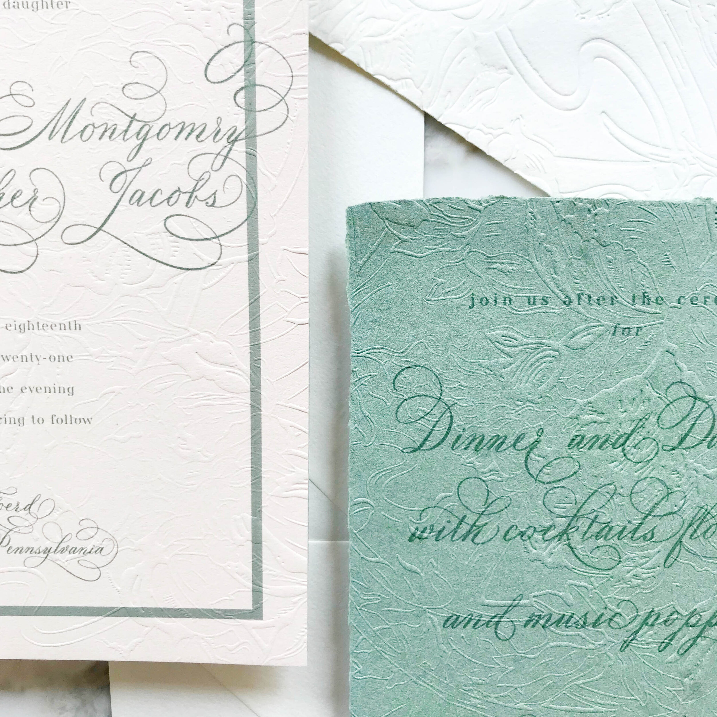
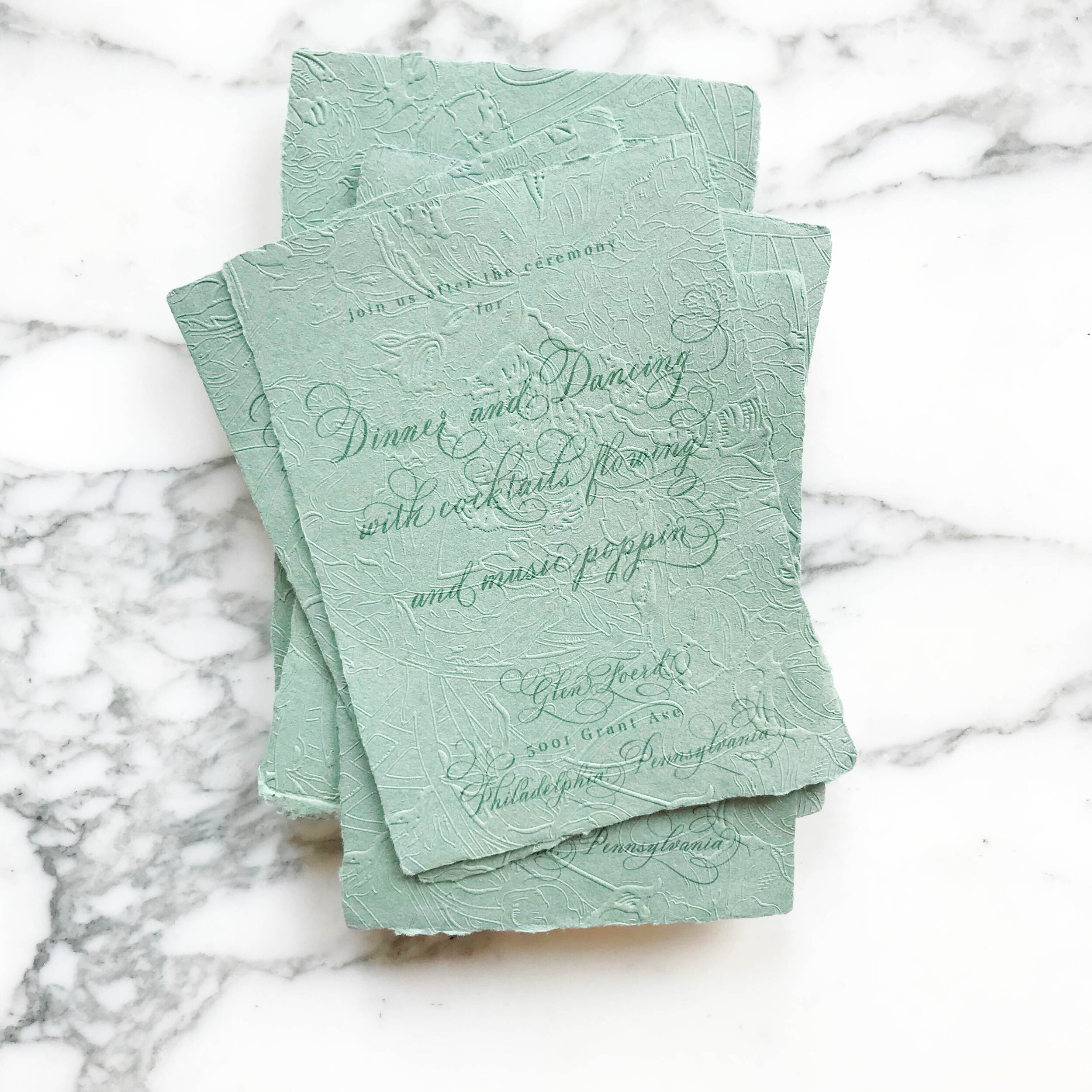
The art nouveau design includes three handmade papers for the green reception card, reply card, and dress code tri-fold. The invitation consisted of two different machined papers, the first in a nude, then backed with a pale green. Our envelopes were both a gorgeous cream, and our envelopes liners were on the same rich nude as the invitations.
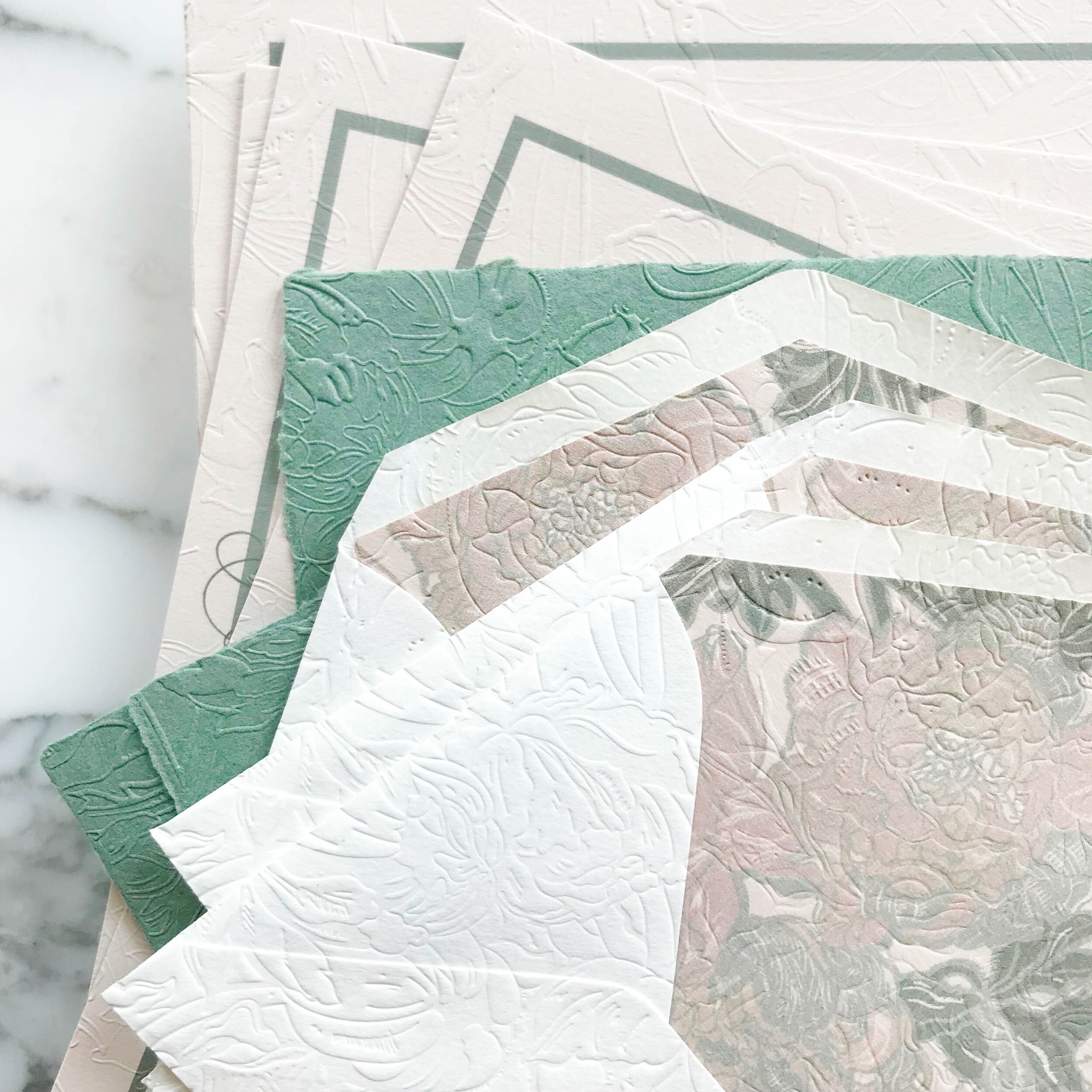
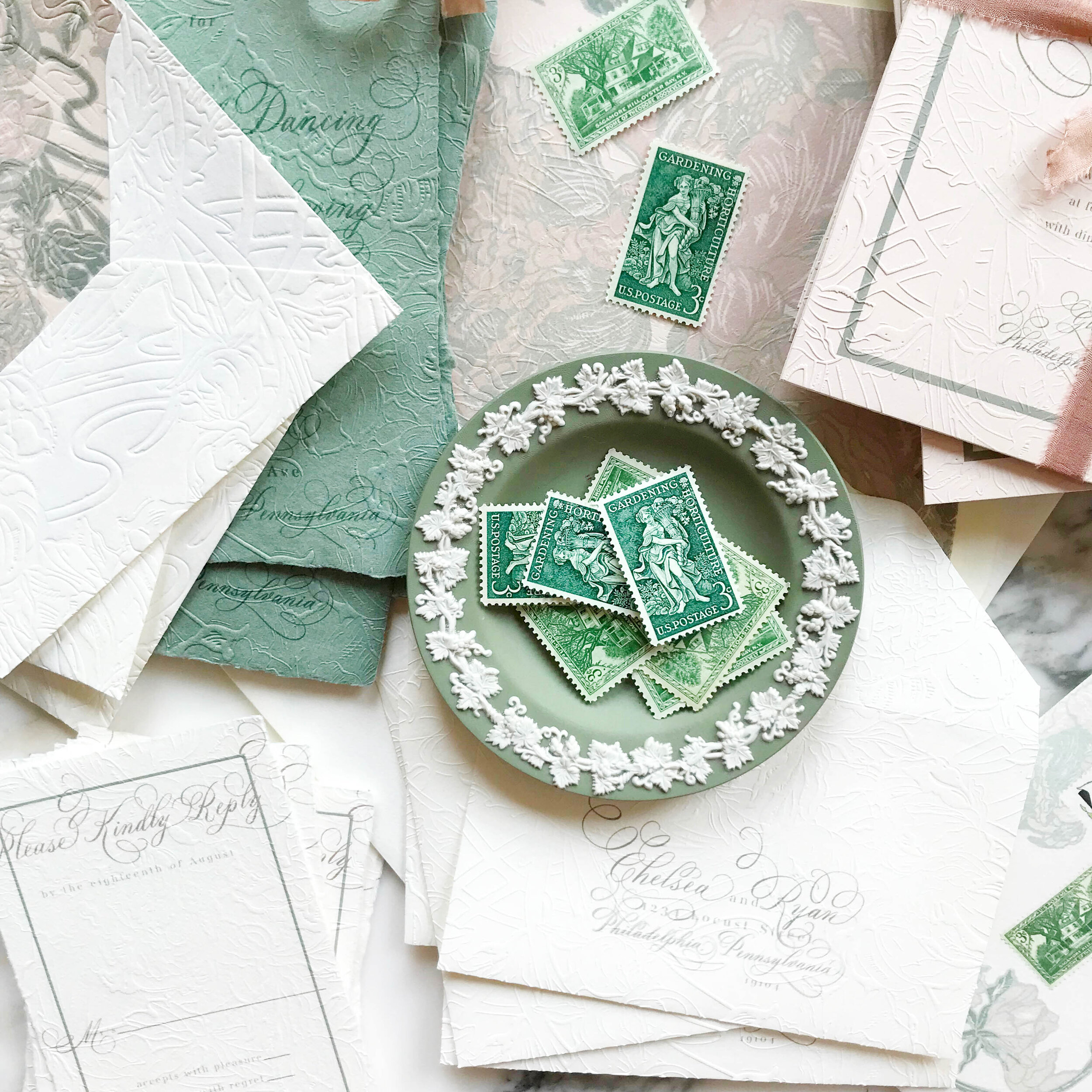
Our darling little tri-folded cards of handmade paper were sealed closed with a tiny wax seal in a taupe grey and embossed with the pattern showing on both sides.


Bespoke Invitation ... sage & rosemary
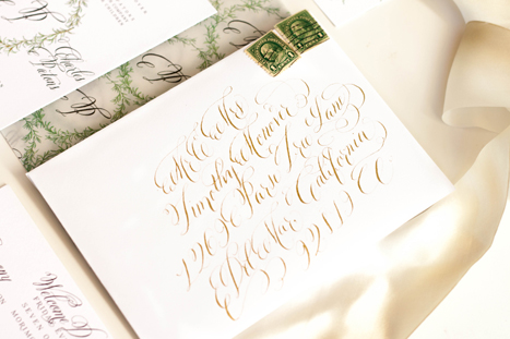
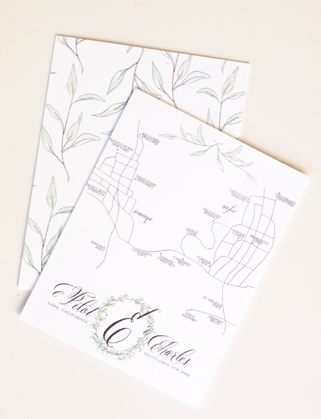
I loved working on this suite...hand drawn rosemary and sage, with touches of gold. The suite was designed around the wedding's venue, hosted at the Carneros Inn in Napa, California. We wanted to incorporate the feeling of the countryside and farm-to-table without leaning too far into the "winery" look and feel of things.
I always choose a group of descriptors for a design, whether its a wedding, invitation, or a home. For this suite, we choose: organic, rustic, elegant, easy, airy, herbal, farm to table, calligraphic,


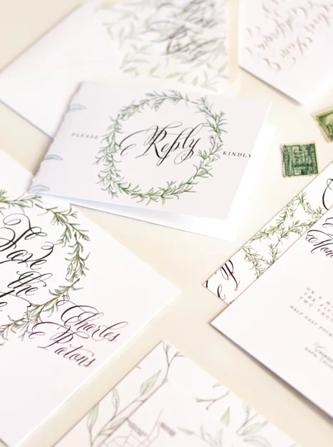
I created a laurel from sketched and painted rosemary to incorporate through several pieces in the suite as well as their monogram. We then used it on the invitation, backer, velum wrap, save the date, front of the reply card, table numbers and the monogram on their hand drawn map. The other darling little design element of this suite that I really loved was the idea of taping herbs to a page and jotting their names on the tape...I really haven't any clue where the idea came from, I just thought it was a creative way of using the pieces. The "taped herbs" were used as backers for several of the pieces and also along the bottom of the reception card.
after the suite was printed, we had each piece run with gold foil to add little bits of gold sparkle into the watercolor elements. We decided against doing gold for the letter as we liked the look of the heavy black contrast. Naturally, all the envelopes were addressed in gold calligraphy ink.