How to Combine Classic & Modern
How do you combine two totally opposing design ideas? We’ll show you…
classic | elegant | gold | clean lines | monochromatic | bold
an invitation suite for a wedding at:
New York Public Library | New York, New York
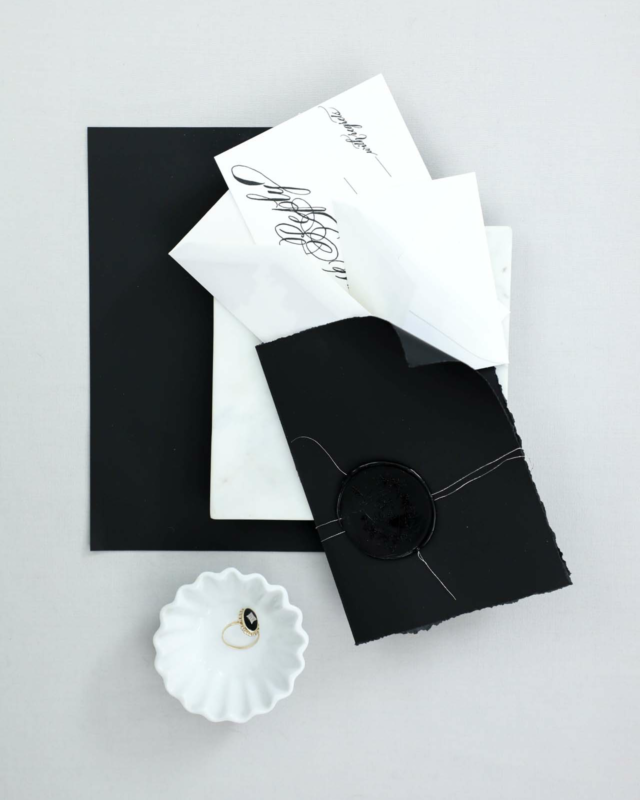
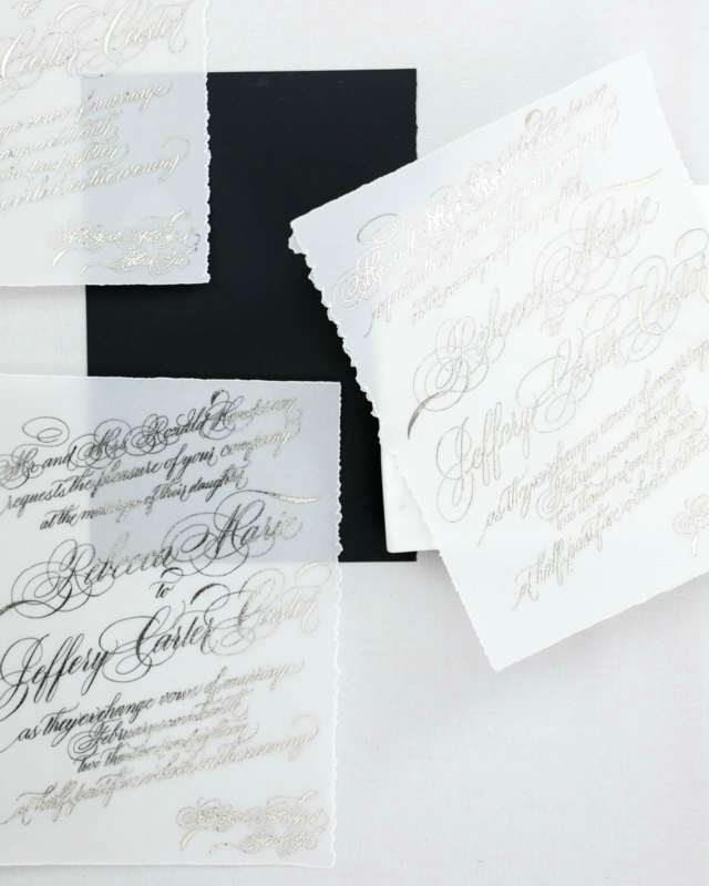
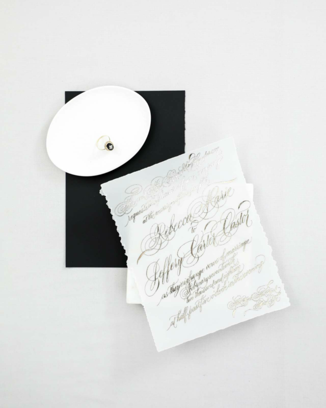
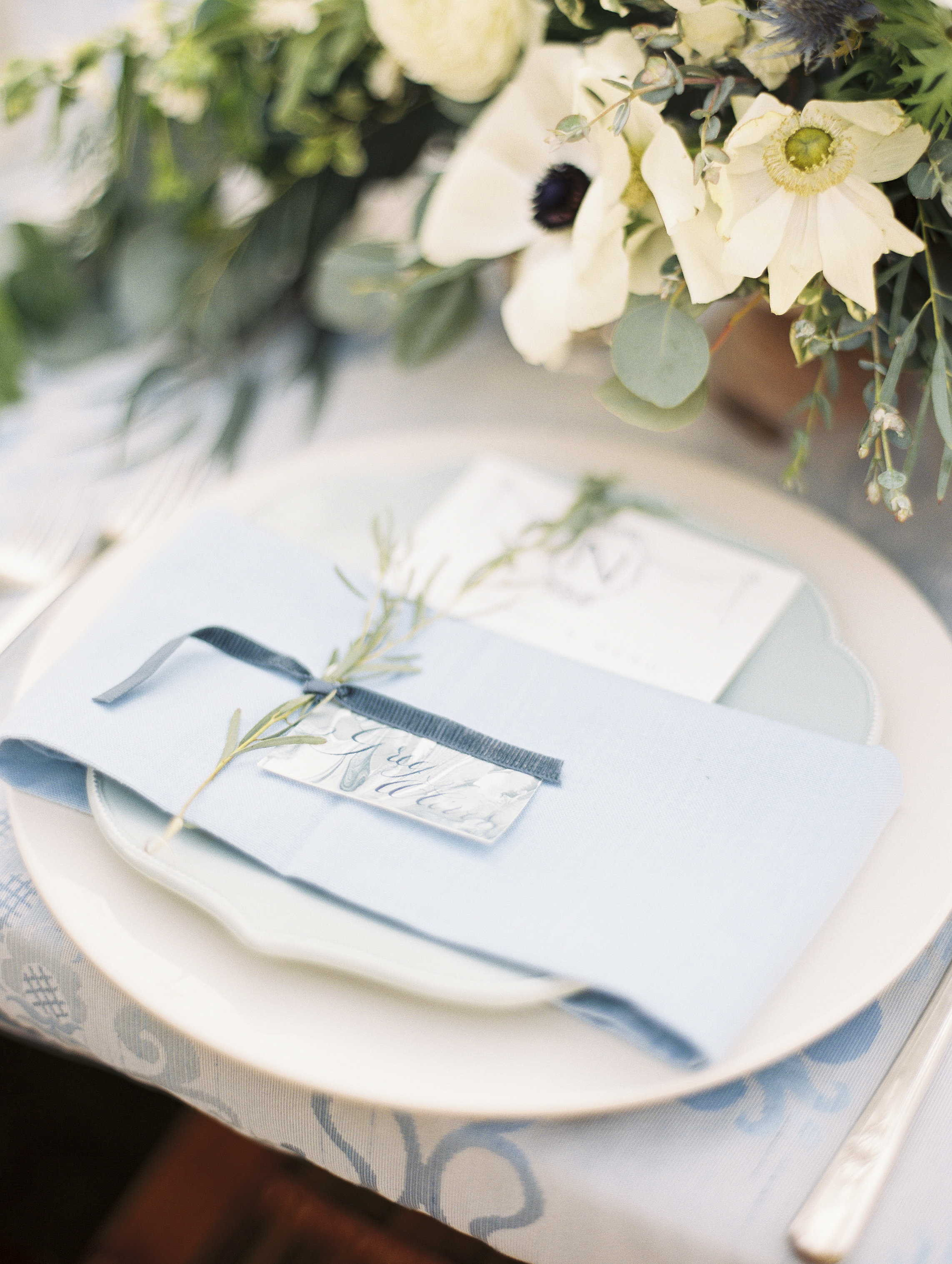
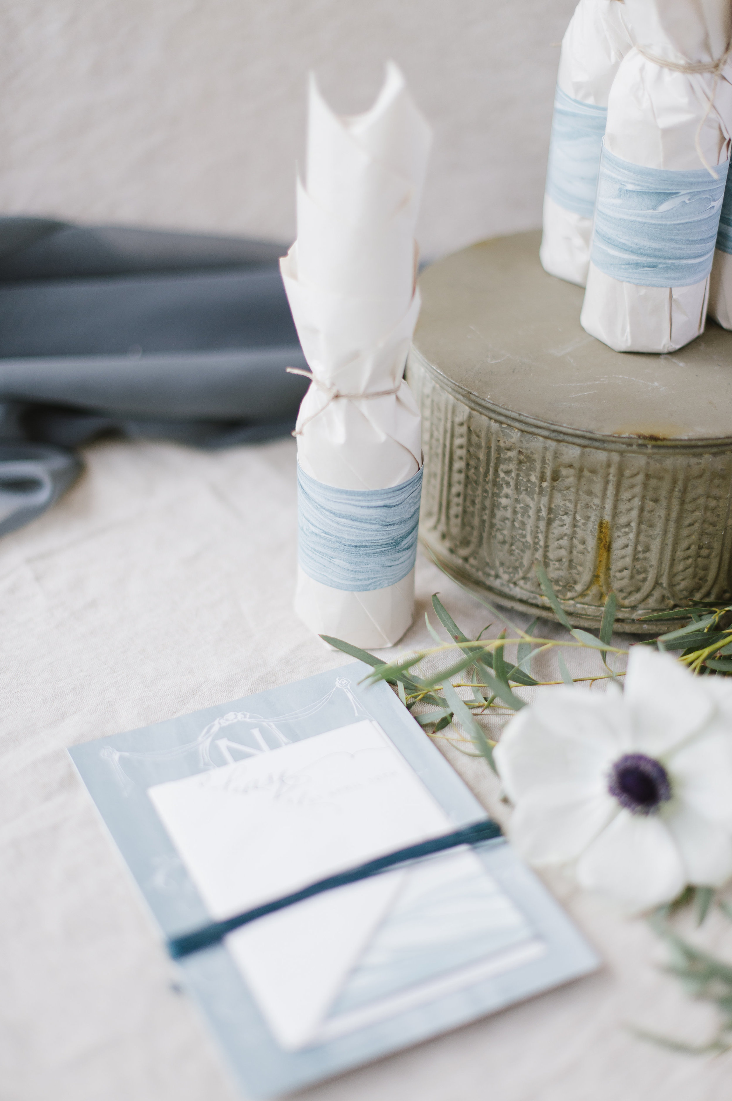
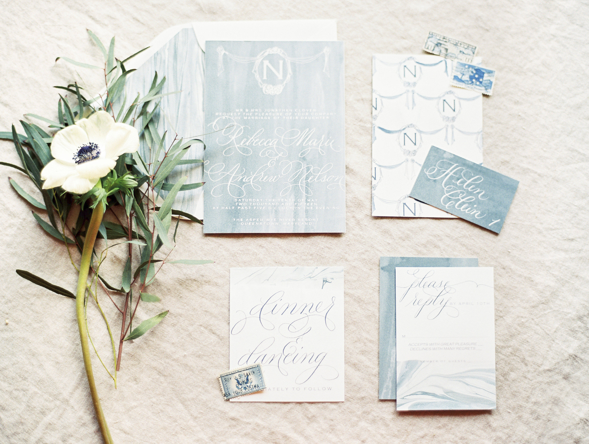
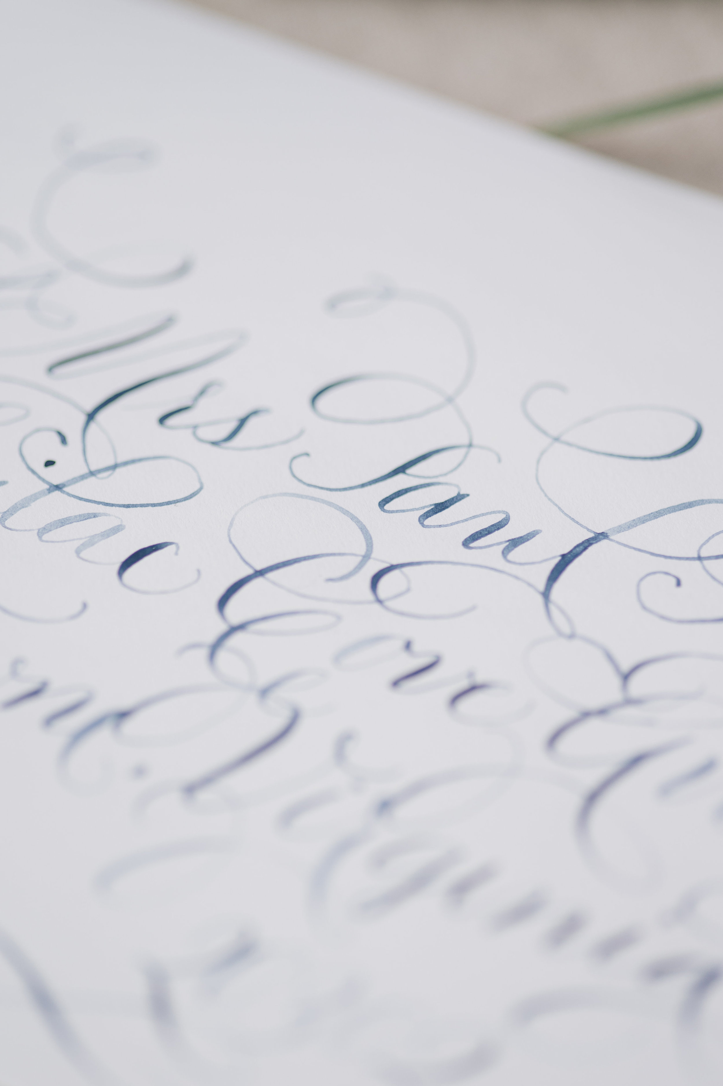
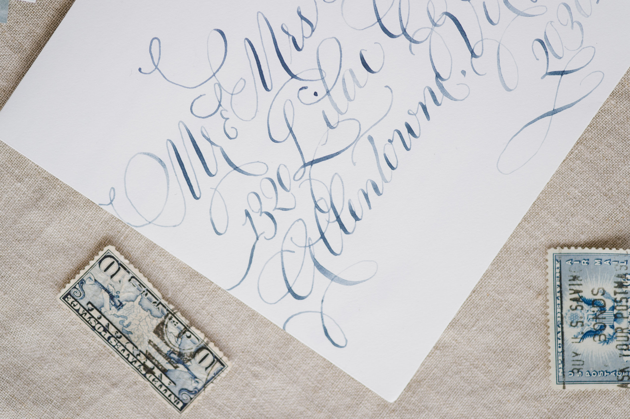
For a wedding at the New York Public Library, our bride wanted to figure out how to combine super traditional, flourished calligraphy (her favorite!) but with more modern lines and a bit of gold.
We started with our paper selection.
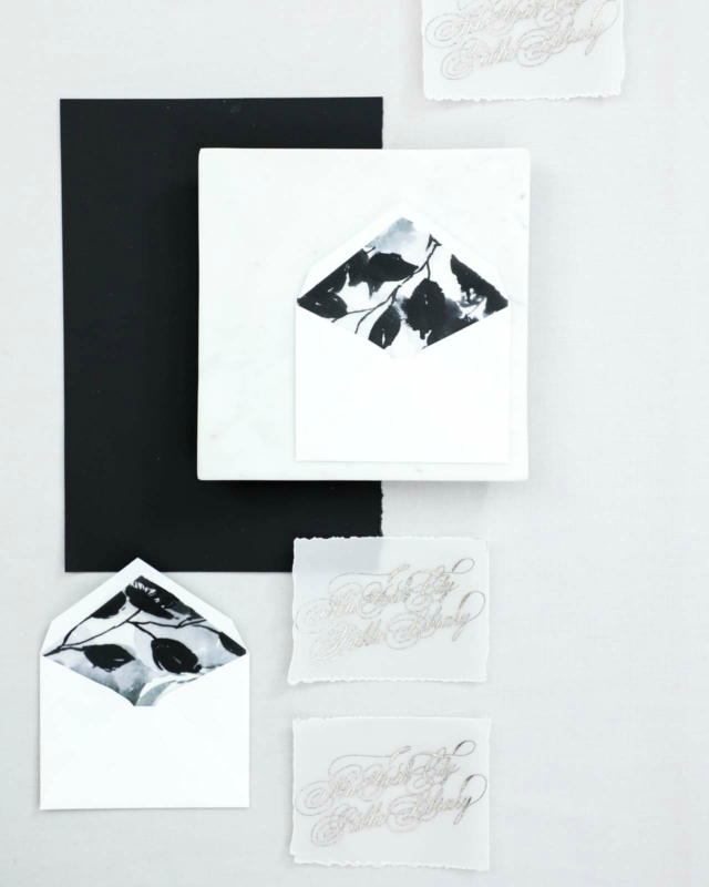
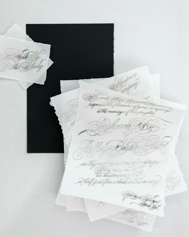
We went with a bold, bright white cotton, a silky smooth black, and thick vellum with deckled edges. The bold white gave us a modern feel while balancing out the over-the-top calligraphy.
We also selected an oversized wax seal in black, again, aiming to combine the traditional and modern.
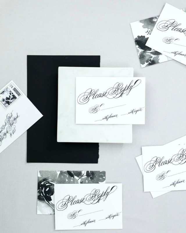
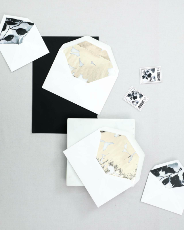
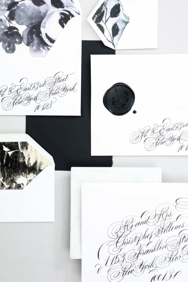
We used a combination of printing methods, including digital printing for our bold monochromatic patterns, and foil for the invitation, reply card envelope liners, and mini insert cards.
We placed the bold black and white floral pattern on both the backs of our insert cards as well as the envelope liners on our mini bright white envelopes.
Bespoke | Rebecca & Jeff
Behind the Scenes
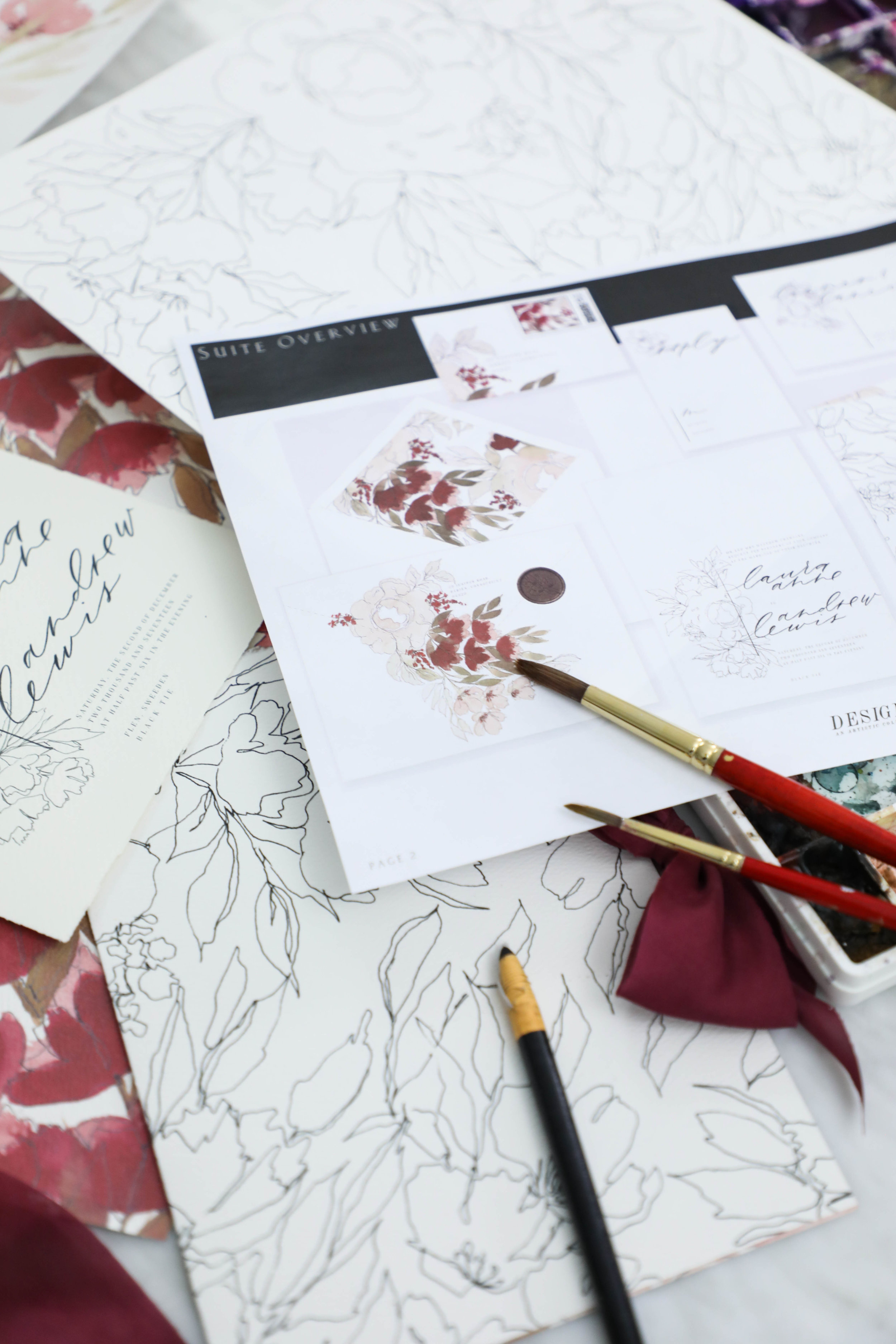
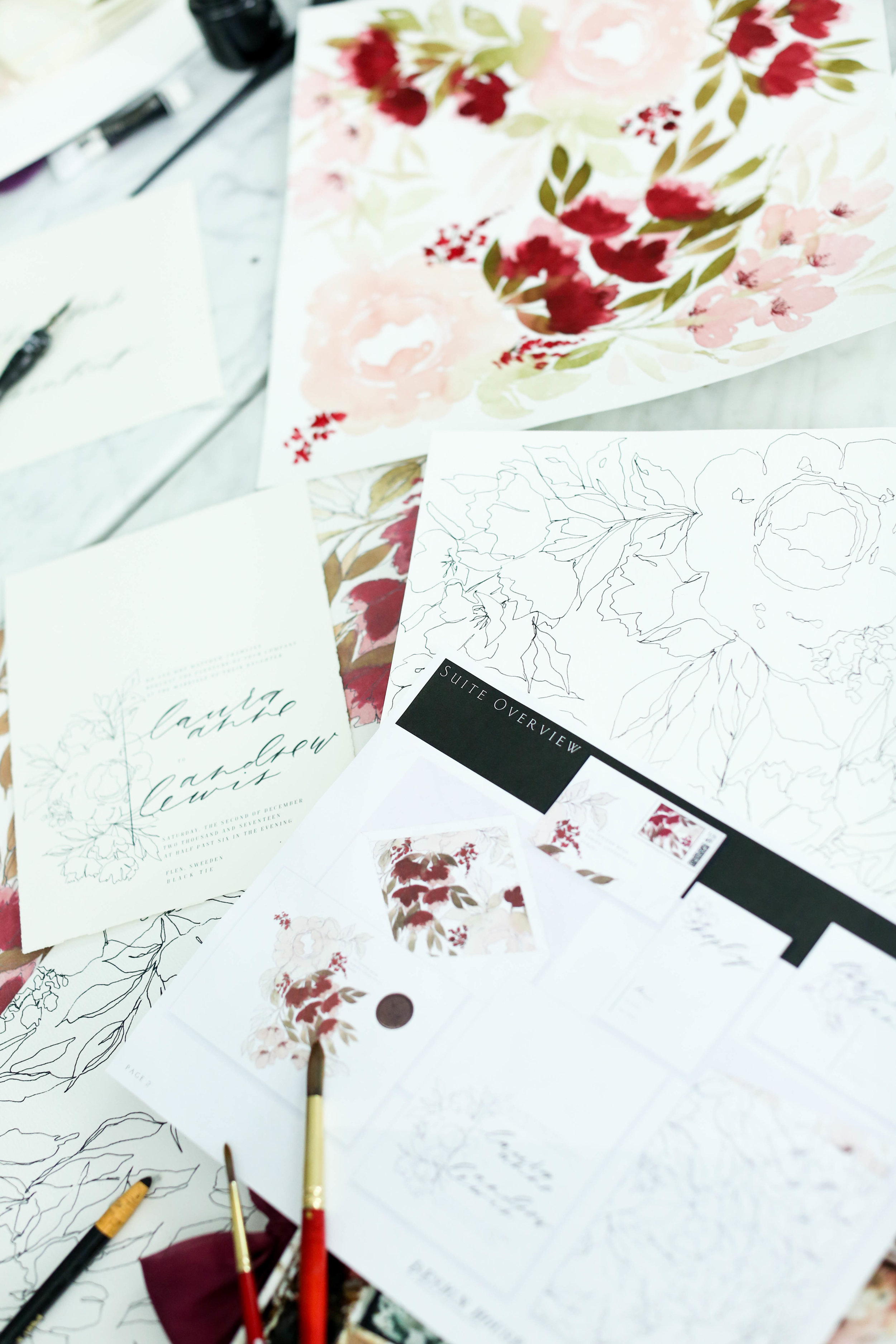
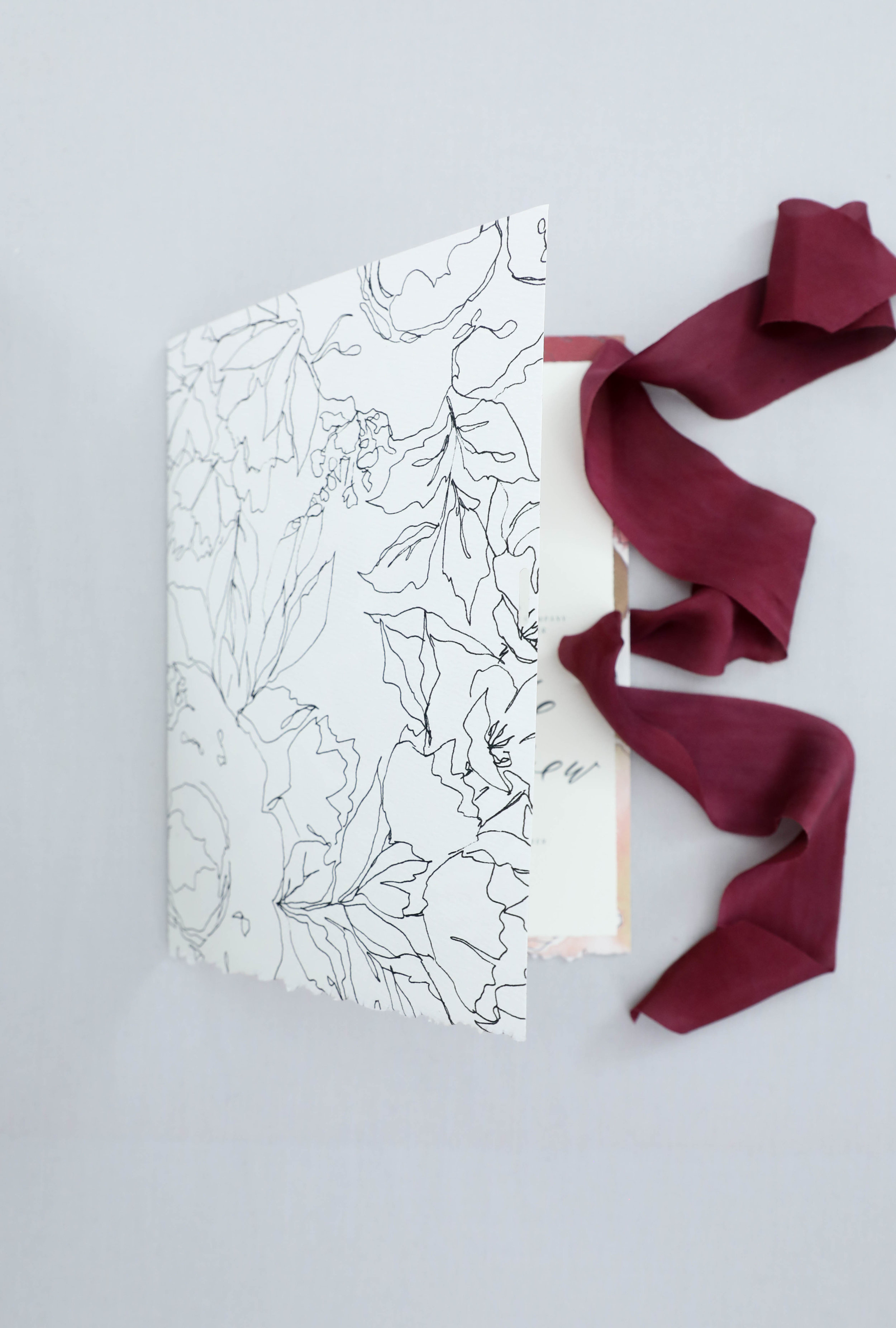
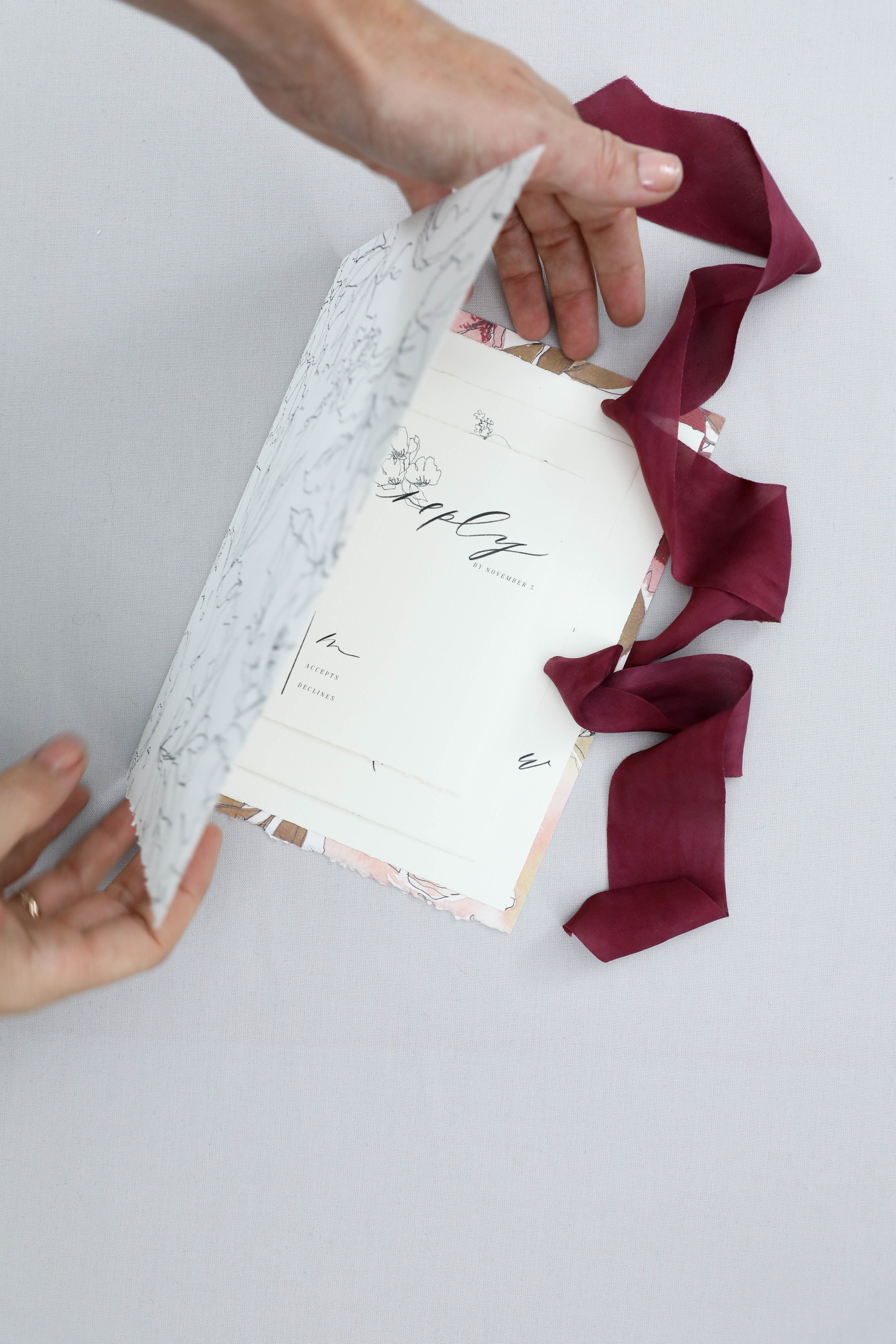
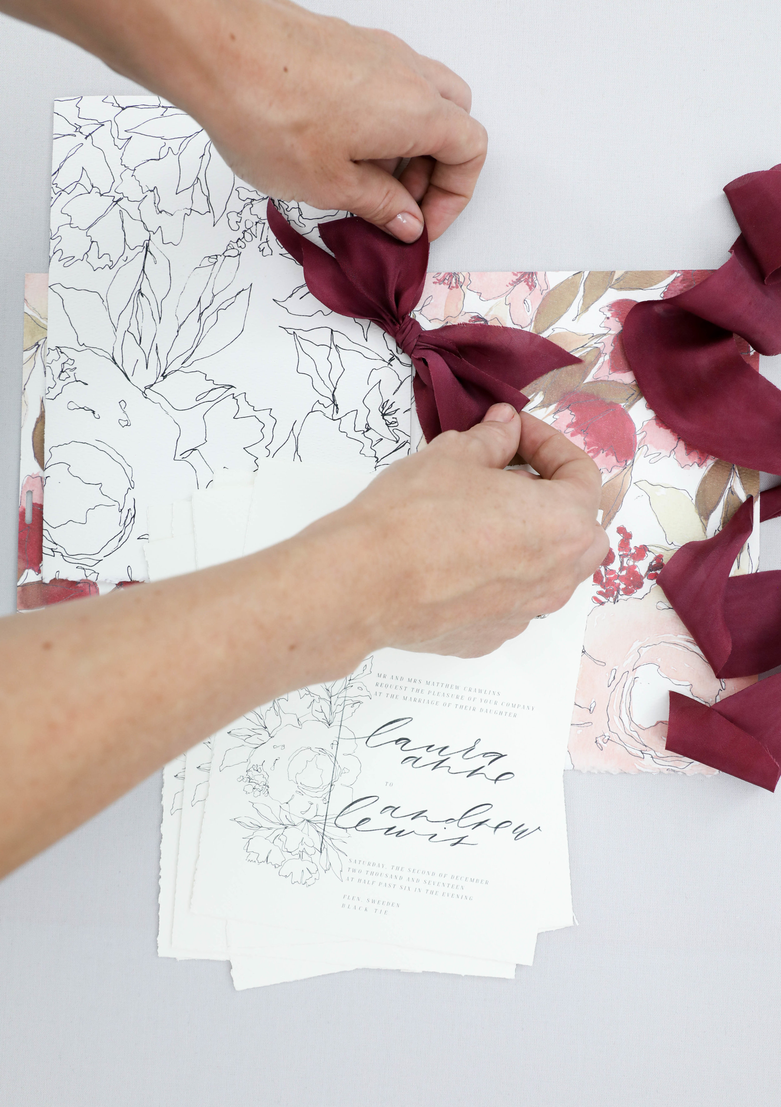
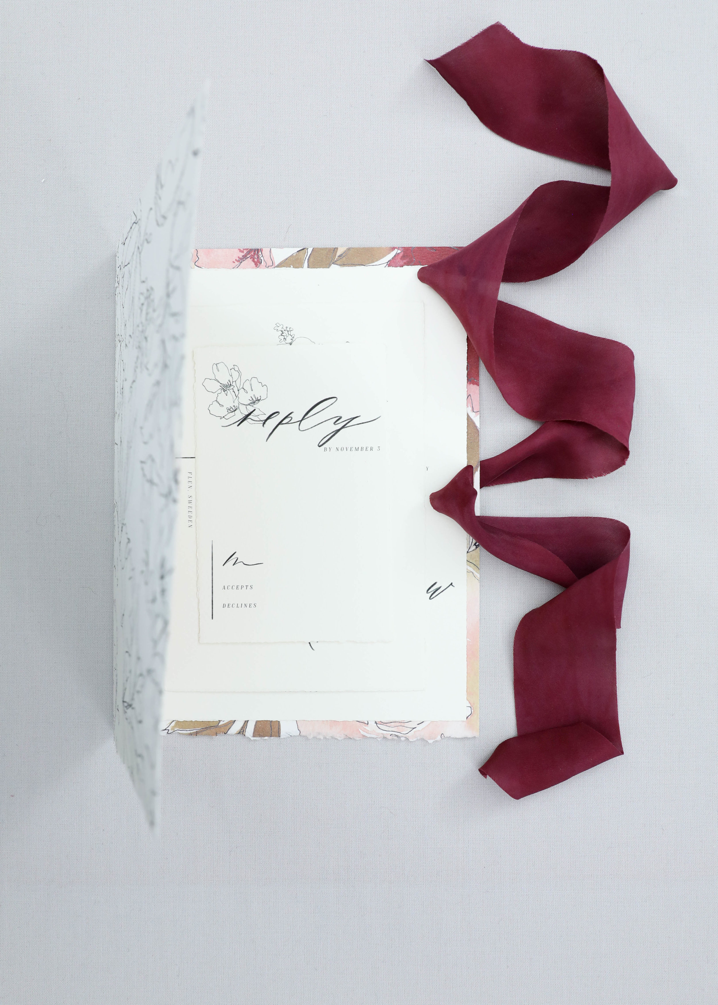
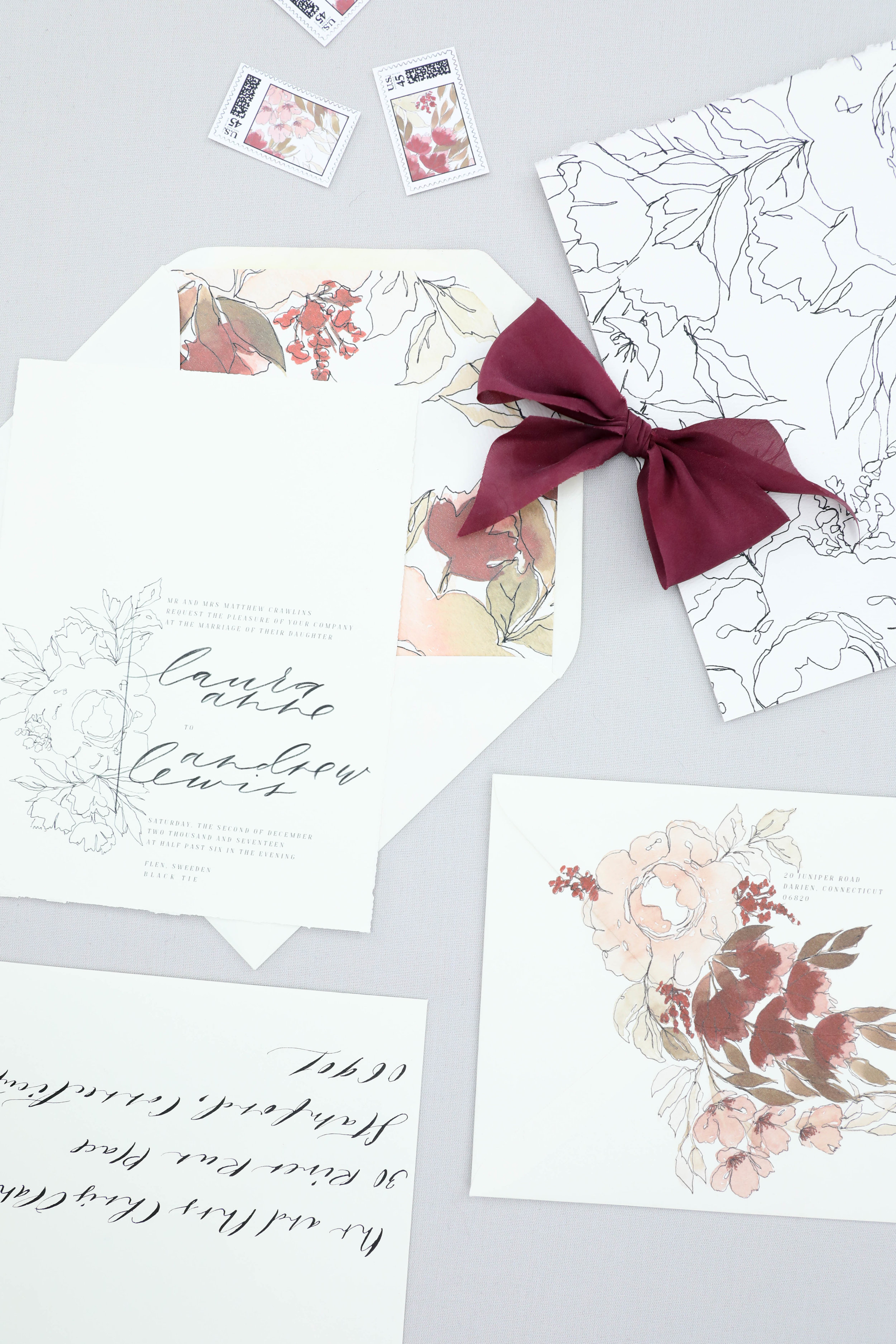
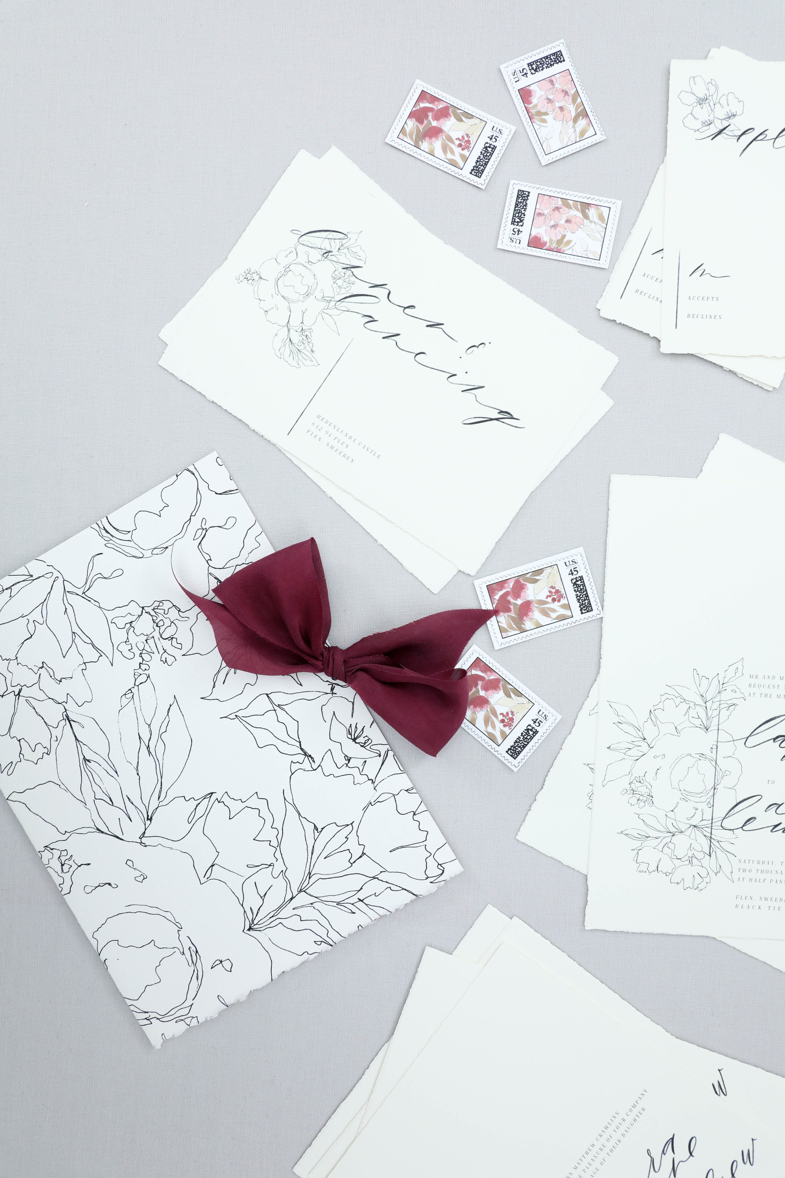
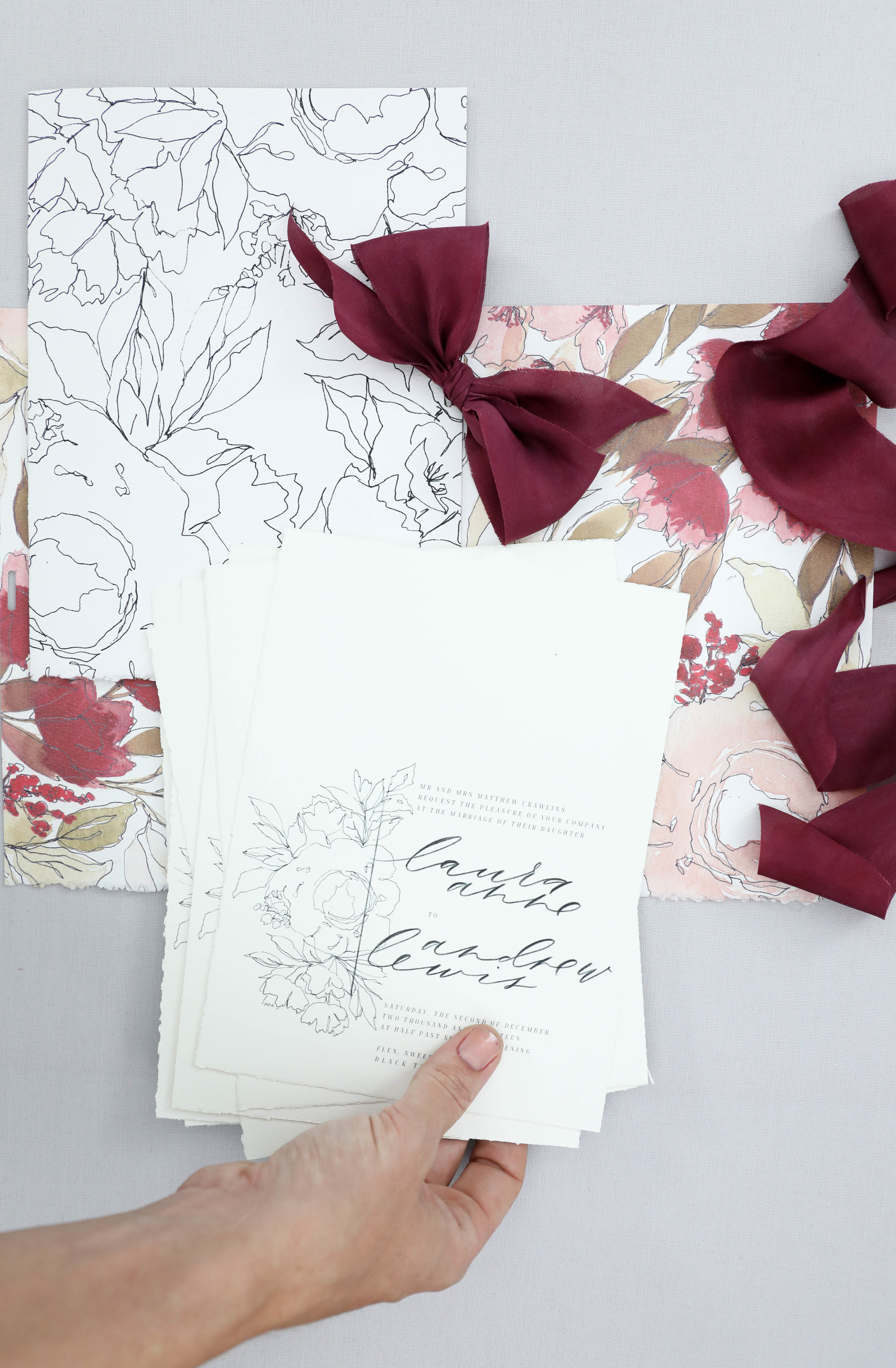
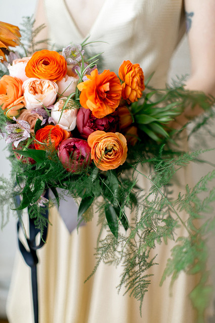
Laura was having a winter wedding and wanted to echo the tones of the season without having a Christmas wedding. We worked with her florist and gown designer to incorporate the same floral types as her bouquet and the applique on her gown to create the floral pattern. The outlined line botanicals of her invitation was a wonderful match for the lace on her gown as well.
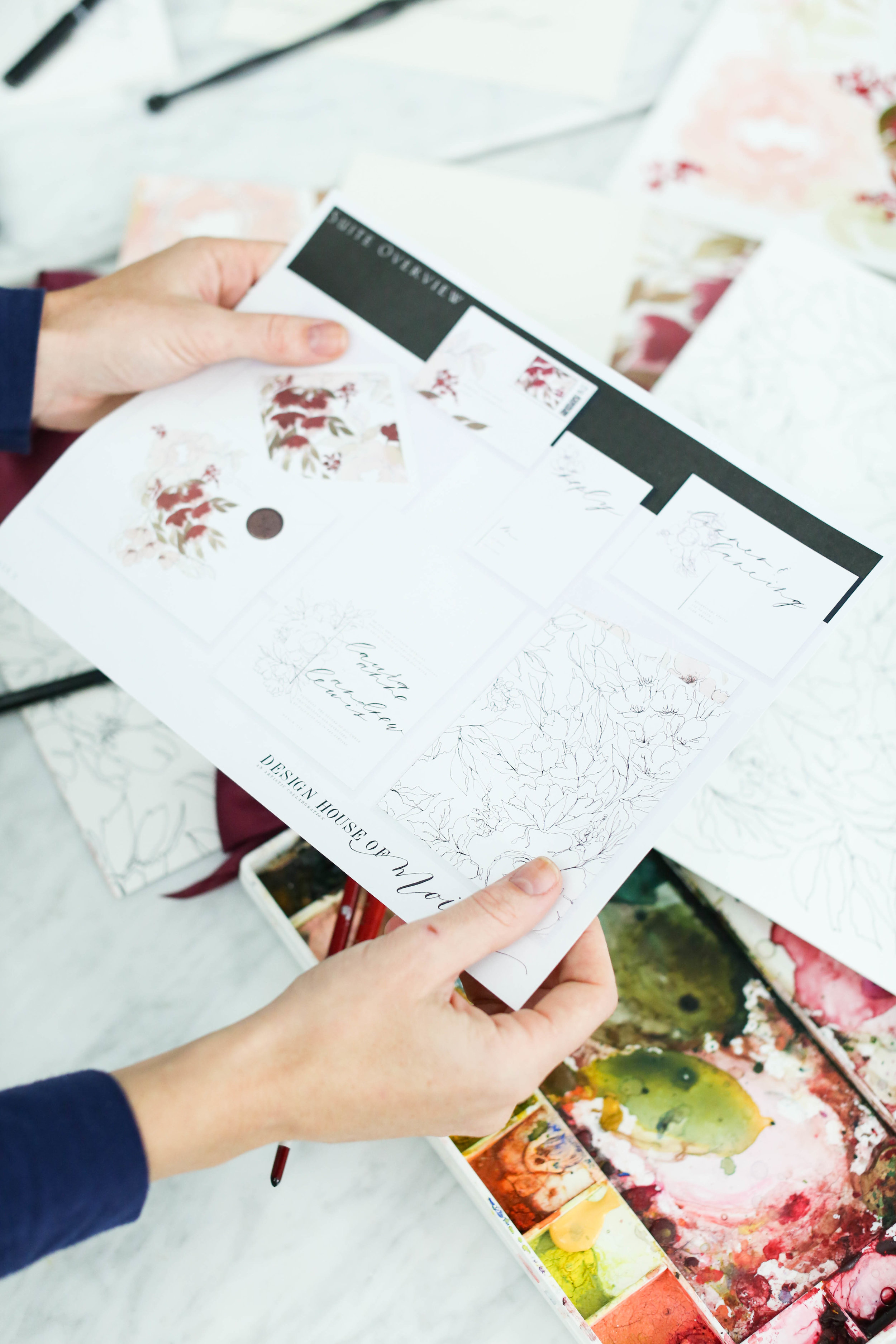
We first begin working with a client by creating a sketch incorporating their ideas and the vision we have for their pieces. From that sketch, we create all the artwork and work into their proof.
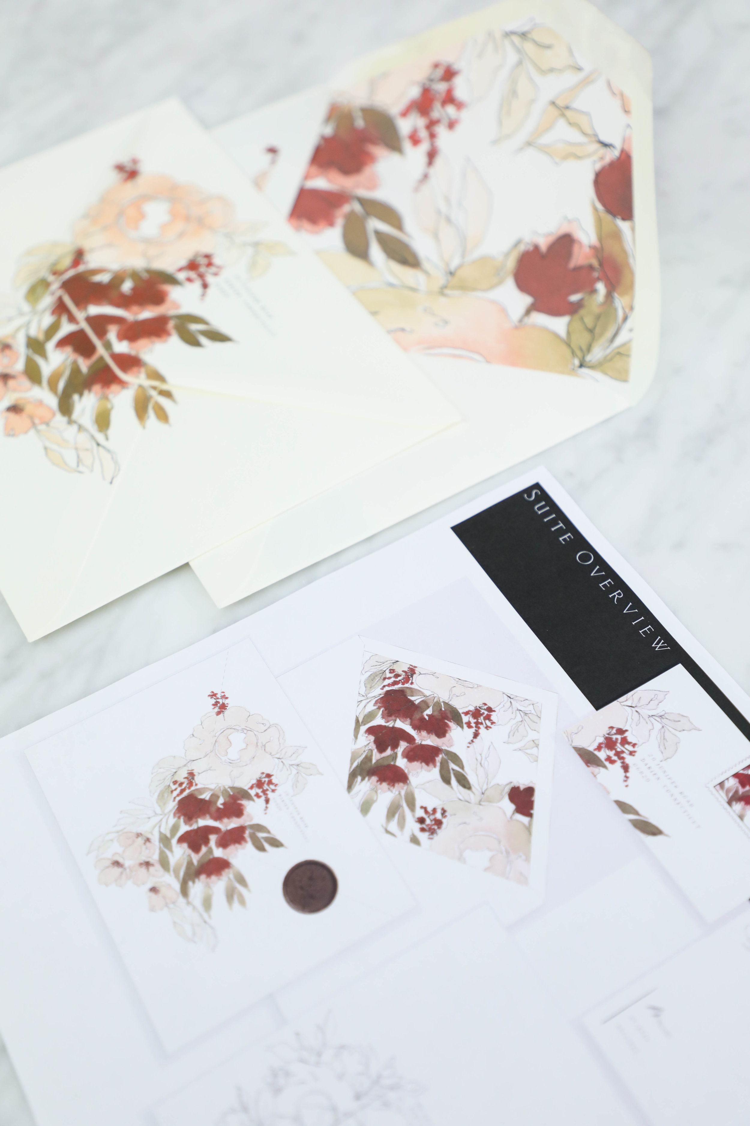
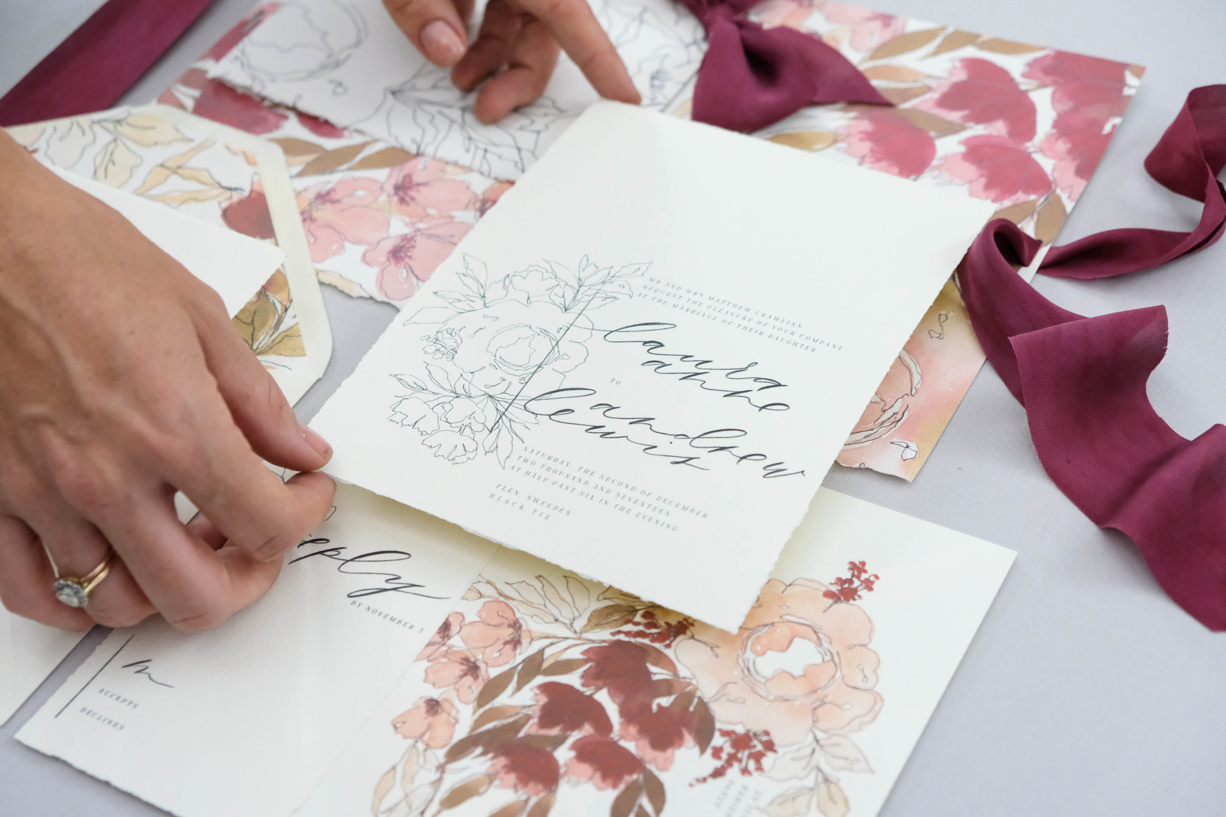
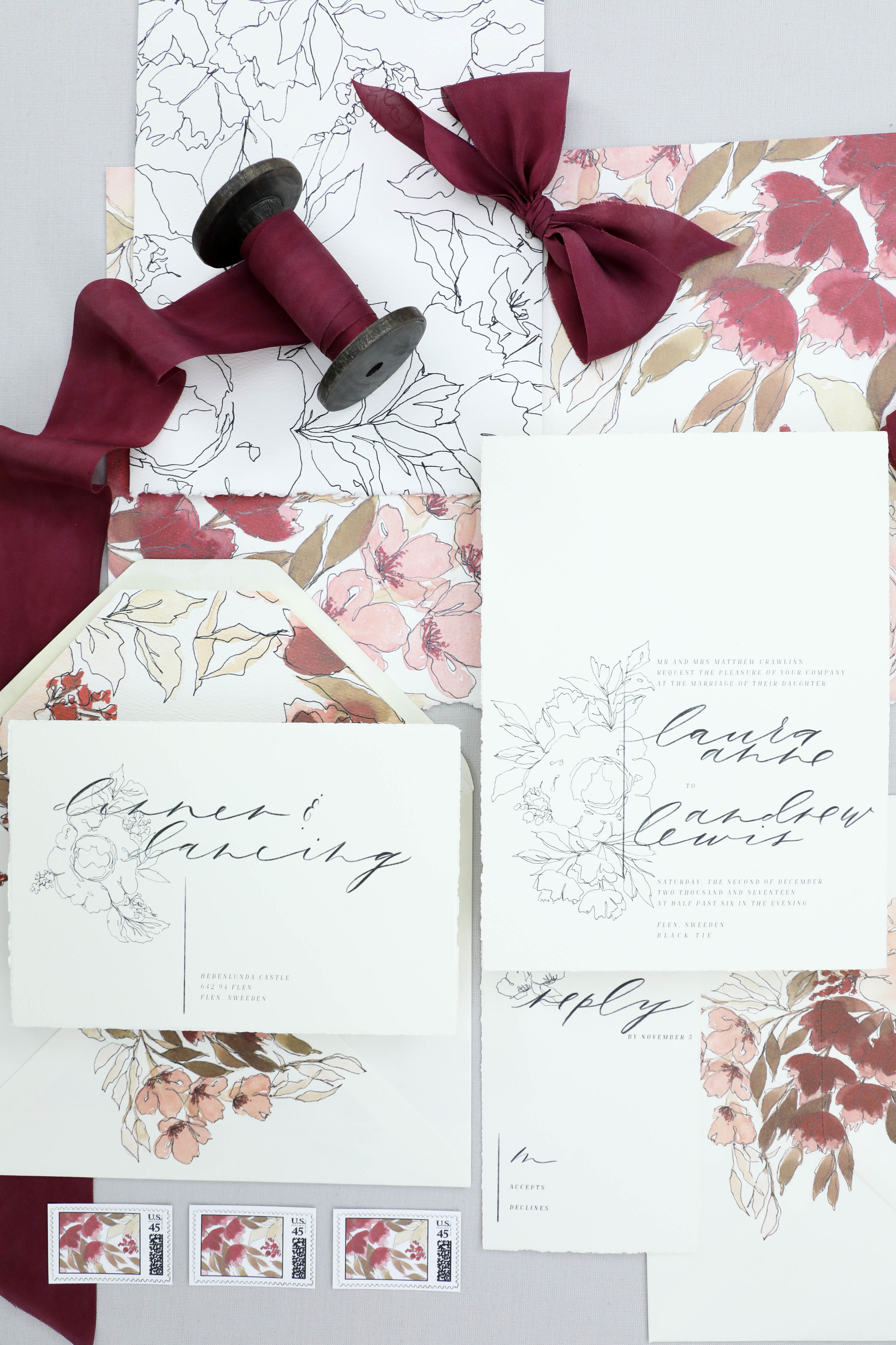
The photos below show Laura's proof, the original artwork that was used to create her design, as well as a few of her printed pieces.
Printed Pieces
Her final pieces were on the larger size and tucked into a custom printed folder. The folder was printed with the simple line botanicals pattern on the outside, and the full color artwork on the inside. All of the invitation pieces were tucked inside and it was tied shut with a burgundy silk ribbon and mailed in an envelope lined with a combined artwork and line botanicals and printed with blooms.
We kept the invitations simple with line botanicals to let the artwork on the folder be the focal point.
Bespoke | Indigo
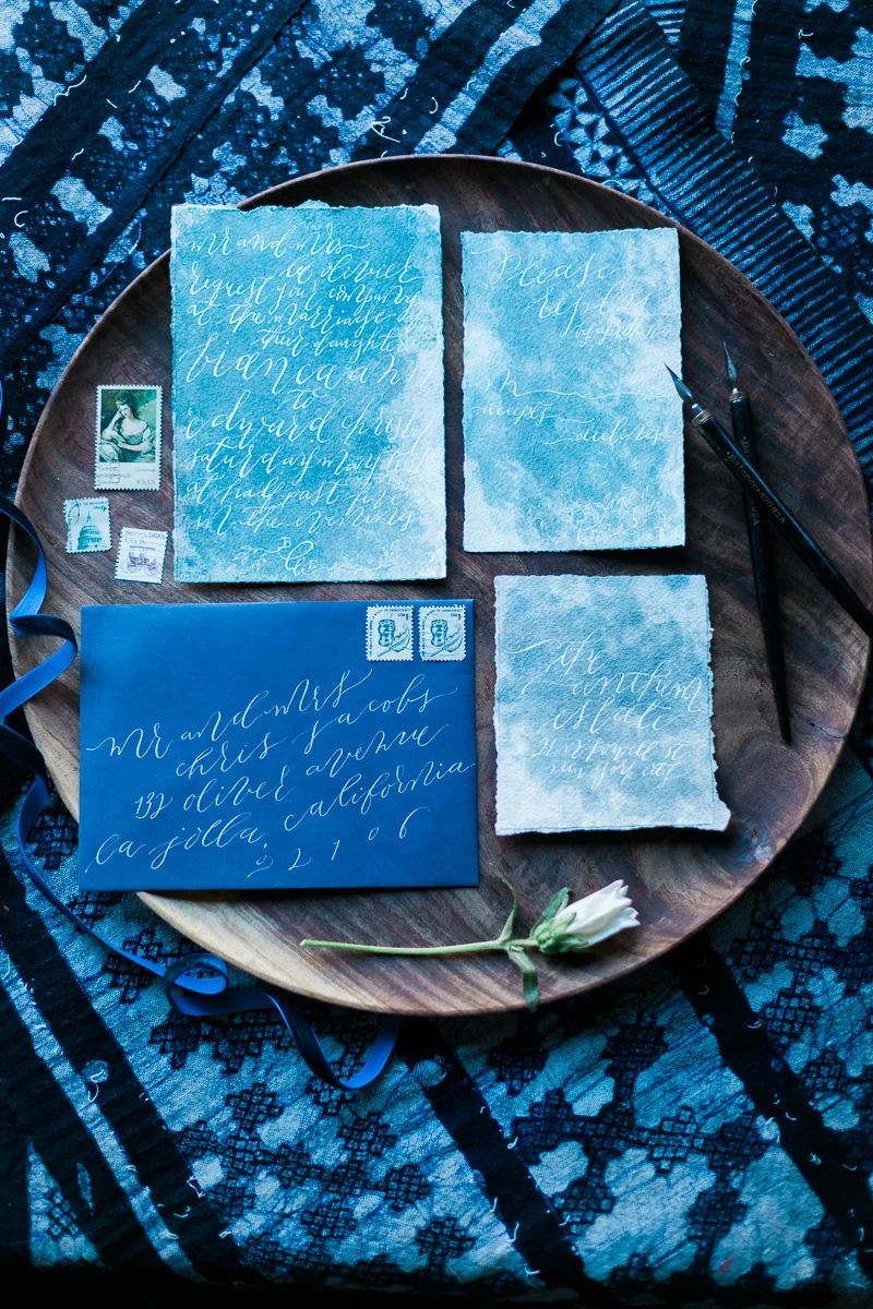
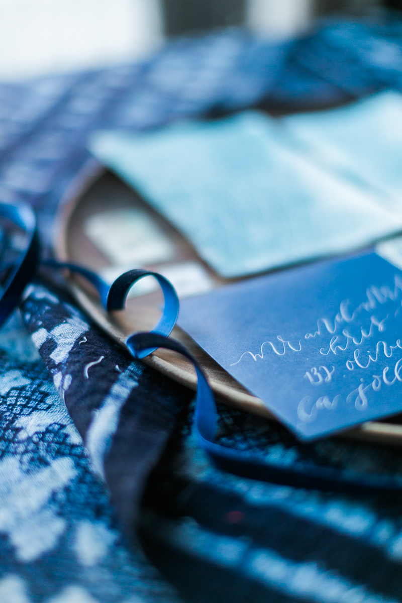
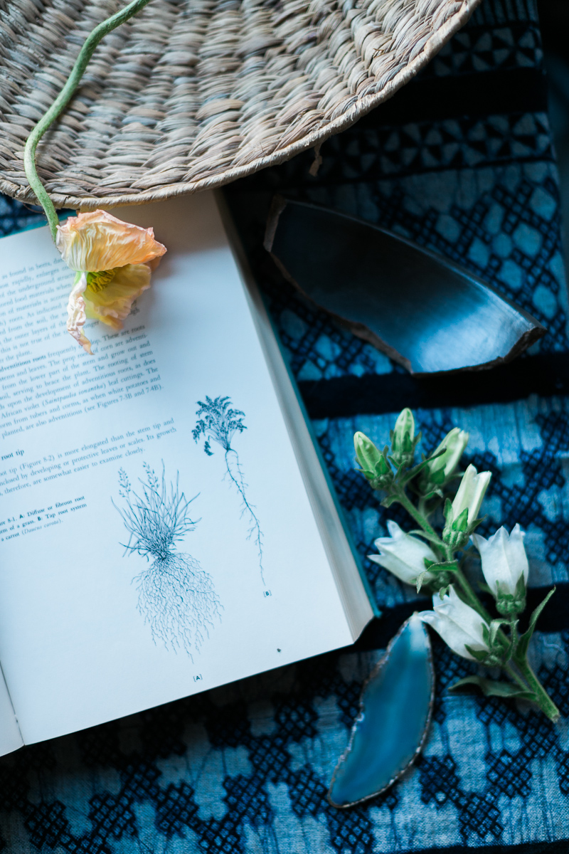
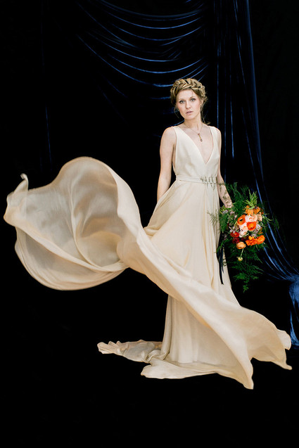
From our amazing photographer on the project, Cadence Kennedy, "As an artist and photographer, I am constantly inspired by color, light and art. I started dreaming of an "indigo" inspired styled shoot after learning of "Cyanotypes" a few years back. Cyanotypes are deep blue photographic prints which originated during the 1800's. They are created by laying botanicals or objects on top of light sensitive paper, exposed to the sun, then developed."
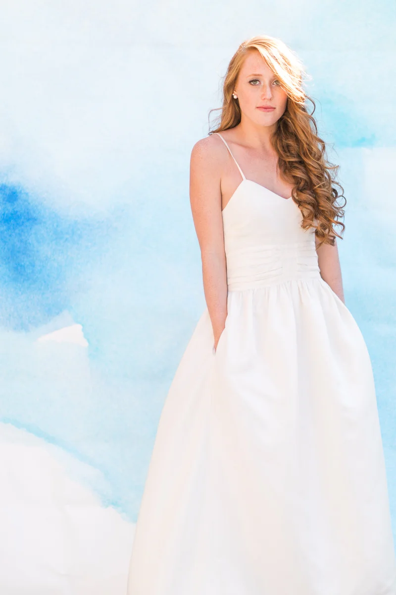
Photography: Cadence Kennedy // Florals: Aurora Botanica // Styling: L 'atelier Vert // Calligraphy: Design House of Moira // Curation: Orchard + Broome // Dresses: Stone Fox Bride // Backdrop: Starling On Bond // Hair: Hair by Tiffany Hayden // Makeup: Jillian Cleary
Featured | 100 layer cake - dutch masters
A bit earlier this year, a project I collaborated was featured on 100 Layer Cake! It was a pleasure to collaborate with Emily Wren on this moody project.
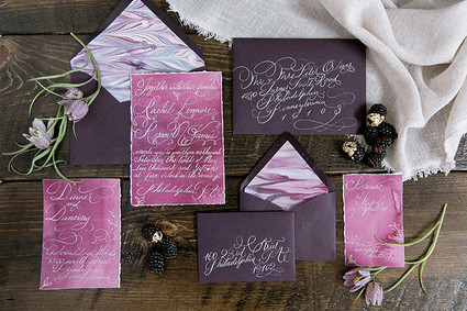
The invitations were a gorgeous, deep aubergine, watercolor washed plum and featured coordinating hand marbled paper as the envelope liners. The over the top flourished calligraphy was printed in white foil and then addressed in matching calligraphy.
Photographer: Emily Wren Photography / Location: Power Plant Productions / Event Design: Confetti & Co. / Floral Design: Kate Farley Design / Hair & Makeup: True Beauty Marks / Calligraphy: Design House of Moira / Desserts: Cake Life Bake Shop / Catering: Birchtree Catering / Rentals: Maggpie Vintage Rentals / Dress: Carol Hannah from Lovely Bride Philadelphia / Jewelry: Egan Day / Models: Gina (owner of True Beauty Marks) & Mike
Bespoke | Moody + Gold
...inspired by the still life painting of the old masters full of dramatic colors and gorgeous, light textures. The photography for this project was so lovely, light and airy; I just fell in love with the finished images!
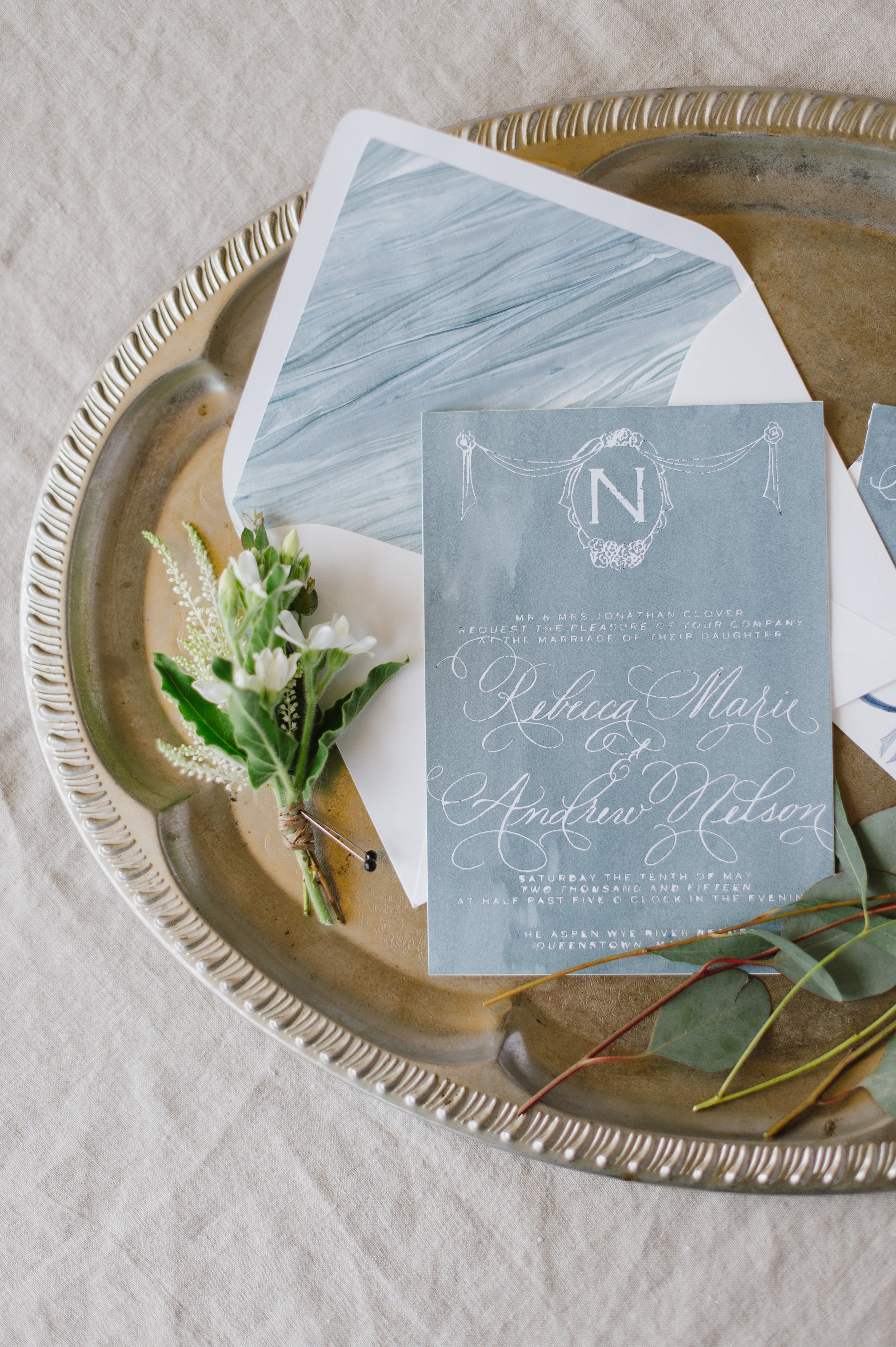
the invitation for this suite included taupe watercolor with gold foil. the invitation was topped with a crested monogram and surrounded by a border. I loved combining the contemporary watercolor with the moody colors. The invitation was layered with a deckled edge velum with the "ever mine" quote on it. The entire suite was wrapped in a raw edged linen with a matching monogram.
Shot by the lovely Cadence Kennedy
Featured | Bayside Workshop
Vendors: Photography: Natalie Franke // Styling: Kruse & Vieira Events // Florals: Intrigue Designs // Invite Suite & Paper Goods & lettering for table: Design House Of Moira // Calligraphy: Poppy & Scooter // Linens: BBJ Linens // Rentals: Select Event Group // Cake: Wildflour Fine Baking Co.// Welcome Basket: Marigold & Grey // Hair & Makeup: Behind The Veil // Gown: Kate McDonald Bridal // Tux: The Black Tux
Featured | Grey Likes Wedding
If you've ever had the pleasure of checking out the work of Natalie Franke, you're in for a serious pleasure! I worked with her, along side Kruse and Vieira Events for the gorgeous two-day Bayside Workshop in Queenstown, Maryland. The swoon worthy photographs were featured on Grey Likes Wedding last week! Here are the invitations I create for the workshop, with more lovely pictures to follow!
Free Printable | Taurus Cocktail
CITRUS SMASH
Yields one cocktail
2 oz top shelf gin
1-2 tangerine peels
1⁄2 oz simple syrup
1⁄2 oz lemon juice
1oz soda
Instructions: Muddle tangerine peels and simple syrup in flat-surfaced glass. Add gin, lemon juice, and top with soda. Serve on the rocks.
Enjoy a free printable of the Citrus Smash cocktail here!
Featured | Martha Stewart Weddings
Michelle Leo of Michelle Leo Events is one of the amazing leaders in our industry, so when she approached me to create a suite for her bride, Sara, I was honored! The suite we created is one of my all time favorites (I know I say that a lot, but how could I possibly pick a true favorite?!).
We wanted to keep the suite classic, elegant, and interesting with some texture and gold. The suite was printed in gold foil on 220lb stock in a pale ivory and a textured aubergine. The main invitation was adorned with antique lace appliqued in the corners, each hand cut from a larger lace piece (on the plus side, it didn't take nearly as long as I thought it would!). The envelopes were both lined with pale fall leaves and the suite was tied up with thin velvet ribbon. The aubergine envelopes were then addressed in flourished gold, and into the post they went!
The overall wedding was simply spectacular and it was such a joy to work with such an amazing team!
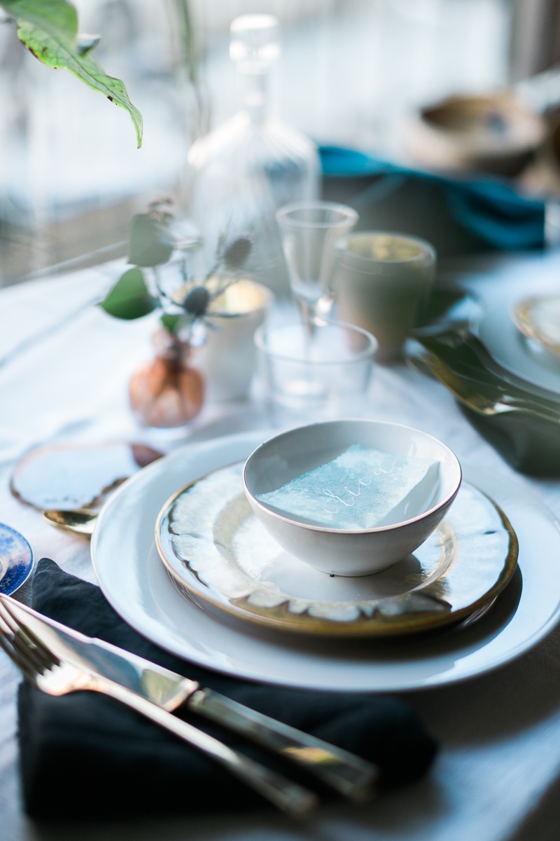
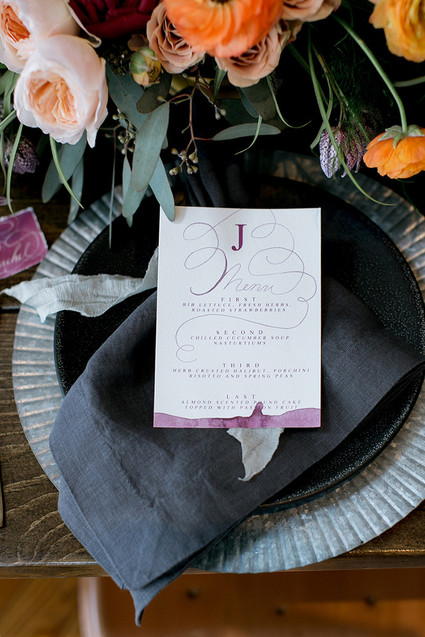
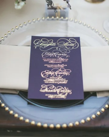
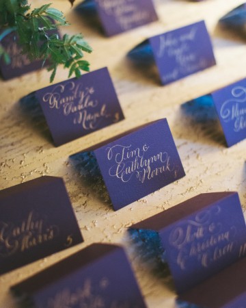
For the menus, we kept with the moody aubergine stock - we loved the way the color stood out against the taupe linens. The main lettering was all done by hand in calligraphy, then mixed with a classic and clean block type. The place cards continued the moody color scheme with each guests name in flourished gold ink.
Photography: Alixann Loosle Photography
Location: High Star Ranch
Event Planning: Michelle Leo Events
Catering: Culinary Crafts
Flowers: Urban Chateau Floral
Videography: Chris McClain
Officiant: Rev. Kamrin Carver
Stationery and Calligraphy: Moira Designs
Cake: One Sweet Slice
Music: Joe Muscolino Band
Rentals: Diamond Rental
Hair and Makeup: Studio Enizio
Featured | Flutter Magazine, Taurus
The second horoscope project I had the pleasure of pairing with Flutter Magazine on was the Taurus horoscope.
APRIL 20 — MAY 20: You love to keep things simple, but you also enjoy the luxuriousness of fine items. Splurge on a simple custom-made lace dress on your special day. Add elements of nature into your décor by using fruits for fun coloring. With earth being your zodiac element, utilize woods for texture to compliment the citrus on your tables. Gift your husband a leather embossed wallet on your wedding day (Will Leather Goods has a great selection!). He will carry it with him everywhere he goes. Set your sights on Costa Rica for an unforgettable honeymoon adventure.
As seen in Flutter Magazine, Issue No. 6
Photography: KT Merry | Design + Styling: Joy Proctor | Floral Design: Amy Osaba Events | Hair + Makeup: LunaBella Makeup and Hair | Jewelry: Sofia Kaman | Furniture: Found Vintage Rentals | Commissioned Cream Backdrop: Katherine Bell of The Habitat Factory | Cocktails + Recipes: Melissa Piña of Soiree Center | Tableware + China: Small Masterpiece | Horoscopes: Briana Westmacott | Cake: Enjoy Cupcakes | Dress: Anne Barge, 617 via Lovely Bride | Invitation Suite: Design House of Moira
Free Printable | Scorpio Cocktail
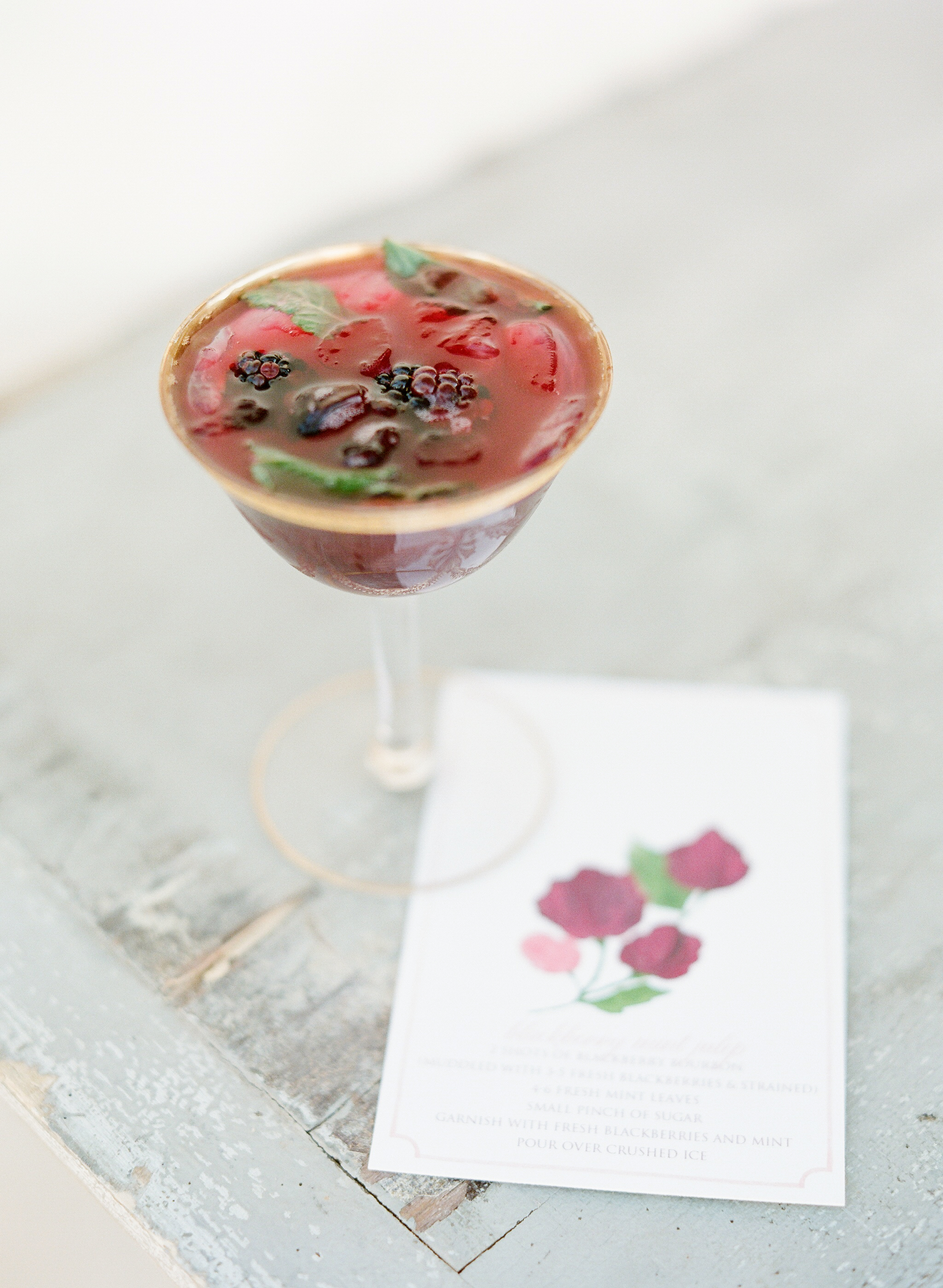
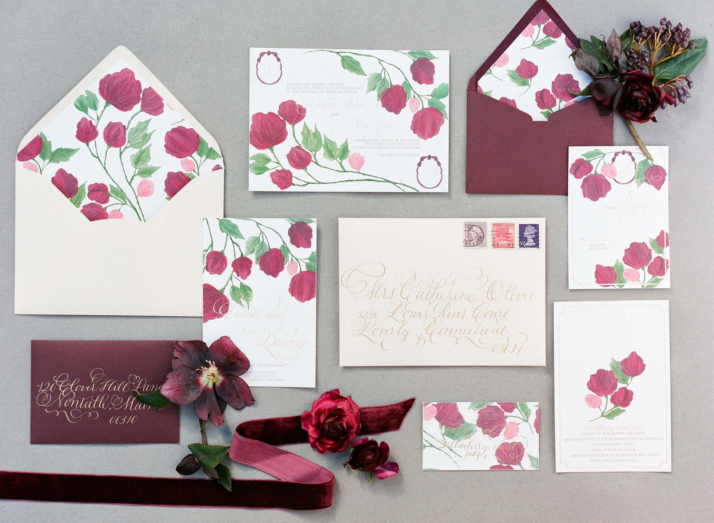
BLACKBERRY MINT JULEP
Yields one cocktail
3 oz blackberry bourbon (instructions below)
4-6 fresh mint leaves
Small pinch of raw sugar
1⁄2 oz soda
Instructions: Muddle mint and sugar in a flat-surfaced glass, add crushed ice, soda, and top with bourbon.
Featured | Flutter Magazine, Scorpio
It was such a pleasure to work with Flutter Magazine on their 6th issue. We took each horoscope and designed a tablescape around the traits associated with each sign. Flutter Magazine complied an amazing group of designers and photographer to bring the shoot to life.
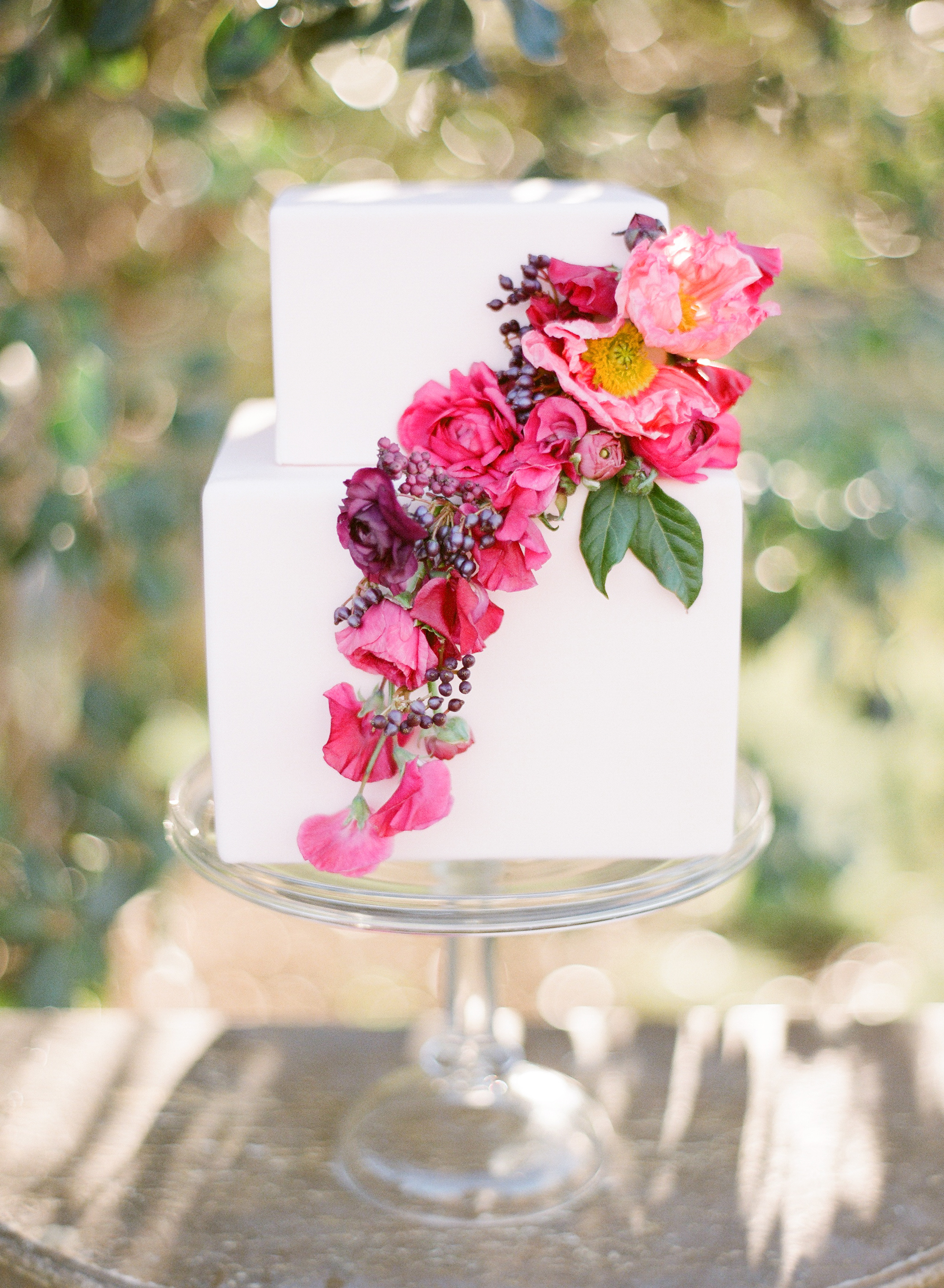
OCTOBER 23 — NOVEMBER 21: We are drawn to you, Scorpio bride. You are magnetic and irresistible. Be sure to emphasize your fiery spirit with bright colors on your tables and invitations. Utilize your lucky gem, the Garnet, to add a pop of color to your own attire. Peonies draped on your cake will make your guests gasp. The lush peony can spice up your bridesmaids bouquets too. Be sure to include elements of lace in your veil and dress. We suggest you jet off to Spain for your honeymoon.
As seen in Flutter Magazine, Issue No. 6
Photography: KT Merry | Design + Styling: Joy Proctor | Floral Design: Amy Osaba Events | Hair + Makeup: LunaBella Makeup and Hair | Jewelry: Sofia Kaman | Furniture: Found Vintage Rentals | Commissioned Cream Backdrop: Katherine Bell of The Habitat Factory | Cocktails + Recipes: Melissa Piña of Soiree Center | Tableware + China: Small Masterpiece | Horoscopes: Briana Westmacott | Cake: M Cakes Sweets | Dress: Rue De Seine, Sadi via Lovely Bride | Invitation Suite: Design House of Moira
Real Wedding | at the press!
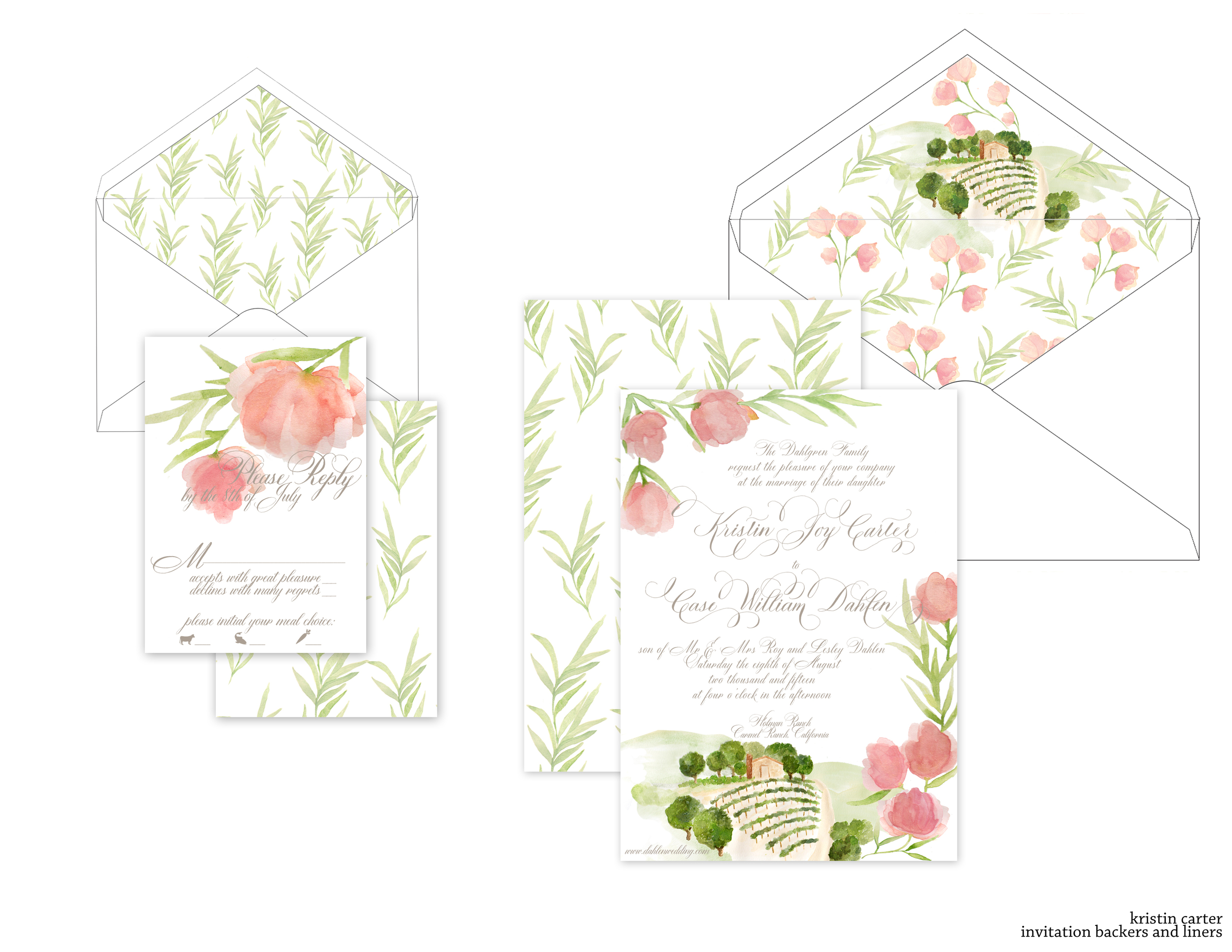
It's always such a pleasure to work with amazing event designers, so when Simone from Soirees by Simone reached out to me, I couldn't want to get started. Her lovely bride, Kristin, was getting married at Holman Ranch in Carmel Ranch, California. We knew that we wanted to tie in the venue itself, as well as the floral types that will be used in her reception decor and bouquet.
We began with several sketches of how the artwork would fall to give me some guidance, and once the sketches were finished, I moved on to the artwork and invitations proofs.
For this suite, we are combining letterpress and flatprint, digitally printing the artwork and then pressing the lettering over it. All the envelopes have been addressed in matching taupe ink and the suite is almost ready for the mail!
Coming soon | loeb boathouse suite
a suite created to reflect the spring view from the Loeb Boathouse in Central Park of the city beyond.
Bespoke | Elisie
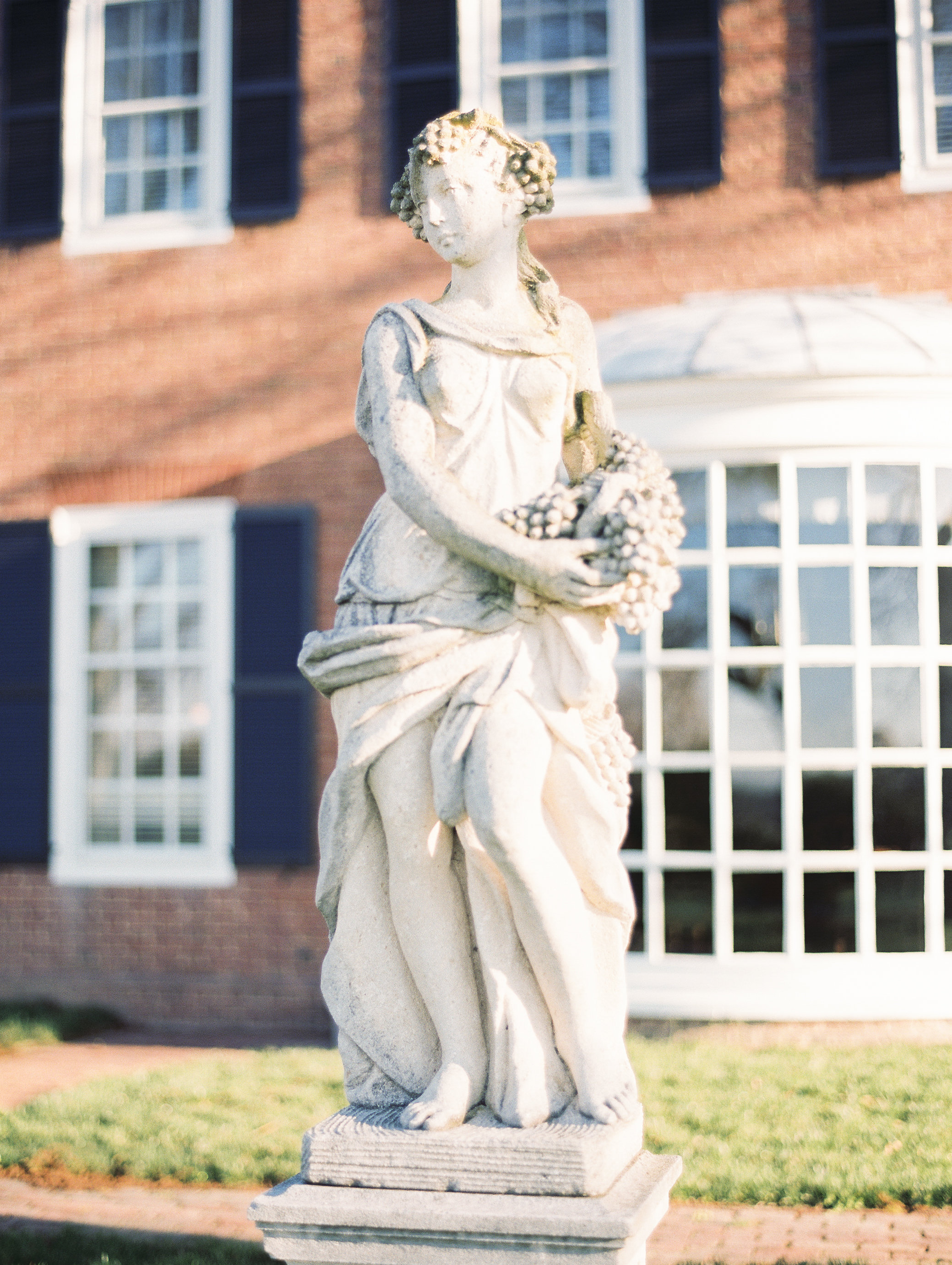
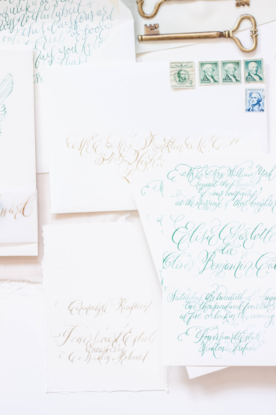
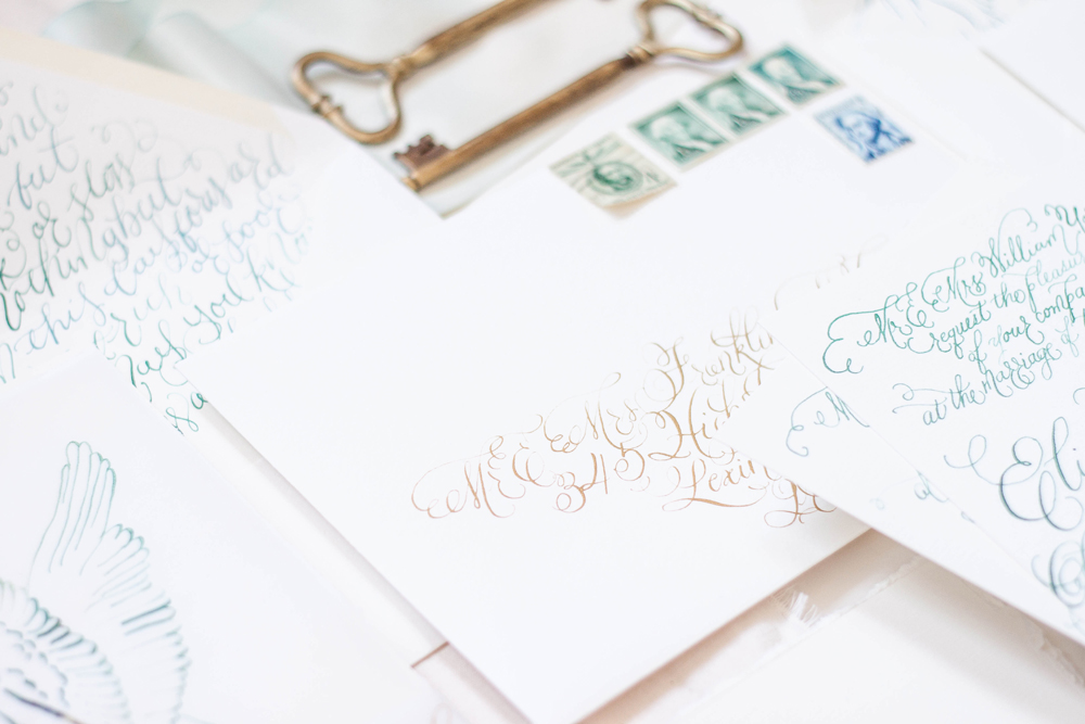
private estate | angelic sculpture | calligraphy | pale | elegant | black tie | silk | deckled edge | gold
Coming Soon | sea breeze & sapphires
a lovely suite inspirited by the sea breeze and sapphires coming to the blog soon!
Bespoke | O'dessa
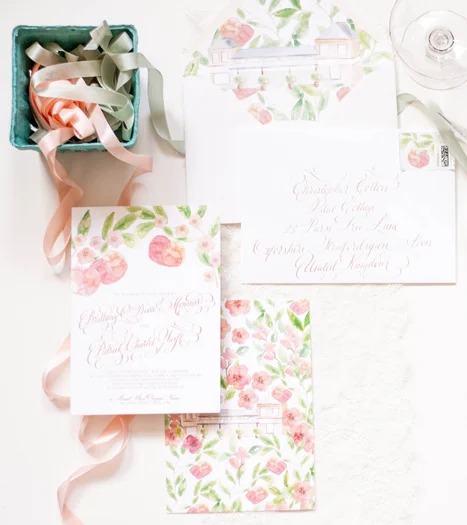
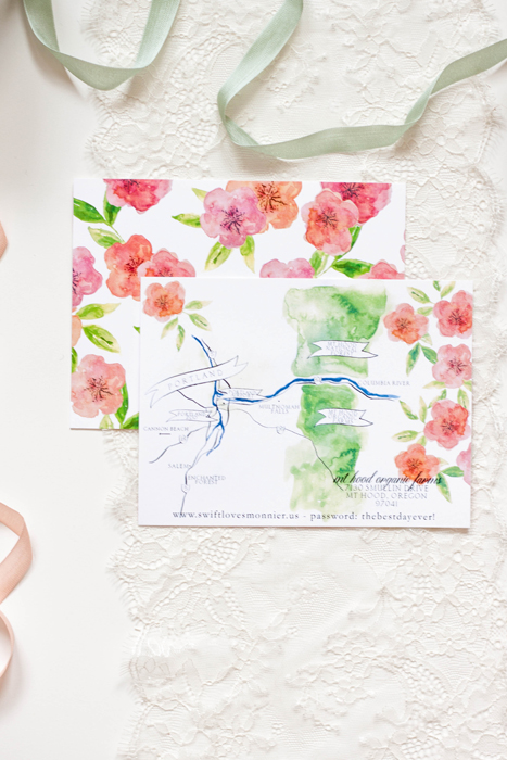
orchard | rose gold | mt hood | organic | bright | formal | apples | blossom
Featured...Ruffled Blog
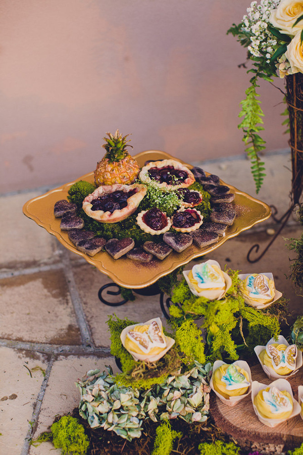
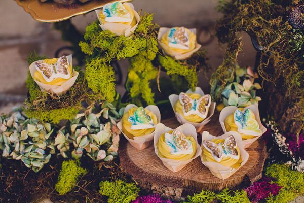
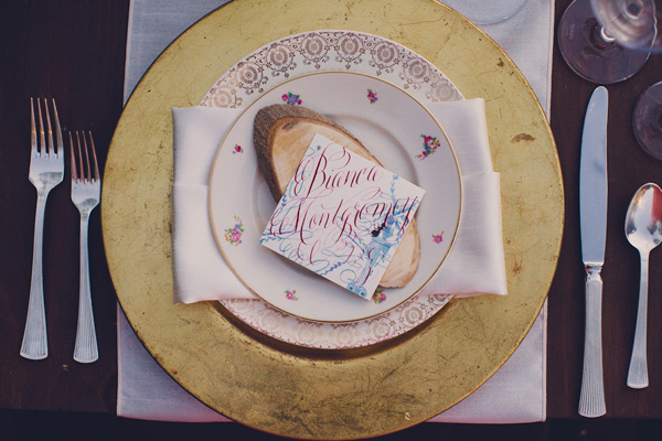
We had such a wonderful time collaborating with Absolutely Events on this suite inspirited by Shakespeare’s A Midsummer Night’s Dream. We've walked you through the process we went though in creating the suite, now you get to see it in action!
Design: Absolutely Events
Florals: Rae Florae
Photography: Jackie Wonders
Bespoke - midsummers night dream
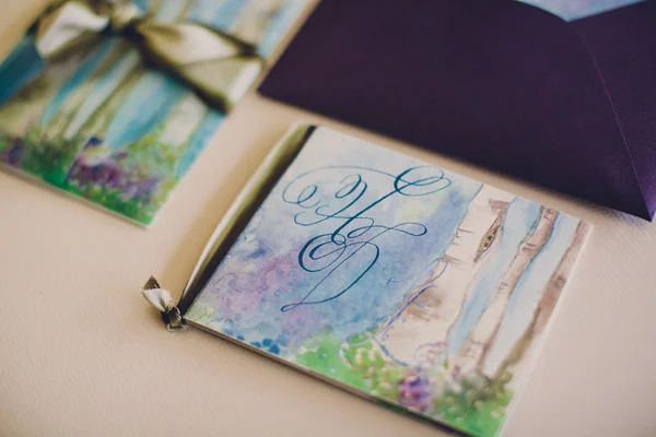
Our last post told the story of the process and artwork behind a wedding invitation suite inspirited by A Midsummer's Night Dream. The final suite was a gorgeous combination of shades of blue, violet and purples with black details.
I really did enjoy working on this suite even though I went through a period of discouragement with the artwork and color palate.
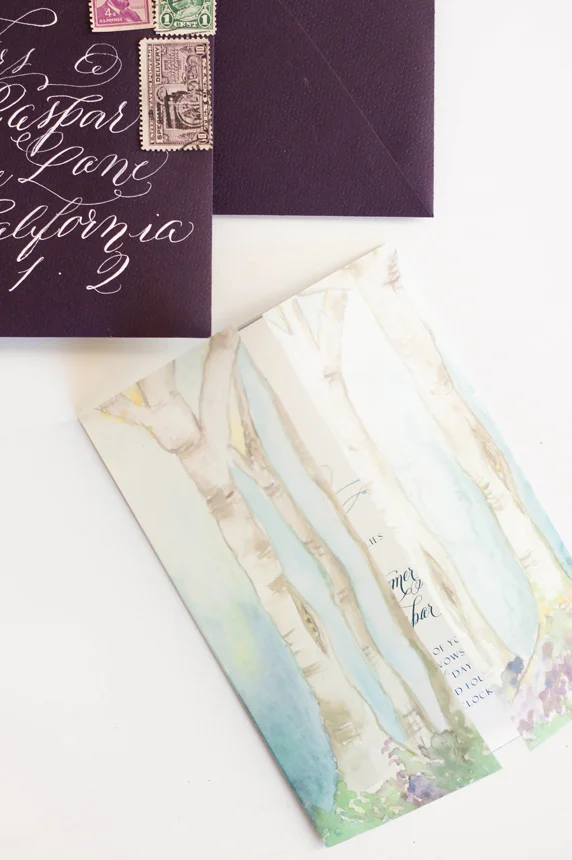
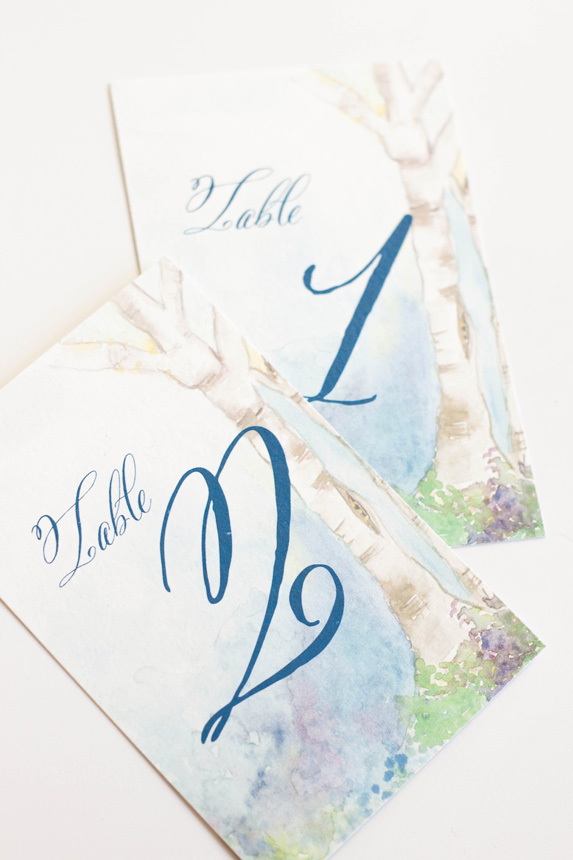
The most colorful and my personal favorite part of the suite was the watercolor painting of a fairy hollow. I created a little vignette of trees spanning a space with colorful flowers and lots of blues. I used the artwork on a thin velum that wrapped the entire suite and held all the pieces together as well as the envelope liner and the back of some of the pieces.
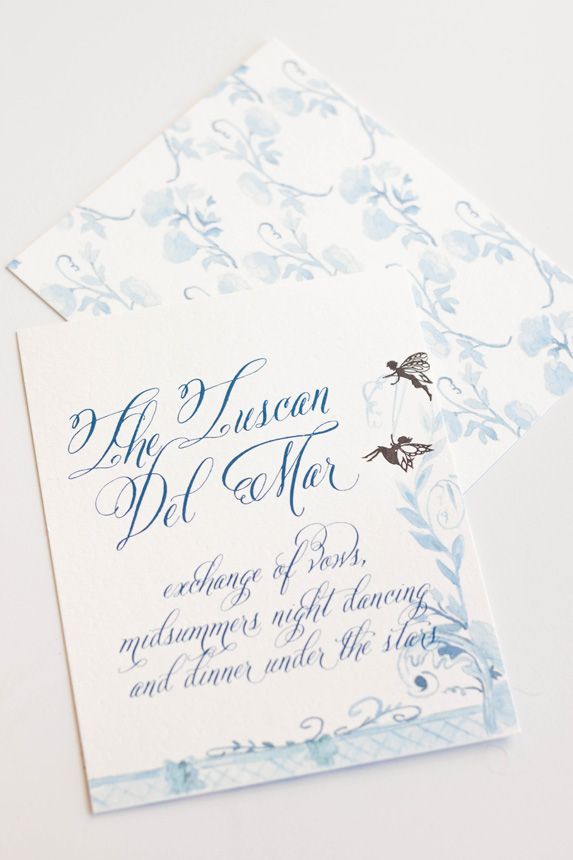
The invitations featured a calligraphy monogram, banner and watercolor flourish. I wanted to keep the main portion of the invitation free of heavy artwork and focus on the calligraphy elements. I knew that the other pieces and the backs would hold enough color and artwork to balance the suite as a whole.
The back of the invitation suite was the artwork that took me the longest, as one could imagine, especially given that I redid the entire thing from color to shades of blue (see previous post for further background). I kept the artwork on the response card and reception similarly simple, but added some of the silhouettes as details.
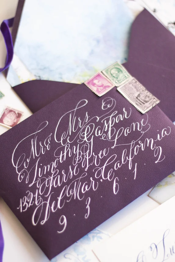
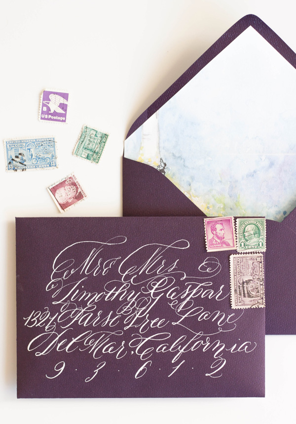
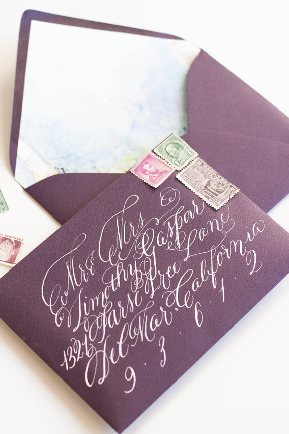
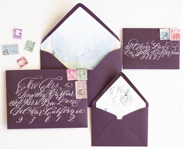
As always, the calligraphy on the aubergine envelopes was a perfect match to the suite in opaque white ink. I lined the envelopes with the matching fairy hollow, with the reply card with matching calligraphy on its liner. I choose some vintage stamps to round out the design.
I LOVED creating the programs! They folded with the artwork contenting front and back. When opened, the bridal party was depicted by silhouettes with the bride and groom in the middle.


