Bespoke - midsummers night dream
Our last post told the story of the process and artwork behind a wedding invitation suite inspirited by A Midsummer's Night Dream. The final suite was a gorgeous combination of shades of blue, violet and purples with black details.
I really did enjoy working on this suite even though I went through a period of discouragement with the artwork and color palate.
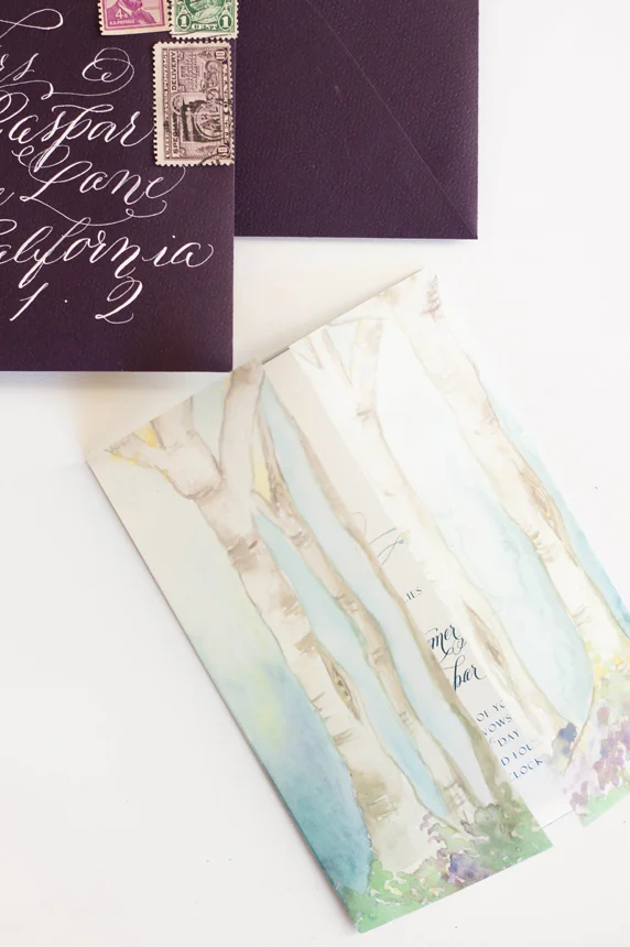
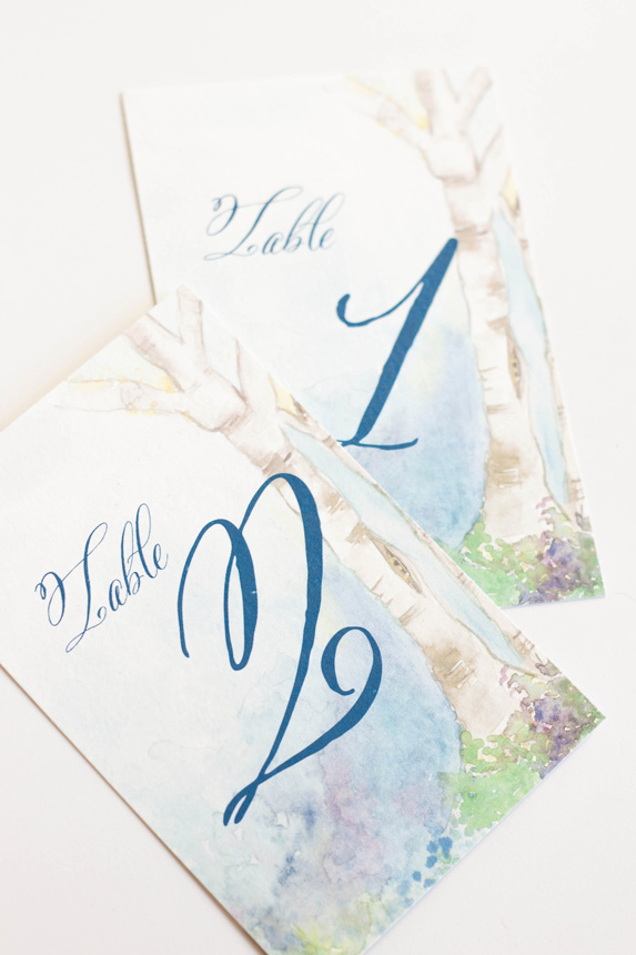
The most colorful and my personal favorite part of the suite was the watercolor painting of a fairy hollow. I created a little vignette of trees spanning a space with colorful flowers and lots of blues. I used the artwork on a thin velum that wrapped the entire suite and held all the pieces together as well as the envelope liner and the back of some of the pieces.
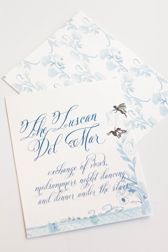
The invitations featured a calligraphy monogram, banner and watercolor flourish. I wanted to keep the main portion of the invitation free of heavy artwork and focus on the calligraphy elements. I knew that the other pieces and the backs would hold enough color and artwork to balance the suite as a whole.
The back of the invitation suite was the artwork that took me the longest, as one could imagine, especially given that I redid the entire thing from color to shades of blue (see previous post for further background). I kept the artwork on the response card and reception similarly simple, but added some of the silhouettes as details.
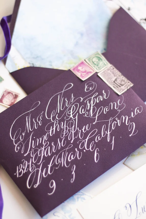
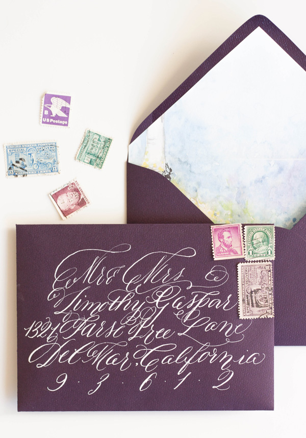
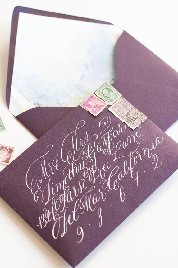
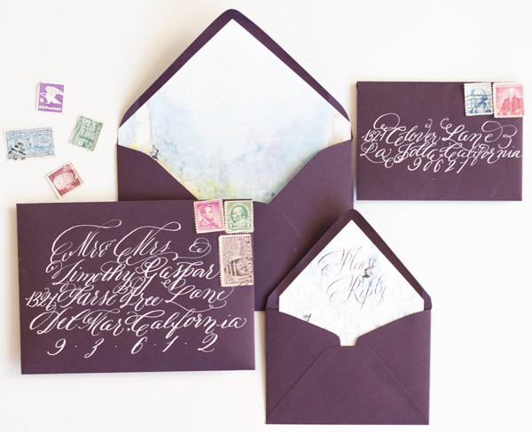
As always, the calligraphy on the aubergine envelopes was a perfect match to the suite in opaque white ink. I lined the envelopes with the matching fairy hollow, with the reply card with matching calligraphy on its liner. I choose some vintage stamps to round out the design.
I LOVED creating the programs! They folded with the artwork contenting front and back. When opened, the bridal party was depicted by silhouettes with the bride and groom in the middle.

