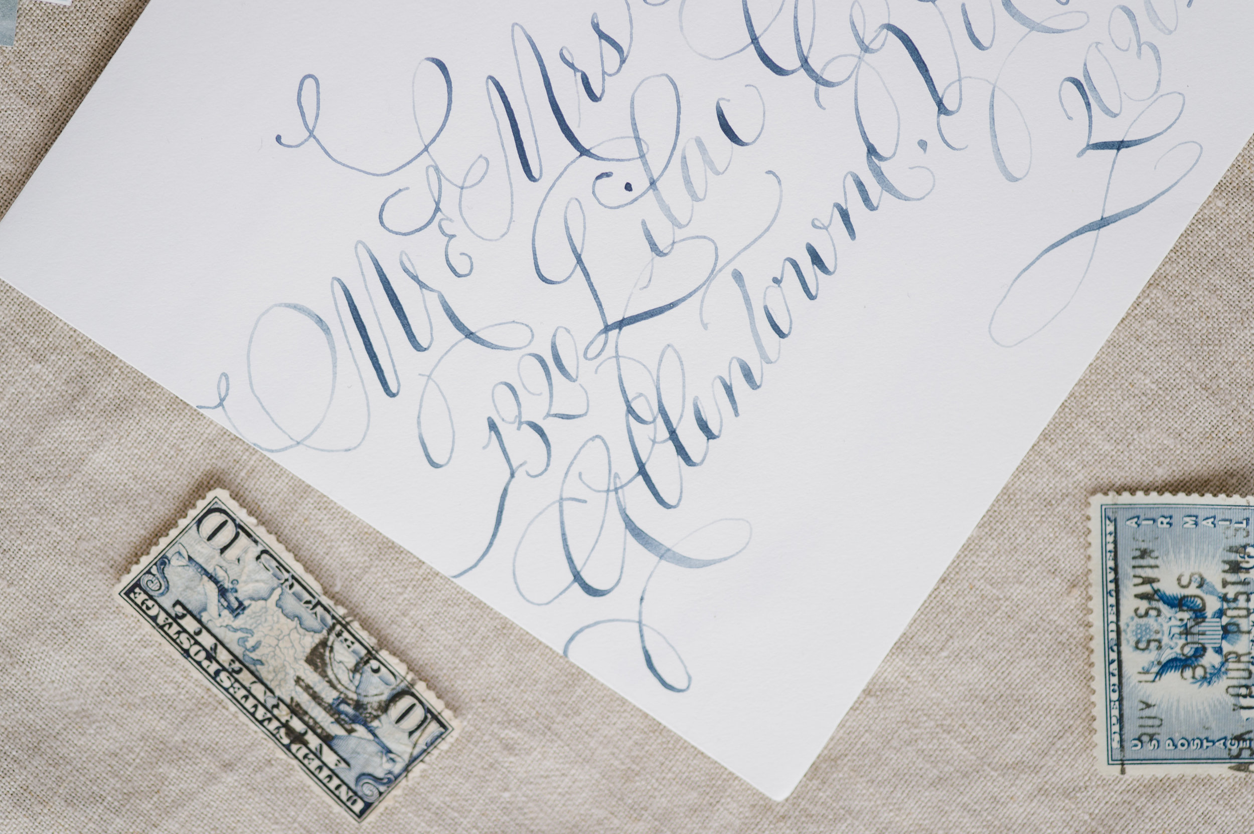
Hand Painted Custom Champagne Bottles
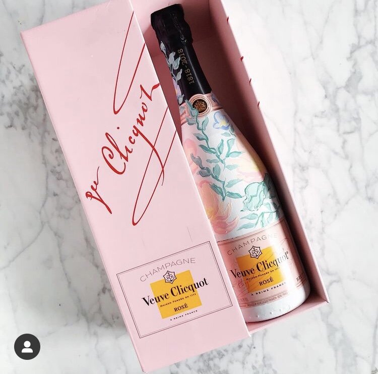
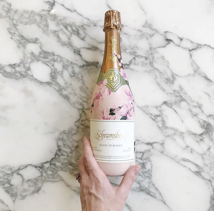
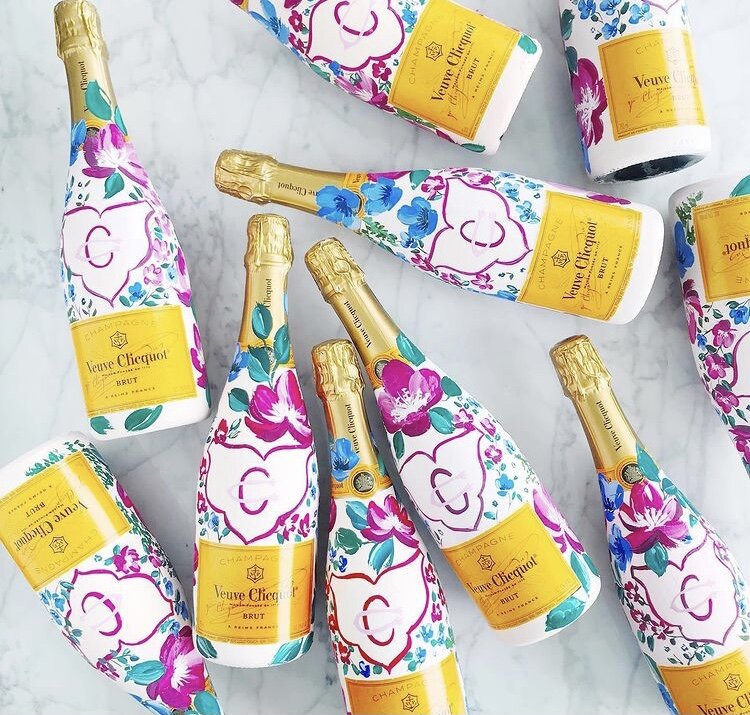
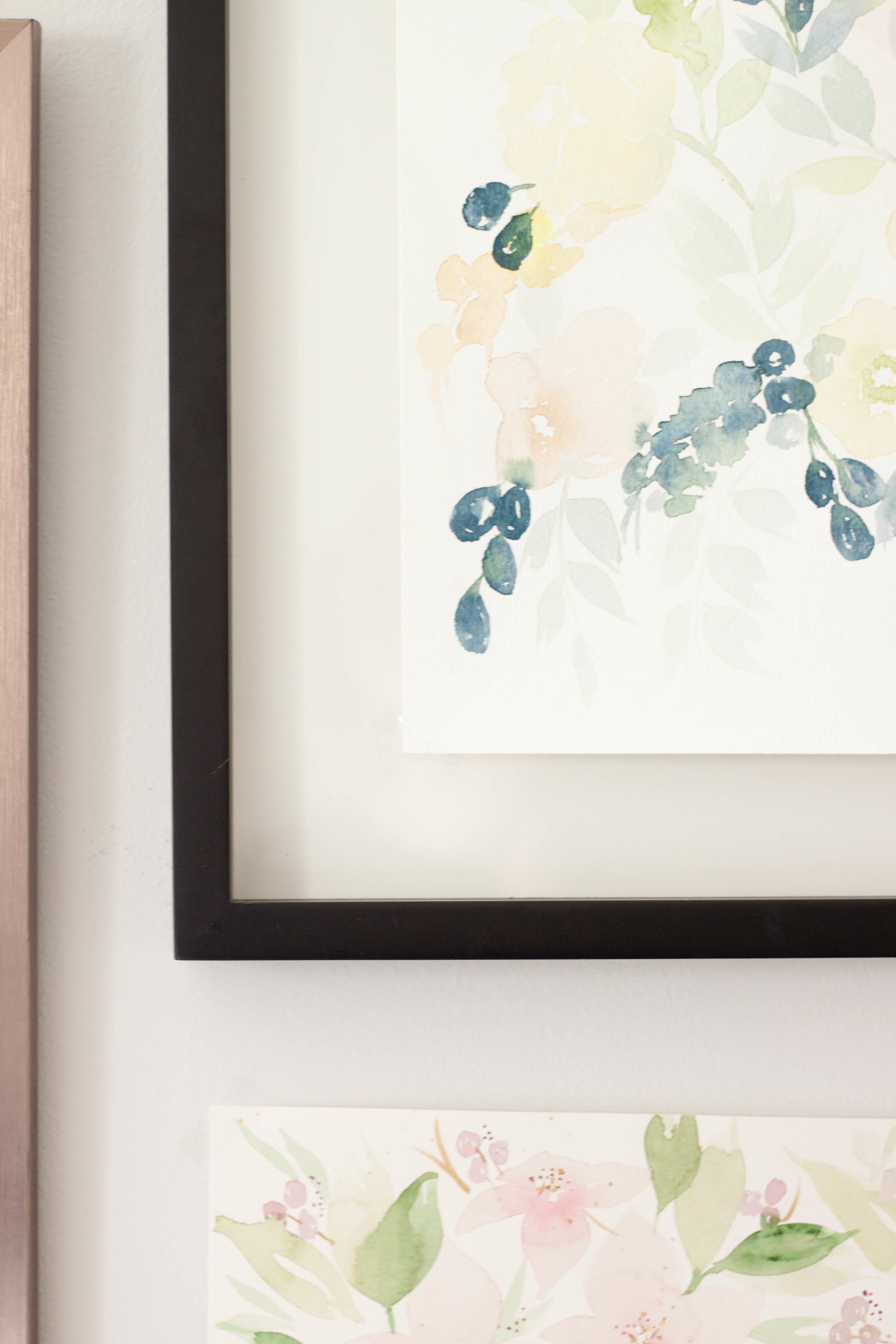
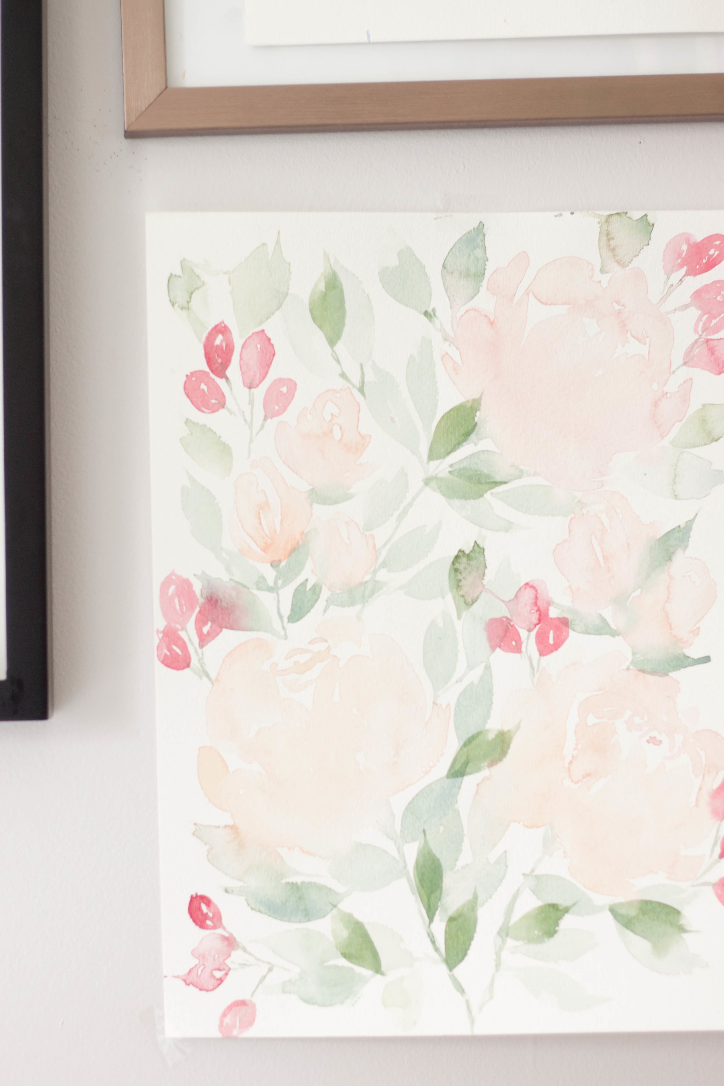
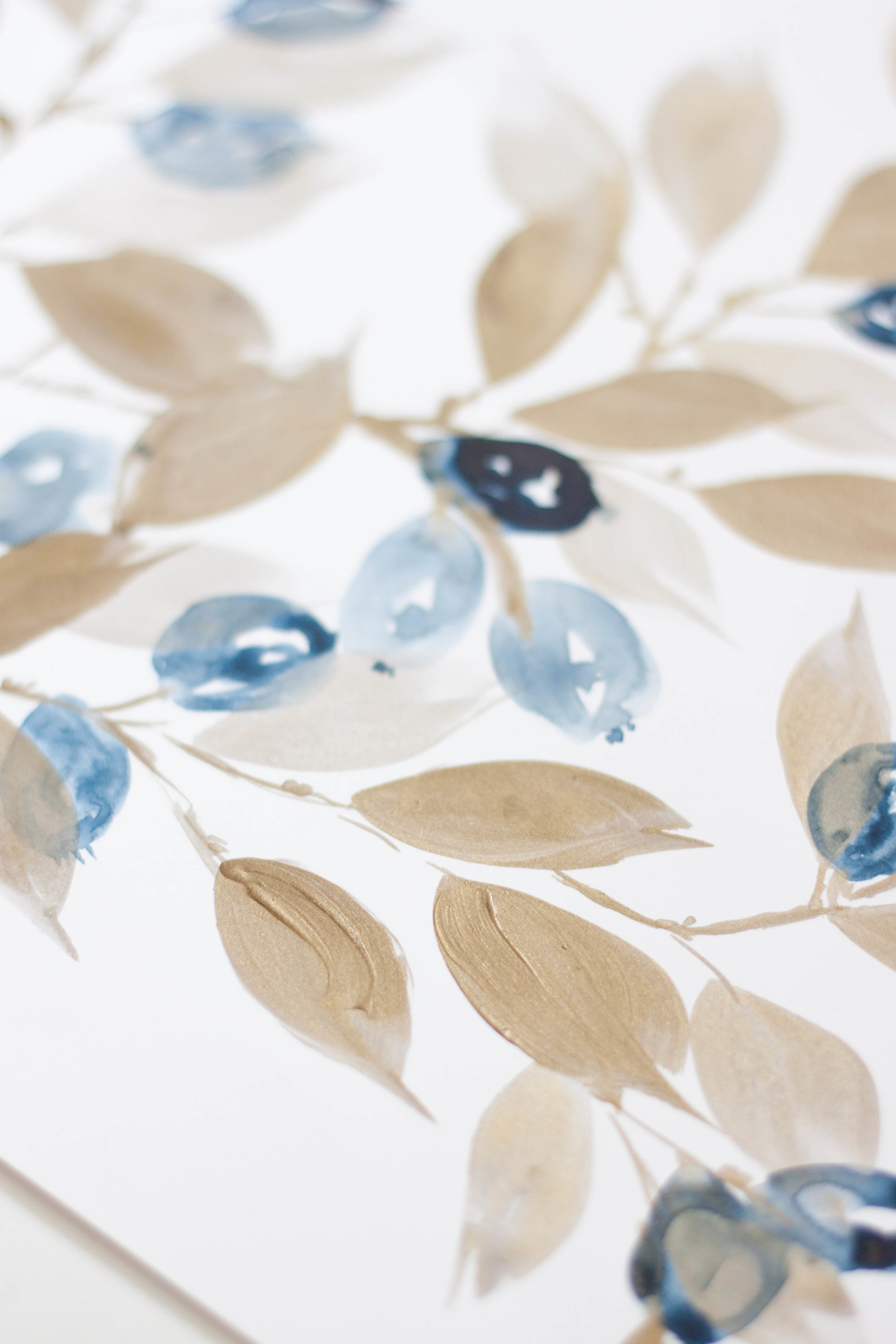
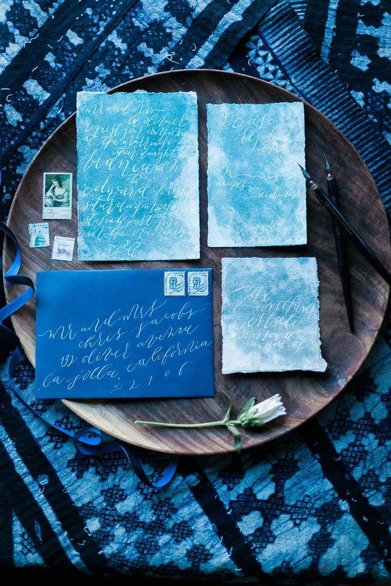
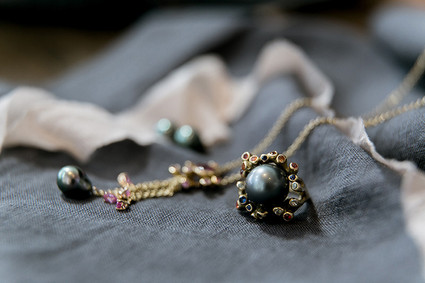
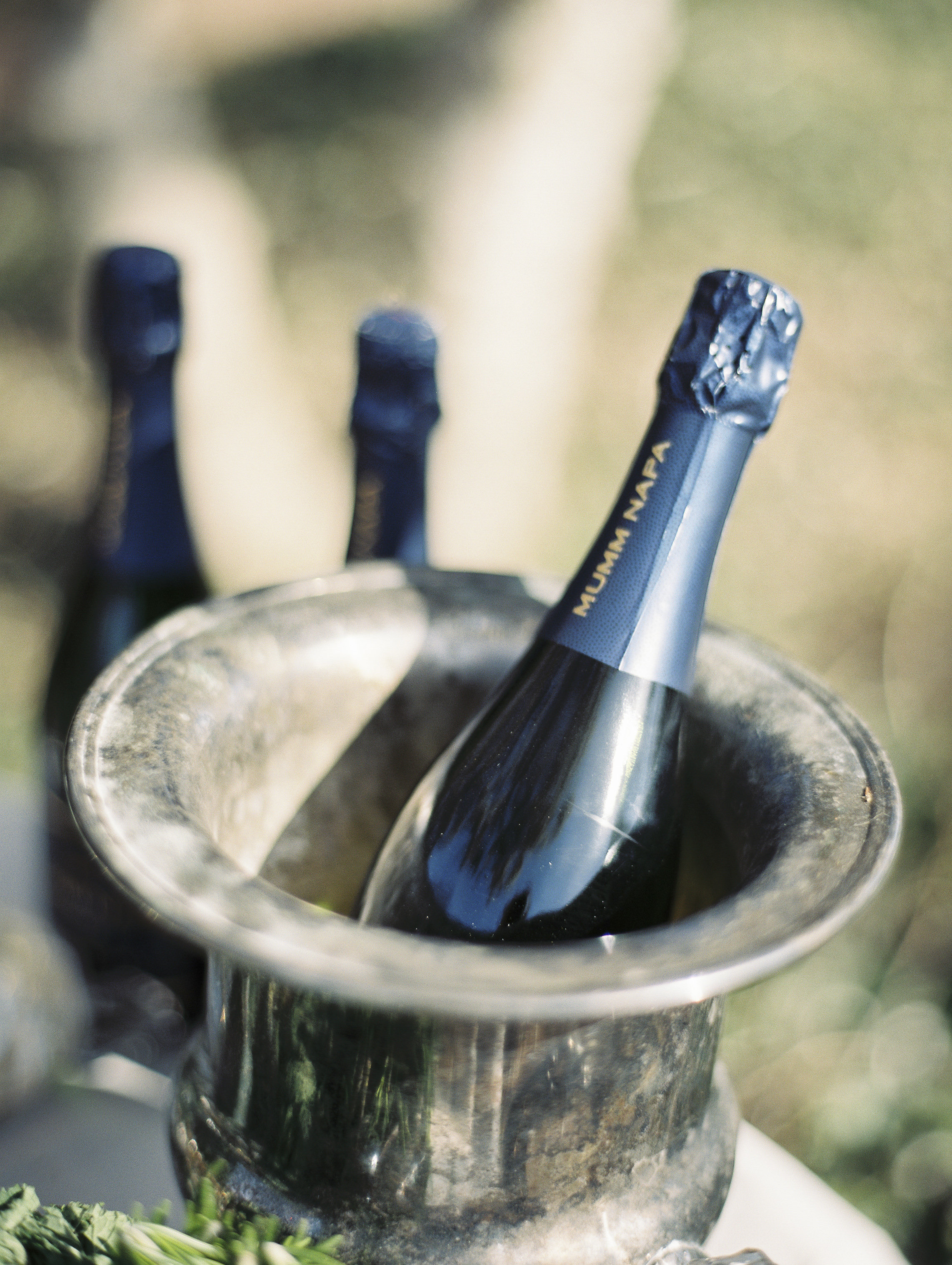
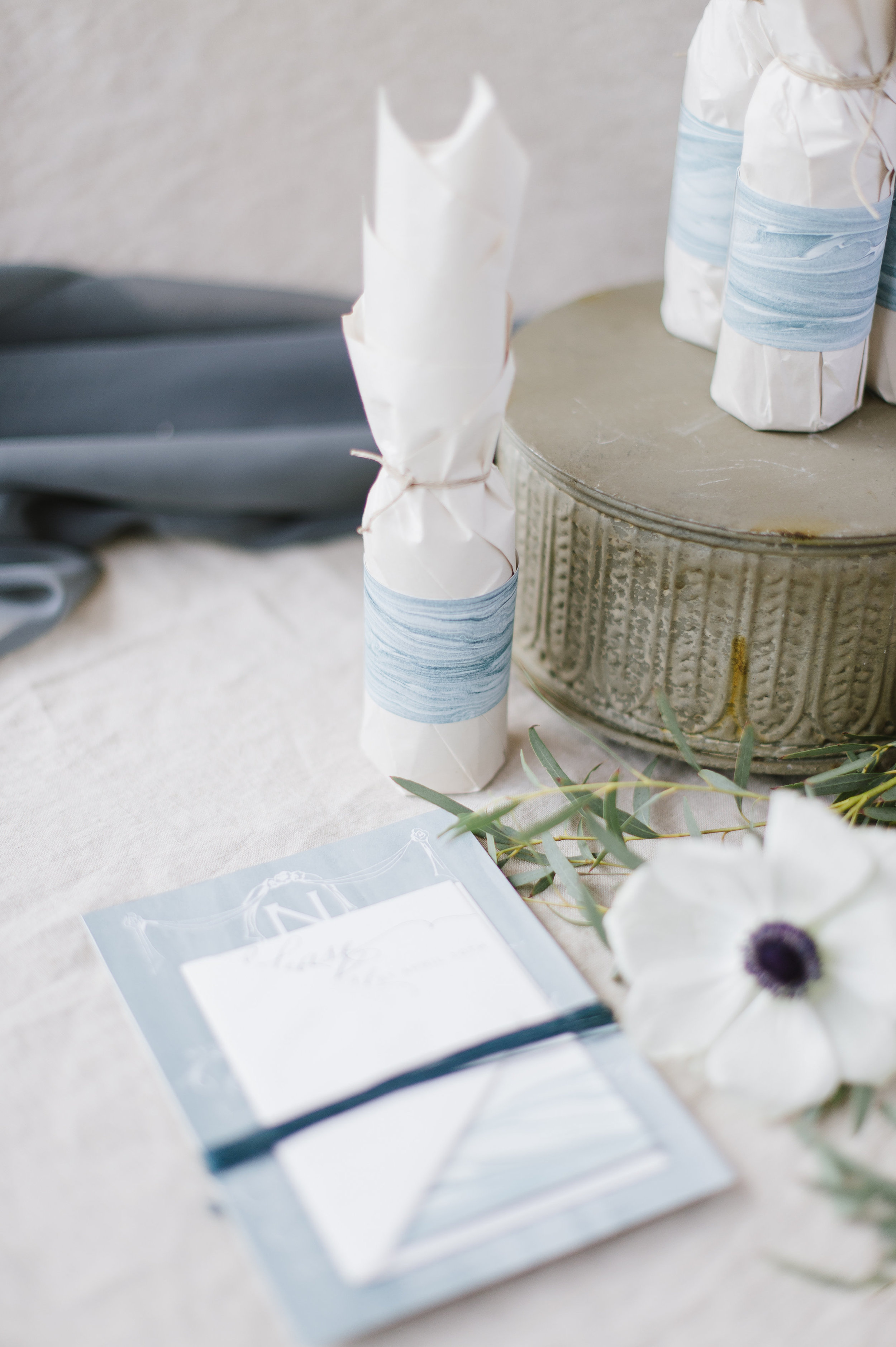
Hand-painted champagne bottles are the perfect custom touch for a gift for your bridal party or adorn your bar for an eye catching detail for your guests.
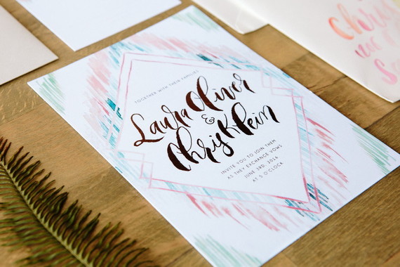
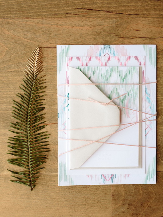
For these particular projects, each bottle was hand-painted to match the bride’s invitation suites with bright fuchsia blooms and cherry blossoms or pale blues and blushes.
Join me on YouTube channel for a brief video featuring some of our painted work.
If you’re interested in commissioning bottles from us, let us know!
Painting White Peonies in Watercolor
Painting white flowers without using white paint
Painting White Peonies in Watercolor
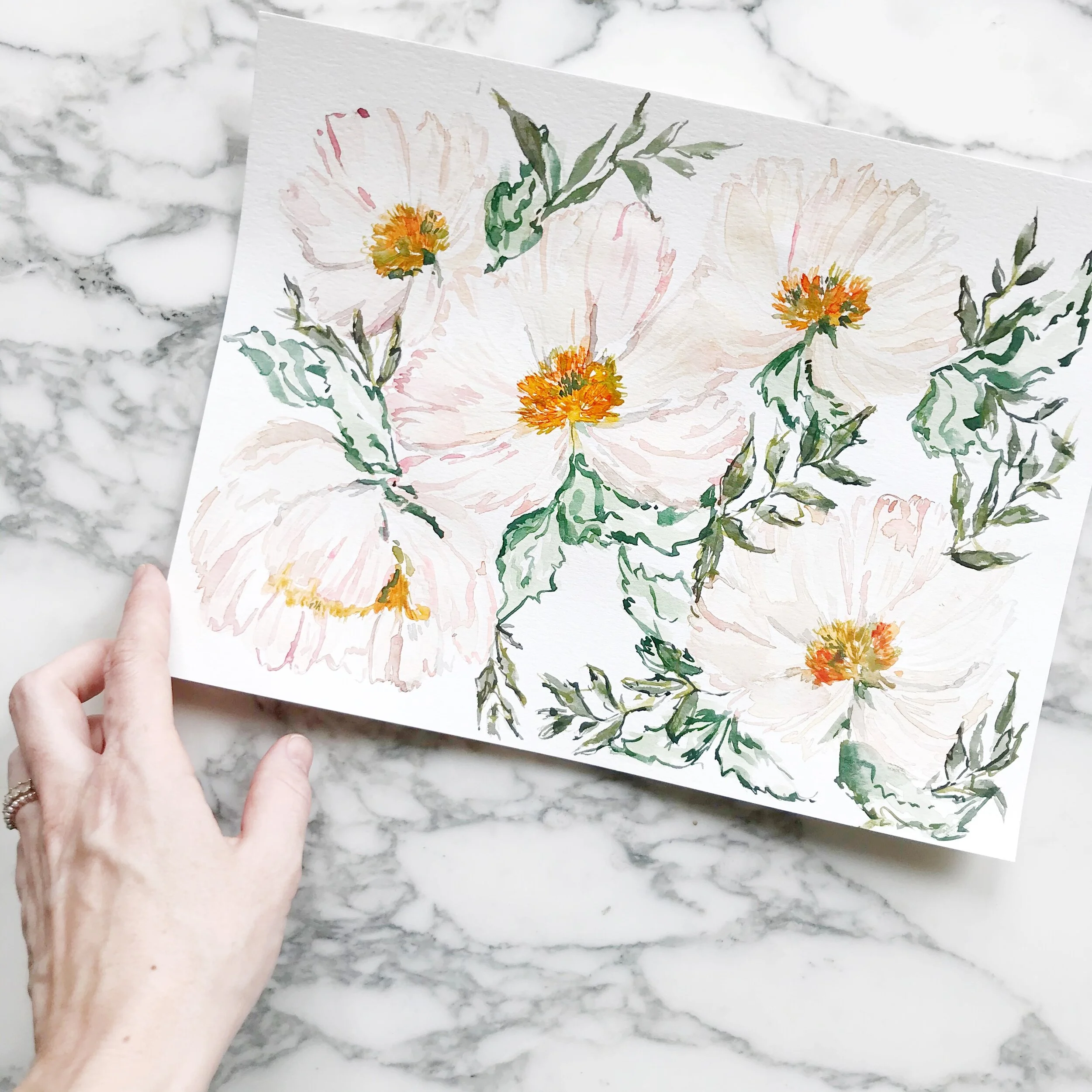
I've been working on a new flower form (new for me, at least) and working a lot with white peonies.
There are two essential ways to paint white flowers - using tiny bits of grey for the flower details and adding a dark background to designate where the flower falls, or using shades of greys and pale neutrals to create the optic of white flowers (because white flowers aren't 100% white).
I'll be using the latter technique to create white peonies with watercolor. I hope these tips for watercolor painting as well as showing you a small example of what's it's like being a working artist and will be useful to you. If you enjoy my artwork and crave more glimpses behind the scenes, please subscribe to my channel and hit the like button.
Also, please leave a comment on the video with questions and requests.
Design House of Moira on the Web:
Instagram - www.instagram.com/designhouseofmoira
Websites - www.designhouseofmoira.com | www.designhouseprepschool.com
Running a Creative Business & Watercolor Painting - Video
I'm playing around with some more five-petal flowers today in some moody spring flowers (doesn't that sound like an oxymoron??).
In this video, I'll talk through a little about my painting process, but we'll also chat openly about creating a unique style and how to compete in a saturated market on value rather than price.
I hope these tips for watercolor painting as well as showing you a small example of what's it's like being a working artist and will be useful to you. If you enjoy my artwork and crave more glimpses behind the scenes, please subscribe to my channel and hit the like button.
Also, please leave a comment on the video with questions and requests. Design House of Moira on the Web:
Instagram - www.instagram.com/designhouseofmoira
Websites - www.designhouseofmoira.com | www.designhouseprepschool.com
price.
Copy of Creative Process | Behind the Scenes
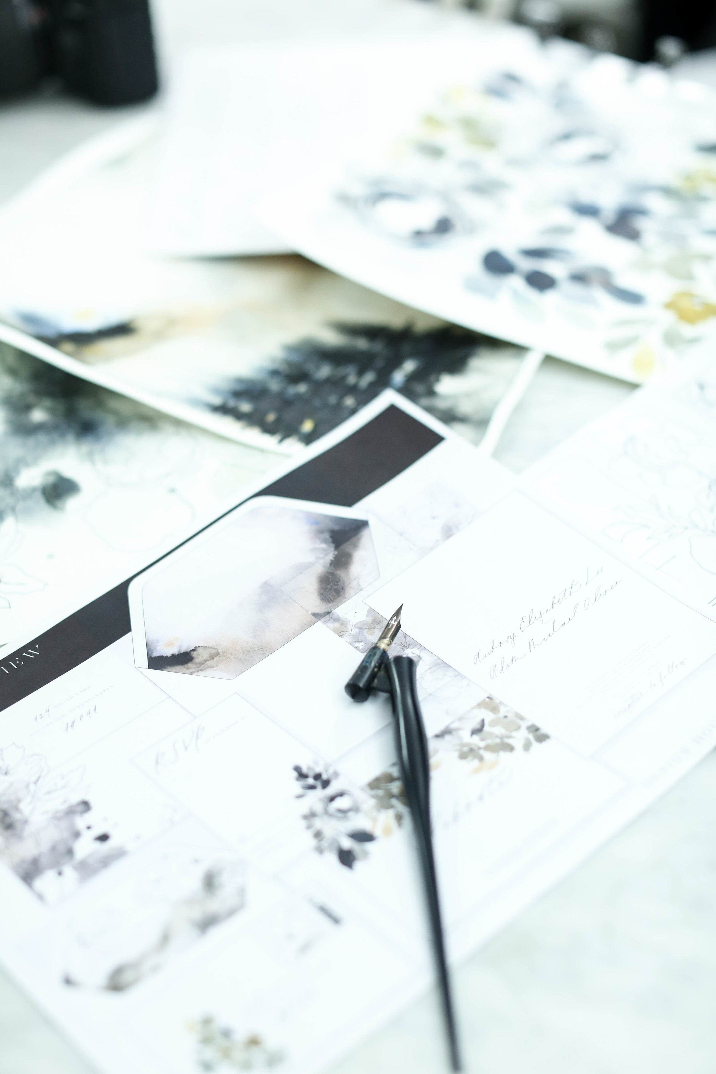
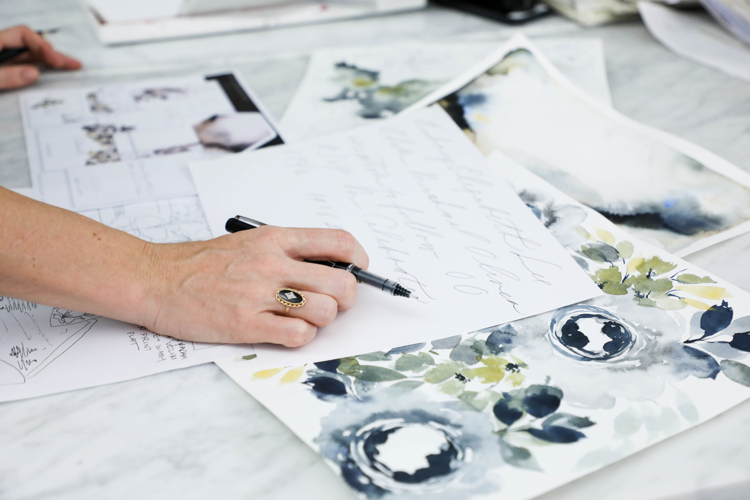
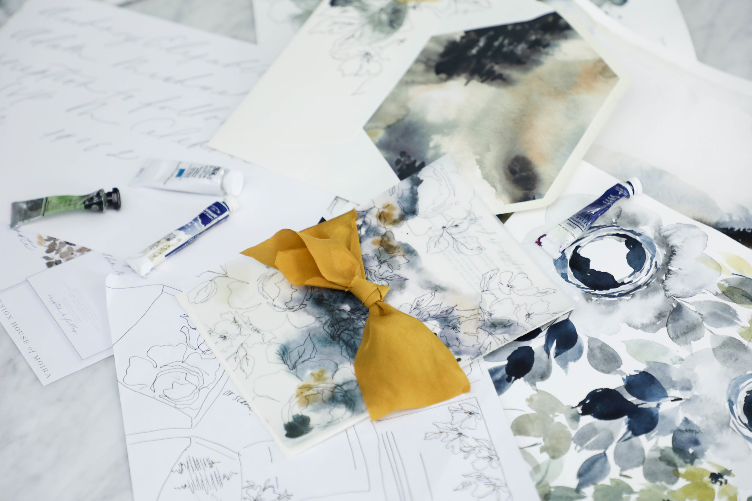
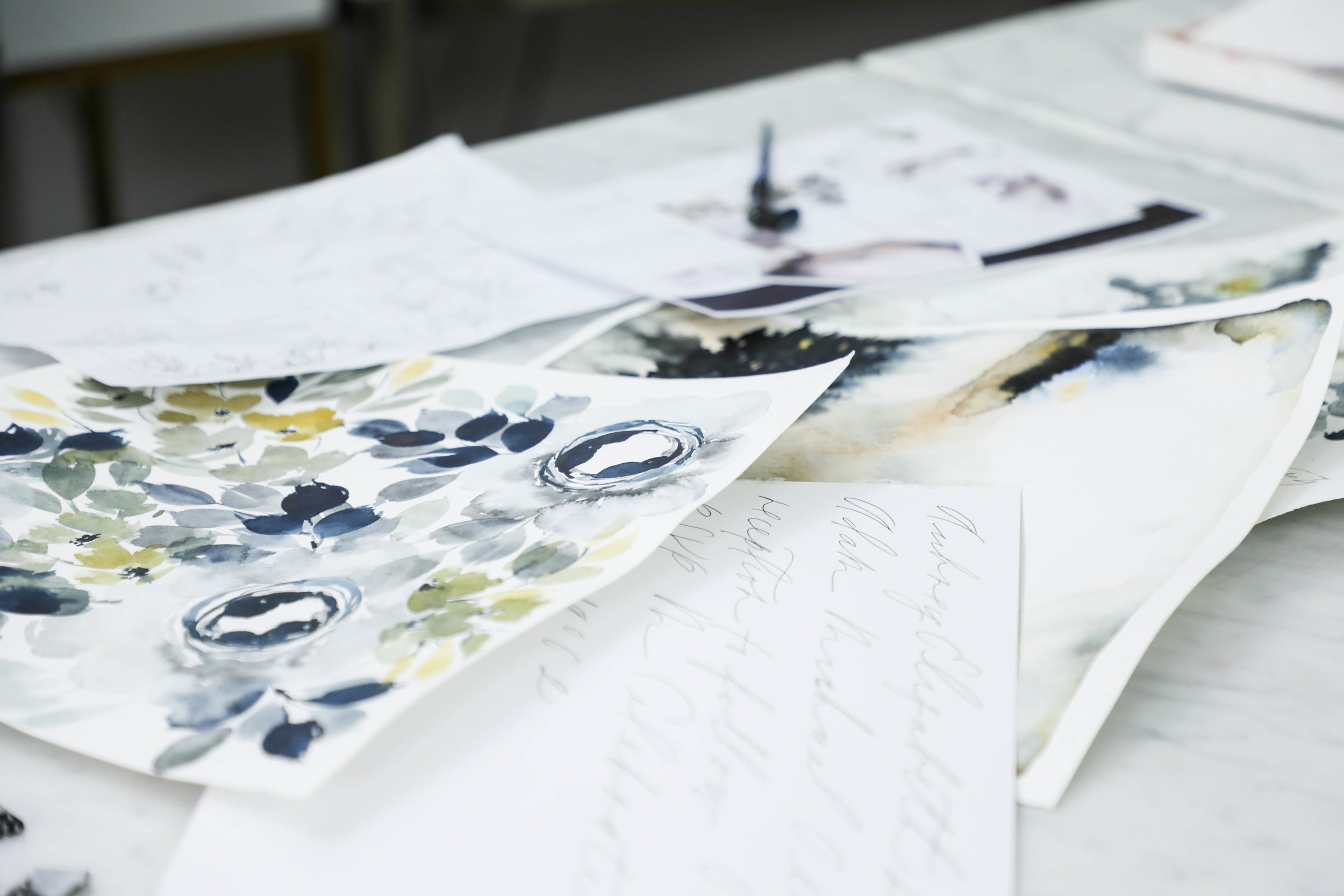
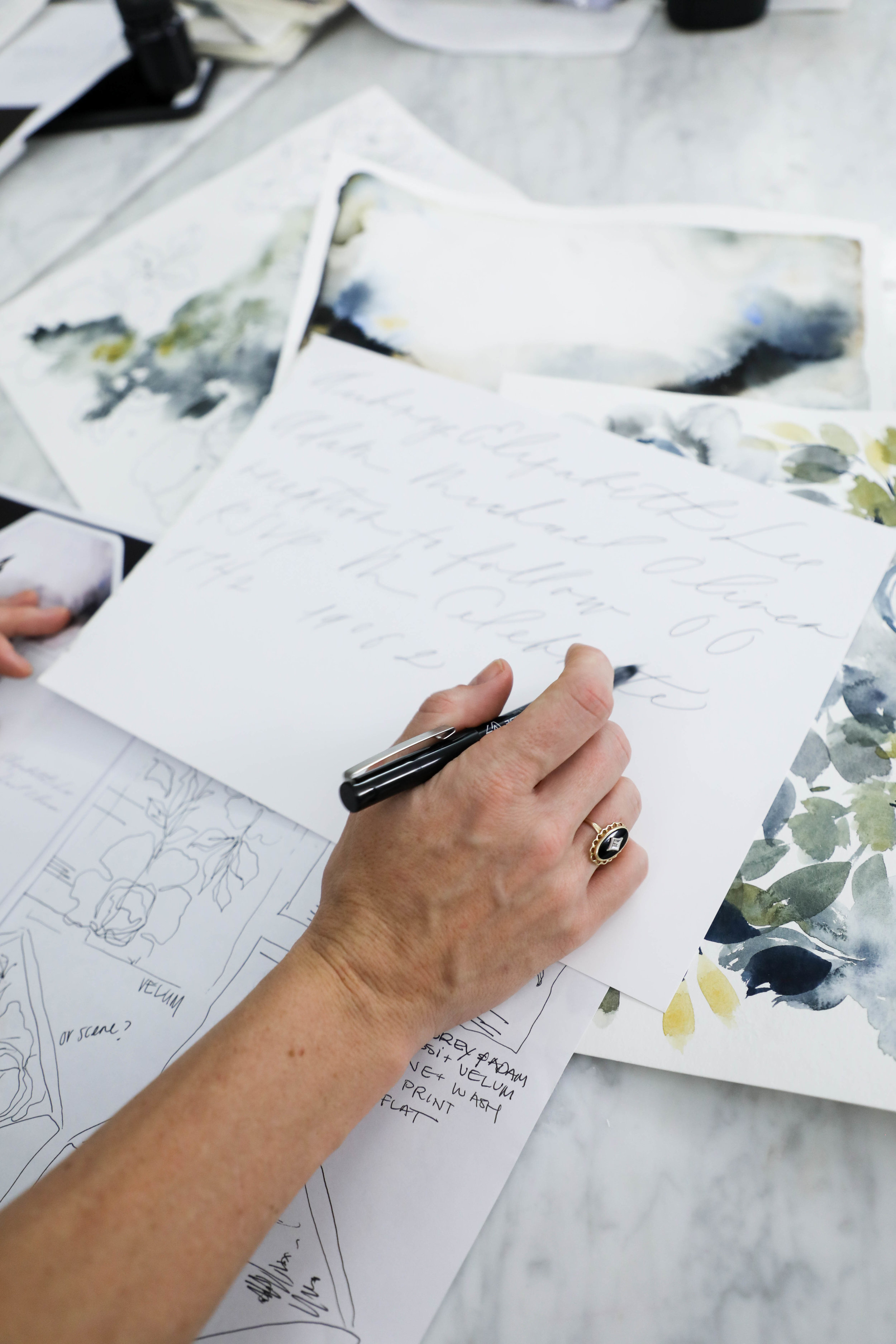
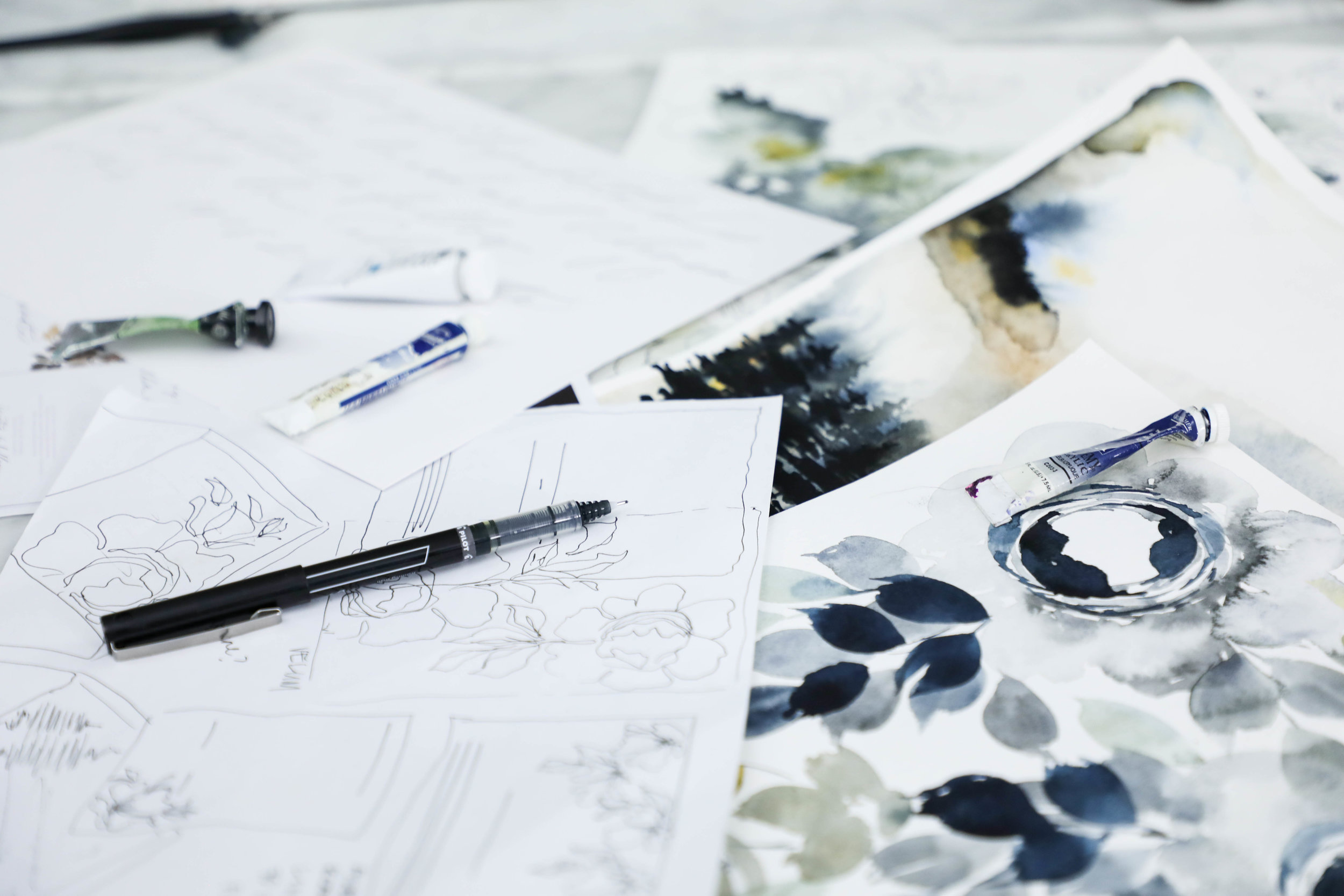
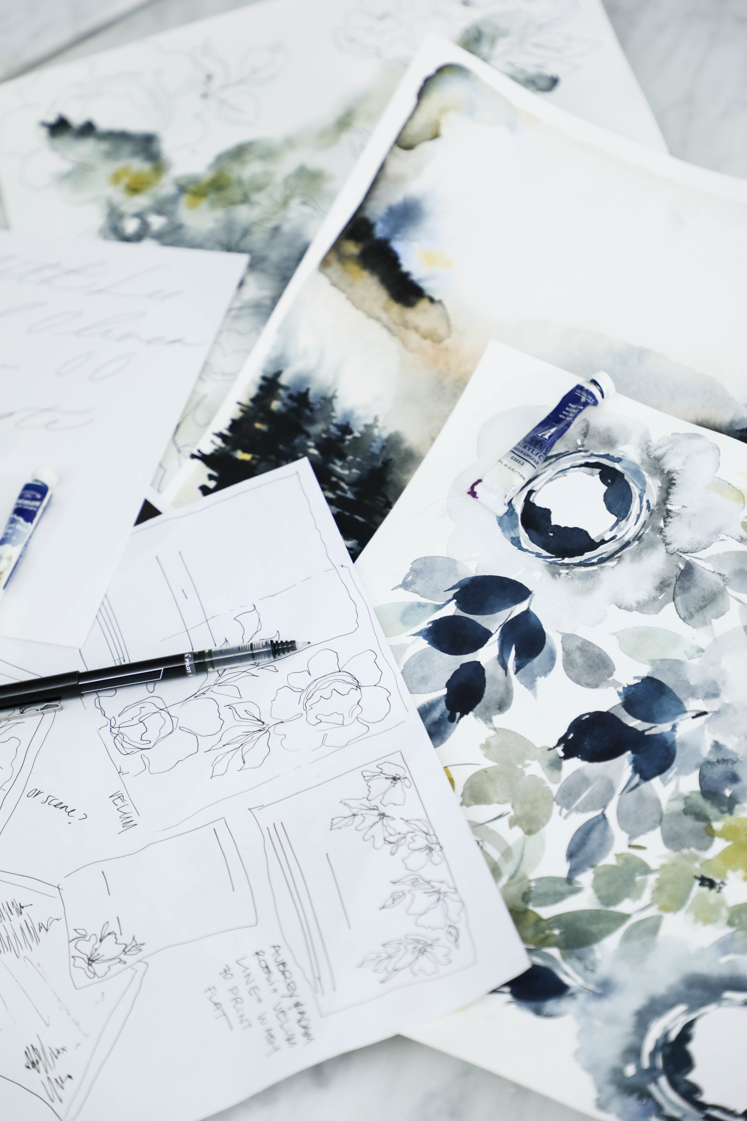
Once we have our sketch finalized and our lettering style selected, we begin creating the artwork that will be included in the invitation suite.
It is our goal and part of our business philosophy that we never want a client to feel limited or concerned that their design won’t be everything they had hoped because they’re limited on how much artwork they can have created for them.
All of our projects include unlimited artwork, regardless of what type of artwork it is. For this suite, we had a watercolor floral pattern, two watercolor wash patterns, a modern landscape piece, and line botanicals.
This is the longest portion of our process without contact with our client. Once they’ve approved the sketch and calligraphy style, we set about creating all the artwork, scanning it into the computer, digitizing the artwork and calligraphy, and getting it ready for their design.
The proof is the next step in the process and is also the next thing the client sees after the sketch (unless they follow us on instagram, in that case, they’ve seen the entire creative process along the way as their design comes to life!).
Aubrey & Adam
Courchevel, France
The proofs shows the overall layout of the suite, as well as each individual piece. A proof is usually about 9 pages long, but can get up to 14 if the suite includes several additional pieces.
I personally love the proofing point in the process. It’s the first point that the client sees their sketch come to life in full color.
Similar to artwork, we do not limit how many proofing rounds each client is allowed. We want the design to be perfection, and we’ll tweak it as much as needed.
Two to three rounds tends to be the average, so that is how we timeline out the clients project. If more rounds are needed, we always make sure to keep an eye on our mail date, since that will get pushed back based on how long proofing takes.
Creative Process | Behind the Scenes
Following the sketch, we create a sheet of lettering and calligraphy samples for our clients to review. We based the styles we provide on the couple’s overall style and the formality of the wedding as well as any personal preferences. Our calligraphy styles are not a generic sheet we give to each client, but created individually for each project. We also prefer to show calligraphy styles shows in the couple’s names, since seeing one’s own name is so much more exciting than seeing a generic style name.
For Aubrey, we created a calligraphy sample sheet with six styles. We knew she preferred minimal and modern, so we showed several variations of that style.
Aubrey selected a delicate monoline style for her lettering. We liked the minimal visual impact it had, while still being interesting and unique.
Sometimes we nail the style on the first try and sometimes it takes some tweaking. For Aubrey, she loved it right away.
Once we’ve selected the style, the Design House team sits down to see where in the sketch the calligraphy falls and what words or phrases we’ll need for the design. Once we have a list of what needs to be written, we write their lettering or calligraphy out by hand.
Aubrey & Adam
Courchevel, France
Creative Process | Behind the Scenes
Aubrey & Adam
Courchevel, France
Aubrey and Adam were married at a gorgeous chalet in Courchevel, France and came to us with some specific ideas in mind. They wanted to incorporate ochre into the design, but dit not want the overall look and feel to be summery and cheerful, but moody and modern. They came to us specifically because of our use of original artwork and lettering designed for each client. As with all our clients, we began the process with a sketch, detailing out our overall ideas for their suite, mixing media and multiple styles of artwork.
We love beginning with a sketch for several reasons:
It helps a client envision the overall look and feel by putting thoughts onto visual mediums
It allows the client to visualize how we see the art moving from one piece to another throughout the suite. We rarely do pieces that all match exactly, but vary the art across multiple elements of the invitation suite.
It creates a point from which we can create and generate all the artwork. As artists and creators, we avoid redoing repetitious work, which consumes a massive amount of time and energy. We want to create your artwork once and do it correctly the first time, rather than missing the mark. This is where the sketch comes in.
We can make adjustments to the art while the art is still theoretical to allow for more time during the proofing rounds and on assembly details.
shown here: the final pieces of artwork used in the printed pieces of the suite, generated from our original sketch
Featured | 100 Layer Cake
Over the summer, I participated in a fun, breezy summer collaboration but never got around to sharing (shame on me!).
From our fearless leader:
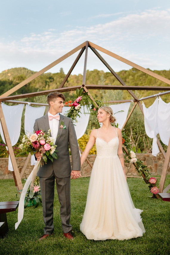
At Glow Event Design, we love coming up with new ways for couples to celebrate saying I Do. More and more of our couples are looking for “weekend experiences” they can enjoy with their guests, rather than traditional receptions. We loved the idea of a summer poolside wedding that could be hosted in a backyard or an outdoor venue. We wanted cocktail hour to have an eclectic look that felt more like you were lounging at the couple’s home rather than on rented furniture. We mixed different styles of chairs and cafe tables to create a “collected” look, and layered in pieces from local boutiques and Anthropologie’s home line to make it look more cozy. Signature drinks were dressed up with custom stirrers and multi-colored coasters. In lieu of traditional place cards, each guest would receive a hand painted planter to take home as a favor.
check out the rest of the feature here:http://www.100layercake.com/wedding-inspiration/modern-summer-wedding-inspiration/
Photographer: Michelle Walker Photography / Venue: K Venues / Event Design & Styling: Glow Event Design / Florist: Amanda Vidmar Design / Hair & Makeup: J Beautique / Baker: Indie Cakes & Pastries / Event Rentals: Blueprint Studios / Ceremony Arch: Buzzworthy Events / Stationery: Design House of Moira / Lasercut Names: Letters To U / Escort Card Planters: Sea and Asters / Tabletop & Misc. Décor: Anthropologie / Bride’s Attire: BHLDN / Groom’s Attire: The Black Tux / Tie: Melissa Sloan / Votives: Glassybaby / Male Model: Entire Productions
Bespoke | Veronica & Charles
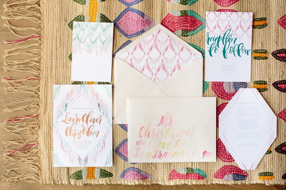
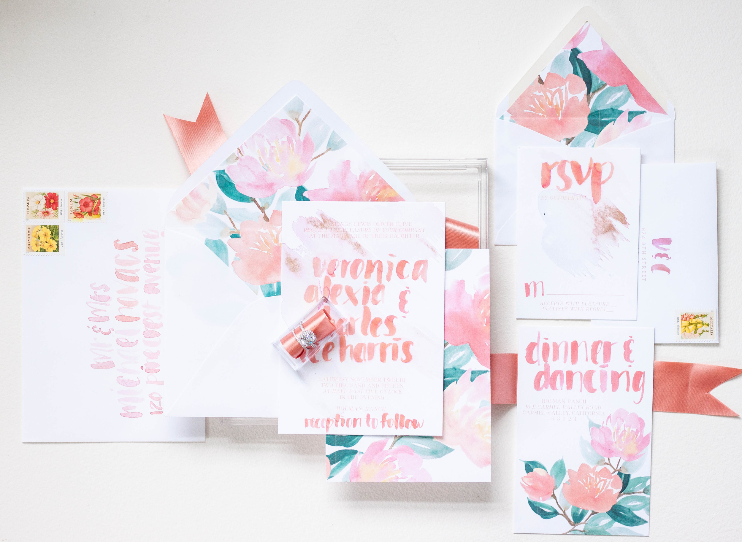
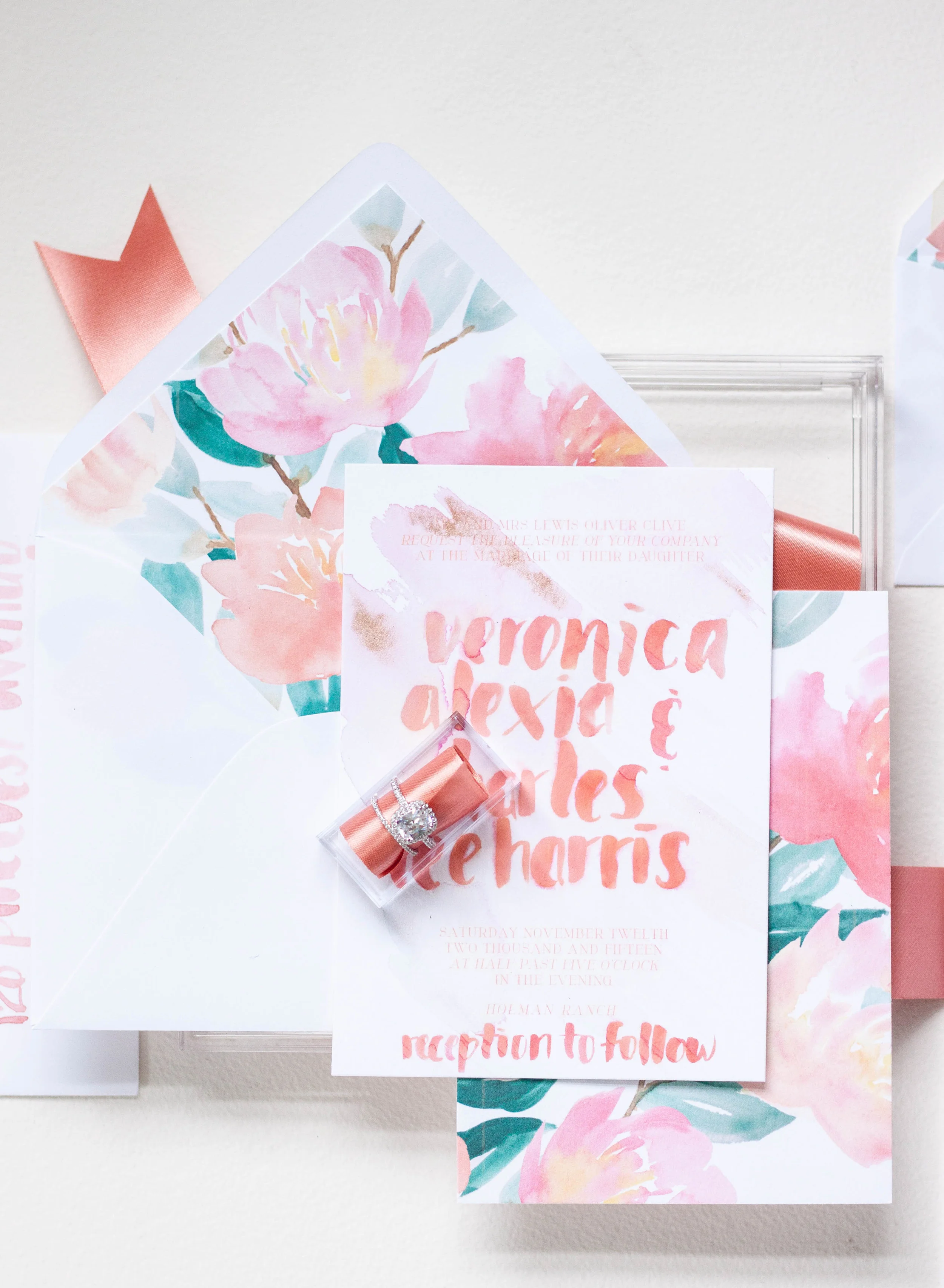
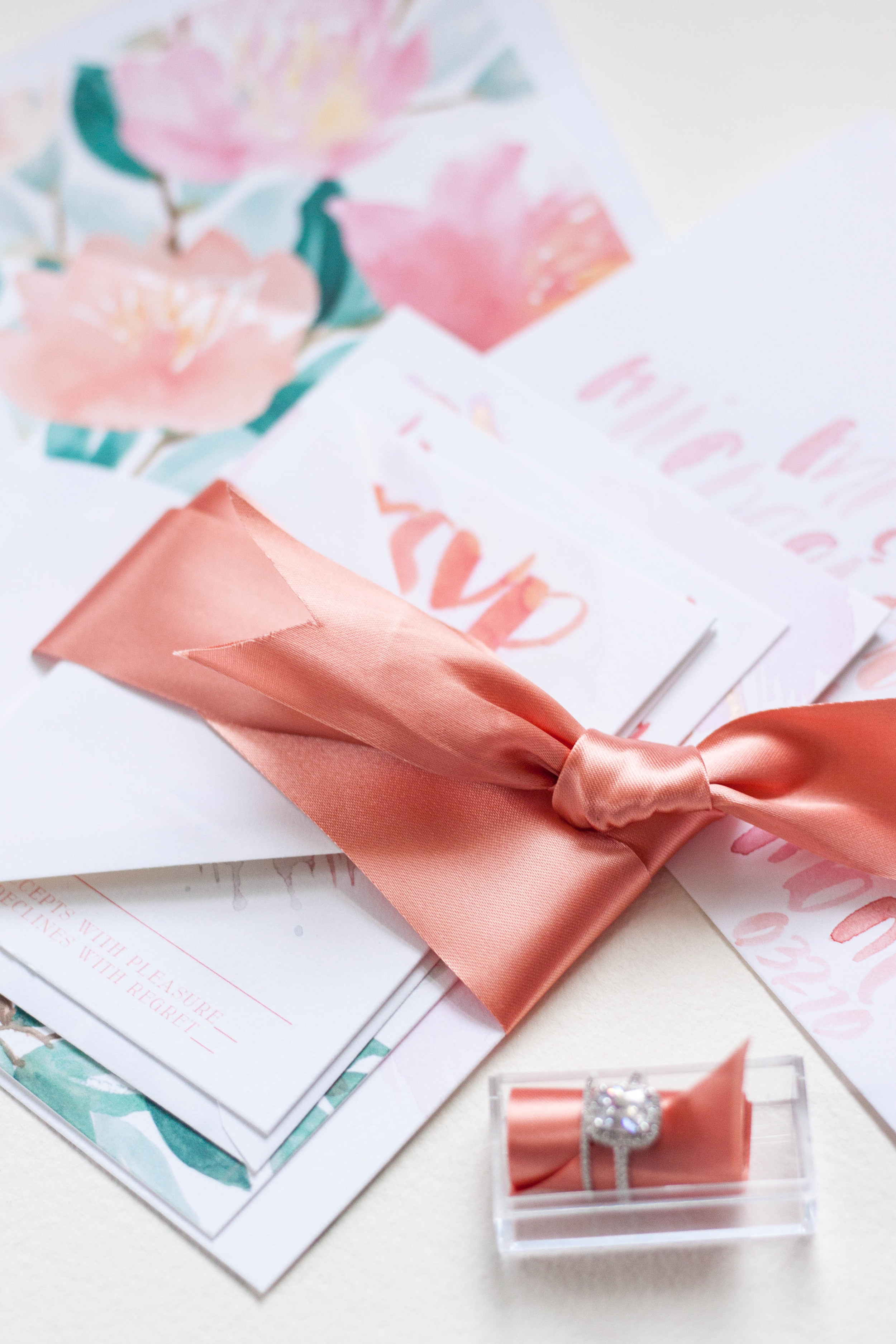
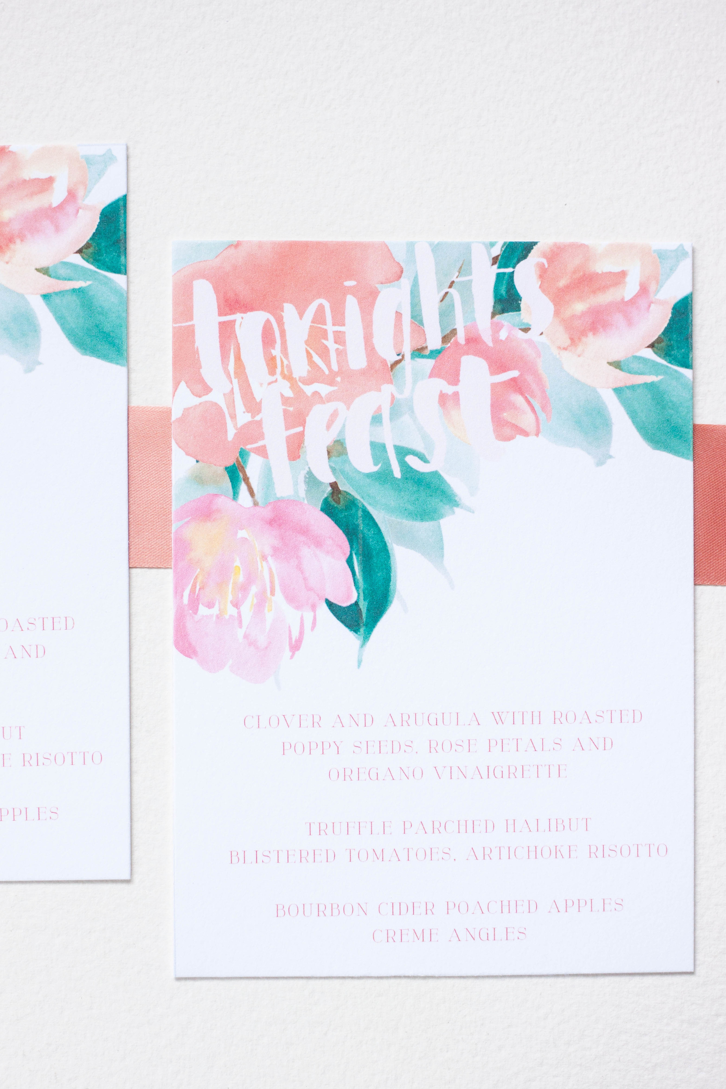
These invitations were created for the Oh So Inspired Retreat held in Sonoma, California last fall. We wanted to create something fun, bright, bold and playful with touches of rose gold and shades of peaches and pinks.
The invitations were kept on the simple side, with bold lettering gracing the front. Behind the lettering, I did a pale watercolor wash of pale pink and dropped in just a touch of rose gold. The backs of the invitations were printed in the bold pattern, adding interest and color to the simple invitation design.
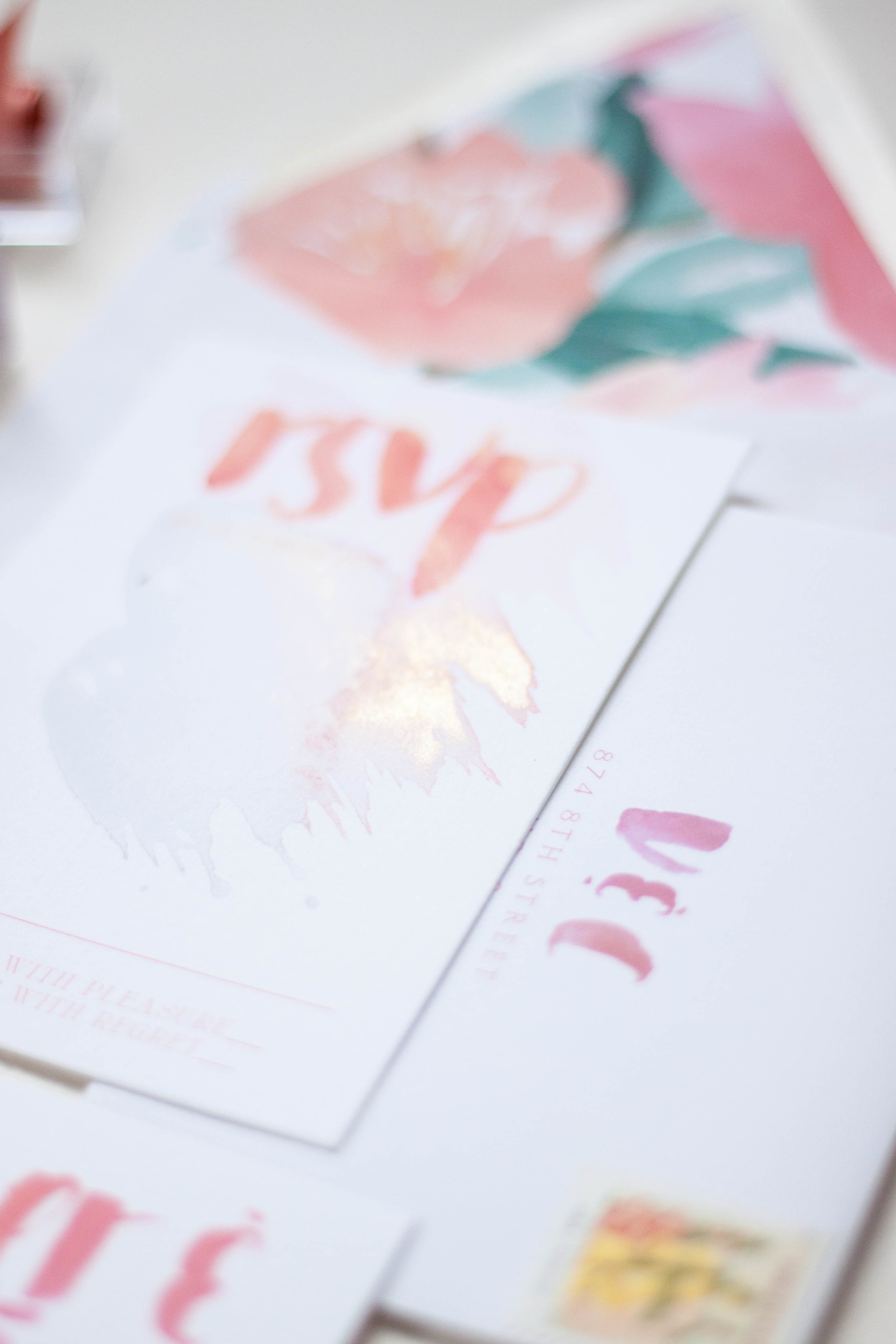
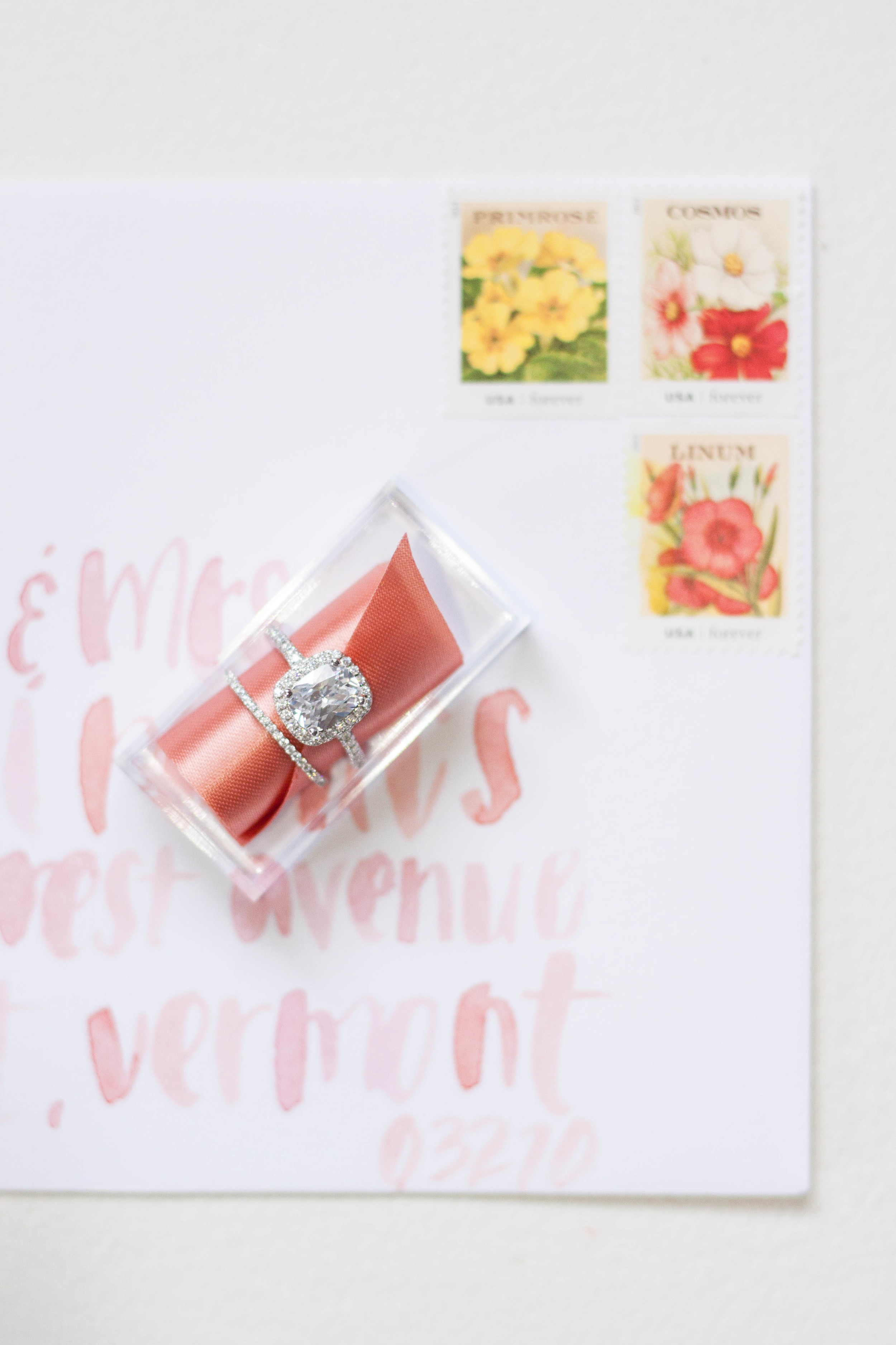
I completely love the envelope design with the envelopes lined in the bold print. Each envelope was addressed in the same bold, heavy brush lettering. The carefully selected stamps are reprints of vintage seed packets and the colors were perfect! The small reply card was printed with the couple's address with their initials in the same bold brush style.
Featured | Style me Pretty
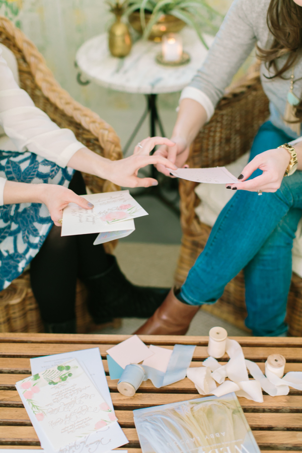
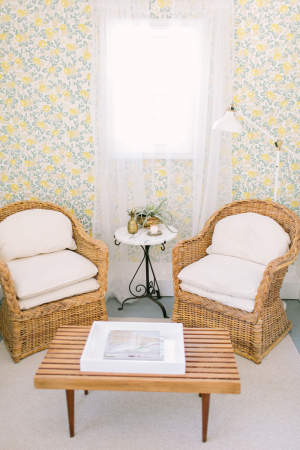
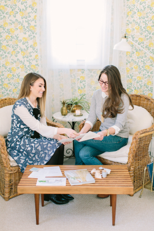
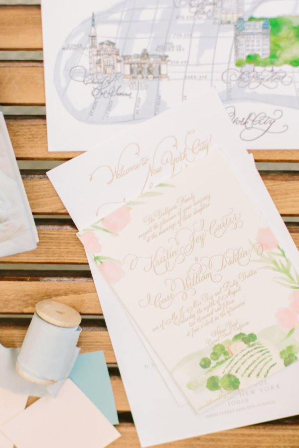
One of my favorite clients (I say 'favorite' but all my clients are pretty fricken awesome!), Miss Jess Galfo, fashion blogger of Dressed by Jess and blogger bride at Style Me Pretty met up with her completely fab event designer to have a sit down recently to chat about style, paper, and all details weddings! Paige from Gilded Lily Events is working with Jess on her wedding design, and I have the pleasure of creating her paper pieces for her. They cozied up in Paige's darling office to pour over paper options, printing methods and wedding details. The lovely afternoon was then shot by Love & Light Photography and was featured on Style Me Pretty today! Jess turned the tables a bit and put on her hat as blogger and picked Paige's brain a bit about owning a wedding design company and working with clients. Check out her full interview the rest of the gallery
From Paige:
There are plenty of ways to showcase your personality on your wedding day, but what elements are the most important?
I truly believe that love is in the details. However, couples can easily get weighed down by all of these “little” things. I like to remind brides-to-be that it is important to really zoom in on the areas that will make the most impact. If you think back on a picture of a wedding that you loved, you probably didn’t notice everything that was going on around it. Focus on what is the most important and highlight it. For an overall beautiful, cohesive look, I believe the flowers and paper goods are the most important elements. They carry the wedding day story and are usually the first and last thing that your guests will take note of.
Invitations are the guests’ first peek at the formality of the wedding along with the type of event being thrown. How can brides keep them creative, yet cohesive?
Save the Dates and invitations are the first connections that your guests will have with your wedding and it sets the tone for what to expect for your day. Before you send out your invitations, make sure you have a good idea of the color palette and key design elements that you are going to use throughout your wedding day. Custom invitations are the way to go and are not just a luxury item. Be clear with your graphic designer or artist of what you want and how they can work within your budget to make your invitation dreams come true.
Check out more from Paige on Style Me Pretty!
Original Artwork | Monochormatic
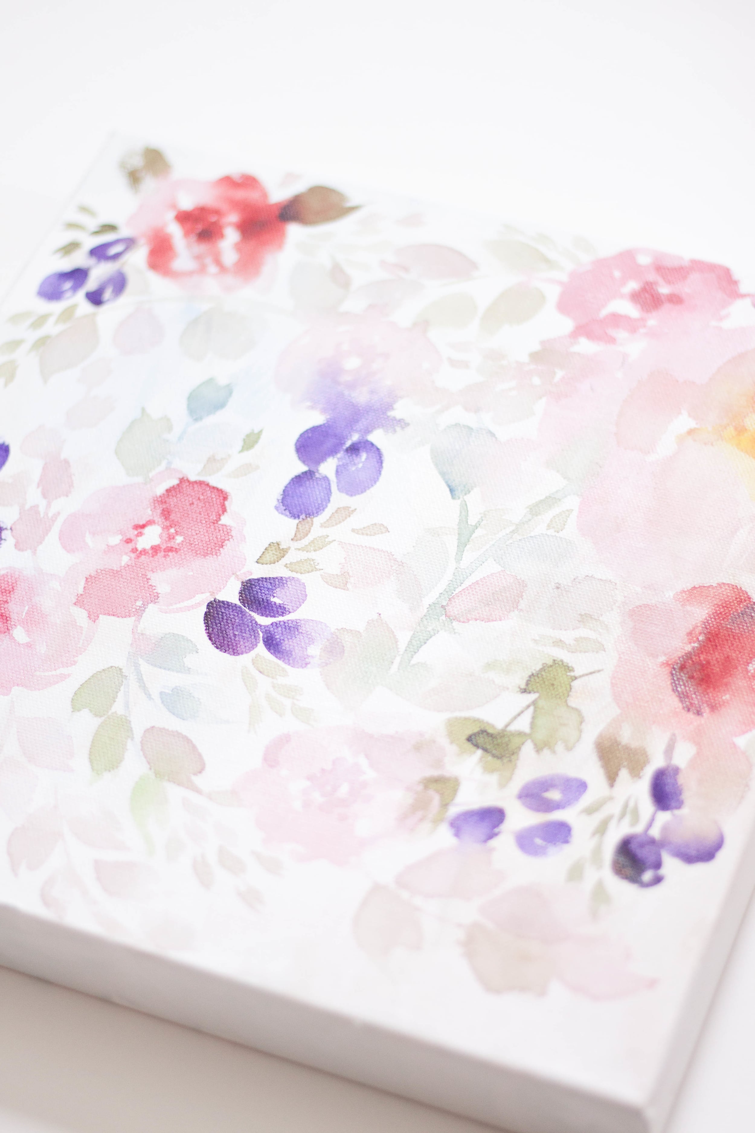
I've been playing around with painting in a single color, adjusting tones and shadows to give depth and contrast. I recently did two pieces in shades of grey and black (and apparently blue. I'm not actually sure where the blue came from, I can only think that there was a tiny bit mixed in the palette with the black - it wasn't noticeable until it had dried!)
I finished these two commissioned pieces last week - they measure 15x11 and are painted on Arches cold press watercolor paper and will be finished with a deckled edge before being shipped off to their new owners!
You can also see a bit of Paige's invitation artwork below the black and white.
Announcement | Original Artwork
About a month or two ago, I started doing something that may seem pretty straight forward, but I had never thought of before (it was a bit of a 'duh' moment). I started creating artwork for no other reason than creation and practice. As an artist, it's actually a bit of a conundrum. I personally know that I have a hard time sitting down and just creating something without any guidelines or parameters. I never know what to paint - or to paint at all. I could sketch, but what would I sketch??
So a began letting color be my parameters and not worrying too much about what I actually painted. I also started letting the watercolor behave as watercolor should, and not worrying so much about it being "perfect". I allowed the paints to bleed together, the reds play into the greens and the blush into blue.
A funny thing happened - the more I practiced, the better I saw my work getting. Shocking, right? Who knew that practice improved one's skills!
Another unexpected thing happened - when I started posting my latest work on social media, I received much higher praise/likes/accolades than normal! My most liked post on instagram EVER was a bronze gouache leaf painting! I was somewhat (totally. I was totally) blown away!
So every other day or so I sit down to create something for the fun of it, but now I have a whole pile of gorgeous watercolor artwork. What will I do with all this artwork?
Well, after several requests, I've decided to sell it! They're my babies, but my walls are full and they need to go to good homes.
So as we welcome 2016, I have launched the first round of artwork for sale. Each piece is unique and original, so if there's a piece you love, snap it up before someone else does! And don't forget to check back for new pieces to be added!
To celebrate the launch, I've also added a free printable to celebrate 2016! Find it in the shop, download and don't forget to share how you use it with #moiraart
2016 Philadlephia Workshops
2016 has brought some really exciting new things for me so far, and we're only a week into it! I have a really awesome second announcement in a few days that doesn't even have anything to do with workshops!
I've taught calligraphy workshops in the past both in hosting them myself and teaching at Paper Source for several years. I love teaching and being able to share my passions and obsessions with others, but I've really strayed away from it for a while now and I miss it! I have so many passions and loves, and anyone who knows me personally know that those passions tend to overflow into all other aspects of my life. There are so many hobbies I've collected over the years, experiences I've learned from, and business mistakes and successes and I want to share that!
That all being said, I've decided to teach a series of workshops throughout the coming year to touch on all sorts of things. My current obsession and the focus of my attention is how to make money as a creative; creating a solid and consistent brand, and using that brand to target your ideal client and learning how to turn that into a money making business. I'm obsessed with studying it and can't wait to share it!
Many of the workshops will be geared towards creative businesses (experienced or inexperienced!), but don't fret! There will be plenty for the hobbyist as well!
2016 brings another big change in my life. I'll (FINGERS CROSSED) be moving soon (yet again. This will make five major moves in two years, in addition to another 6 moves in and out of storage units and a 3,000 mile cross country move). Johnathan and I are house hunting for our forever home and are getting our currenthouse ready to sell. Something that is in the forefront of my mind as we house hunt is finding a home that has a large enough space or studio that I can host workshops in my own home (I mean, how awesome would that be!!). It would make set up a breeze and I would be able to host anything from an intimate class of just a handful all the way up to a full sized class.
Being from California where everything is so spread out, I love how (relatively) close together everything on the east coast is! I would love to also be able to host traveling attendees who are driving in from other cities to attend (Hello, DC and NYC, I'm talking to you girls!).
Right now, I'm asking for anyone who is interested to get signed up so I can see which classes are the most requested and who's interested, that way when I have some dates solidified, I'll be able to let you know.
Paper Talk | Why choose custom
Working with a bride and groom to create something this unique and reflective of their wedding day is such a pleasure. Being able to bring in that fine art aspect as well as hand lettering and calligraphy just brings a look and feel so different from anything you can find in the pre-designed realm.
Working with a designer on a custom piece is like watching a dream come to life. Around here, we begin with a sketch to show our ideas of how the artwork with work and play from one piece to another and to help our clients see our vision. I keep every sketch I've ever done - I love being able to flip back trough them! We work together selecting the printing method, paper, assembly detail, calligraphy style and artwork that go into each design, all based on the couple's person story and their style.
One of my main goals is to make this process as painless as possible! All of our clients also have access to our full stamping and stuffing services - meaning, we assemble, stuff, stamp, address, and seal your invitations, so all you need to do is mail them! That's just one of the perks of working with a custom designer. You will also get a bit more guidance on all the little details - like what printing is good for you (how would you know, you've never done this before!) how much your final pieces will weigh for postage, or what wording etiquette should you use - we'll take care of all those details for you and take as much off your plate as we can.
Why choose custom, you ask? Let's talk about it! There are so many options out there for your wedding initiations; they come in all shapes, sized and price points. So how do you decide? Should you print at home? Order a pre-fab design from a reputable website? Go with something you aren't so thrilled about? Take the leap and go for something you love? Dig yourself into the DIY hole? Go crazy and pull out all your hair just trying to decide?
Custom is a really fun option, but it isn't always for everyone. Trust me, you're talking to the queen of DIY - it's how I got into this business in the first place..."puh, this whole graphic design thing cant be that hard, I can totally do this!" I would ALWAYS rather do it myself and figure out the process than have someone else do it, so if you're a DIYer, I feel ya! However, DIY or pre-fab isn't for everyone either.
A few years ago, I had the epiphany that I wanted to limit myself to custom only designs, and I wanted to restrict myself and not offer the "I have something for absolutely everyone" mentality. I had done the graphics approach for about 3 years at that point, and I just wasn't loving it. I wanted to offer something totally unique to myself and my company, so I began offering artwork based designs only. You do see this approach more frequently now, but when I first started playing with the idea about four and a half years ago, there really wasn't anything like it in the market (except Julie Song, who's work makes me swoon!)
A couple who chooes a custom deign usually has a few things about them: They know exactly what they like! They're usually confident in themselves and know that they wants the details of their wedding to totally reflect their personal style. They may be looking for flexibility or something a bit more fun than the invitations they've seen in the past, or wish to have original artwork of their venue created for them. Sometimes it may be that they've never seen something they just love, but know the work of the artist and are confident in building something together.
Give us a shout if you're interested in finding out more about creating a custom design for your wedding!
Bespoke | Indigo
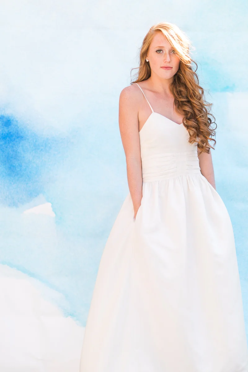
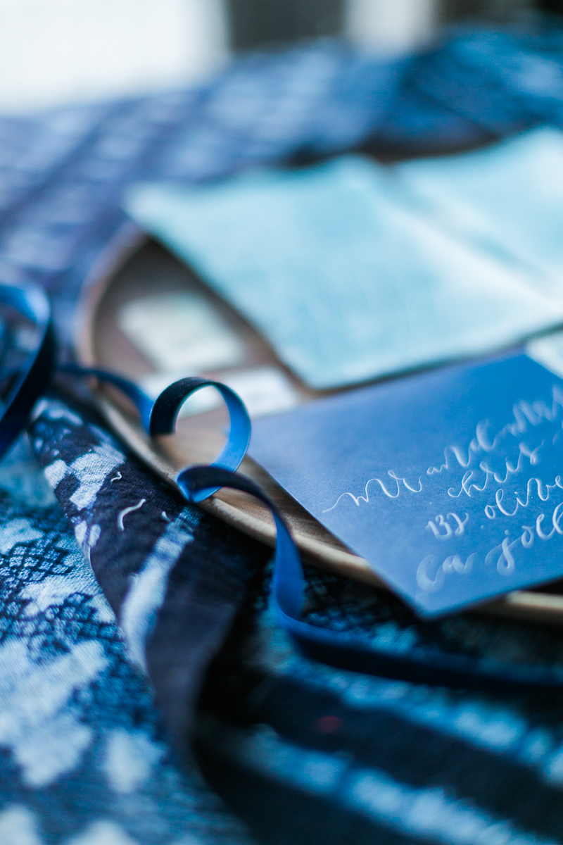
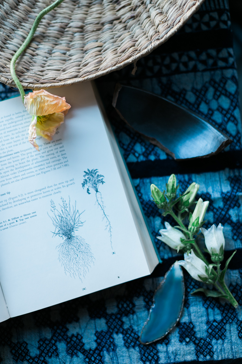
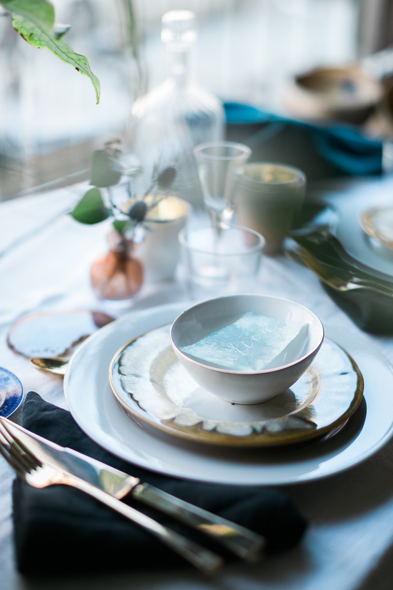
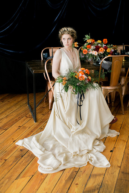
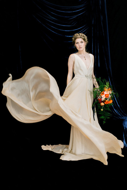
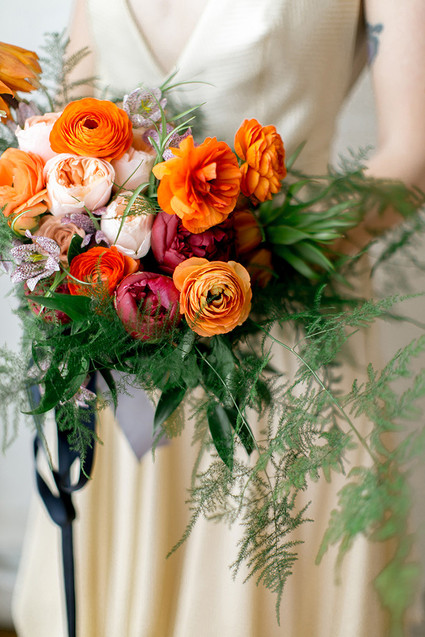
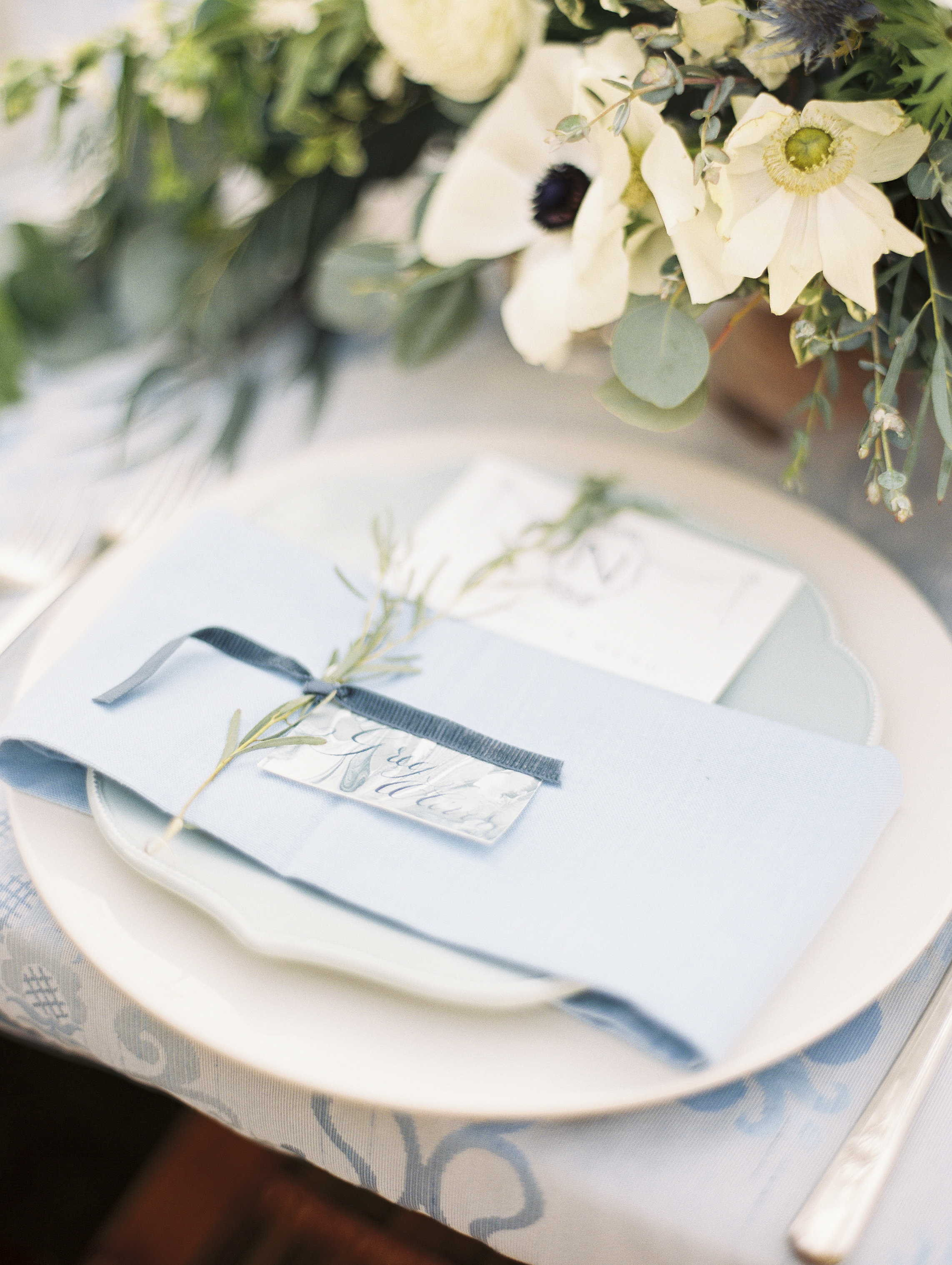
From our amazing photographer on the project, Cadence Kennedy, "As an artist and photographer, I am constantly inspired by color, light and art. I started dreaming of an "indigo" inspired styled shoot after learning of "Cyanotypes" a few years back. Cyanotypes are deep blue photographic prints which originated during the 1800's. They are created by laying botanicals or objects on top of light sensitive paper, exposed to the sun, then developed."
Photography: Cadence Kennedy // Florals: Aurora Botanica // Styling: L 'atelier Vert // Calligraphy: Design House of Moira // Curation: Orchard + Broome // Dresses: Stone Fox Bride // Backdrop: Starling On Bond // Hair: Hair by Tiffany Hayden // Makeup: Jillian Cleary
Featured | 100 layer cake - dutch masters
A bit earlier this year, a project I collaborated was featured on 100 Layer Cake! It was a pleasure to collaborate with Emily Wren on this moody project.
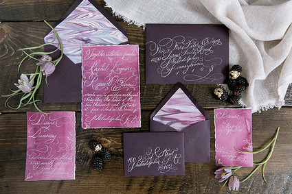
The invitations were a gorgeous, deep aubergine, watercolor washed plum and featured coordinating hand marbled paper as the envelope liners. The over the top flourished calligraphy was printed in white foil and then addressed in matching calligraphy.
Photographer: Emily Wren Photography / Location: Power Plant Productions / Event Design: Confetti & Co. / Floral Design: Kate Farley Design / Hair & Makeup: True Beauty Marks / Calligraphy: Design House of Moira / Desserts: Cake Life Bake Shop / Catering: Birchtree Catering / Rentals: Maggpie Vintage Rentals / Dress: Carol Hannah from Lovely Bride Philadelphia / Jewelry: Egan Day / Models: Gina (owner of True Beauty Marks) & Mike
Featured | Bayside Workshop
Vendors: Photography: Natalie Franke // Styling: Kruse & Vieira Events // Florals: Intrigue Designs // Invite Suite & Paper Goods & lettering for table: Design House Of Moira // Calligraphy: Poppy & Scooter // Linens: BBJ Linens // Rentals: Select Event Group // Cake: Wildflour Fine Baking Co.// Welcome Basket: Marigold & Grey // Hair & Makeup: Behind The Veil // Gown: Kate McDonald Bridal // Tux: The Black Tux
Featured | Grey Likes Wedding
If you've ever had the pleasure of checking out the work of Natalie Franke, you're in for a serious pleasure! I worked with her, along side Kruse and Vieira Events for the gorgeous two-day Bayside Workshop in Queenstown, Maryland. The swoon worthy photographs were featured on Grey Likes Wedding last week! Here are the invitations I create for the workshop, with more lovely pictures to follow!
Free Printable | Taurus Cocktail
CITRUS SMASH
Yields one cocktail
2 oz top shelf gin
1-2 tangerine peels
1⁄2 oz simple syrup
1⁄2 oz lemon juice
1oz soda
Instructions: Muddle tangerine peels and simple syrup in flat-surfaced glass. Add gin, lemon juice, and top with soda. Serve on the rocks.
Enjoy a free printable of the Citrus Smash cocktail here!
Featured | Flutter Magazine, Taurus
The second horoscope project I had the pleasure of pairing with Flutter Magazine on was the Taurus horoscope.
APRIL 20 — MAY 20: You love to keep things simple, but you also enjoy the luxuriousness of fine items. Splurge on a simple custom-made lace dress on your special day. Add elements of nature into your décor by using fruits for fun coloring. With earth being your zodiac element, utilize woods for texture to compliment the citrus on your tables. Gift your husband a leather embossed wallet on your wedding day (Will Leather Goods has a great selection!). He will carry it with him everywhere he goes. Set your sights on Costa Rica for an unforgettable honeymoon adventure.
As seen in Flutter Magazine, Issue No. 6
Photography: KT Merry | Design + Styling: Joy Proctor | Floral Design: Amy Osaba Events | Hair + Makeup: LunaBella Makeup and Hair | Jewelry: Sofia Kaman | Furniture: Found Vintage Rentals | Commissioned Cream Backdrop: Katherine Bell of The Habitat Factory | Cocktails + Recipes: Melissa Piña of Soiree Center | Tableware + China: Small Masterpiece | Horoscopes: Briana Westmacott | Cake: Enjoy Cupcakes | Dress: Anne Barge, 617 via Lovely Bride | Invitation Suite: Design House of Moira
Free Printable | Scorpio Cocktail
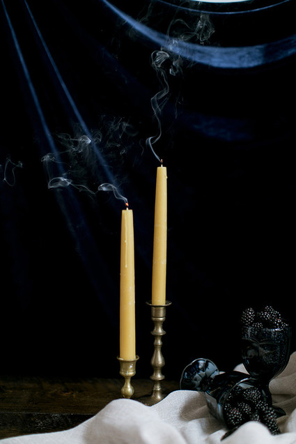
BLACKBERRY MINT JULEP
Yields one cocktail
3 oz blackberry bourbon (instructions below)
4-6 fresh mint leaves
Small pinch of raw sugar
1⁄2 oz soda
Instructions: Muddle mint and sugar in a flat-surfaced glass, add crushed ice, soda, and top with bourbon.
