Bespoke | Elisie
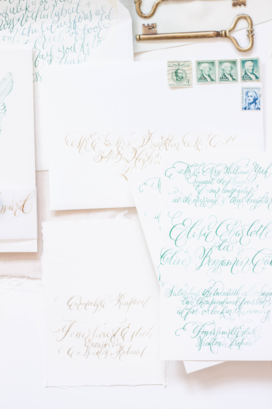
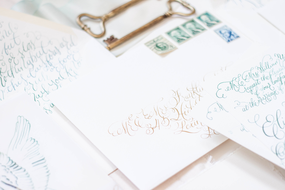
private estate | angelic sculpture | calligraphy | pale | elegant | black tie | silk | deckled edge | gold
Coming Soon | estate & sculpture
...a suite inspired by an angelic sculpture and a private estate coming to the blog soon!
Bespoke | O'dessa
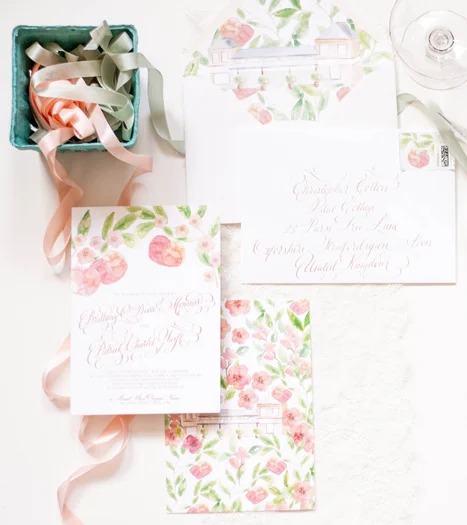
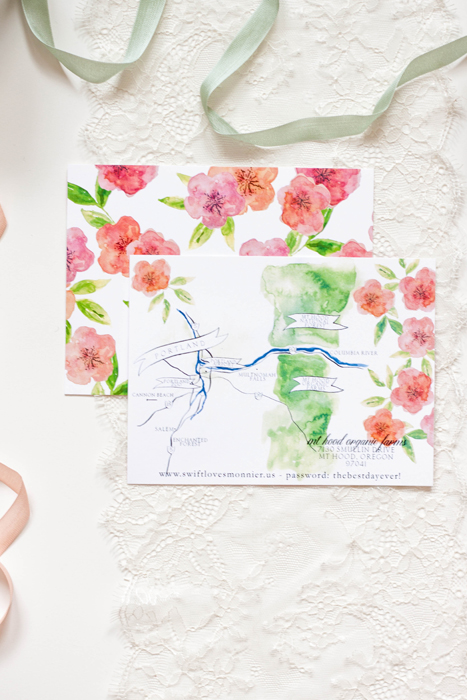
orchard | rose gold | mt hood | organic | bright | formal | apples | blossom
Featured | ruffled blog
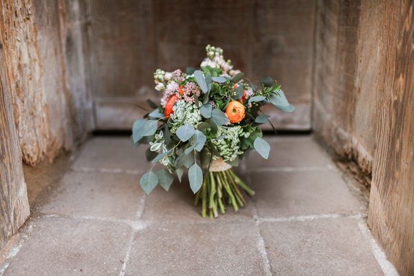
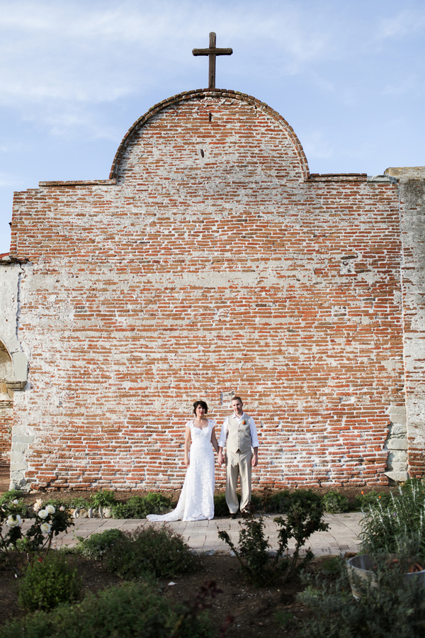
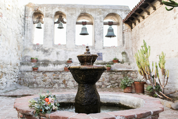
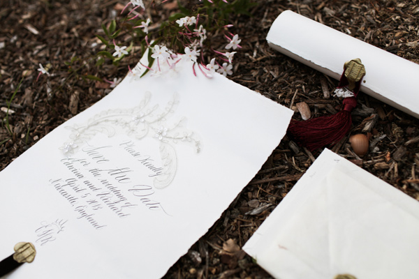
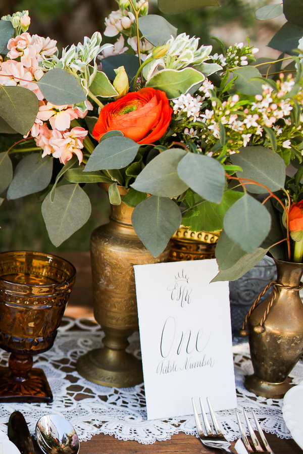
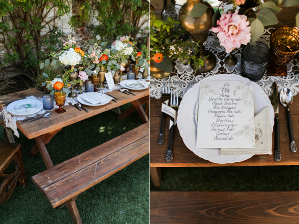
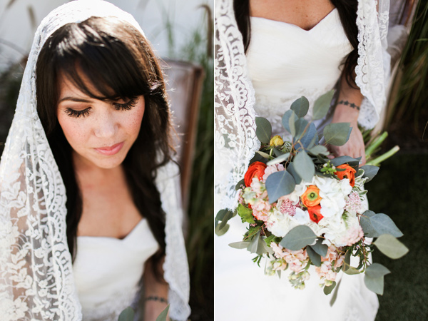
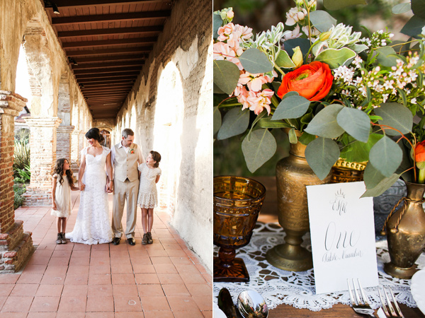
rustic | spanish | lace | velvet | fall | wine | calligraphy | elegant | formal
photographer: Chris Wojdak Photography
designer: Franchine Ribeau Events
calligraphy & invitations: Moira Design Studio
florals: Il Profumo Dei Fiori
Featured | style me pretty!
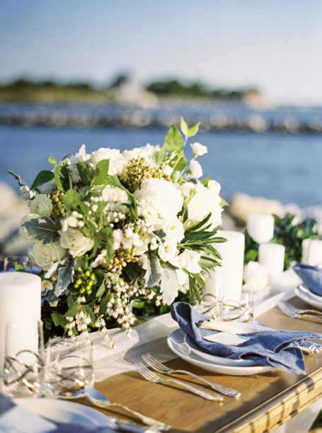
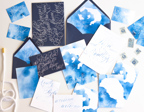
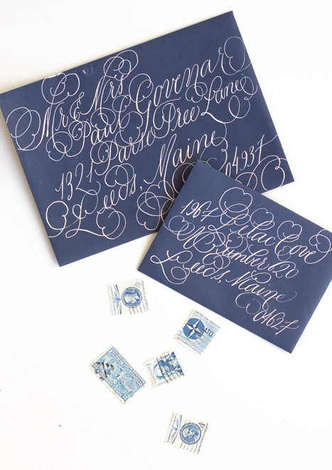
seaside | calligraphy | watercolor | sea breeze | antique stamps | silver flatware | rope | quote | white | pale blue | gauzy | airy | light
photography: Krista A Jones
design: Alex Meyer
stationary & calligraphy: Moira Design Studio
flowers: The Floral Studio
"...In you I wrap a thousand onward years."
Instagram Weekly
This week on Instagram...this is such a gorgeous suite that I have the pleasure of creating. It included a watercolor pattern of gorgeous blown open roses and buds and it was mixed with a pale watercolor stripe. The suite itself was all hand lettered on deckled edge paper, tied up with thread and assembled with a wax monogram seal. More to come!
Bespoke...Santorini Destination Wedding Invitations
When approached to create a suite for a destination wedding in Santorini, I jumped at the opportunity!
This suite differs from our typical work a tad...when building the ideas and design elements that this suite would be created around, I toyed with the idea of creating an illustration that embodied the classic Santorini buildings. We also wanted to incorporate the distinctive blues of both the classic Santorini rooftops as well as the surrounding piercing blue ocean. In the end, we nixed the building idea and decided to keep it a bit more simple and focus on the blues and the movement of the ocean.
I used a watercolor wash as a base in a vibrant cerulean blue, letting the wash be uneven in saturation. I then illustrated a map of the island itself and used that as an overlay for both the backers as well as envelope liner. I used a fairly flourished calligraphy style to balance out the simplicity of the suite.
Bespoke - midsummers night dream
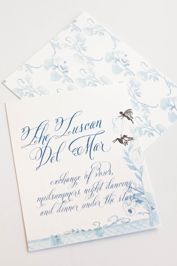
Our last post told the story of the process and artwork behind a wedding invitation suite inspirited by A Midsummer's Night Dream. The final suite was a gorgeous combination of shades of blue, violet and purples with black details.
I really did enjoy working on this suite even though I went through a period of discouragement with the artwork and color palate.
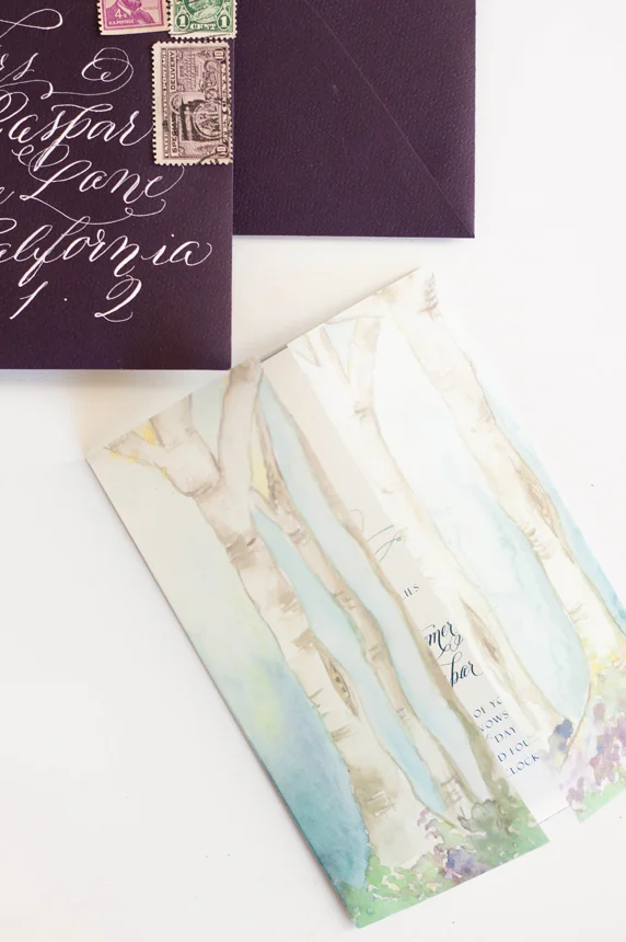
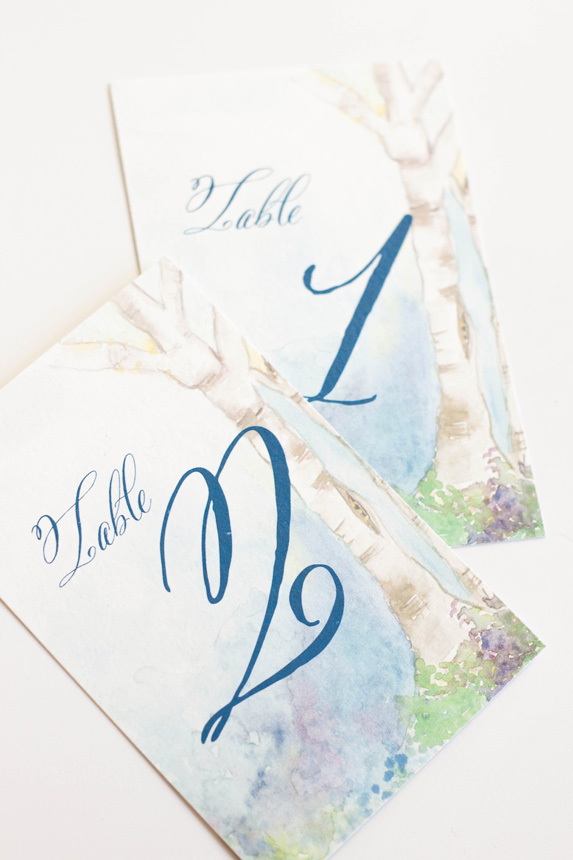
The most colorful and my personal favorite part of the suite was the watercolor painting of a fairy hollow. I created a little vignette of trees spanning a space with colorful flowers and lots of blues. I used the artwork on a thin velum that wrapped the entire suite and held all the pieces together as well as the envelope liner and the back of some of the pieces.
The invitations featured a calligraphy monogram, banner and watercolor flourish. I wanted to keep the main portion of the invitation free of heavy artwork and focus on the calligraphy elements. I knew that the other pieces and the backs would hold enough color and artwork to balance the suite as a whole.
The back of the invitation suite was the artwork that took me the longest, as one could imagine, especially given that I redid the entire thing from color to shades of blue (see previous post for further background). I kept the artwork on the response card and reception similarly simple, but added some of the silhouettes as details.
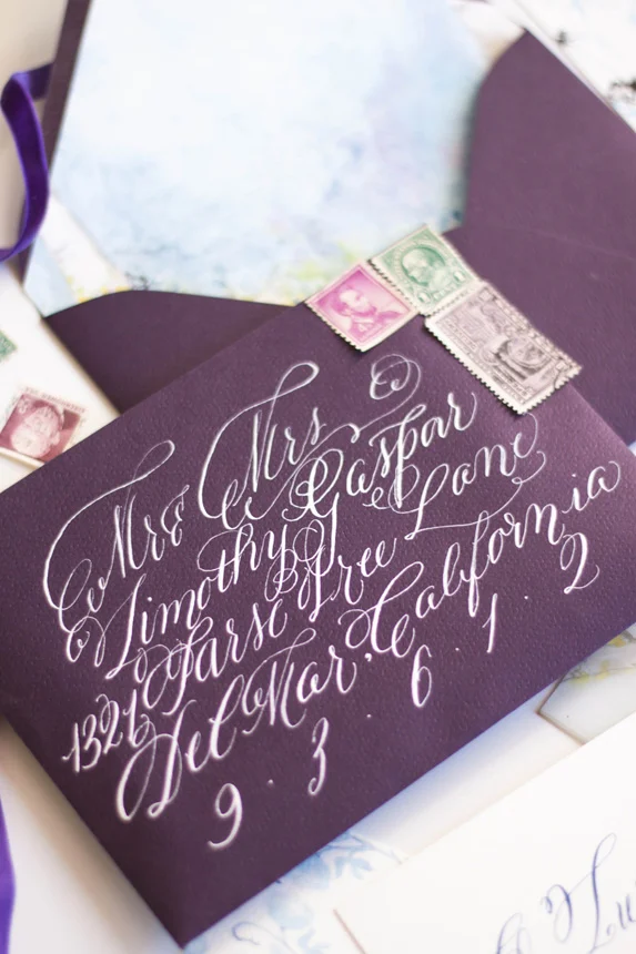
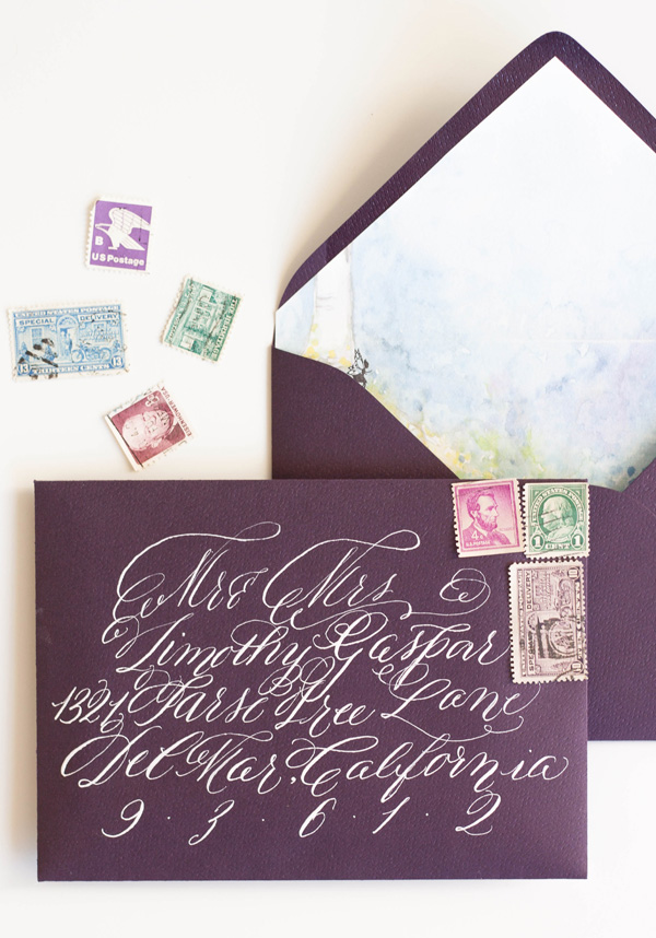
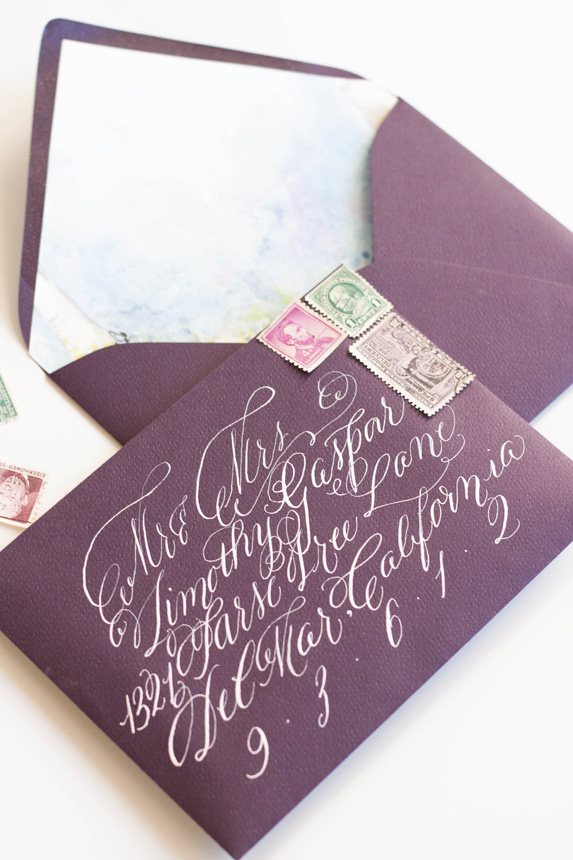
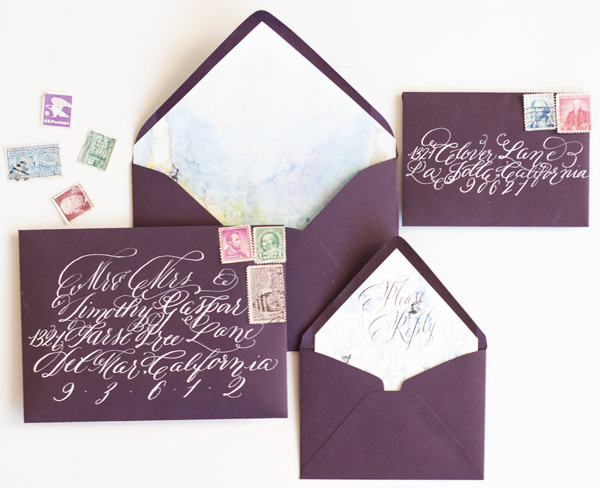
As always, the calligraphy on the aubergine envelopes was a perfect match to the suite in opaque white ink. I lined the envelopes with the matching fairy hollow, with the reply card with matching calligraphy on its liner. I choose some vintage stamps to round out the design.
I LOVED creating the programs! They folded with the artwork contenting front and back. When opened, the bridal party was depicted by silhouettes with the bride and groom in the middle.


