Featured...Ruffled Blog
We had such a wonderful time collaborating with Absolutely Events on this suite inspirited by Shakespeare’s A Midsummer Night’s Dream. We've walked you through the process we went though in creating the suite, now you get to see it in action!
Design: Absolutely Events
Florals: Rae Florae
Photography: Jackie Wonders


Featured...Ceremony Magazine 2014
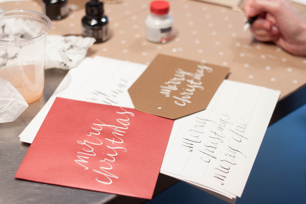
We did some lovely calligraphy work in our Rilla style for a shoot for Ceremony Magazine. We always just adore white ink on blue paper! Florals by Adrianne Smith Floral and Photography by Jennifer Dery.

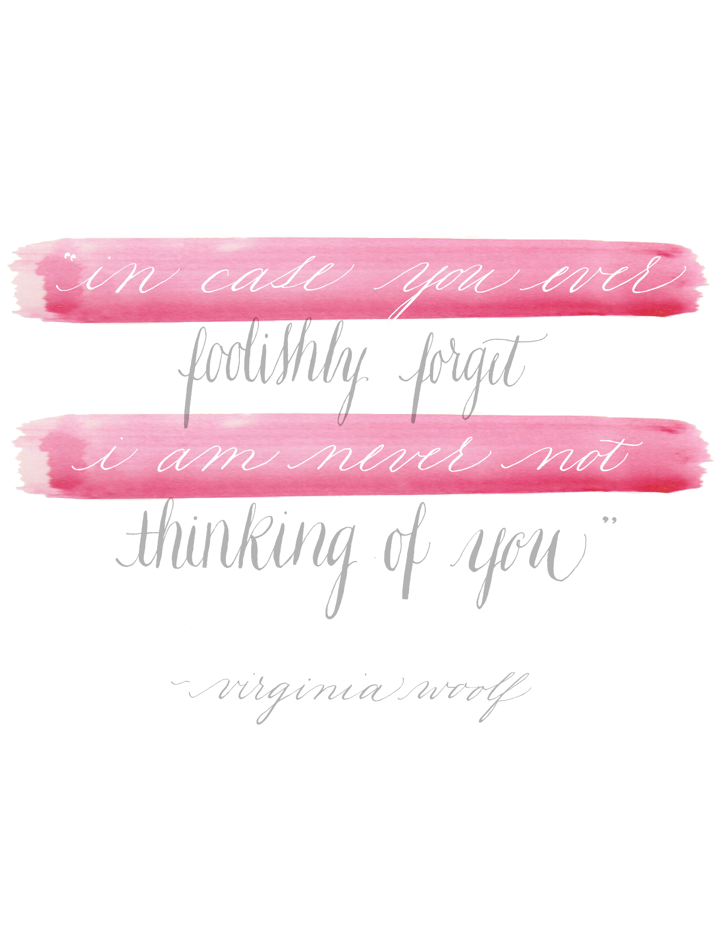
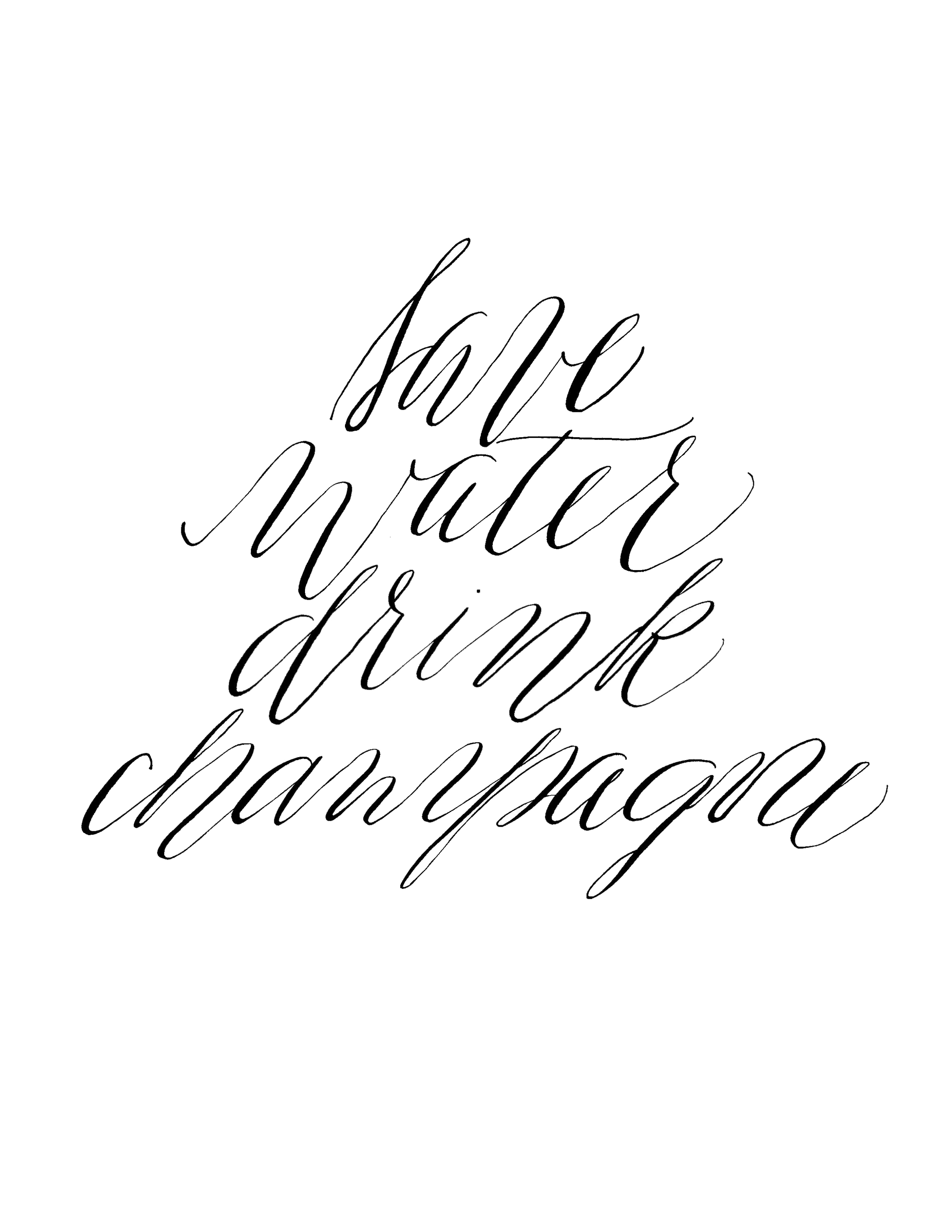
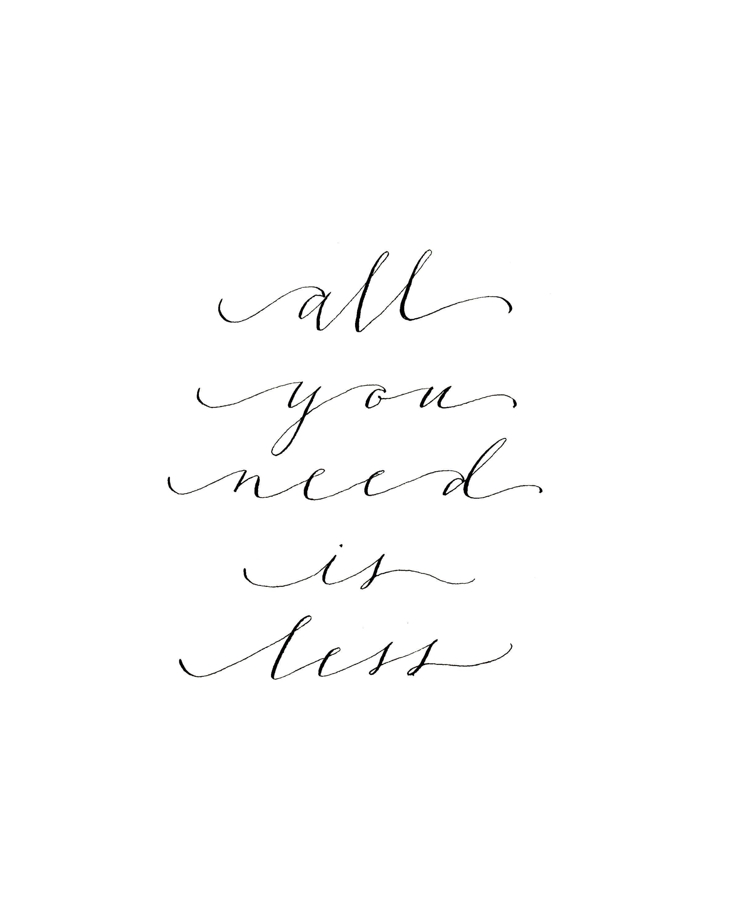
Studio Shoppe - all you need is less print
"all you need is less" print, hand scribed in a simple calligraphy font by our lovely Miss Jenny, makes a wonderful addition to any gallery wall!

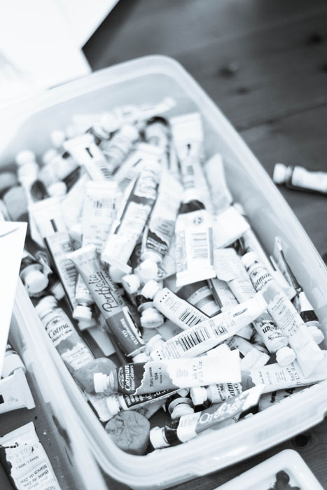
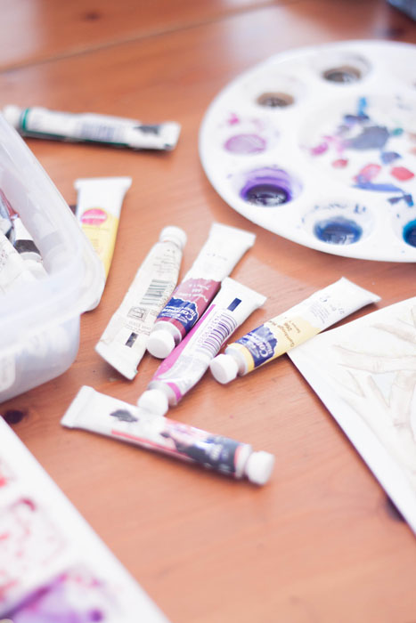
...in process - behind the scenes
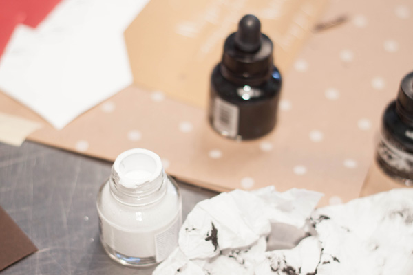
Part of our process is amassing several bespoke invitation suites, all their artwork and sketches, and shooting them all at once for the website, the blog, and any submissions pieces. This process involves paper, calligraphy, envelopes, liners, cameras, many hands (making for lighter work), step ladders, and coffee. Around here, we drink almond milk lattes.
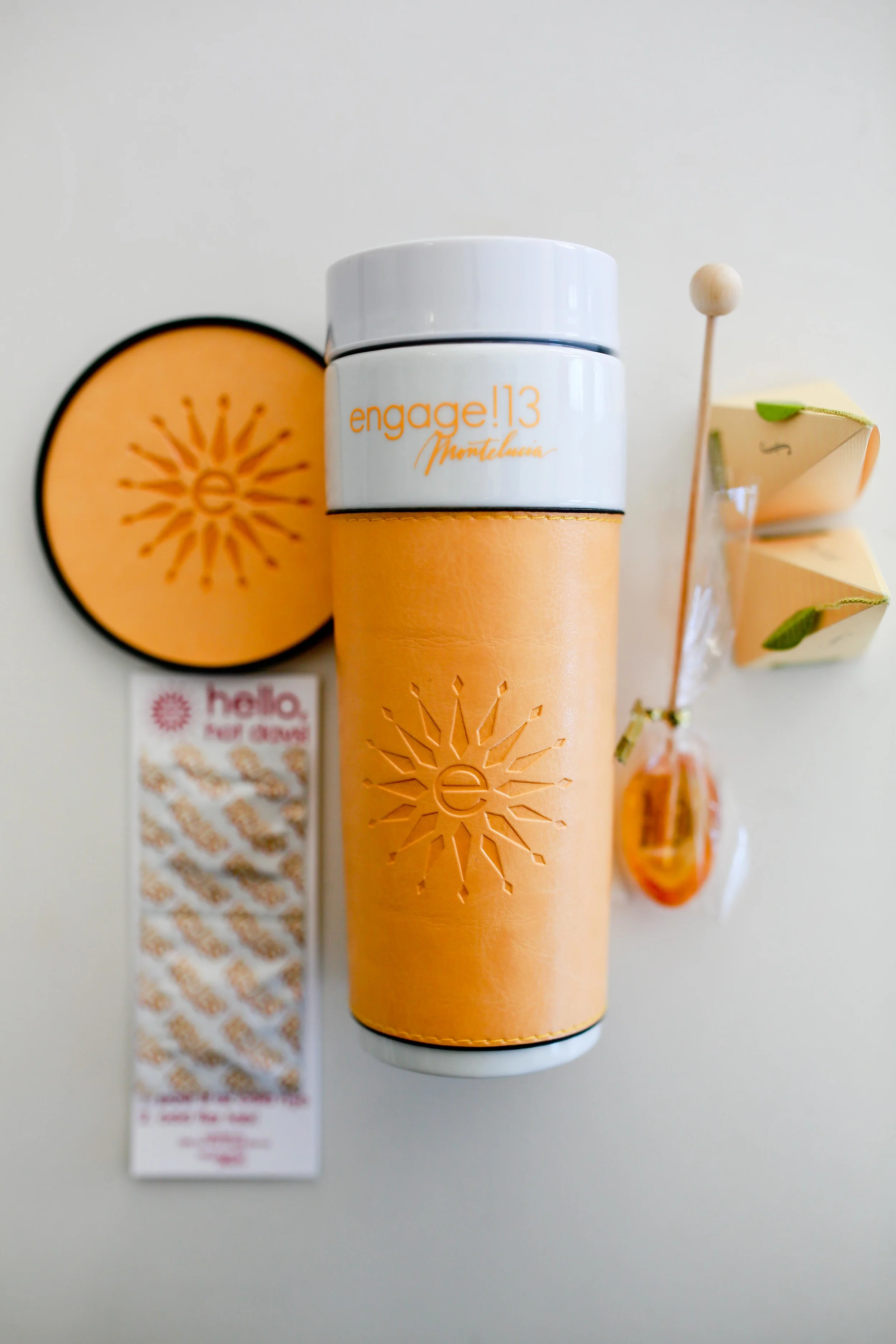
The Moira Girls at Engage!13
We had the amazing honor and pleasure of attending this years Engage!13 conference. The conference is a luxury wedding summit comprised of the best of the best in the entire industry and included attendee from across the US, across the pond and around the world. We had the pleasure of meeting industry greats like Jose Villa, Ceci Johnson, Randy Fenoli, Todd Events, and so many more. Every last detail was planned with perfection, letterpress, and color coordination. Our first day of check in included our Engage tote bags (color themed, of course) with our first round of swag (a word I personally detest, but for lack of a better option, we'll use it here).
Here are some details shots of our day one at The Montelucia Resort.
Photographs by Chellise Michael Photography


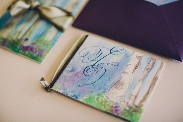
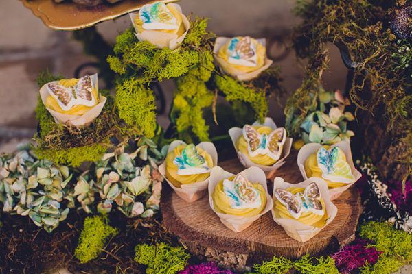
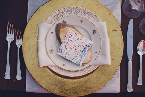
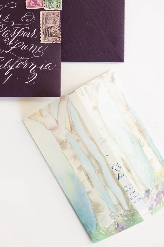
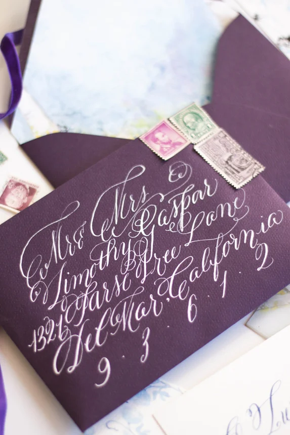
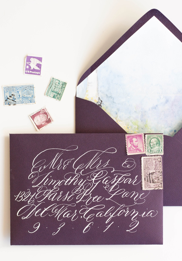
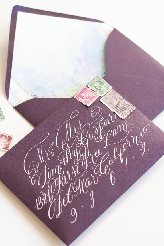
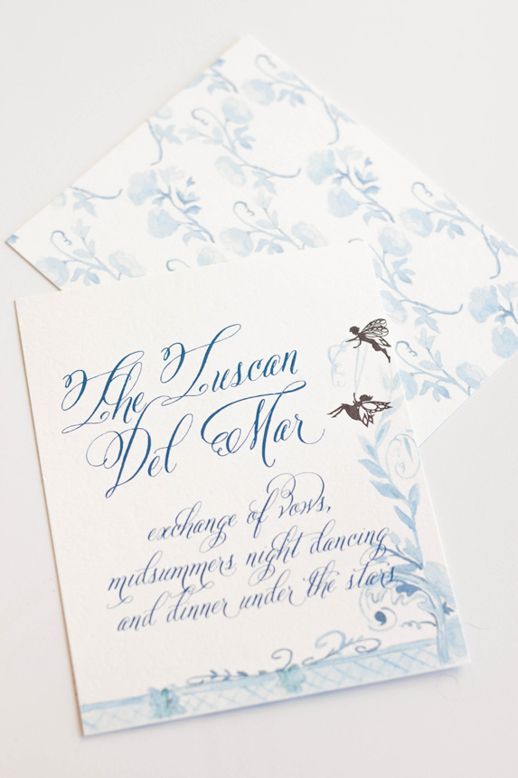
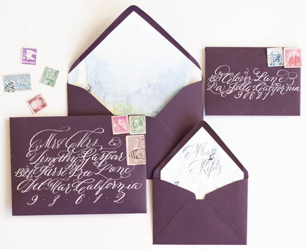
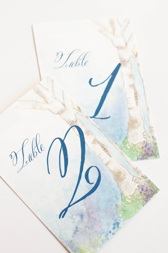
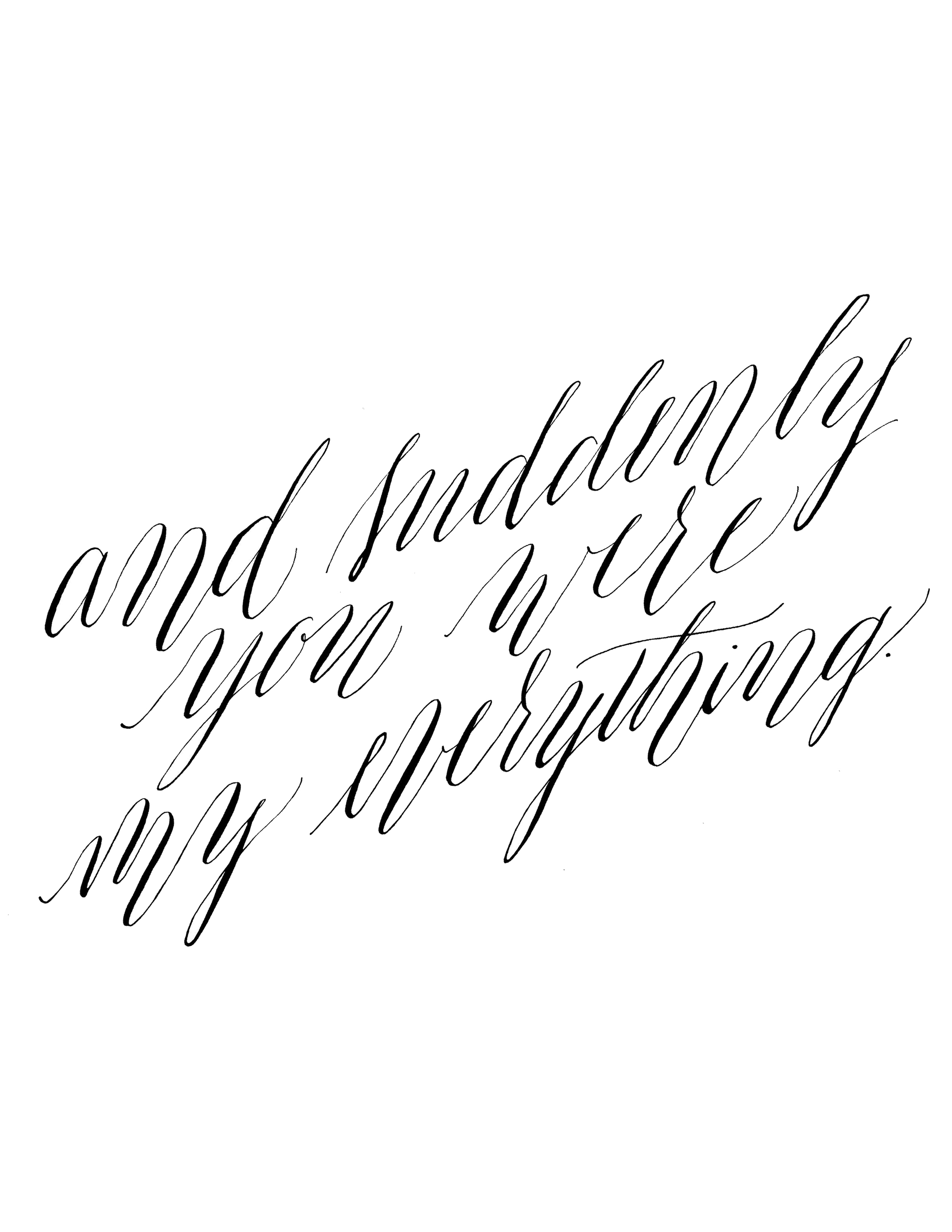
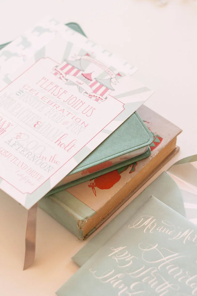
Bespoke - midsummers night dream

Our last post told the story of the process and artwork behind a wedding invitation suite inspirited by A Midsummer's Night Dream. The final suite was a gorgeous combination of shades of blue, violet and purples with black details.
I really did enjoy working on this suite even though I went through a period of discouragement with the artwork and color palate.
The most colorful and my personal favorite part of the suite was the watercolor painting of a fairy hollow. I created a little vignette of trees spanning a space with colorful flowers and lots of blues. I used the artwork on a thin velum that wrapped the entire suite and held all the pieces together as well as the envelope liner and the back of some of the pieces.


The invitations featured a calligraphy monogram, banner and watercolor flourish. I wanted to keep the main portion of the invitation free of heavy artwork and focus on the calligraphy elements. I knew that the other pieces and the backs would hold enough color and artwork to balance the suite as a whole.
The back of the invitation suite was the artwork that took me the longest, as one could imagine, especially given that I redid the entire thing from color to shades of blue (see previous post for further background). I kept the artwork on the response card and reception similarly simple, but added some of the silhouettes as details.


As always, the calligraphy on the aubergine envelopes was a perfect match to the suite in opaque white ink. I lined the envelopes with the matching fairy hollow, with the reply card with matching calligraphy on its liner. I choose some vintage stamps to round out the design.


I LOVED creating the programs! They folded with the artwork contenting front and back. When opened, the bridal party was depicted by silhouettes with the bride and groom in the middle.


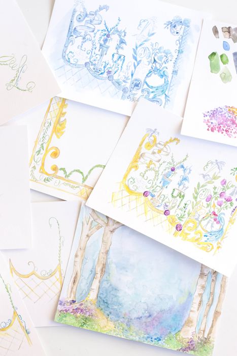
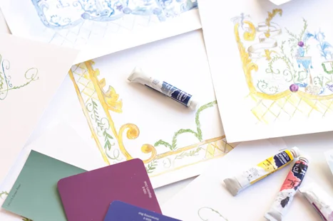
...in process - A midsummers night's dream
Today we have some background on the Midsummer Night's Dream suite we created for a photoshoot with Absolutely Events. You know me, I start with my sketches of all the different pieces and ideas and move onto the art pieces. This was a tough one; I knew the idea I wanted to work with and it just didn't turn out the way I wanted...I redid the artwork twice and still ended up reworking all the pieces digitally.


The artwork for this one was on the complicated side. I wanted to incorporate the design elements of a chinoiserie or antique damask and how different little scenes were depicted and layered. I also wanted a "fairy hallow" with shades of blues and purples.
I then put paint to paper, filled everything with shades of yellows, purples, blues and greens...and I hated it and did the entire thing over again in shades of blues.


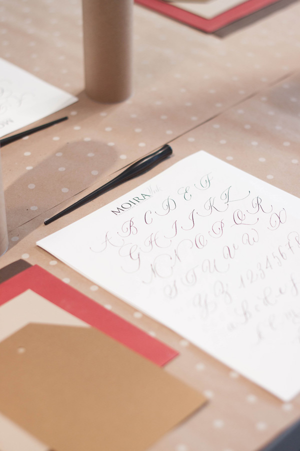
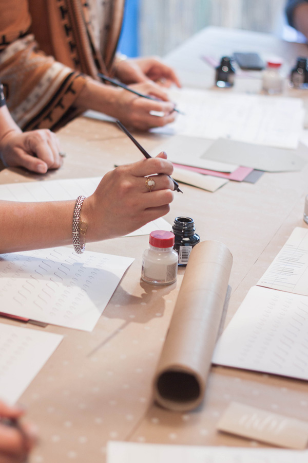
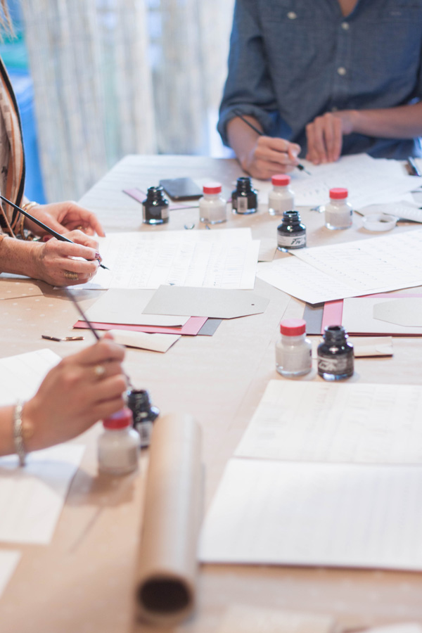
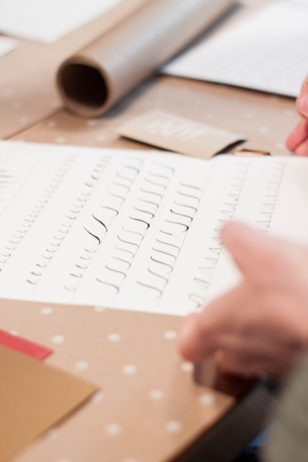
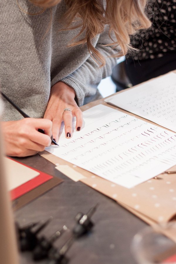
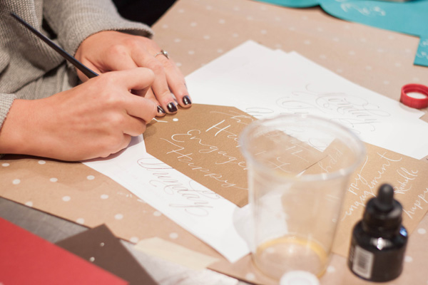
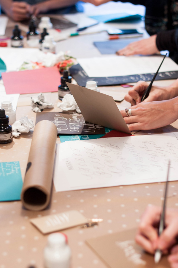
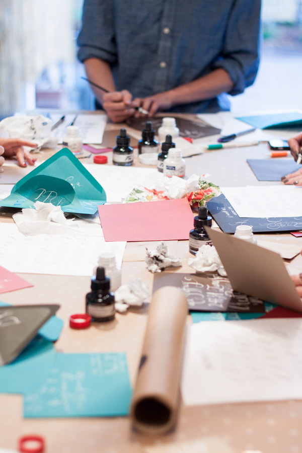
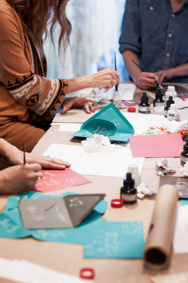
Calligraphy Workshop San Francisco
We had such a lovely and amazing time teaching our first San Francisco calligraphy workshop! We had the beautiful Natalie from Natalie Bowen Design host us at her darling new studio in SOMA. Her studio has several workable rooms and a large patio out back. The entire studio is bathed in gorgeous natural light with an amazing collection of curated vases and florist tools...plus the MOST amazing wallpaper in her powder room!

For this particular workshop, we taught a specific font style. The kits included a white ink, black ink, pen holder, and 4 nibs. We also included a full lettering exemplar of the letter with several phrases and words done in the font as examples. We topped the whole thing off with some envelope and paper products from our favorite Paper Source.


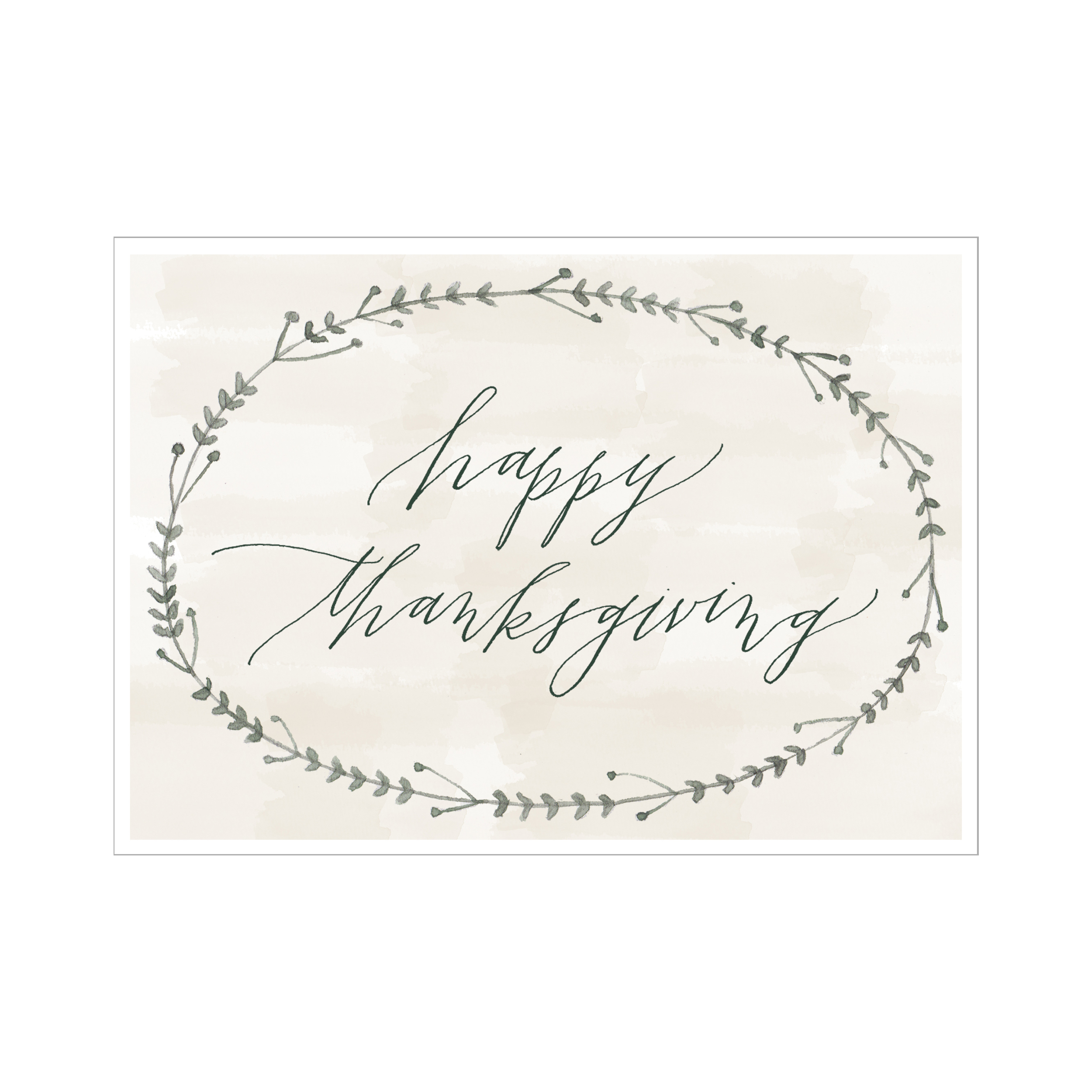
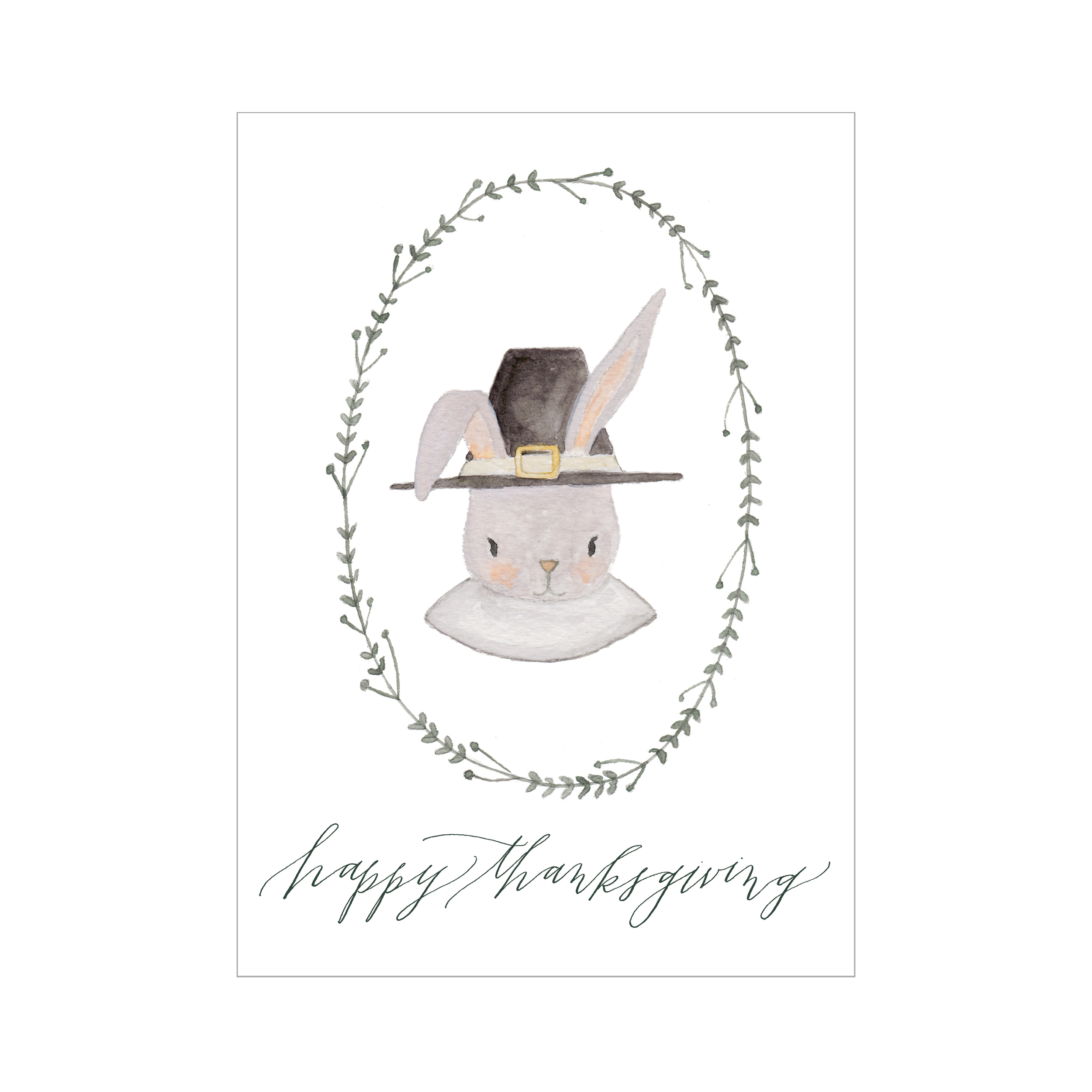
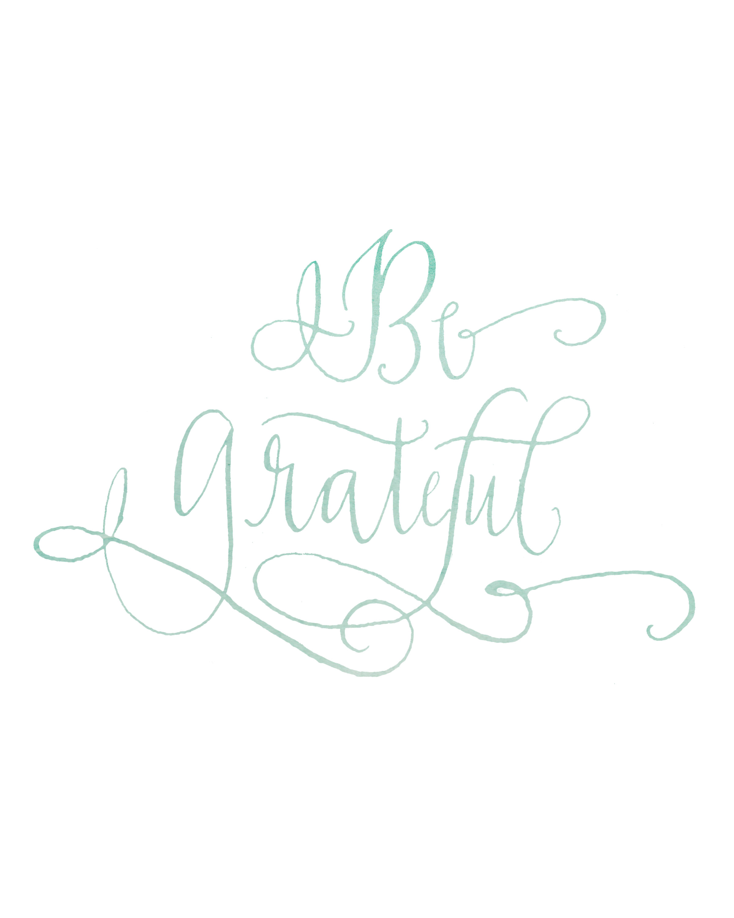
Thanksgiving Downloads!
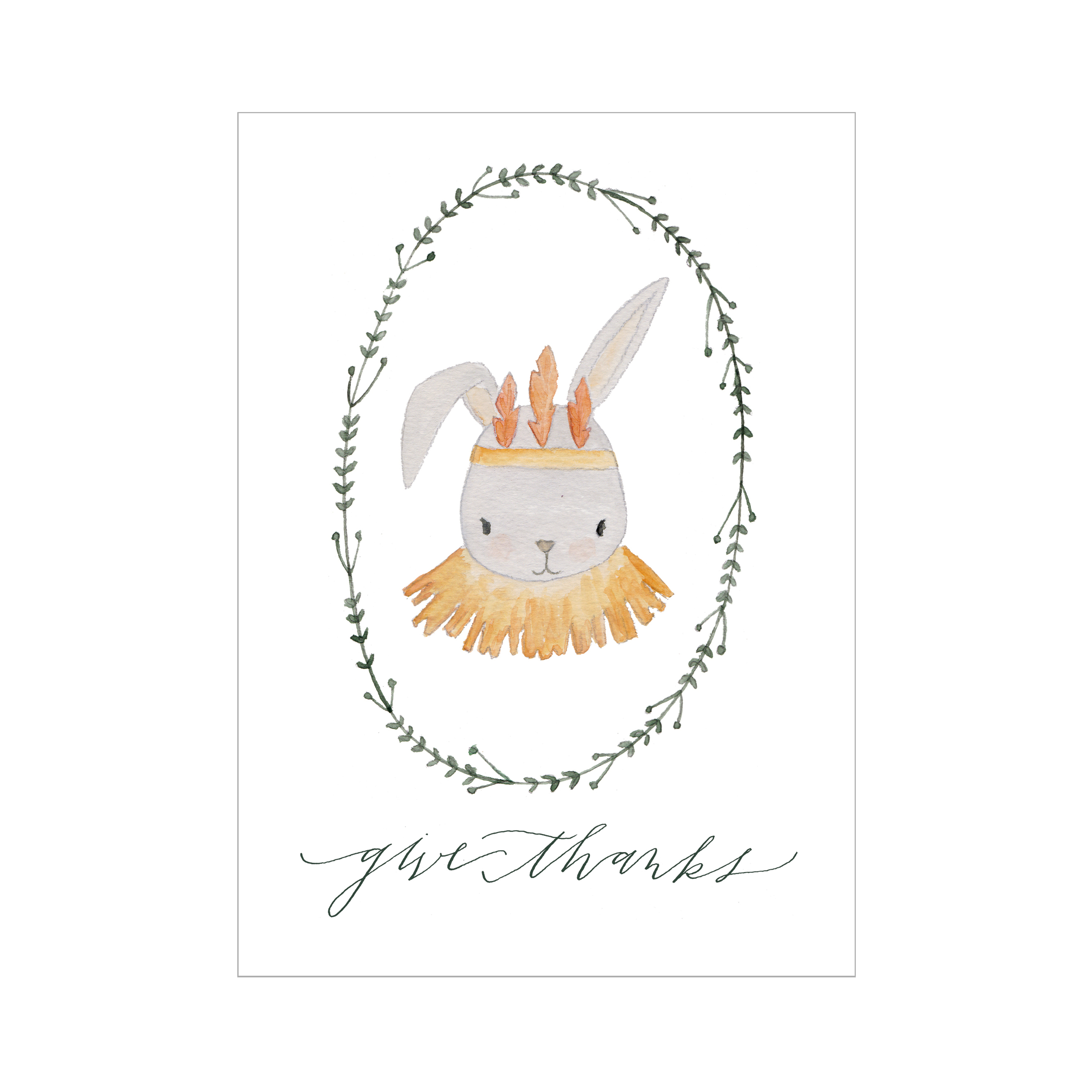
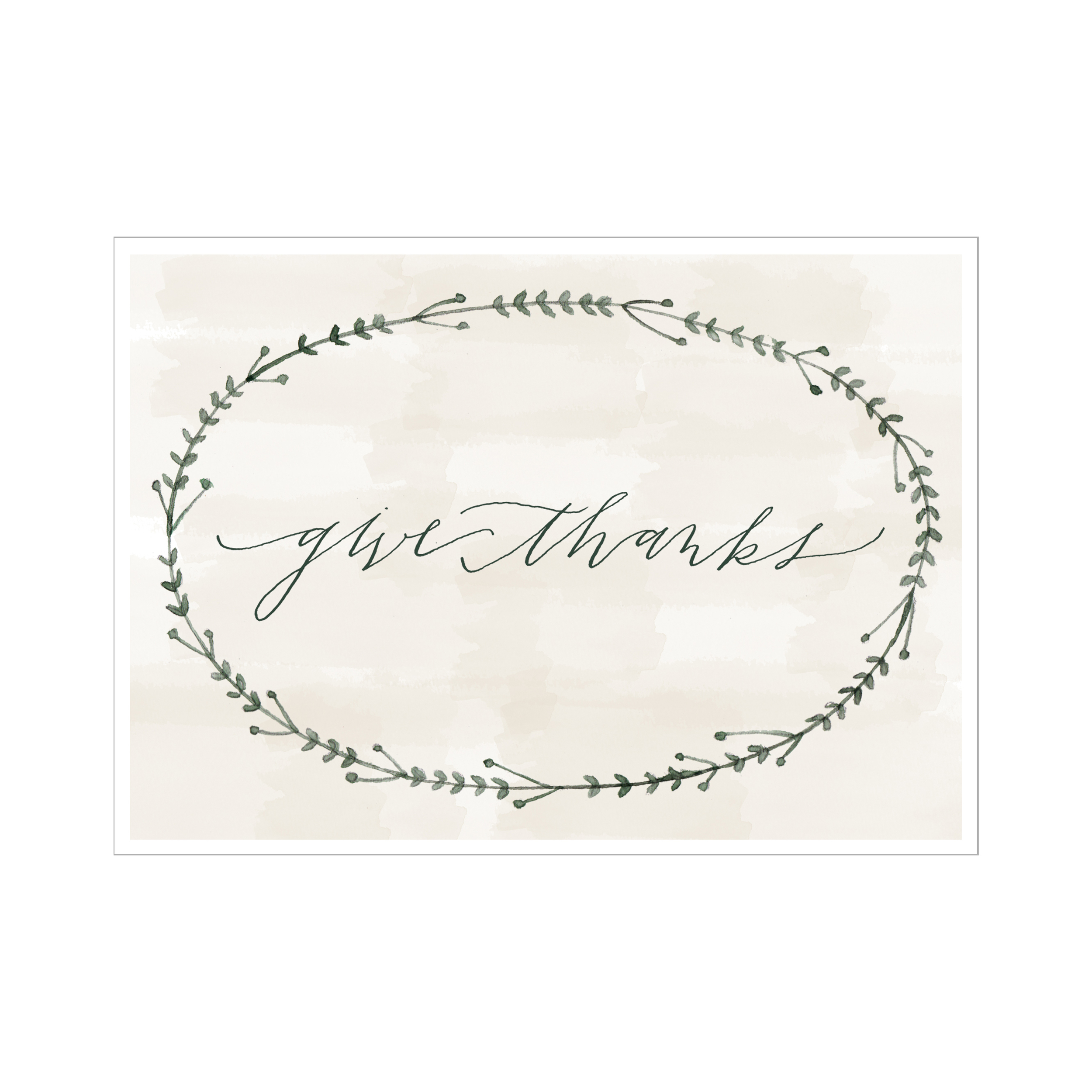
Thanksgiving has always been one of my very favorite times of year and favorite holidays. As much as I absolutely love Christmas time, I love that Thanksgiving is more quiet, calm, and truly is about time spent with our most loved ones and taking the time to be grateful for the many blessings that we have been given.
As you may or may not know, I am very thankful for my sweet little white rabbit named Andy. John and I are both pretty smitten with him! I wanted to create some Thanksgiving downloads that you could print out and use at home and decided that Andy would be the star this year - all dressed up in his feathers and his pilgrim hat. I think that if I tried any of this in real life, that I would get a not-very-amused bunny, but illustrated Andy likes to dress up!
The downloads are available through our studio shoppe at our studio shoppe!
I will be spending Thanksgiving with John's family here in Scottsdale and am making the cranberries and the dessert - pumpkin pie may be my favorite thing ever! It will be the first time in a few years that my parents will not be coming out, but I look forward to getting to see them at Christmas. What about you? Are you traveling for the holiday? What is your favorite dish to make/eat?
I hope that you enjoy these little downloads and that you all have the most wonderful time with your loved ones and take the time to be quietly thankful.
xoxo Jenny
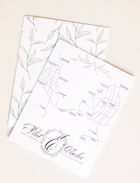
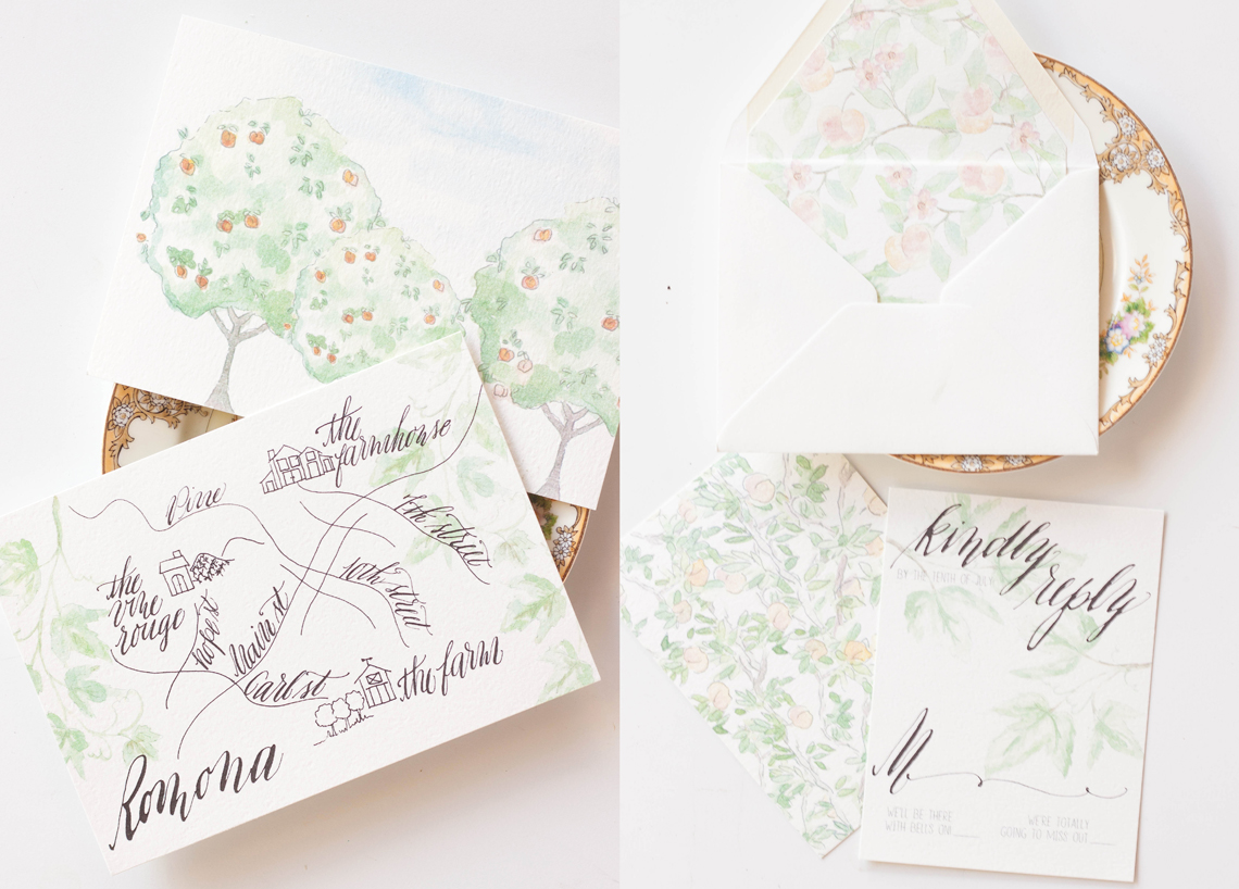
Bespoke Invitation ... sage & rosemary
I loved working on this suite...hand drawn rosemary and sage, with touches of gold. The suite was designed around the wedding's venue, hosted at the Carneros Inn in Napa, California. We wanted to incorporate the feeling of the countryside and farm-to-table without leaning too far into the "winery" look and feel of things.
I always choose a group of descriptors for a design, whether its a wedding, invitation, or a home. For this suite, we choose: organic, rustic, elegant, easy, airy, herbal, farm to table, calligraphic,


I created a laurel from sketched and painted rosemary to incorporate through several pieces in the suite as well as their monogram. We then used it on the invitation, backer, velum wrap, save the date, front of the reply card, table numbers and the monogram on their hand drawn map. The other darling little design element of this suite that I really loved was the idea of taping herbs to a page and jotting their names on the tape...I really haven't any clue where the idea came from, I just thought it was a creative way of using the pieces. The "taped herbs" were used as backers for several of the pieces and also along the bottom of the reception card.
after the suite was printed, we had each piece run with gold foil to add little bits of gold sparkle into the watercolor elements. We decided against doing gold for the letter as we liked the look of the heavy black contrast. Naturally, all the envelopes were addressed in gold calligraphy ink.


...in process - rosemary & sage invitations
Whenever I begin a new design, there are a few very important steps. First, determining the look and feel of the event and making sure the lines of communication are open between the designer and the client. That may seem like a given, but seeing how much time we spend on artwork, its nice to only have to do it once!
For this suite, we started with our descriptors - organic, farm to table, green, airy, light, elegant, formal. We knew we wanted to incorporate rosemary, sage, a hand drawn map, bits of gold, and very formal cursive. The next step I take is to sketch out the entire suite. I do this for a few reasons - one, it really helps me determine what art piece I'll need, what spot calligraphy will be needed where, what pieces we're actually going to be working on and it also helps the client see the overall look and feel and how the artwork will flow from one piece to another (which can be difficult to communicate otherwise). These sketches are exactly what I show to a client as we work through the process - they aren't very clean or pretty, but the communicate the general idea.

After the sketch is done, I begin working on sketching out the artwork. Depending on the overall look and feel, sometimes I go straight to watercolor or whatever our chosen color medium is. In this case, I purposely chose to ink everything first to bring in an element of black.


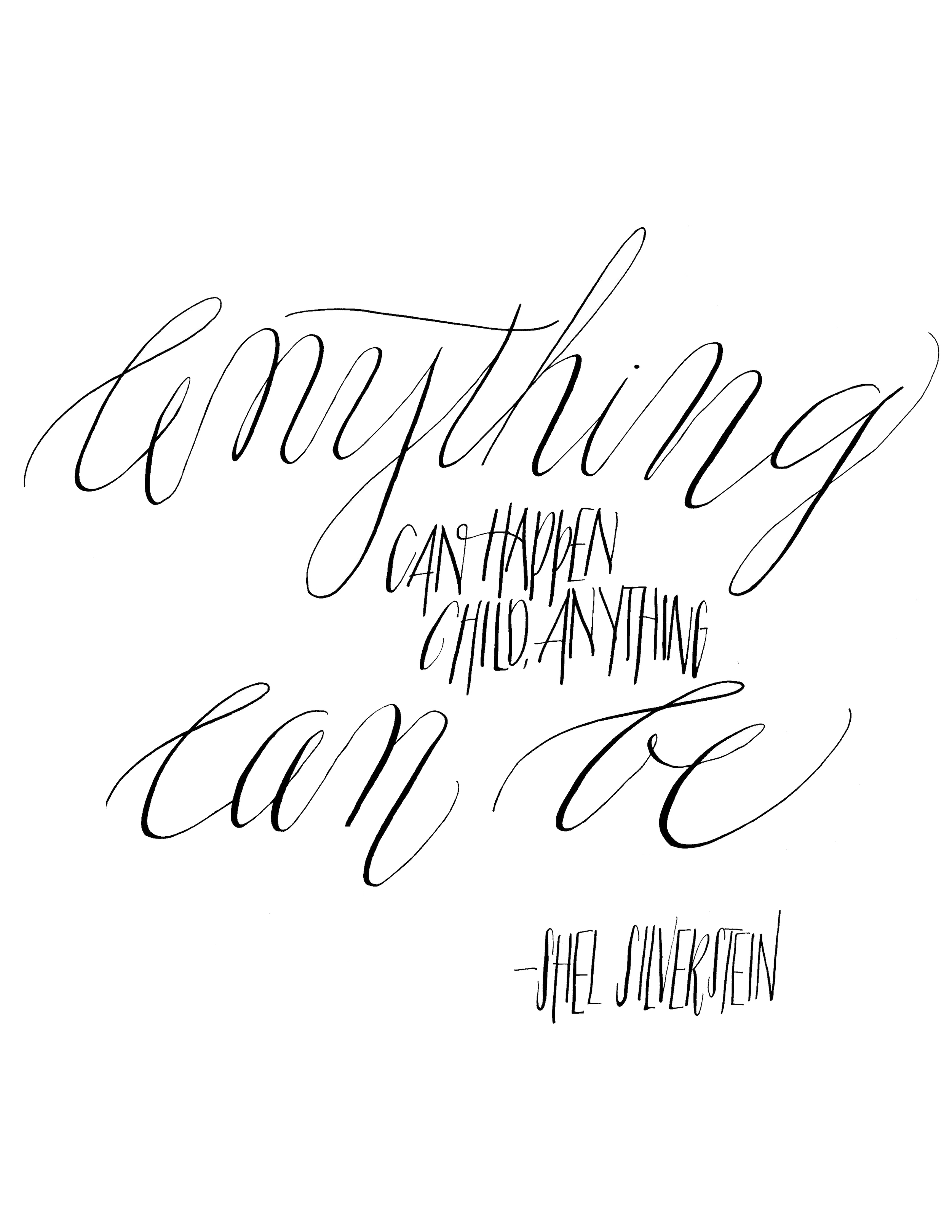
Studio Shoppe - anything can be print
Growing up, I LOVED Shel Silverstein (I mean, who didn't?). When I cam across this quote, the rhyme of it just struck a chord with me, the words catching my heart. When I looked it up and realized who was being quoted, it was no surprise.
Anything can happen, child. Anything can be.
I love the idea of this hanging on the wall in the room of a little girl...then it should come in pink. If you would like it in pink, shoot me an email and in pink it shall be!

Presenting - Moira Studio Shoppe!
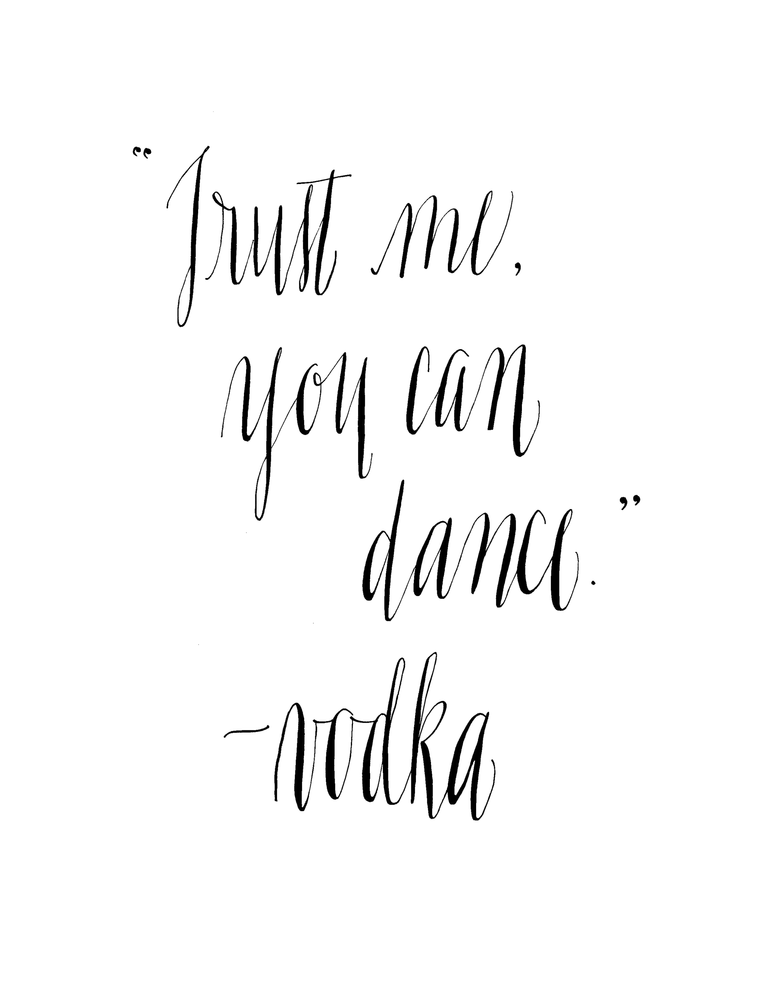
Jenny and I have made ourselves collected ourselves a lovely little pile of calligraphed quotes. She and I both are huge fans of Instagram (@designhouseofmoira and @moirainkcalligraphy) and we doodle quotes to post weekly. Our brilliant selves realized that they actually make really lovely gallery prints, and we thusly (and finally) launched our Studio Shoppe! Prints are available in a variety of sizes, printed on cotton paper and make will make someone very happy come Christmas time! You can visit our studio shoppe here.
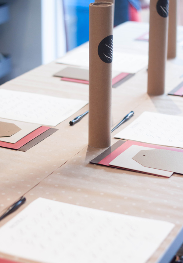
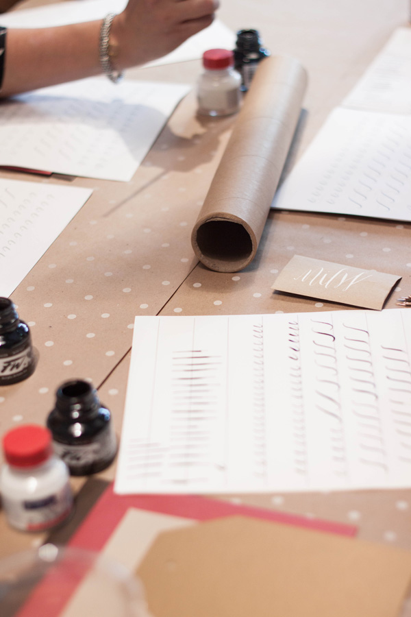
Moira Ink Calligraphy workshops!!
We are so thrilled to announce the launch of our calligraphy and lettering workshops!! You can register for either our San Diego calligraphy workshop (October 26th) or San Francisco (November 10th) through our Studio Shoppe! We'll be adding an additional San Diego (La Mesa) class as well as a second San Francisco class soon!

Our calligraphy workshops will cover beginning calligraphy techniques, review and style and entire font set, learn and review basic flourishing, centering, ink types and mixing colors as well as the basic supply options. This workshop is perfect for soon-to-be brides (and their bridesmaids!) as well as industry professionals, shop owners (talk about having adorable signage!), crafters and scrapbookers, as well as anyone looking to learn a new skill set.
Featured...on Oh so beautiful paper!
It is always a pleasure and an honor to be featured by an industry blog! We love Oh So Beautiful Paper and are thrilled to have our Peach Orchard bespoke suite featured there today!


a few weeks back, we did a post about creating this suite and the artwork that went into it. Its one of my favorite suites to date!
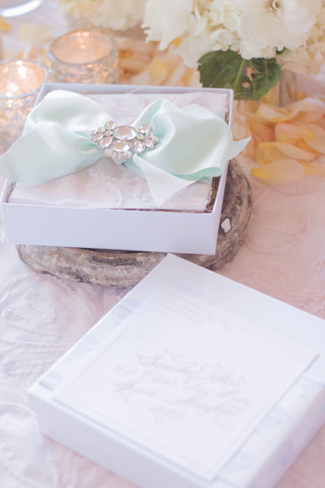
Bespoke invitation ... hot air balloon baby shower
My little sister called me one day (on a side note, my sister is truly an incredible person)...her best friend was having a baby and she asked me to create the invitations for her baby shower and to design the shower itself. No pressure or anything. Working for a friend is difficult, working for family is even worse! The expectations are high; they're familiar with all your work and know what your levels of creativity and capability are. Thankfully, my sister knew when she said, "do something over the top and sparkly" that I totally had this.
I started with a few ideas (the background and artwork details to follow at some point). We knew we wanted something slightly whimsical, pastel, pink, sparkle and I knew I wanted to ship it in a box. I loved the idea of incorporating hot air balloons; the historic kind with laurels, fanciful rope work and pennants streaming off the baskets. I also knew I wanted to create something more that just the balloons themselves, something to give them depth and perspective. I drew out a city skyline in simple ink pen, keeping the city itself simple and used the combination of the city layered with the balloons.
The names of the mommy-to-be and her new baby girl were done in calligraphy, appropriately with a good deal of flourishing. The entire suite was printed on crystal white shimmer paper. The second card bore their registry information, additional calligraphy, and hot air balloons. The entire suite was wrapped up in a pale pink fabric with a lovely floral applique on it. I then used a 3 inch pale mint satin ribbon to tie them up and topped the entire set with a large brooch. The entire suite was popped in a beautiful box in matching white shimmer, a matching address label with matching calligraphy wrapped around the box, keeping it closed through the post.


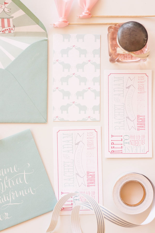
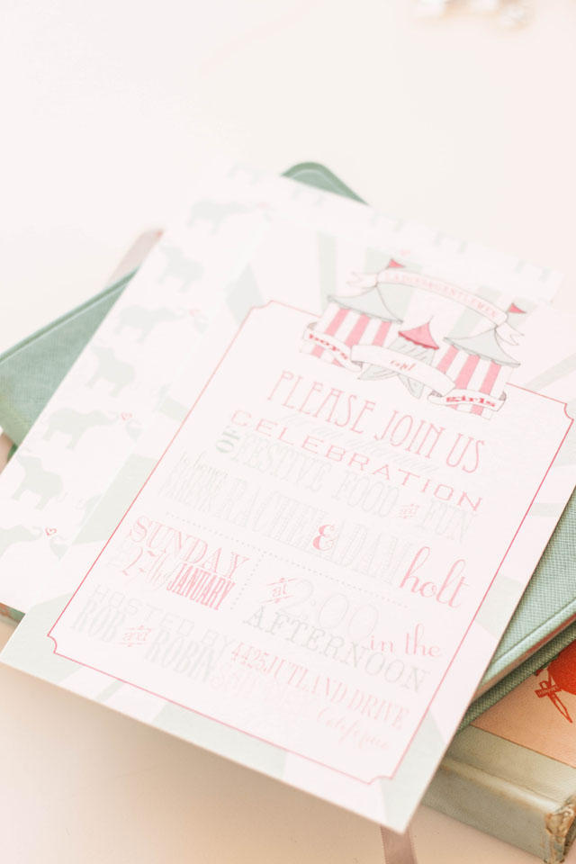
Bespoke Invitation...circus baby shower
...today we're going to chat a bit about the design process behind this darling little shower invitation.
I adore working with a bride and groom to create something for their wedding...dont get me wrong. Every couple is different and presents a slightly different aesthetic...however, its quite fun to be able to branch out and do something a bit different sometimes.
This lovely invitation was created for a circus themed baby shower. My client (Miss Robin) wanted to incorporate pool blue and shades of blush as well as a slight nod to the typical typography one would find on the vintage show posters.
The one draw back about shower invitations is that there are less pieces... we love more pieces...it gives us the ability of incorporating more elements, especially in the backers. For this project, I knew I wanted to create a pattern using elephants and hearts.
Lets chat about this tent for a moment...you simply cant have a circus themed anything without a tent. I hand drew the tent itself, and layered it with banners.
We kept with the typographical lettering for the insert card, which included the mommy-to-be's registry information as well reply directions for the guests. We backed it with the matching elephant and hearts backer.
...you know how much I just adore envelope liners... how could you not?? We incorporated the same tent as the invitations and repeated the color burst. All the envelopes were then addressed in white calligraphy using our Helena font.


this suite was created through our bespoke process.
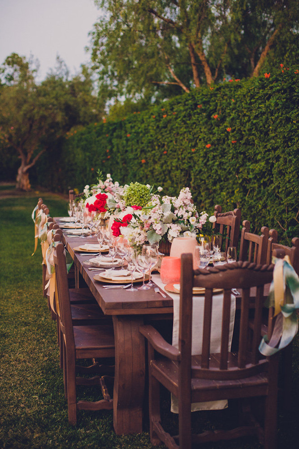
Featured...Al Fresco Dining on Style Me Pretty

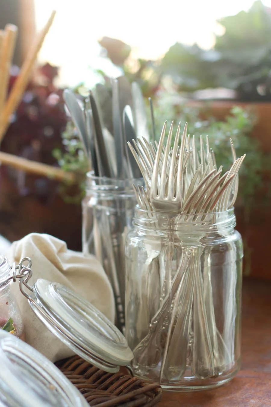
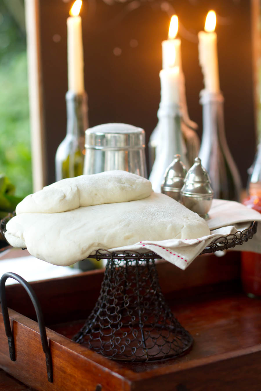
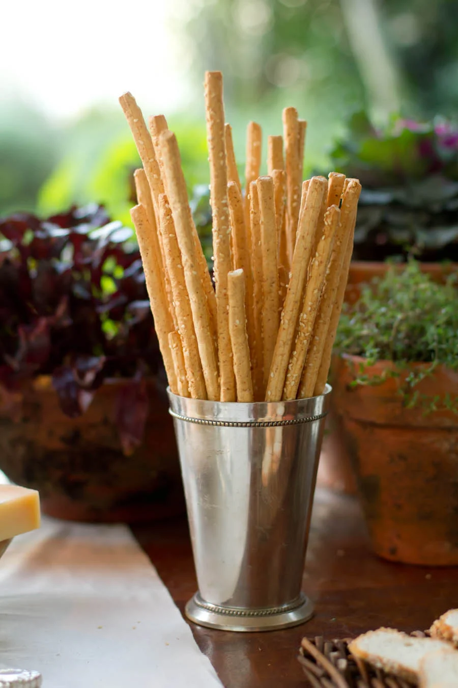
A bit ago we decided to have some friends over for a dinner party...but since Im inherently an event designer, I can never to just a simple dinner party (actually, this was pretty simple for me). I wanted something interactive, not that i dont love cooking an meal and then ending up in the kitchen half the night. I was looking forward to spending an evening with friends, so I decided to do a build-you-own-pizza night, have several local artisan cheeses and meats, and make my own dough and sauce.
I wanted the evening to be light and carefree, enjoying the last bits of warm summer evening before the fall chill kicks in.
For decor, I have always loved the look of candle wax dripping...clearly having been lit over and over in the same ritual. I created the look with empty wine bottles and candles, letting the wax trickle down the sides.
There is a little French restaurant here locally in San Diego (Kensington to be precise) called Bleu Boheme; a quaint place, tucked into a corner building, with chalkboard walls with hand lettered and painted menus, reclaimed wood floors, exposed stone walls, and silver candlesticks that have been burning candles in their same position for years. The wax drips and puddles on the tables, off the edges. There is just something so blissfully romantic to it all...something I just cant quite put my finger on. Anyhow, I digress.
I brought out a stack of my vintage china plates, antique flatware and linen napkins. I love the look of stacked and mismatched china, with their little patterns and colors peeking out around the edges. I never can pick a favorite...


I backed the table with a board (which I most certainly hung from the edge of my patio, much to my husbands dismay) with a quote:
"when the wine goes in, strange things come out"
it seemed appropriate.


you can read more about this lovely party on Style Me Pretty Living
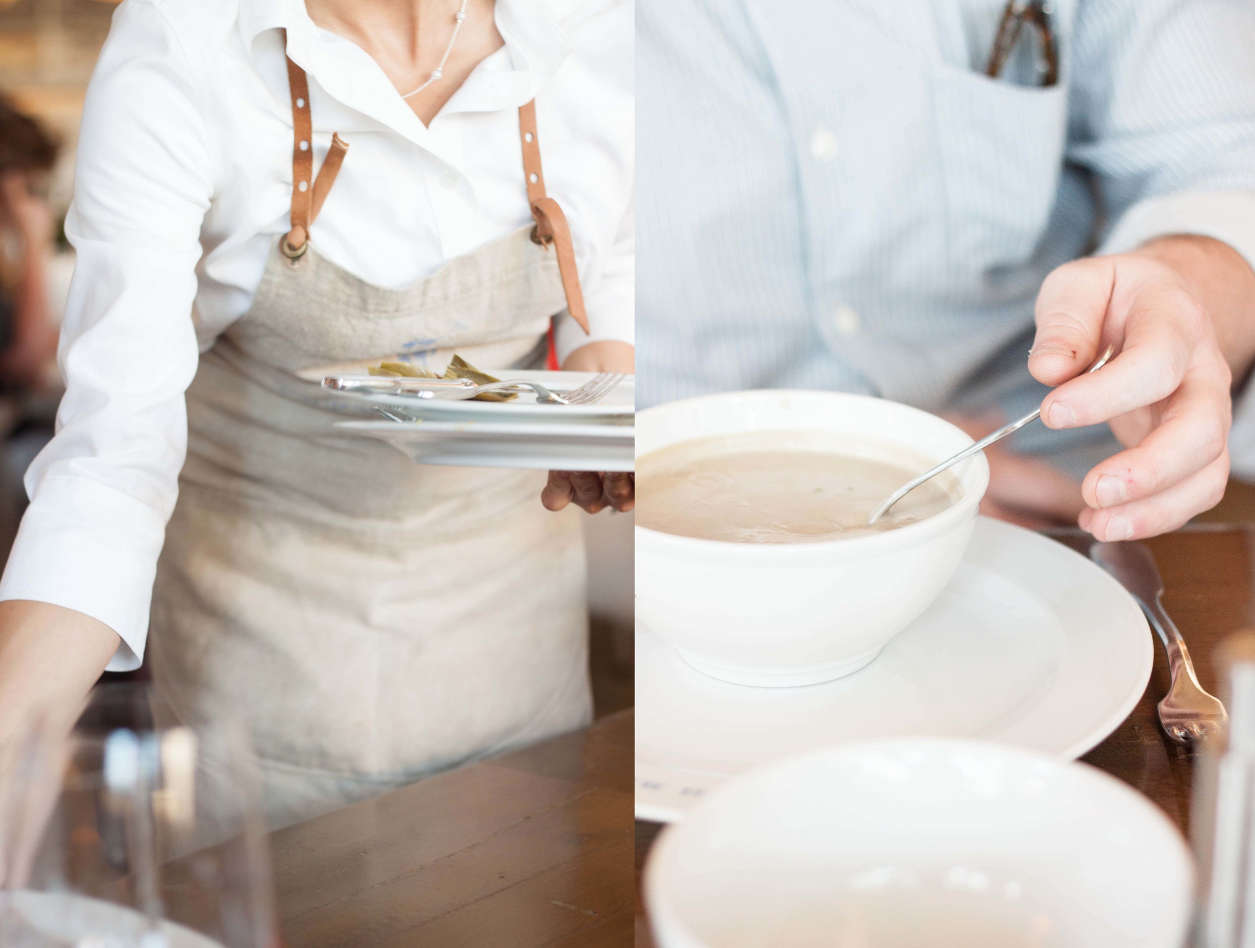
Featured...on Style Me Pretty Living!!
I have to give Jenny some credit on this one...a couple weeks ago she brought up a good point - I take a TON of pictures. I mean, seriously. Its a little nuts. That's not the point she brought up, but they're related. She suggested working some of my (non professional) photography into our world a little more - like where my husband and I travel, for example. So, on her suggestion, I sent some pics from a recent Napa trip we took with some friends to Abby over at Style Me Pretty Living. Slightly to my shock, she emailed me back the same afternoon asking if I mind if they published it the following day! Needless to say, our trip to Napa is not blogged on Style Me Pretty today!

The husband and I have now been to Napa/Sonoma at least a half a dozen times, probably more. It's our quick weekend get away go-to. Now that we've been a decent amount of times, the novelty of all the wineries has worn off a bit...I mean that in a good way. The last few times we've been there, Ive been able to slow down from art of cramming in as many wineries as possible and been able to enjoy things a bit more. Something Ive really noticed the more Im there is the sheer beauty of the area that I feel most visitors miss in their wine rush.

Ive always been the romantic that swoons over "weeds" climbing up an old wall (I think they're vines, not weeds) or the way brick crumbles. The Napa valley is truly a beautiful area, even aside from the acres and acres of grape vines. The old gnarled trees that line the winding roads, the rolling hills and treelines, the fact that there aren't any freeways. Moss grows in the shade on bridges, trees and buildings, Jersey cows spot the landscape and Michelin star restaurants are tucked into nondescript old buildings. Plus there's wine.
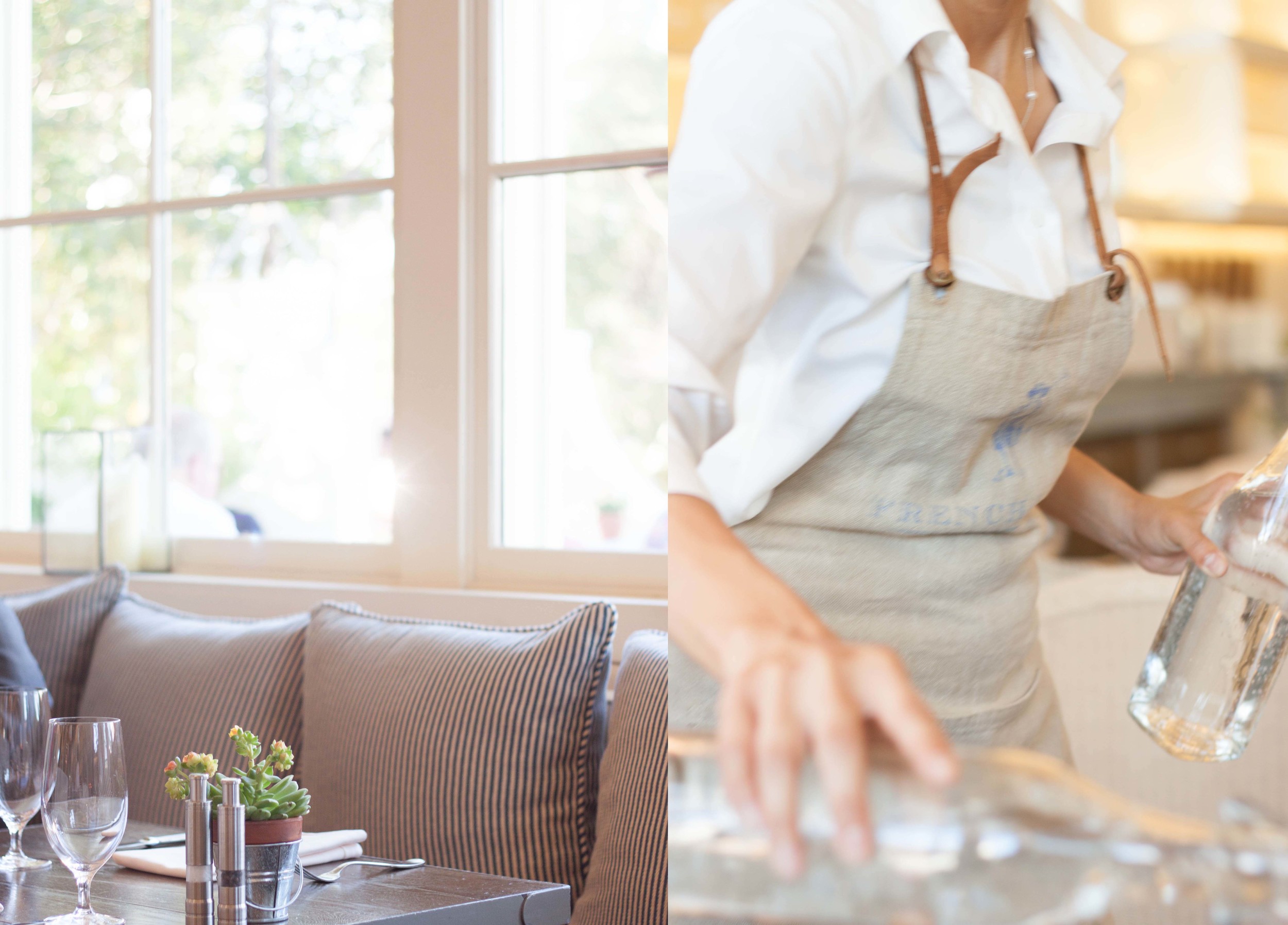
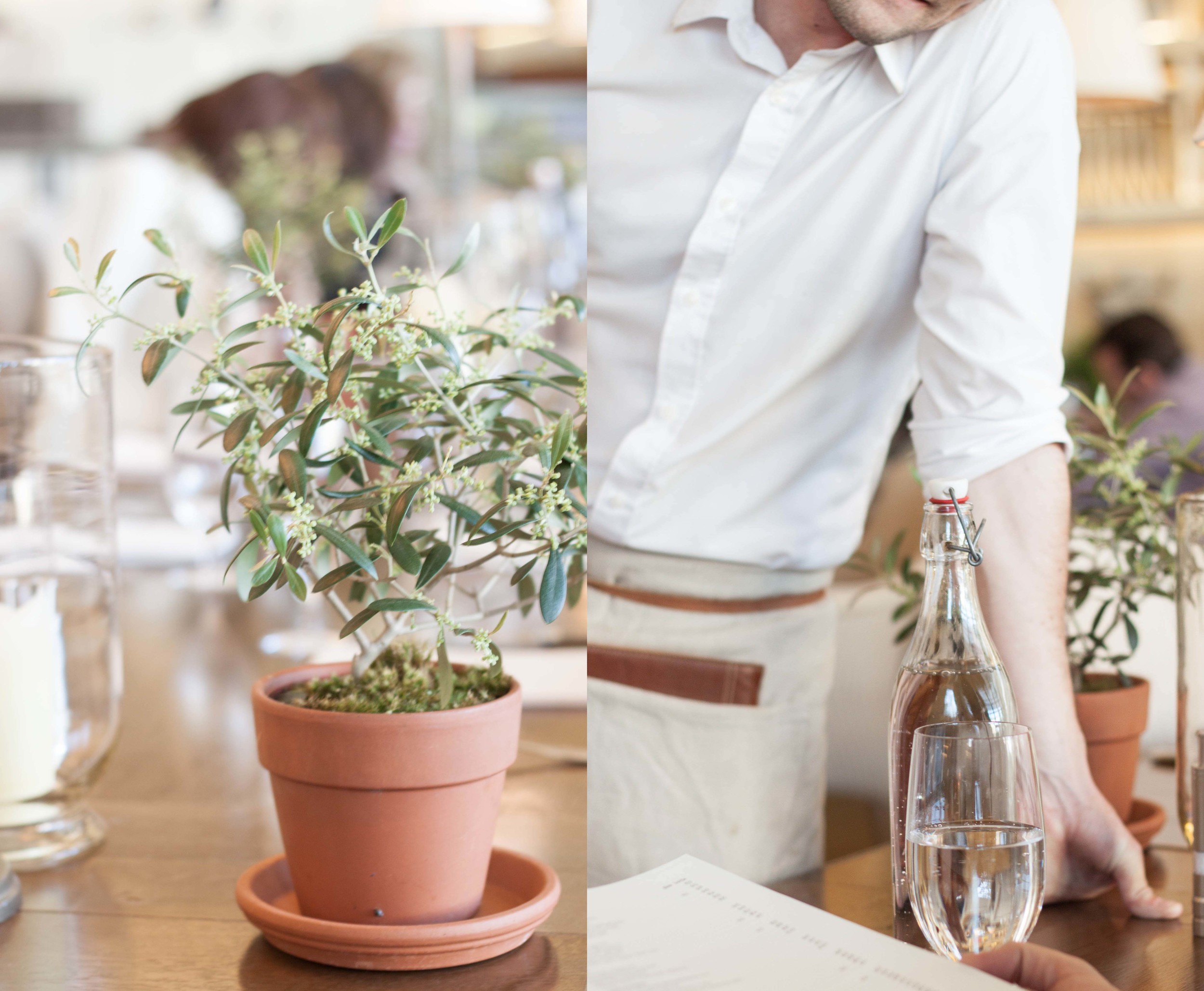
On this particular trip, we found a darling little restaurant in St. Helena, where we were staying, called The French Blue. The white, bright open space is right up my alley! Quite a bit of the restaurant seating was at a long family style table, with little sections for separate parties split with table lamps and little potted rosemary and olive trees. All the seating was over sized, with large pillows. I just loved the open, bistro atmosphere and the simple charm.
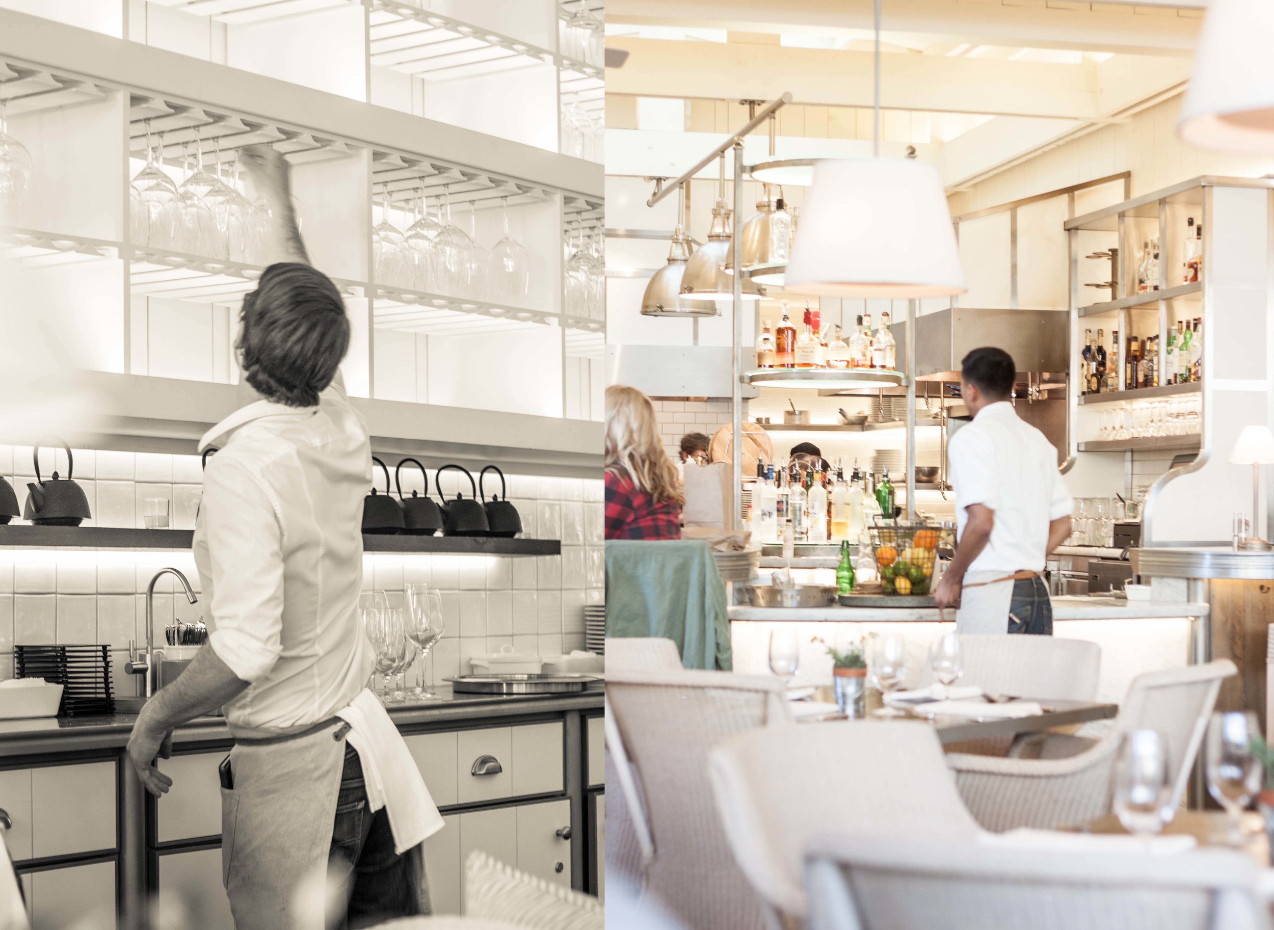
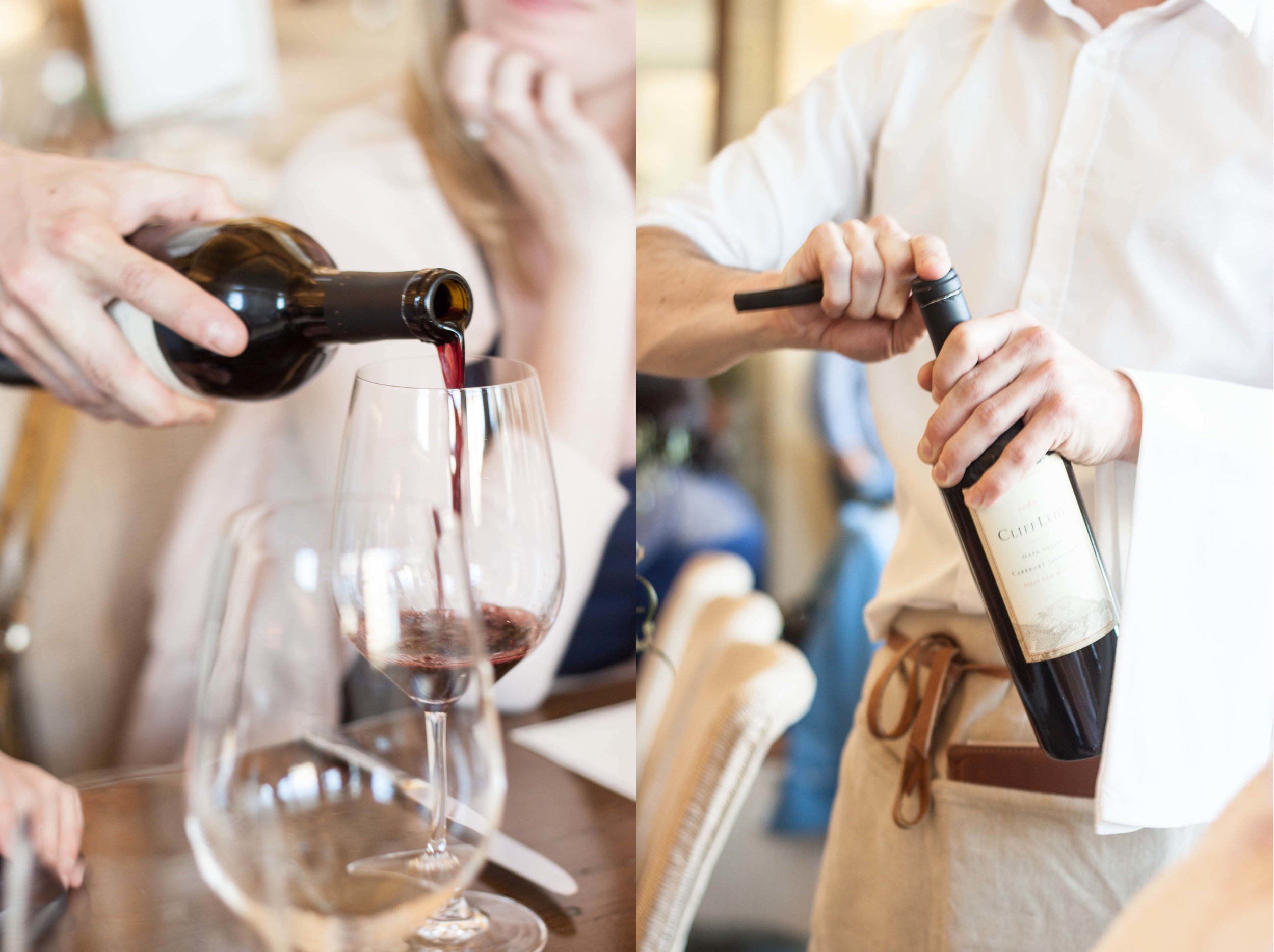

We also got to take a cooking lesson at White Hall Lane with their executive chef. Their new kitchen is gorgeous, with the same bright light I love. Its on their second floor, and the balcony looks out over their vineyard. We've been member at WHL for a few years now, and its been exciting to watch the company and their facilities grow and change.
We have realized that renting a house is the way to go when you visit the valley - you don't have to eat out as much, you have more space and have so much more flexibility. I would encourage you to visit the valley, but pay close attention to the unseen beauty around you.


photography: moi | The French Blue | Schramsburg | Far Neinte | Nickel & Nickel | St Helena | White Hall Lane | Hall Wines
...in process - A Midsummers Night Dream
Like all our designs, we start with some sketches. This one was particularly in need of a layout since I knew there would be quite a few elements and characters in play. By sketching it out, I have a better idea of where I can use what elements, how the pieces translate from the invitation all the way through to the menus and placecards, as well as I have a better understanding of what elements will need to be created.
From the sketches, I started created the artwork with pencil and paper, then went back through and inked it all in. This was a case that i wanted to leave some of the lines visible, so I choose to use ink rather than just leaving the pencil.


...then comes the mess. Im grateful that I have enough space that I can get out all my toys and leave them out if need be. I started painting these in last night and finished them this morning.