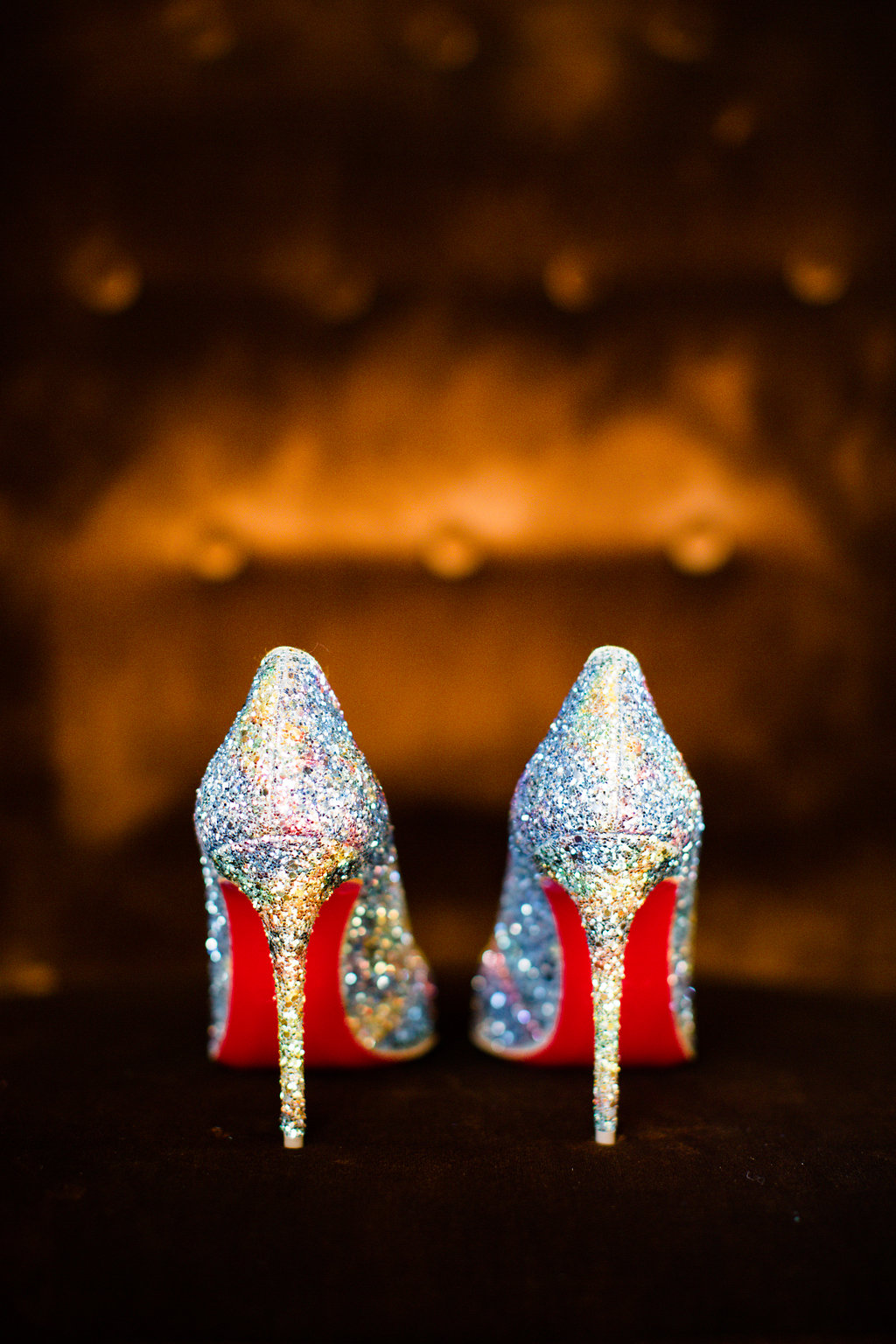
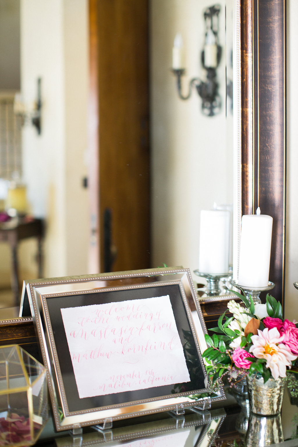
Spring Garden Floral Wedding Invitations - Overview
Pale blush, taupes, pastel spring greens, and French blues for a botanical garden wedding.

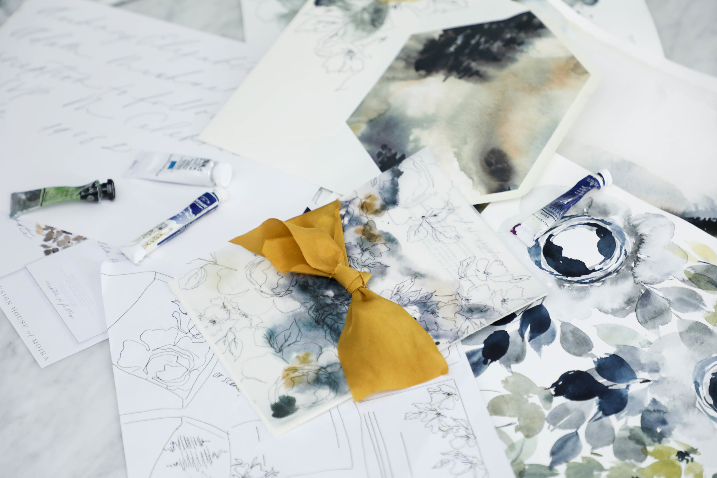
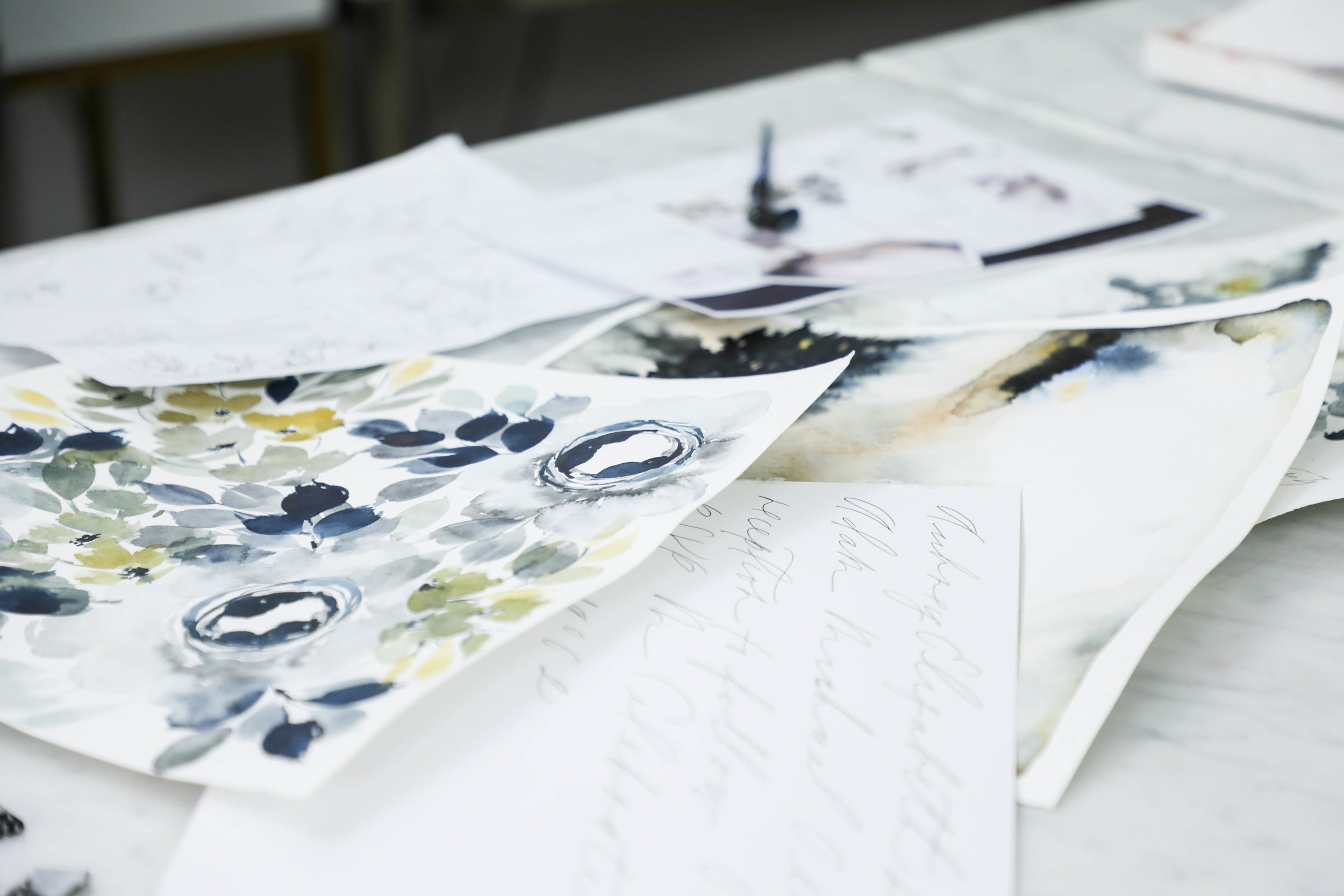
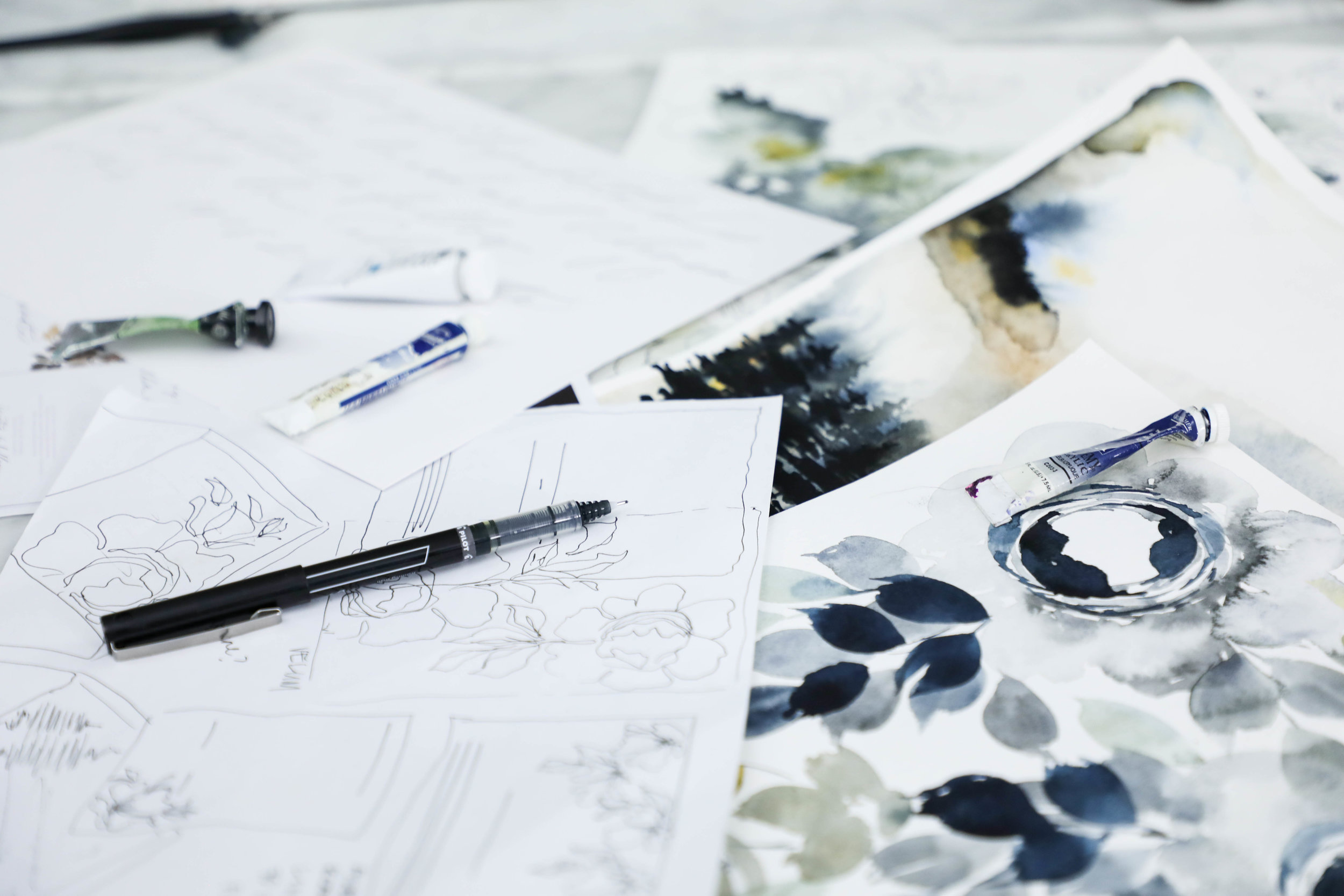
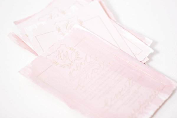
Spring Florals & Handmade Papers
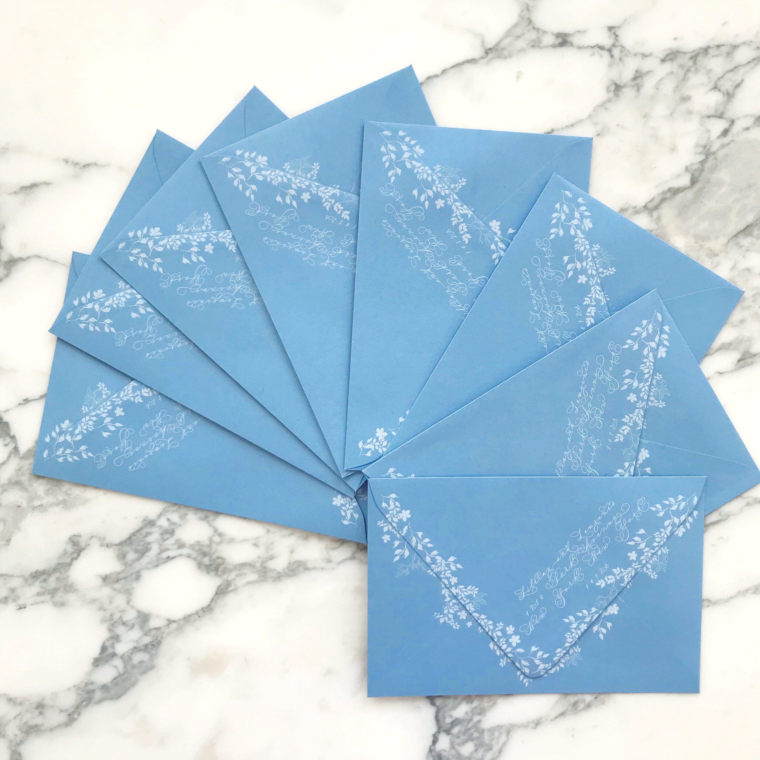
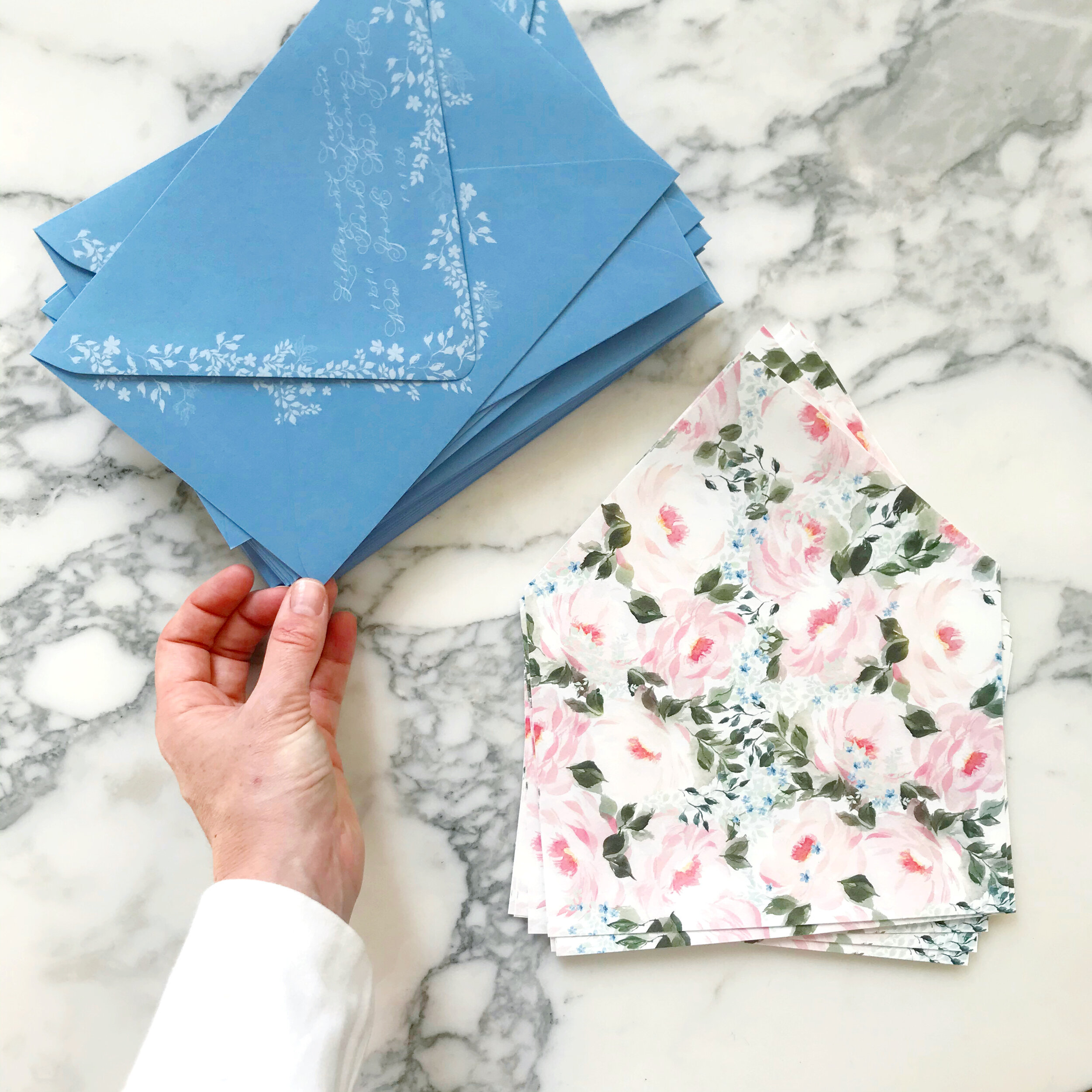
French blue garden wedding invitations with tumbling vines and blooming roses
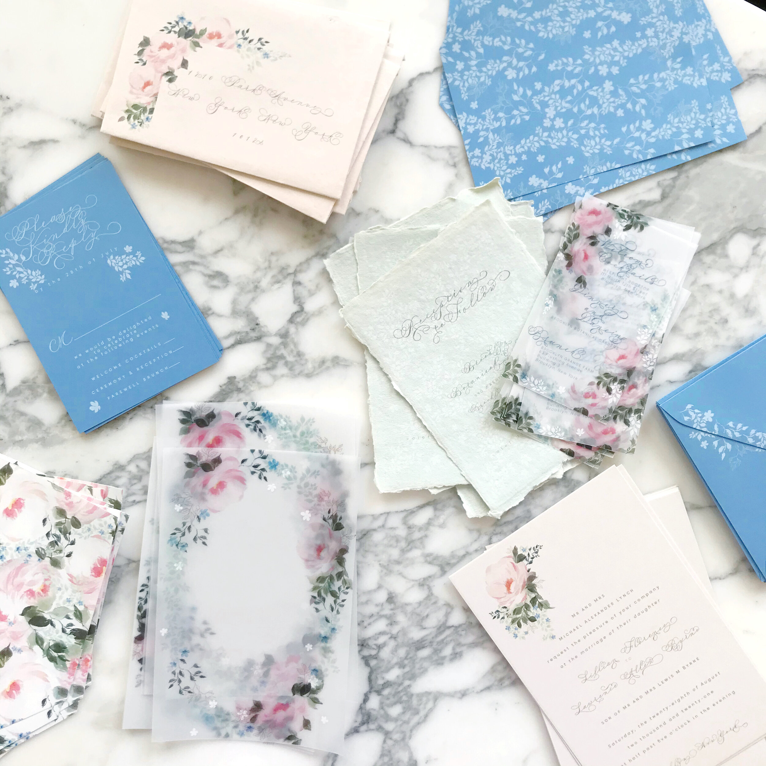
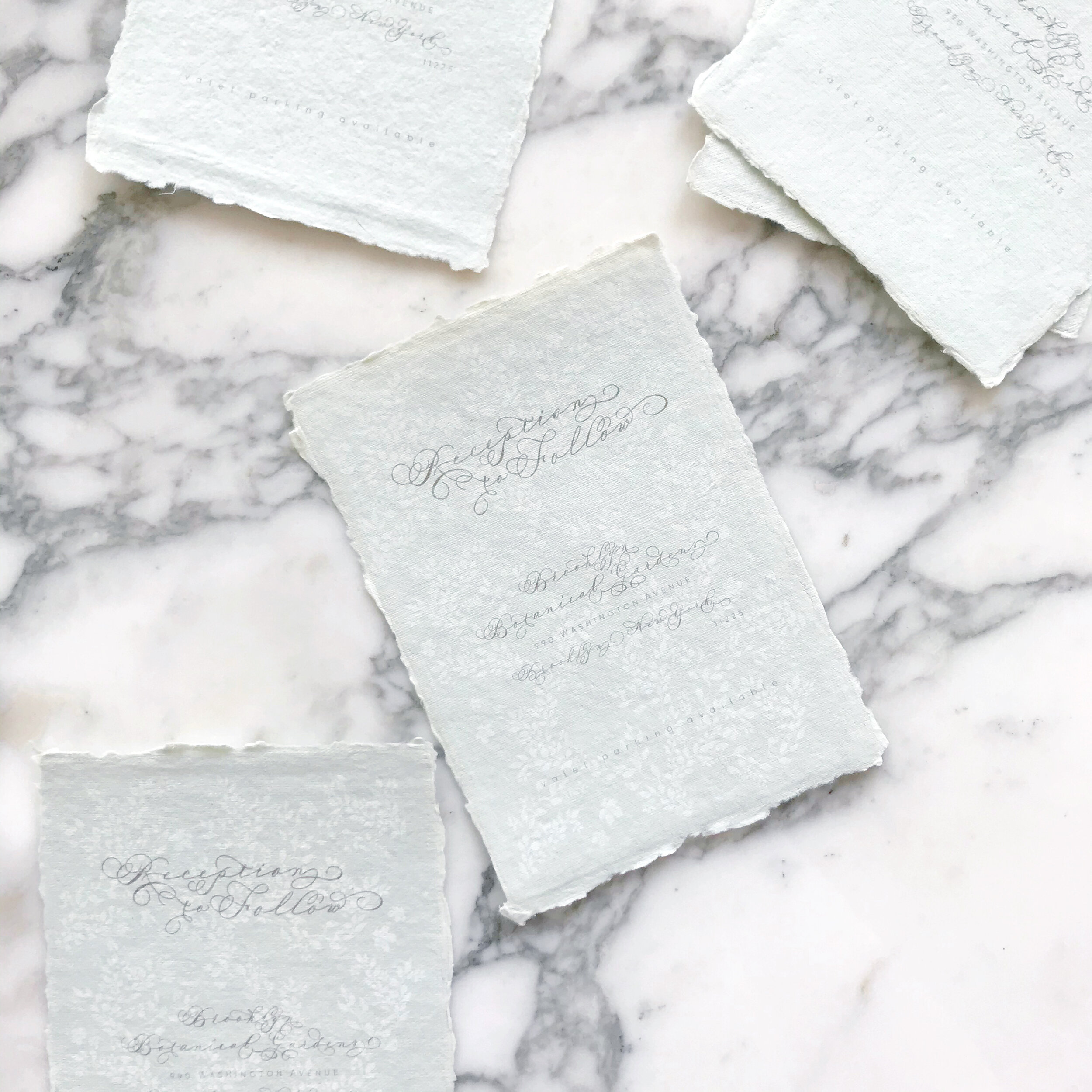
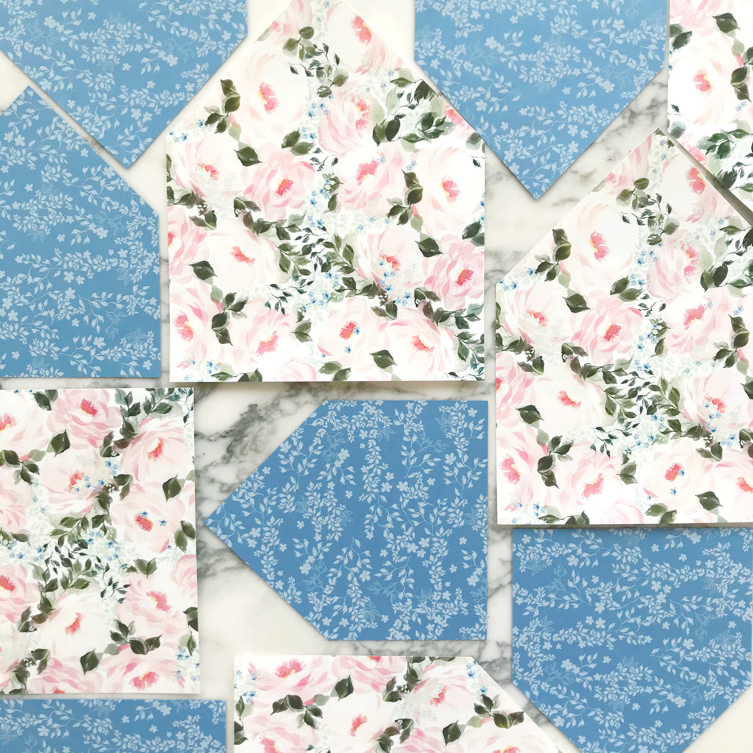
So much spring happening here! Like most of the wedding invitation suites we design, we have lots of mixed media paper types here.
We began the overall design with the blue - we knew we wanted a medium French blue…not too grey, but on the spring side. Once I had the blue sourced, I was able to collect all the other papers we used.
Roses and forget-me-nots play with each other in the artwork for this suite, incorporating spring green, blue, and blush into the watercolor that was designed and created specifically for this client.


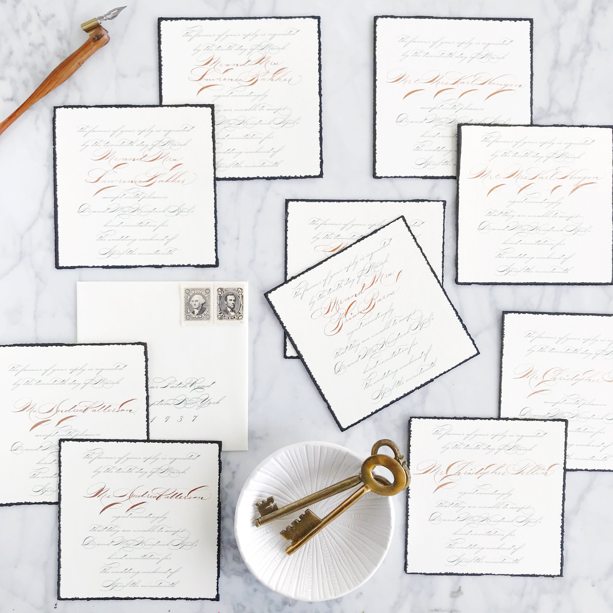
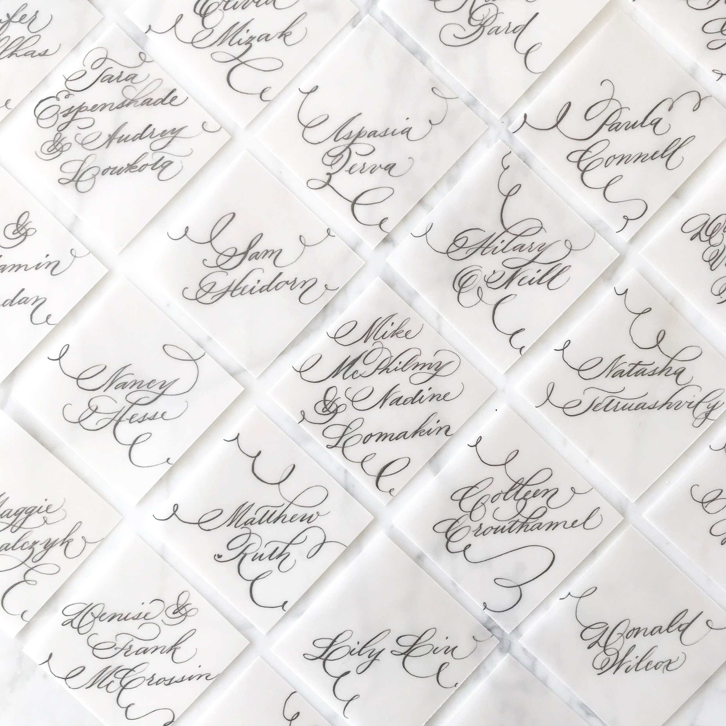
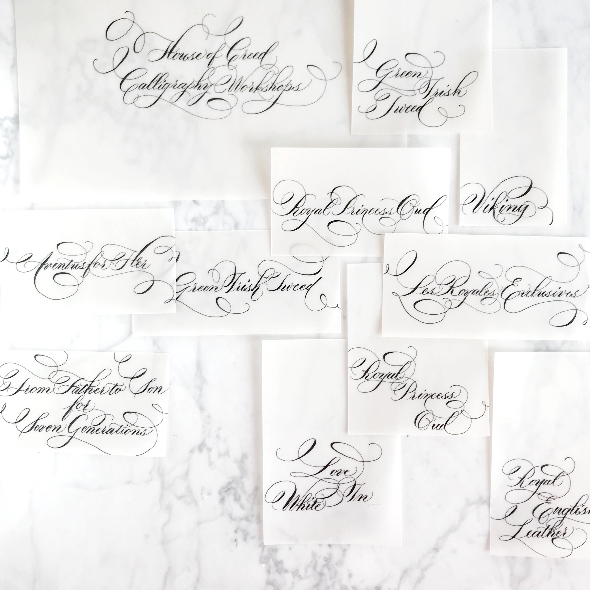
Formal Calligraphy
Formal calligraphy is the epitome of formality and tradition. it’s elegant style and grace lends itself perfectly for a formal wedding or a black tie evening.
There really is no such thing as “perfect etiquette” when it comes to weddings anymore. Nowadays, weddings are all about the merging of two people and everything those two individuals encompass.
However, formal will always be formal, and what better way to introduce your guests to your formal affair than with gorgeous formal calligraphy?
Wedding calligraphy comes in so many styles, from brush calligraphy to modern, flourished to drawn out and simplistic. Today we’re looking at the formal end of the calligraphy pool, which also happens to be my favorite end to swim in.
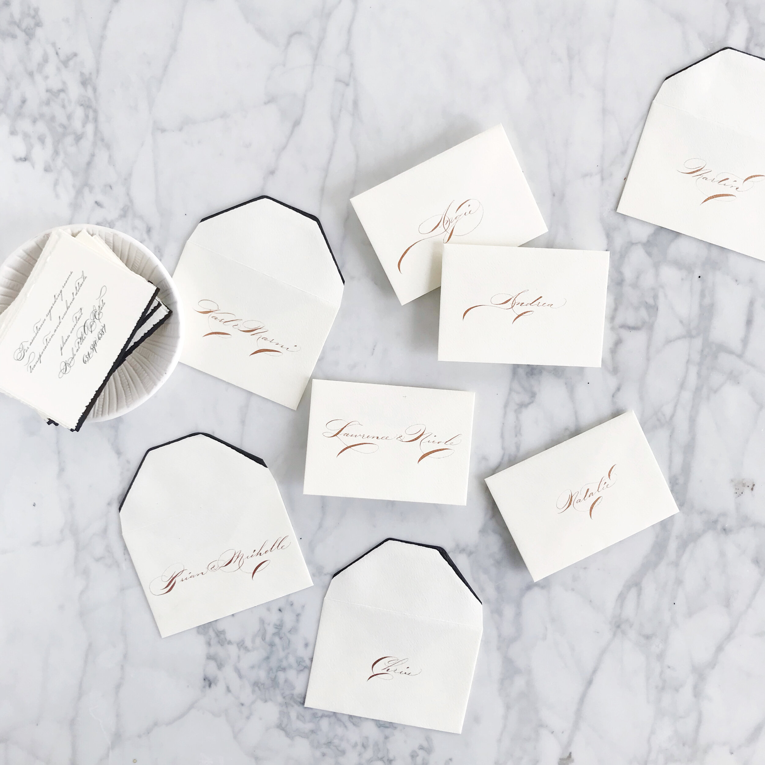
Like all calligraphy, formal wedding calligraphy can be used as spot calligraphy (titles and names) or the whole invitation entirely in calligraphy.
Things to keep in mind when selecting a calligrapher and calligraphy style:
Make sure the style you like is legible, especially if you love the look of the entire suite in calligraphy! Your guests need to be able to read what it says!
Not all calligraphers are created equal. Some have years and years of experience, and some are new to the scene. Like with most professions, you may find that more seasoned veterans have a more streamlined process and are able to help you select a style with ease. Typically, formal styles take longer to develop and learn, so you’re more likely to come across someone with a bit more experience under their belts when looking for a formal calligrapher.
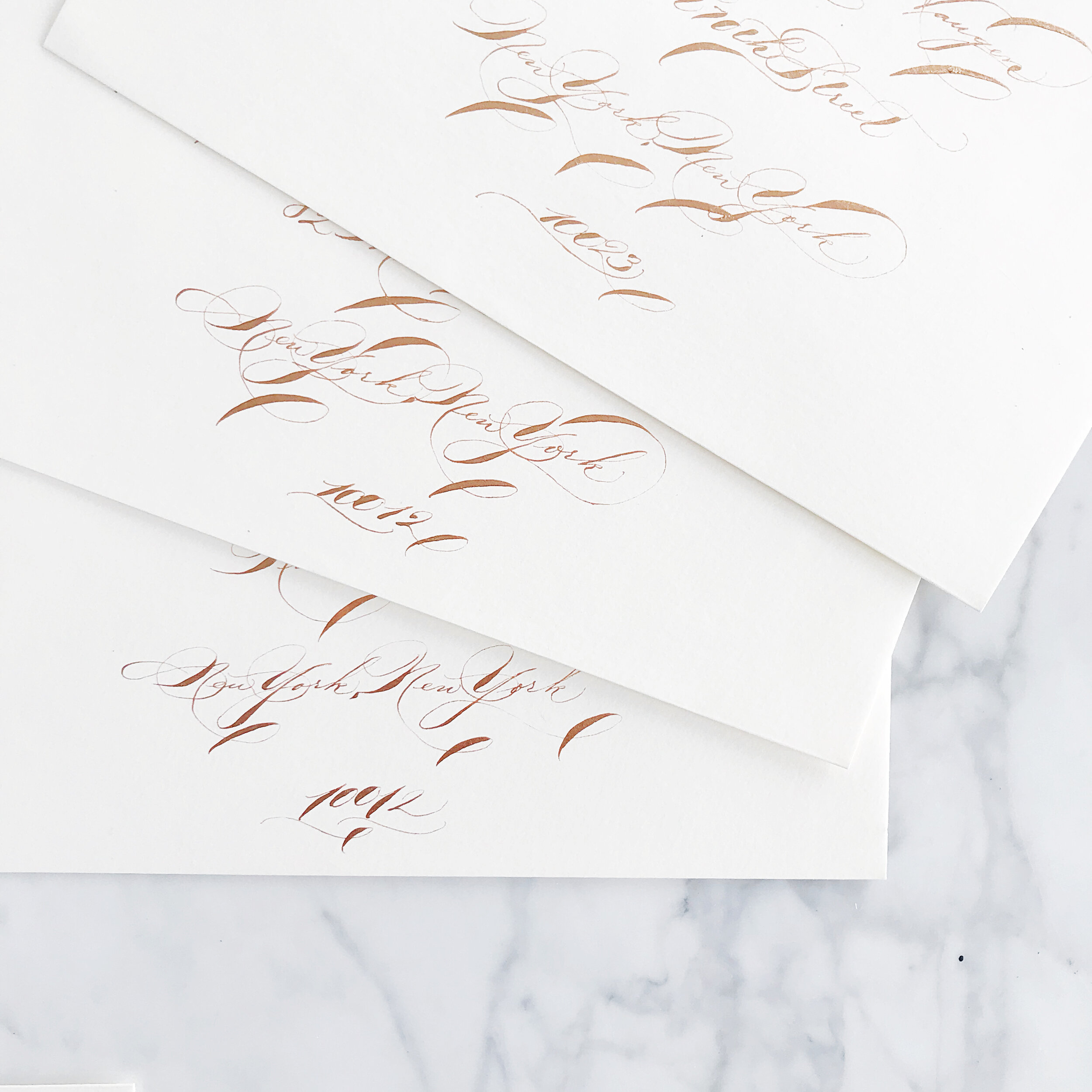
Although some of these invitations are written entirely in calligraphy, they are not written individually in calligraphy. Formal calligraphy is a graceful and time-consuming art that takes time. Is it possible to have each one handwritten? Certainly, but be prepared to pay for it! Each invitation suite written entirely and individually by hand can take anywhere between an hour to several hours, so be prepared to see pricing north of $150 per suite (for example, I would charge $350+ for each suite). However, there’s good news! Most calligraphers have a much simpler and cost-friendly alternative! We handwrite each suite once, scanning the calligraphy into an editing software (I use Photoshop) to make any alterations and corrections and get the calligraphy into the invitation design. We then print each suite, rather than writing each one individually. I have seen many a bride asking for each suite handwritten not knowing the difference, so hopefully, this clears it up!
When shopping for calligraphy invitations, you can either pair up with a designer who then hires a calligrapher with/for you, or you can select a designer that also does calligraphy (like me!). When working with more than one artist on a project, look for a seasoned designer who can take the helm in finding a calligapher/printer/suppliers that fit your aesthetic and budget to make your invitation process smooth and stress-free!
Summer Wedding Invitation Inspiration
Summer weddings are all about those bold colors, full of sunshine and exuberance. I love everything from the seaside blues to sunflower yellows!


Cheerful yellows, bright oranges, leafy greens, and summer sky blues are all over this time of year! I love outdoor weddings, and the summer season is all about parasols and the bright hues of the season.
So let’s talk about summer invitations, and we’ll start with the summer invitation inspiration in this post!
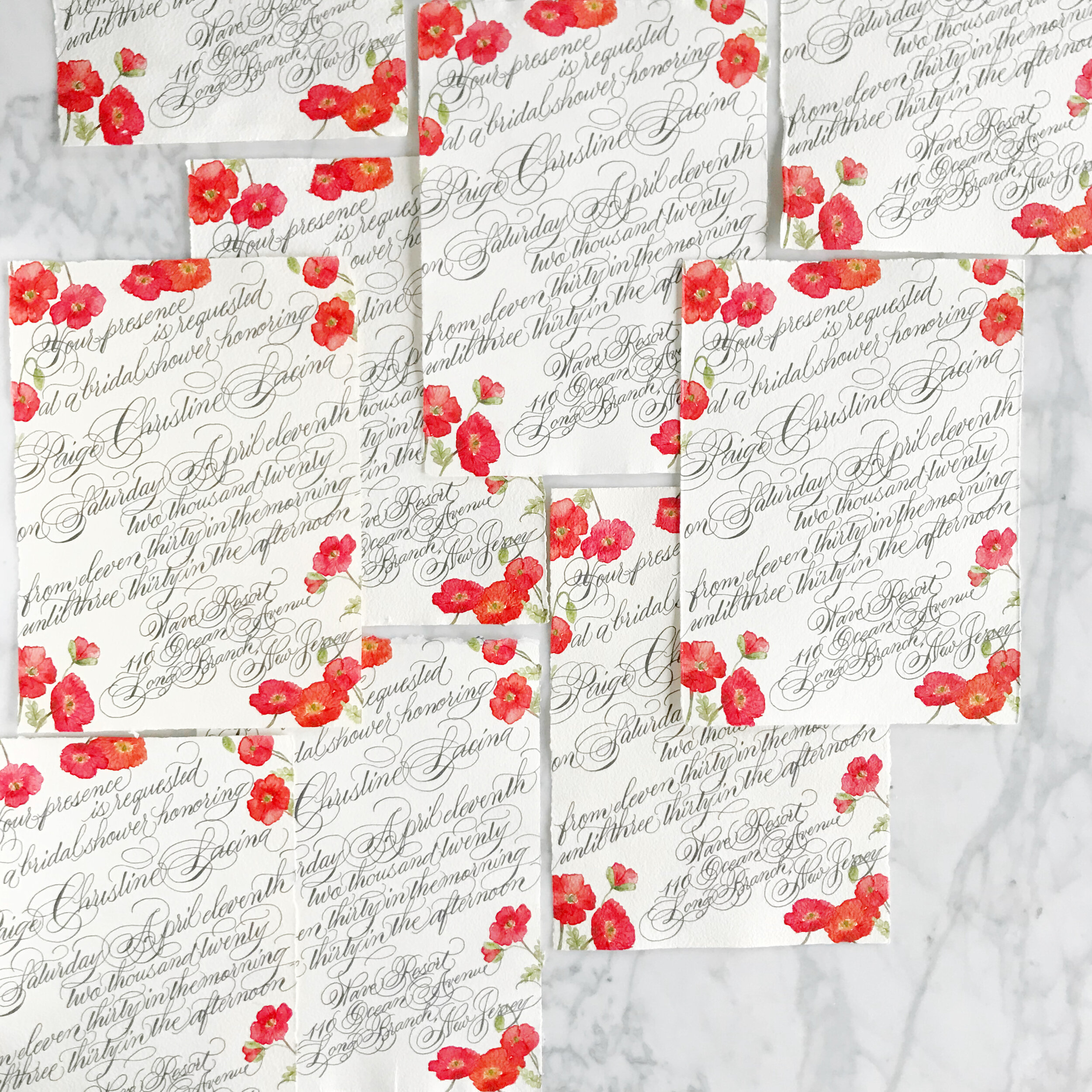
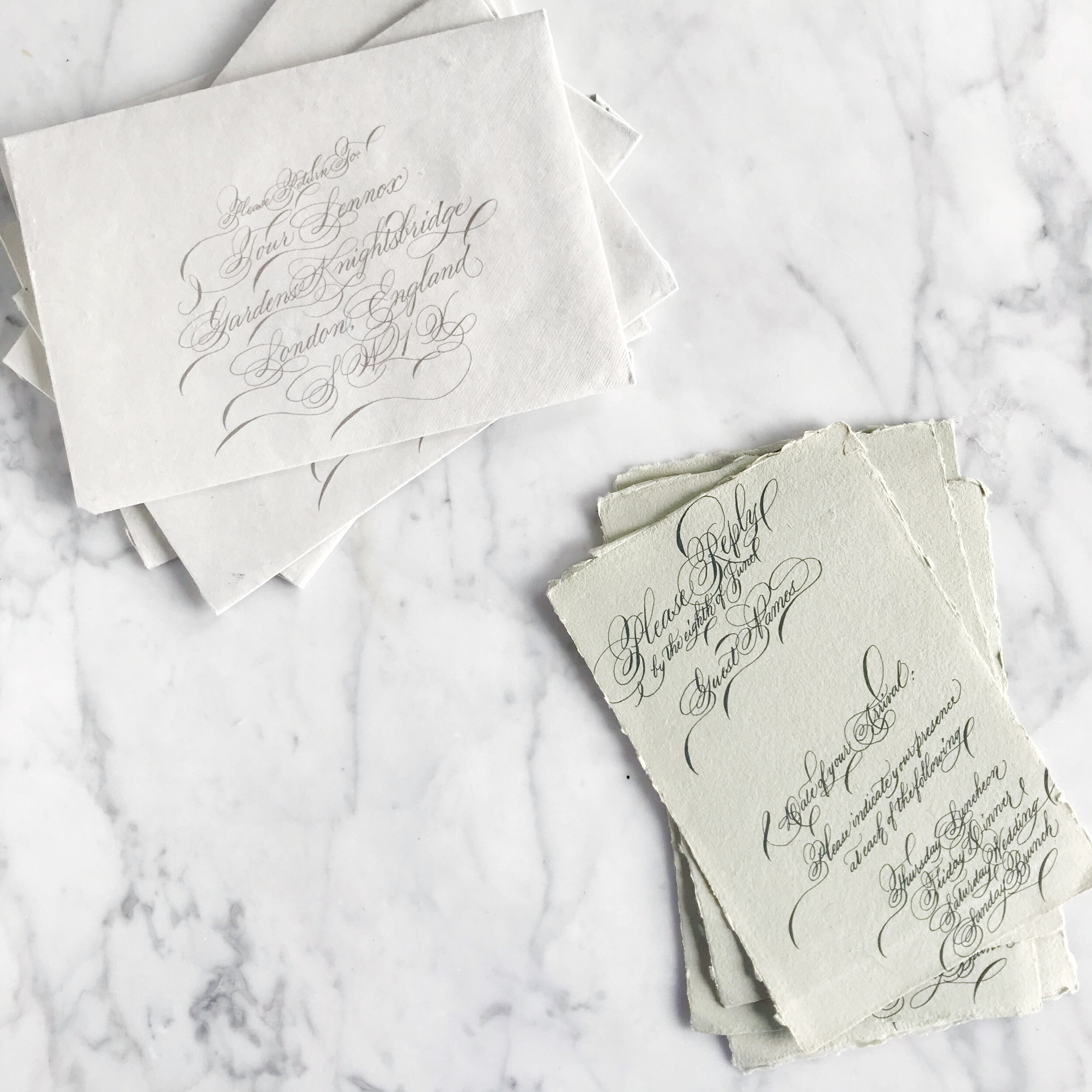
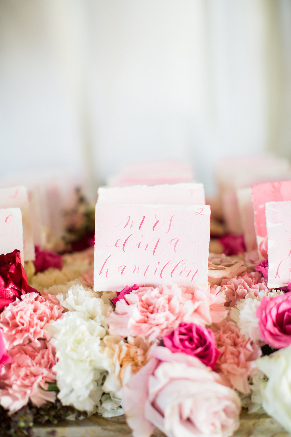
Poppies are such a summer staple, and the Icelandic poppies for these bridal shower invitations are no exception! Printed on handmade paper and covered edge to edge in gorgeous formal calligraphy, these bridal shower invites take your shower game to the next level! We went way over the top with the calligraphy for this suite, pouring the flourishes over the deckled edges.
The simple save the dates, layered with Japanese cane paper and handmade paper, for a Bermuda destination wedding are pale and understated. I love the idea of going off the beaten path, so taking on the tropical vibe while foregoing blues and bright colors is definitely my type of project. The amazing tactile texture of the cane paper was exactly what our bride was looking for. We paired it with a sage green handmade paper with a deckled edge to add in even more texture.
Can we say holy cow envelope game? I loved this project! The bride got married at her parent’s property in Sun Valley, Utah, surrounded by tall grasses and wildflowers. We spent some time researching the varietals that would be blooming at the time of her wedding and built her entire suite around those, bringing in bright yellows, shades of oranges and blues, leaf greens, and pale pinks and peaches (I shocked myself with how many colors I was able to build into this suite!) Bits of line botanicals peak out from the corners, creating some interesting negative space. At some point, we’ll also look at the suite of woodland creatures we also created for this suite (owls, foxes, and bears, oh my!).
These summer invitation suites have such different looks and feel to their aesthetic. I love the directions each of these brides went to reflect their personal style in their wedding!
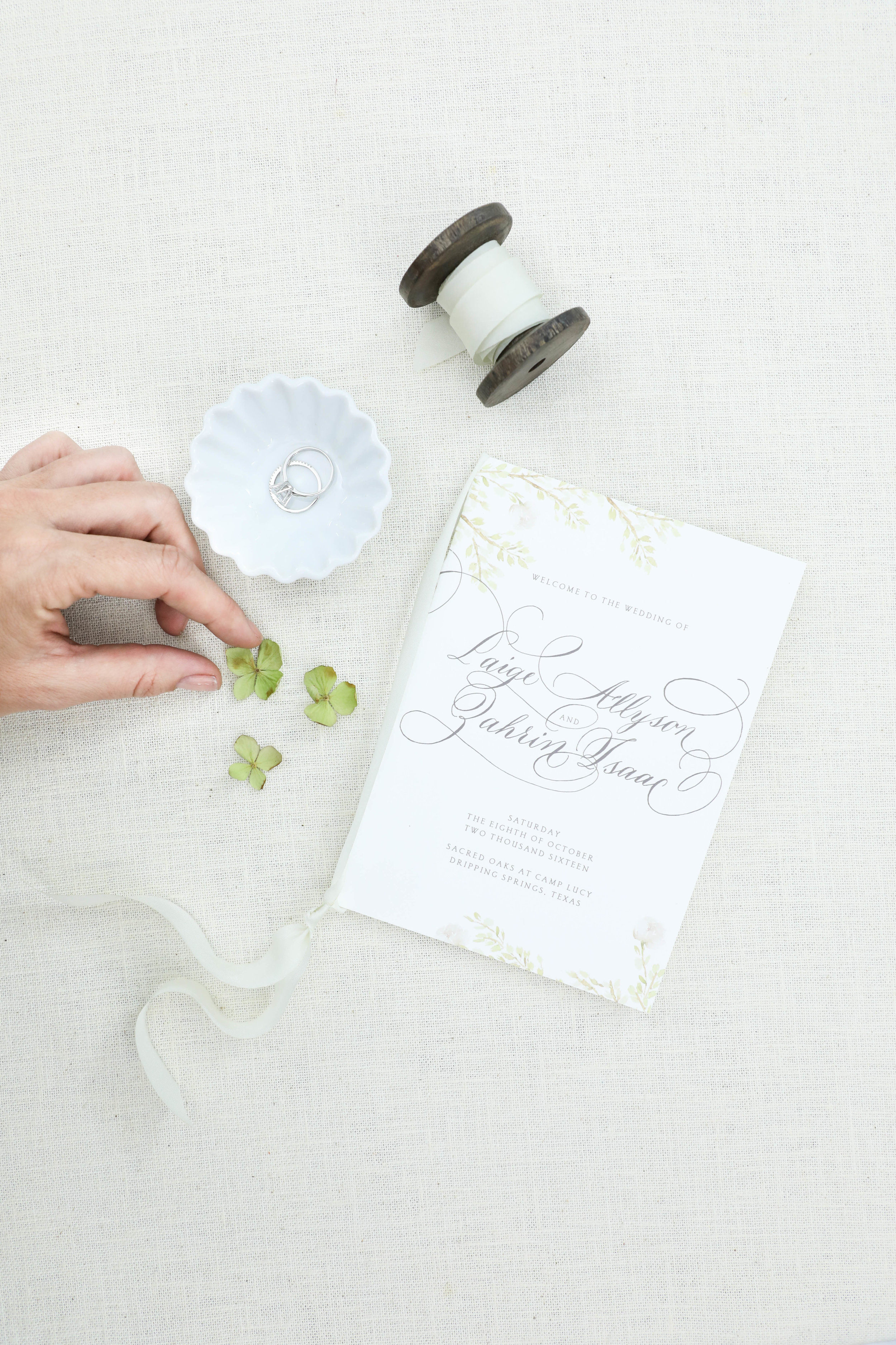
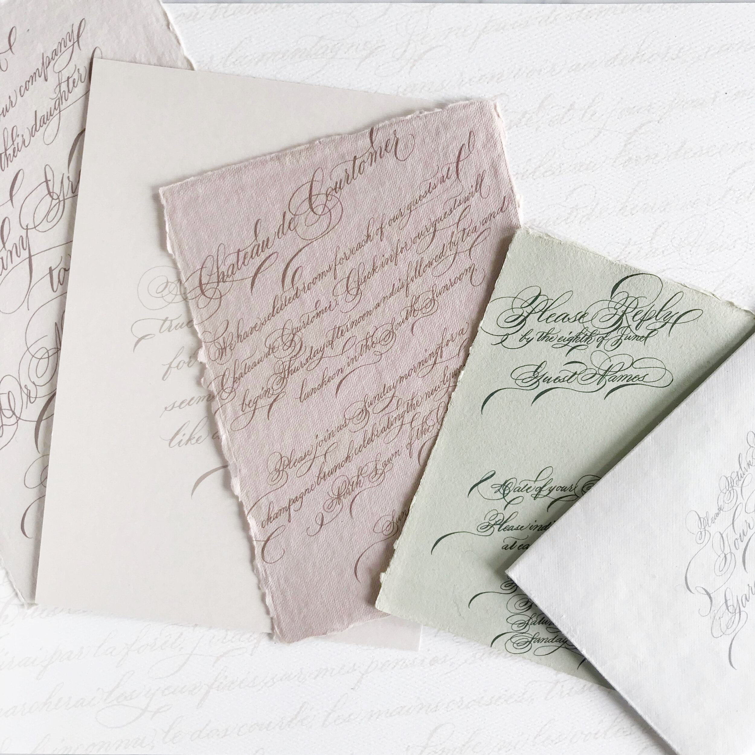
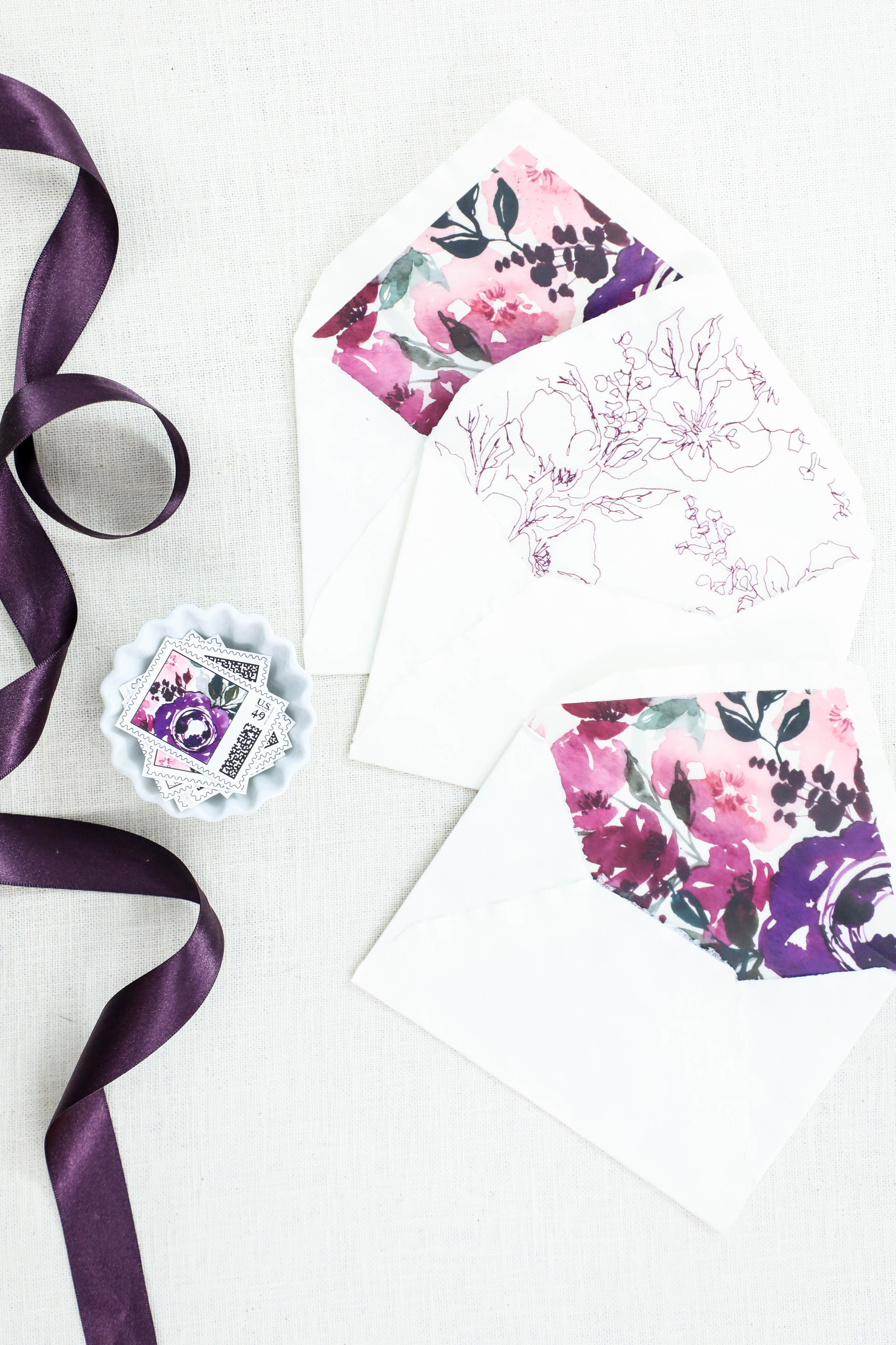
Spring Wedding Invitation Inspiration
The spring season is all about the emergence from winter, flowers blooming, and the world exploding into color. A spring wedding, regardless of venue and locale, can feel the same way!

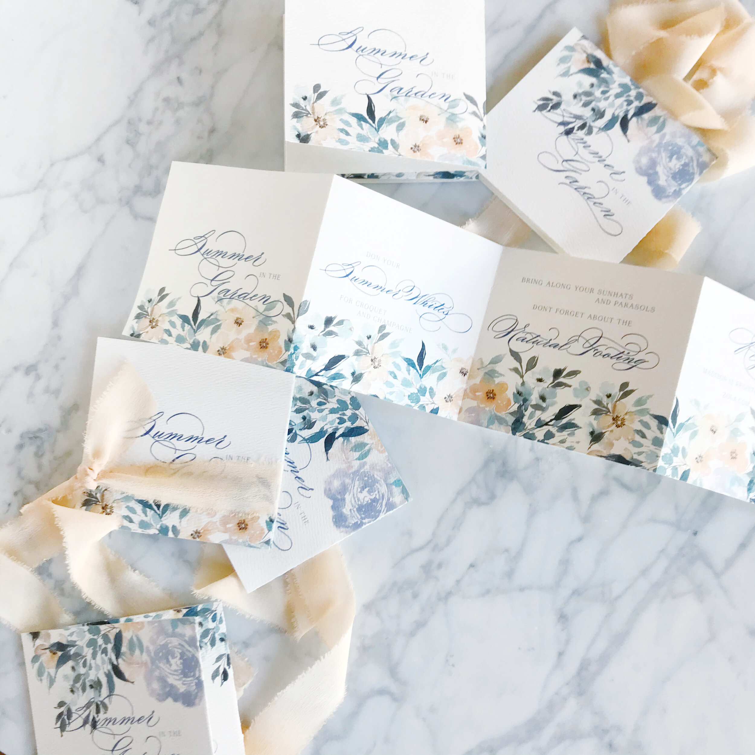
Pastel florals, delicate blooms, pale pinks and peaches, all exude the feeling of the season.
So let’s talk about spring invitations, and we’ll start with the spring invitation inspiration in this post!
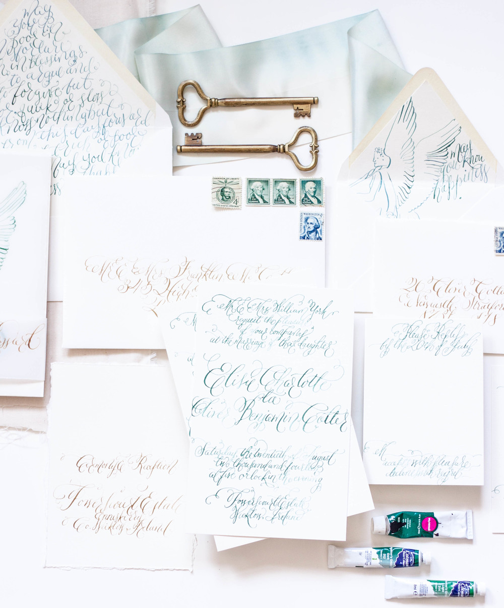
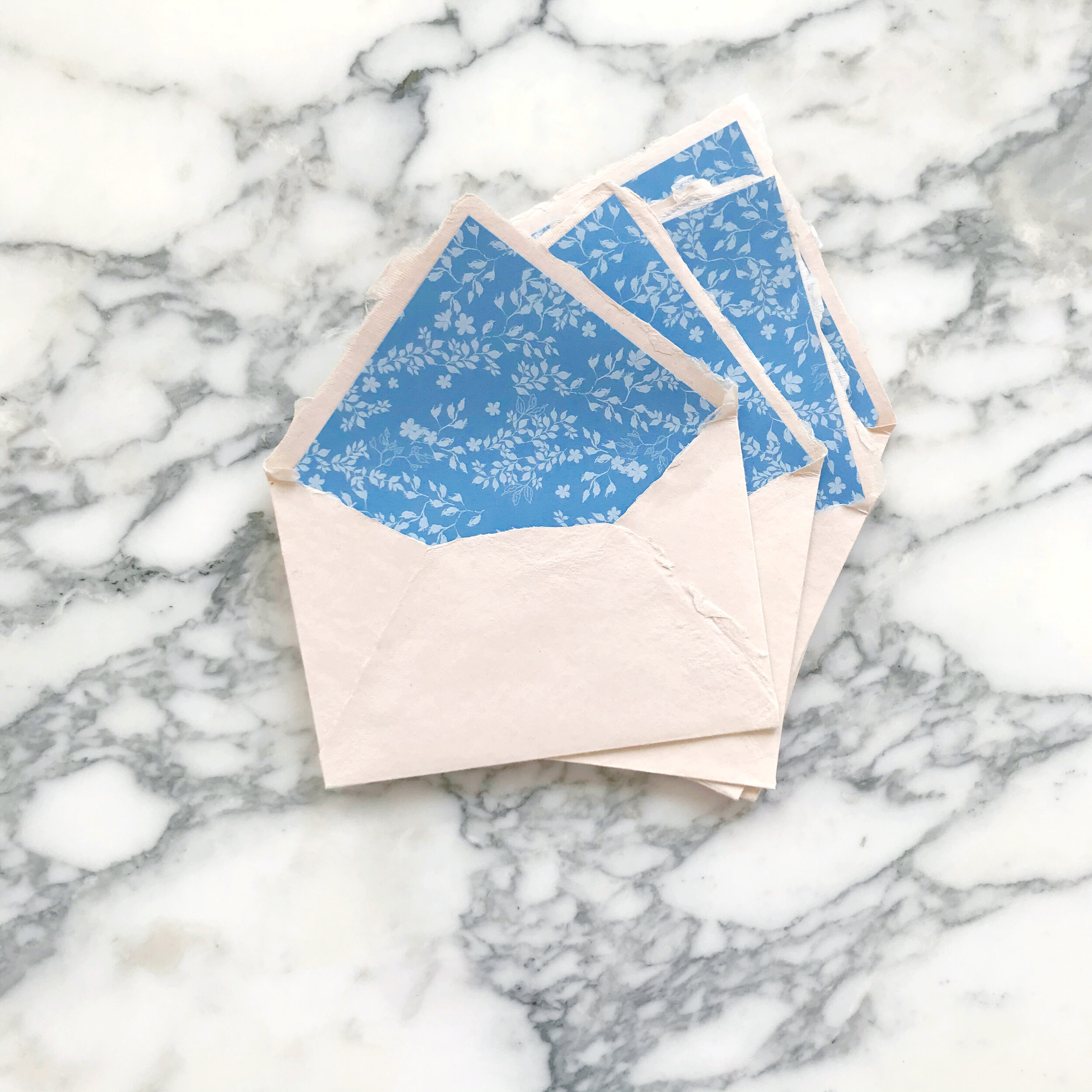
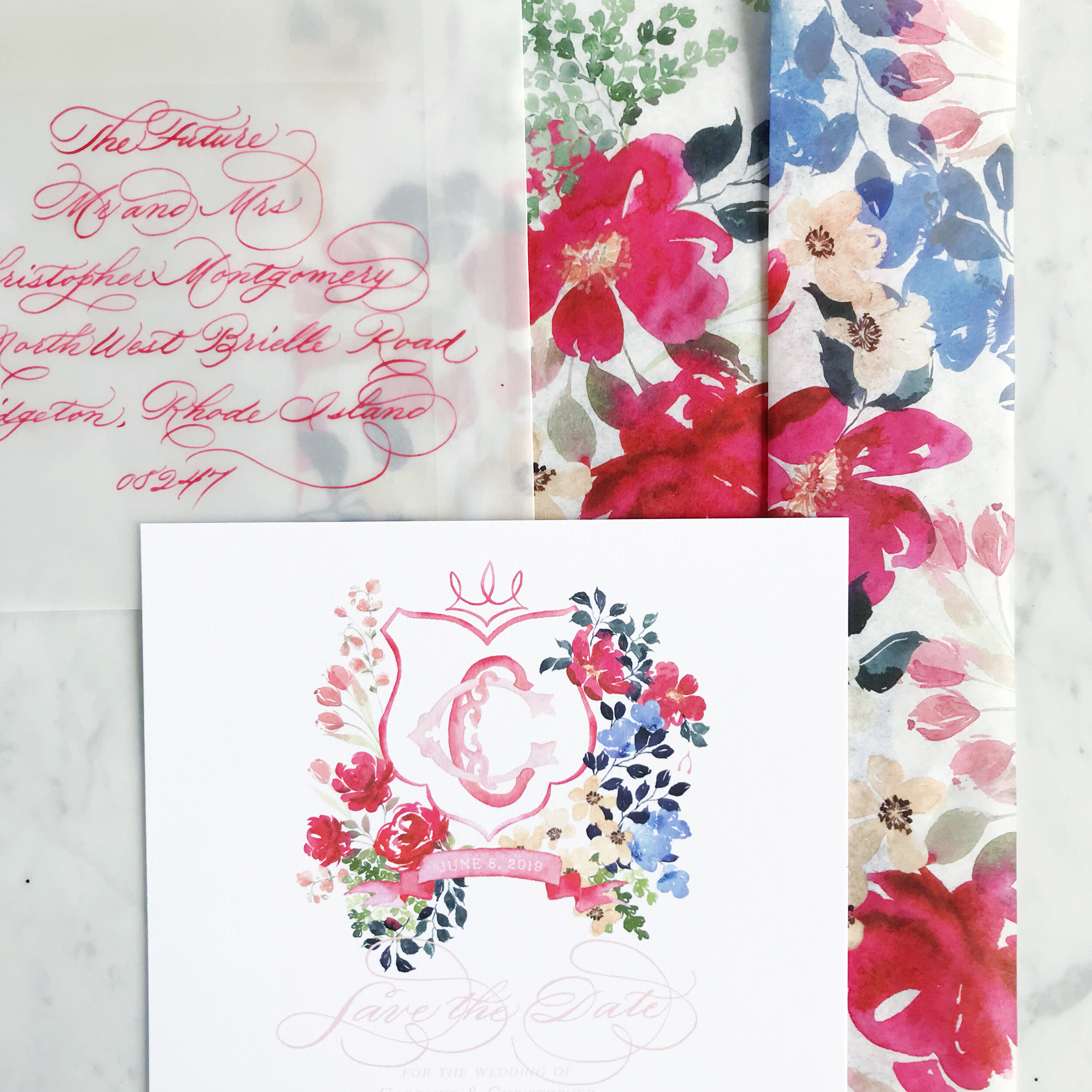
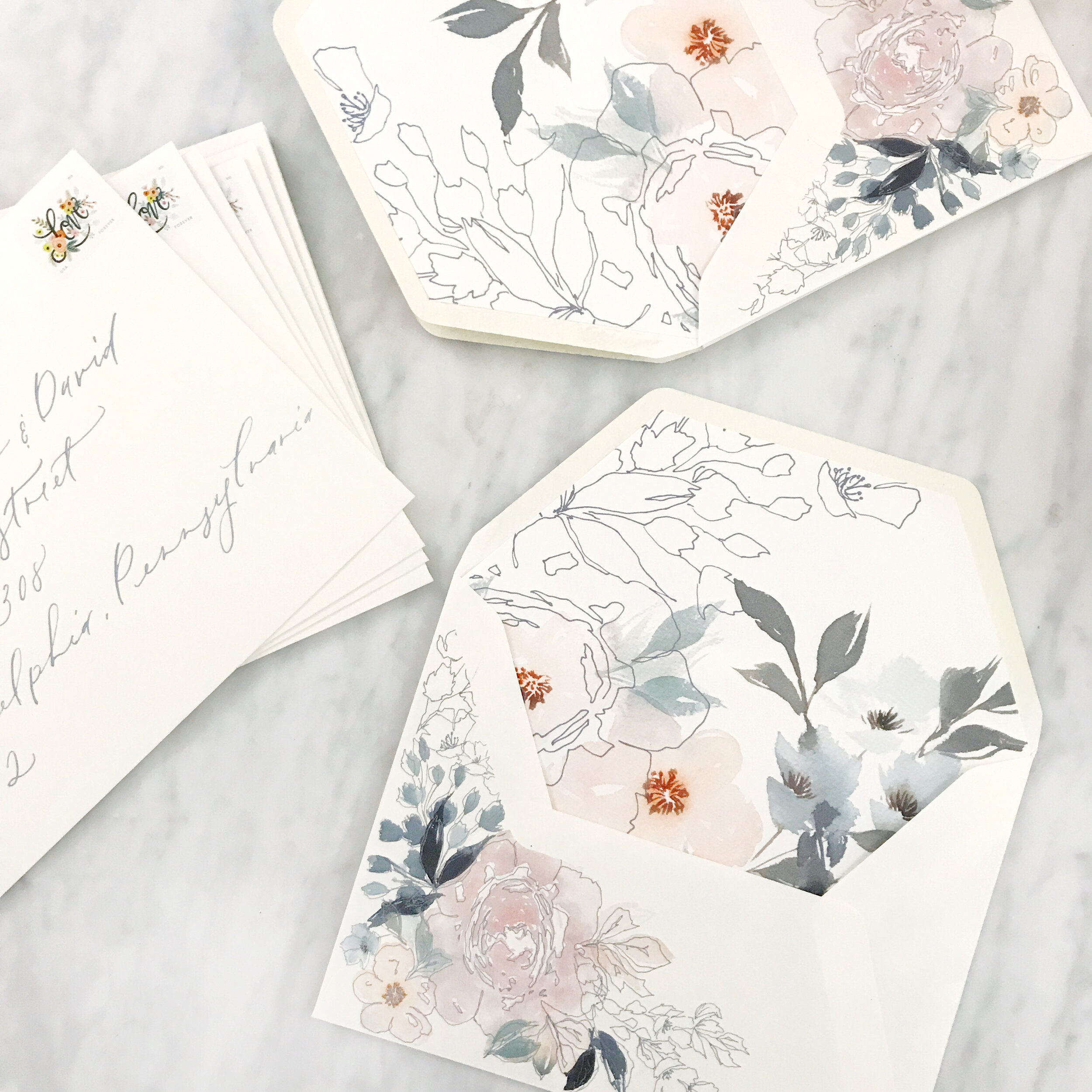
The first image on the left above features pastel pinks and blushes, pale blues, muted olive greens, and dark blues. We balanced the watercolor florals with the negative space created by line botanicals on both the custom printed artwork on a warm white envelope as well as the envelope liner. The envelopes were addressed in a pale blue modern calligraphy style that was designed for the client’s suite.
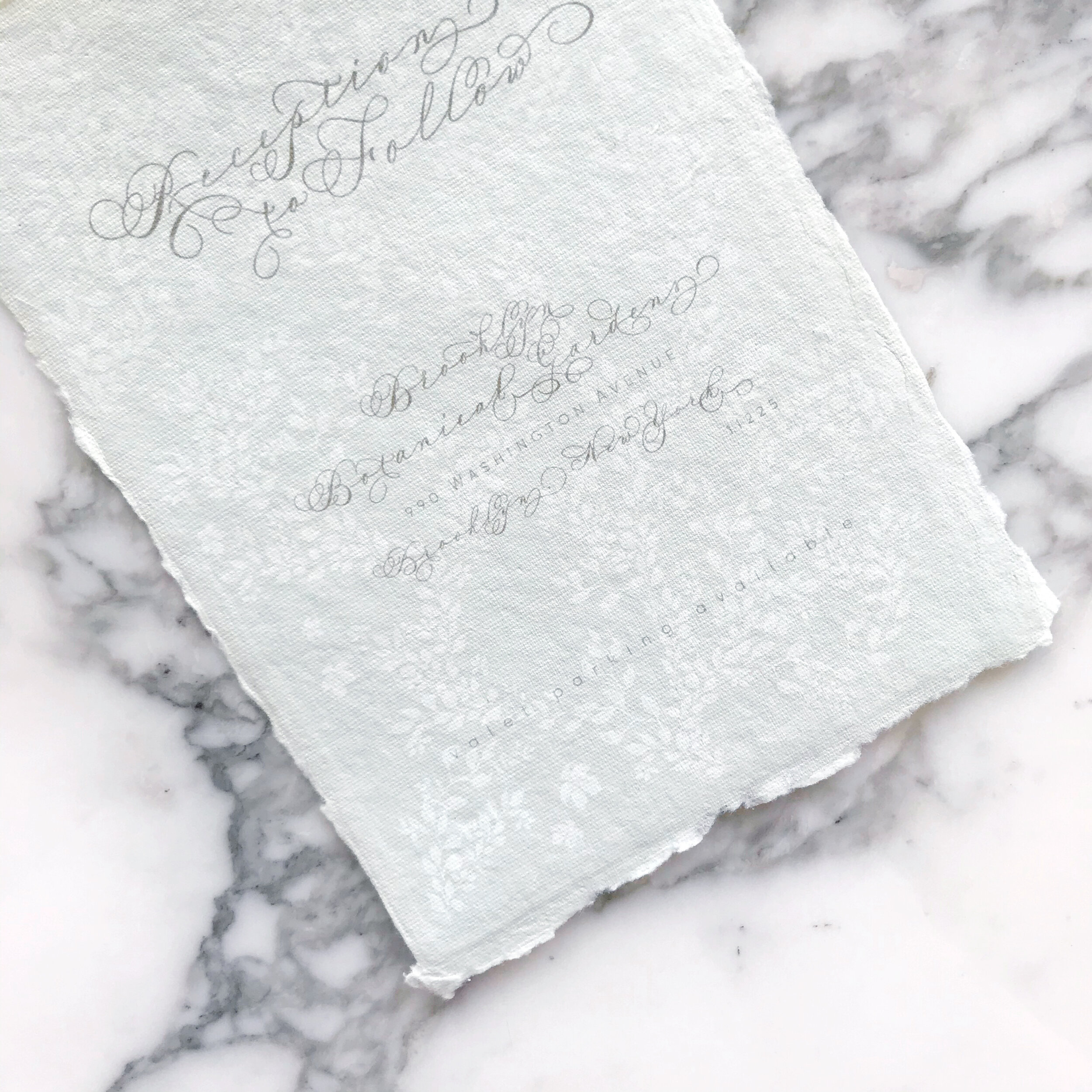
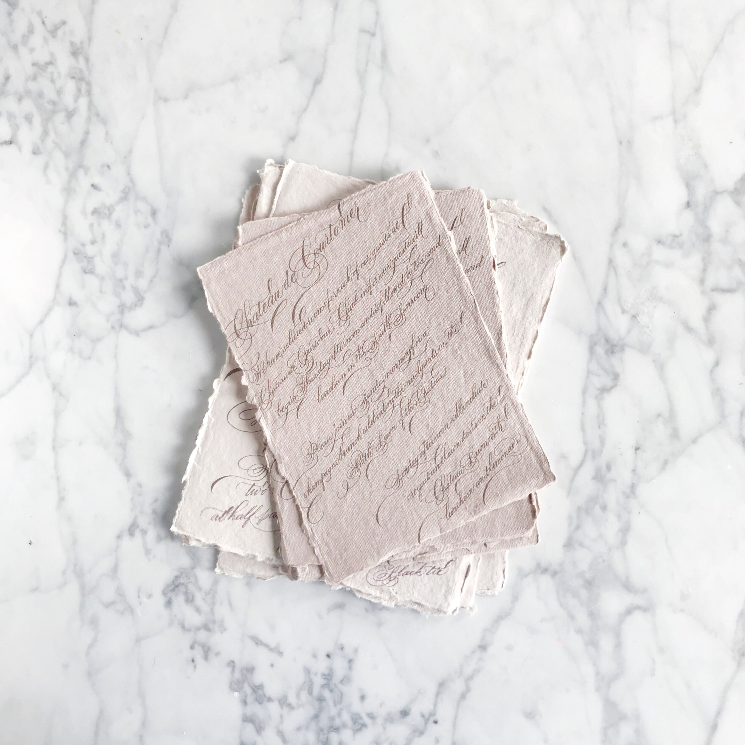
The center image above is one of my personal favorites. It has a different feel than the watercolor artwork suites that have become our signature, but I love the variety of textures that we achieved in mixing papers together. This suite features more traditional artwork, printed in deep rust, rose pink, olive green, and dark and light blues. The paper featured in this suite features warm whites, deep rose, pumpkin orange, pastel blush, and light blue, all handmade paper. The invitation was blind pressed for an overall texture on paper created in India by a female-owned, operated, and staffed company that pays a living wage to all their employees (this is important to us!). The additional paper selections were hand-produced here in the U.S. Handmade paper is such a gorgeous product to work with, but can be a nasty beast to print on (but totally worth it, IMO). Both envelopes were lined in custom envelope liners featuring artwork from the suite, and a pastel blush vellum overall completed the suite.
Last but not least in today’s spring invitation inspiration round-up is an accordion-folded save the date on a gorgeous warm white paper with a subtle overall texture. The florals for this suite are built around peach, lavender, pale blues, and muted olive greens. We went with traditional calligraphy with lots of flourishes for this suite. We easily could have brought in a more modern style to create a more playful overall look and feel, but selected the formal to reflect the level of formality of the overall event. The peach spring save the date was tied together with a gorgeous peach silk chiffon ribbon.
It amazes me that these suites are basically all featuring the same color palette (which I only realized as I was typing this and noticed that I had typed the same colors in all three projects!). It shows how different each bride is in how they see their day and how we work with them to develop a design unique to them!
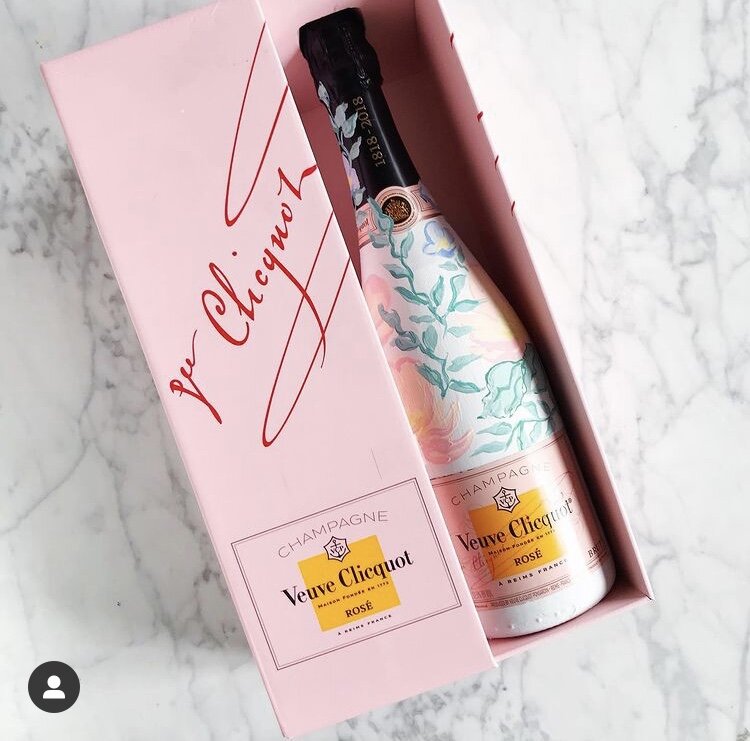
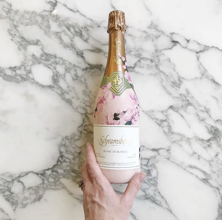
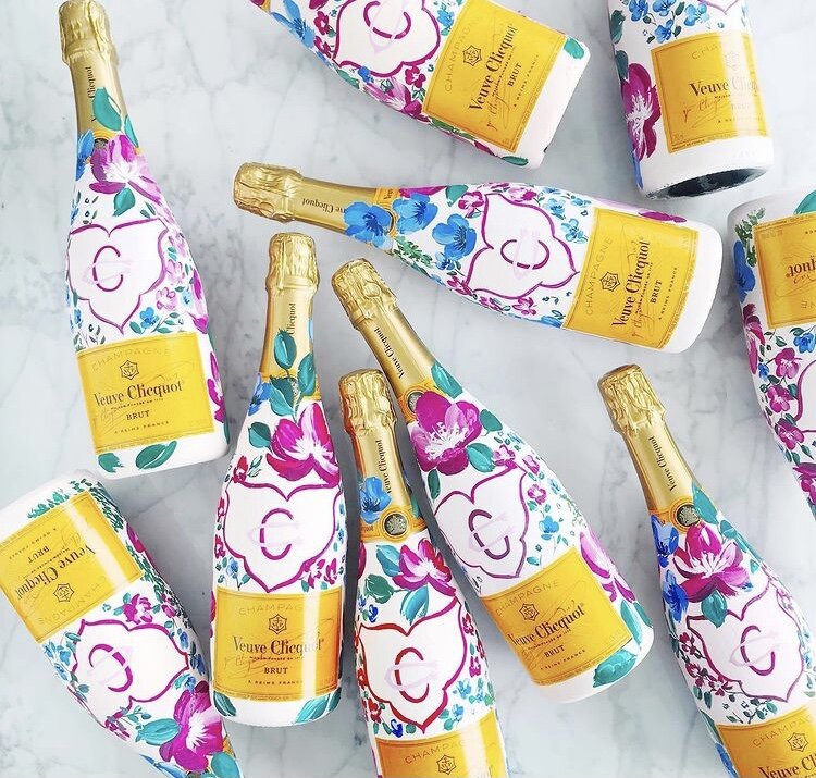
Hand Painted Custom Champagne Bottles
Hand-painted champagne bottles are the perfect custom touch for a gift for your bridal party or adorn your bar for an eye catching detail for your guests.
For these particular projects, each bottle was hand-painted to match the bride’s invitation suites with bright fuchsia blooms and cherry blossoms or pale blues and blushes.
Join me on YouTube channel for a brief video featuring some of our painted work.
If you’re interested in commissioning bottles from us, let us know!

Digitizing Calligraphy - Creative Process with Clients
Walking through our creative process when selecting, writing, digitizing, and using calligraphy in a custom invitation suite.
Digitizing calligraphy used to be part of my job that I loathed. I found it tedious and unpleasant and felt like my time could be better spent doing literally anything. These days, I find it slightly more cathartic.
A few steps: The first thing I do before I even get to this stage is do a sample sheet of calligraphy for my clients. I don't maintain a universal sample sheet for several reasons - first is that I don't want to be locked into any handful of calligraphy styles, and my styles tend to evolve fairly quickly (which also means I don't want to do a new calligraphy sheet once a month). I also want the client to see what their names will look like in each style, so the list of options I provide to them is of their actual names.
Another trick is that I don't give them all the options in the world. We've discussed their style and overall look and feel, and I put together a list based on that. If they're doing a modern affair, I'm not going to show them Spencerian or super flourished Copperplate. I also don't present clients with font selections that are really close to one another - I can tell the difference, but usually, a client can't. I show them a handful of fonts that are all very different from one another.
Ok, so that was all before I even get to writing. Once I have a selected calligraphy style from the client, I do all their spot calligraphy (also note that at this point, I've also completed and they've approved their sketch, so I know where the calligraphy will be needed so I can avoid needing to go back and do more). We then scan, adjust our levels, and correct any mistakes or bumps (ahhhem....too much coffee...oh let's be real, it's not coffee, it's Redbull).
Once we have all out lines smoothed out, I cut apart each line or section and label each layer. I then start a lettering file that I name VERY SPECIFICALLY as _Client Name LETTERING. This places the file at the top of the client folder and the ALL CAPS makes it really easy to spot. We do the same with our ARTWORK and PRINT files which makes everything really easy to see when I'm putting together proofs and dropping lettering and artwork into a million files.
I hope these tips for a professional calligrapher as well as showing you a small example of what's it's like being a working artist and will be useful to you. If you enjoy my artwork and crave more glimpses behind the scenes, please subscribe to my channel and hit the like button. Also, please leave a comment on the video with questions and requests.
Design House of Moira on the Web:
Instagram - www.instagram.com/designhouseofmoira
Websites - www.designhouseofmoira.com | www.designhouseprepschool.com

Painting White Peonies in Watercolor
Painting white flowers without using white paint
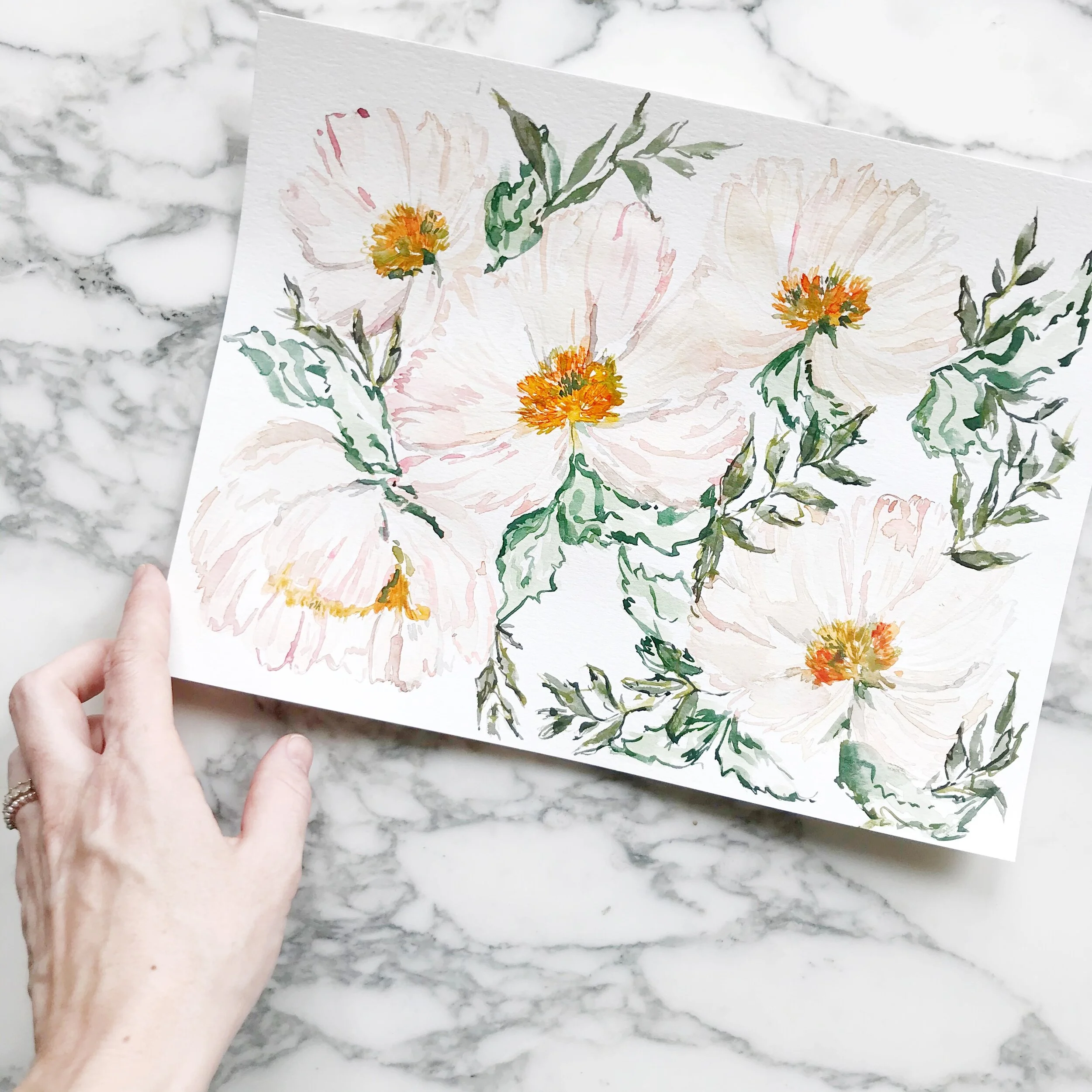
Painting White Peonies in Watercolor
I've been working on a new flower form (new for me, at least) and working a lot with white peonies.
There are two essential ways to paint white flowers - using tiny bits of grey for the flower details and adding a dark background to designate where the flower falls, or using shades of greys and pale neutrals to create the optic of white flowers (because white flowers aren't 100% white).
I'll be using the latter technique to create white peonies with watercolor. I hope these tips for watercolor painting as well as showing you a small example of what's it's like being a working artist and will be useful to you. If you enjoy my artwork and crave more glimpses behind the scenes, please subscribe to my channel and hit the like button.
Also, please leave a comment on the video with questions and requests.
Design House of Moira on the Web:
Instagram - www.instagram.com/designhouseofmoira
Websites - www.designhouseofmoira.com | www.designhouseprepschool.com
Running a Creative Business & Watercolor Painting - Video
I'm playing around with some more five-petal flowers today in some moody spring flowers (doesn't that sound like an oxymoron??).
In this video, I'll talk through a little about my painting process, but we'll also chat openly about creating a unique style and how to compete in a saturated market on value rather than price.
I hope these tips for watercolor painting as well as showing you a small example of what's it's like being a working artist and will be useful to you. If you enjoy my artwork and crave more glimpses behind the scenes, please subscribe to my channel and hit the like button.
Also, please leave a comment on the video with questions and requests. Design House of Moira on the Web:
Instagram - www.instagram.com/designhouseofmoira
Websites - www.designhouseofmoira.com | www.designhouseprepschool.com
price.
//social graces
when to mail out
wedding invitations
no seriously, when are you supposed to do that??
There are so many conflicting questions and answers out there it will make your head spin! I can't even imagine being a bride and attempting to navigate the vast world of etiquette for your wedding day; I don't envy you one bit. However, we're here to help!
Wedding etiquette is something we've been practicing for so long, it now come second nature to us. It's like a flow chart our brains are constantly cascading down.
So here's the run down:
Save the dates:
Save the Dates are awesome. They give everyone a heads up and allow your guests time to plan details like flights and hotels (even though, let's be real, they won't actually book their hotel until a month out only after you've hounded them for months). Save the dates are typically mailed out 6-9 months ahead of your wedding. We usually suggest avoiding holidays - so if your six to seven month mark falls between Thanksgiving and Christmas, try and get those in the mail before the holiday season hits so it doesn't get mixed up with holiday cards and widespread massive panic of the holiday season.
Invitations
These get sticky. We suggest mailing out six to eight weeks prior. Here are some general ideas that are often mistakenly disregarded:
- No, it's not helpful or appropriate to mail them out 12 weeks early. This is not only generally considered rude, but unnecessary. You also put far more time between telling guests your date, your reply date and your actual wedding - you'll end up with a far greater number not sending their reply cards back and guests are far more likely to forget about your wedding all together (yes, this actually happens). If you have an idiosyncratic notion that for some reason, your guests are the exception and your invitations really really really need to be out four months in advance, just know that you're incorrect.
- Six weeks prior is fine. This reminds me of eating out at steak restaurants in a major metropolitan city...I say 'medium rare' and it's like it has become a competition to see how close they can get it to rare while still calling it medium and everyone tries to out do everyone else. Six weeks is fine, and just because your friend, who's wedding is AFTER yours has already sent hers out 10 weeks prior, just know that you're right and she's wrong. Six weeks is your minimum; it gives your guests two weeks to get reply cards back and a month to get your count to your caterer (more on this shortly).
- Eight weeks is the maximum. Any further out than this and you'll start running into issues: guests assume their on the A/B list and cause drama (whhhhyyyyyyyyy), people forget to reply at all, your invitation gets lost in the time shuffle and you end up out of sight and out of mind.
- Six to eight weeks out is when they get mailed, not received.
- We schedule all of our invitations to be mailed at the eight week mark. This means we're early. It gives us leeway in case you've changed your mind on what postage you'd like to use, there was a holdup at the printer, or you're not quite finished putting together your address list on time. Anywhere between six and eight weeks is acceptable and follows protocol. If you're at seven weeks and five days, you're not late. If you're at 6 weeks and four days, you're also not late.
- Reply dates: caterers typically ask for your final count ten business days prior to your event. We recommend setting your reply by date at four weeks out, giving you two weeks to hunt down the ungrateful slackers (I mean, your lovely guests and family) who haven't replied yet. If your caterer is one out of hundreds of thousands that thinks it's normal to ask for your head count two months prior, ask them what they're smoking.
- Your guests will receive your invitations anywhere from 2 days to 7 days after you mail them. It wont be consistent, either. You'll have local people get them a week later than people on the opposite coast. We serve at the pleasure of the United States Postal Service, ladies and gentlemen. If there were another plausible option for sending mail, we would be using it. Trust me.
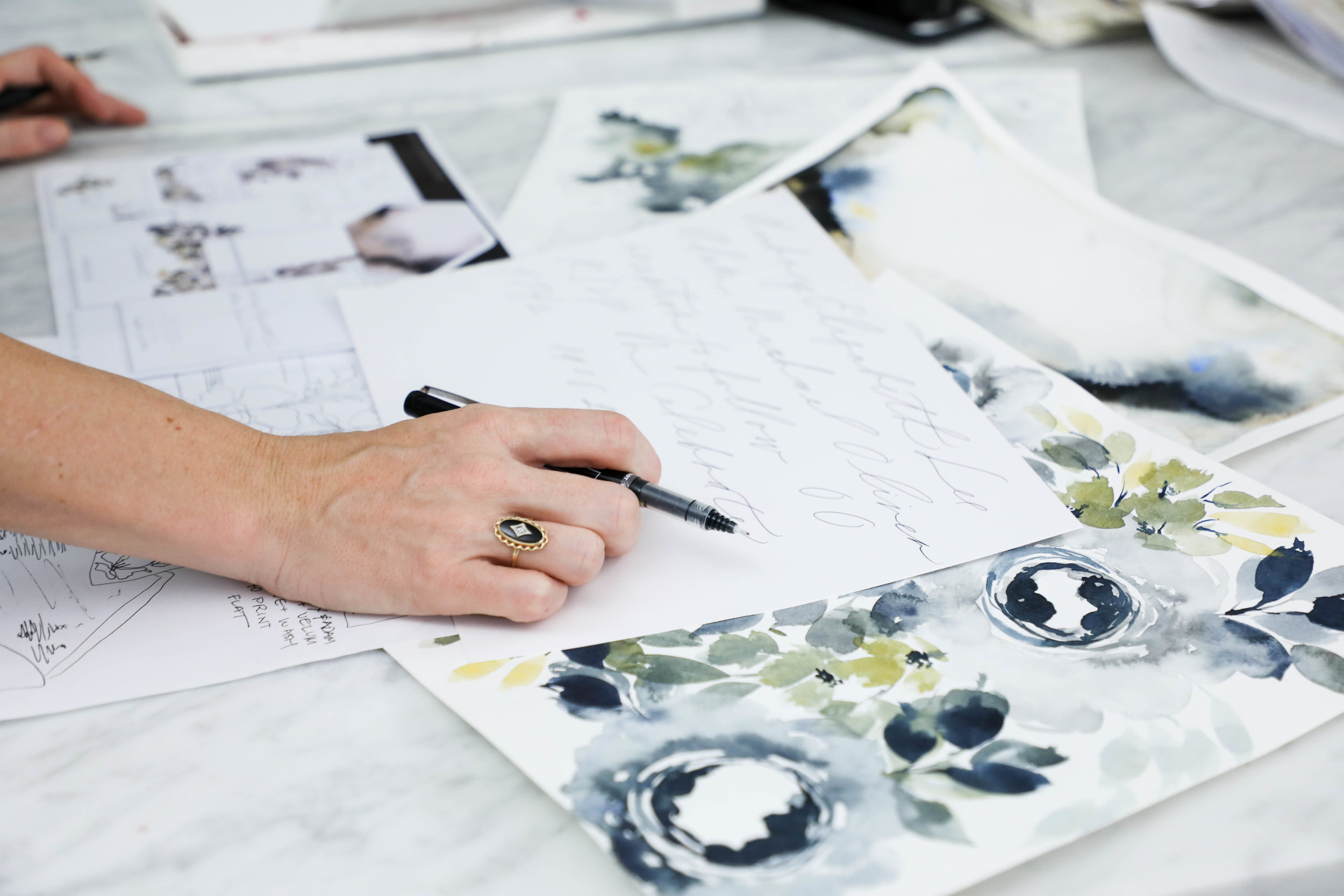
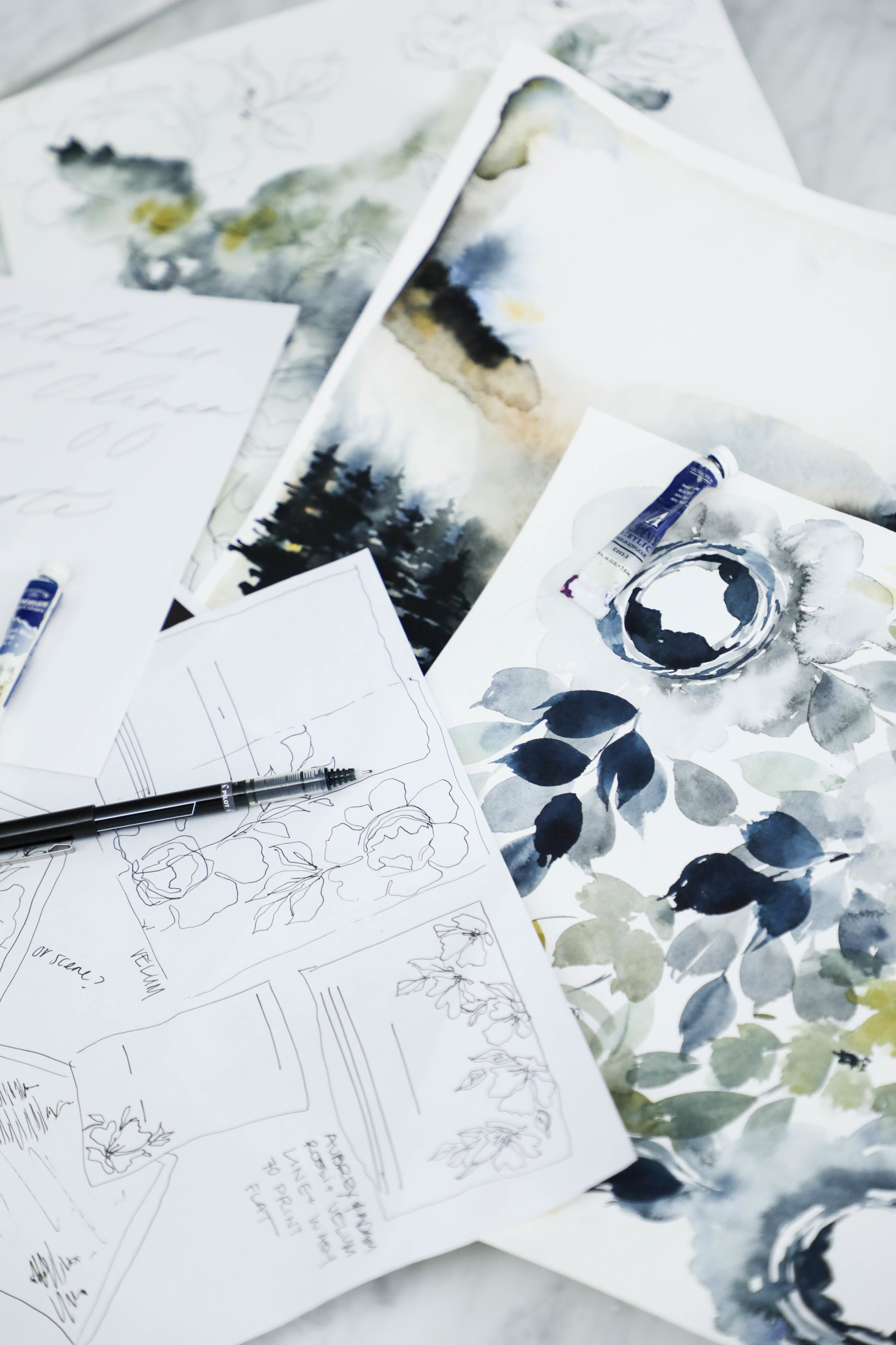
Copy of Creative Process | Behind the Scenes
Once we have our sketch finalized and our lettering style selected, we begin creating the artwork that will be included in the invitation suite.
It is our goal and part of our business philosophy that we never want a client to feel limited or concerned that their design won’t be everything they had hoped because they’re limited on how much artwork they can have created for them.
All of our projects include unlimited artwork, regardless of what type of artwork it is. For this suite, we had a watercolor floral pattern, two watercolor wash patterns, a modern landscape piece, and line botanicals.
This is the longest portion of our process without contact with our client. Once they’ve approved the sketch and calligraphy style, we set about creating all the artwork, scanning it into the computer, digitizing the artwork and calligraphy, and getting it ready for their design.
The proof is the next step in the process and is also the next thing the client sees after the sketch (unless they follow us on instagram, in that case, they’ve seen the entire creative process along the way as their design comes to life!).

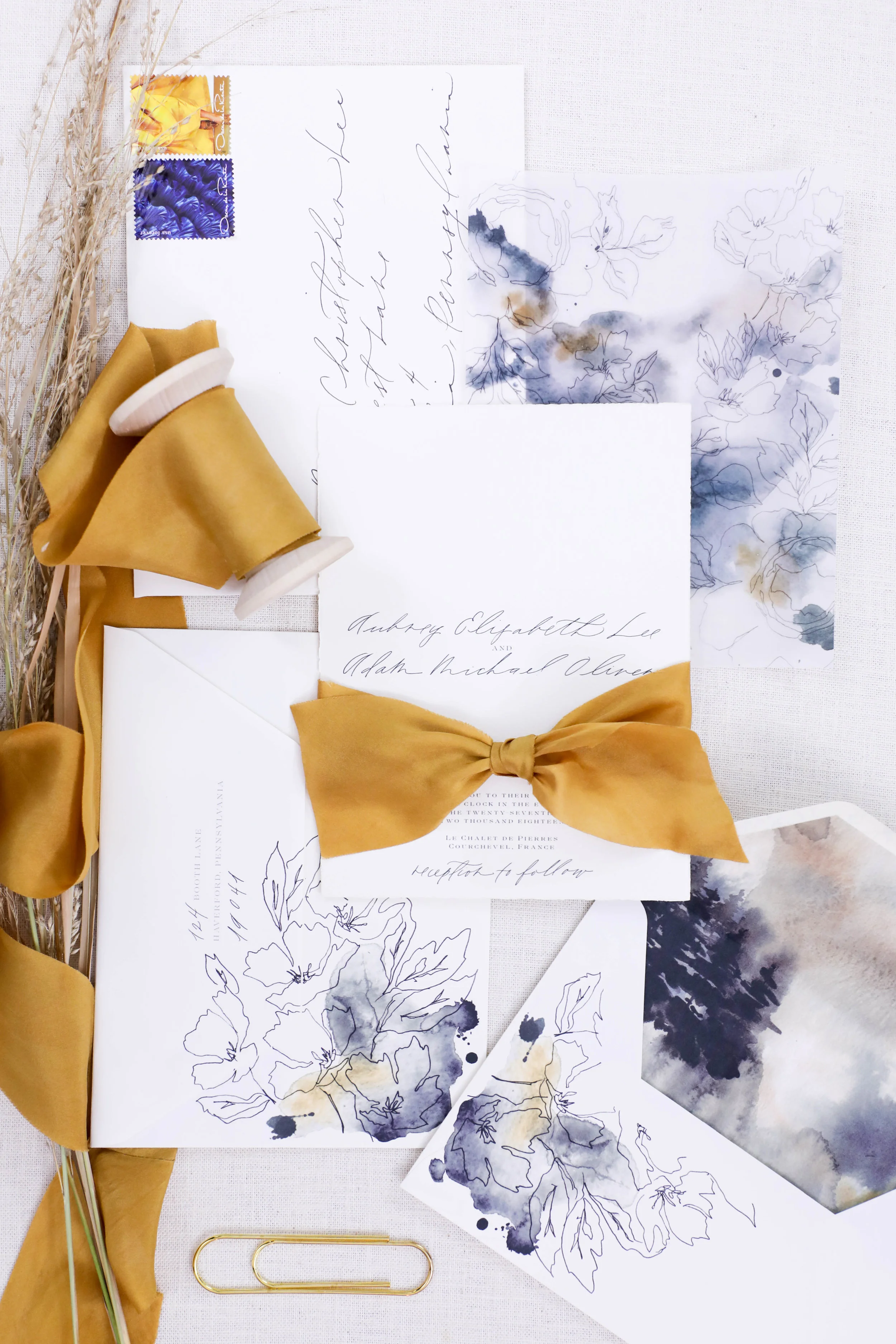
Aubrey & Adam
Courchevel, France
The proofs shows the overall layout of the suite, as well as each individual piece. A proof is usually about 9 pages long, but can get up to 14 if the suite includes several additional pieces.
I personally love the proofing point in the process. It’s the first point that the client sees their sketch come to life in full color.
Similar to artwork, we do not limit how many proofing rounds each client is allowed. We want the design to be perfection, and we’ll tweak it as much as needed.
Two to three rounds tends to be the average, so that is how we timeline out the clients project. If more rounds are needed, we always make sure to keep an eye on our mail date, since that will get pushed back based on how long proofing takes.

Creative Process | Behind the Scenes
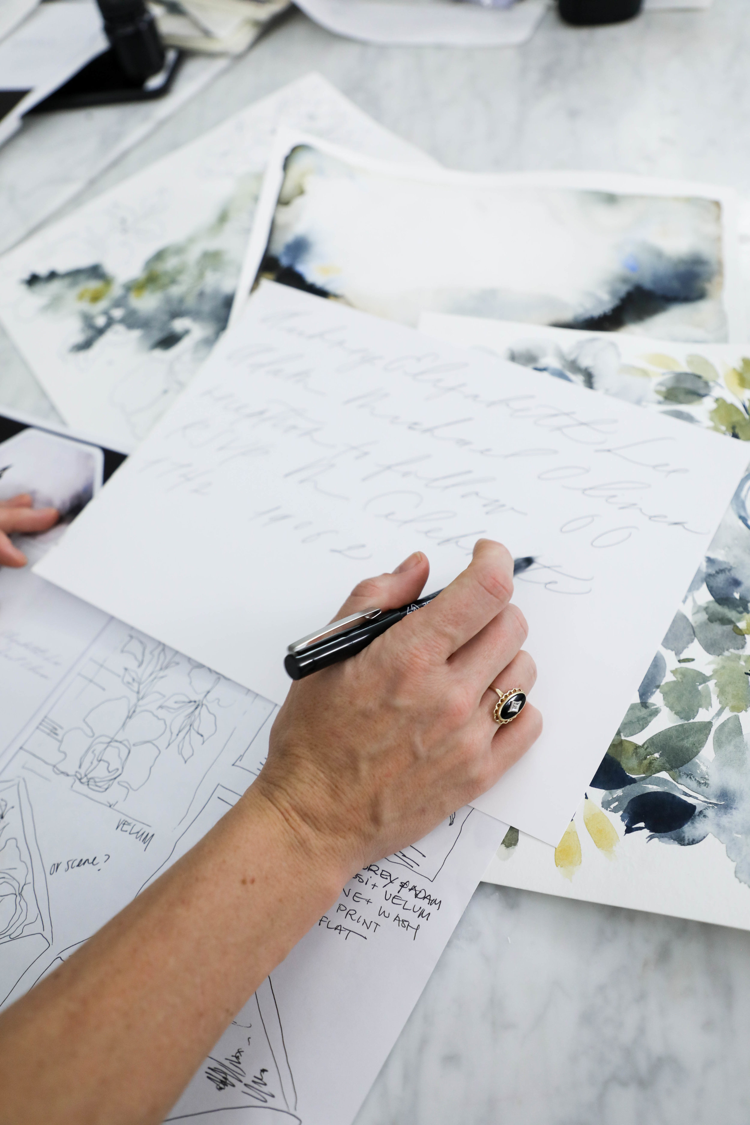
Following the sketch, we create a sheet of lettering and calligraphy samples for our clients to review. We based the styles we provide on the couple’s overall style and the formality of the wedding as well as any personal preferences. Our calligraphy styles are not a generic sheet we give to each client, but created individually for each project. We also prefer to show calligraphy styles shows in the couple’s names, since seeing one’s own name is so much more exciting than seeing a generic style name.
For Aubrey, we created a calligraphy sample sheet with six styles. We knew she preferred minimal and modern, so we showed several variations of that style.
Aubrey selected a delicate monoline style for her lettering. We liked the minimal visual impact it had, while still being interesting and unique.
Sometimes we nail the style on the first try and sometimes it takes some tweaking. For Aubrey, she loved it right away.
Once we’ve selected the style, the Design House team sits down to see where in the sketch the calligraphy falls and what words or phrases we’ll need for the design. Once we have a list of what needs to be written, we write their lettering or calligraphy out by hand.
Aubrey & Adam
Courchevel, France
Creative Process | Behind the Scenes

Aubrey & Adam
Courchevel, France
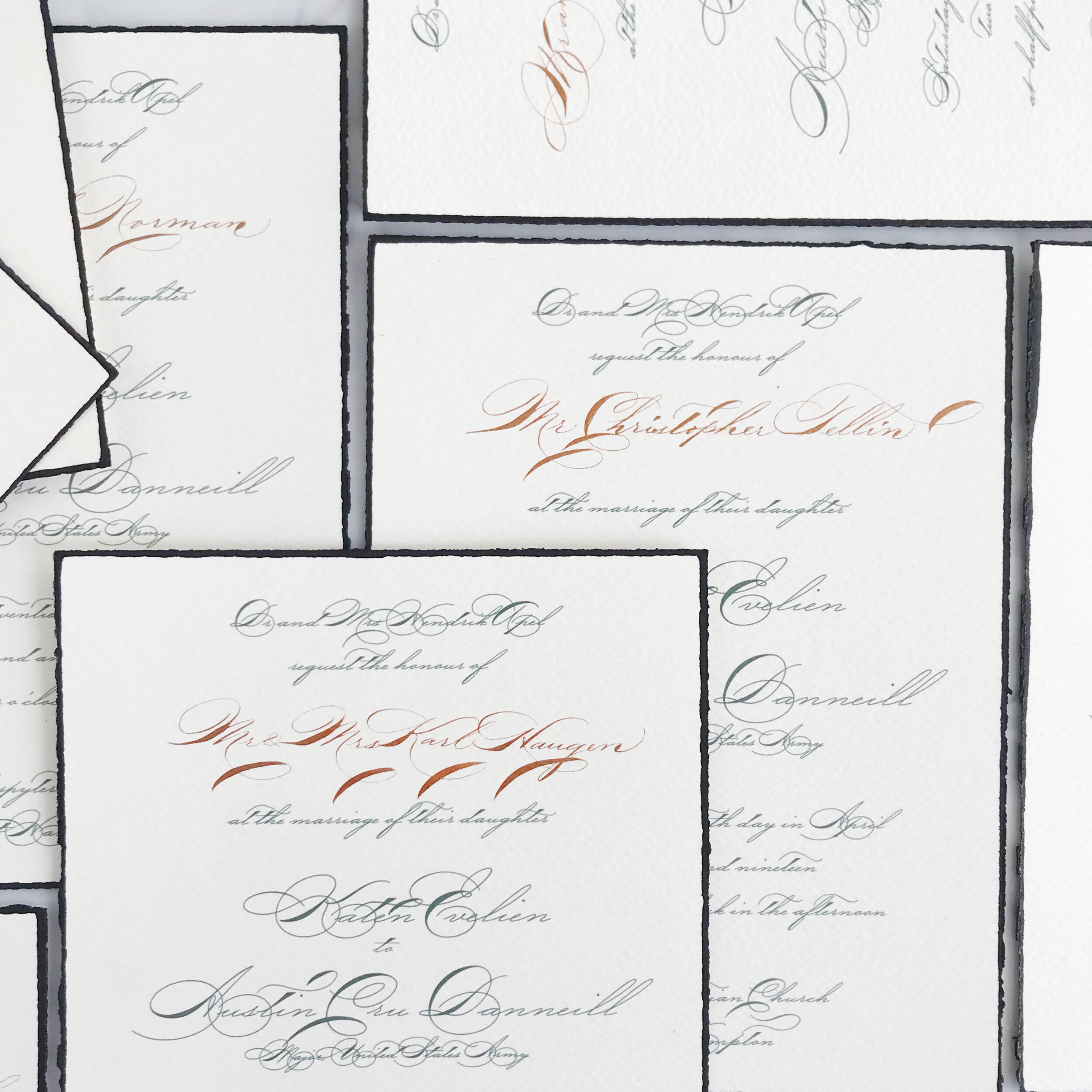
Aubrey and Adam were married at a gorgeous chalet in Courchevel, France and came to us with some specific ideas in mind. They wanted to incorporate ochre into the design, but dit not want the overall look and feel to be summery and cheerful, but moody and modern. They came to us specifically because of our use of original artwork and lettering designed for each client. As with all our clients, we began the process with a sketch, detailing out our overall ideas for their suite, mixing media and multiple styles of artwork.
We love beginning with a sketch for several reasons:
It helps a client envision the overall look and feel by putting thoughts onto visual mediums
It allows the client to visualize how we see the art moving from one piece to another throughout the suite. We rarely do pieces that all match exactly, but vary the art across multiple elements of the invitation suite.
It creates a point from which we can create and generate all the artwork. As artists and creators, we avoid redoing repetitious work, which consumes a massive amount of time and energy. We want to create your artwork once and do it correctly the first time, rather than missing the mark. This is where the sketch comes in.
We can make adjustments to the art while the art is still theoretical to allow for more time during the proofing rounds and on assembly details.
shown here: the final pieces of artwork used in the printed pieces of the suite, generated from our original sketch
Featured | Oh So Beautiful Paper
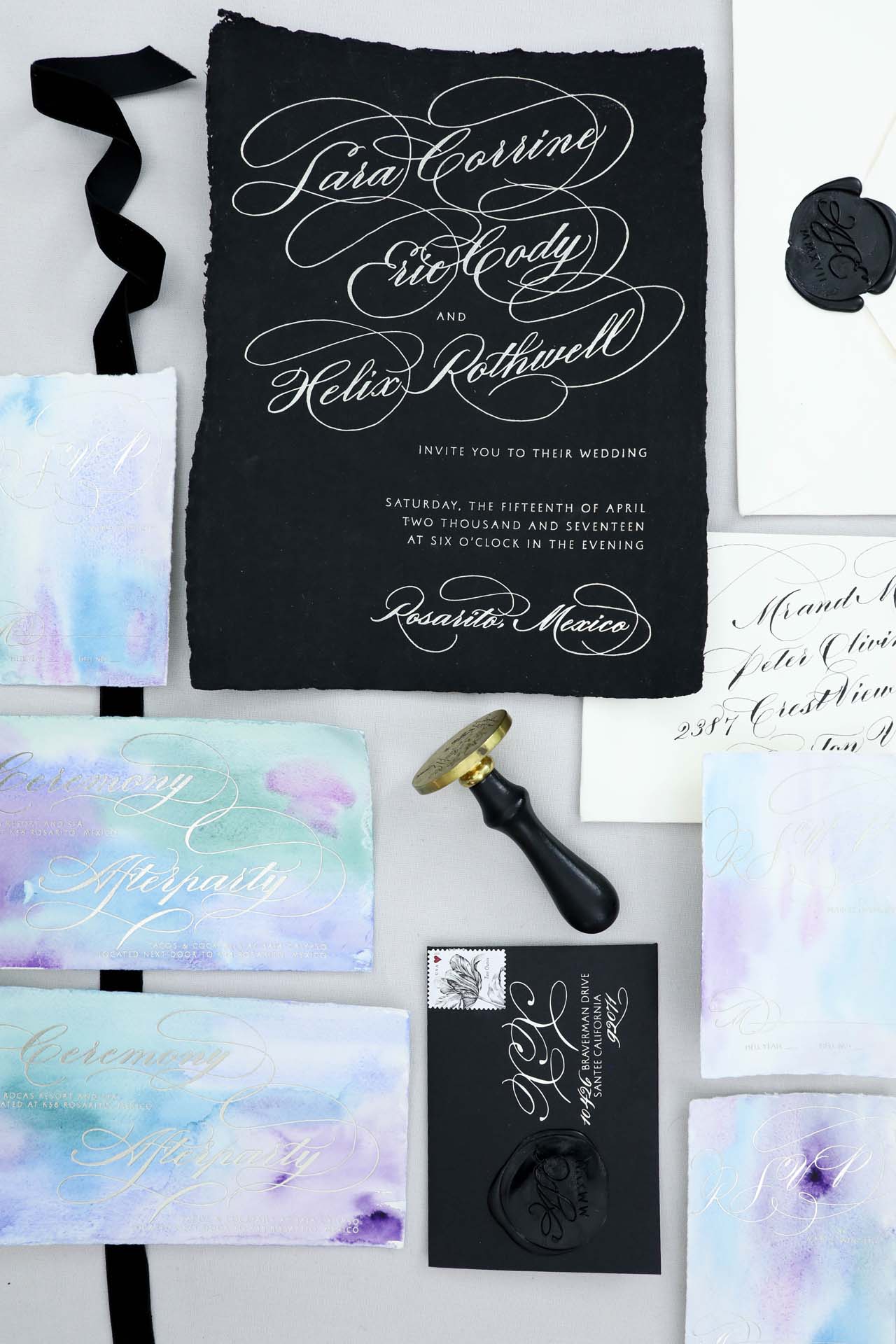
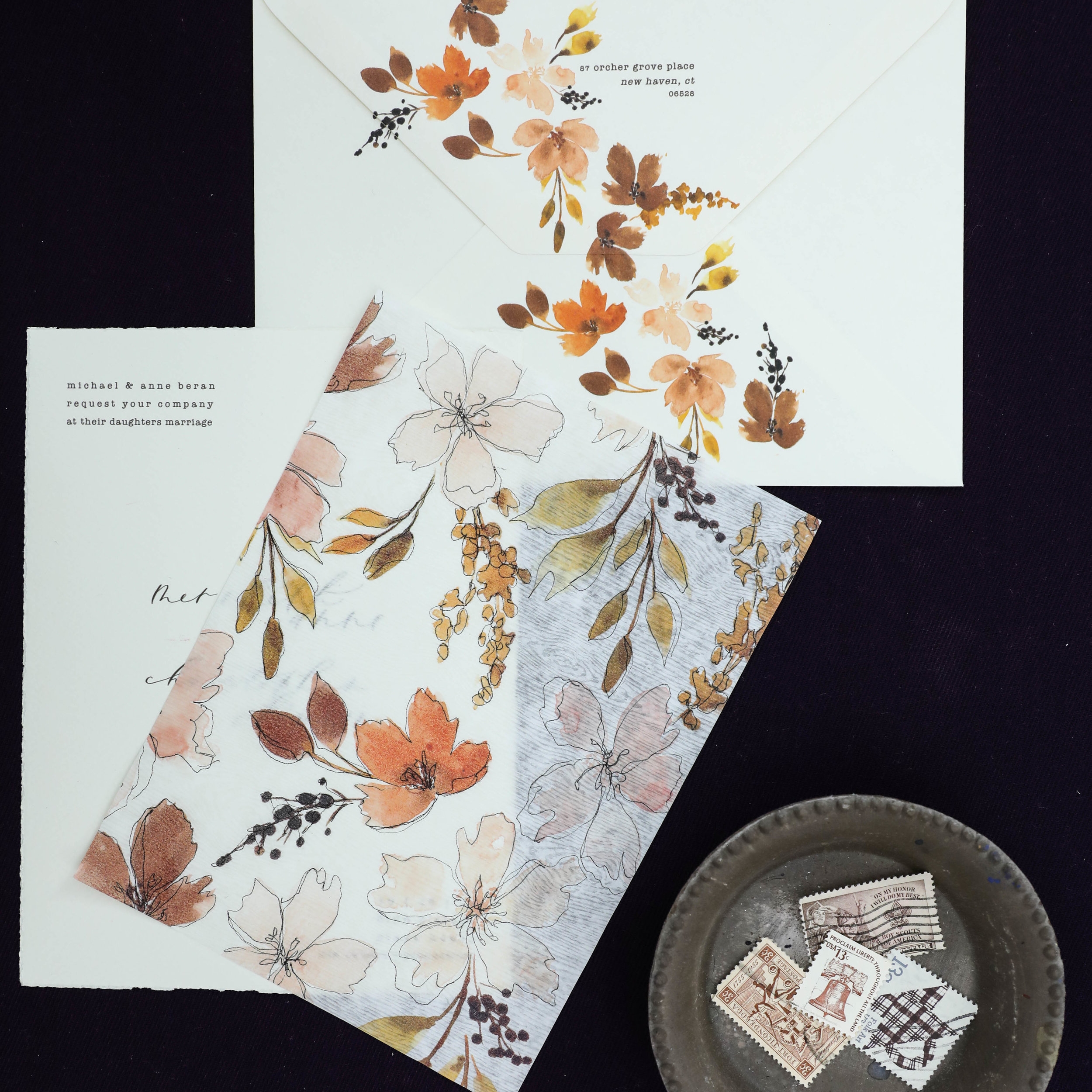
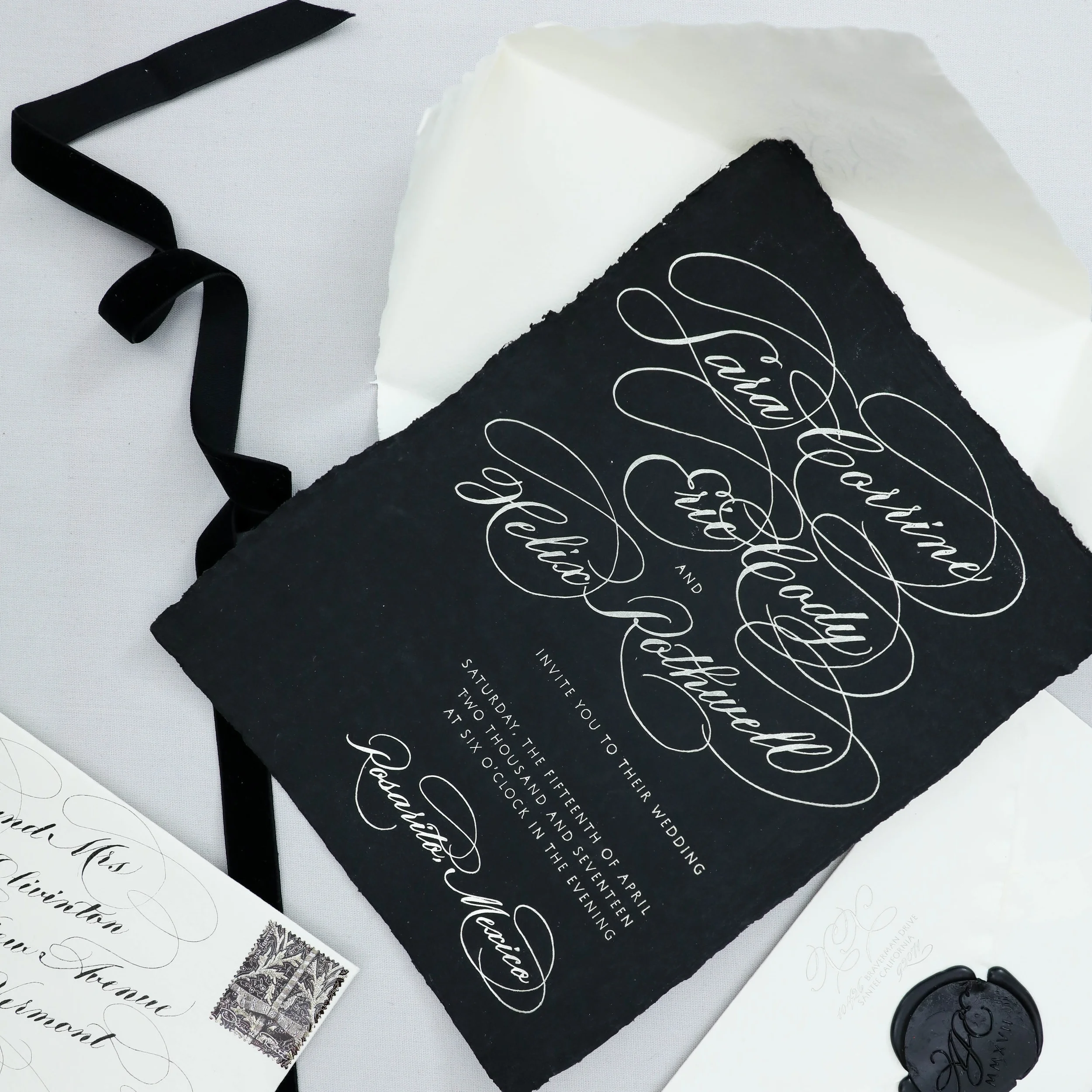
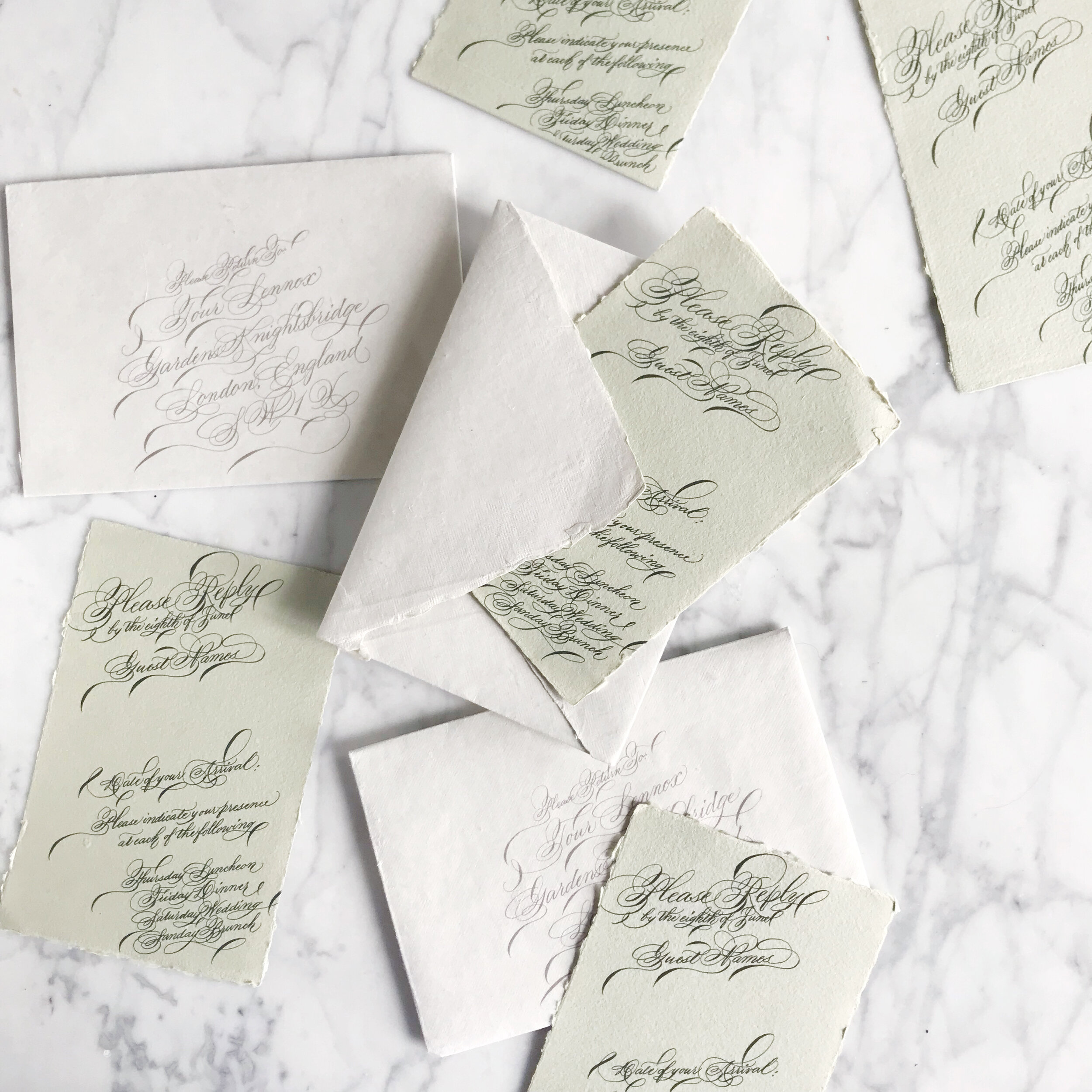
We had an unusual combination of requests from this bride: she wanted black, dramatic, foil printing, handmade paper, a large scale wax seal, unusual size, and mermaid paper (yes, mermaid paper). Since size and handmade paper are the most difficult, we started there. We collaborated with Owl Post Calligraphy to create a custom order of black handmade paper in 8×11 inches.


We wanted to be able to fold the invitation into thirds, so we paired it with inserts that were long and thin to fit inside the folded invitation. We choose a long envelope that opened with a flap rather than on the end of a #10 envelope.

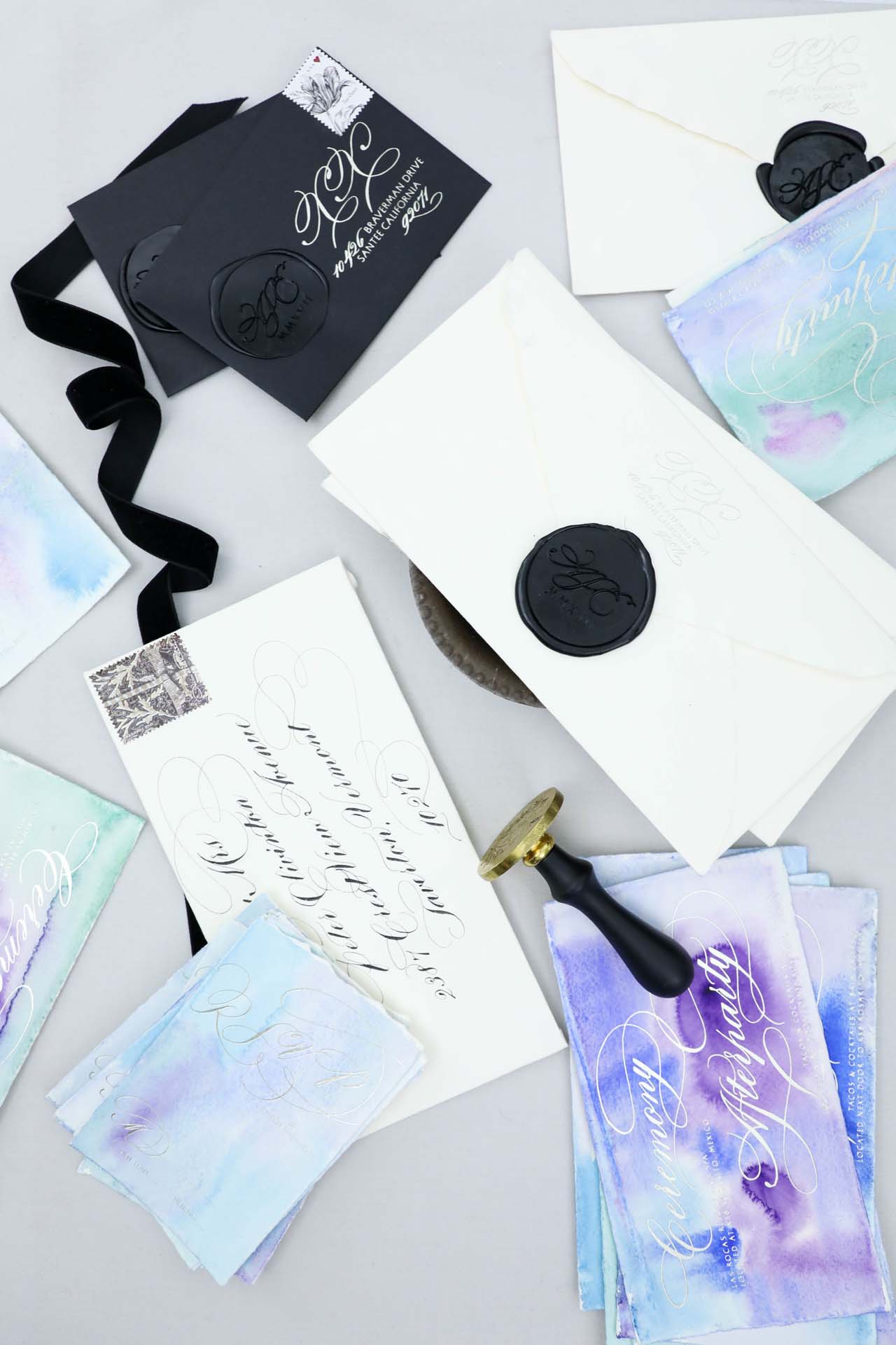


The mailing envelopes were a gorgeous handmade paper from Spain with a lacy and delicate deckled edge, while the reply envelope was a deep matte black.The wording on the invitation was also unusual. The wedding was hosted by the bride, groom and their son, whose names are listed together as a family. The additional inserts were all hand painted with watercolor in shades of blues, teals, and purples (mermaid colors!) on Italian paper with an extremely soft felt finish and delicate deckled edge. We selected the Italian paper for its cotton content and knowing that it wouldn’t buckle or warp with the watercolor.


We paired an extremely formal and flourished calligraphy style selected by the bride and with a simple sans serif. We then selected a pale silver with a slightly matte finish for the printing. We wanted to be able to use the same printing on all four paper types included in the suite – Spanish and Italian handmade paper, custom black handmade paper and the flat black envelope.
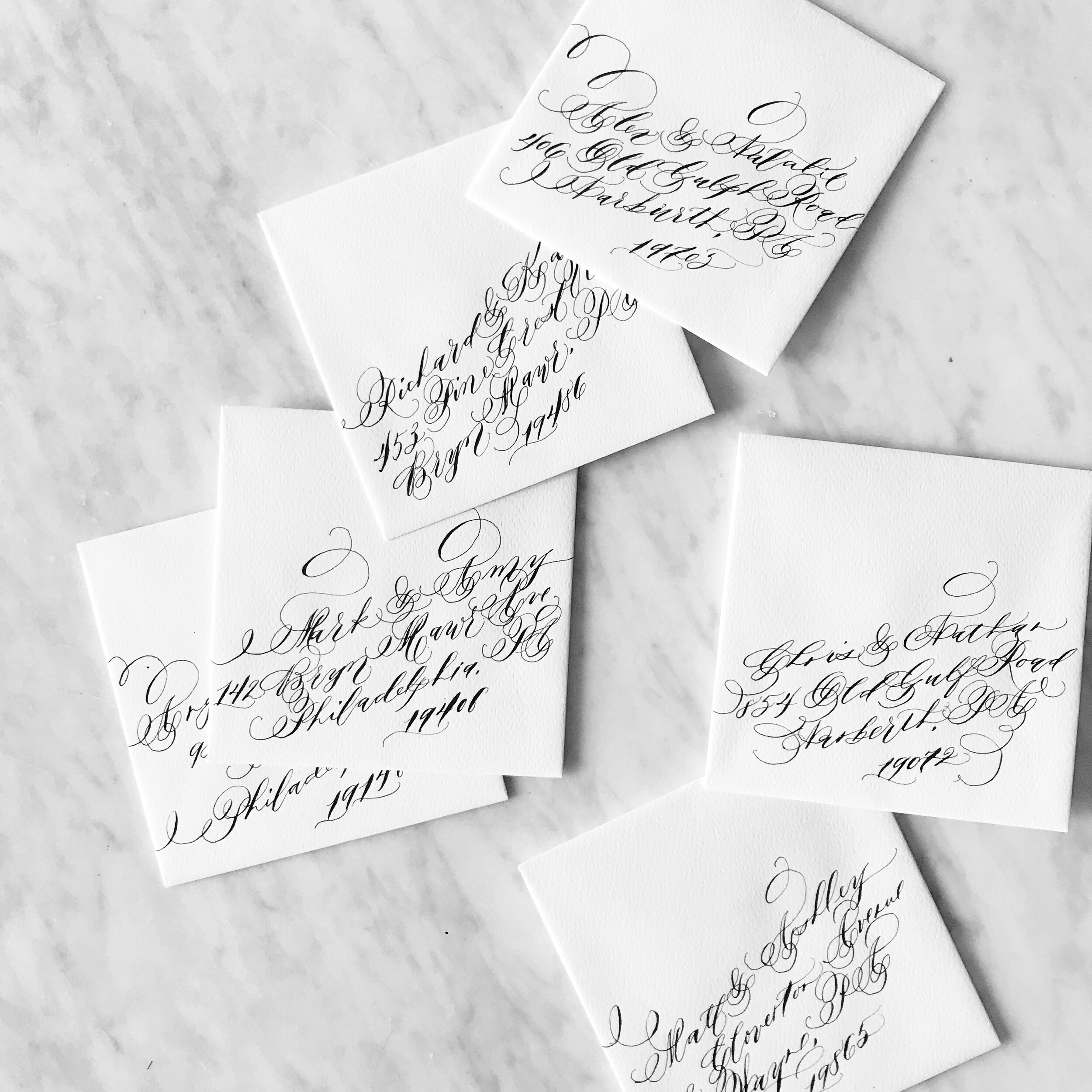
We created a logo for the couple of XX representing the day they decided to become a family. The XX logo was featured on the 2” wax seal as well as the return address and reply card envelope. The entire suite was folded and tucked inside the gorgeous, ivory Spanish paper envelope and addressed in matching formal calligraphy. We choose Oscar de la Renta postage with two stamps per envelope.
See the whole post here!!!
Design House Prep School

Semester IV course lineup announcement
We will be announcing next semester's courses next week! For current students, you can we'll be announcing via Facebook live on Monday, January 22 at 9am. We'll be announcing the courses throughout the rest of the day on instagram on our blogs!
If you haven't joined us as a student yet, Design House Prep School is an online business school geared towards creatives. We add new courses each semester covering both creative and business side of being a creative entrepreneur. Join us at Design House Prep School to get your creative business on the track for success!
Real Wedding | Kristen & Sean

Kristen & Sean
A gorgeous destination wedding on the sands of Portugal....
It was our pleasure to create this simple, moody suite for Kristen and Sean's wedding at Areias Do Seixo in A Dos Cunhados, Portugal. Evoke did an absolutely gorgeous job designing the intimate wedding and Kristen's beautiful pale blue gown was a perfect fit for their destination wedding.


Real Wedding | Annie & Matt
It is such a pleasure to work with a bride who's response to just about everything is, "sure! whatever you think will look amazing!"
Annie was a dream client from day one - she knew what she was looking for and was able to described her vision and communicate what she liked. Throughout the planning process, I would present her with ideas (hey, what do you think about doing your place cards so they ombre from the A's to the Z's?) and she trusted my judgement to make it happen. Her wedding to her amazing husband, Matt, was a day made of sunshine and smiles with a to-die-for view!

Annie & Matt
A gorgeous view, intimate wedding and cozy atmosphere.


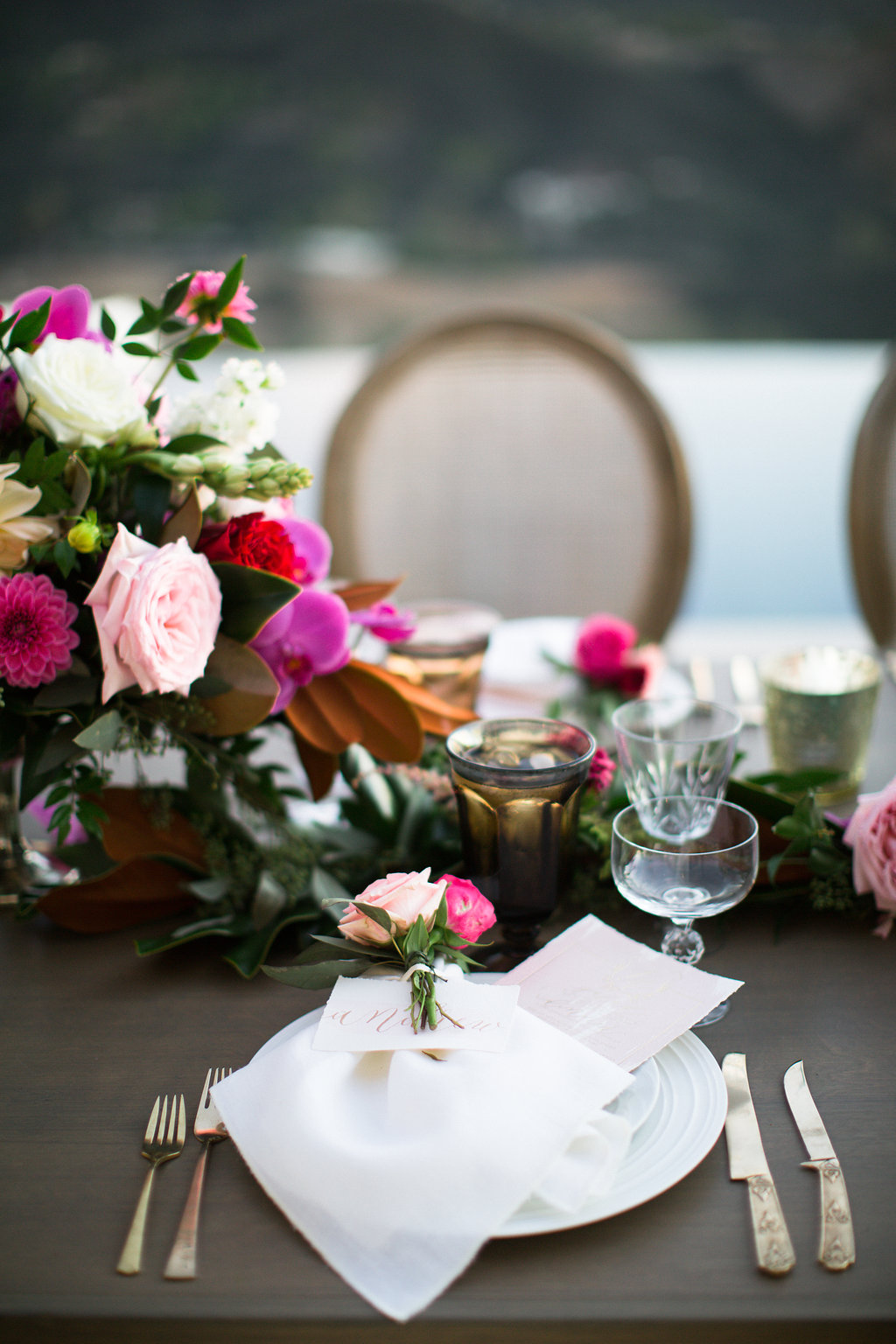
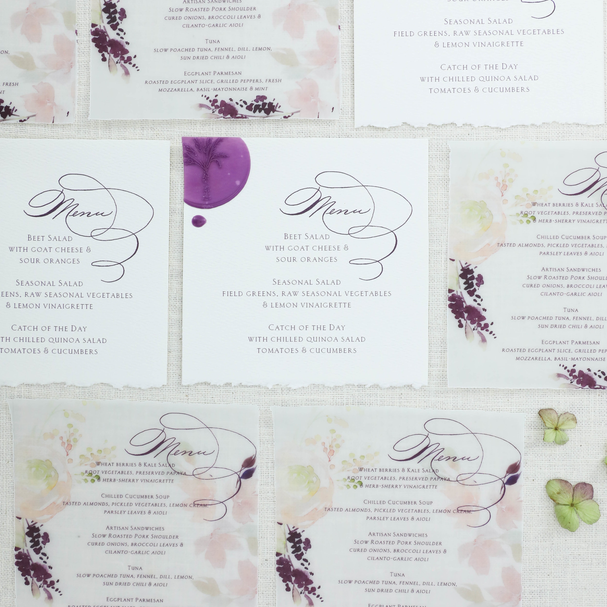
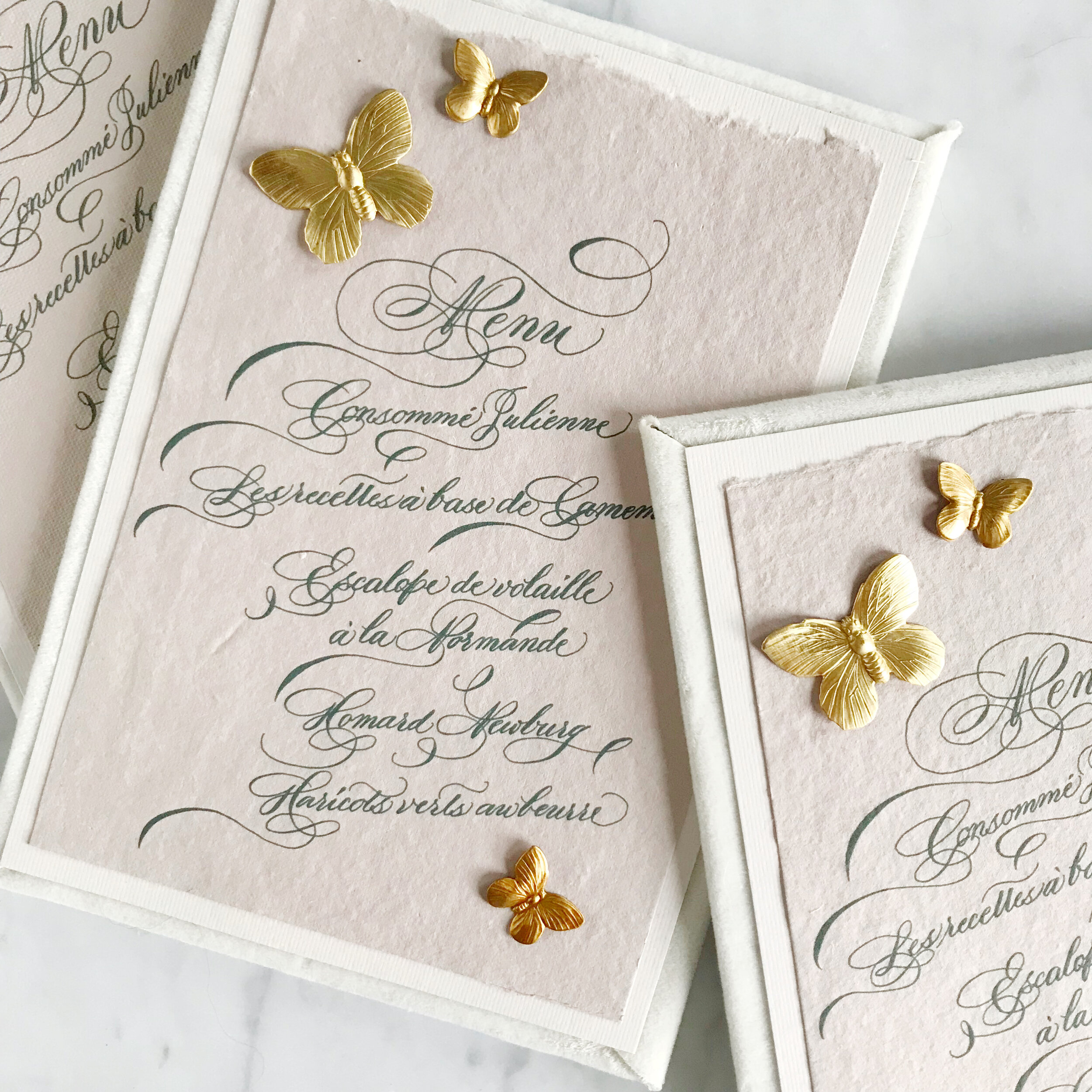
Together, Annie and I created her reception pieces, using taupe pink watercolor and gold foil and calligraphy. Her menus were each hand water colored and deckled with her menu details printed in gold foil. Each menu was just the slightest bit different, and lined up on the table those details were noted by guests. Her place cards were also all hand watercolored, with the guests names in dark pink to white calligraphy. All the place cards were then arranged on a bed of flowers. Each of her table numbers followed the same theme of watercolor topped with gold calligraphy.


Bespoke | Laura

Laura & Ellis
shades of indigo, velvet, monochromatic, elegant, fall wedding

the tri-fold save the date folded into a thin, velum envelope so the artwork could be seen inside. custom postage completed the save the date envelopes.

the invitation suite was kept simple on the fronts of the pieces with indigo monochromatic artwork gracing the reverse of each piece. The suite included a save the date, invitation, reply card, reception card and dress code card. The reply envelope and save the date envelopes were both a thin, transparent velum.


We paired the suite with a thin piece of velum, printed with the moody artwork suite to bring in the dark, winter reds and berries.


Custom postage and artwork printed envelope liners completed the suite. We created the postage from the two artwork suites we used throughout the design.
Bespoke | Kaitlin

Kaitlin & Ryan
an elegant and refined affair, with romantic touches and personalized details.


We lined the envelopes with custom liners featuring an illustration of the chapel the couple would be married in. Each envelope was sealed with a custom wax seal with the bride and groom's new combined monogram in gold wax.


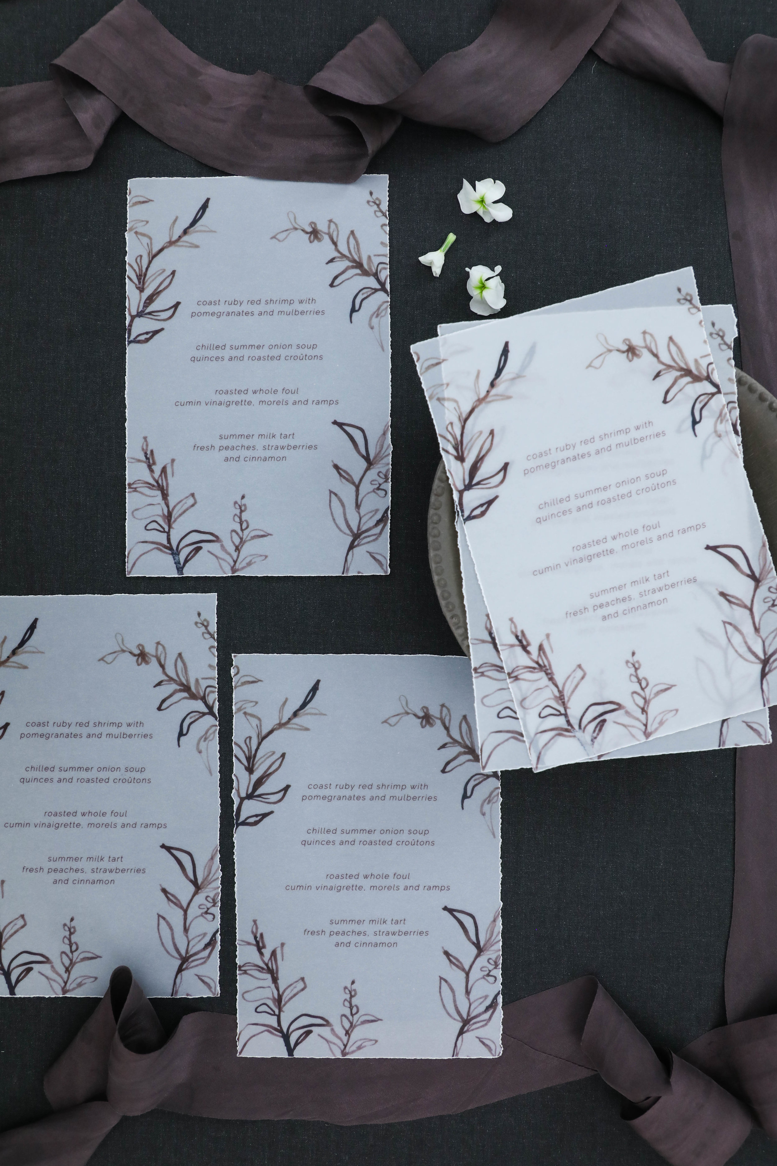
Bespoke | Kiersten & Matt

Kiersten & Matthew
dark and moody, with elegance and romance - a perfect combination for a snowy winter wedding.


original artwork beside finished printed pieces

We kept the invitation fairly simple with a line botanical laurel and a modern calligraphy style.


The additional inserts included the reply card and reception card, both of which we kept very simple and minimal. They both featured the same modern calligraphy and small blooms from the line botanical artwork suite

We paired the suite with a thin piece of velum, printed with the moody artwork suite to bring in the dark, winter reds and berries.


Custom postage and artwork printed envelope liners completed the suite. We created the postage from the two artwork suites we used throughout the design. The three envelope liners (save the date, mailing envelope, reply card envelope) featured the two main artwork suites as well as a contemporary landscape scene created to reflect the bride's childhood home.
12 Days of Christmas - Day 12

15% off
ALL WEDDING STATIONERY ORDERS
Because we wouldn't want our stationery clients to be left out this holiday season, we are offering 15% OFF ALL WEDDING STATIONERY ORDERS if you send in your inquiry TODAY.
That means, any inquiry received today, December 24, that continues on to an eventual contract will be eligible for a 15% discount on their full invitation or save the date order.
Design House of Moira prides itself on creating beautiful, heirloom quality, one of a kind suites of wedding stationery, with every piece tailored to your personality and style. If you or someone you know will be planning an upcoming wedding soon, send us an inquiry at the contact page to see if we would be the right fit for you!