Spring Wedding Invitation Inspiration
The spring season is all about the emergence from winter, flowers blooming, and the world exploding into color. A spring wedding, regardless of venue and locale, can feel the same way!
Pastel florals, delicate blooms, pale pinks and peaches, all exude the feeling of the season.
So let’s talk about spring invitations, and we’ll start with the spring invitation inspiration in this post!
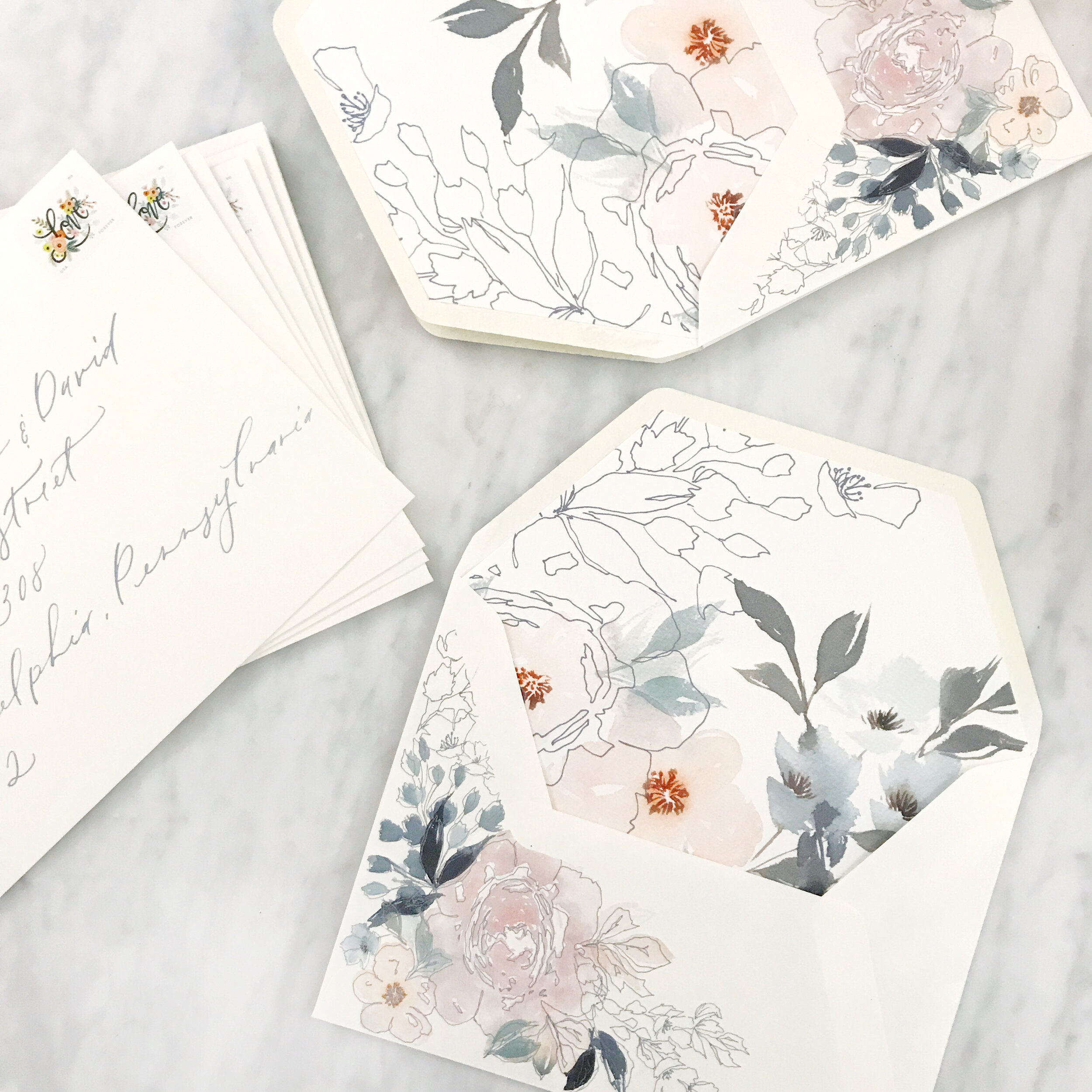
The first image on the left above features pastel pinks and blushes, pale blues, muted olive greens, and dark blues. We balanced the watercolor florals with the negative space created by line botanicals on both the custom printed artwork on a warm white envelope as well as the envelope liner. The envelopes were addressed in a pale blue modern calligraphy style that was designed for the client’s suite.
The center image above is one of my personal favorites. It has a different feel than the watercolor artwork suites that have become our signature, but I love the variety of textures that we achieved in mixing papers together. This suite features more traditional artwork, printed in deep rust, rose pink, olive green, and dark and light blues. The paper featured in this suite features warm whites, deep rose, pumpkin orange, pastel blush, and light blue, all handmade paper. The invitation was blind pressed for an overall texture on paper created in India by a female-owned, operated, and staffed company that pays a living wage to all their employees (this is important to us!). The additional paper selections were hand-produced here in the U.S. Handmade paper is such a gorgeous product to work with, but can be a nasty beast to print on (but totally worth it, IMO). Both envelopes were lined in custom envelope liners featuring artwork from the suite, and a pastel blush vellum overall completed the suite.
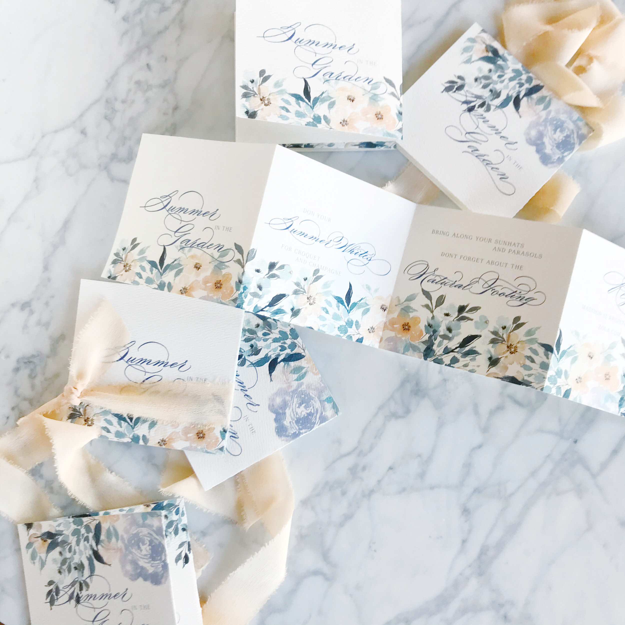
Last but not least in today’s spring invitation inspiration round-up is an accordion-folded save the date on a gorgeous warm white paper with a subtle overall texture. The florals for this suite are built around peach, lavender, pale blues, and muted olive greens. We went with traditional calligraphy with lots of flourishes for this suite. We easily could have brought in a more modern style to create a more playful overall look and feel, but selected the formal to reflect the level of formality of the overall event. The peach spring save the date was tied together with a gorgeous peach silk chiffon ribbon.
It amazes me that these suites are basically all featuring the same color palette (which I only realized as I was typing this and noticed that I had typed the same colors in all three projects!). It shows how different each bride is in how they see their day and how we work with them to develop a design unique to them!


