Posts tagged rose wedding invitation
Gold Gilded & Embossed Invitation

elegant | regal | Gold | old-world | dramatic

an invitation suite for a wedding at:

the beekman hotel | new york, new york


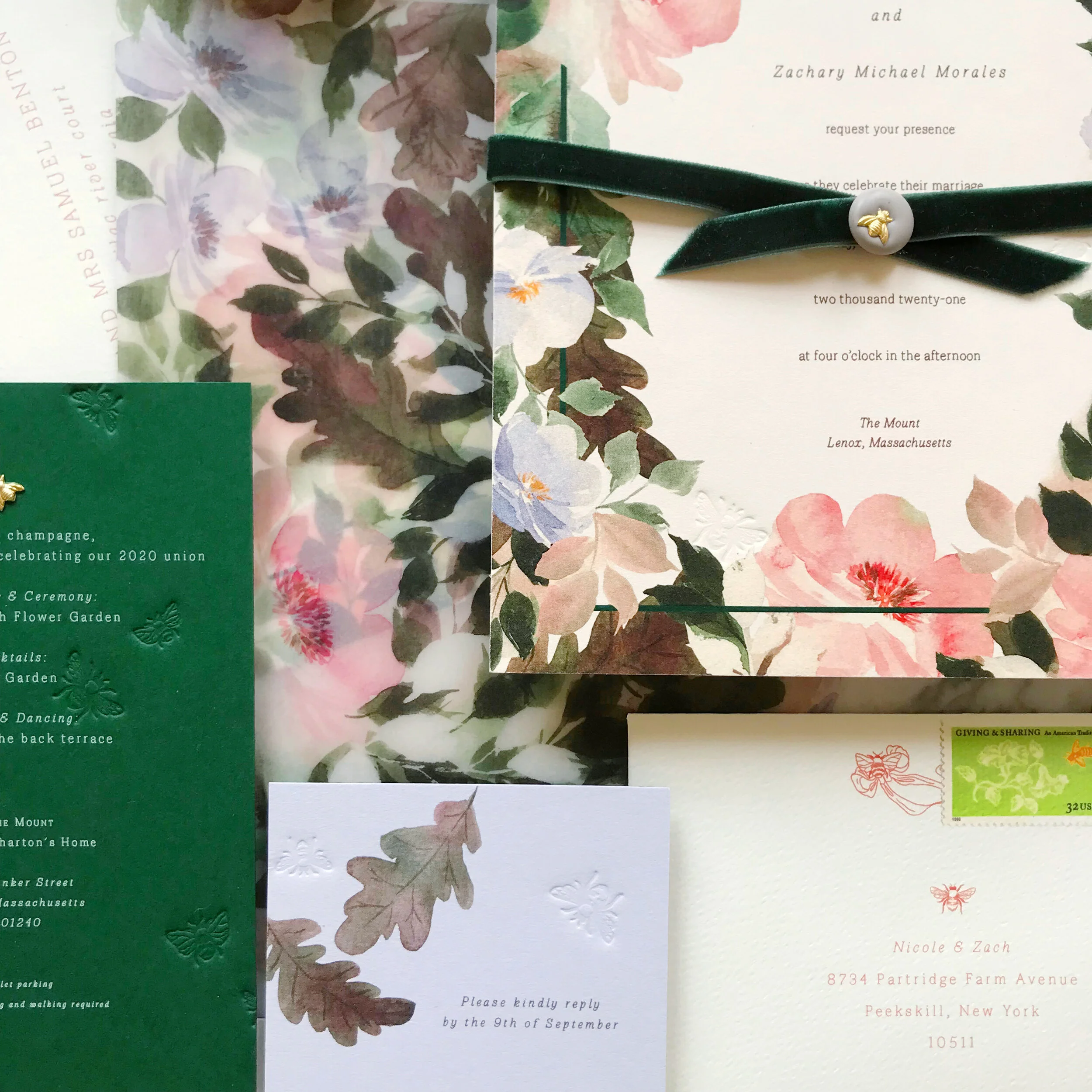
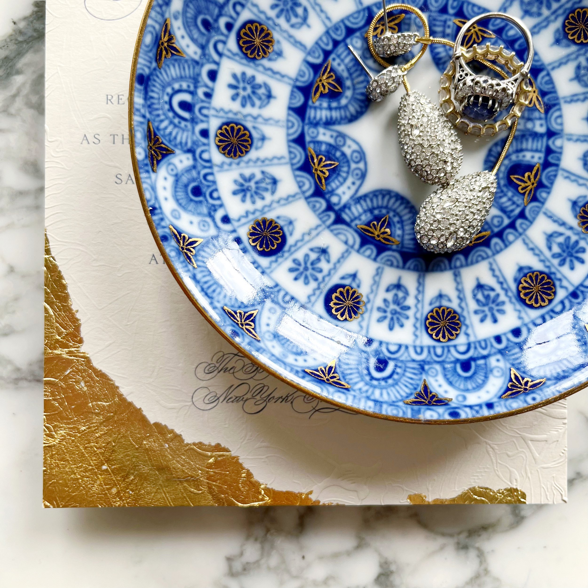
We used so many details of the Beekman Hotel as we played with design ideas for Yara. She knew she wanted bits of gold and embossing, and we wanted to pull color inspiration from her beautiful sapphire engagement ring. We also wanted to echo some of the overall textures and feelings of the hotel, like the dark moody lighting and all the velvet upholstery.

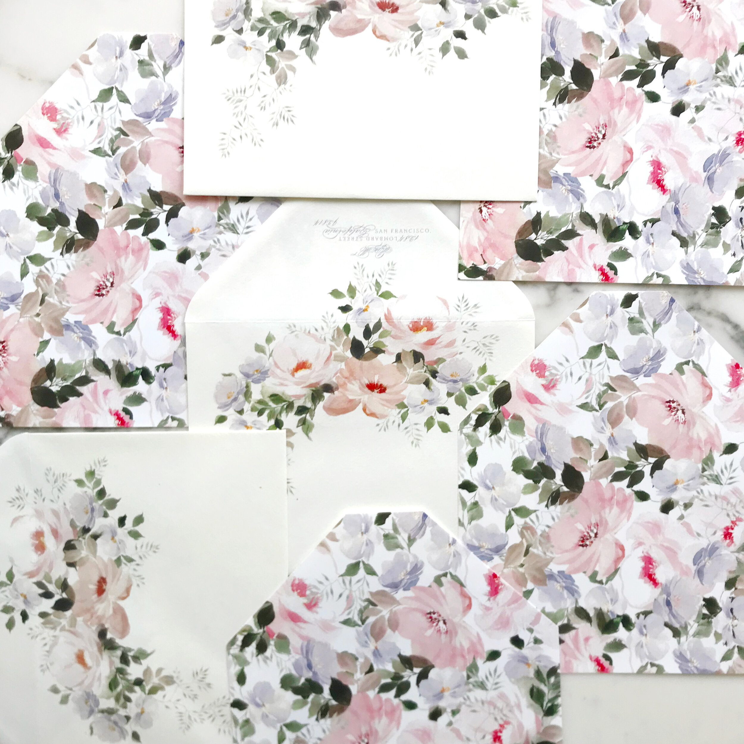
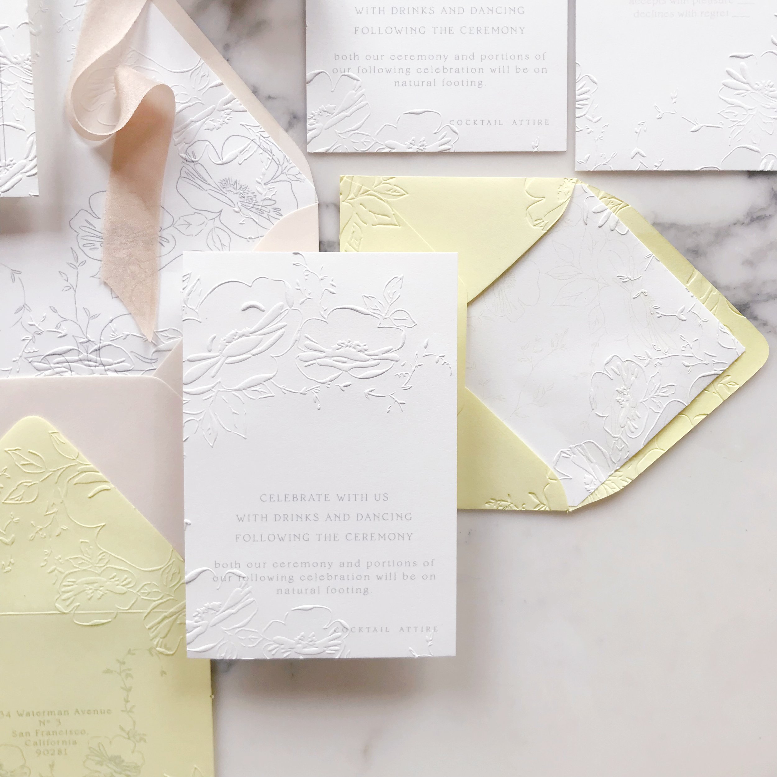
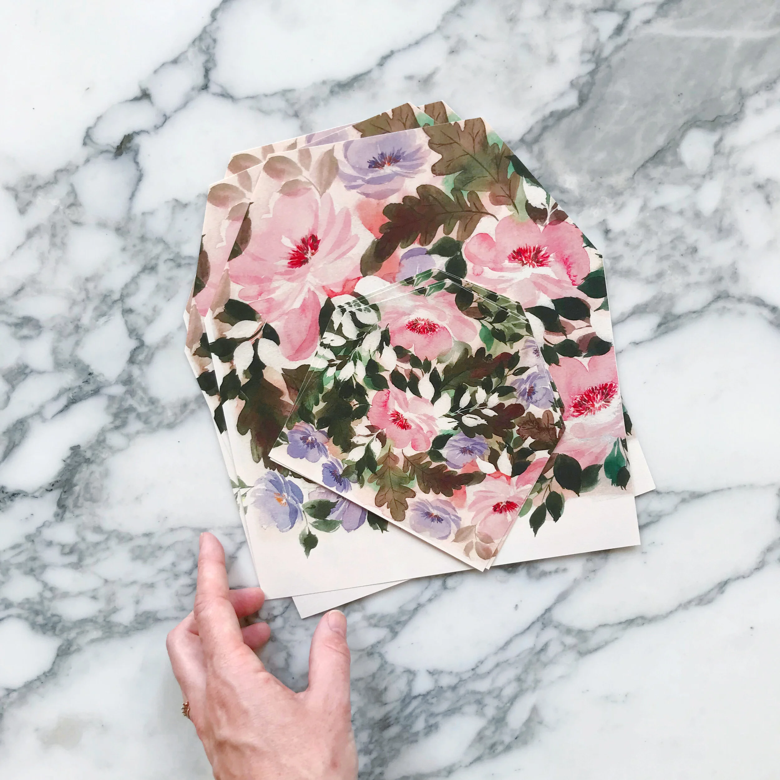
We also selected not to go with all white paper, instead, we selected a warm white and a taupe.

Our bride was looking for old-world drama, and I think we delivered!

She had seen so many examples of “old-world” invitations that were pale and beautiful, but hardly any that were dark and moody, like the hotel that was hosting their nuptials.

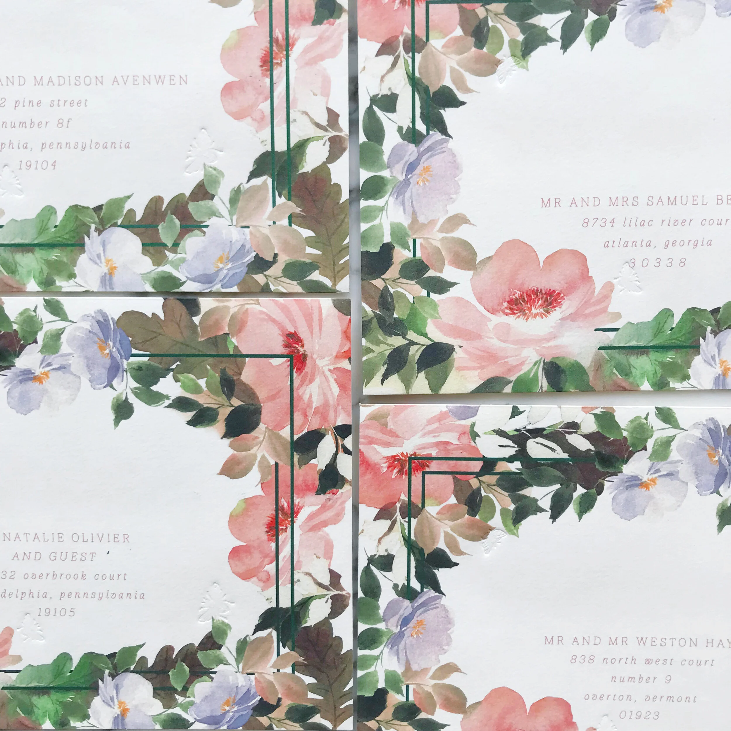
Each piece of the suite had gold gilding applied by hand. The invitation had the most dramatic gilding, followed by the reception card. Our additional insert card just had touches of gold around the edges.

We always want each piece to feel unique and not like a cookie-cutter of the other pieces in the suite. but have their own personality!

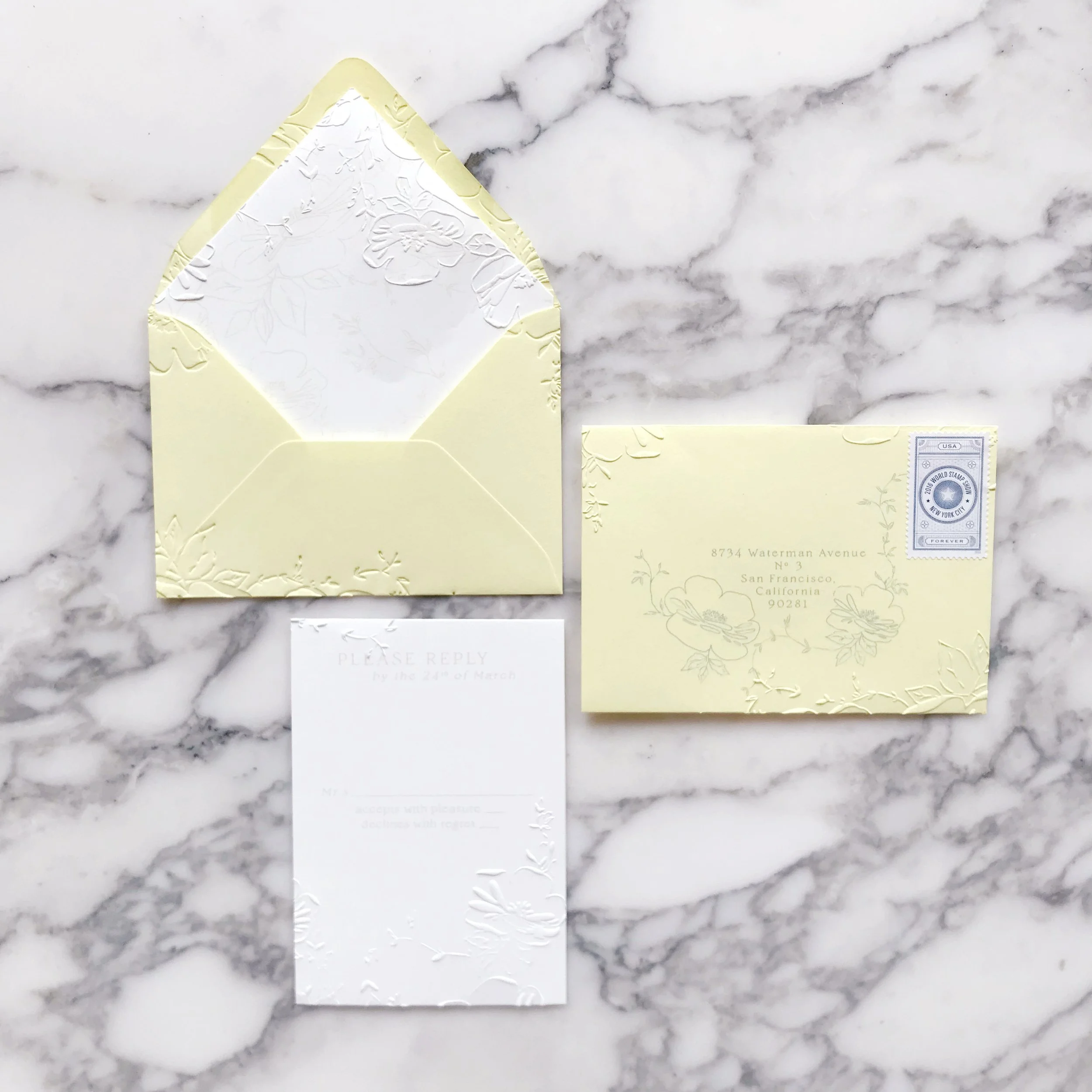
The taupe mailing envelopes also had gilded detail rounding the return address, as well as gilded details on the deep sapphire blue wax seals.


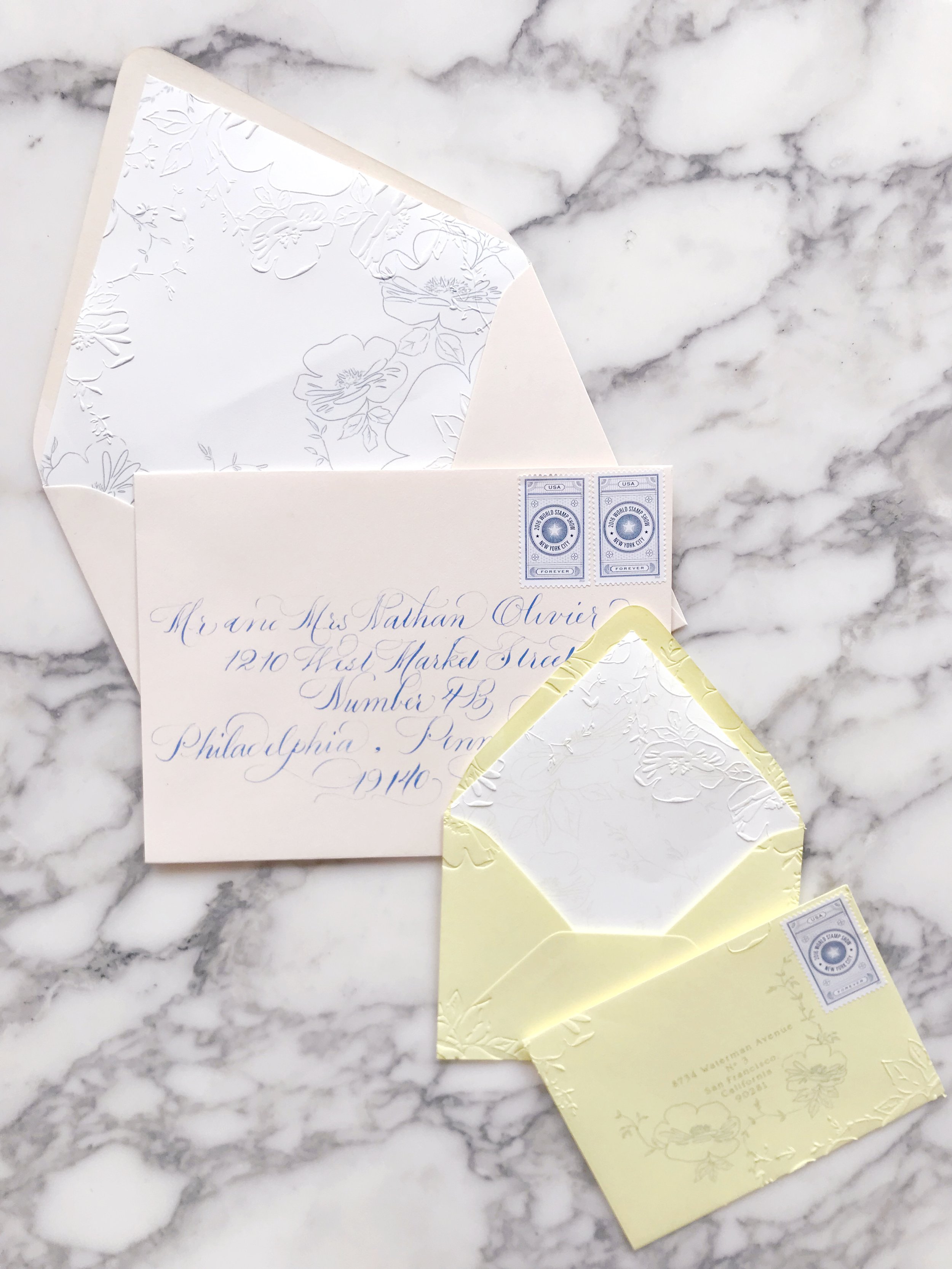
Another high-impact moment is the reply envelope. Fully embossed and lined with gold gilding, it’s a dramatic piece with so much texture and wow factor! The fronts of each reply envelope also featured a bit of old-world magic with tiny pieces of gilding.


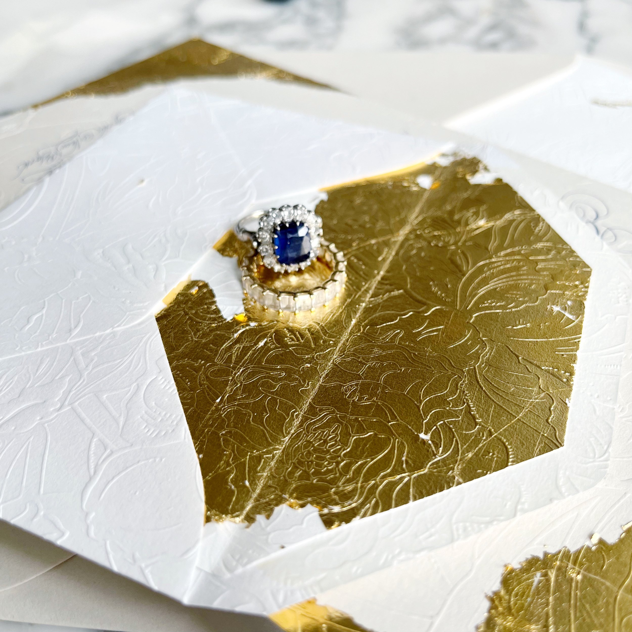
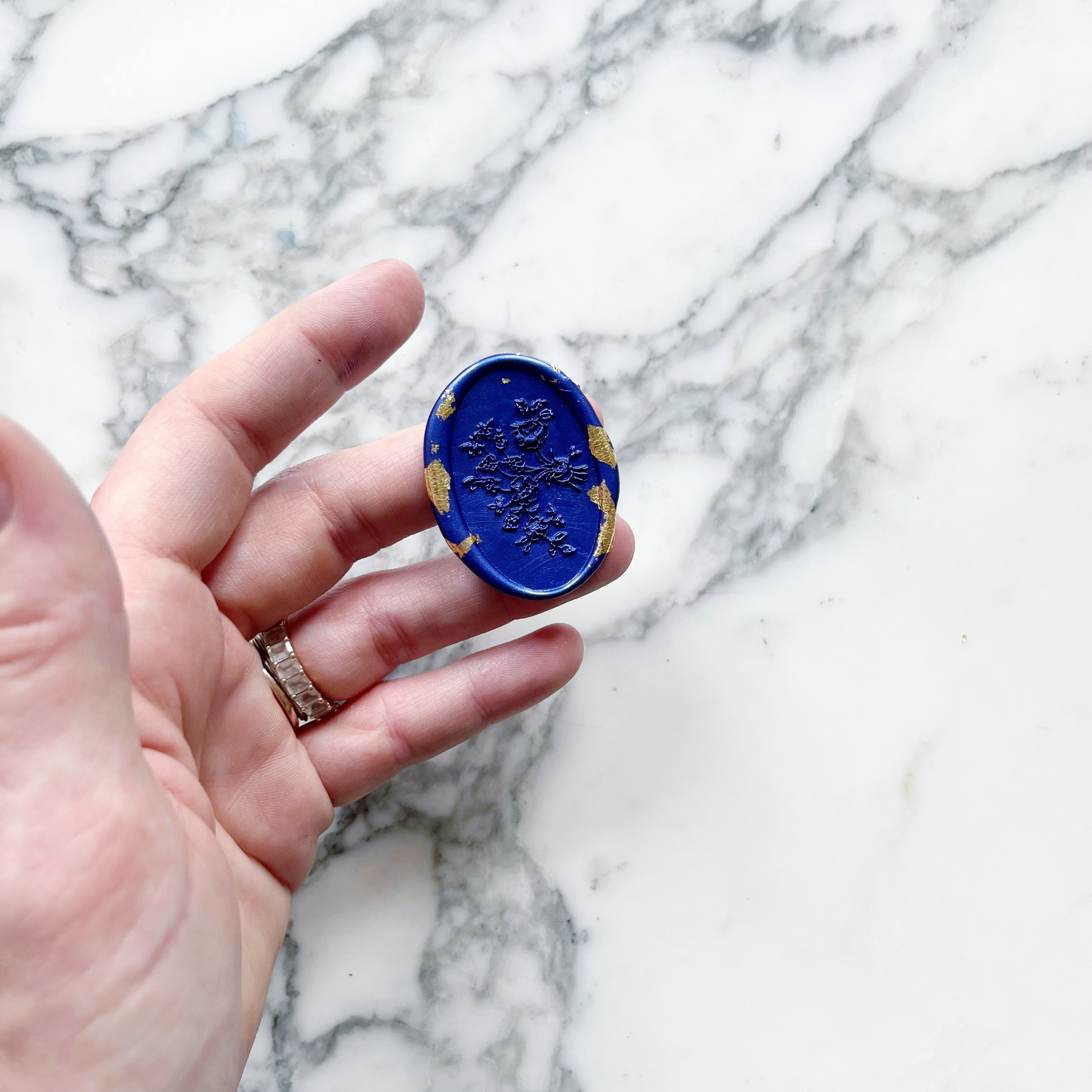
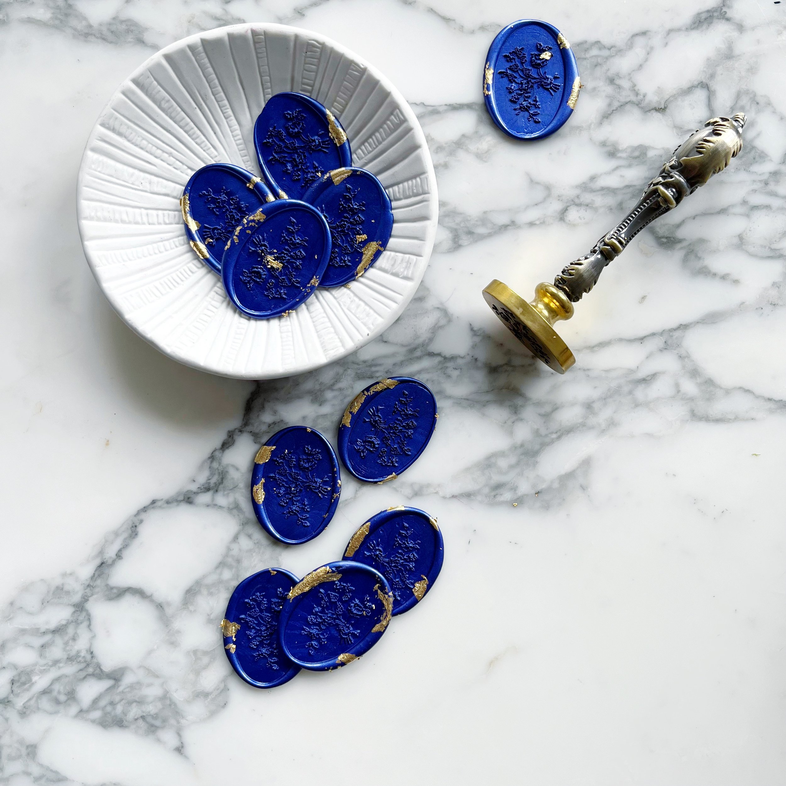
The oval floral wax seals we designed for Yara’s suite also had bits and pieces of gilding in the sapphire blue wax. We used the wax seals to hold closed our taupe mailing envelopes.


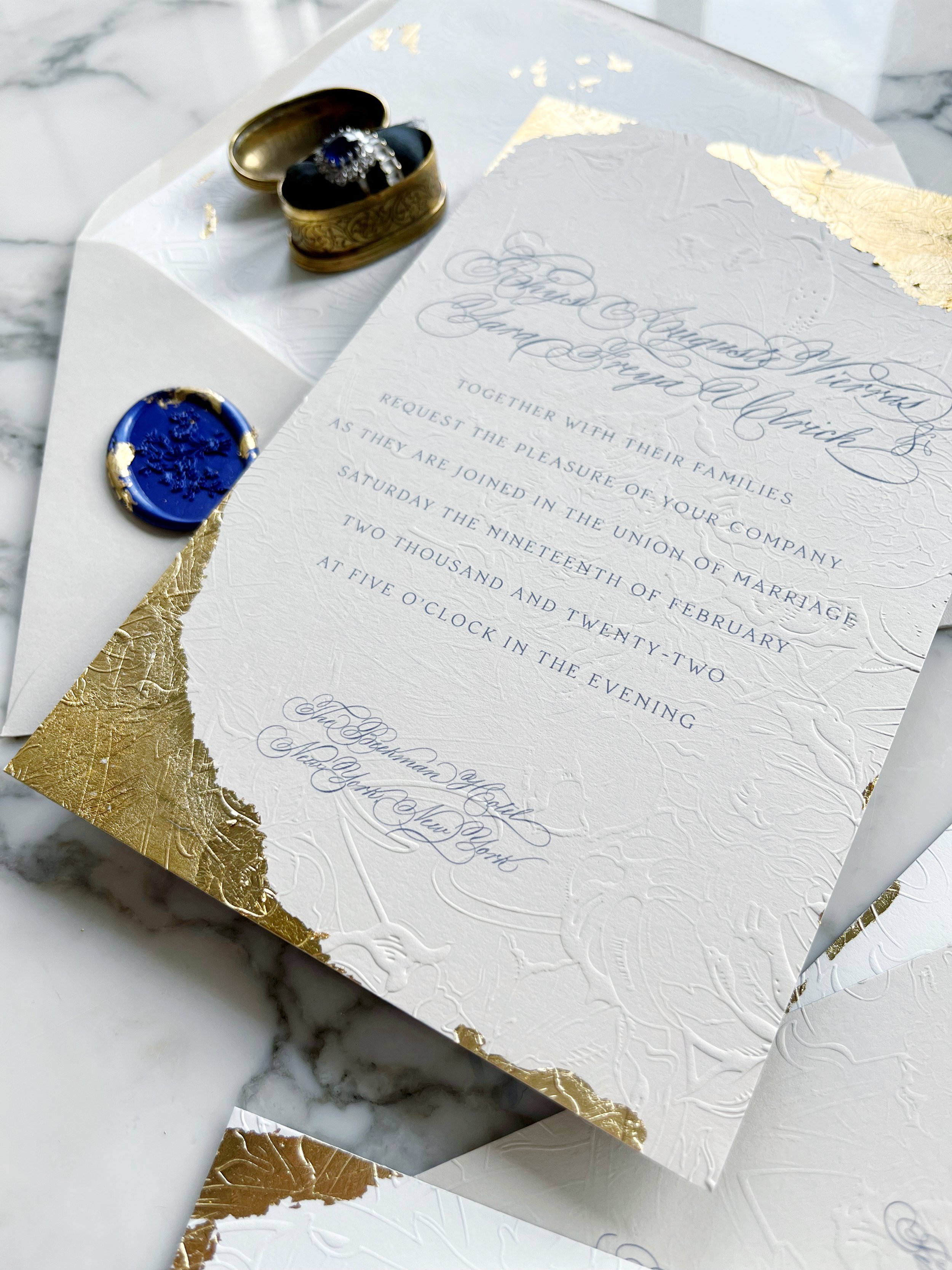
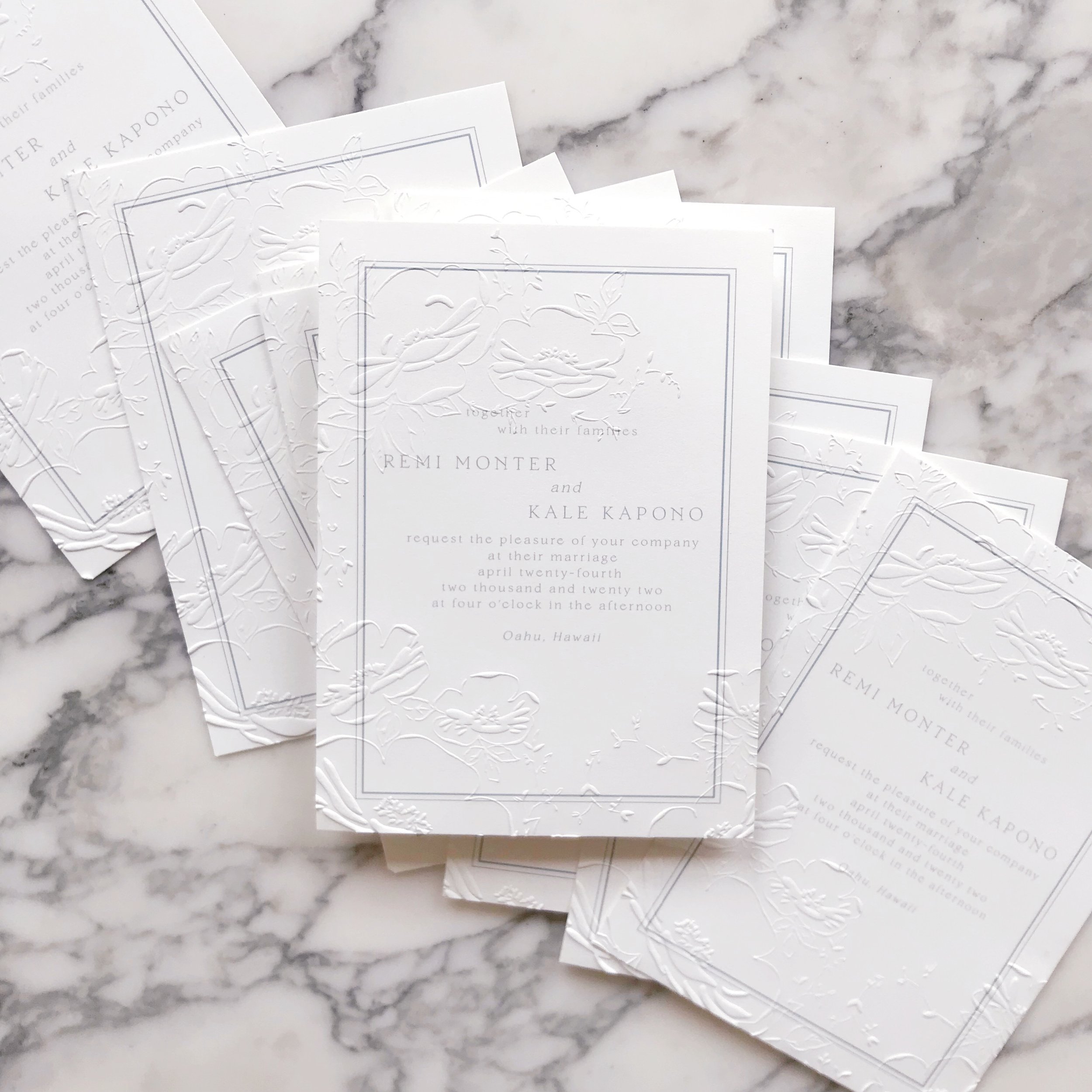
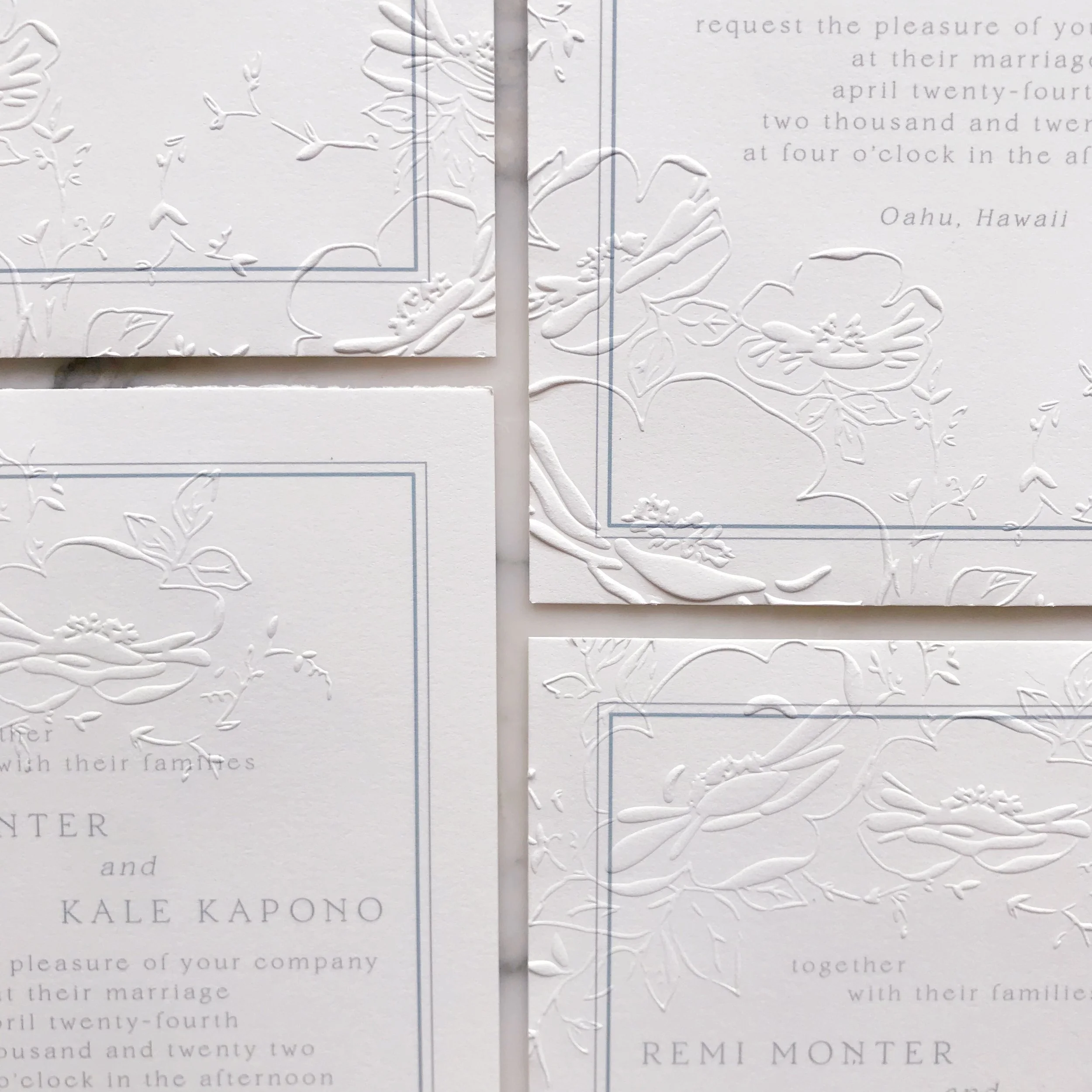
The embossing is definitely the highlight of the suite with the embossed pattern covering several of the pieces. The tactile experience and visual beauty are like nothing else! These invitations were designed to truly set the mood for Yara and Rhys’ wedding!

 
Winter Garden Roses

romantic | fluttery | soft

an invitation suite for a wedding at:

beaulieu gardens | Rutherford, california


The bride always had her heart set on an outdoor garden wedding, but after their nuptials had been postponed several times and a date opened up at their favorite museum, Laura and Zac jumped on it.

Our goal was to create a garden-style floral invitation suite for Laura while keeping it on the more modern side to fit with the style of the Museum of Contemporary art.


Our overall design element was the pattern that we created for Laura and Zac’s suite. Comprised of all the garden flowers she loved, including roses and jasmine vines, we selected a pale grey lavender for the florals.

We applied different styles of the pattern to each piece within their invitation suite, creating interest and a unique feel to each card and envelope.


Naturally, the envelope liners matched the overall suite with a similar pattern.


Pastel & Embossed Destination Wedding

Pastel | Textured | Modern Romance

an invitation suite for a wedding at:

Private Residence, Oahu, Hawaii


Our bride wanted a soft and romantic feel to her wedding invitation suite, incorporating a pale french blue, buttercup yellow, and blush.

She also knew that she loved the embossed texture we’ve been showing a lot of lately, but wanted to create more negative space with hers.


We chose two main methods for elevating the overall design:

Linen bound folio to house the suite

and

Overall embossed pattern

The linen bound folio in a natural linen color was carried throughout the suite. We backed several pieces in the same linen and layered it into our menus as well.

You know how much we love embossing, so we created an embossing pattern based on the watercolor and embossed everything. Embossing is such an elegant and unusual way to add texture and elevate the overall suite.


We selected a thin silk ribbon in a light bush to tie the whole suite together. Each invitation was tied with a simple bow over the semi-transparent vellum layer with blush roses printed on it.


One of the design elements we wanted to work with was negative space. We do a lot of design work that has an overall embossed pattern, but for this design, we wanted to eco the asymmetry that the bride was using throughout the wedding.

The invitations had negative space in the middle with roses and vines tumbling in a semi-circle around the wording.

We also see the same asymmetrical design work on all the other pieces, my favorite being the reply envelopes.


We used the same asymmetry and negative space on the menus and place cards with bits of the floral pattern and vine work peaking in along the edges of the menu cards.

The place cards were a simple cards with different aspects of the floral embossing on each card, complete with blue calligraphy.

 
Modern Florals in Pale Lavender

Modern | Monochromatic | Floral | Soft

an invitation suite for a wedding at:

The Museum of Contemporary Art - Chicago, Illinois


The bride always had her heart set on an outdoor garden wedding, but after their nuptials had been postponed several times and a date opened up at their favorite museum, Laura and Zac jumped on it.

Our goal was to create a garden-style floral invitation suite for Laura while keeping it on the more modern side to fit with the style of the Museum of Contemporary art.


Our overall design element was the pattern that we created for Laura and Zac’s suite. Comprised of all the garden flowers she loved, including roses and jasmine vines, we selected a pale grey lavender for the florals.

We applied different styles of the pattern to each piece within their invitation suite, creating interest and a unique feel to each card and envelope.


Naturally, the envelope liners matched the overall suite with a similar pattern.


Destination Wedding in Hawaii at The Four Seasons

Tropical | Bright | Elegant | Linen

an invitation suite for a wedding at:

The Four Seasons, Oahu, Hawaii


Bee Fall Rose Garden Wedding Invitation2929.JPG

We wanted to create a bold, tropical pattern that could be used throughout the paper and reception spaces in varying ways. We were aiming for tropical but wanted to create a feeling that was slightly more upscale and elegant alongside the more casual island feel.


We chose two main methods for elevating the overall design:

Linen bound folio to house the suite

and

Overall embossed pattern

The linen bound folio in a natural linen color was carried throughout the suite. We backed several pieces in the same linen and layered it into our menus as well.

You know how much we love embossing, so we created an embossing pattern based on the watercolor and embossed everything. Embossing is such an elegant and unusual way to add texture and elevate the overall suite.


We also had to die-shapes created for this project - one in the shape of the island of Oahu, and one in the shape of the hibiscus flower we used throughout the suite.

The island was used as an insert for the invitation, as well as tags for our welcome bags. The flowers we used everywhere else!


*Hawaii Destination Linen Folio Wedding Invitations35.JPG

Now that we have all our elements laid out, let’s talk about the invitation itself.

Elegant and on the simple side, our invitation was printed with the couple’s crest on top of bright white cotton. The invitation was then backed in a bright pink and the entire piece was embossed with an overall texture, front and back.

We then created our folios, which we shaped line envelopes. The inside of each linen-bound folio was lined in custom-printed mulberry paper to match the suite.

The left hand side held the stack of a reply card and envelope, reception card, and info card, all tied together with seafoam green grosgrain ribbon.


Our finishing details included a second color of vintage grosgrain ribbon, lots of linen, tons of texture, and an invitation that rewards you for interacting with it!

 
Fall Rose Garden Invitation Suite

Moody | Roses | Fall Greens | Velvet | Romantic

an invitation suite for a wedding at:

The Mount, Lenox, Massachusetts


Bee Fall Rose Garden Wedding Invitation2929.JPG

We wanted to create a romantic garden invitation suite without feeling dainty or pale. Our lovely bride, Nicole, wanted a bit of deeper colors and drama in with her more traditional roses. It was a pleasure to help create unexpected moments throughout her suite, including the blind press details and little brass bee apliques for her garden wedding at The Mount in Lenox, Massachusetts


We began our design process with the idea of roses and bees. Once I had a good idea of what artwork I had in mind, I went into devising adorable little additions to her design. We designed her reception cards to be a simple design (to balance out the other artwork heavy pieces) and then added an overall bee impression pattern to bring texture and visual interest to the dark green cards.

Our reply cards were also fairly simple with a couple fall leaves and little bees pressed into the pale purple papers.


Let’s talk about these envelopes. It’s no secret that envelopes are one of my favorite thing to design. They’re difficult to print, require precision and imagination. I also think they are a wildly under-designed space in wedding invitations. Think how naked this overall suite would feel if the only artwork-heavy piece we had was the invitation! I love being able to use simple pieces like the reception card and reply card to keep a balance in the overall suite.

Our envelopes were printed front over to the back flap, creating an entire piece when they opened, while not feeling incomplete when closed. We also pressed a few little bees into the corners for added detail and texture.

For postage, we went with our usual mix of current issue and vintage.


Also in our usual fashion, both our mailing envelopes and reply card envelopes were lined in matching artwork.


Last, but certainly not least, lets talk about the invitation itself.

Printed on pale blush paper, the invitation was designed to be a punch of moody artwork. I wanted layers of design elements, so we started with 300lb paper, printed deep florals, blind pressed little bees, and then added our brass bee appliques amongst the flowers.


We added a few finishing details, including the vellum wrap around our insert cards, the tiny little wax dots with brass bees, and deep green velvet ribbon.

 
Sneek Peek - A Fall Wedding in a Rose Garden
 

Roses | Moody | Fall Greens | Bees | Texture | Velvet

an invitation suite for a wedding at:

the mount | Lenox, massachusetts

_ Bee Fall Rose Garden Wedding Invitation2936.JPG

I love designs that reward you for taking a closer look and this suite is a perfect example of that! The invitation has the tiniest little bees blind pressed (letterpress without ink) into the border of the design. We also see the same pressed bees on the reply card, reception card, and envelopes.

Stay tuned for more details of this design to follow!