Posts tagged fall wedding
Sneek Peek - A Fall Wedding in a Rose Garden
 

Roses | Moody | Fall Greens | Bees | Texture | Velvet

an invitation suite for a wedding at:

the mount | Lenox, massachusetts

_ Bee Fall Rose Garden Wedding Invitation2936.JPG

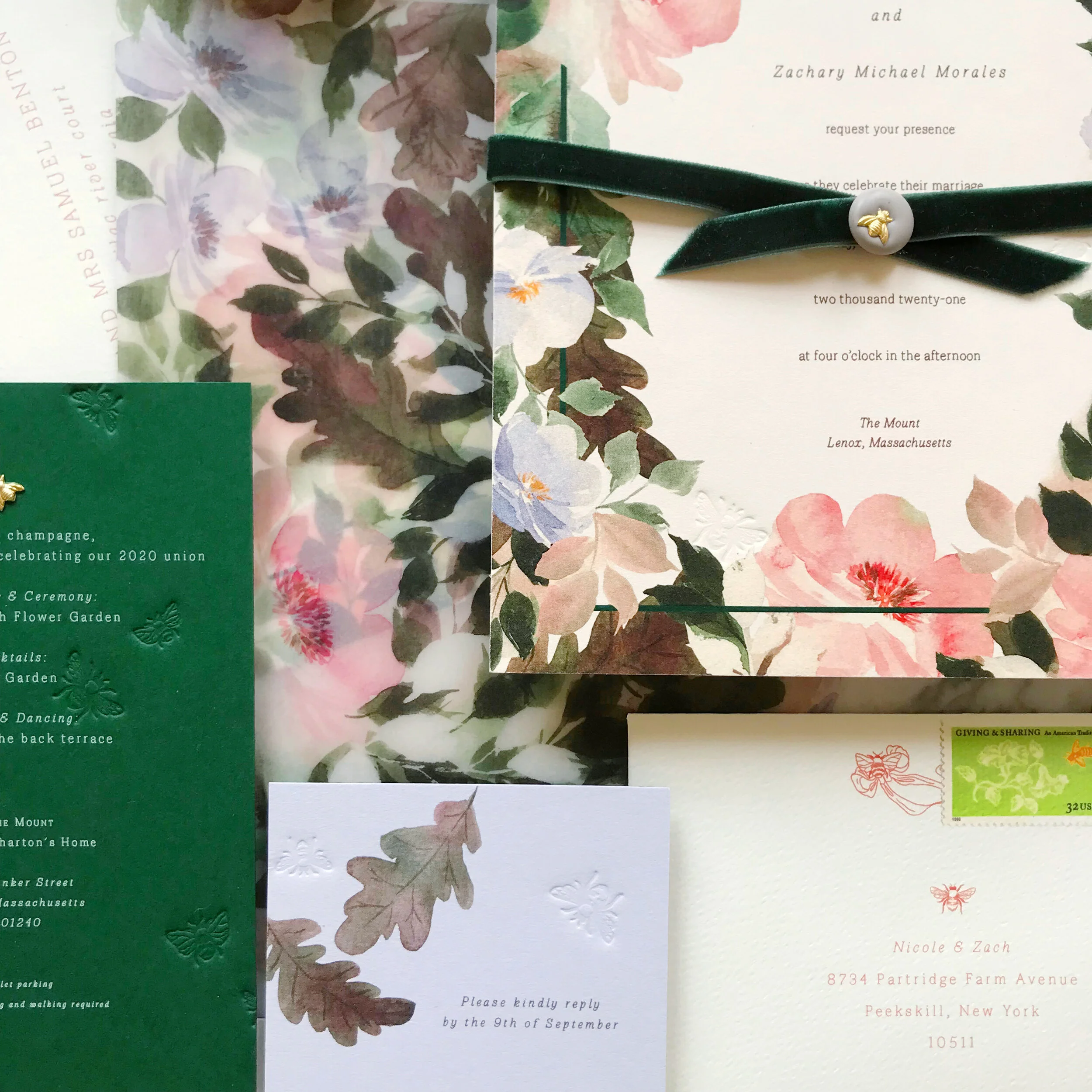
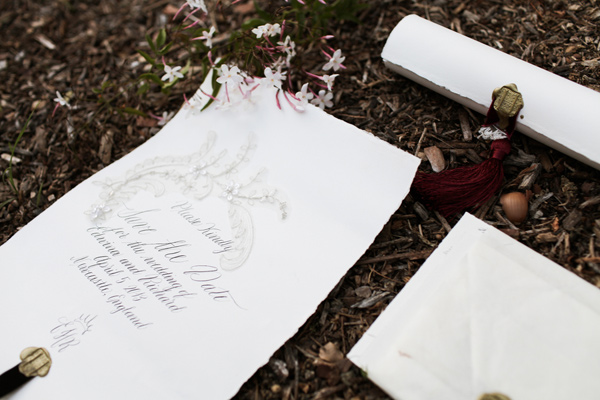
I love designs that reward you for taking a closer look and this suite is a perfect example of that! The invitation has the tiniest little bees blind pressed (letterpress without ink) into the border of the design. We also see the same pressed bees on the reply card, reception card, and envelopes.

Stay tuned for more details of this design to follow!

 
Fall Wedding Invitations for a California Wedding
 

moody | bold | unexpected | texture | fall

an invitation suite for a wedding at:

Whispering Rose Ranch | Solvang California


The Colors

When our brides first approached us, they had a pretty good idea of what they were looking for. They wanted unexpected texture, deep rose colors, a pop of green, and shades of neutrals.

We selected two shades of greens, two shades of rose, and three shades of pale neutrals, including a sage and chartreuse green, a deep rose and a more violet blush, and a range of pale taupes and creams.

We loved the idea of unexpected textures! We have two pieces that were blind pressed (debossed) layered with digital printing on both the reply card envelope and reception card with a pillowy texture. I also really loved pitching the idea of layering cane into the invitation itself, adding an additional pale color as well as some awesome texture.


The Design

We love the artwork suite for this design. We included two pieces of watercolor artwork, as well as some solid artwork for our tone-on-tone design, and line artwork design of two different vintage style bows.

We see the bow design topping the invitations, reception cards, and reply envelopes. We see them again sneaking in on the back of the rehearsal cards and flaps of the reply envelopes.

We loved the variances of heavy and light design work throughout all the cards, like the minimal design on the reply card, to let the green pop and stand out. Meanwhile, we have the brunch card and its heavy floral tone-on-tone border, which I just love.


Our mailing envelopes were also pretty amazing with artwork on the fronts and back. We also see our second piece of artwork on the mailing envelope liner.


Featured | ruffled blog

rustic | spanish | lace | velvet | fall | wine | calligraphy | elegant | formal


photographer: Chris Wojdak Photography

designer: Franchine Ribeau Events

calligraphy & invitations: Moira Design Studio

florals: Il Profumo Dei Fiori

Moira Design Studio | Chris Wojdak Photography