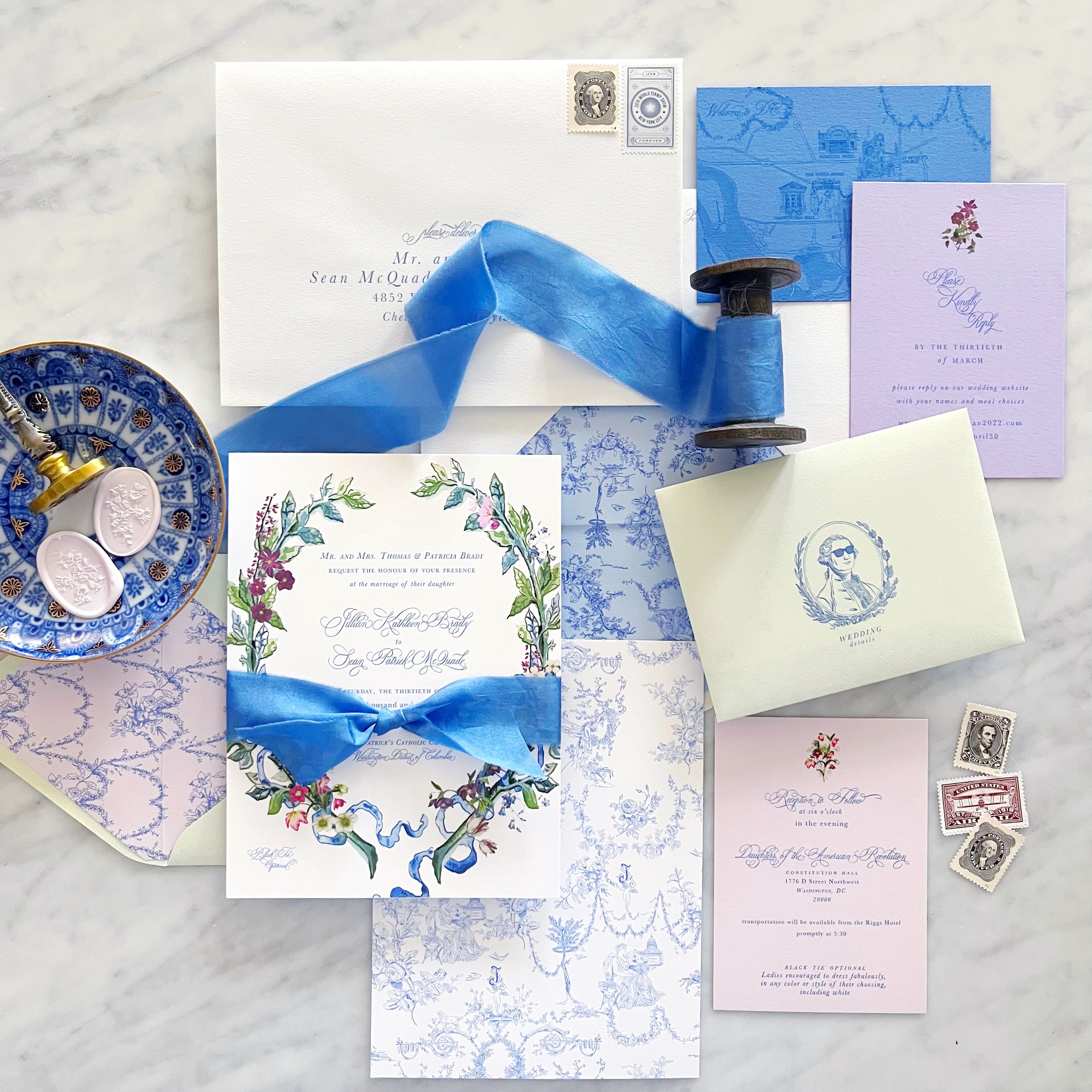
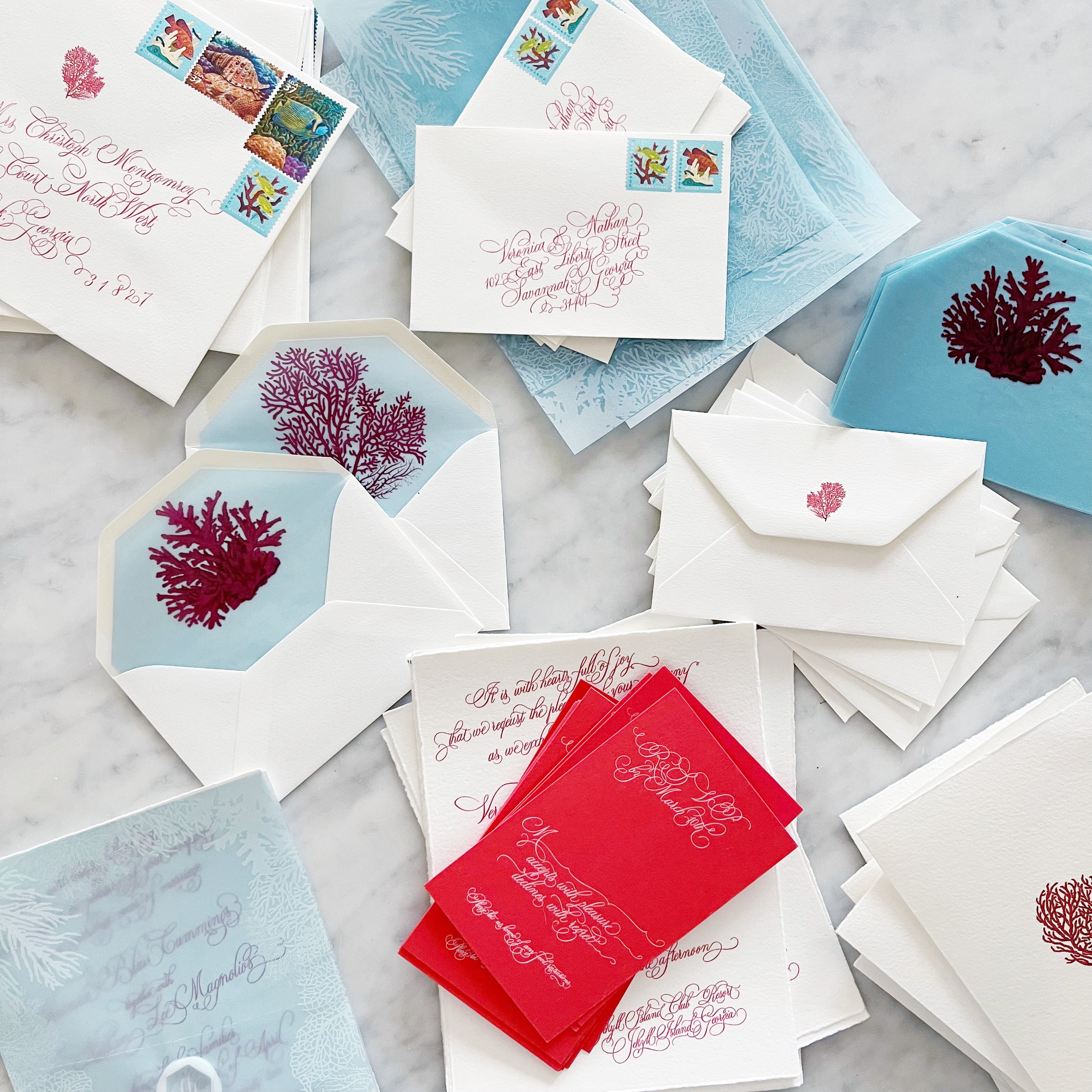
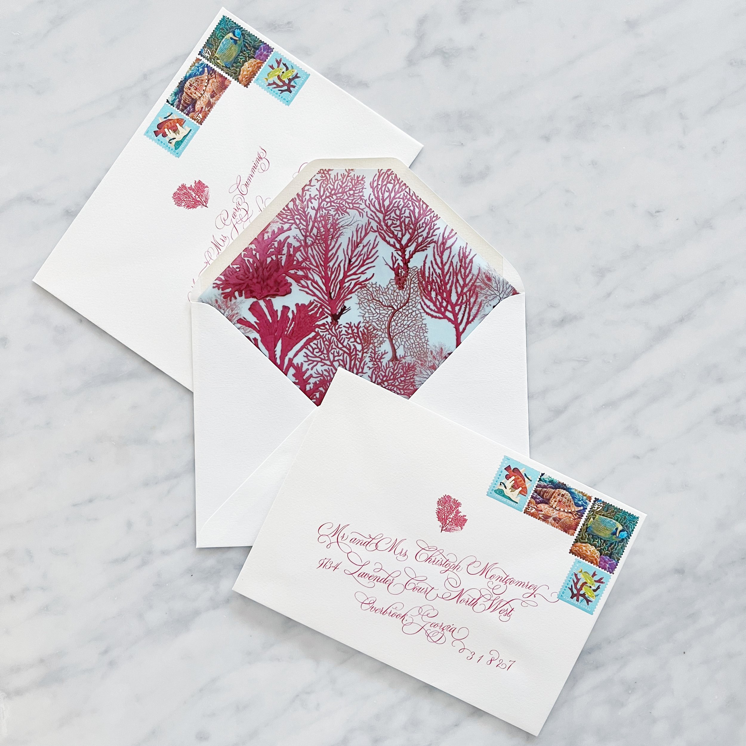
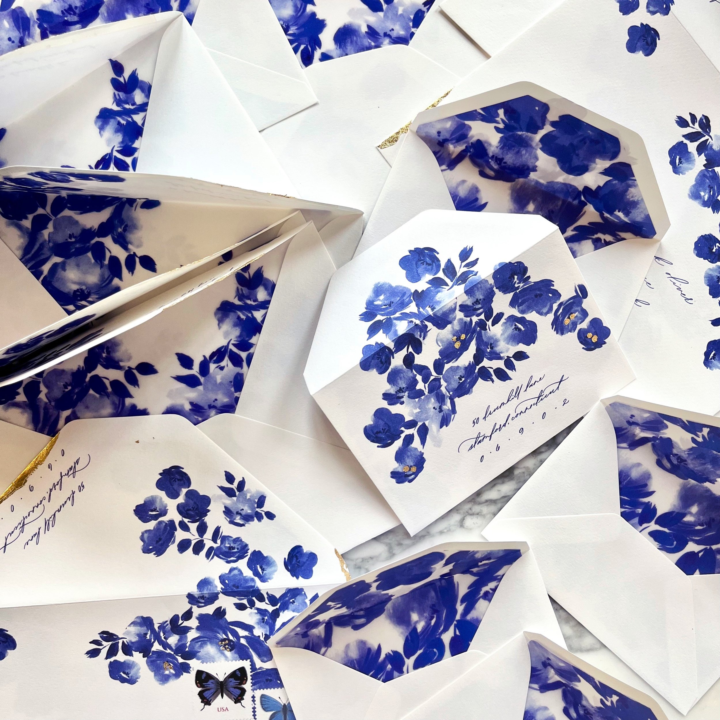
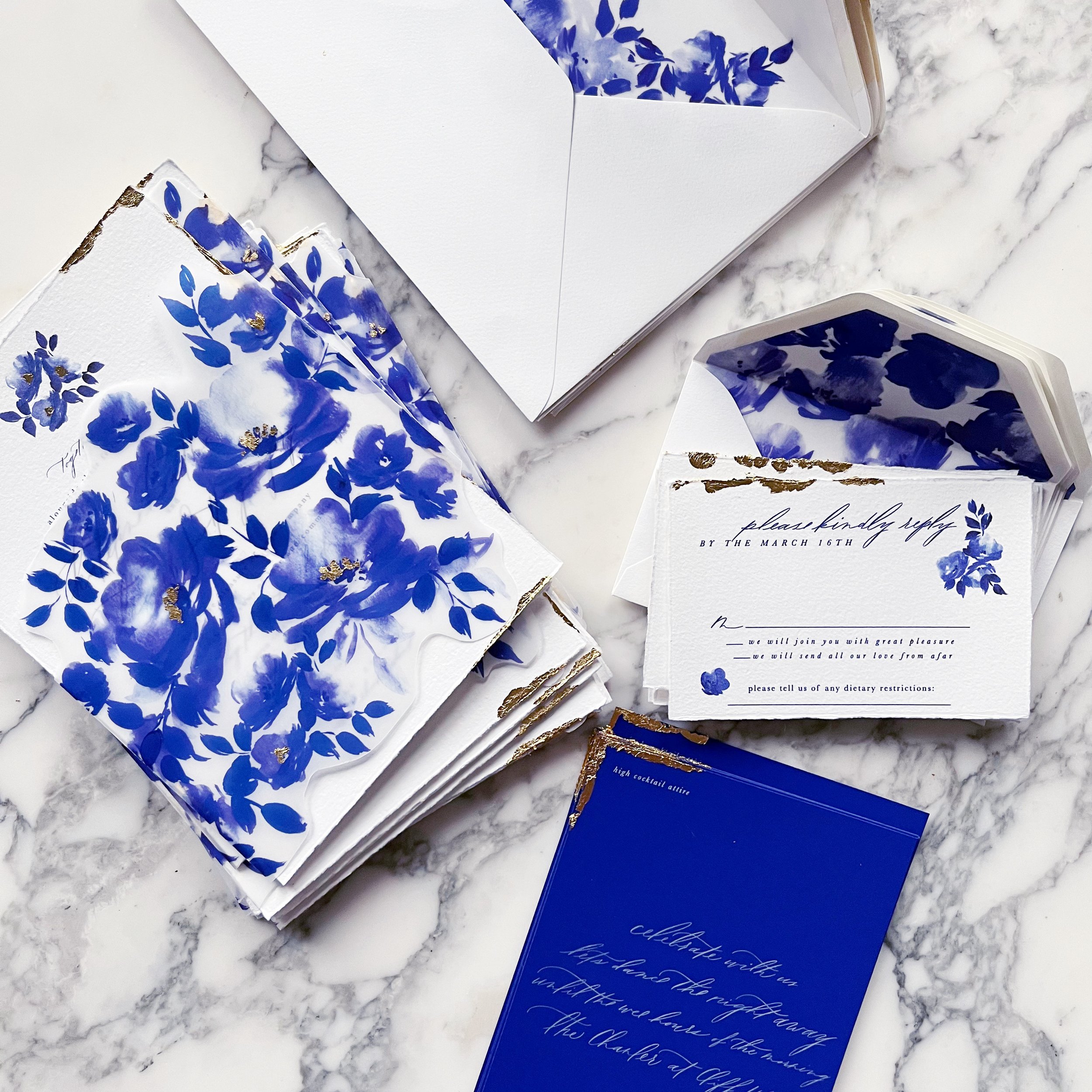
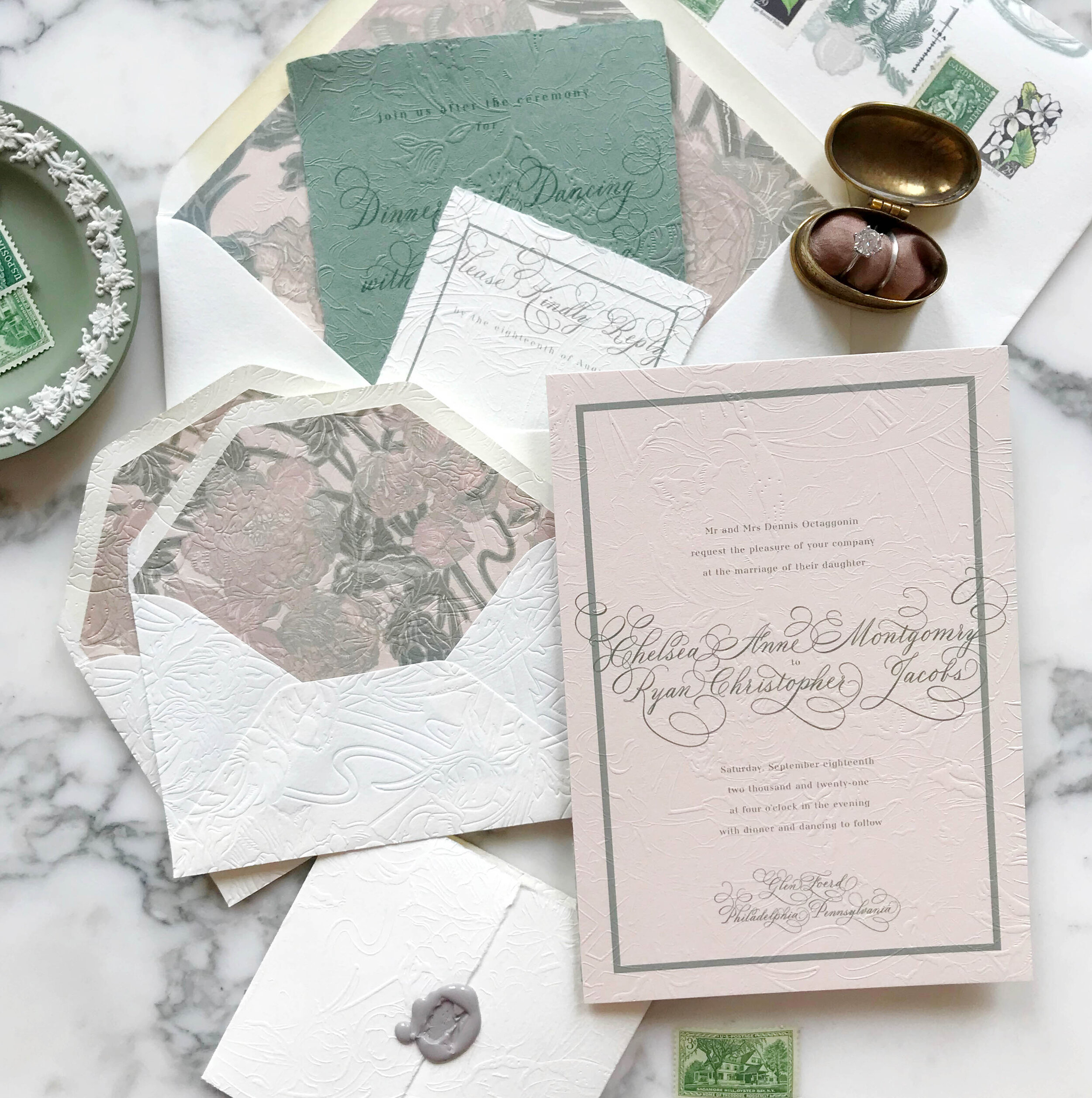
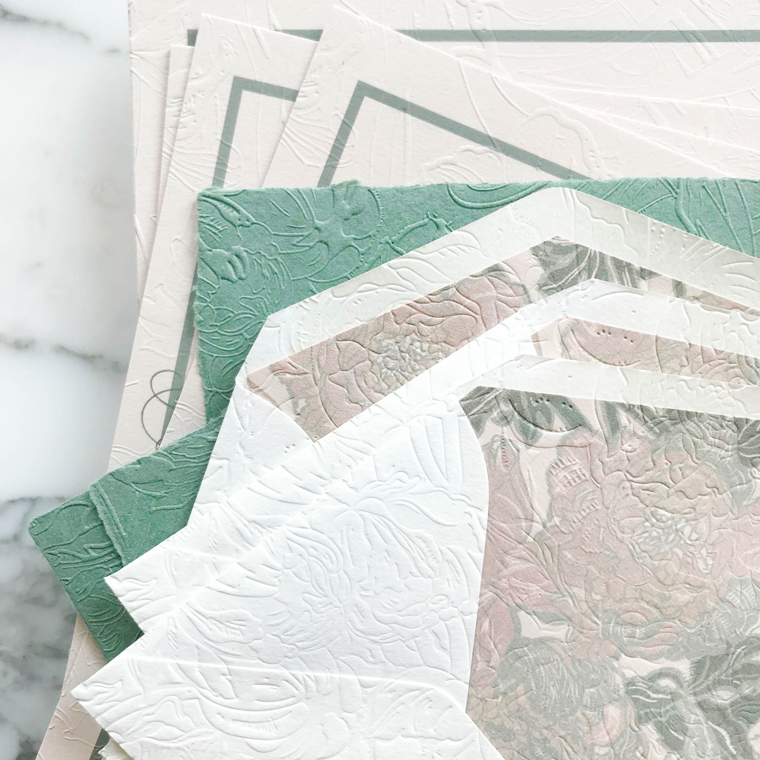
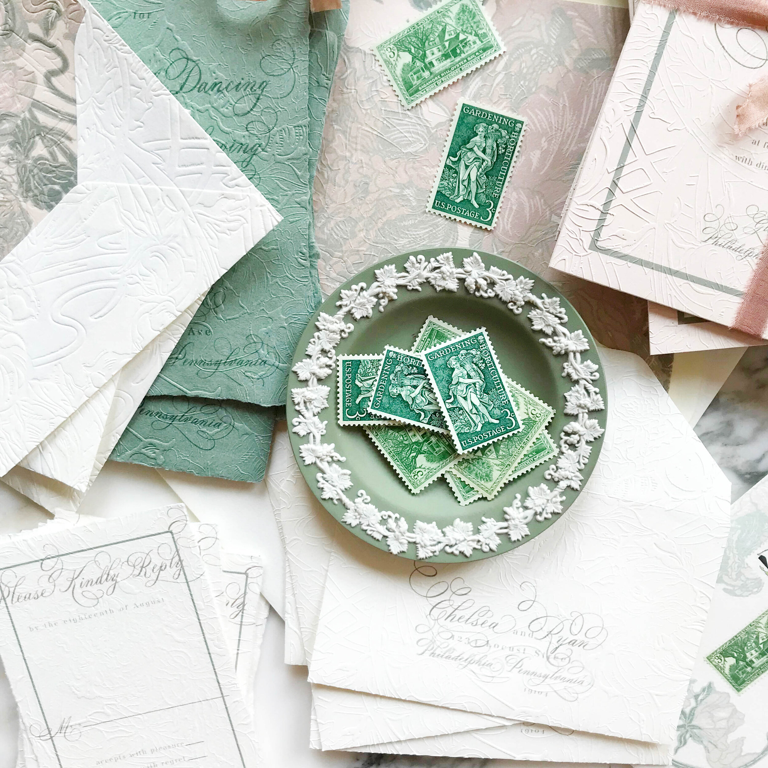
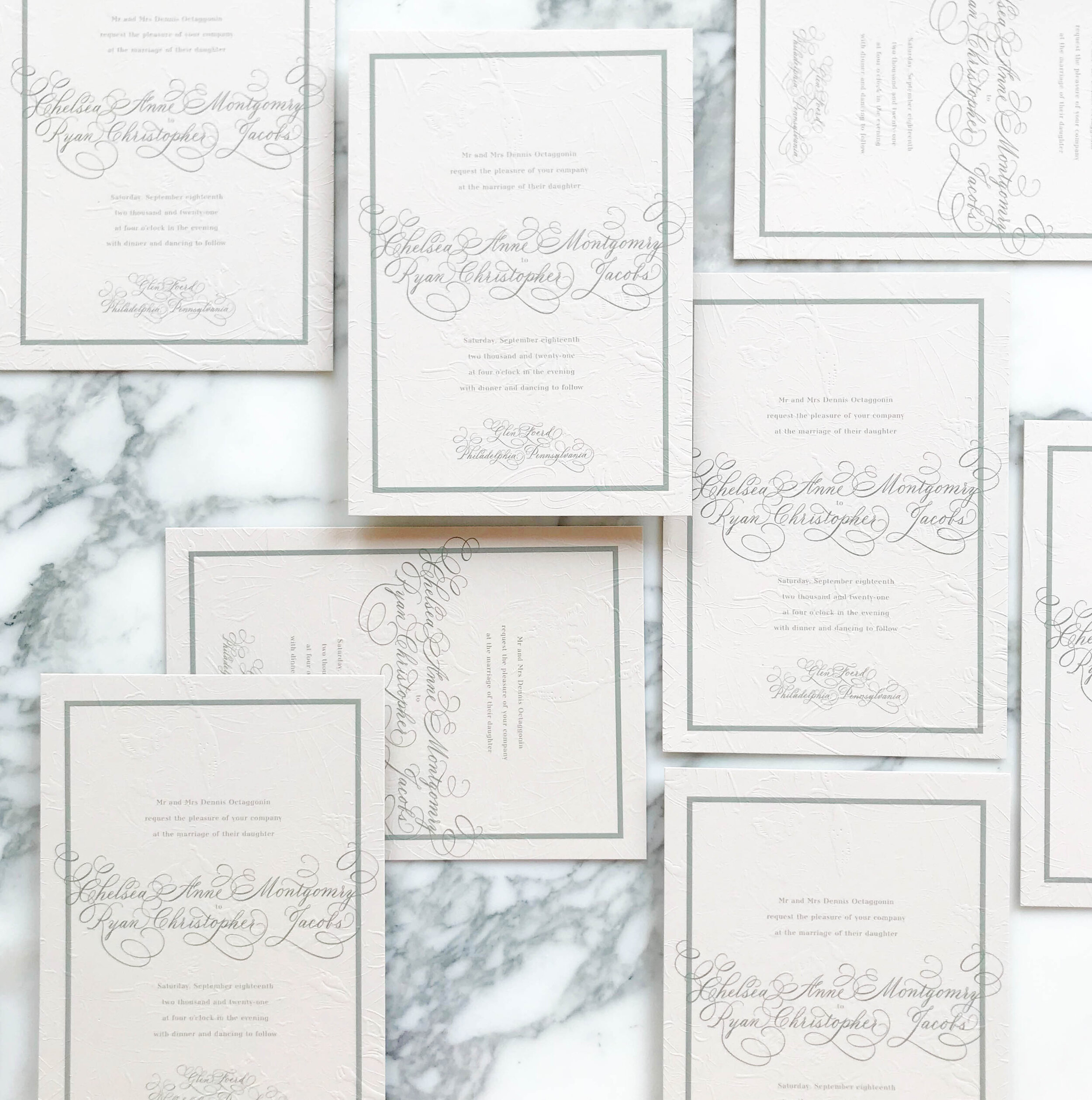
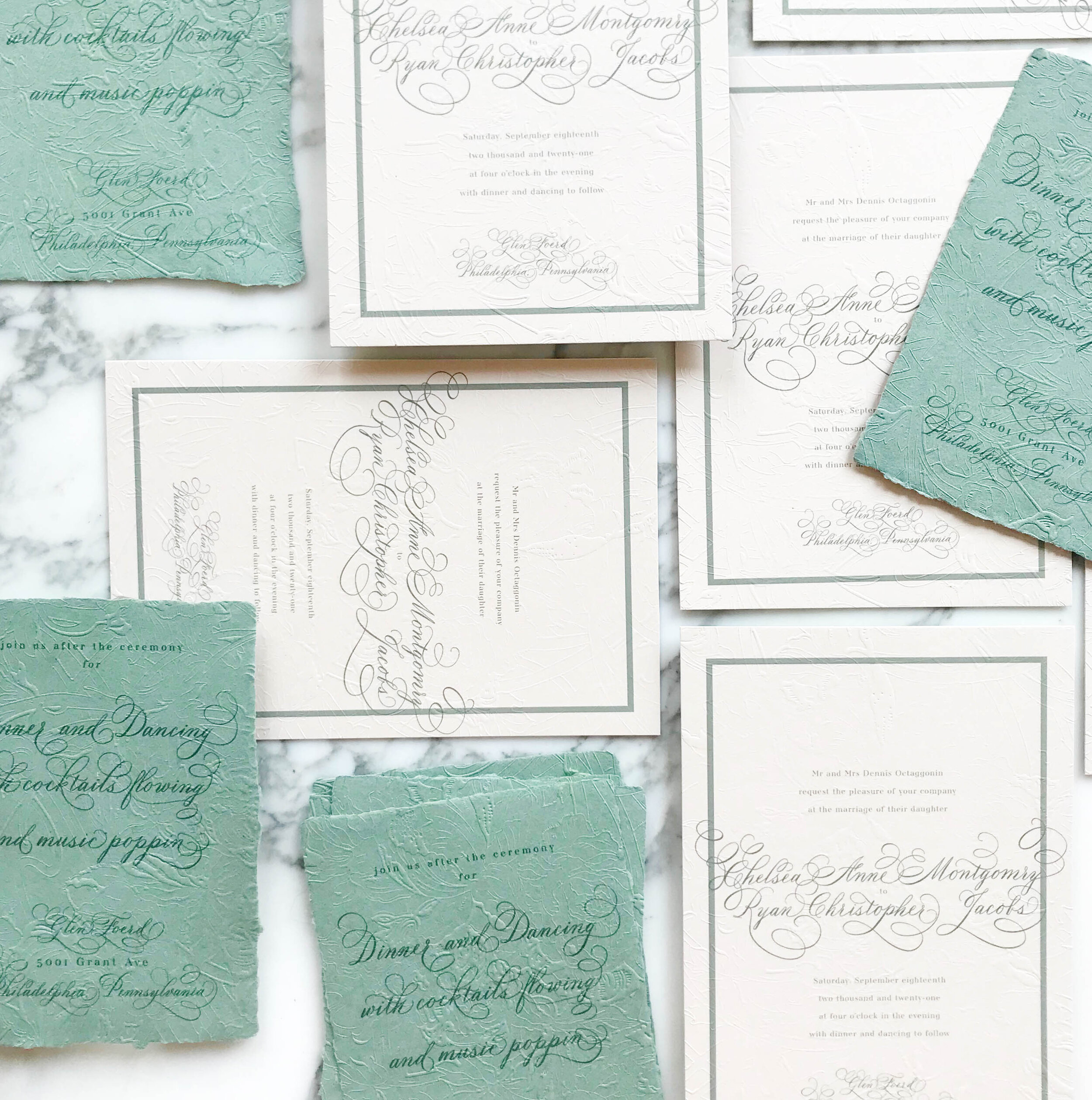
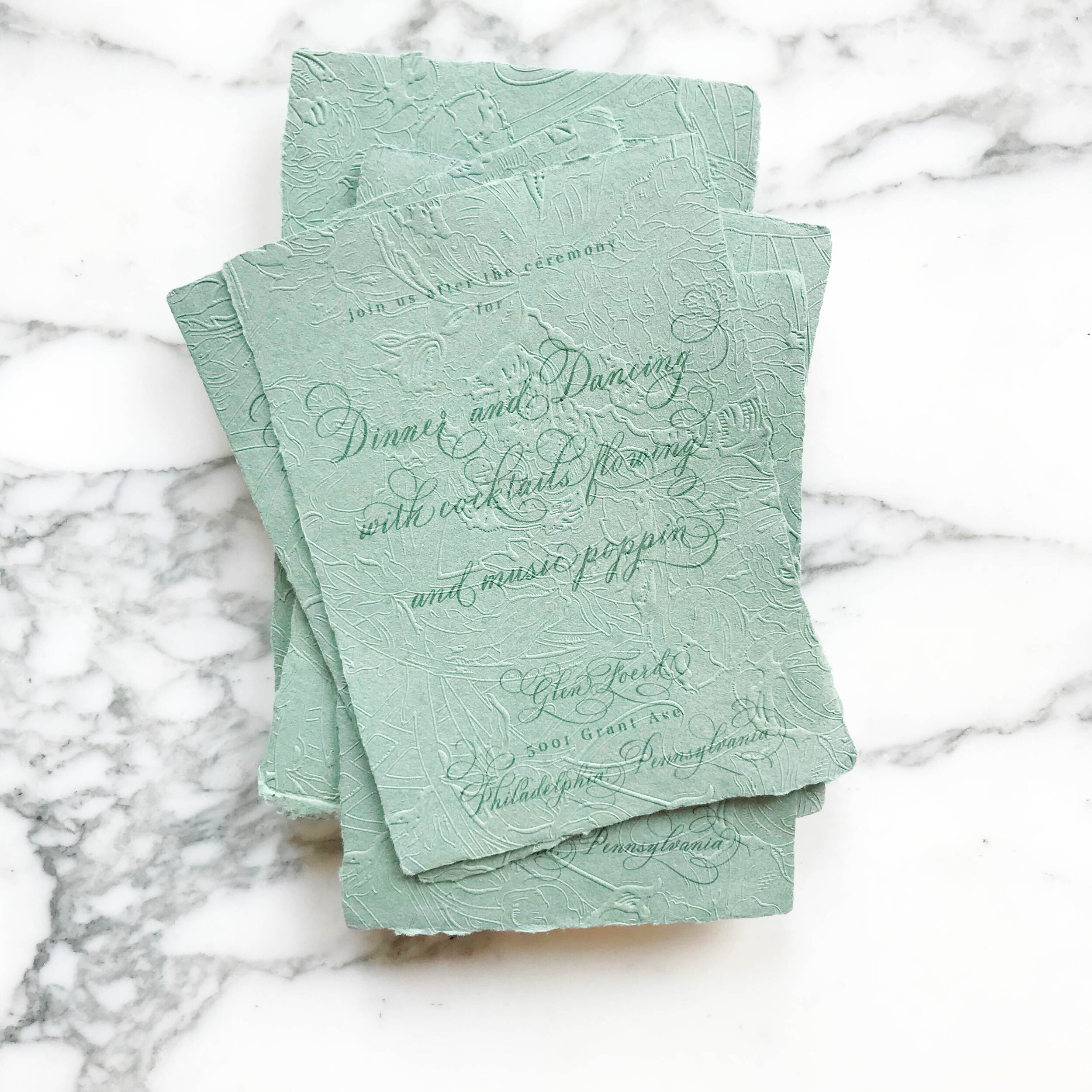
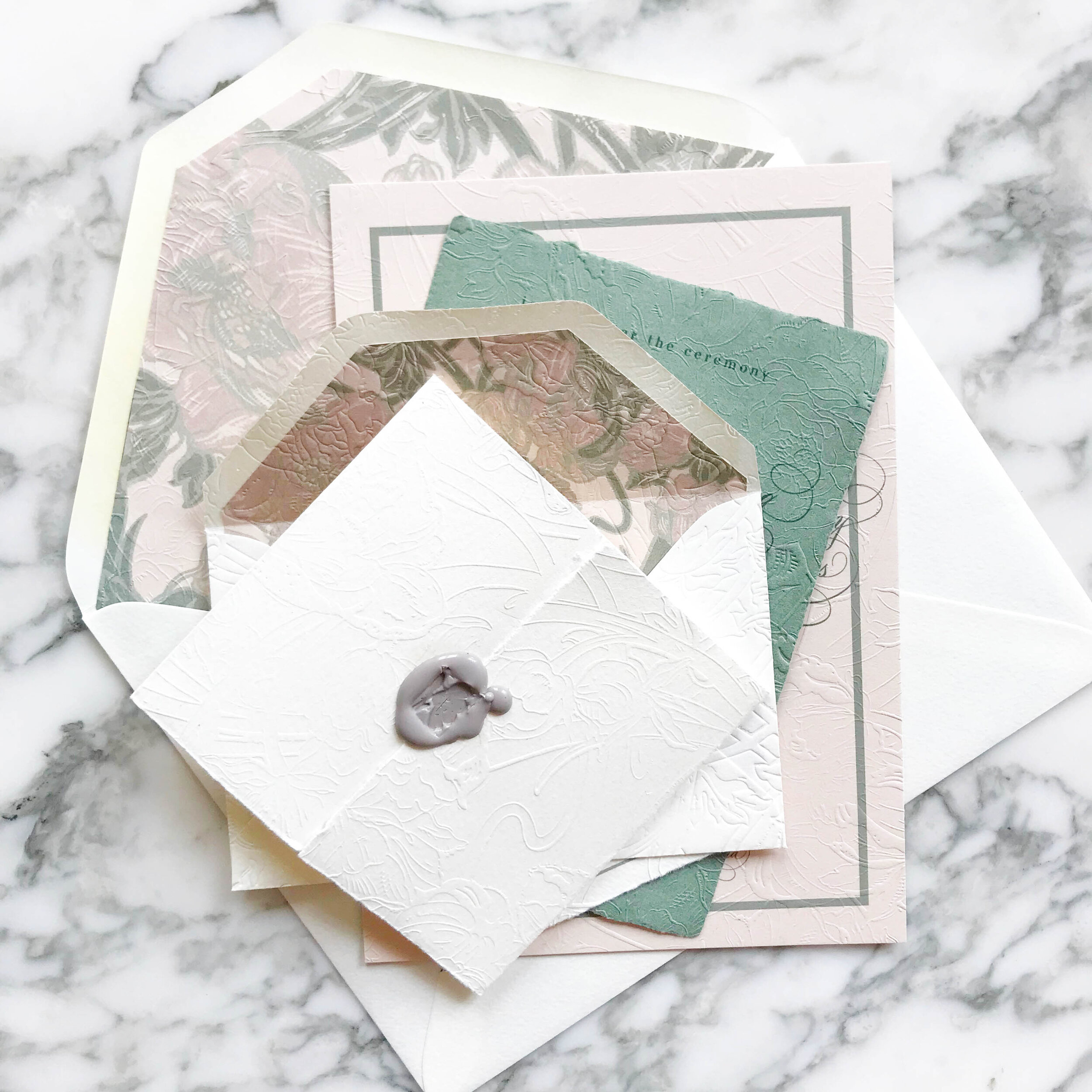
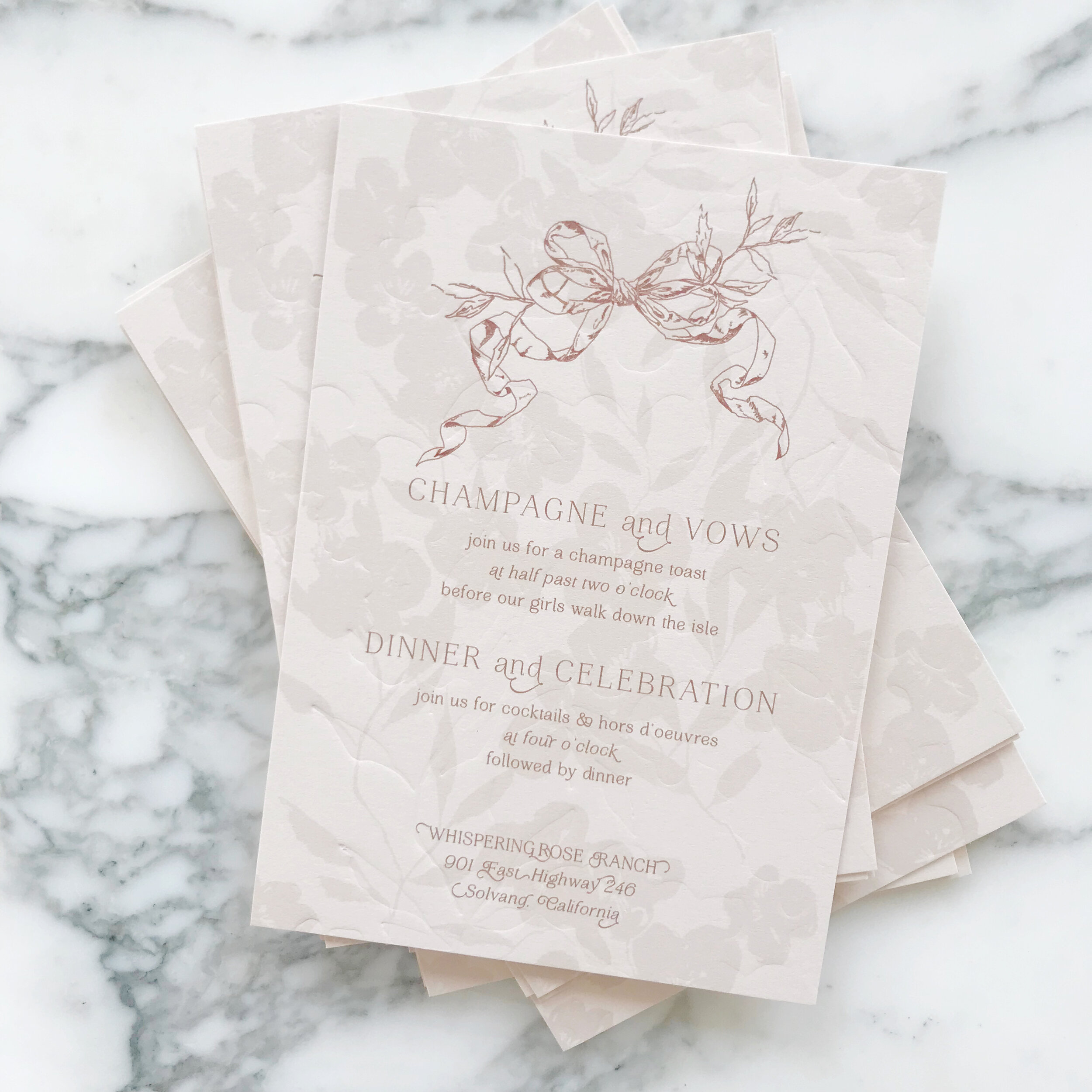
Posts tagged custom wedding invitations
A Custom Toile Pattern for a Historic DC Wedding

A reception for the ages….and rare that I get to help set up in person!


Pro Pics (which these are not!) are from Jen Fariello, Florals by Springvale Floral, Coordination by Cheers, Darling.

A Custom Toile Pattern - Reception

The reception was held a the GORGEOUS DAR in DC, with so many historic details and the most stunning and dramatic columns.

For her reception details, we added a few touches of gold here and there. We started with gold gilded table numbers, then went to gold calligraphy for the place card calligraphy, and gold calligraphy detail on the menus.

The menus were unusually large and designed to sit under the plates at each place setting with the napkins and placecards on top.

A Custom Toile Pattern for a DC Wedding - Assembly Details

Between the shortages throughout the industry and the very distinctive shade of blue I was looking for, we ended up going with a custom-dyed silk ribbon to hold all our pieces together. We paired it with a pale pink custom wax seal and vintage styled postage.

A Custom Toile Pattern for a DC Wedding - Colors

I love getting a project where I get to work with a ton of colors! Granted, the shortages we’re seeing throughout the paper industry right now didn’t make it easy, but I was up for the challenge.

We wanted to go with spring pastels without feeling too much like an Easter church service. I selected very specific shades, including a cool pink, medium rosy purple, spring green, pale blue, and a distinctive shade of cornflower blue.

Seaside Wedding Invitations

…more from Jekyll Island

Blue and Coral Wedding Invitation Suite

Jekyll Island, Georgia

calligraphy | botanical | bright

botanical coral illustrations, flourished calligraphy, bold coral colors, pale blue vellum, themed postage

Reply card sets with two different designs for the envelope liners, bright coral reply card, coral detail on the flat of the envelope, calligraphy return address, and gorgeous vintage postage.

Flourished coral calligraphy on handmade paper, pale blue vellum overlays with coral details printed on white in a frame around the edges, thin silver thread held tight with semi-transparent wax seals, and bold envelope liners.

 
Chinoiserie Blue Wedding Invitations - Envelopes
 

Envelopes…always my favorite part of an invitation suite. A commonly neglected and always unexpected design element….


This suite featured two different pieces of artwork on the envelope liners, as well as artwork printed on both the reply envelope as well as the mailing envelope. Naturally, we selected blue postage to compliment the overall aesthetic.


Chinoiserie Blue Invitations
 

chinoiserie | gold | soft | bold | floral

Newport | Rhode Island

I’m so in love with these blues!

The blues are a perfect pairing for a spring wedding in Newport, Rhode Island. Our bride wanted a touch of the opulence of the venue without going full Victorian for her invitations. She and her family grew up spending their summer holidays nearby and she always loved passing by the Chanler House as a little girl. The invitations were the compromise between the classic Victorian styling of the venue and the more modern feel that the couple preferred as their own personal style.

I selected a white handmade paper with velvety soft edges for the invitation and reply cards, and paired with them with a bold lapis blue for the reception card. I loved the contemporary vibe the blue insert brought to the overall suite. We also selected a modern calligraphy style to pair with the blue watercolor florals.

Lets talk about gold gilding.

One of my favorite details to add is gold gilding to the edge of designs. For this particular design, I also added it to the centers of various blooms throughout the suite, including the reverse of the invitation, the die cut overlay, mailing envelopes, and reply envelopes.

 
Art Nouveau Wedding Invitations
 

art nouveau, pale greens and nudes, elegant, overall texture, soft, unexpected, soothing, formal

Glen Foerd Mansion | Philadelphia, Pennsylvania

Embossed Art Nouveau Wedding Invitations Green and Nude4.jpg

We wanted to bring in the graceful and soothing vibes of the Art Nouveau era with pale neutrals, smooth greens, and impressive overall texture. We selected artwork inspired by antique wall paper to start our design work. Working with the artwork and palette of nudes and greens, we developed our overall look and feel, a perfect fit for the gorgeous Philadelphia mansion of Glen Foerd.

_Embossed Art Nouveau Wedding Invitations.10.jpg

The most striking element of the design is the texture. Each piece was embossed with a glorious overall texture for a pillowy and tactile feel.

My personal favorite piece of the suite are the reply envelopes. We embossed the envelopes after they were lined, so the liners as well as the fronts and back of the envelopes all had a contiguous embossed pattern.

Embossed Art Nouveau14.jpg

Like most of our projects, we combined several different paper types to come to our finished design. For this particular suite, we ended up with six different types of papers, including both machined and handmade.

The art nouveau design includes three handmade papers for the green reception card, reply card, and dress code tri-fold. The invitation consisted of two different machined papers, the first in a nude, then backed with a pale green. Our envelopes were both a gorgeous cream, and our envelopes liners were on the same rich nude as the invitations.

Our darling little tri-folded cards of handmade paper were sealed closed with a tiny wax seal in a taupe grey and embossed with the pattern showing on both sides.

_Embossed Art Nouveau Wedding Invitations.2.jpg
 
How to Combine Classic & Modern

How do you combine two totally opposing design ideas? We’ll show you…

 
Dramatic-Black-and-White-Calligraphy-Wedding-Invitations-Design-House-of-Moira-OSBP-1-640x960.jpeg

classic | elegant | gold | clean lines | monochromatic | bold

an invitation suite for a wedding at:

New York Public Library | New York, New York

For a wedding at the New York Public Library, our bride wanted to figure out how to combine super traditional, flourished calligraphy (her favorite!) but with more modern lines and a bit of gold.


We started with our paper selection.

We went with a bold, bright white cotton, a silky smooth black, and thick vellum with deckled edges. The bold white gave us a modern feel while balancing out the over-the-top calligraphy.

We also selected an oversized wax seal in black, again, aiming to combine the traditional and modern.


We used a combination of printing methods, including digital printing for our bold monochromatic patterns, and foil for the invitation, reply card envelope liners, and mini insert cards.

We placed the bold black and white floral pattern on both the backs of our insert cards as well as the envelope liners on our mini bright white envelopes.

 
Fall Wedding Invitations for a California Wedding
 

moody | bold | unexpected | texture | fall

an invitation suite for a wedding at:

Whispering Rose Ranch | Solvang California


The Colors

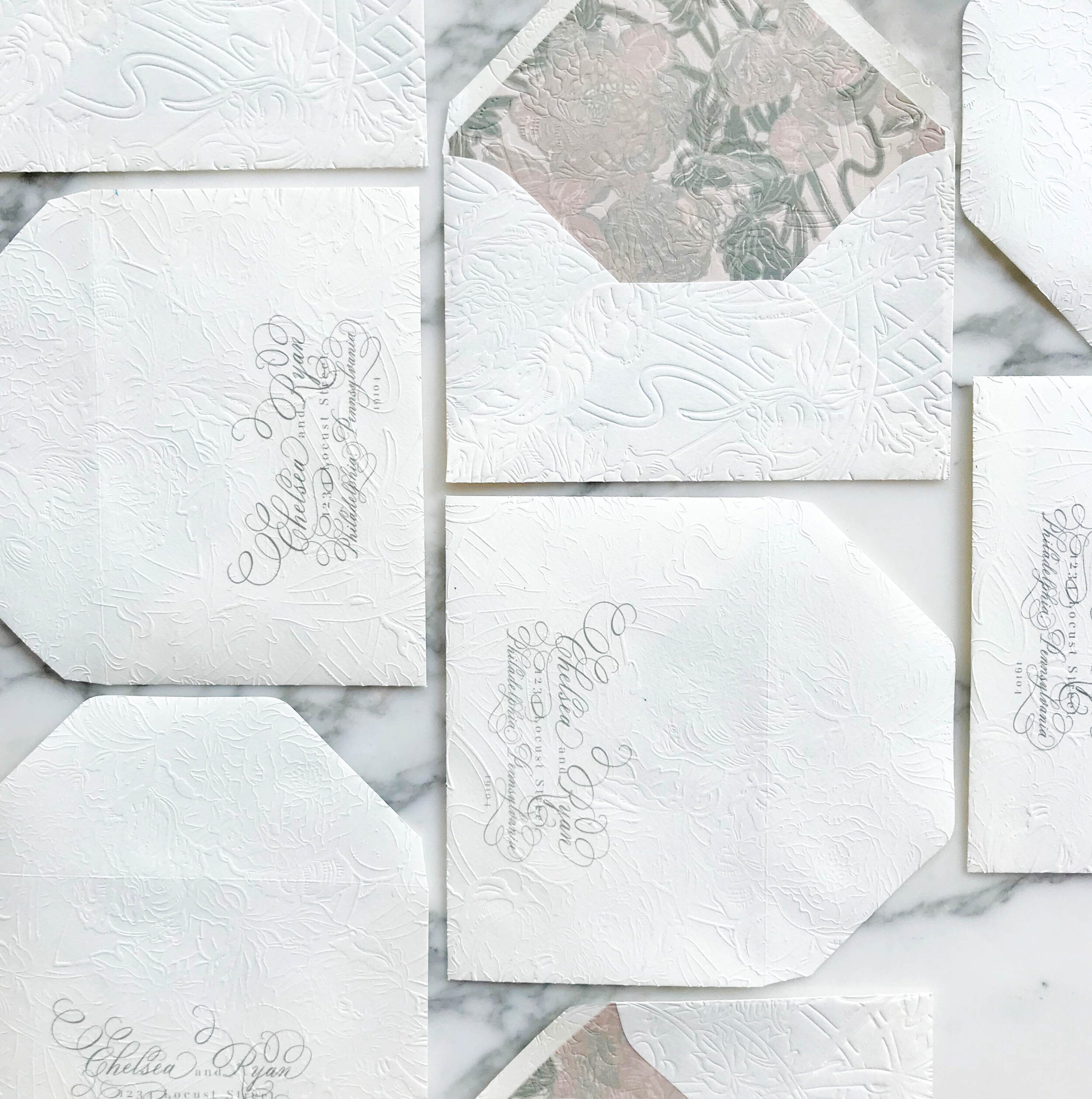
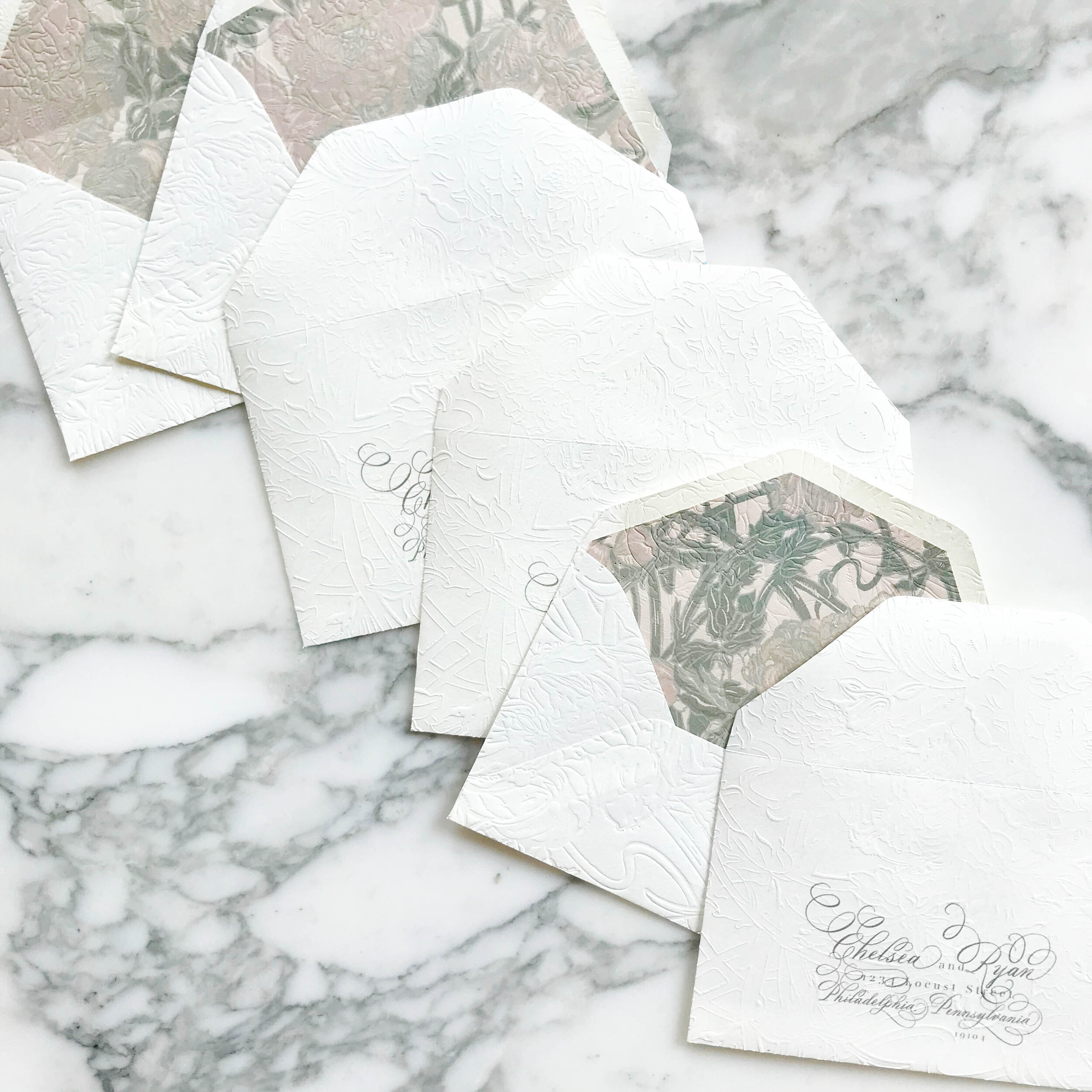
When our brides first approached us, they had a pretty good idea of what they were looking for. They wanted unexpected texture, deep rose colors, a pop of green, and shades of neutrals.

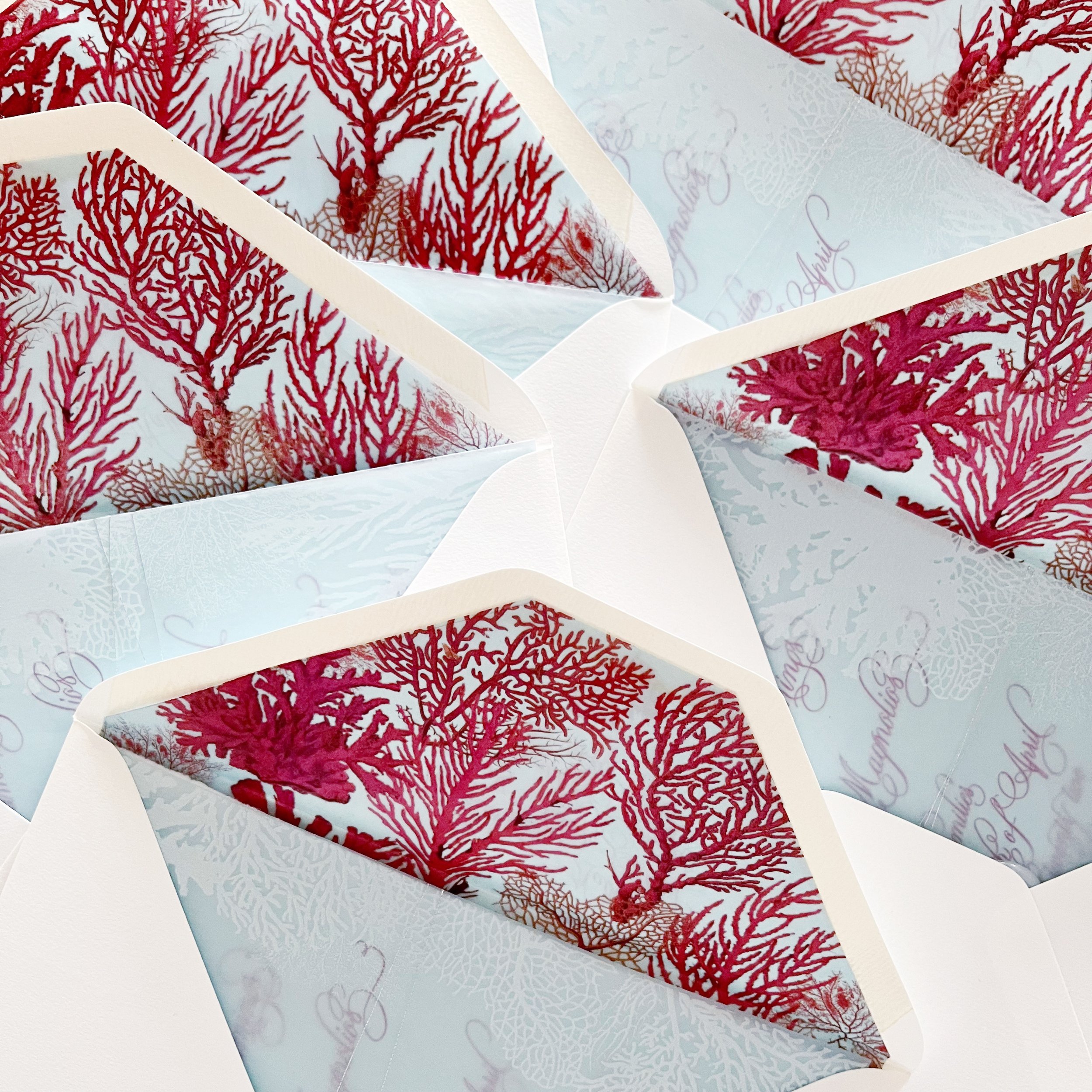
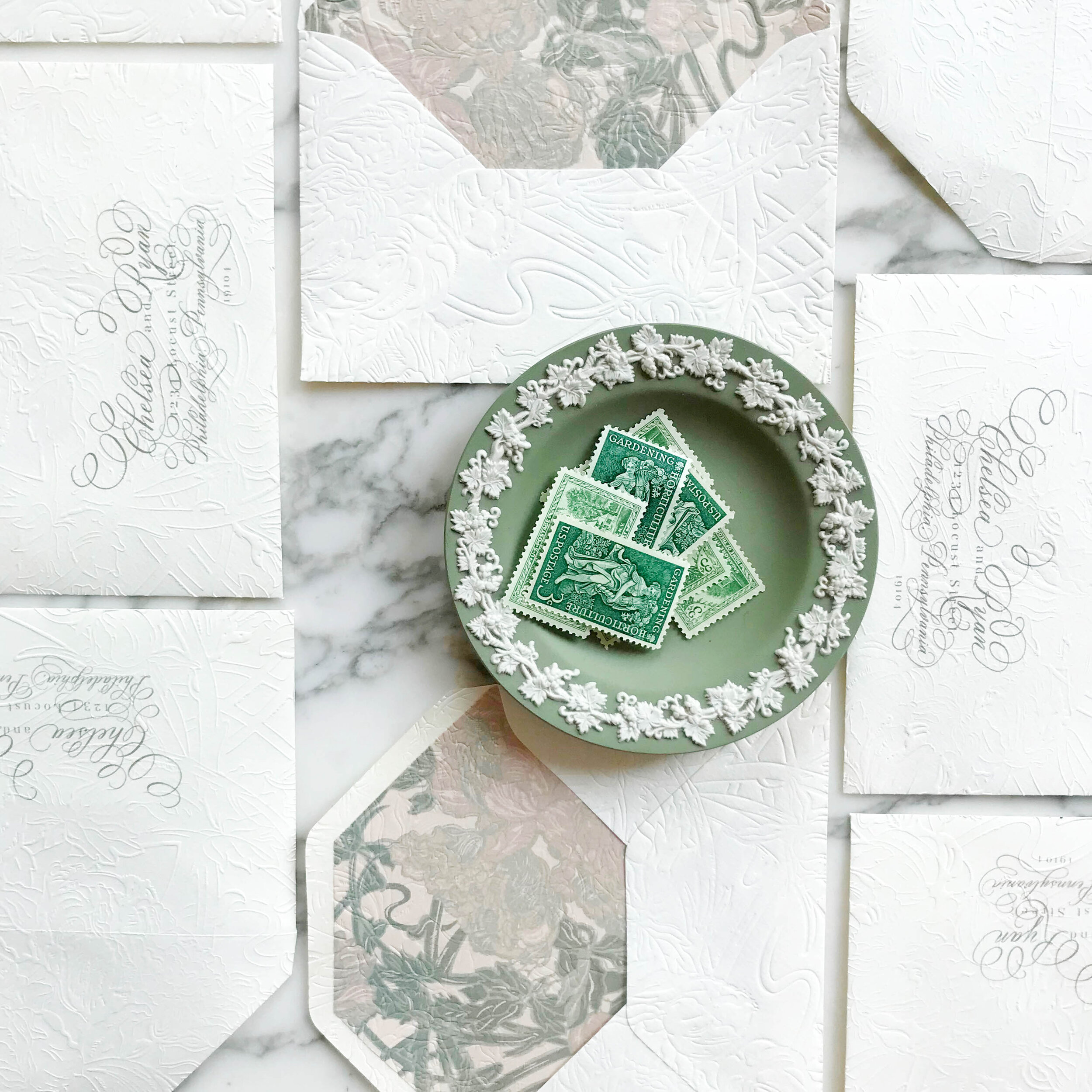
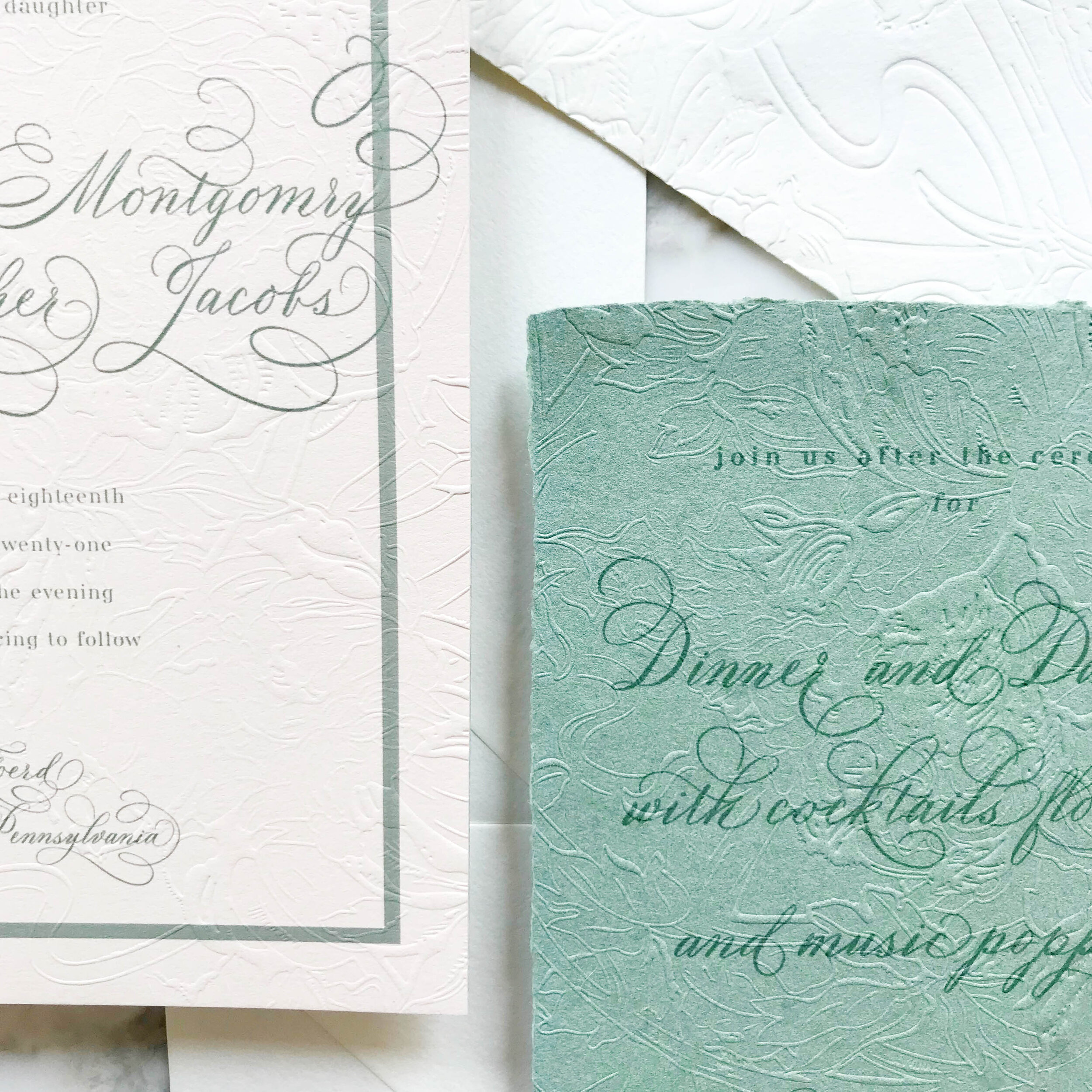
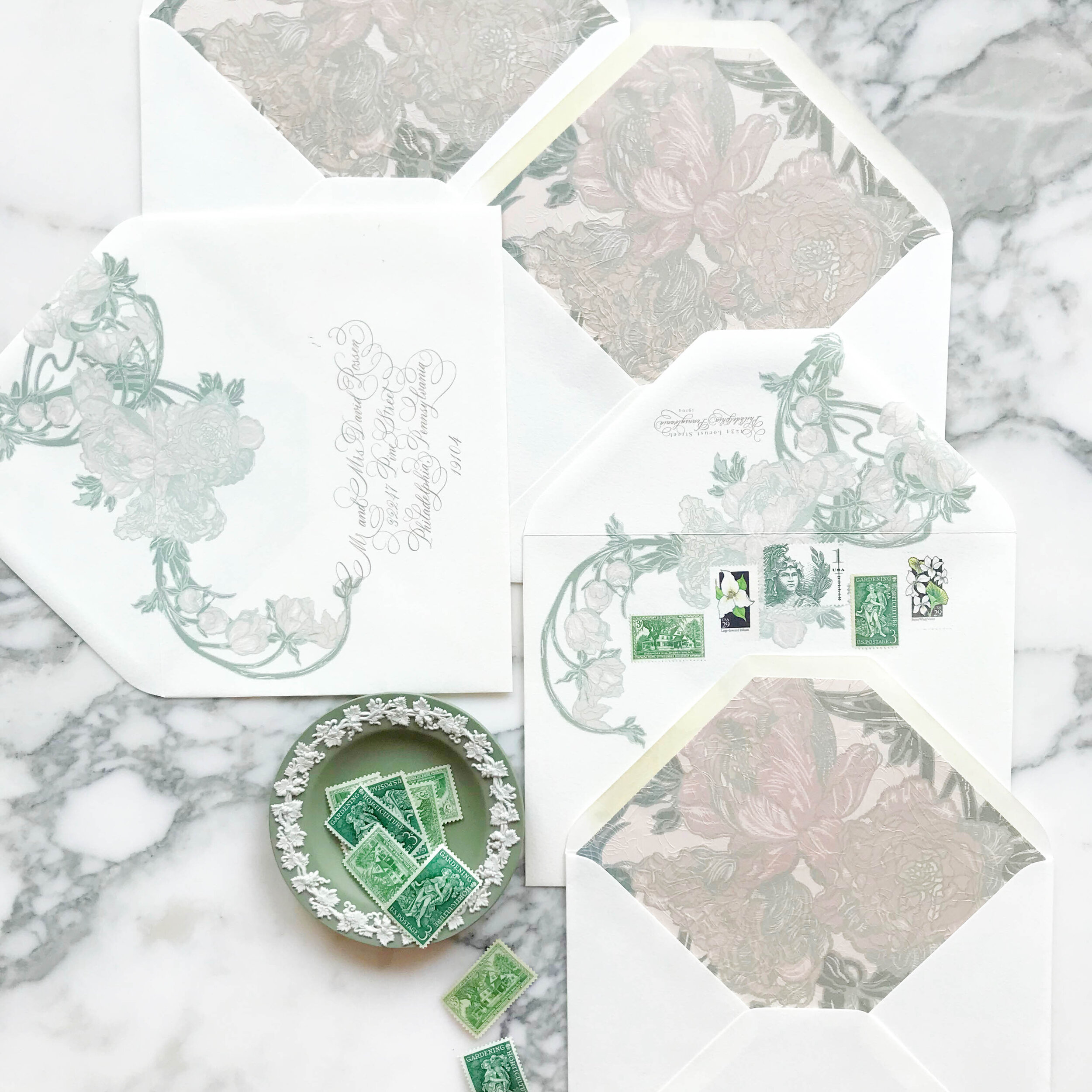
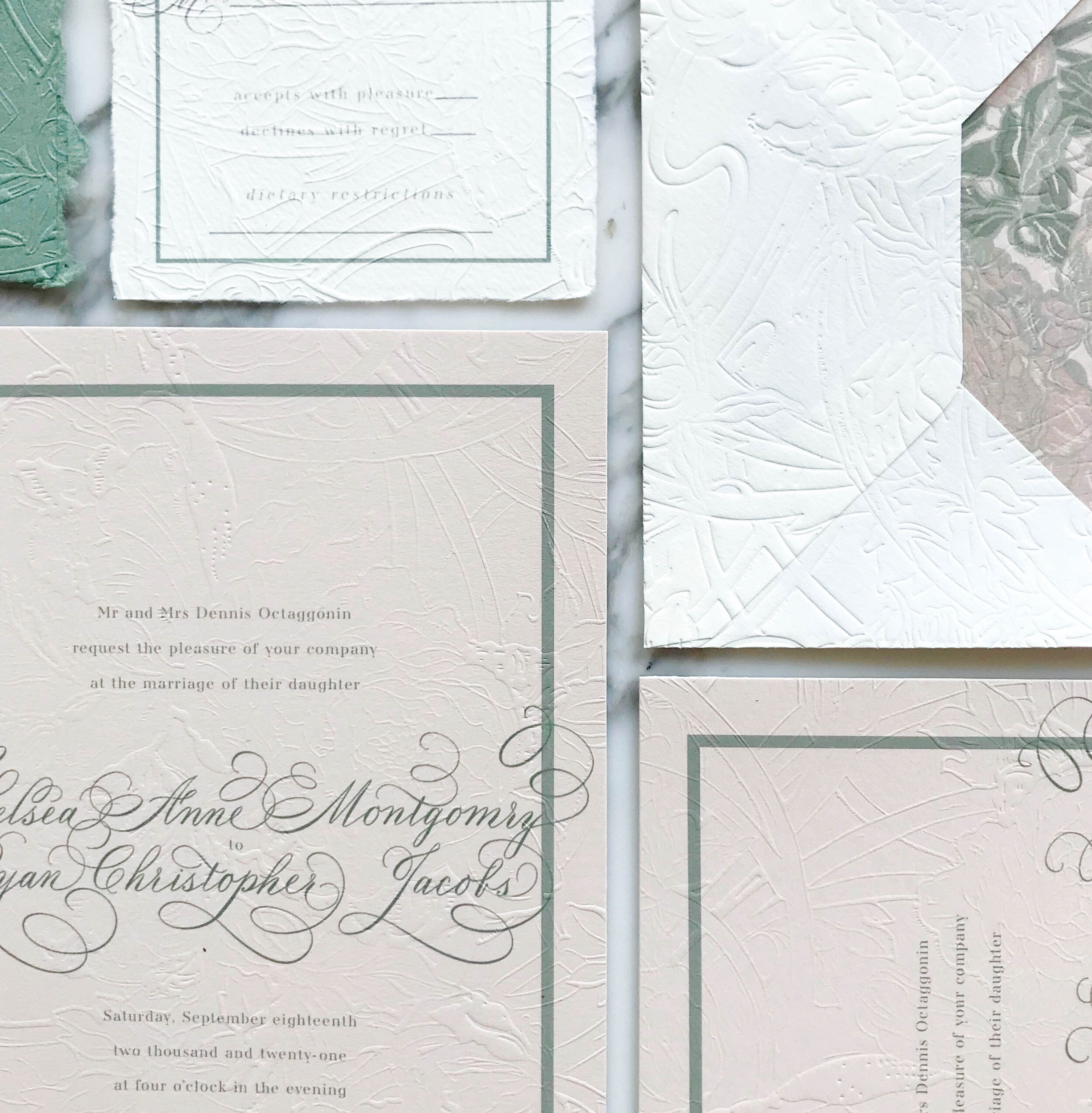
We selected two shades of greens, two shades of rose, and three shades of pale neutrals, including a sage and chartreuse green, a deep rose and a more violet blush, and a range of pale taupes and creams.

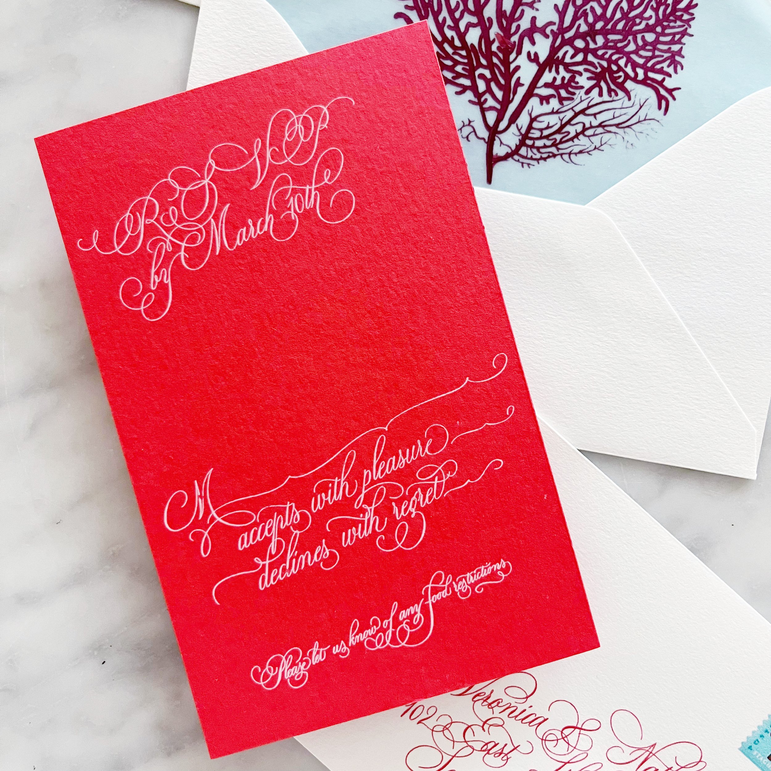
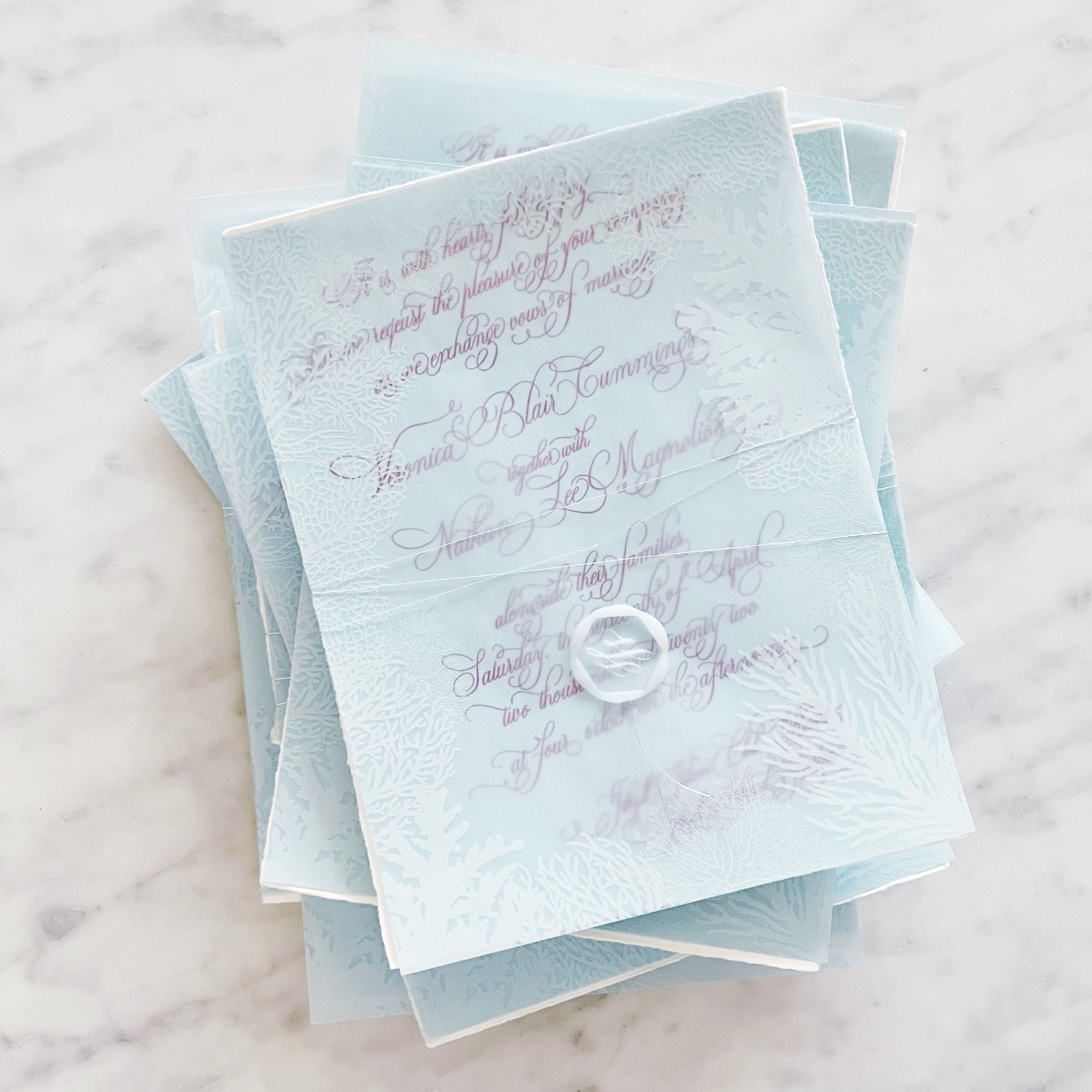
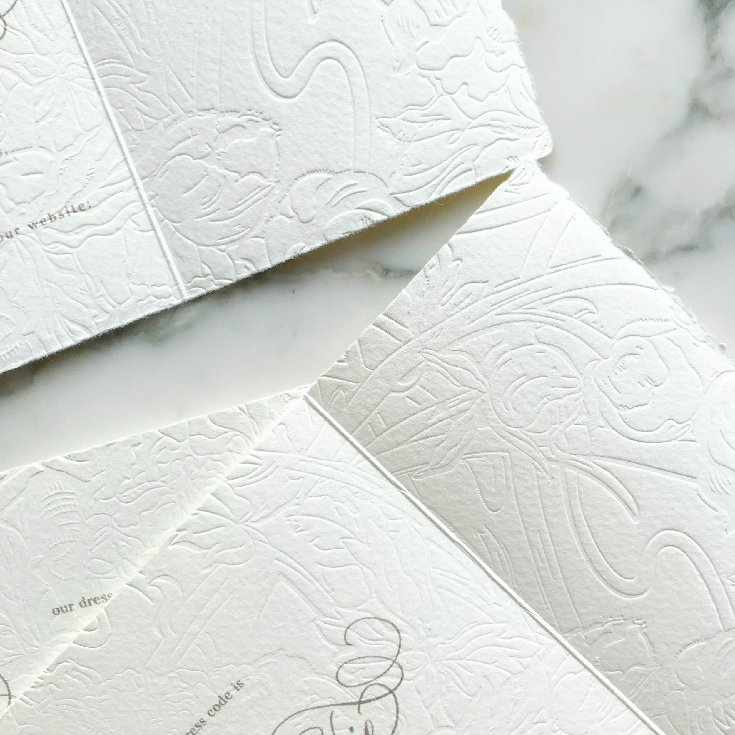
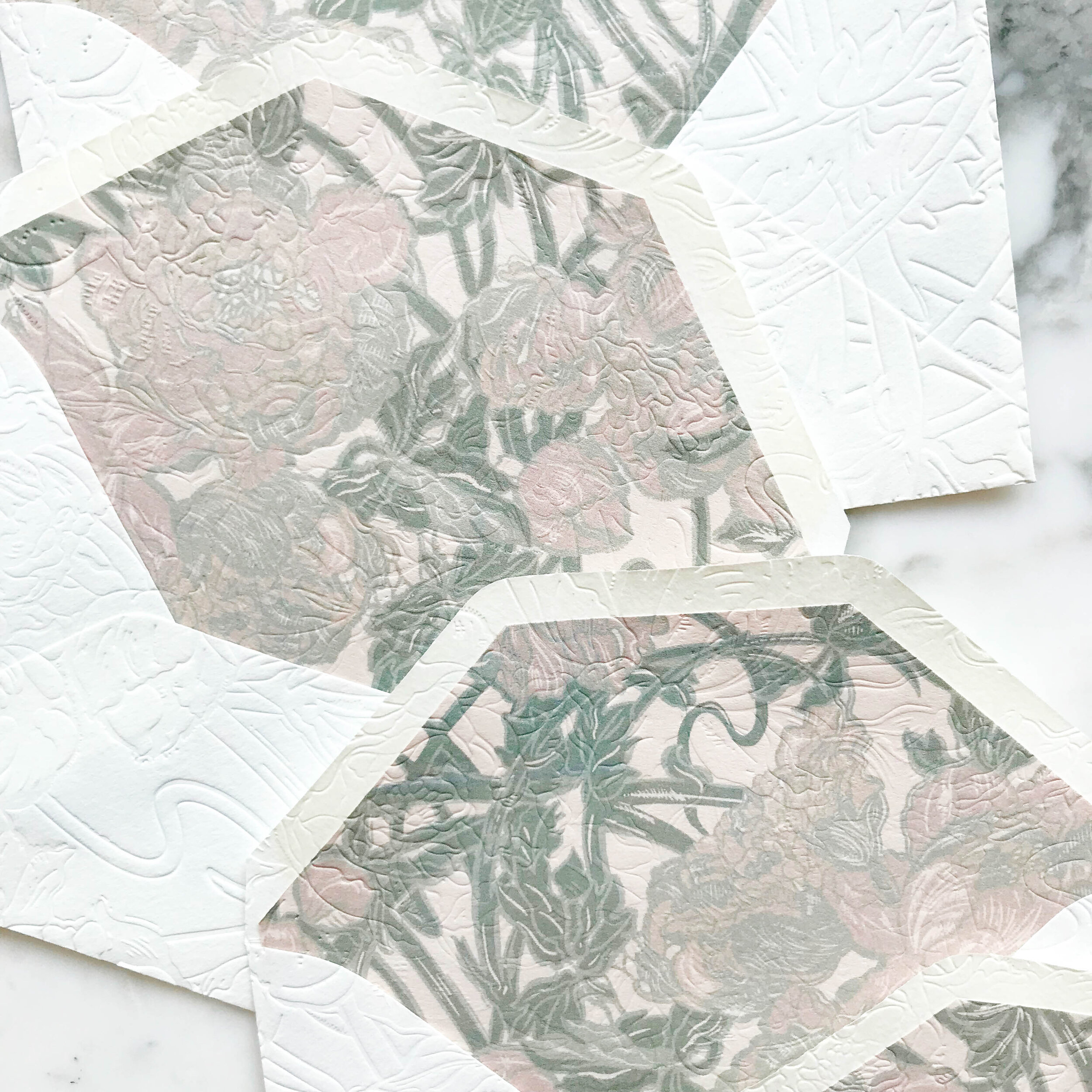
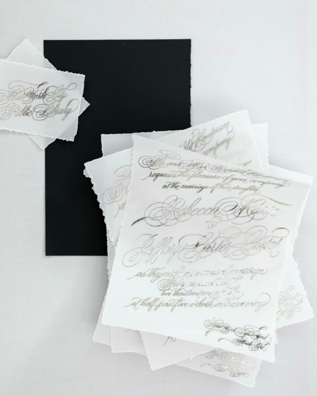
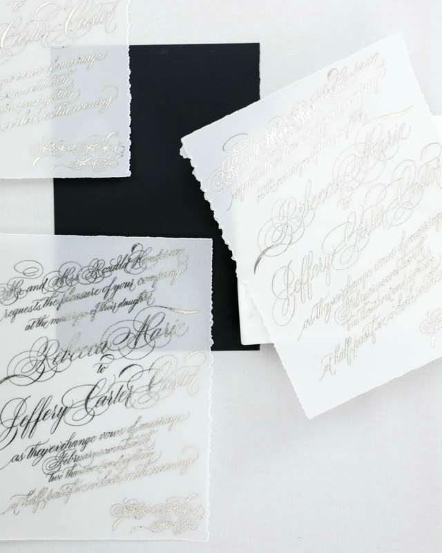
We loved the idea of unexpected textures! We have two pieces that were blind pressed (debossed) layered with digital printing on both the reply card envelope and reception card with a pillowy texture. I also really loved pitching the idea of layering cane into the invitation itself, adding an additional pale color as well as some awesome texture.


The Design

We love the artwork suite for this design. We included two pieces of watercolor artwork, as well as some solid artwork for our tone-on-tone design, and line artwork design of two different vintage style bows.

We see the bow design topping the invitations, reception cards, and reply envelopes. We see them again sneaking in on the back of the rehearsal cards and flaps of the reply envelopes.

We loved the variances of heavy and light design work throughout all the cards, like the minimal design on the reply card, to let the green pop and stand out. Meanwhile, we have the brunch card and its heavy floral tone-on-tone border, which I just love.


Our mailing envelopes were also pretty amazing with artwork on the fronts and back. We also see our second piece of artwork on the mailing envelope liner.