


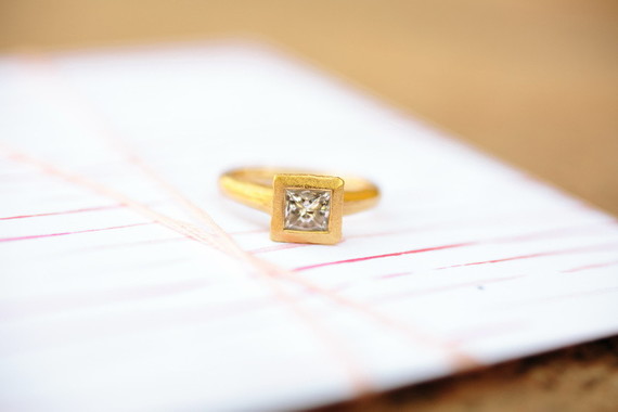
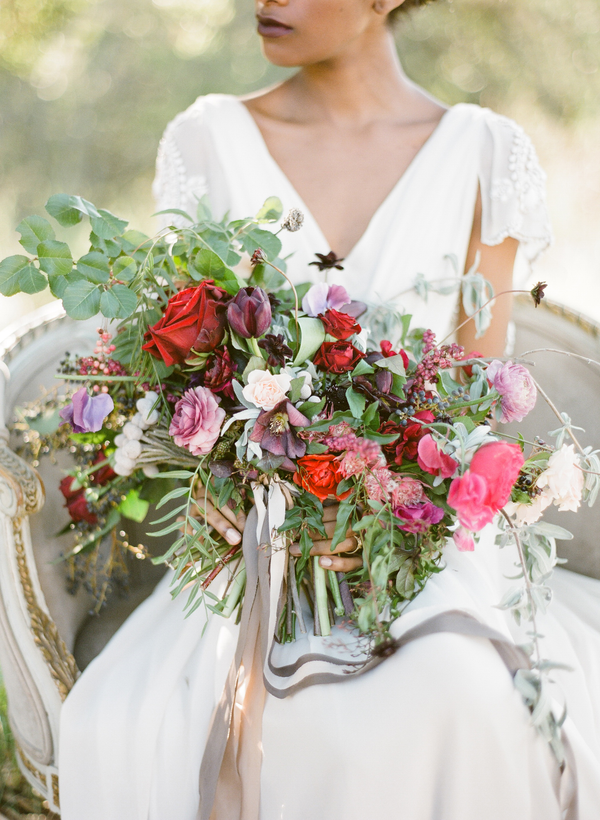
Newport | Rhode Island

We have some lovely details for the custom designs we’re finishing up for a beautiful wedding in Newport.
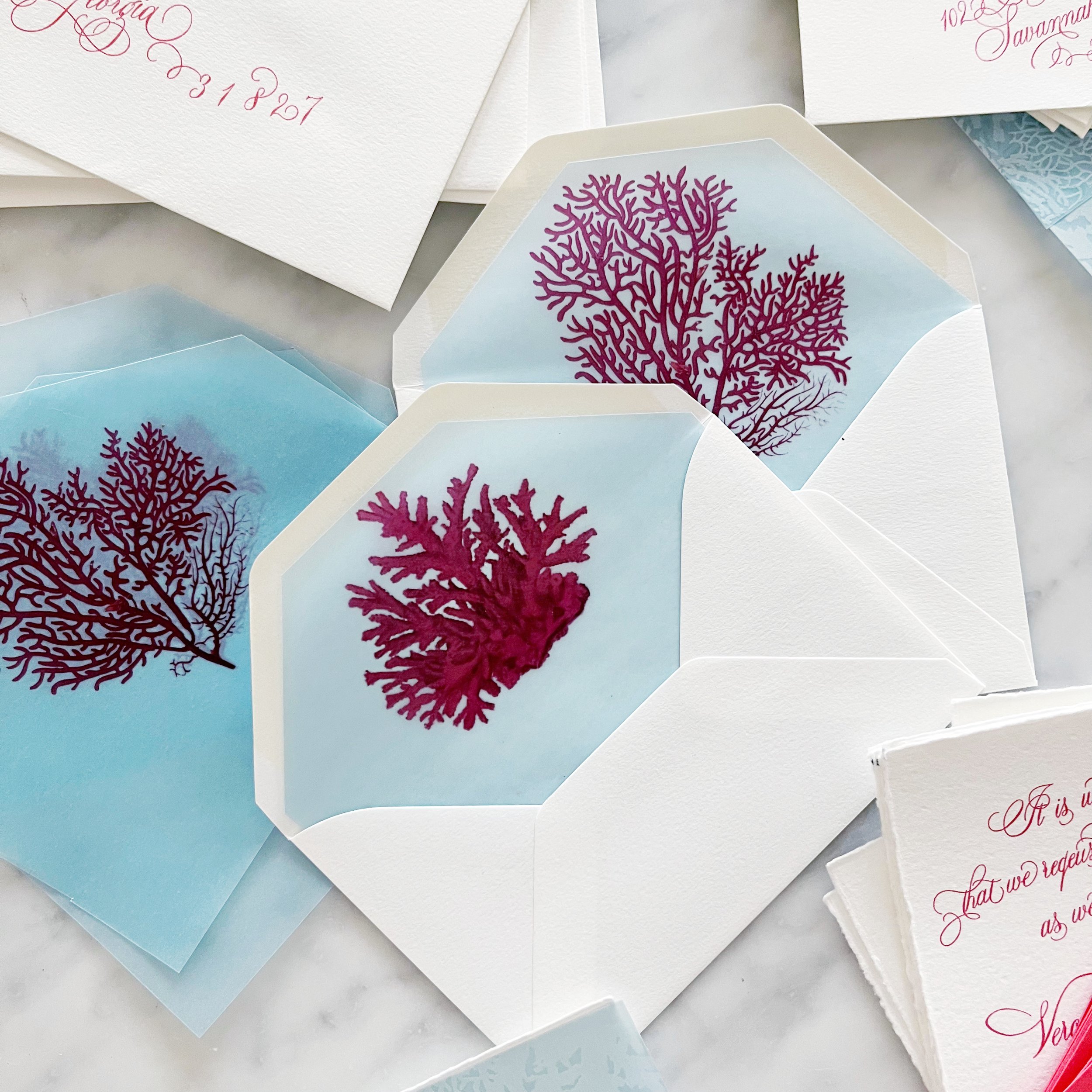
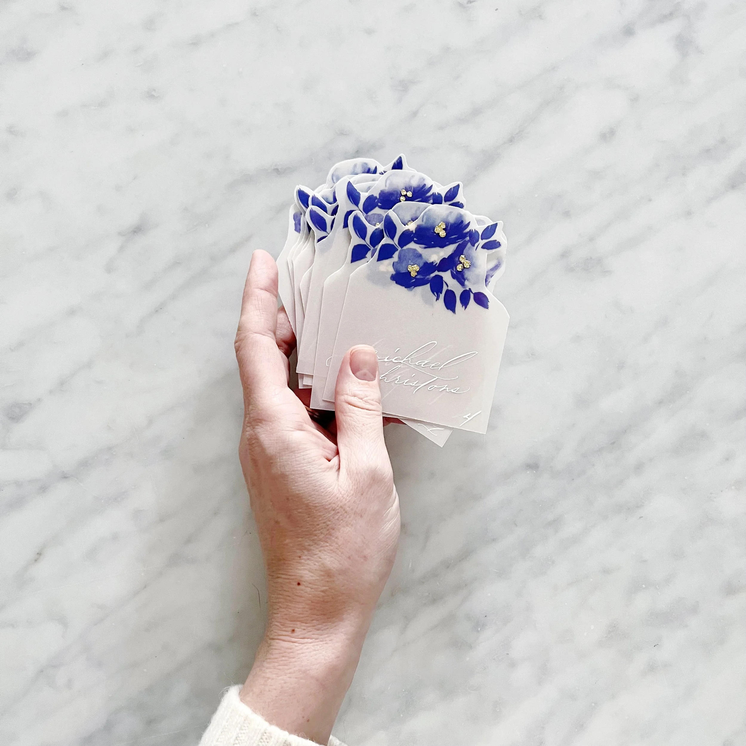
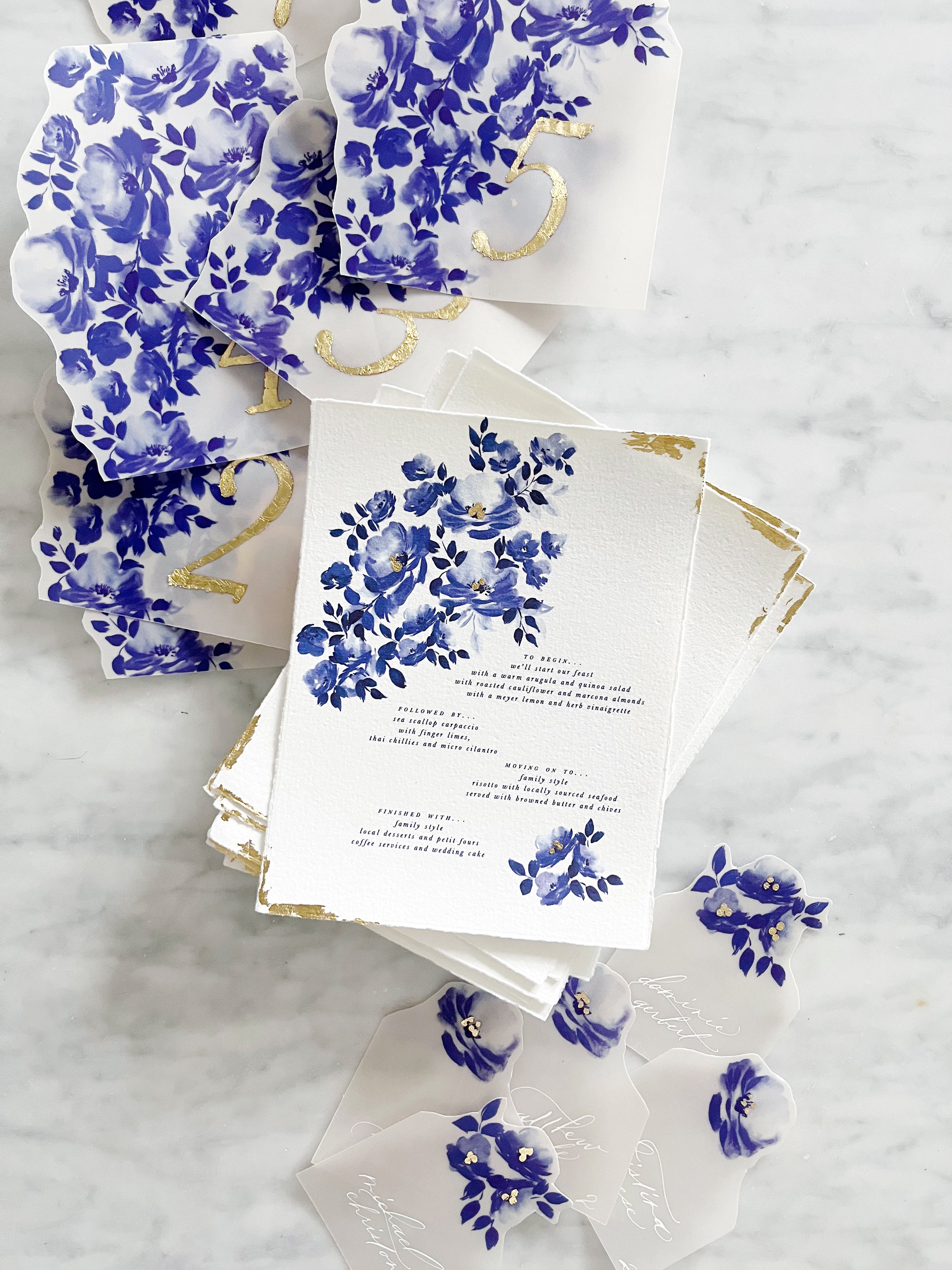
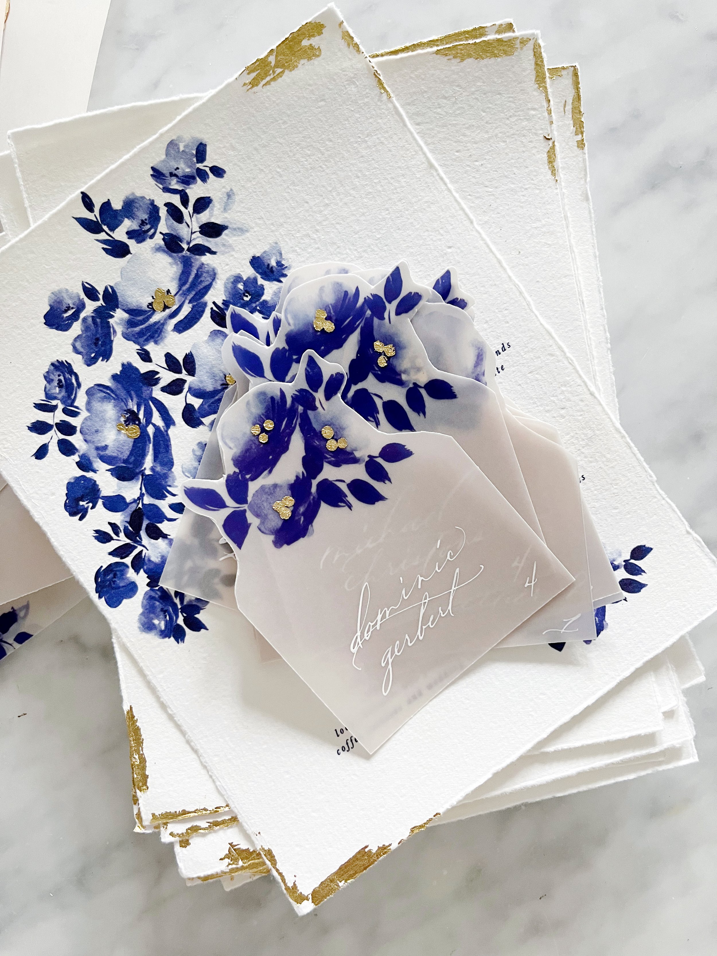
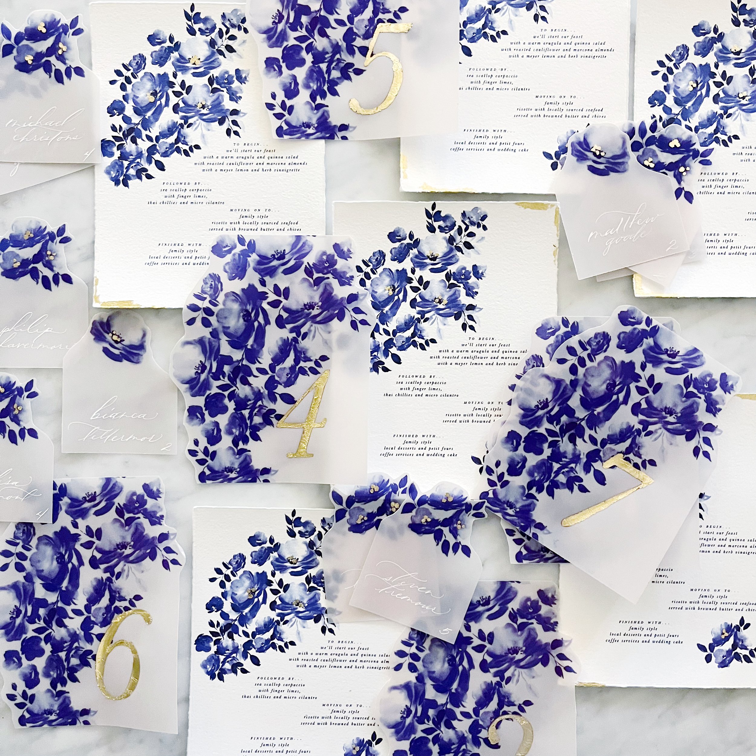
We created two different designs for the escort cards to use as meal indicators, and each card had a cluster of gold gilding at the centers of their blooms.

We continued the gilding on the table numbers, which were all gilded by hand.


Likewise, our menus had gilded details in the flower clusters and along the edges of the white handmade paper that coordinated with the invitation suite design.


Over the summer, I participated in a fun, breezy summer collaboration but never got around to sharing (shame on me!).


From our fearless leader:
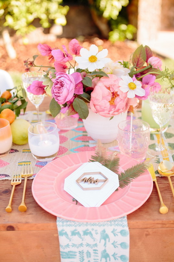
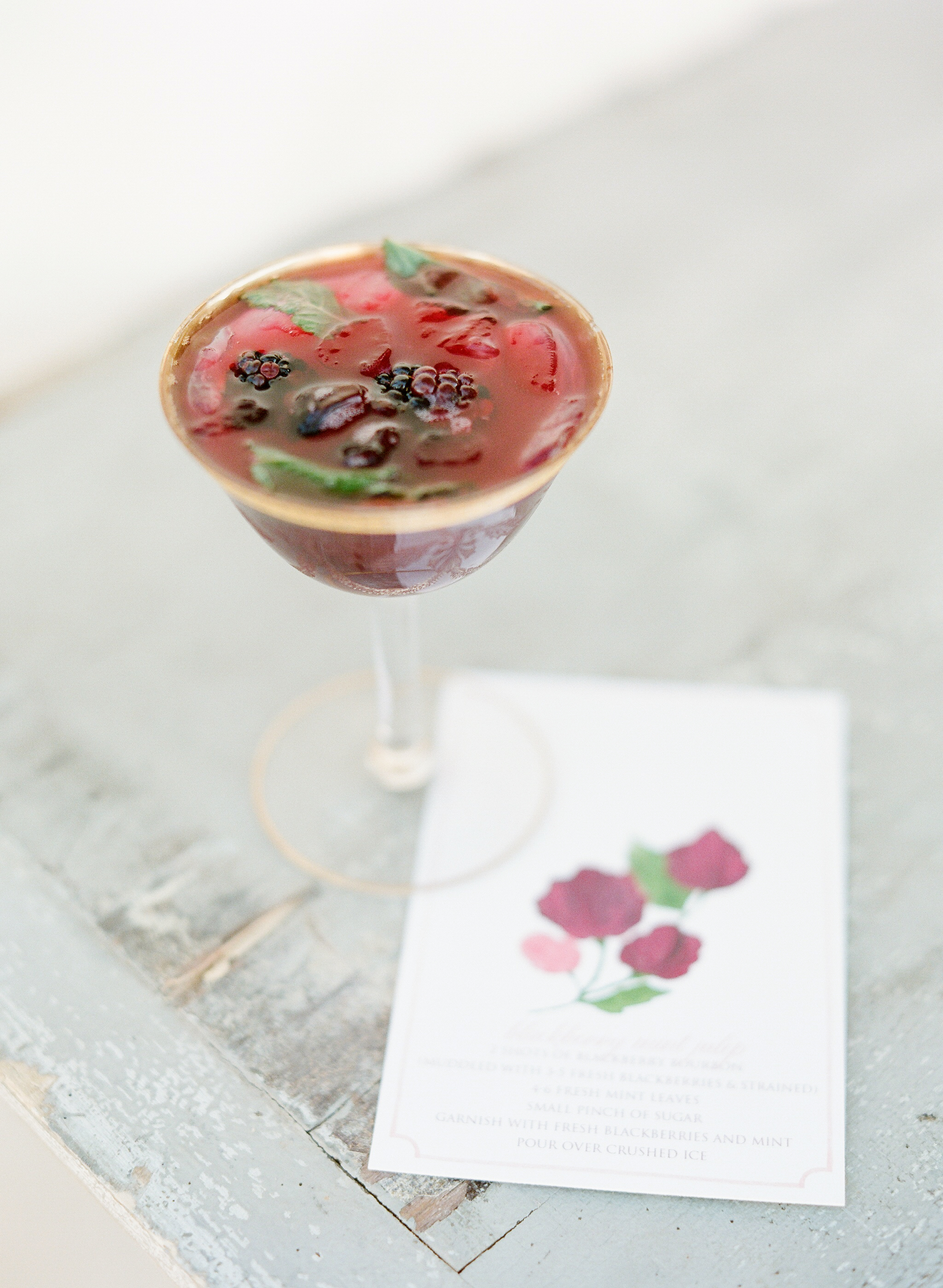
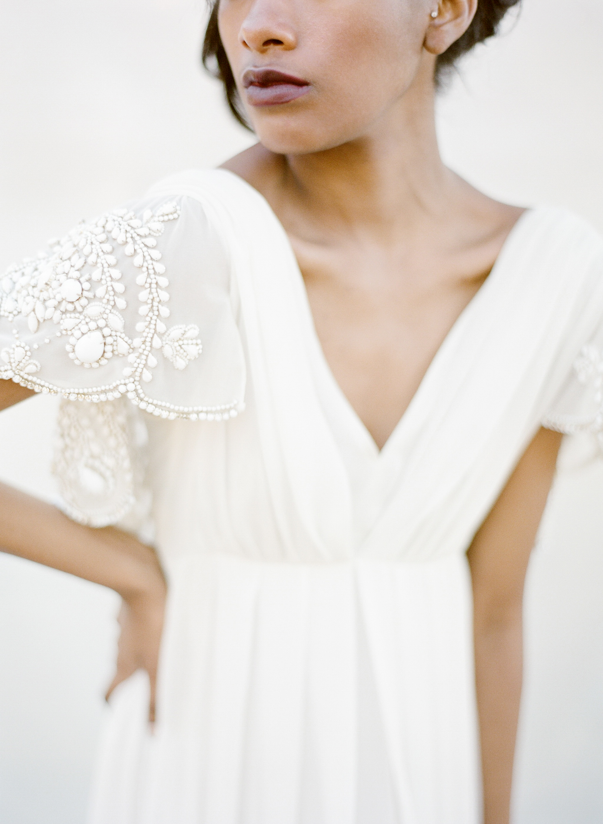
At Glow Event Design, we love coming up with new ways for couples to celebrate saying I Do. More and more of our couples are looking for “weekend experiences” they can enjoy with their guests, rather than traditional receptions. We loved the idea of a summer poolside wedding that could be hosted in a backyard or an outdoor venue. We wanted cocktail hour to have an eclectic look that felt more like you were lounging at the couple’s home rather than on rented furniture. We mixed different styles of chairs and cafe tables to create a “collected” look, and layered in pieces from local boutiques and Anthropologie’s home line to make it look more cozy. Signature drinks were dressed up with custom stirrers and multi-colored coasters. In lieu of traditional place cards, each guest would receive a hand painted planter to take home as a favor.
check out the rest of the feature here:http://www.100layercake.com/wedding-inspiration/modern-summer-wedding-inspiration/
Photographer: Michelle Walker Photography / Venue: K Venues / Event Design & Styling: Glow Event Design / Florist: Amanda Vidmar Design / Hair & Makeup: J Beautique / Baker: Indie Cakes & Pastries / Event Rentals: Blueprint Studios / Ceremony Arch: Buzzworthy Events / Stationery: Design House of Moira / Lasercut Names: Letters To U / Escort Card Planters: Sea and Asters / Tabletop & Misc. Décor: Anthropologie / Bride’s Attire: BHLDN / Groom’s Attire: The Black Tux / Tie: Melissa Sloan / Votives: Glassybaby / Male Model: Entire Productions
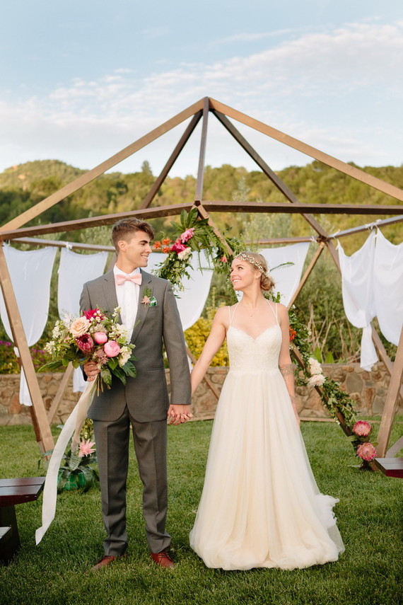
It was such a pleasure to work with Flutter Magazine on their 6th issue. We took each horoscope and designed a tablescape around the traits associated with each sign. Flutter Magazine complied an amazing group of designers and photographer to bring the shoot to life.
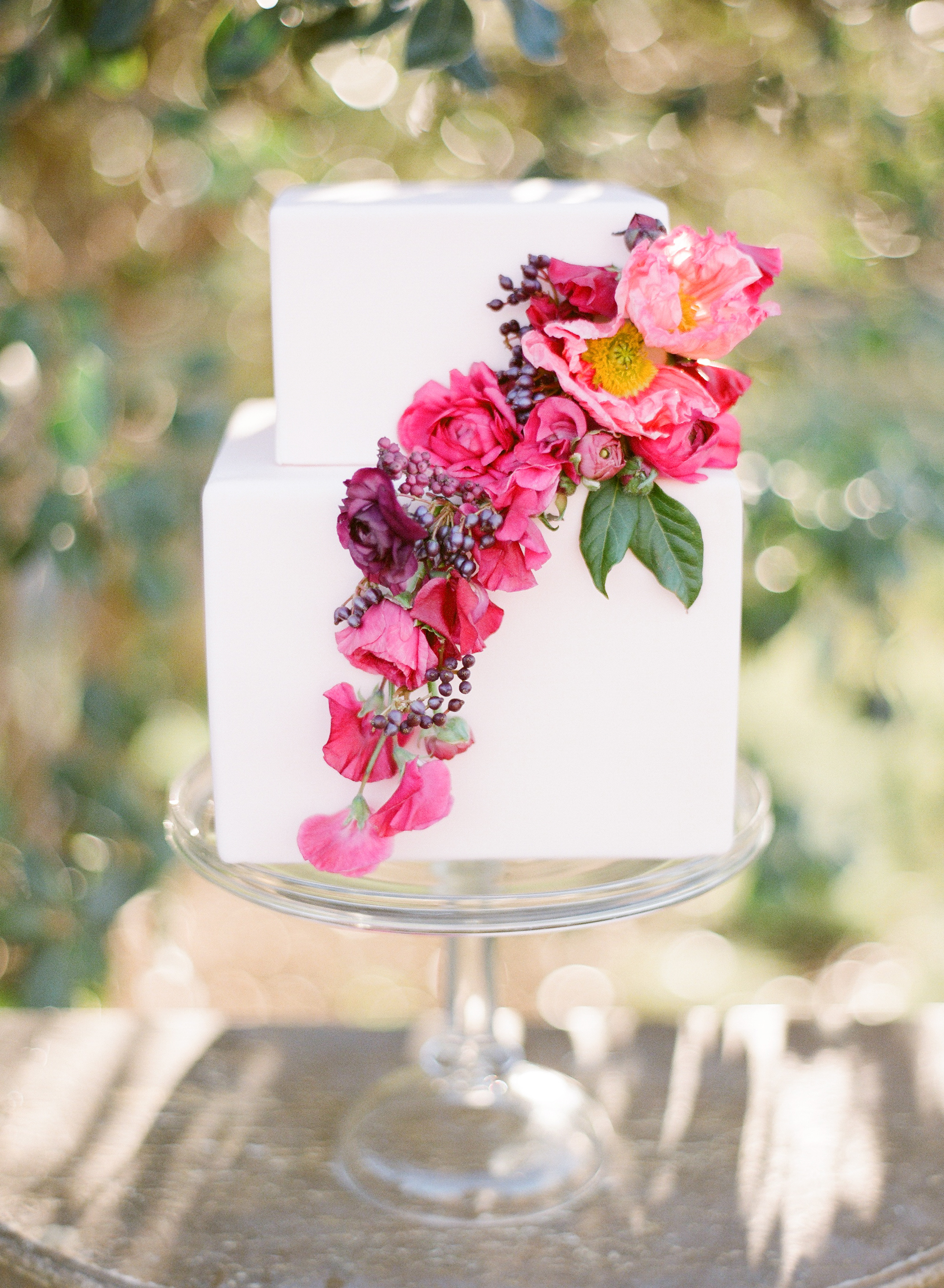
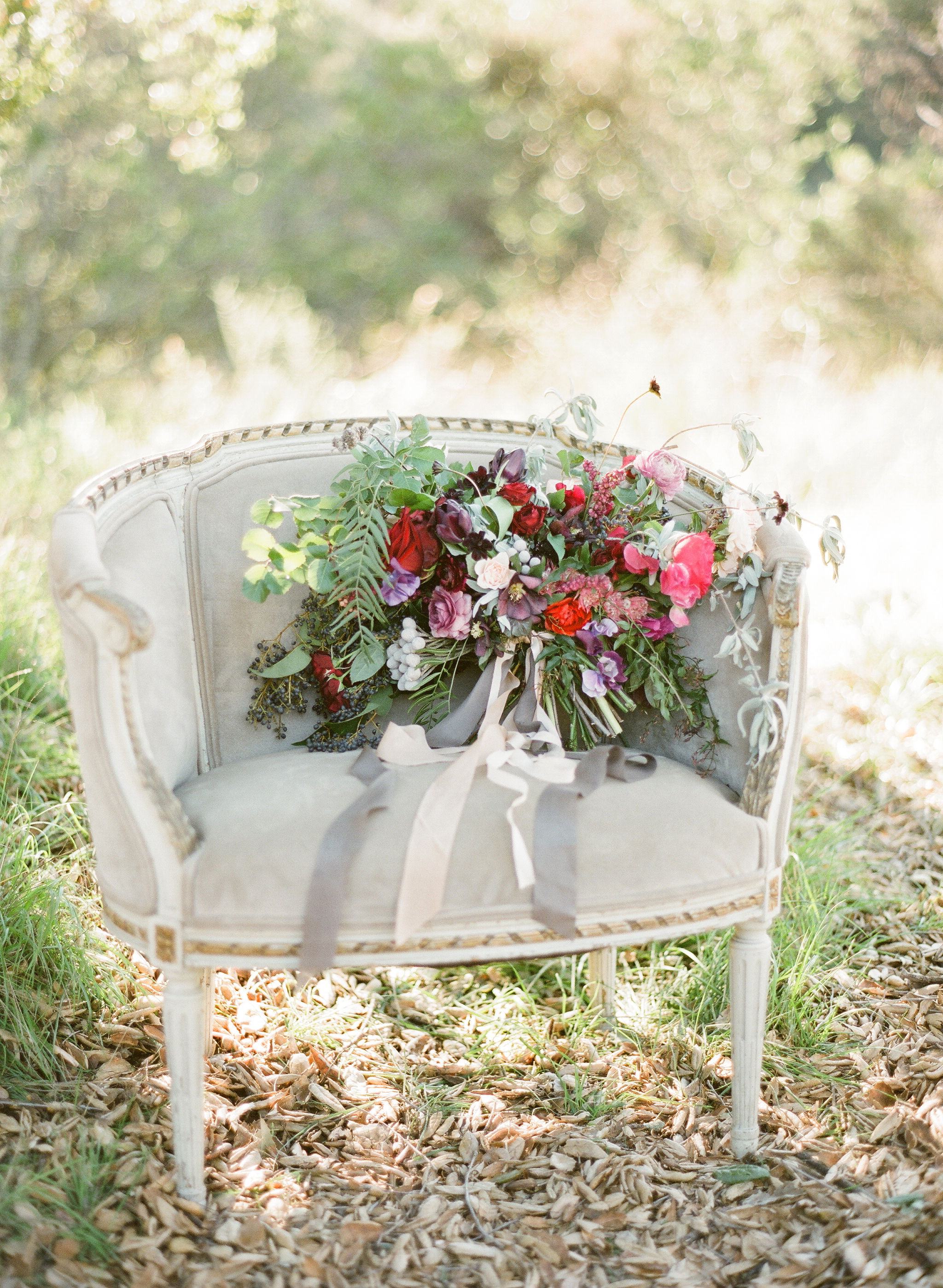
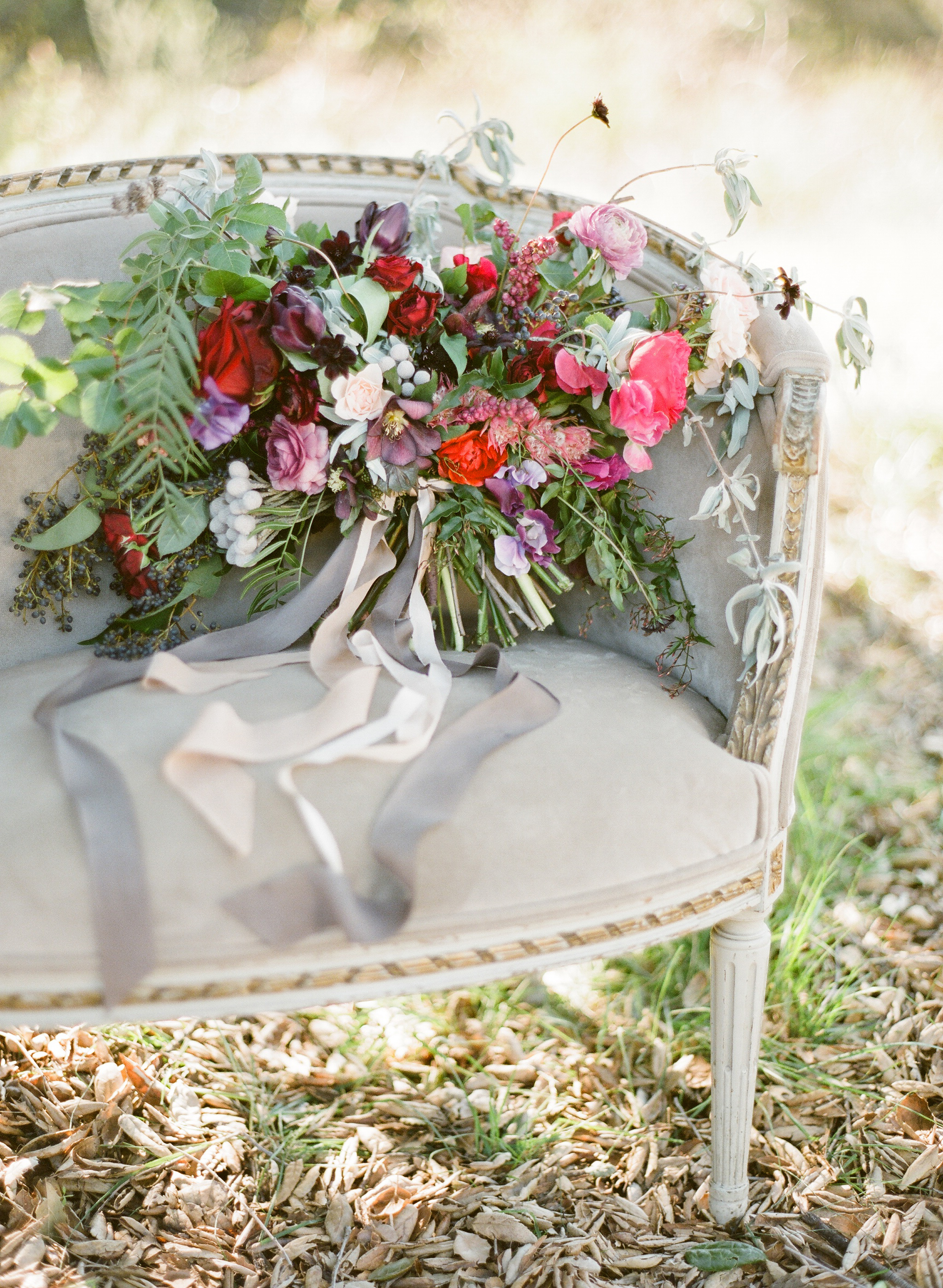
OCTOBER 23 — NOVEMBER 21: We are drawn to you, Scorpio bride. You are magnetic and irresistible. Be sure to emphasize your fiery spirit with bright colors on your tables and invitations. Utilize your lucky gem, the Garnet, to add a pop of color to your own attire. Peonies draped on your cake will make your guests gasp. The lush peony can spice up your bridesmaids bouquets too. Be sure to include elements of lace in your veil and dress. We suggest you jet off to Spain for your honeymoon.


As seen in Flutter Magazine, Issue No. 6
Photography: KT Merry | Design + Styling: Joy Proctor | Floral Design: Amy Osaba Events | Hair + Makeup: LunaBella Makeup and Hair | Jewelry: Sofia Kaman | Furniture: Found Vintage Rentals | Commissioned Cream Backdrop: Katherine Bell of The Habitat Factory | Cocktails + Recipes: Melissa Piña of Soiree Center | Tableware + China: Small Masterpiece | Horoscopes: Briana Westmacott | Cake: M Cakes Sweets | Dress: Rue De Seine, Sadi via Lovely Bride | Invitation Suite: Design House of Moira
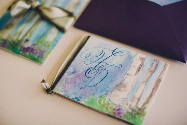
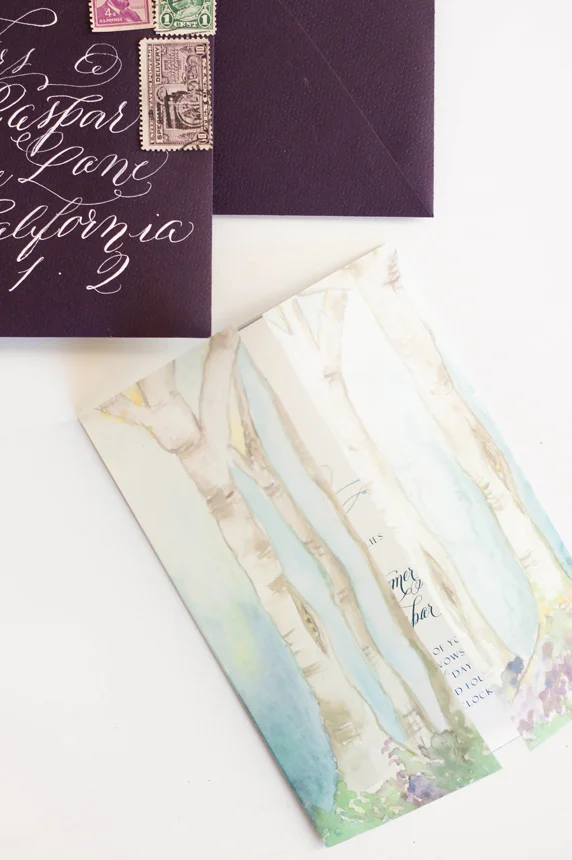
When approached to create a suite for a destination wedding in Santorini, I jumped at the opportunity!
This suite differs from our typical work a tad...when building the ideas and design elements that this suite would be created around, I toyed with the idea of creating an illustration that embodied the classic Santorini buildings. We also wanted to incorporate the distinctive blues of both the classic Santorini rooftops as well as the surrounding piercing blue ocean. In the end, we nixed the building idea and decided to keep it a bit more simple and focus on the blues and the movement of the ocean.
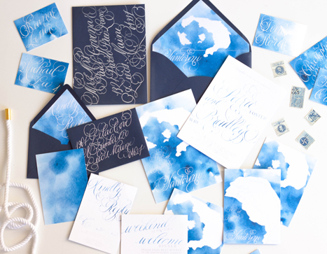
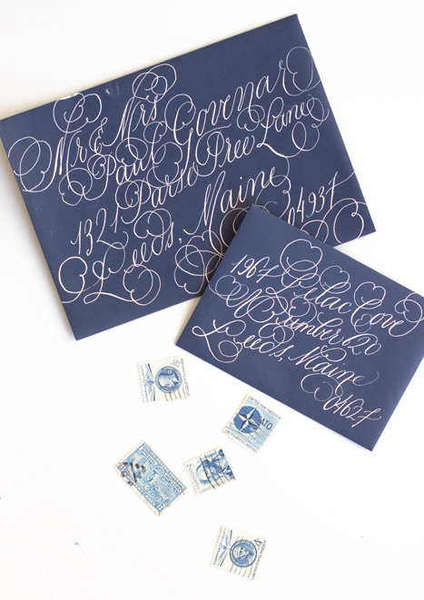
I used a watercolor wash as a base in a vibrant cerulean blue, letting the wash be uneven in saturation. I then illustrated a map of the island itself and used that as an overlay for both the backers as well as envelope liner. I used a fairly flourished calligraphy style to balance out the simplicity of the suite.


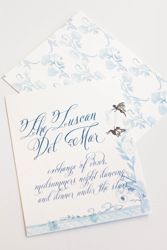
We had such a wonderful time collaborating with Absolutely Events on this suite inspirited by Shakespeare’s A Midsummer Night’s Dream. We've walked you through the process we went though in creating the suite, now you get to see it in action!
Design: Absolutely Events
Florals: Rae Florae
Photography: Jackie Wonders


Our last post told the story of the process and artwork behind a wedding invitation suite inspirited by A Midsummer's Night Dream. The final suite was a gorgeous combination of shades of blue, violet and purples with black details.
I really did enjoy working on this suite even though I went through a period of discouragement with the artwork and color palate.
The most colorful and my personal favorite part of the suite was the watercolor painting of a fairy hollow. I created a little vignette of trees spanning a space with colorful flowers and lots of blues. I used the artwork on a thin velum that wrapped the entire suite and held all the pieces together as well as the envelope liner and the back of some of the pieces.


The invitations featured a calligraphy monogram, banner and watercolor flourish. I wanted to keep the main portion of the invitation free of heavy artwork and focus on the calligraphy elements. I knew that the other pieces and the backs would hold enough color and artwork to balance the suite as a whole.
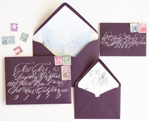
The back of the invitation suite was the artwork that took me the longest, as one could imagine, especially given that I redid the entire thing from color to shades of blue (see previous post for further background). I kept the artwork on the response card and reception similarly simple, but added some of the silhouettes as details.


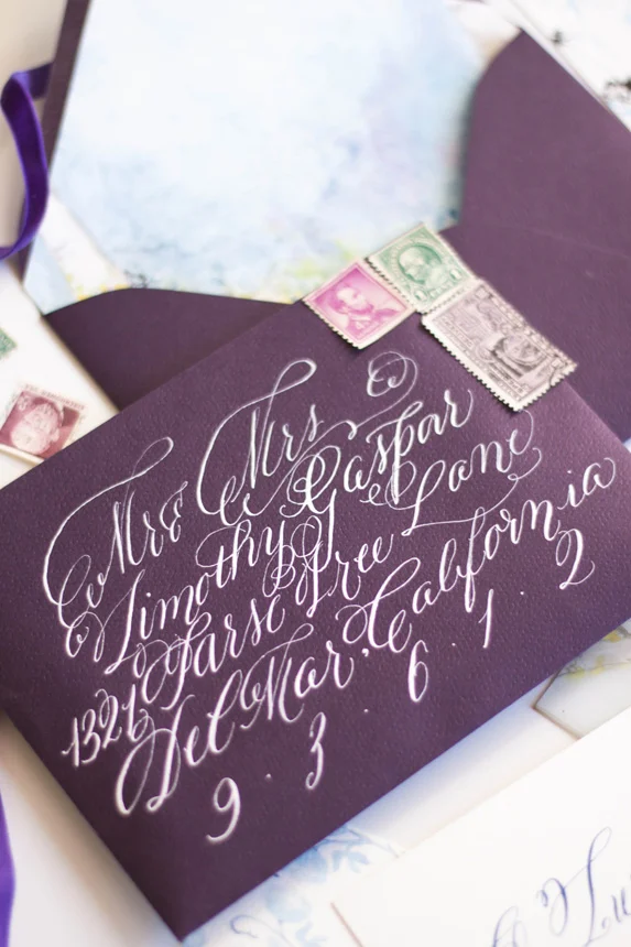
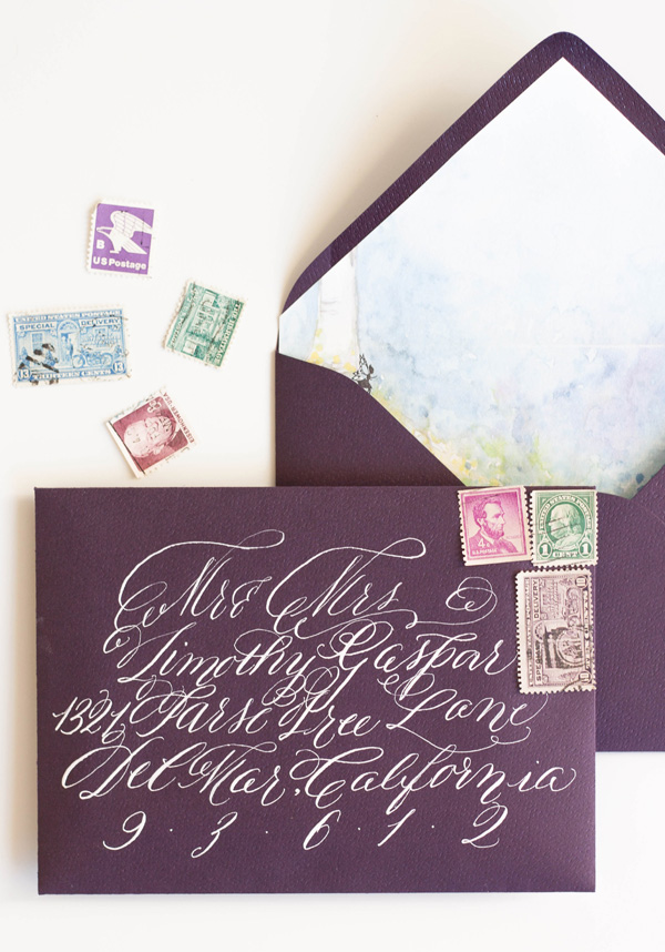
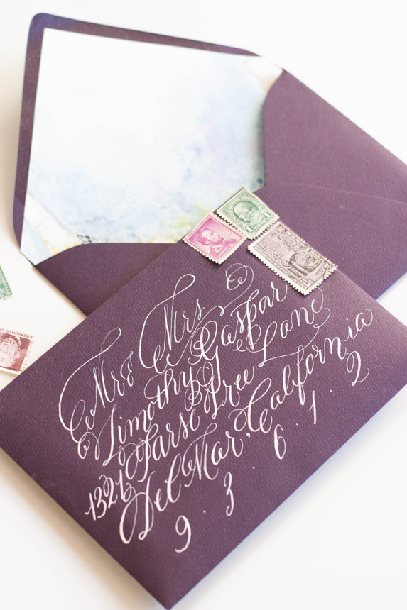
As always, the calligraphy on the aubergine envelopes was a perfect match to the suite in opaque white ink. I lined the envelopes with the matching fairy hollow, with the reply card with matching calligraphy on its liner. I choose some vintage stamps to round out the design.


I LOVED creating the programs! They folded with the artwork contenting front and back. When opened, the bridal party was depicted by silhouettes with the bride and groom in the middle.


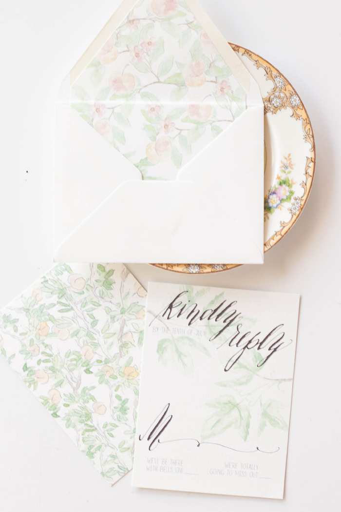
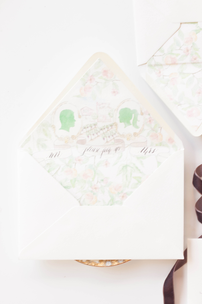
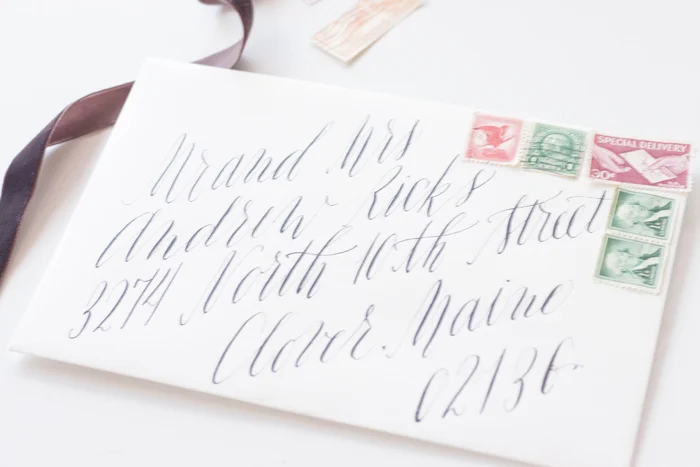
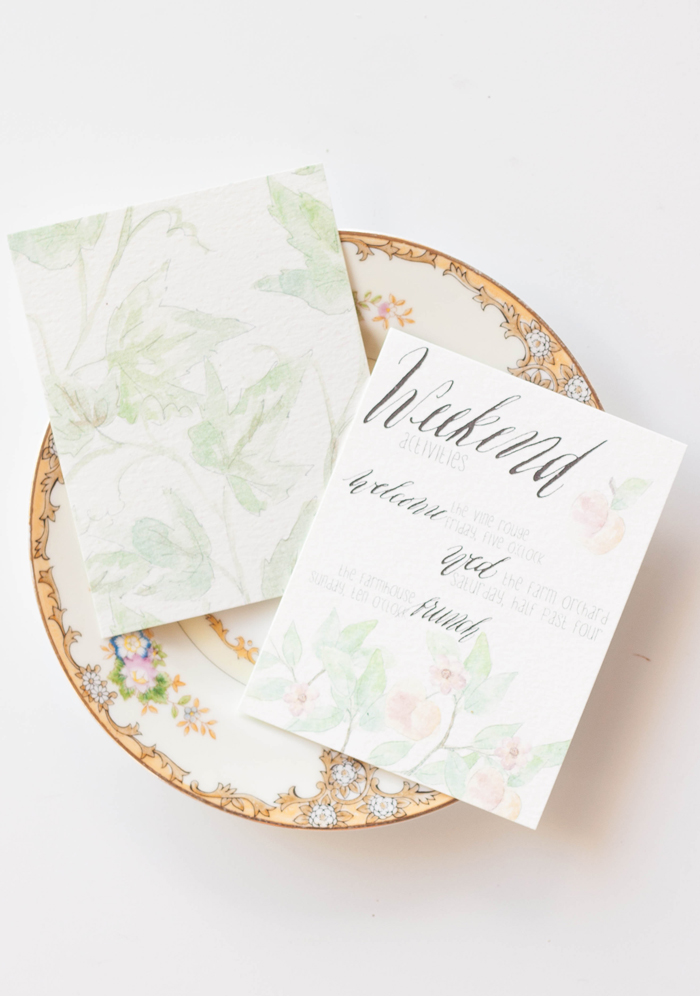
It is always a pleasure and an honor to be featured by an industry blog! We love Oh So Beautiful Paper and are thrilled to have our Peach Orchard bespoke suite featured there today!

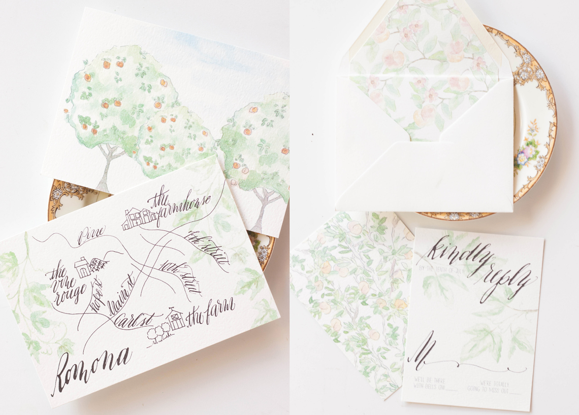

a few weeks back, we did a post about creating this suite and the artwork that went into it. Its one of my favorite suites to date!
Like all our designs, we start with some sketches. This one was particularly in need of a layout since I knew there would be quite a few elements and characters in play. By sketching it out, I have a better idea of where I can use what elements, how the pieces translate from the invitation all the way through to the menus and placecards, as well as I have a better understanding of what elements will need to be created.
From the sketches, I started created the artwork with pencil and paper, then went back through and inked it all in. This was a case that i wanted to leave some of the lines visible, so I choose to use ink rather than just leaving the pencil.


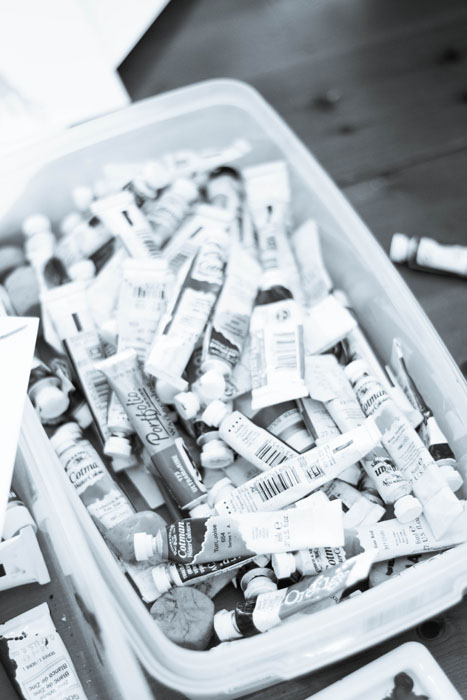
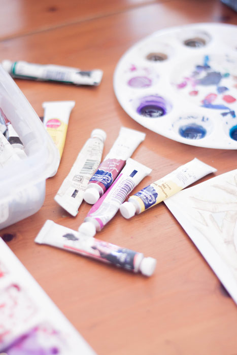
...then comes the mess. Im grateful that I have enough space that I can get out all my toys and leave them out if need be. I started painting these in last night and finished them this morning.


we get asked a lot about the process we go through when creating custom invitations... starting from scratch always creates a lengthy process no mater what you're creating, and custom wedding invitations are no exception.
our process is different from most for a few reasons - one, we're calligraphers. two, we're artists and three, we're graphic designers. add those three factors together, and you get a unique take on paper products.
let us walk you through our process a bit ... when working with a new bespoke invitaion client, the first thing we do is hammer out some of their ideas, what pieces they would like, and what the overall look and feel will be. this usually starts with sketches, rough notes and some scribbles...like so...

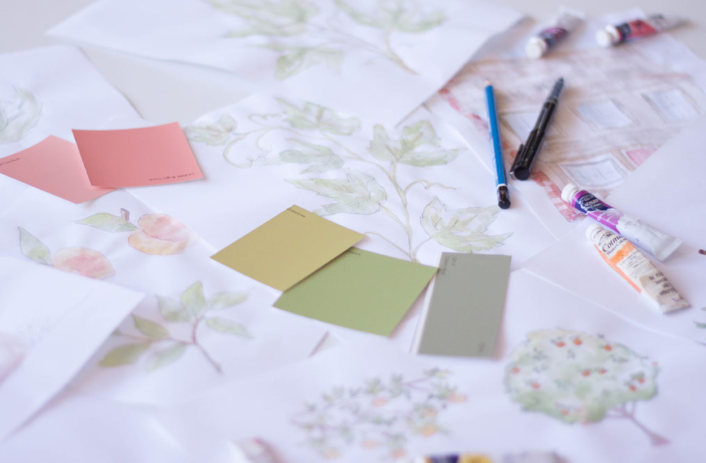
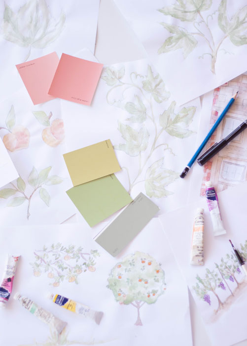
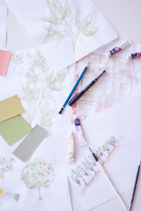
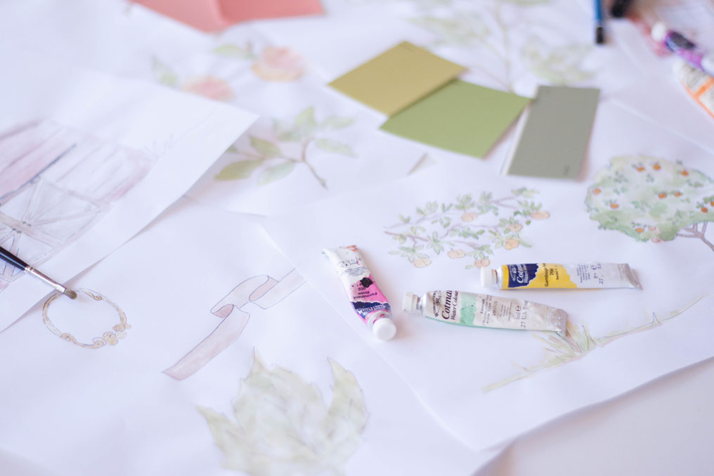
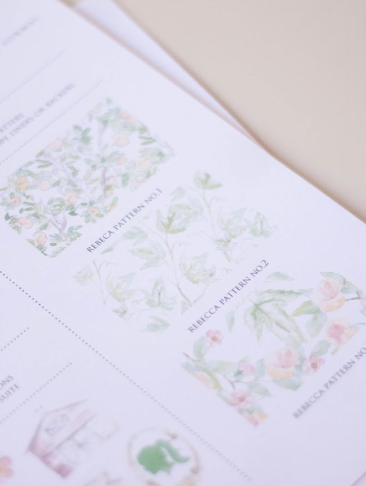
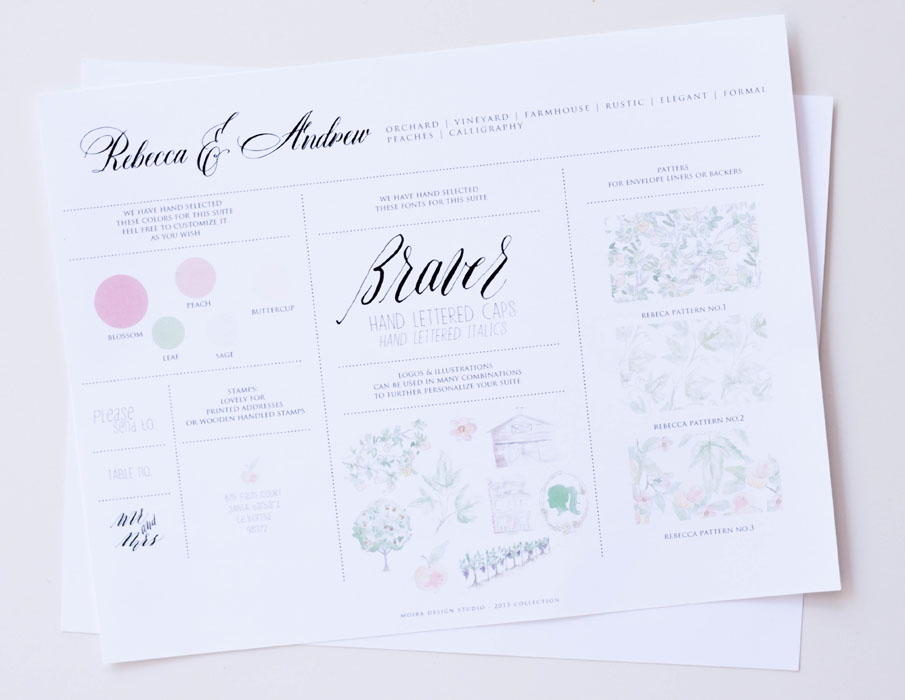
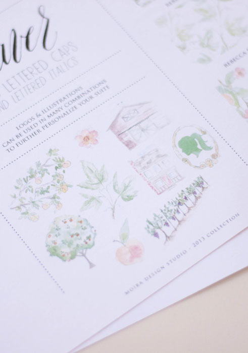
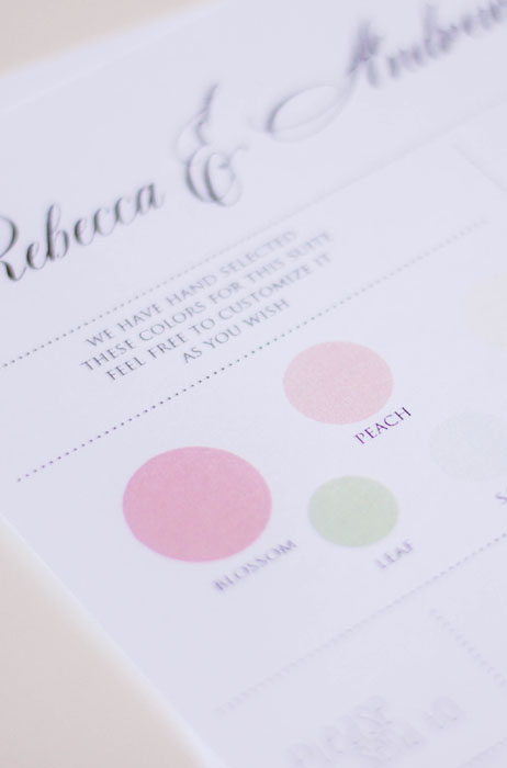
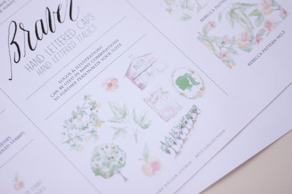
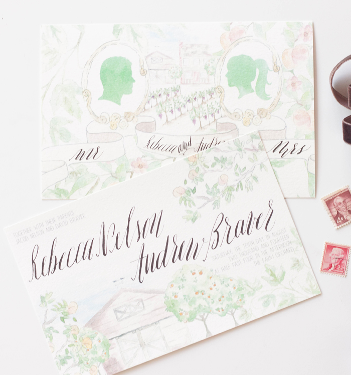
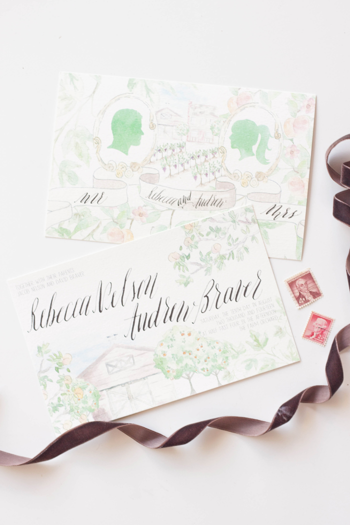
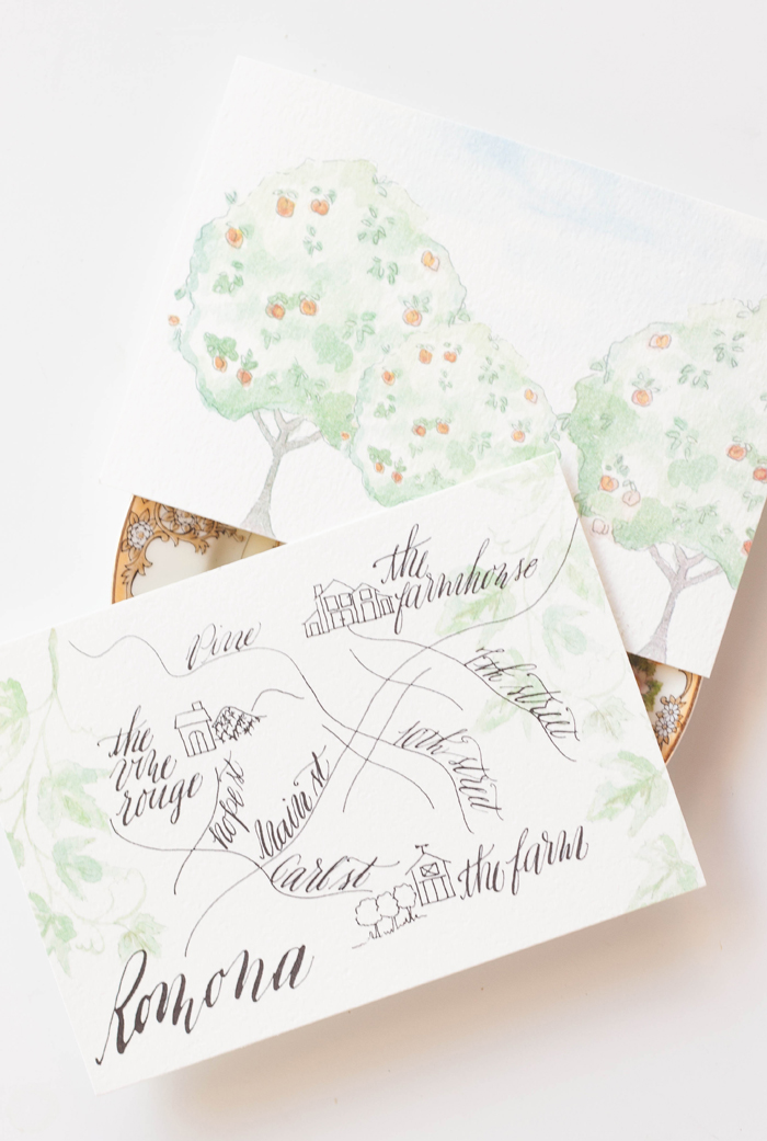
these sketched sheets are the basis for our design. we review color palettes, design inclusions, potential assembly ideas, etc. for this particular suite, we're pulling out peaches, blushes, pinks, greens and ivories. the design elements included in this suite will be peach blossoms, peach trees, orchards, some grape vines, grape leaves (no actual grapes) and the barn and farmhouse where the reception will take place. the client also likes silhouette portraits, which we'll try get on the design somewhere. at this point, we really get a feel for the overall formality of the event as well.
the next step is to start creating some artwork. we begin with sketches, then depending on the look we're going for, their either inked and then painted, or just painted. for this suite, i first sketched, then inked using rough lines rather than a hard outline. i wanted the watercolor to be fair in color, so i used the light ink lines to help define the elements a bit more. here, i ended up with about 8 pages of elements.

now comes the fun part - the painting or illustrating. since we use a lot of mixed media, this could be watercolor, gouache, colored pencil, ink, or acrylic. by this point, we've really narrowed down what a client is looking for. sometimes this includes doing a rough design board if we need to narrow things down a bit more before we move into the paint stage. since this stage is the most time consuming, we try to not end up painting too many more elements than what we'll actually be using.
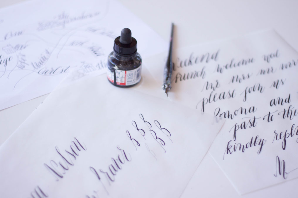
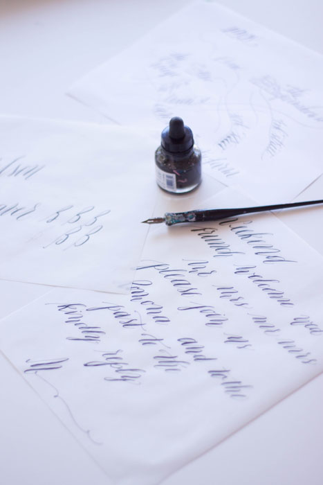
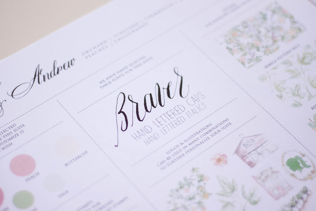
we then march right into the lettering. since we're also calligraphers, most of our work includes some sort of hand lettering or calligraphy. we do all our calligraphy as master copy work, then using a scanner, applique the calligraphy onto the design and reproduce the work as one print. we use the same process for our artwork.
from here, we create a design board. we LOVE using design boards; they're an excellent way to visually put all our elements in one place and convey the overall look and feel. a client can see all their artwork, patterns, fonts, and other options all listed out at once. we use these design boards to decide what elements go where, what patterns we'll put on which pieces, what the envelope liners will be, etc.

once our design board is in place, and all our elements have been approved by the client, we move into our proofing. we create invitation suites different from a lot of design companies out there - each piece in the suite is often quite different from the next and sometimes showing just a single piece doesn't convey the entire suite accurately. we usually create a couple invitation layout options, but select our favorite to create several pieces in the suite so the client can see how we plan on using elements from one piece to another. we also print the back sides of all our pieces, adding even more details and available space for elements and design.
our process and technique does set us apart, and the end result is truly a completely bespoke invitation, extremely unique to each client. this is where the hashtag #ilovemyjob comes in!