Posts tagged summer wedding
Vintage Postage on Wedding Invitations


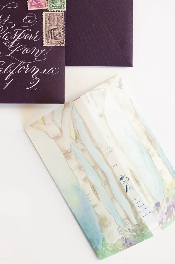
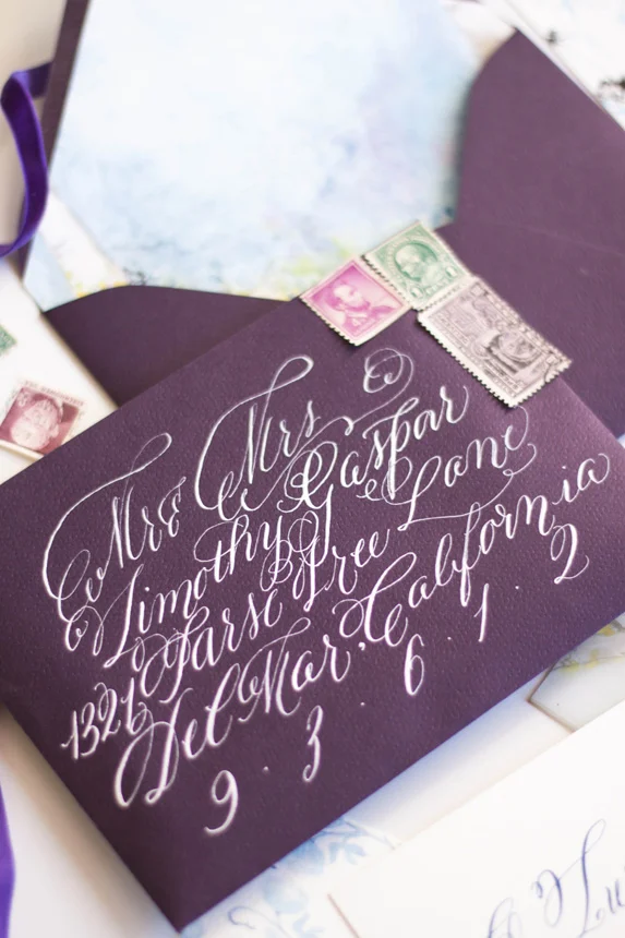
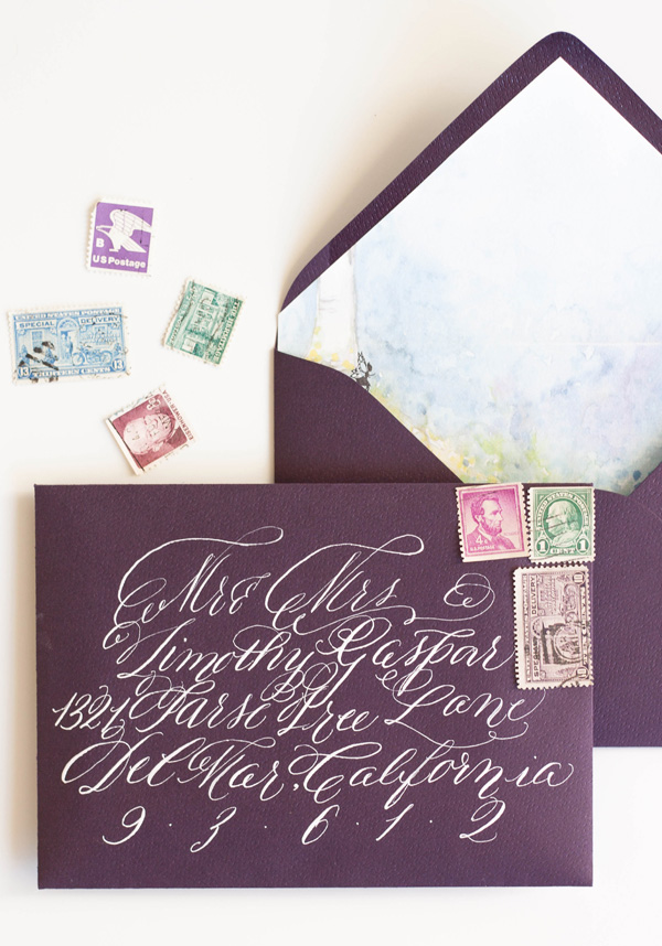
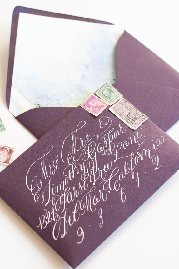
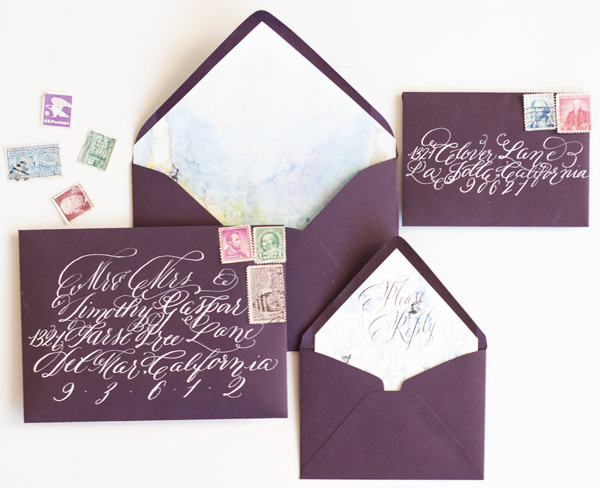
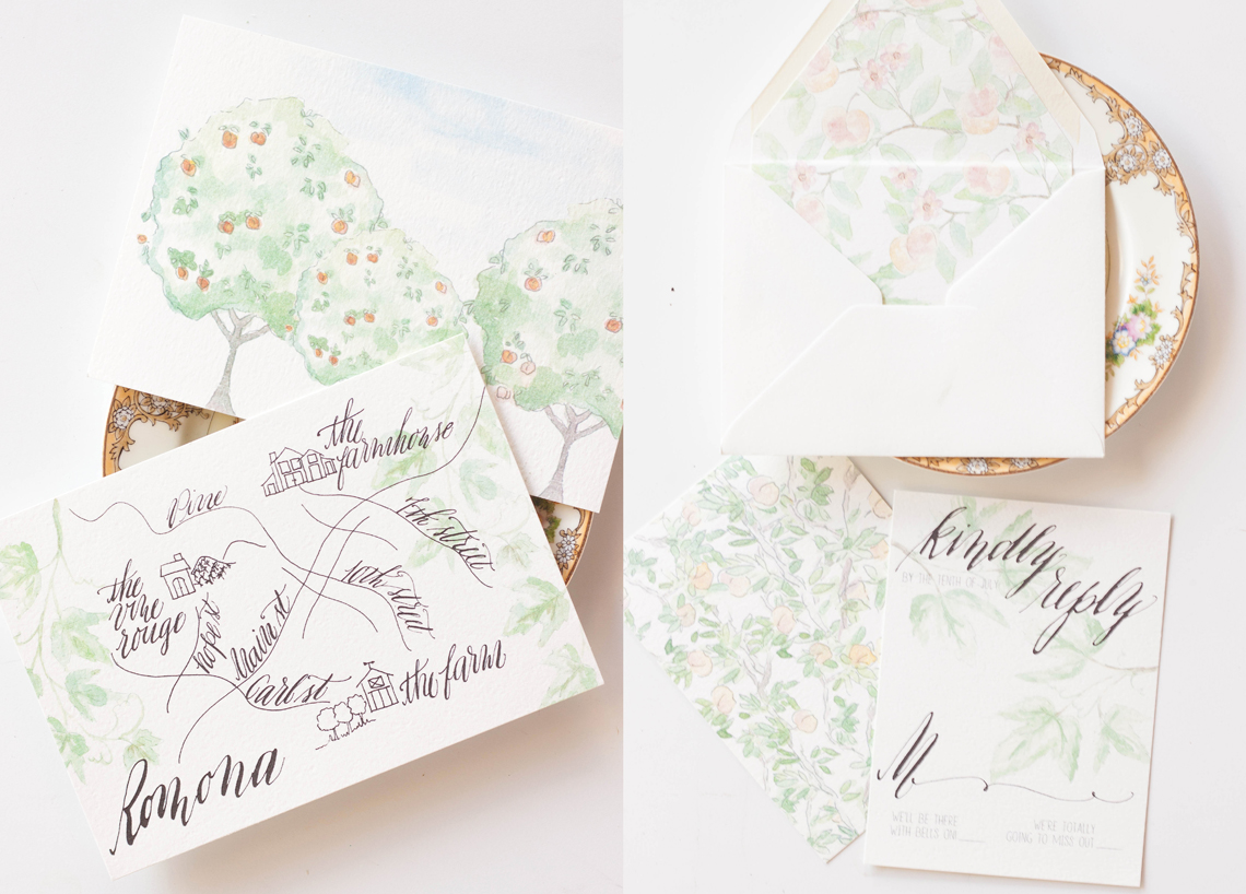
I love curated postage on wedding invitations! It’s like a miniature gallery of art in support of your overall aesthetic.


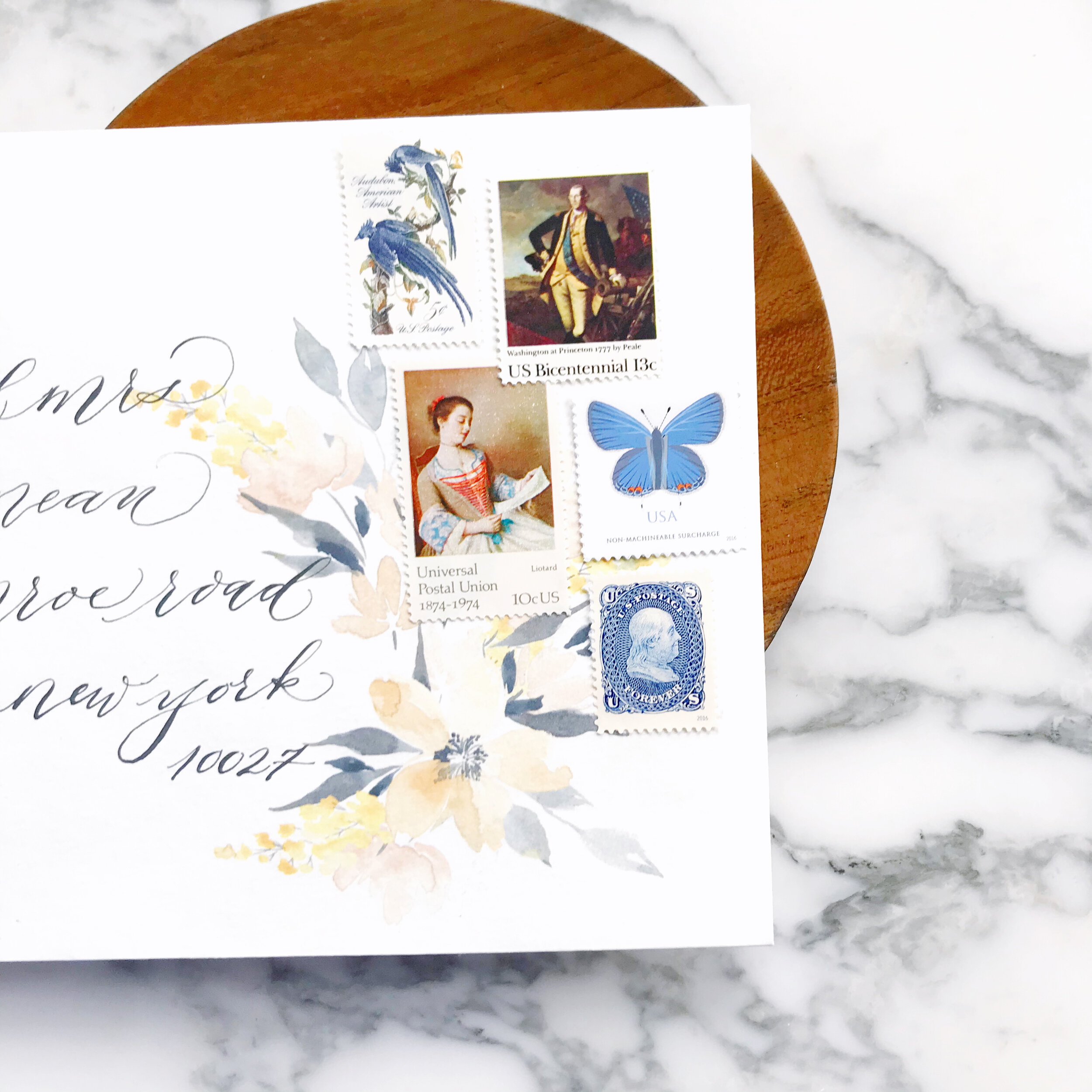
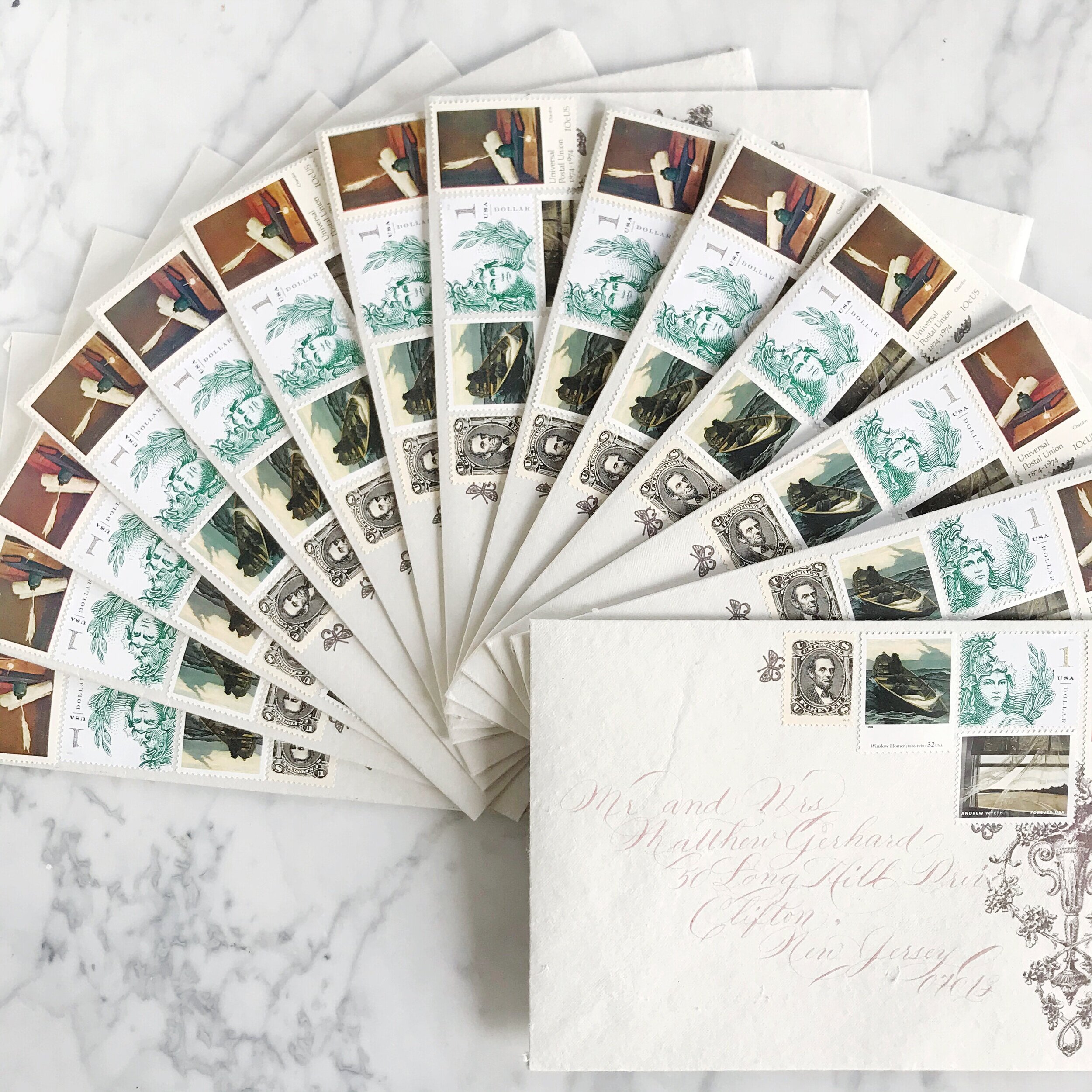
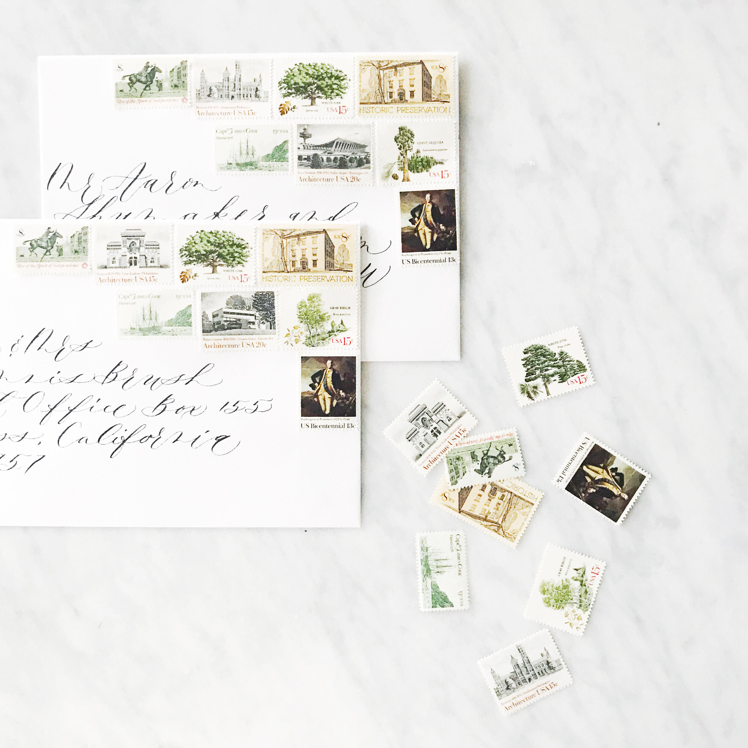
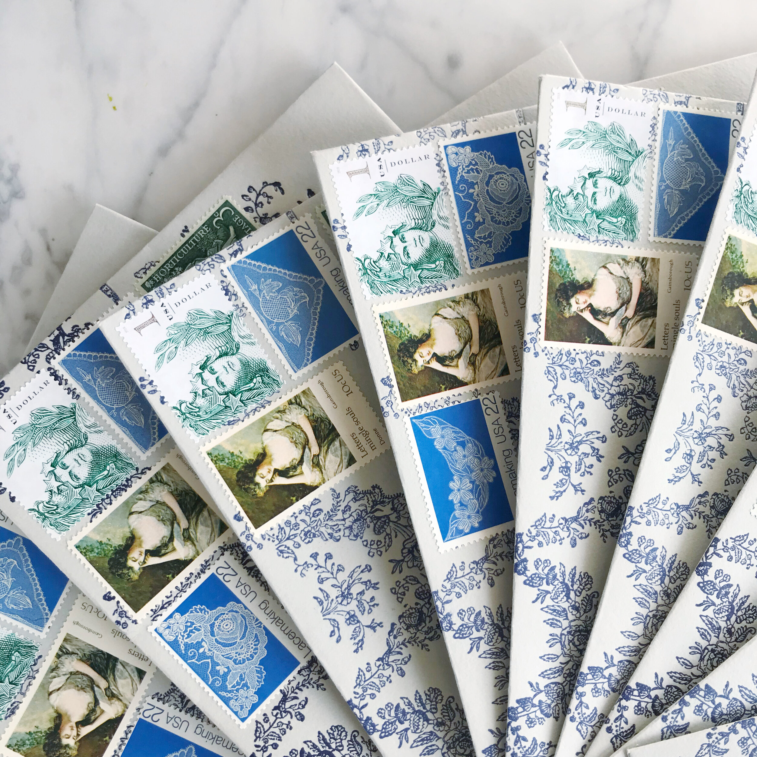
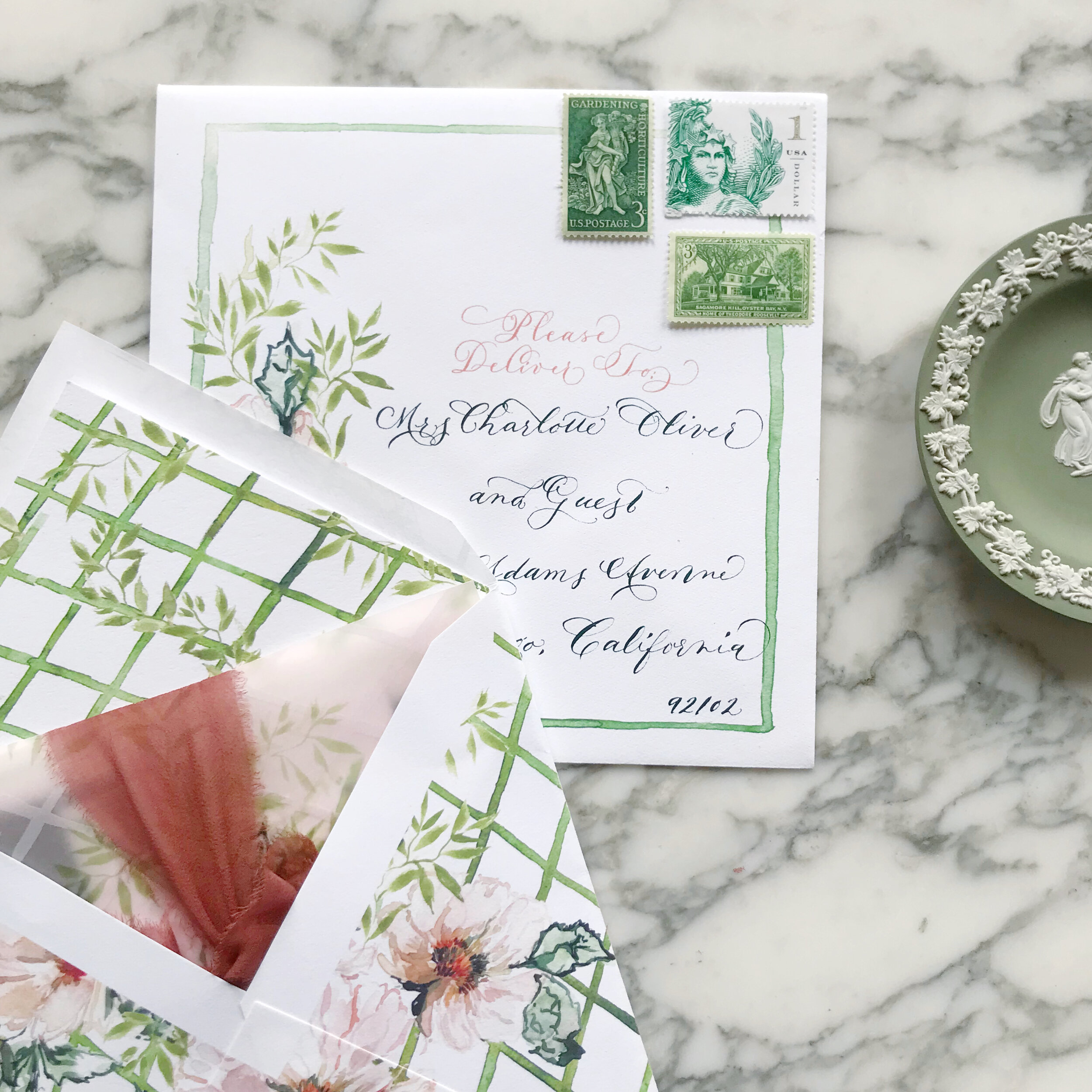
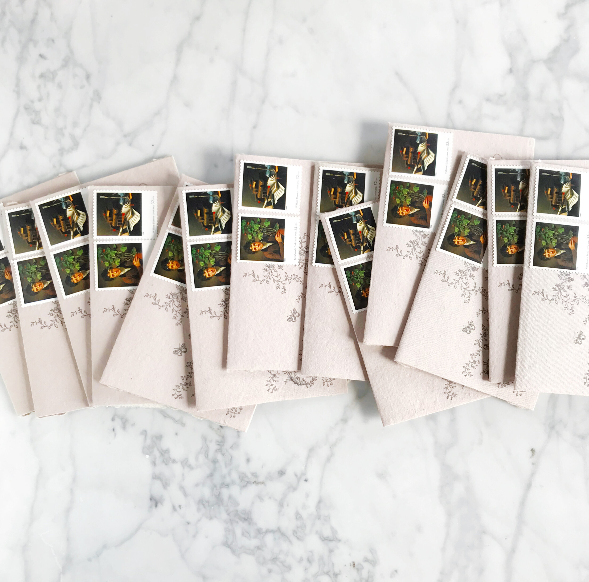
As a designer, vintage postage has its pros and cons. The pro is obviously how gorgeous and unique it is, bringing in supporting aesthetics to your suite (especially if you’re going for an old-world or vintage vibe!). Sourcing vintage postage can be challenging when wedding invitation suites require 100+ stamps. Inventory also tends to change quickly, so stamps you found three weeks ago and included in your pricing and proof may no longer be available at the same price.

I personally l love the challenge of finding the perfect collection of stamps for our clients. I have several tried and true suppliers who always have great selections and will help me find any postage that we need.

Tips for including vintage postage for your wedding invitations

Some designers will offer this service and don’t be surprised when they have an additional fee attached to it (we don’t, it’s a service we include in our pricing). Sourcing the right quantities and prices for vintage postage can be time-consuming, but not nearly as time-consuming as applying them to your envelopes!

If you’re applying the postage yourself, give yourself lots of time, it takes much longer than you think!

Use glue, don’t rely on being able to lick the old stamps as the adhesive ages at different rates, depending on how old the postage is. You certainly don’t want any falling off in transit!

Be prepared to pay about 3x the rate of current issue postage when shopping for vintage postage for your wedding invitations


Summer Wedding Invitation Inspiration
 

Summer weddings are all about those bold colors, full of sunshine and exuberance. I love everything from the seaside blues to sunflower yellows!


Cheerful yellows, bright oranges, leafy greens, and summer sky blues are all over this time of year! I love outdoor weddings, and the summer season is all about parasols and the bright hues of the season.

So let’s talk about summer invitations, and we’ll start with the summer invitation inspiration in this post!

Poppies are such a summer staple, and the Icelandic poppies for these bridal shower invitations are no exception! Printed on handmade paper and covered edge to edge in gorgeous formal calligraphy, these bridal shower invites take your shower game to the next level! We went way over the top with the calligraphy for this suite, pouring the flourishes over the deckled edges.

The simple save the dates, layered with Japanese cane paper and handmade paper, for a Bermuda destination wedding are pale and understated. I love the idea of going off the beaten path, so taking on the tropical vibe while foregoing blues and bright colors is definitely my type of project. The amazing tactile texture of the cane paper was exactly what our bride was looking for. We paired it with a sage green handmade paper with a deckled edge to add in even more texture.

Can we say holy cow envelope game? I loved this project! The bride got married at her parent’s property in Sun Valley, Utah, surrounded by tall grasses and wildflowers. We spent some time researching the varietals that would be blooming at the time of her wedding and built her entire suite around those, bringing in bright yellows, shades of oranges and blues, leaf greens, and pale pinks and peaches (I shocked myself with how many colors I was able to build into this suite!) Bits of line botanicals peak out from the corners, creating some interesting negative space. At some point, we’ll also look at the suite of woodland creatures we also created for this suite (owls, foxes, and bears, oh my!).

These summer invitation suites have such different looks and feel to their aesthetic. I love the directions each of these brides went to reflect their personal style in their wedding!

 
Bespoke | O'dessa

orchard | rose gold | mt hood | organic | bright | formal | apples | blossom

Featured | style me pretty!

seaside | calligraphy | watercolor | sea breeze | antique stamps | silver flatware | rope | quote | white | pale blue | gauzy | airy | light

photography: Krista A Jones

design: Alex Meyer

stationary & calligraphy: Moira Design Studio

flowers: The Floral Studio

moira design studio | bespoke

"...In you I wrap a thousand onward years."

Bespoke - midsummers night dream
moiradesignstudio.jpg
 

Our last post told the story of the process and artwork behind a wedding invitation suite inspirited by A Midsummer's Night Dream.  The final suite was a gorgeous combination of shades of blue, violet and purples with black details.  


I really did enjoy working on this suite even though I went through a period of discouragement with the artwork and color palate.  


The most colorful and my personal favorite part of the suite was the watercolor painting of a fairy hollow.  I created a little vignette of trees spanning a space with colorful flowers and lots of blues.  I used the artwork on a thin velum that wrapped the entire suite and held all the pieces together as well as the envelope liner and the back of some of the pieces.  

moiradesignstudio.jpg

The invitations featured a calligraphy monogram, banner and watercolor flourish.  I wanted to keep the main portion of the invitation free of heavy artwork and focus on the calligraphy elements.  I knew that the other pieces and the backs would hold enough color and artwork to balance the suite as a whole. 


The back of the invitation suite was the artwork that took me the longest, as one could imagine, especially given that I redid the entire thing from color to shades of blue (see previous post for further background).  I kept the artwork on the response card and reception similarly simple, but added some of the silhouettes as details. 

moira design studio.jpg

As always, the calligraphy on the aubergine envelopes was a perfect match to the suite in opaque white ink.  I lined the envelopes with the matching fairy hollow, with the reply card with matching calligraphy on its liner.  I choose some vintage stamps to round out the design. 

I LOVED creating the programs!  They folded with the artwork contenting front and back. When opened, the bridal party was depicted by silhouettes with the bride and groom in the middle.  

Featured...on Oh so beautiful paper!

It is always a pleasure and an honor to be featured by an industry blog!  We love Oh So Beautiful Paper and are thrilled to have our Peach Orchard bespoke suite featured there today! 

Featued-on-OSBP.jpg