Posts tagged blush
Art Nouveau Wedding Invitations
 

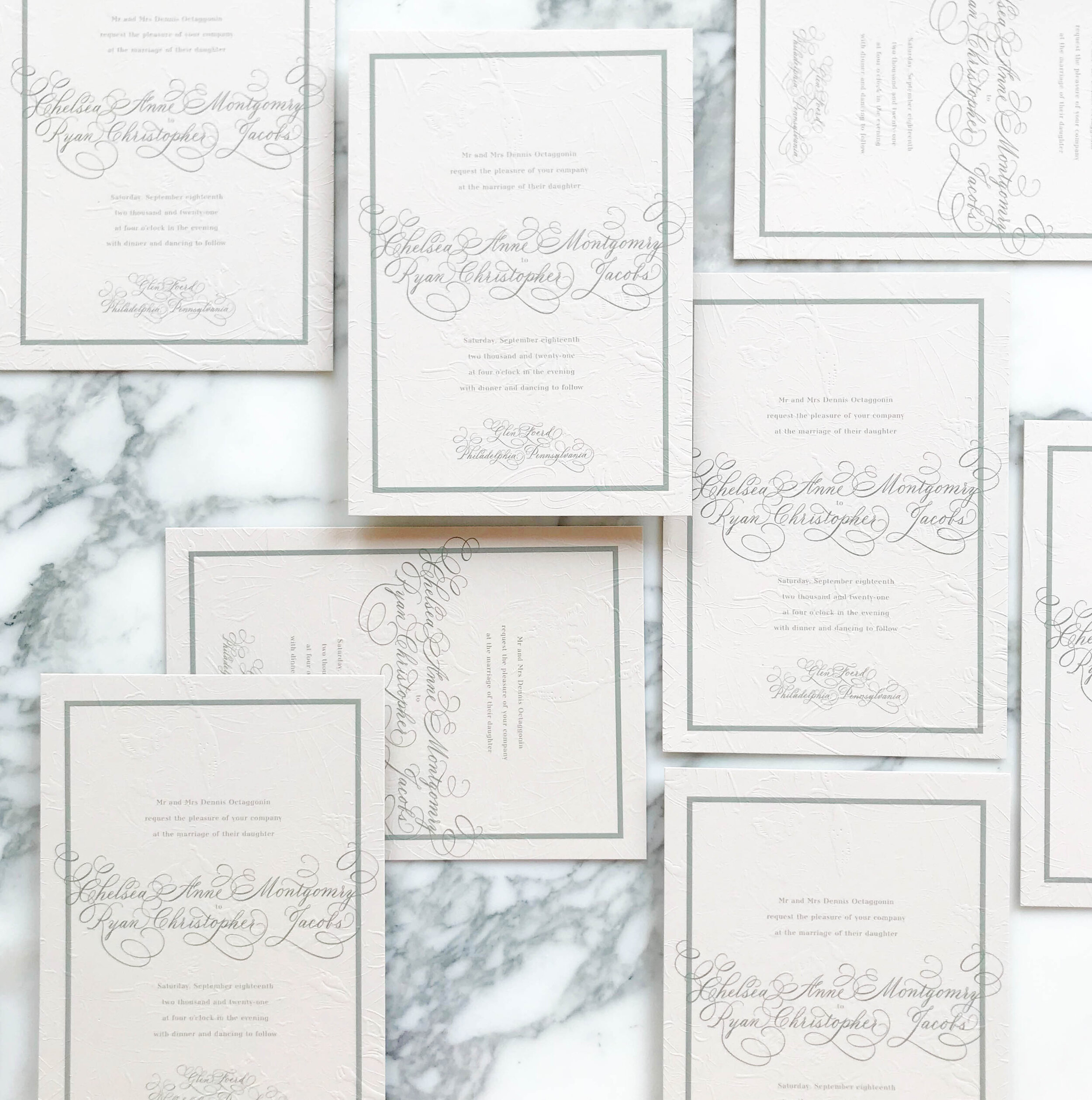
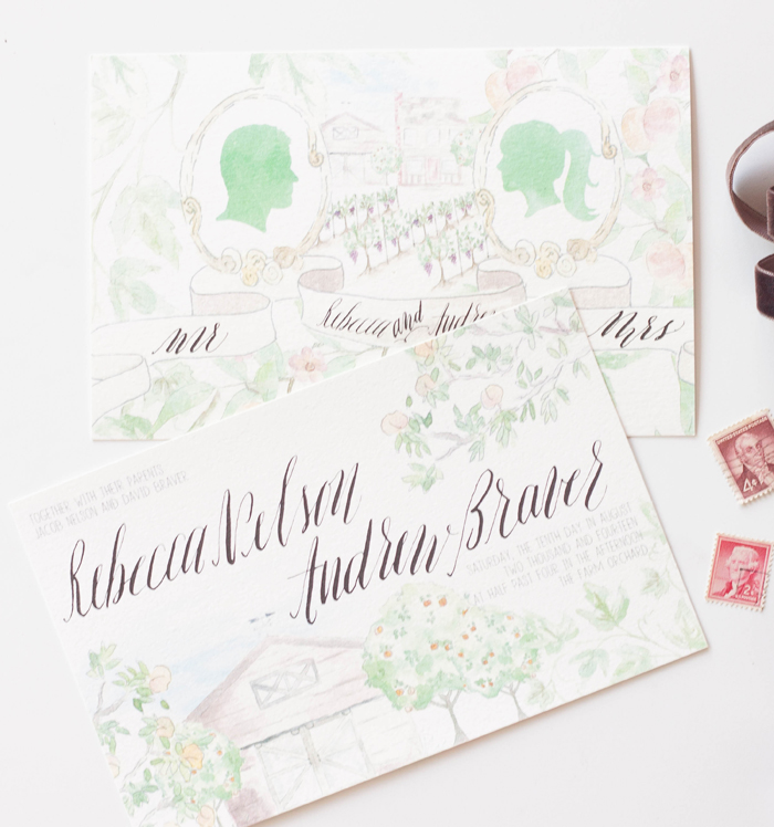
art nouveau, pale greens and nudes, elegant, overall texture, soft, unexpected, soothing, formal

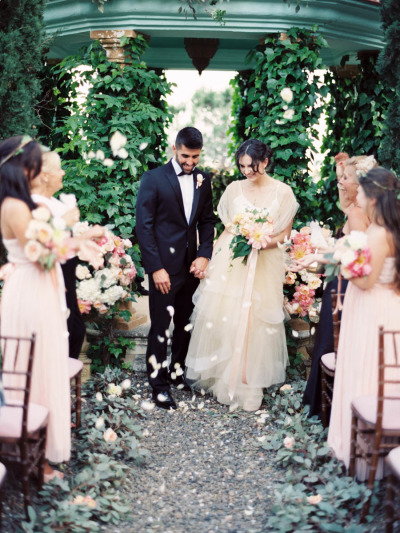
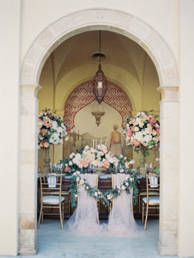
Glen Foerd Mansion | Philadelphia, Pennsylvania

Embossed Art Nouveau Wedding Invitations Green and Nude4.jpg

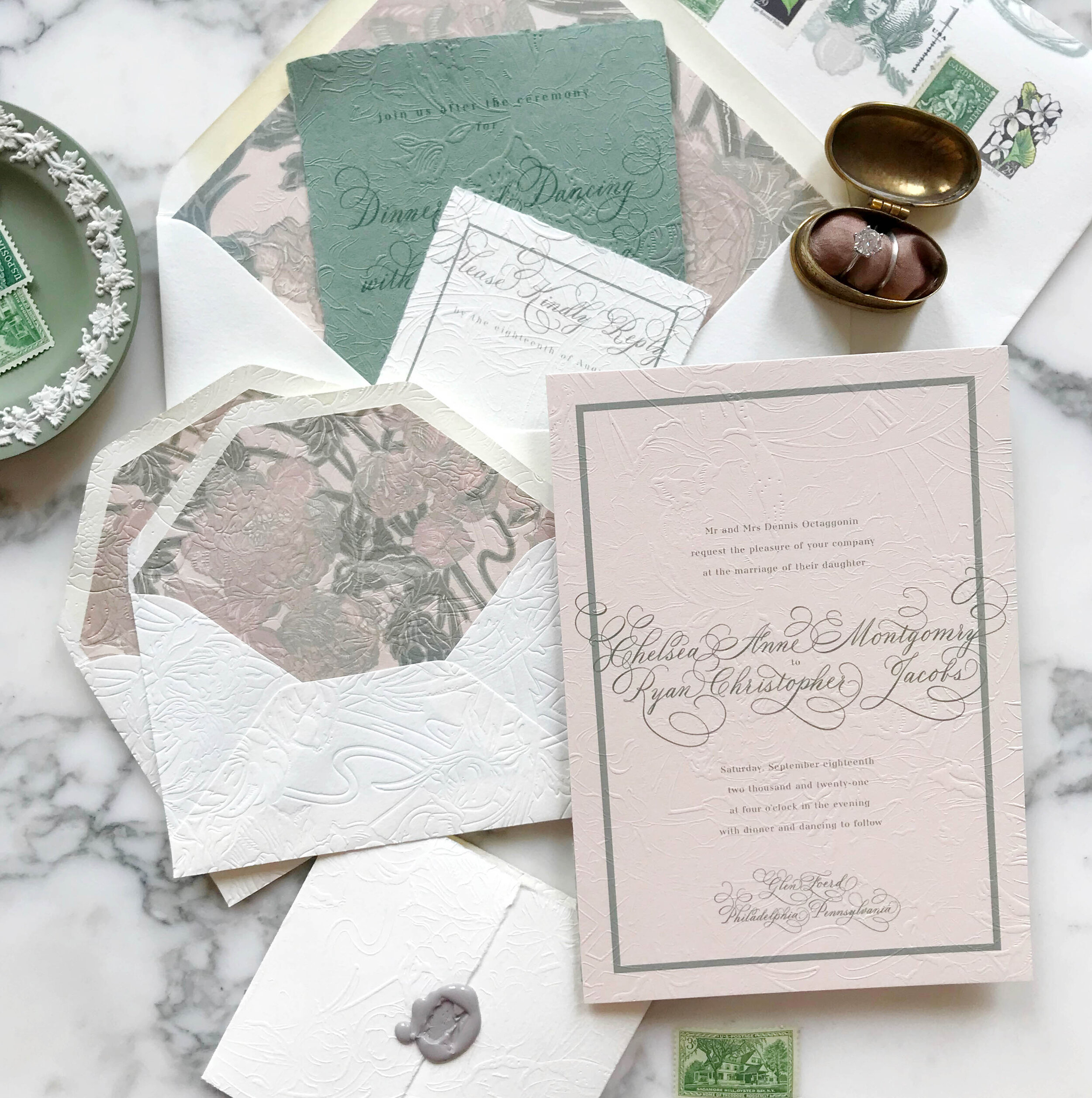
We wanted to bring in the graceful and soothing vibes of the Art Nouveau era with pale neutrals, smooth greens, and impressive overall texture. We selected artwork inspired by antique wall paper to start our design work. Working with the artwork and palette of nudes and greens, we developed our overall look and feel, a perfect fit for the gorgeous Philadelphia mansion of Glen Foerd.

_Embossed Art Nouveau Wedding Invitations.10.jpg

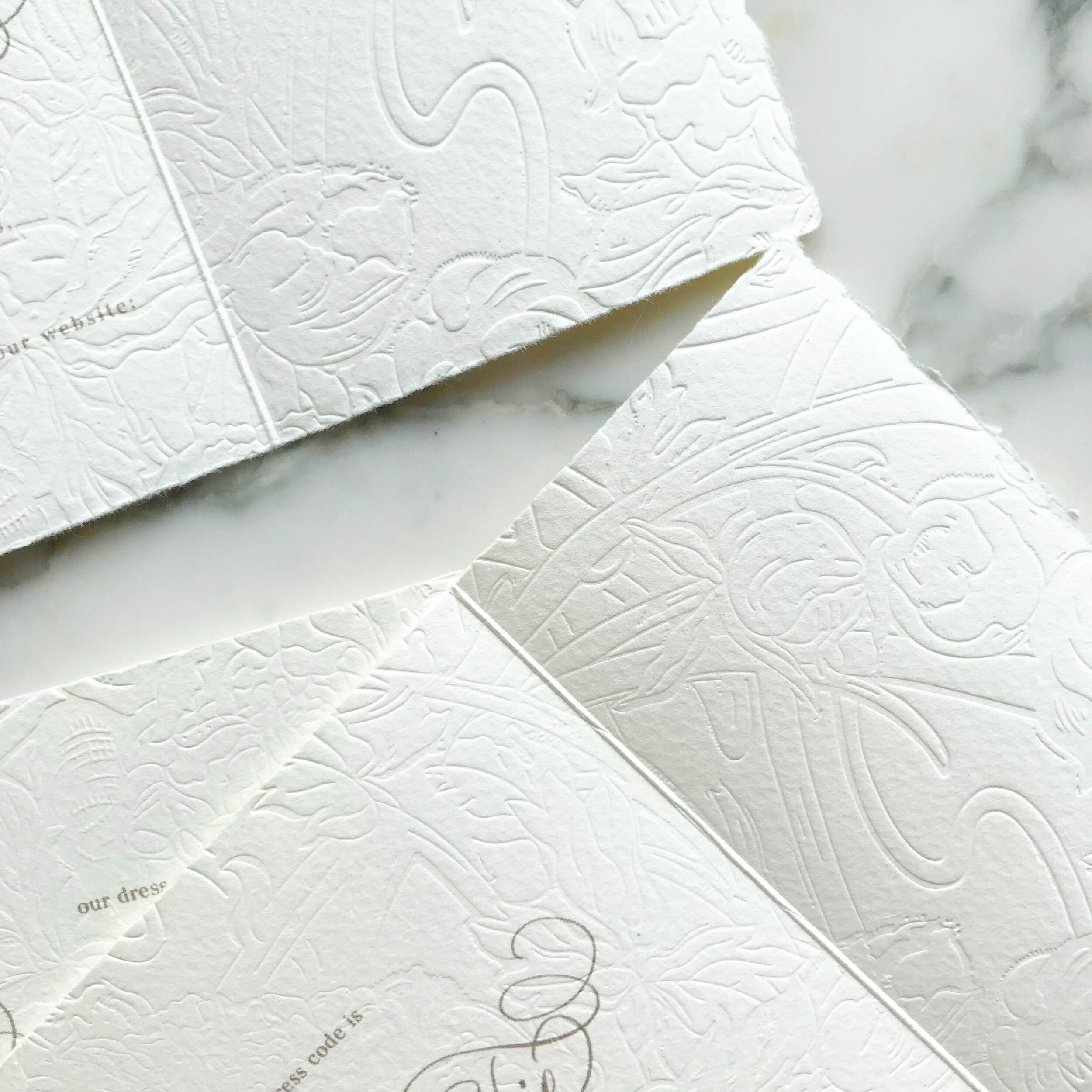
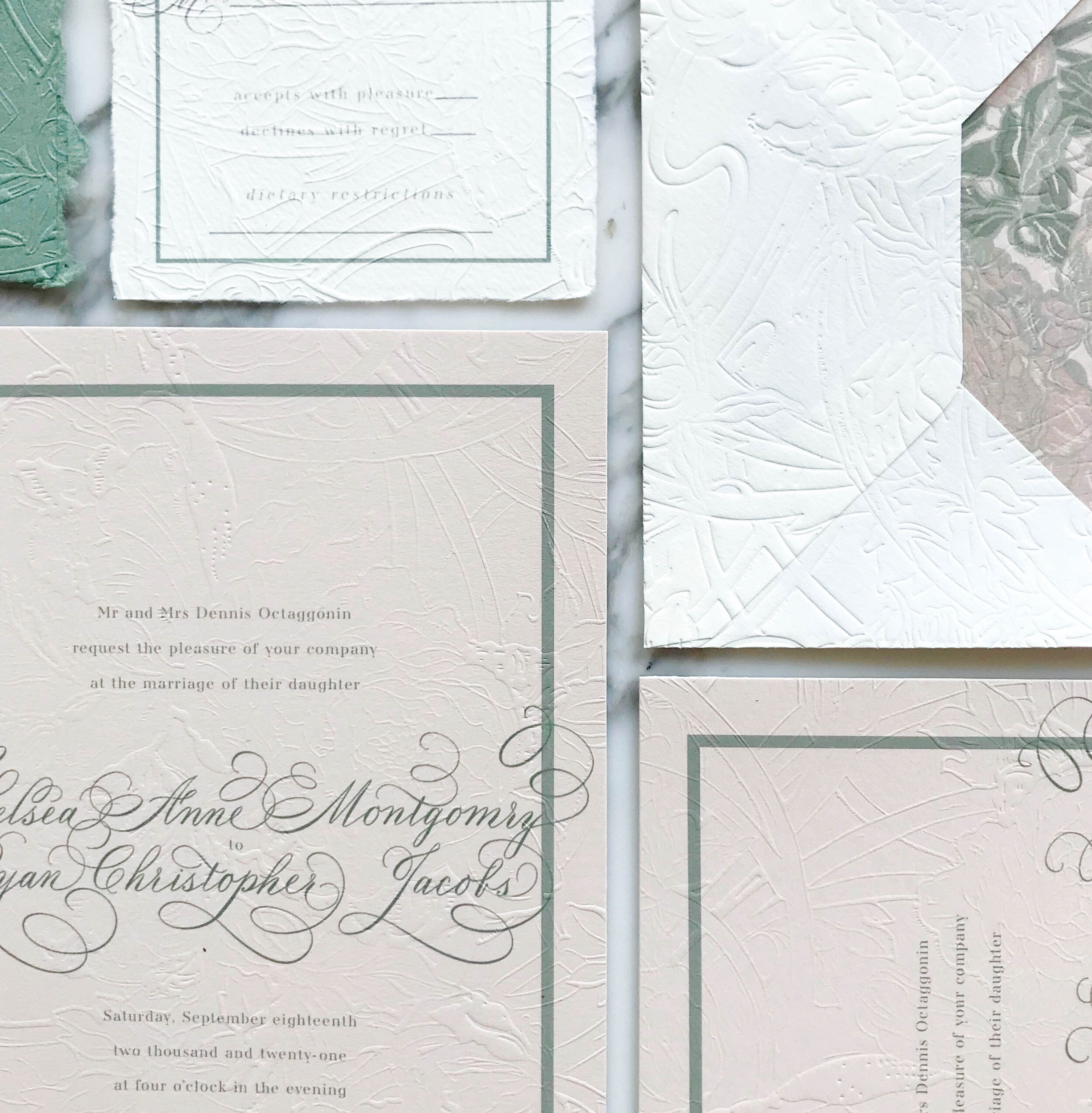
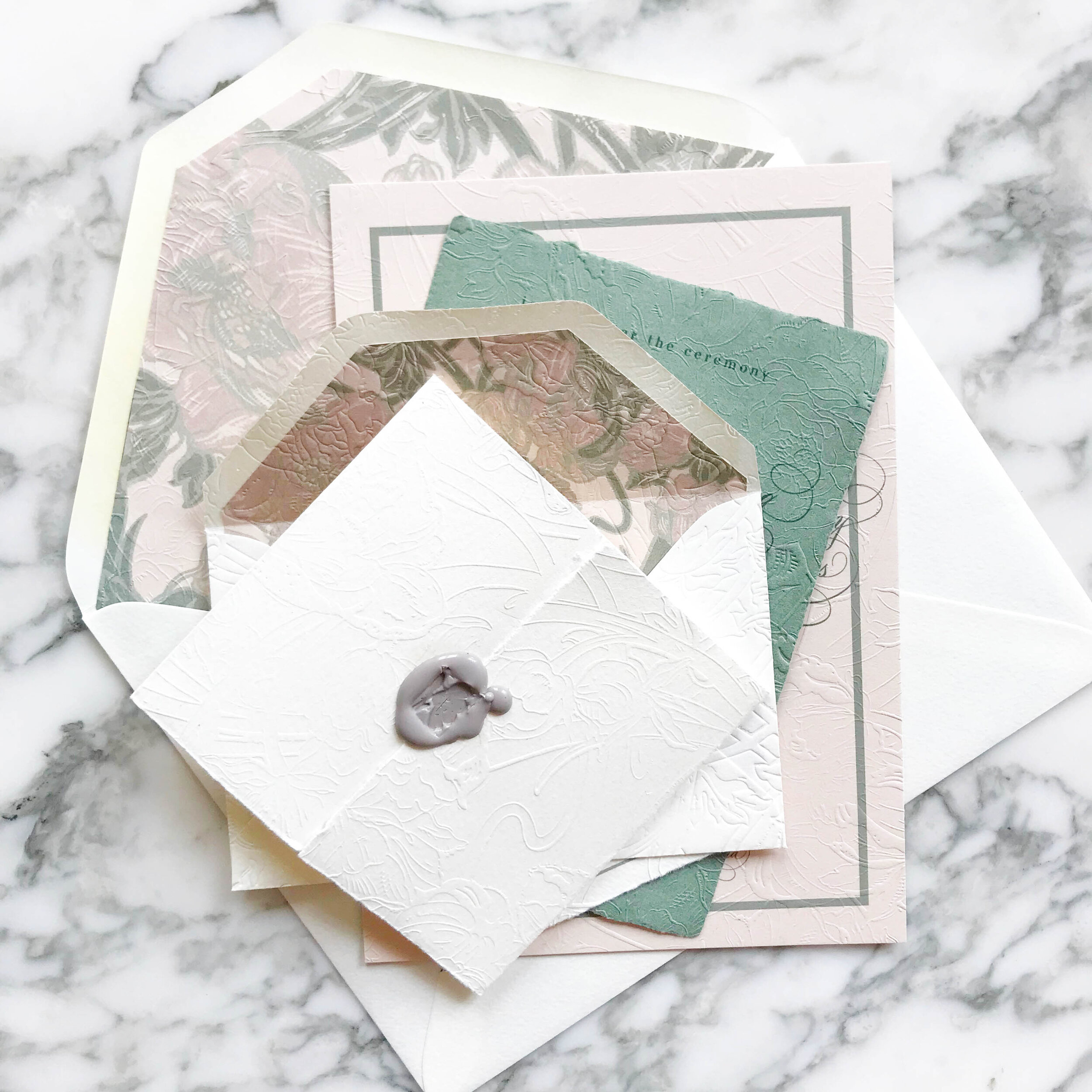
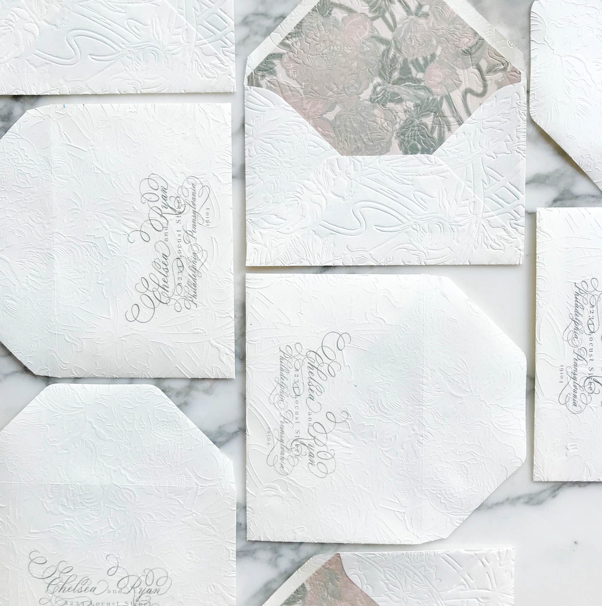
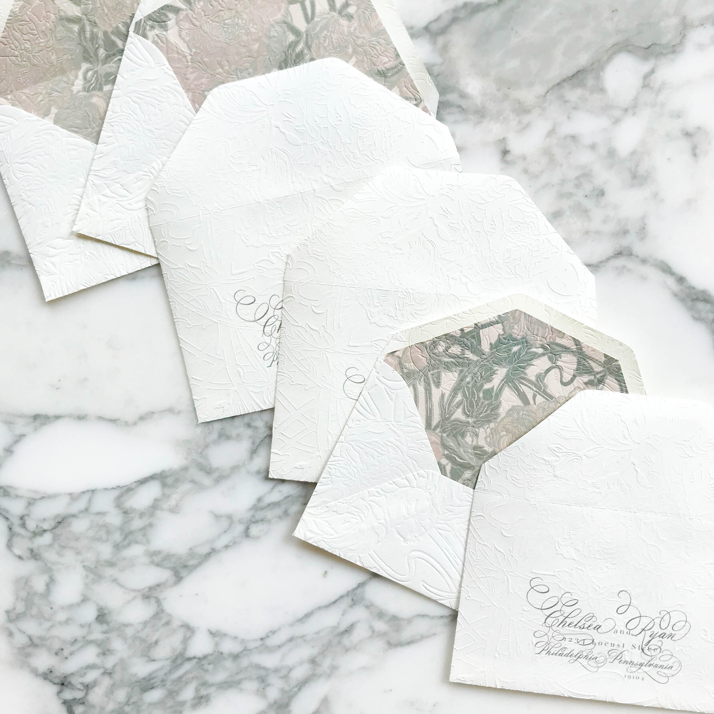
The most striking element of the design is the texture. Each piece was embossed with a glorious overall texture for a pillowy and tactile feel.

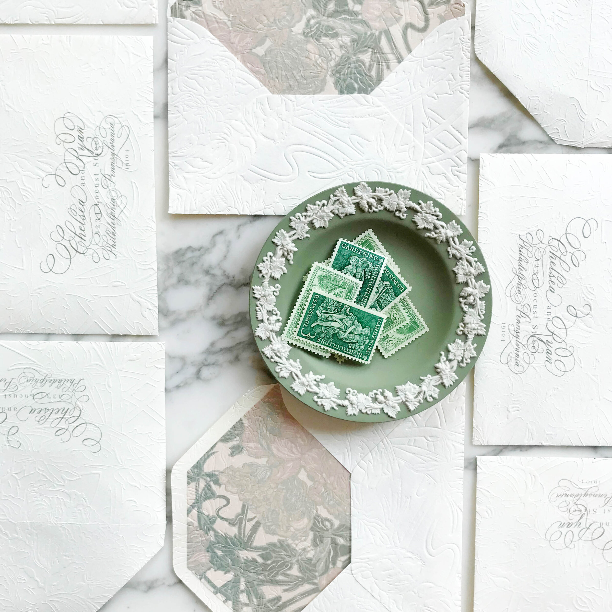
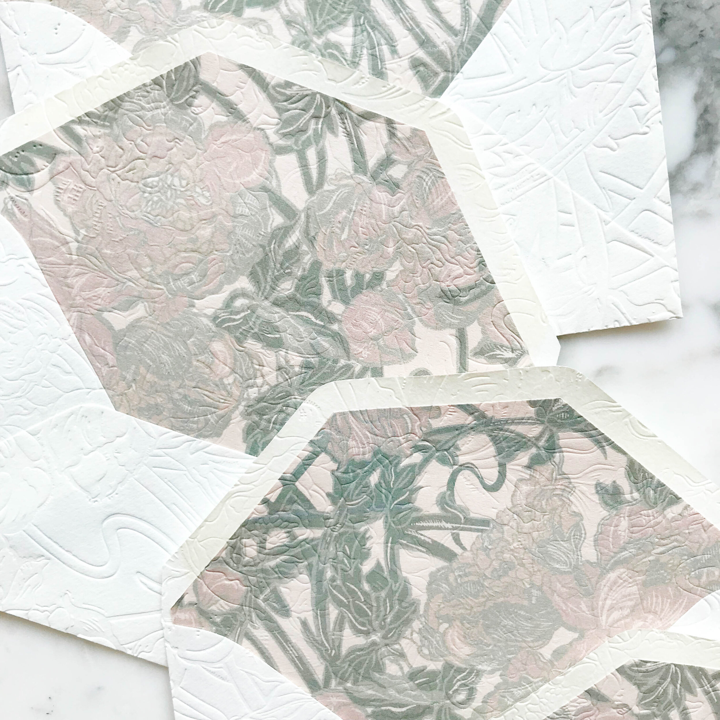
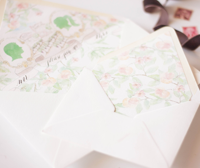
My personal favorite piece of the suite are the reply envelopes. We embossed the envelopes after they were lined, so the liners as well as the fronts and back of the envelopes all had a contiguous embossed pattern.

Embossed Art Nouveau14.jpg

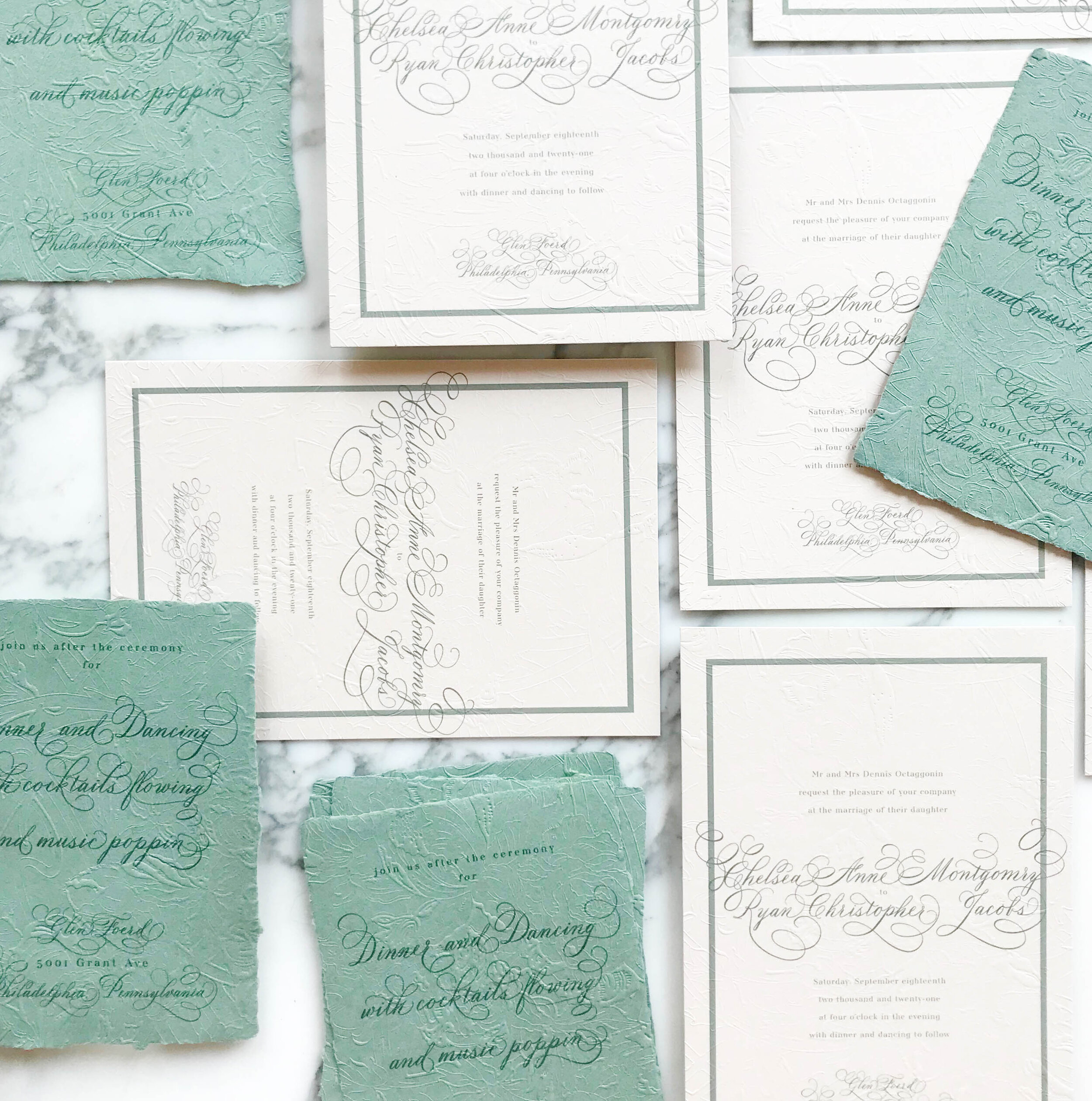
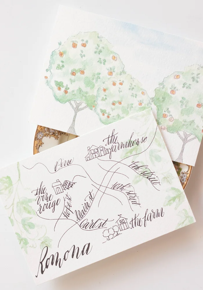
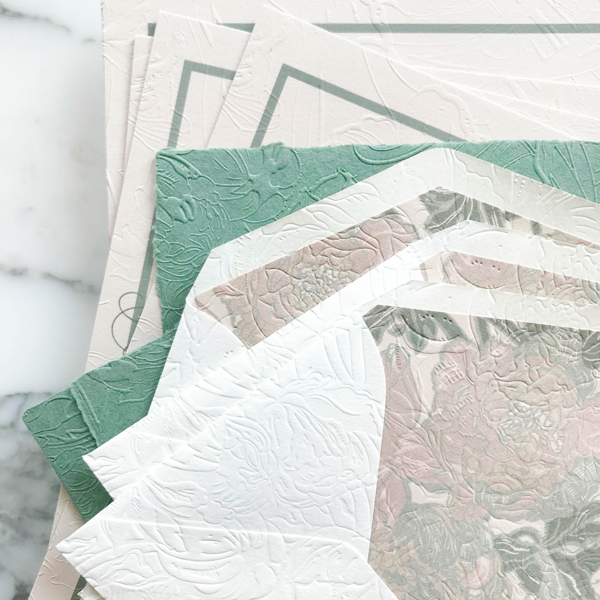
Like most of our projects, we combined several different paper types to come to our finished design. For this particular suite, we ended up with six different types of papers, including both machined and handmade.

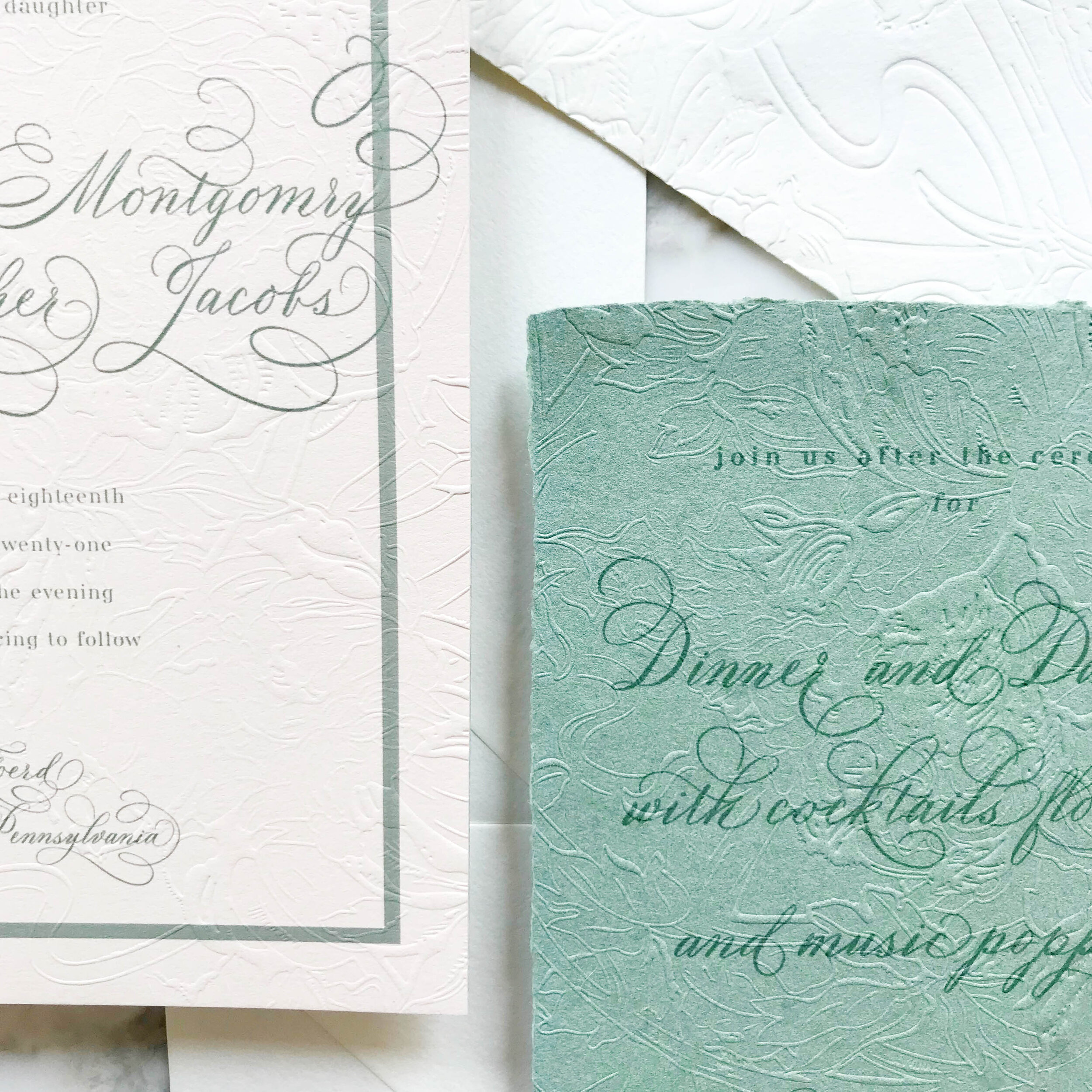
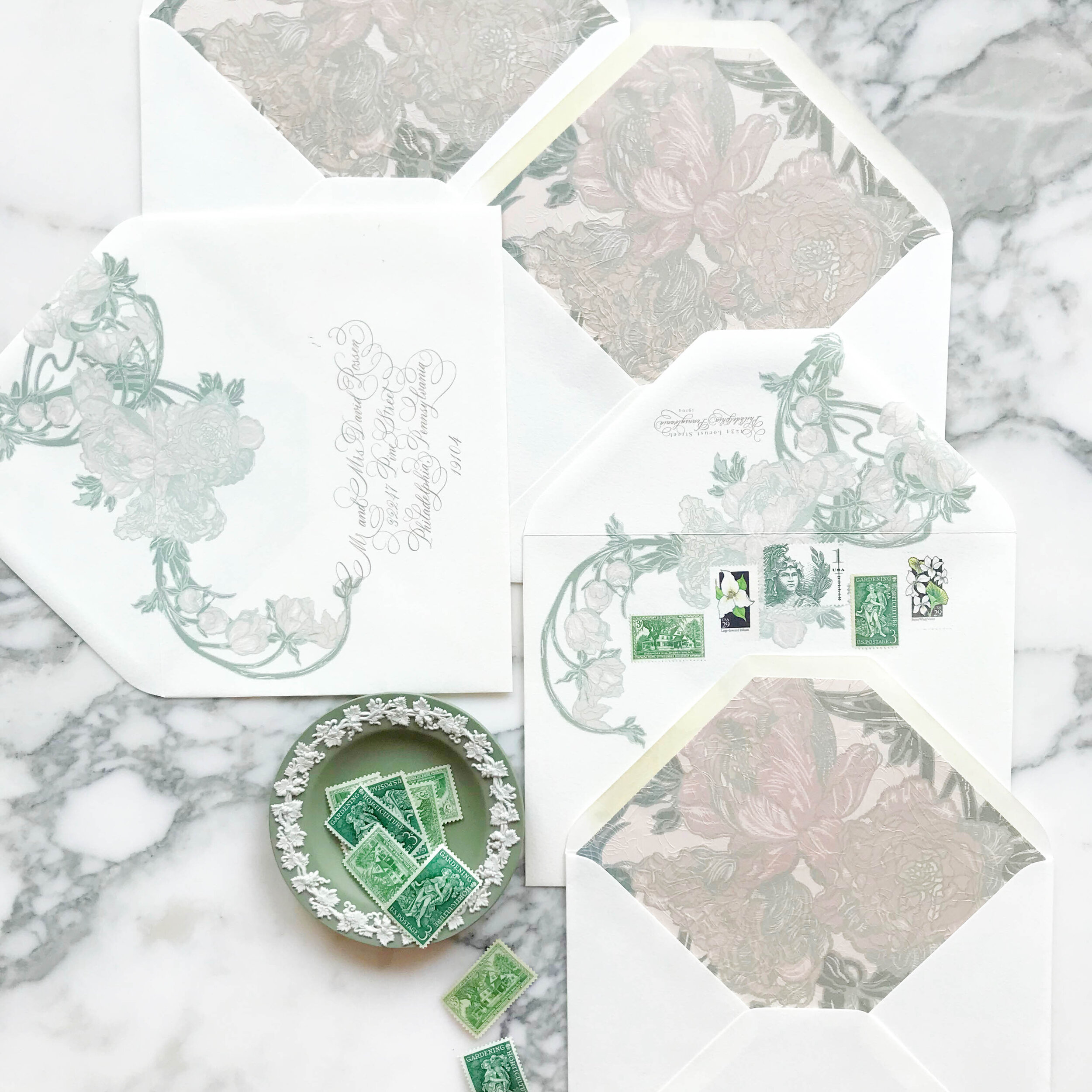
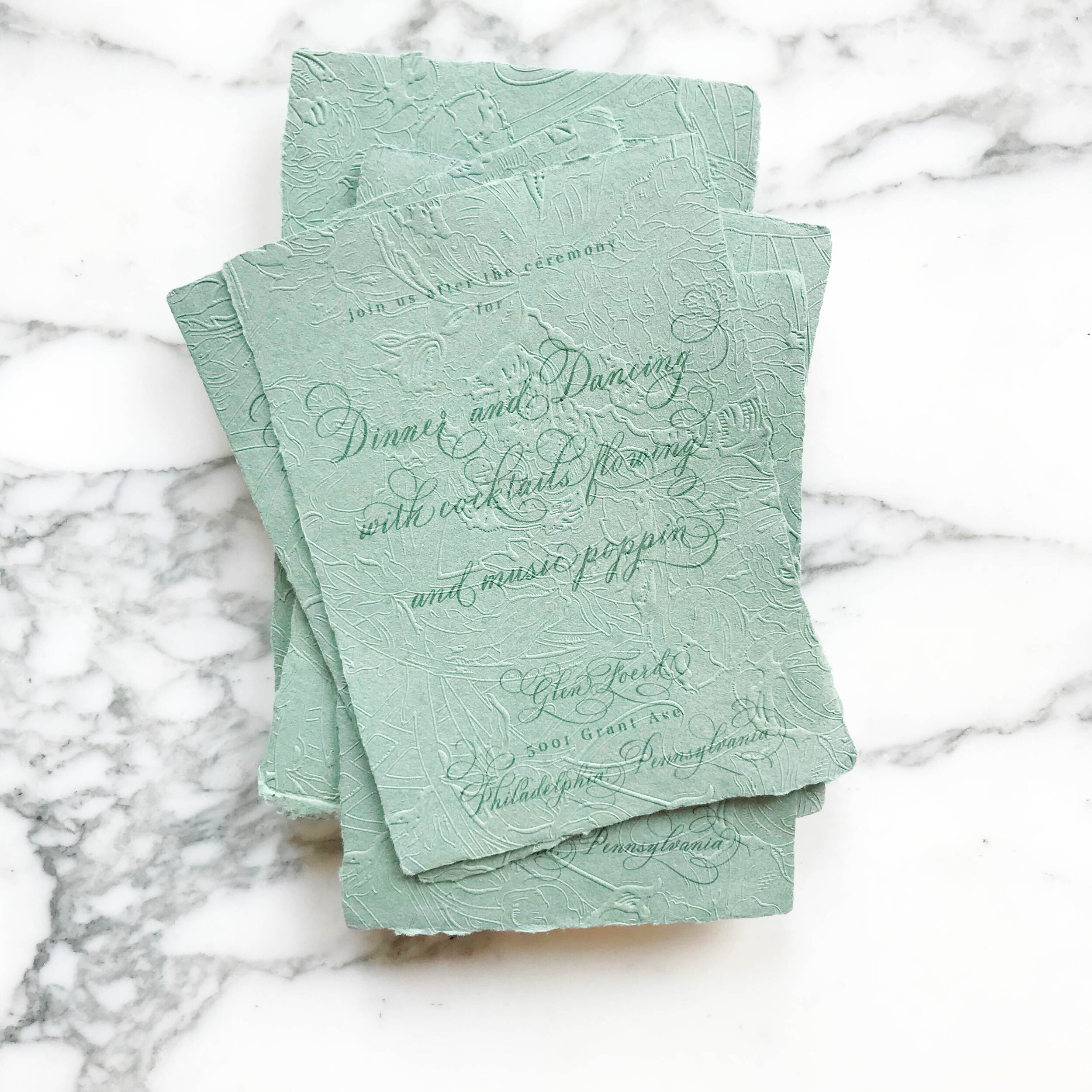
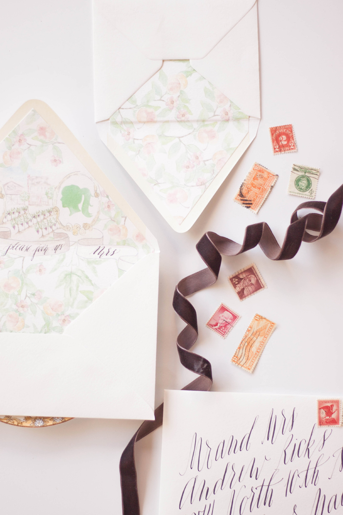
The art nouveau design includes three handmade papers for the green reception card, reply card, and dress code tri-fold. The invitation consisted of two different machined papers, the first in a nude, then backed with a pale green. Our envelopes were both a gorgeous cream, and our envelopes liners were on the same rich nude as the invitations.

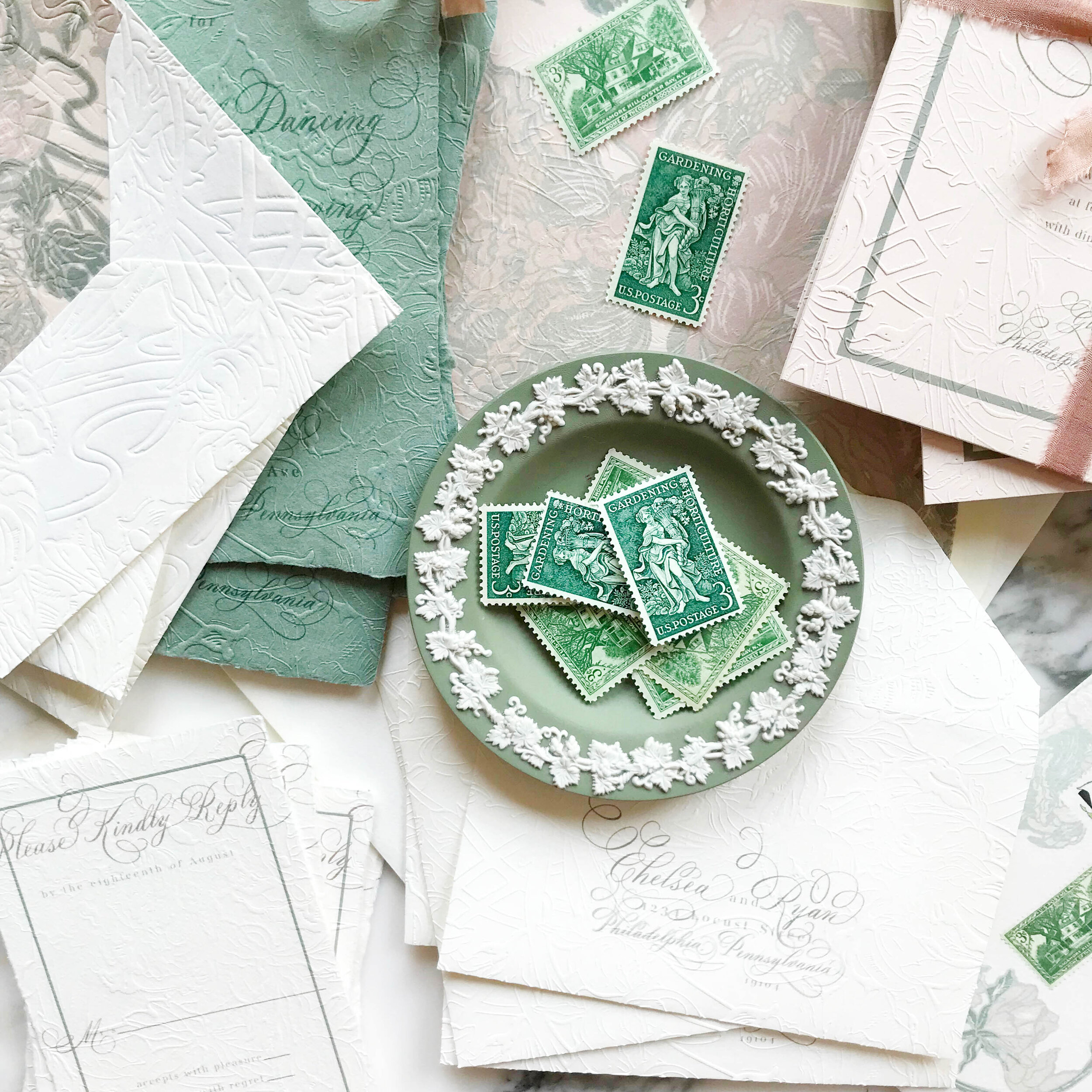
Our darling little tri-folded cards of handmade paper were sealed closed with a tiny wax seal in a taupe grey and embossed with the pattern showing on both sides.

_Embossed Art Nouveau Wedding Invitations.2.jpg
 
Featured | Style me Pretty

I had the pleasure of working with Luica and David, along with Joseba Sandoval of Sandoval Studio Photography and Romance Weddings to create this luscious and romantic wedding held at a private villa in Spain.  I was approached by Joseba to meet with his bride who was looking for something lush, organic, blush and peach, and intimate.  The villa created a private retreat for their small wedding and their over the top florals were perfectly framed by the architecture of the space.  

For their stationery (which will have more details posting this week), I created a pattern based on the Spanish tile that was featured through out the villa.  I paired that with the fluffy garden roses and ranunculus used throughout their florals.  We choose to keep the calligraphy contemporary to reflect the couples style, and wrapped the suite in antique lace.  I added touches of rose gold by hand to each invitation suite, and I still swoon over the final pieces.  The brides pale peach gown was just to die for!

Photography: Sandoval Studios Photography | Wedding Gown: Chaviano Couture | Wedding Cake:Sweet Things By Fi | Belt Gown: Carlee Sizemore | Bride Shoes: Chinese Laundry | Candy Bar: Dulce Serendipia | Catering : El Gastor | Chairs And Linen: Pedro Navarro | Cheesecake Design And Cheesecake Table Decor: Reviva Weddings | Creative Direction And Overall Styling: Mar Sandoval From Romance Weddings | Flowers And Ceremony Decor: Pedro Navarro | Groom Suite: Hugo Boss | Stationery Design And Escort Cards: Design House Of Moira | Venue: Villa | Wedding Favors And Drink Stirres: Mar Sandoval From Romance Weddings | Wedding Planning And Coordination: Reviva Weddings | Wedding Rings: Lujan Jewelry

Bespoke Invitation...circus baby shower

...today we're going to chat a bit about the design process behind this darling little shower invitation.  


I adore working with a bride and groom to create something for their wedding...dont get me wrong.  Every couple is different and presents a slightly different aesthetic...however, its quite fun to be able to branch out and do something a bit different sometimes.   

This lovely invitation was created for a circus themed baby shower.  My client (Miss Robin) wanted to incorporate pool blue and shades of blush as well as a slight nod to the typical typography one would find on the vintage show posters. 

The one draw back about shower invitations is that there are less pieces... we love more  pieces...it gives us the ability of incorporating more elements, especially in the backers.  For this project, I knew I wanted to create a pattern using elephants and hearts. 

Lets chat about this tent for a moment...you simply cant have a circus themed anything  without a tent.  I hand drew the tent itself, and layered it with banners. 


We kept with the typographical lettering for the insert card, which included the mommy-to-be's registry information as well reply directions for the guests.  We backed it with the matching elephant and hearts backer.


...you know how much I just adore  envelope liners... how could you not??   We incorporated the same tent as the invitations and repeated the color burst.  All the envelopes were then addressed in white calligraphy using our Helena font.

this suite was created through our bespoke process.  

Bespoke invitations:

I know its cliche, and I say it every time...this is my new favorite!  Im going to go ahead and call these envelope liners epic....not a word to be taken lightly!!  Epic.  I said it.  They feature water color portrait silhouettes in little painted frames, with an awesome banner.  Tucked between the frames is a mini painting of the barn and farmhouse from the venue complete with little grape vines that lead up to the house.  Top that off with some calligraphy and then add some peach branches and grape vines and you have yourself a pretty amazing envelope liner!

The suite also includes watercolor and calligraphy on the reply card, reception and brunch card, and the reply envelope liner. 

Yup, definitely my new favorite! 


I know its cliche, and I say it every time...this is my new favorite!  Im going to go ahead and call these envelope liners epic....not a word to be taken lightly!!  Epic.  I said it.  They feature water color portrait silhouettes in little painted frames, with an awesome banner.  Tucked between the frames is a mini painting of the barn and farmhouse from the venue complete with little grape vines that lead up to the house.  Top that off with some calligraphy and then add some peach branches and grape vines and you have yourself a pretty amazing envelope liner!

The suite also includes watercolor and calligraphy on the reply card, reception and brunch card, and the reply envelope liner. 

Yup, definitely my new favorite!