Posts in wedding
Copy of Creative Process | Behind the Scenes

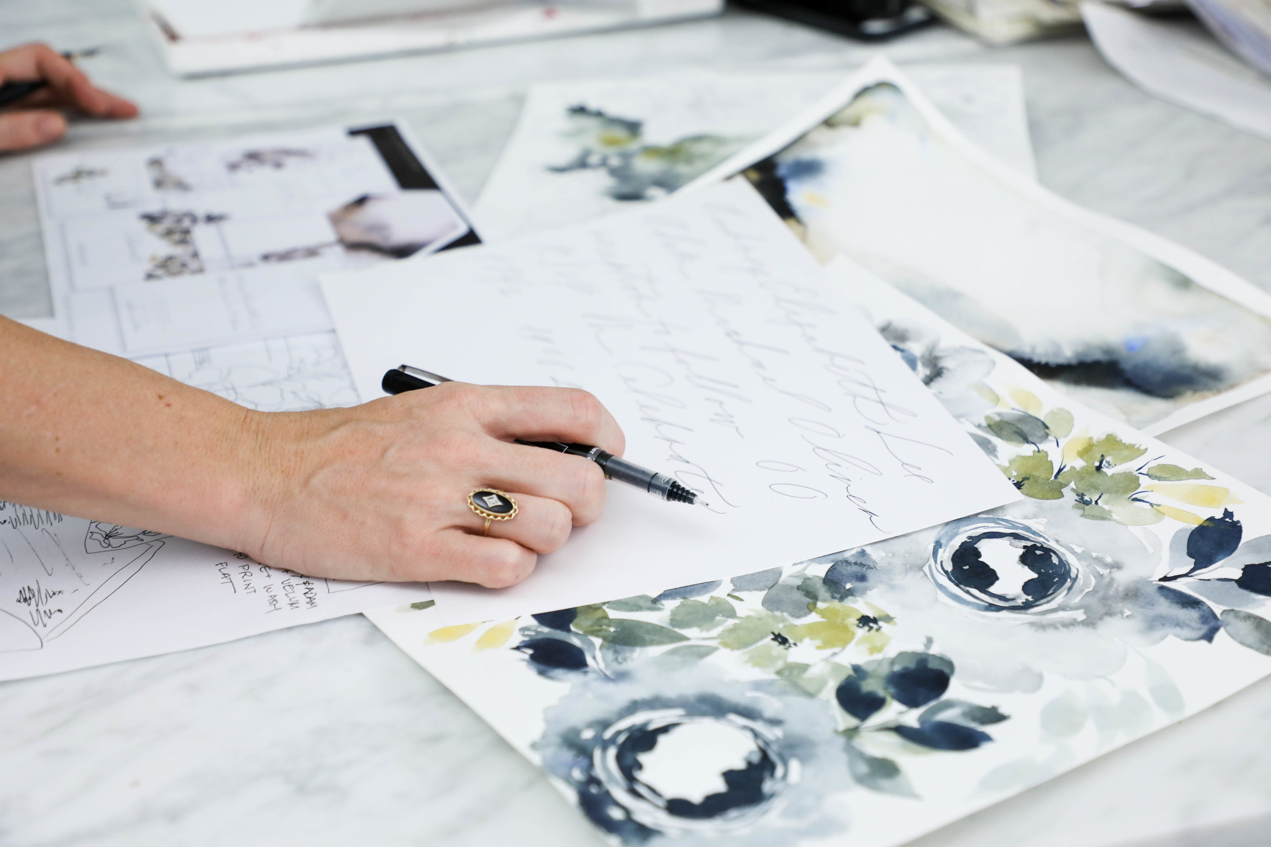
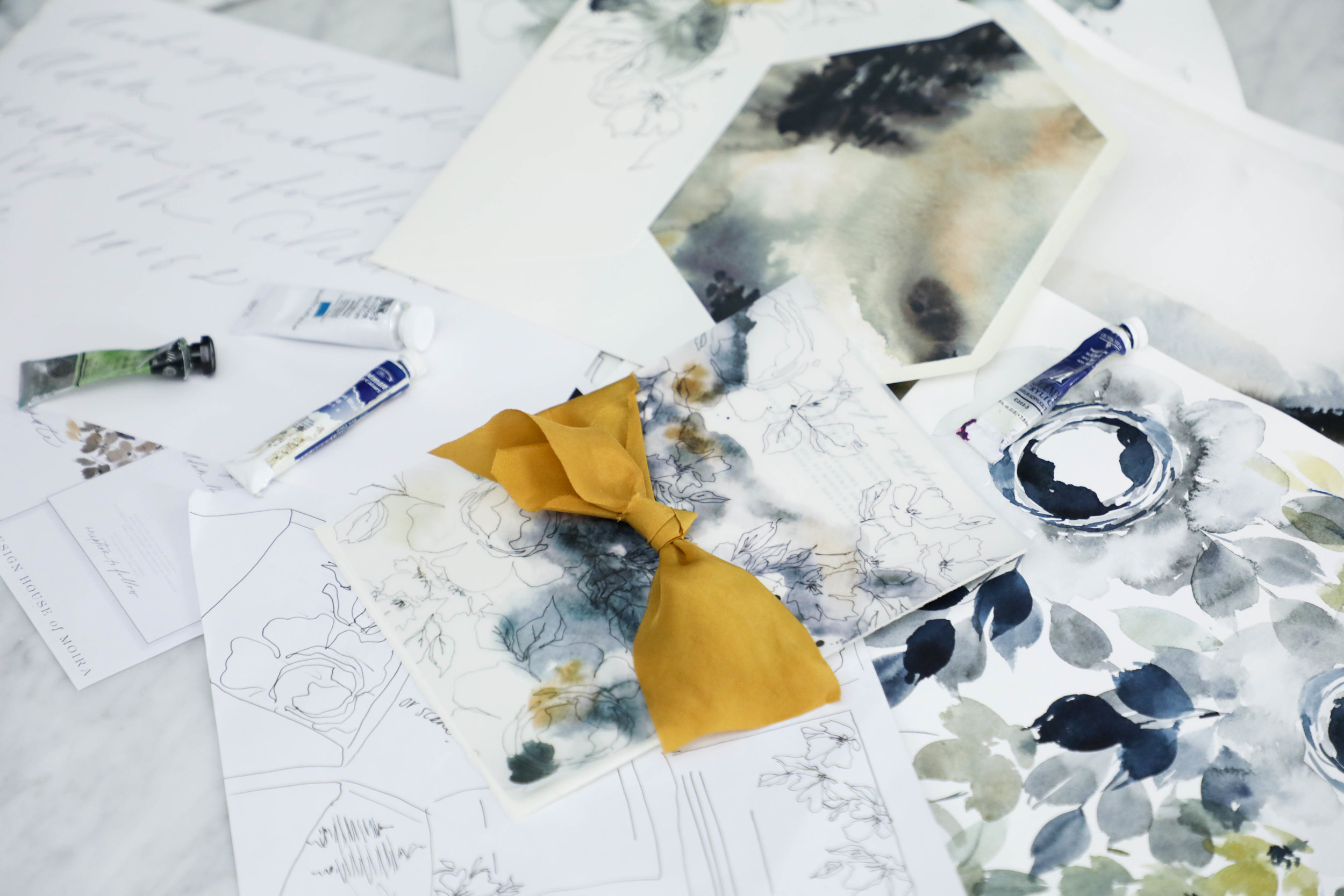
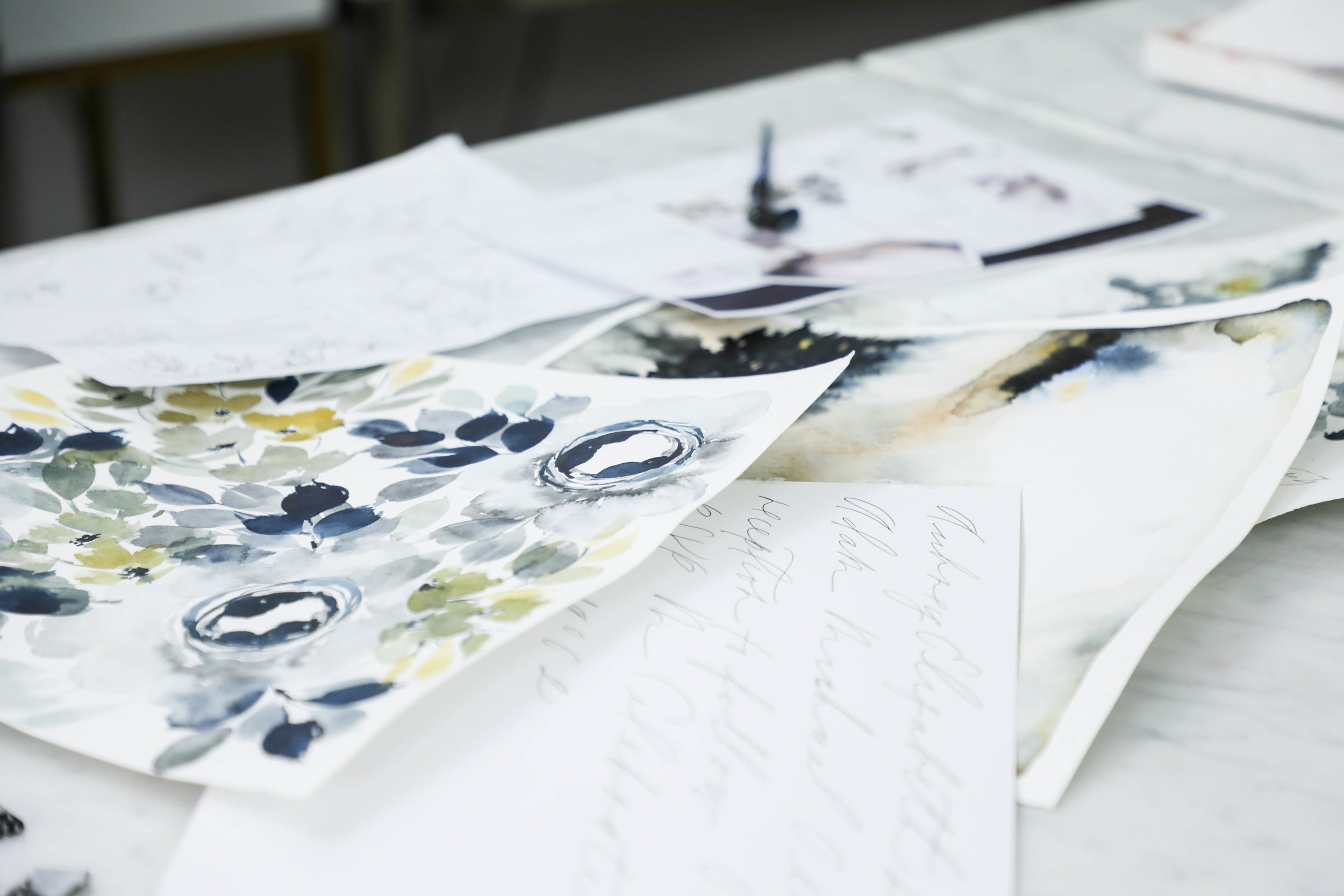
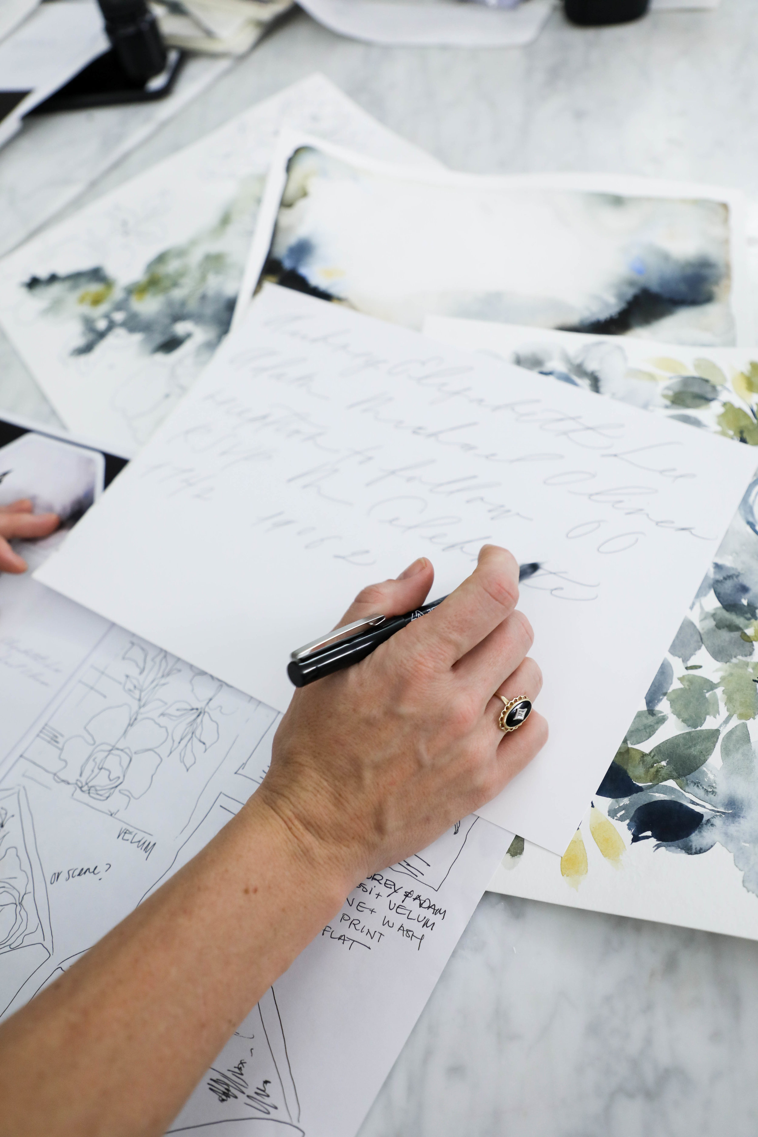
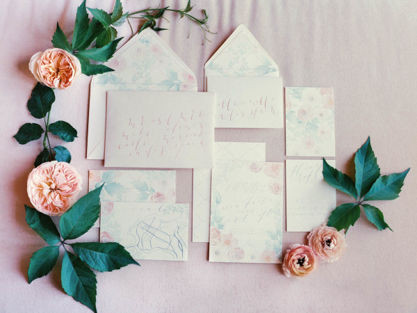
Once we have our sketch finalized and our lettering style selected, we begin creating the artwork that will be included in the invitation suite.

It is our goal and part of our business philosophy that we never want a client to feel limited or concerned that their design won’t be everything they had hoped because they’re limited on how much artwork they can have created for them.

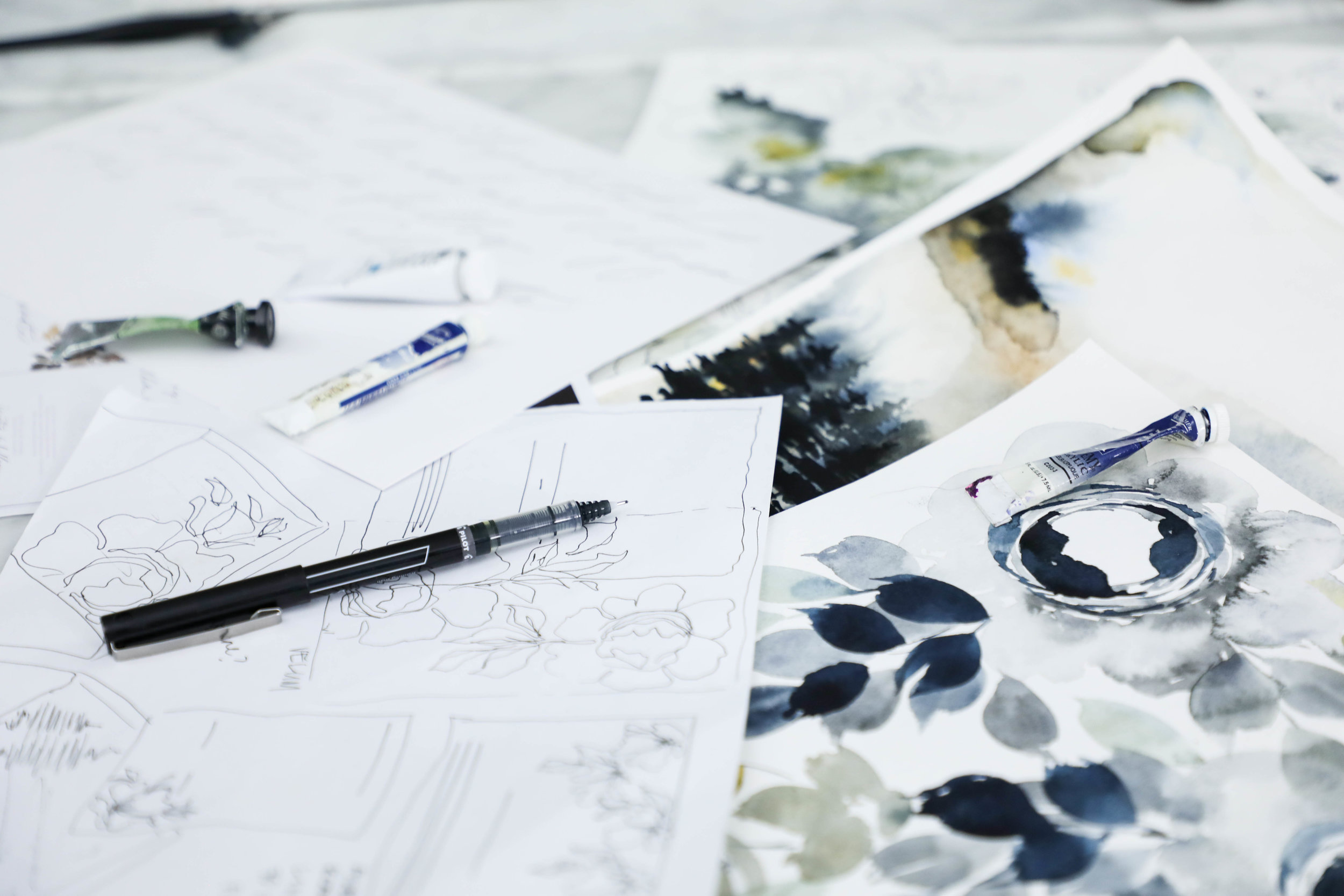
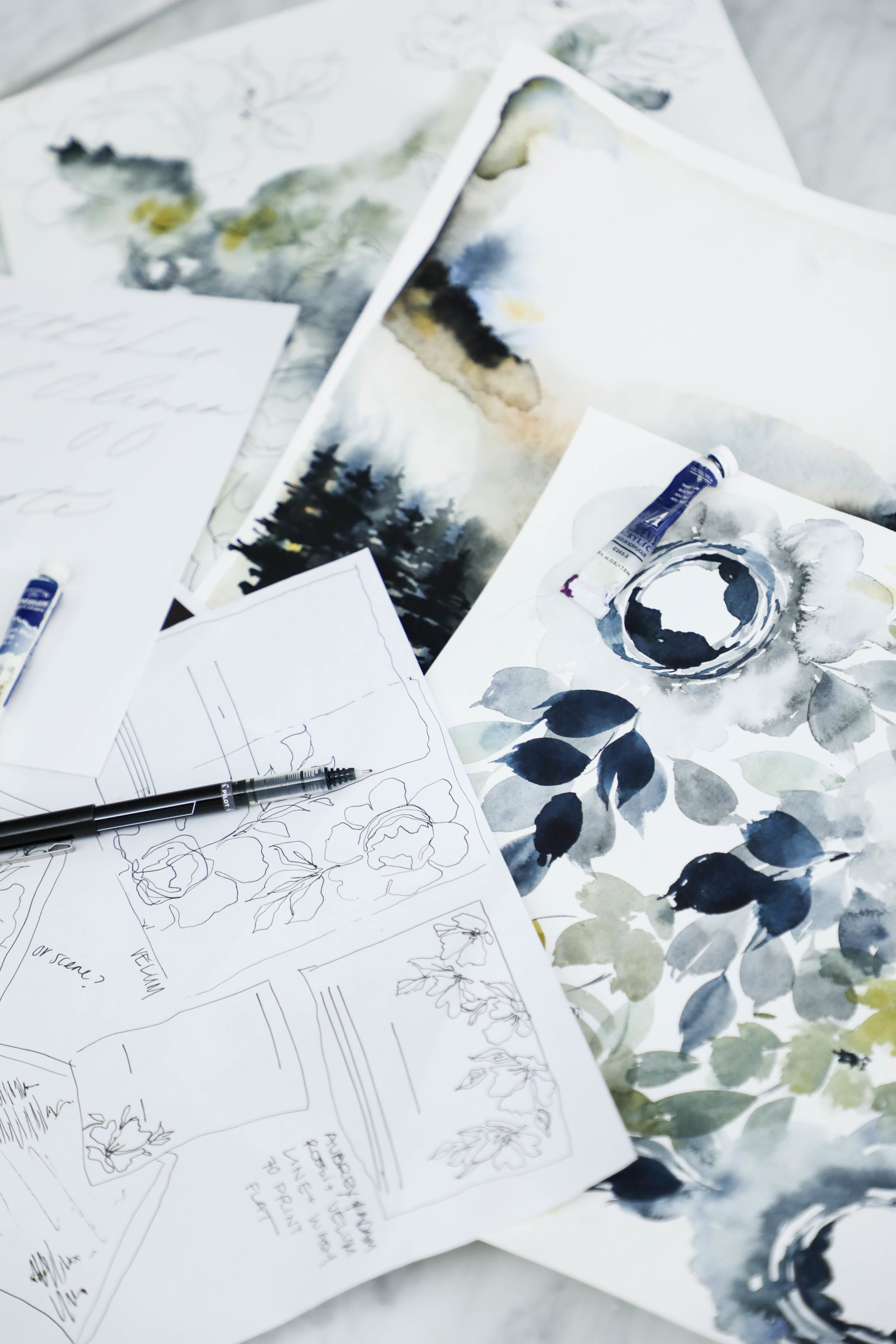
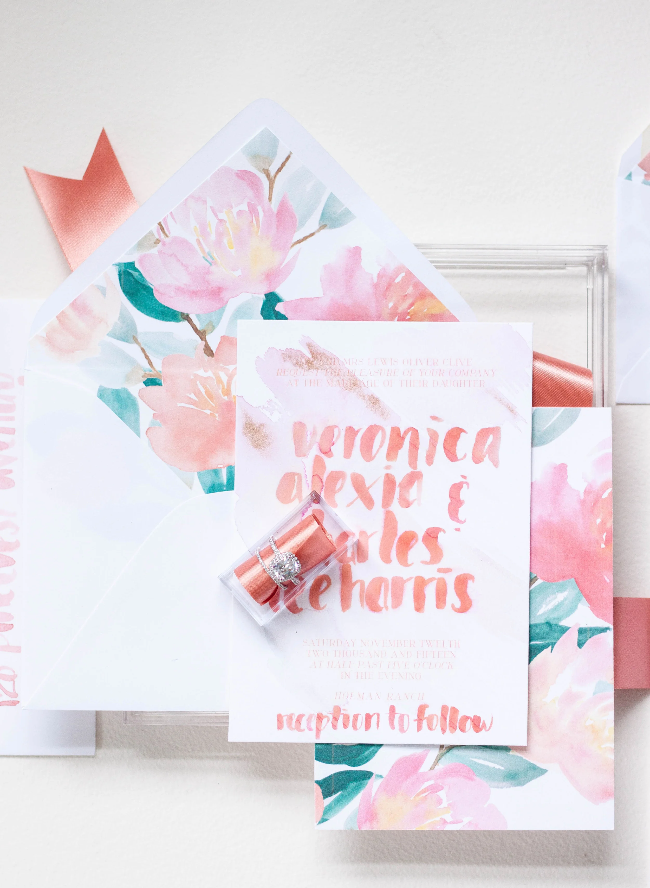
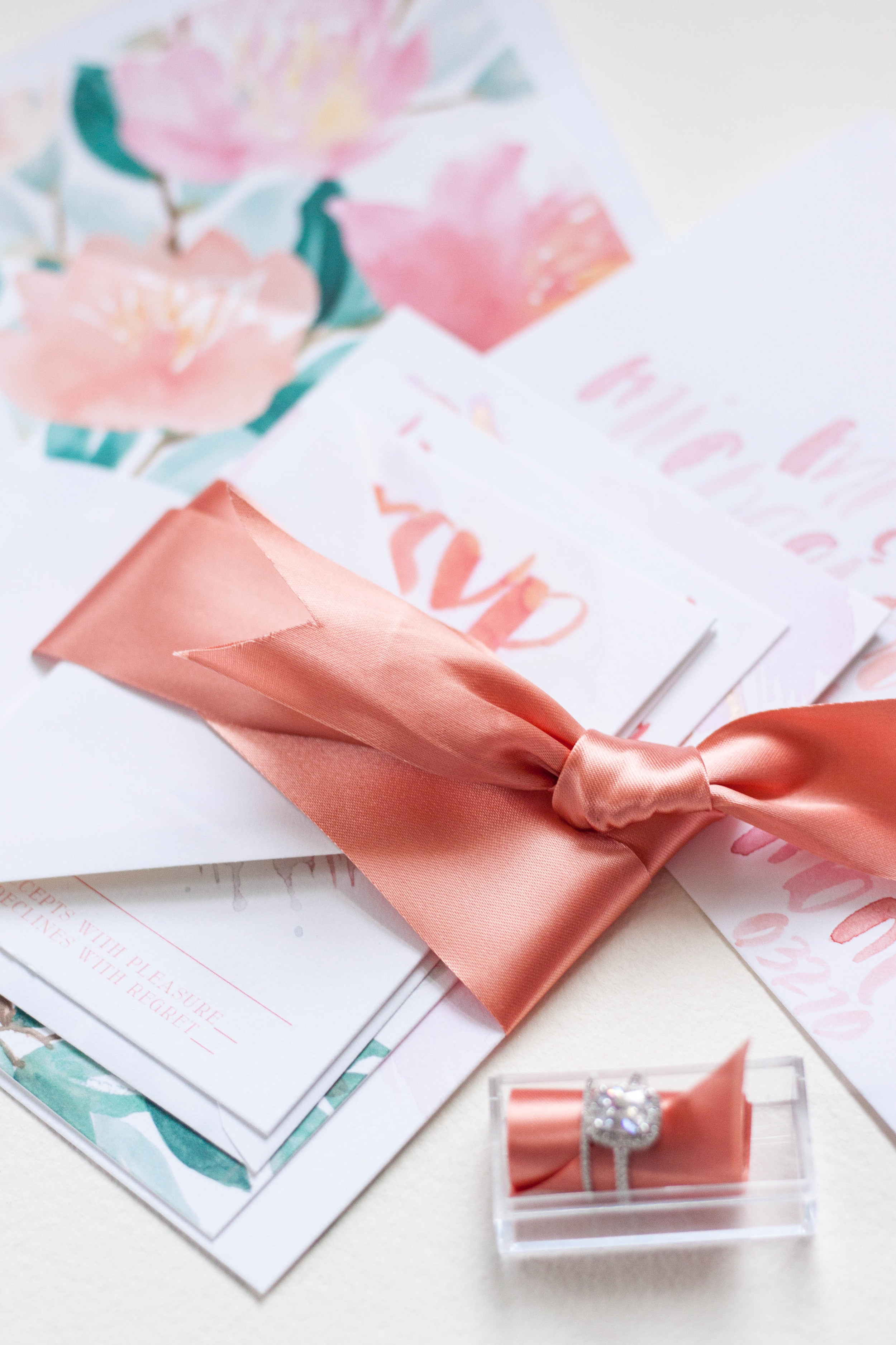
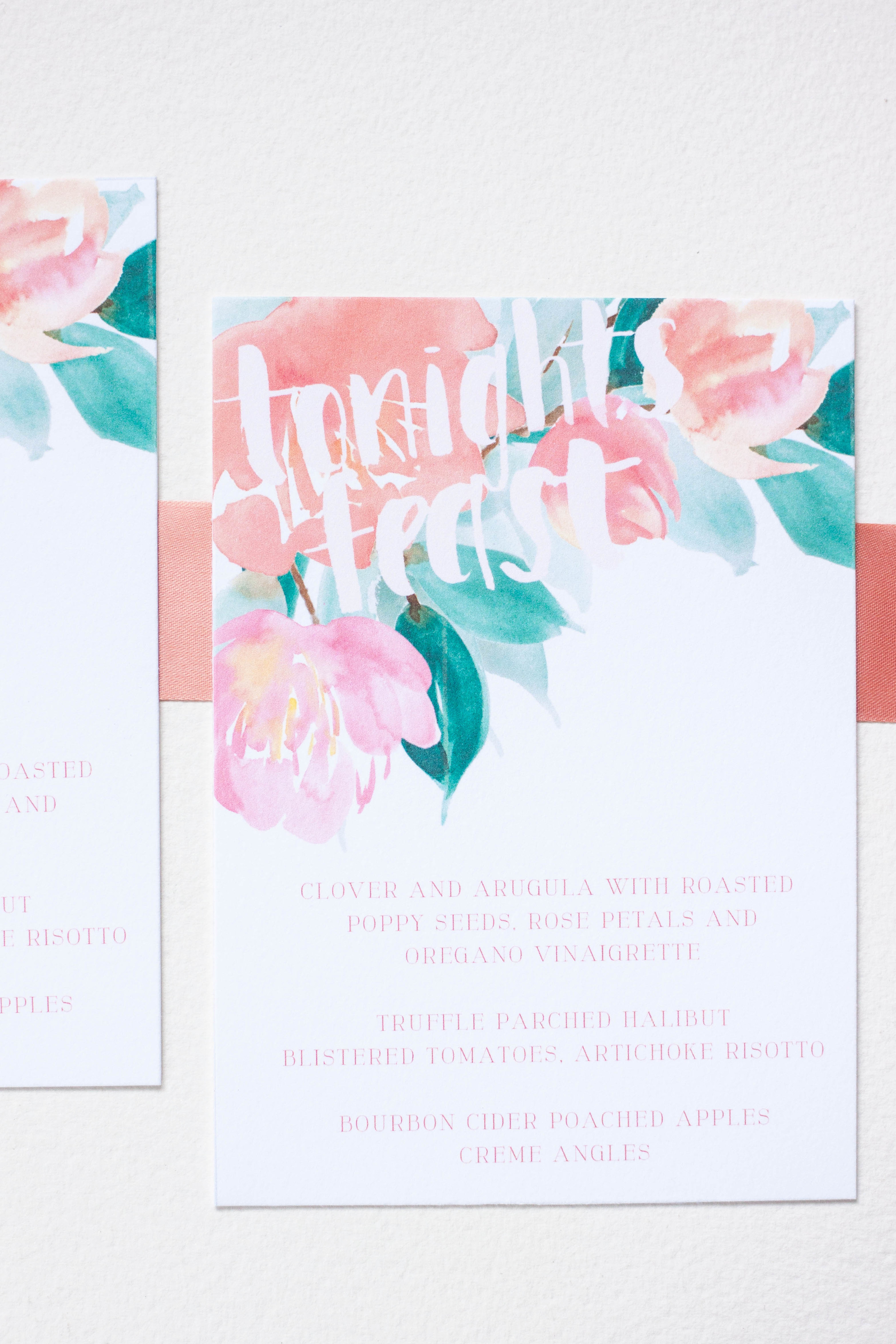
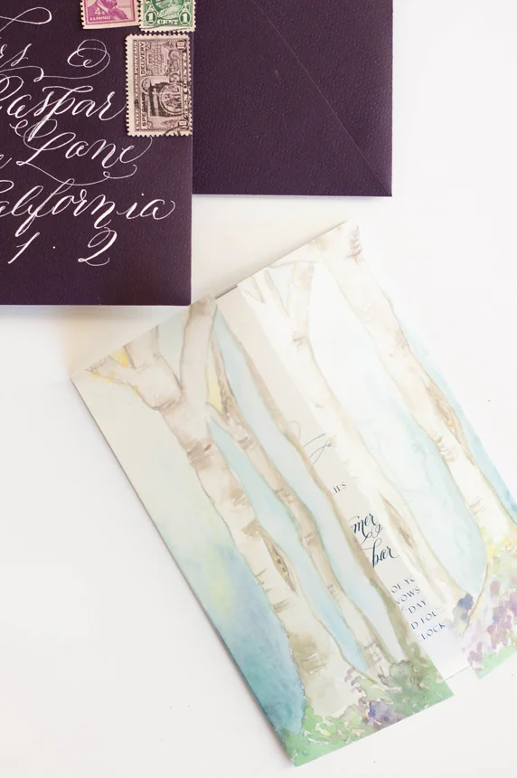
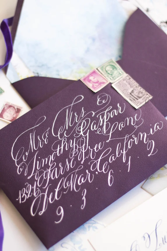
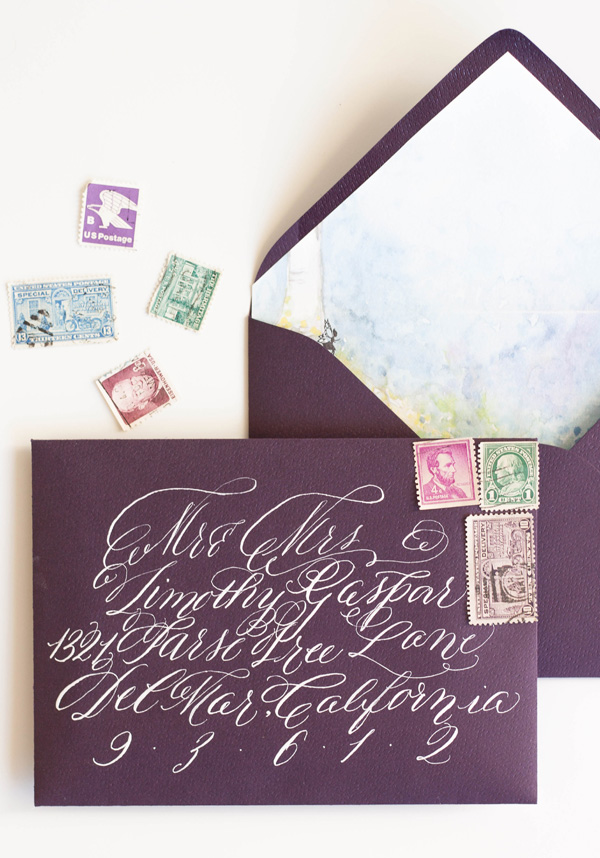
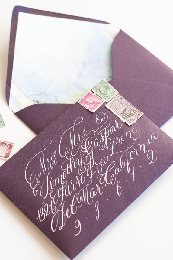
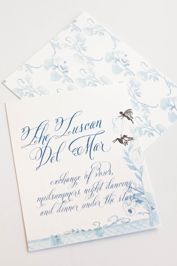
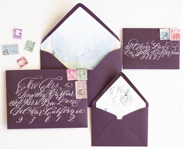
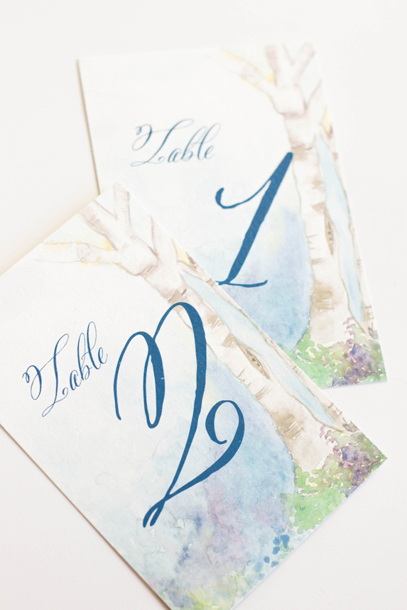
All of our projects include unlimited artwork, regardless of what type of artwork it is. For this suite, we had a watercolor floral pattern, two watercolor wash patterns, a modern landscape piece, and line botanicals.

This is the longest portion of our process without contact with our client. Once they’ve approved the sketch and calligraphy style, we set about creating all the artwork, scanning it into the computer, digitizing the artwork and calligraphy, and getting it ready for their design.

The proof is the next step in the process and is also the next thing the client sees after the sketch (unless they follow us on instagram, in that case, they’ve seen the entire creative process along the way as their design comes to life!).
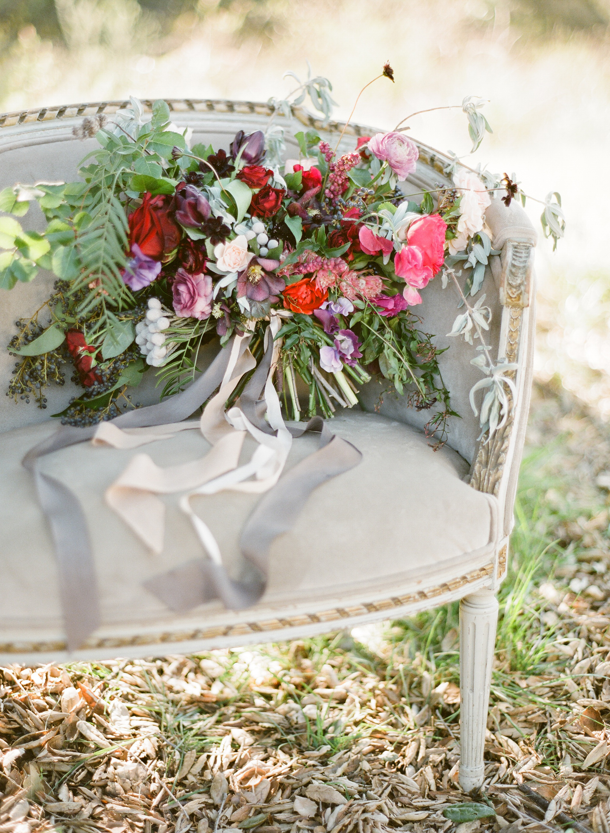
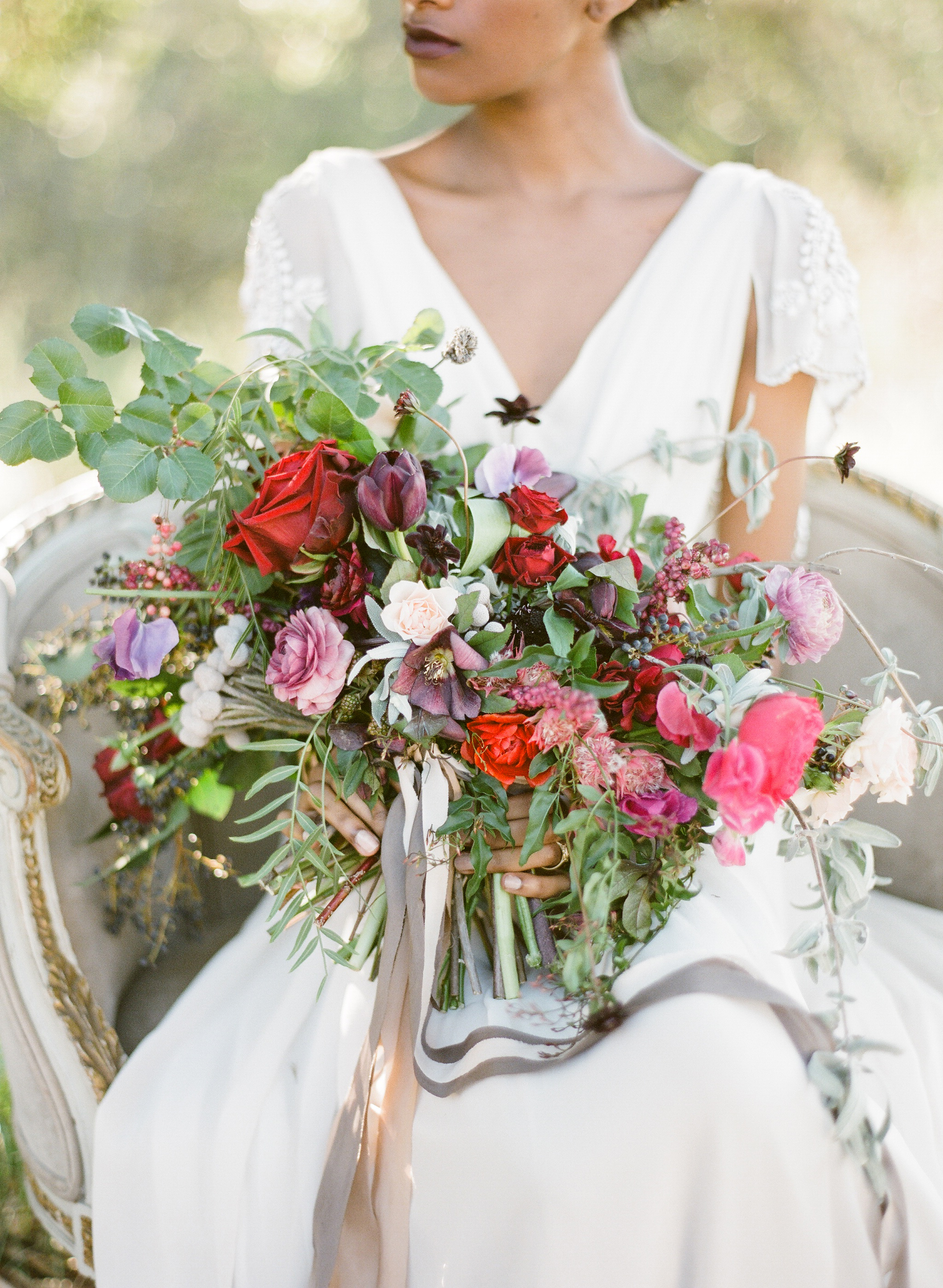
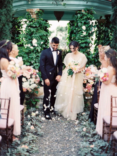
W97A8997.jpg


Aubrey & Adam

Courchevel, France

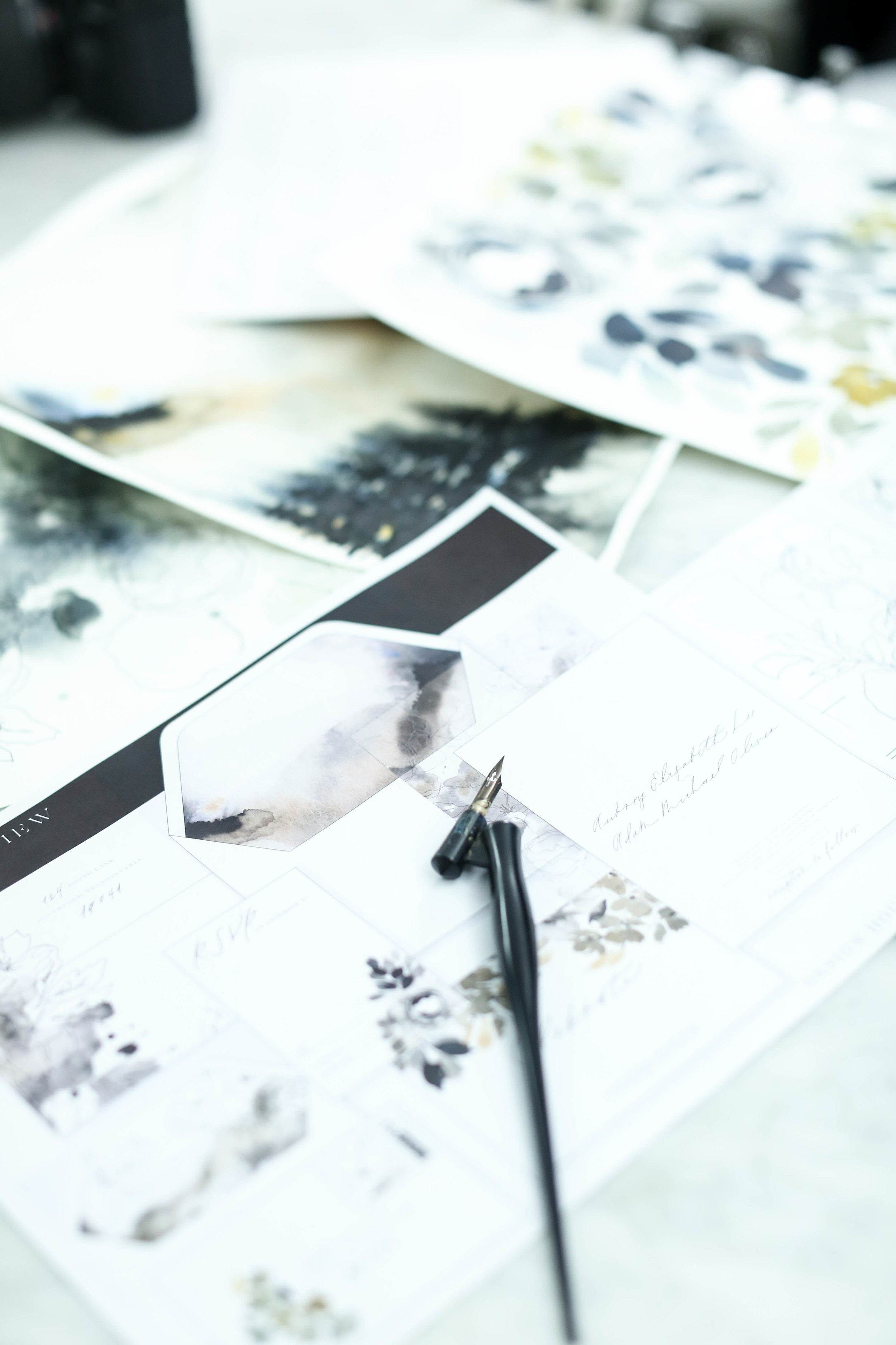
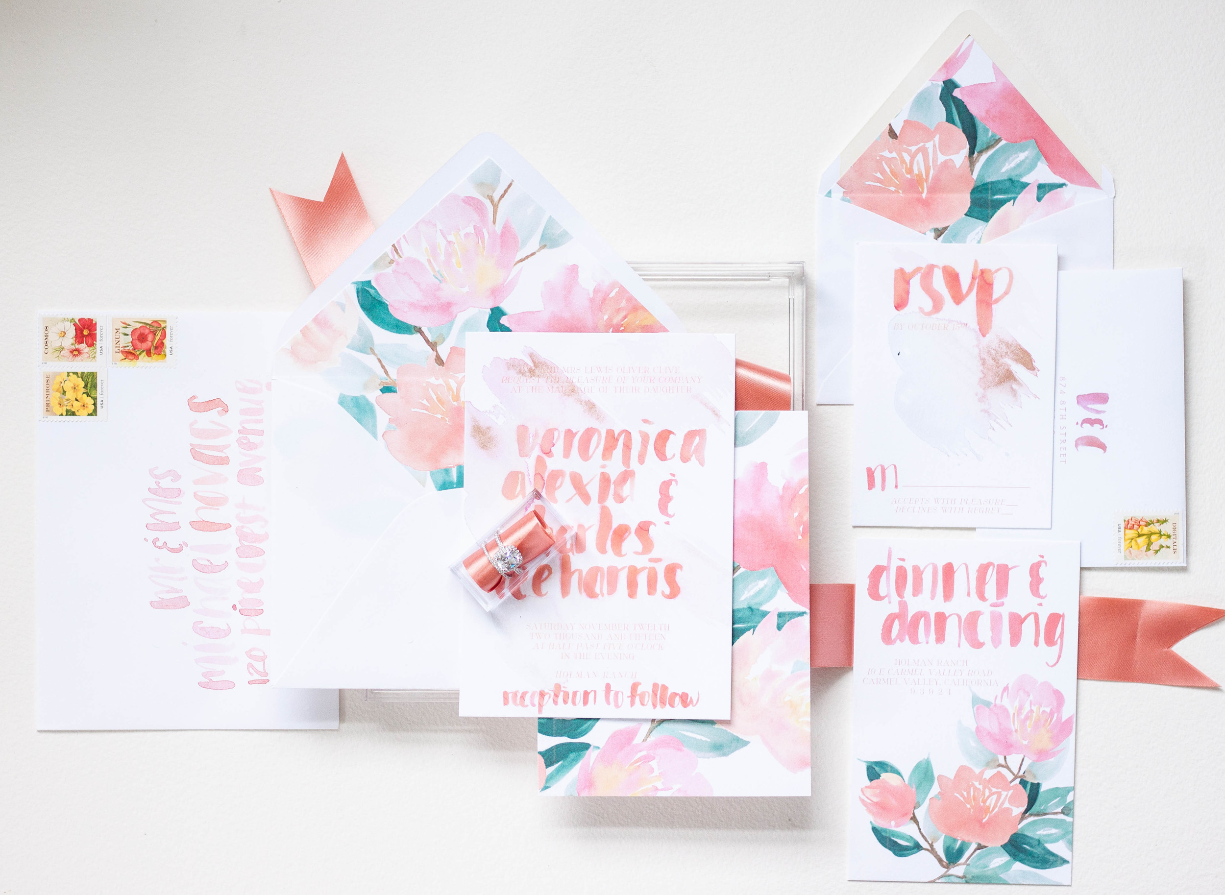
The proofs shows the overall layout of the suite, as well as each individual piece. A proof is usually about 9 pages long, but can get up to 14 if the suite includes several additional pieces.

I personally love the proofing point in the process. It’s the first point that the client sees their sketch come to life in full color.

Similar to artwork, we do not limit how many proofing rounds each client is allowed. We want the design to be perfection, and we’ll tweak it as much as needed.

Two to three rounds tends to be the average, so that is how we timeline out the clients project. If more rounds are needed, we always make sure to keep an eye on our mail date, since that will get pushed back based on how long proofing takes.


Creative Process | Behind the Scenes

Following the sketch, we create a sheet of lettering and calligraphy samples for our clients to review. We based the styles we provide on the couple’s overall style and the formality of the wedding as well as any personal preferences. Our calligraphy styles are not a generic sheet we give to each client, but created individually for each project. We also prefer to show calligraphy styles shows in the couple’s names, since seeing one’s own name is so much more exciting than seeing a generic style name.

For Aubrey, we created a calligraphy sample sheet with six styles. We knew she preferred minimal and modern, so we showed several variations of that style.

Aubrey selected a delicate monoline style for her lettering. We liked the minimal visual impact it had, while still being interesting and unique.

Sometimes we nail the style on the first try and sometimes it takes some tweaking. For Aubrey, she loved it right away.

Once we’ve selected the style, the Design House team sits down to see where in the sketch the calligraphy falls and what words or phrases we’ll need for the design. Once we have a list of what needs to be written, we write their lettering or calligraphy out by hand.

Design House of Moira | Victoria Rothwell


Aubrey & Adam

Courchevel, France

Creative Process | Behind the Scenes
Design House of Moira | Victoria Rothwell

Aubrey & Adam

Courchevel, France

Aubrey and Adam were married at a gorgeous chalet in Courchevel, France and came to us with some specific ideas in mind. They wanted to incorporate ochre into the design, but dit not want the overall look and feel to be summery and cheerful, but moody and modern. They came to us specifically because of our use of original artwork and lettering designed for each client. As with all our clients, we began the process with a sketch, detailing out our overall ideas for their suite, mixing media and multiple styles of artwork.

We love beginning with a sketch for several reasons:


  • It helps a client envision the overall look and feel by putting thoughts onto visual mediums

  • It allows the client to visualize how we see the art moving from one piece to another throughout the suite. We rarely do pieces that all match exactly, but vary the art across multiple elements of the invitation suite.

  • It creates a point from which we can create and generate all the artwork. As artists and creators, we avoid redoing repetitious work, which consumes a massive amount of time and energy. We want to create your artwork once and do it correctly the first time, rather than missing the mark. This is where the sketch comes in.

  • We can make adjustments to the art while the art is still theoretical to allow for more time during the proofing rounds and on assembly details.


shown here: the final pieces of artwork used in the printed pieces of the suite, generated from our original sketch


Bespoke | Veronica & Charles
 
Design House of Moira | Summer Watercolor Invitation


These invitations were created for the Oh So Inspired Retreat held in Sonoma, California last fall.  We wanted to create something fun, bright, bold and playful with touches of rose gold and shades of peaches and pinks.


The invitations were kept on the simple side, with bold lettering gracing the front.  Behind the lettering, I did a pale watercolor wash of pale pink and dropped in just a touch of rose gold.  The backs of the invitations were printed in the bold pattern, adding interest and color to the simple invitation design. 

I completely love the envelope design with the envelopes lined in the bold print.  Each envelope was addressed in the same bold, heavy brush lettering.  The carefully selected stamps are reprints of vintage seed packets and the colors were perfect!  The small reply card was printed with the couple's address with their initials in the same bold brush style.

Design House of Moira | Summer Watercolor Invitation
Design House of Moira | Summer Watercolor Invitation | Envelope Liners
Featured | Flutter Magazine, Scorpio

It was such a pleasure to work with Flutter Magazine on their 6th issue.  We took each horoscope and designed a tablescape around the traits associated with each sign.  Flutter Magazine complied an amazing group of designers and photographer to bring the shoot to life.

OCTOBER 23 — NOVEMBER 21: We are drawn to you, Scorpio bride. You are magnetic and irresistible. Be sure to emphasize your fiery spirit with bright colors on your tables and invitations. Utilize your lucky gem, the Garnet, to add a pop of color to your own attire. Peonies draped on your cake will make your guests gasp. The lush peony can spice up your bridesmaids bouquets too. Be sure to include elements of lace in your veil and dress. We suggest you jet off to Spain for your honeymoon.

Moira Design Studio

As seen in Flutter Magazine, Issue No. 6

Photography: KT Merry | Design + Styling: Joy Proctor | Floral Design: Amy Osaba Events | Hair + Makeup: LunaBella Makeup and Hair | Jewelry: Sofia Kaman | Furniture: Found Vintage Rentals | Commissioned Cream Backdrop: Katherine Bell of The Habitat Factory | Cocktails + Recipes: Melissa Piña of Soiree Center | Tableware + China: Small Masterpiece | Horoscopes: Briana Westmacott | Cake: M Cakes Sweets | Dress: Rue De Seine, Sadi via Lovely Bride | Invitation Suite: Design House of Moira

Featured | Style me Pretty

I had the pleasure of working with Luica and David, along with Joseba Sandoval of Sandoval Studio Photography and Romance Weddings to create this luscious and romantic wedding held at a private villa in Spain.  I was approached by Joseba to meet with his bride who was looking for something lush, organic, blush and peach, and intimate.  The villa created a private retreat for their small wedding and their over the top florals were perfectly framed by the architecture of the space.  

For their stationery (which will have more details posting this week), I created a pattern based on the Spanish tile that was featured through out the villa.  I paired that with the fluffy garden roses and ranunculus used throughout their florals.  We choose to keep the calligraphy contemporary to reflect the couples style, and wrapped the suite in antique lace.  I added touches of rose gold by hand to each invitation suite, and I still swoon over the final pieces.  The brides pale peach gown was just to die for!

Photography: Sandoval Studios Photography | Wedding Gown: Chaviano Couture | Wedding Cake:Sweet Things By Fi | Belt Gown: Carlee Sizemore | Bride Shoes: Chinese Laundry | Candy Bar: Dulce Serendipia | Catering : El Gastor | Chairs And Linen: Pedro Navarro | Cheesecake Design And Cheesecake Table Decor: Reviva Weddings | Creative Direction And Overall Styling: Mar Sandoval From Romance Weddings | Flowers And Ceremony Decor: Pedro Navarro | Groom Suite: Hugo Boss | Stationery Design And Escort Cards: Design House Of Moira | Venue: Villa | Wedding Favors And Drink Stirres: Mar Sandoval From Romance Weddings | Wedding Planning And Coordination: Reviva Weddings | Wedding Rings: Lujan Jewelry

Featured | style me pretty!

seaside | calligraphy | watercolor | sea breeze | antique stamps | silver flatware | rope | quote | white | pale blue | gauzy | airy | light

photography: Krista A Jones

design: Alex Meyer

stationary & calligraphy: Moira Design Studio

flowers: The Floral Studio

moira design studio | bespoke

"...In you I wrap a thousand onward years."

Instagram Weekly

This week on Instagram...this is such a gorgeous suite that I have the pleasure of creating.  It included a watercolor pattern of gorgeous blown open roses and buds and it was mixed with a pale watercolor stripe.  The suite itself was all hand lettered on deckled edge paper, tied up with thread and assembled with a wax monogram seal.  More to come!

designhouseofmoira
Bespoke - midsummers night dream
moiradesignstudio.jpg
 

Our last post told the story of the process and artwork behind a wedding invitation suite inspirited by A Midsummer's Night Dream.  The final suite was a gorgeous combination of shades of blue, violet and purples with black details.  


I really did enjoy working on this suite even though I went through a period of discouragement with the artwork and color palate.  


The most colorful and my personal favorite part of the suite was the watercolor painting of a fairy hollow.  I created a little vignette of trees spanning a space with colorful flowers and lots of blues.  I used the artwork on a thin velum that wrapped the entire suite and held all the pieces together as well as the envelope liner and the back of some of the pieces.  

moiradesignstudio.jpg

The invitations featured a calligraphy monogram, banner and watercolor flourish.  I wanted to keep the main portion of the invitation free of heavy artwork and focus on the calligraphy elements.  I knew that the other pieces and the backs would hold enough color and artwork to balance the suite as a whole. 


The back of the invitation suite was the artwork that took me the longest, as one could imagine, especially given that I redid the entire thing from color to shades of blue (see previous post for further background).  I kept the artwork on the response card and reception similarly simple, but added some of the silhouettes as details. 

moira design studio.jpg

As always, the calligraphy on the aubergine envelopes was a perfect match to the suite in opaque white ink.  I lined the envelopes with the matching fairy hollow, with the reply card with matching calligraphy on its liner.  I choose some vintage stamps to round out the design. 

I LOVED creating the programs!  They folded with the artwork contenting front and back. When opened, the bridal party was depicted by silhouettes with the bride and groom in the middle.