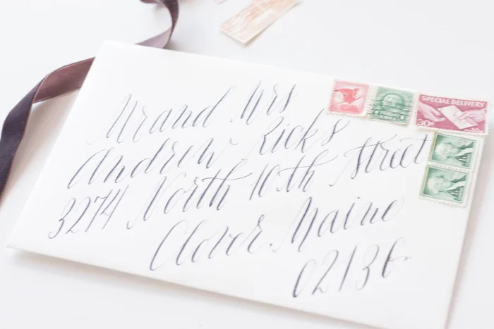
I love these envelope liners designed for a breathtaking wedding at the Ojai Valley Inn. Vines climb up these custom liners in white ink with an embossed pattern of climbing vines over the top.

chinoiserie | gold | soft | bold | floral
Newport | Rhode Island

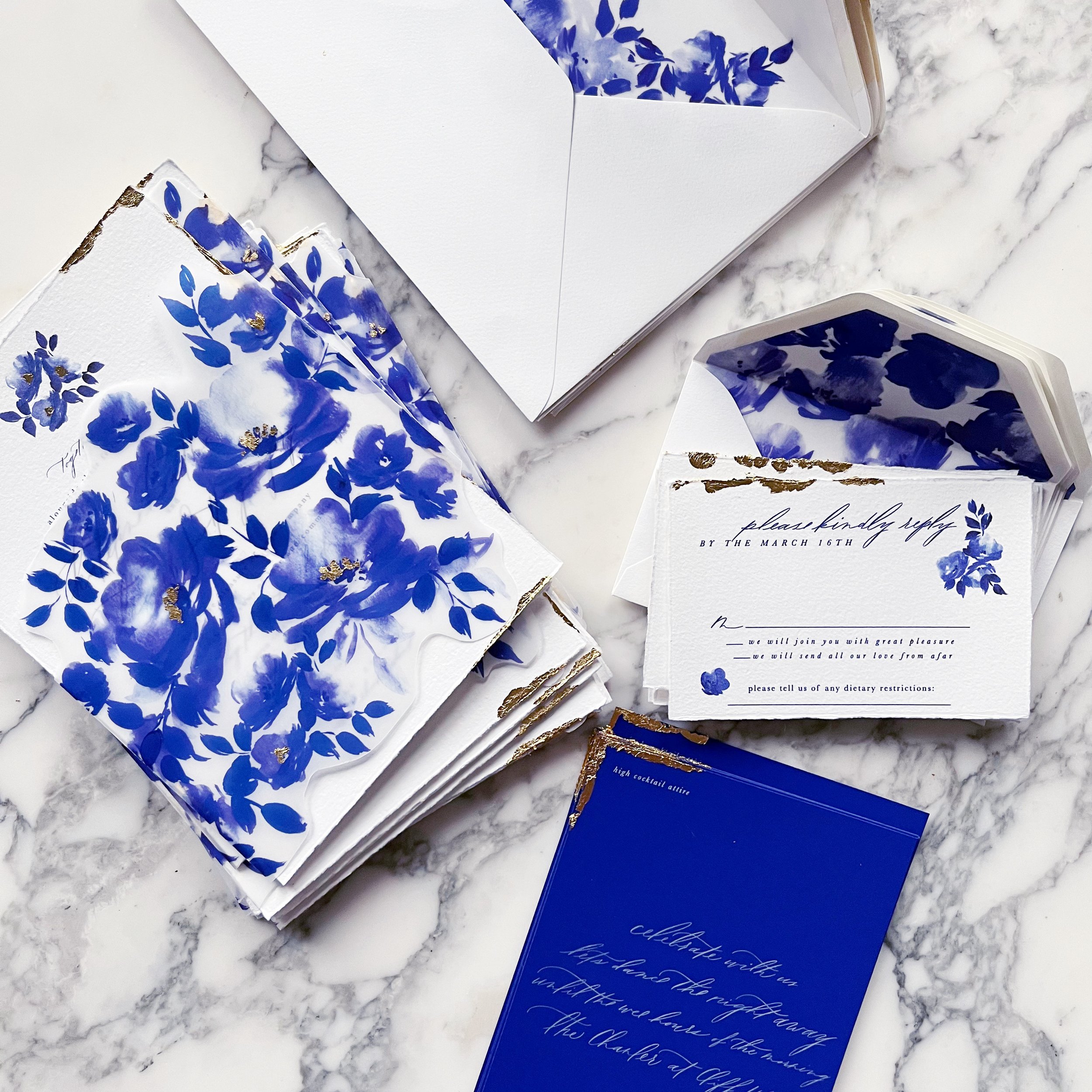
I’m so in love with these blues!
The blues are a perfect pairing for a spring wedding in Newport, Rhode Island. Our bride wanted a touch of the opulence of the venue without going full Victorian for her invitations. She and her family grew up spending their summer holidays nearby and she always loved passing by the Chanler House as a little girl. The invitations were the compromise between the classic Victorian styling of the venue and the more modern feel that the couple preferred as their own personal style.


I selected a white handmade paper with velvety soft edges for the invitation and reply cards, and paired with them with a bold lapis blue for the reception card. I loved the contemporary vibe the blue insert brought to the overall suite. We also selected a modern calligraphy style to pair with the blue watercolor florals.

Lets talk about gold gilding.
One of my favorite details to add is gold gilding to the edge of designs. For this particular design, I also added it to the centers of various blooms throughout the suite, including the reverse of the invitation, the die cut overlay, mailing envelopes, and reply envelopes.


Aubrey & Adam
Courchevel, France
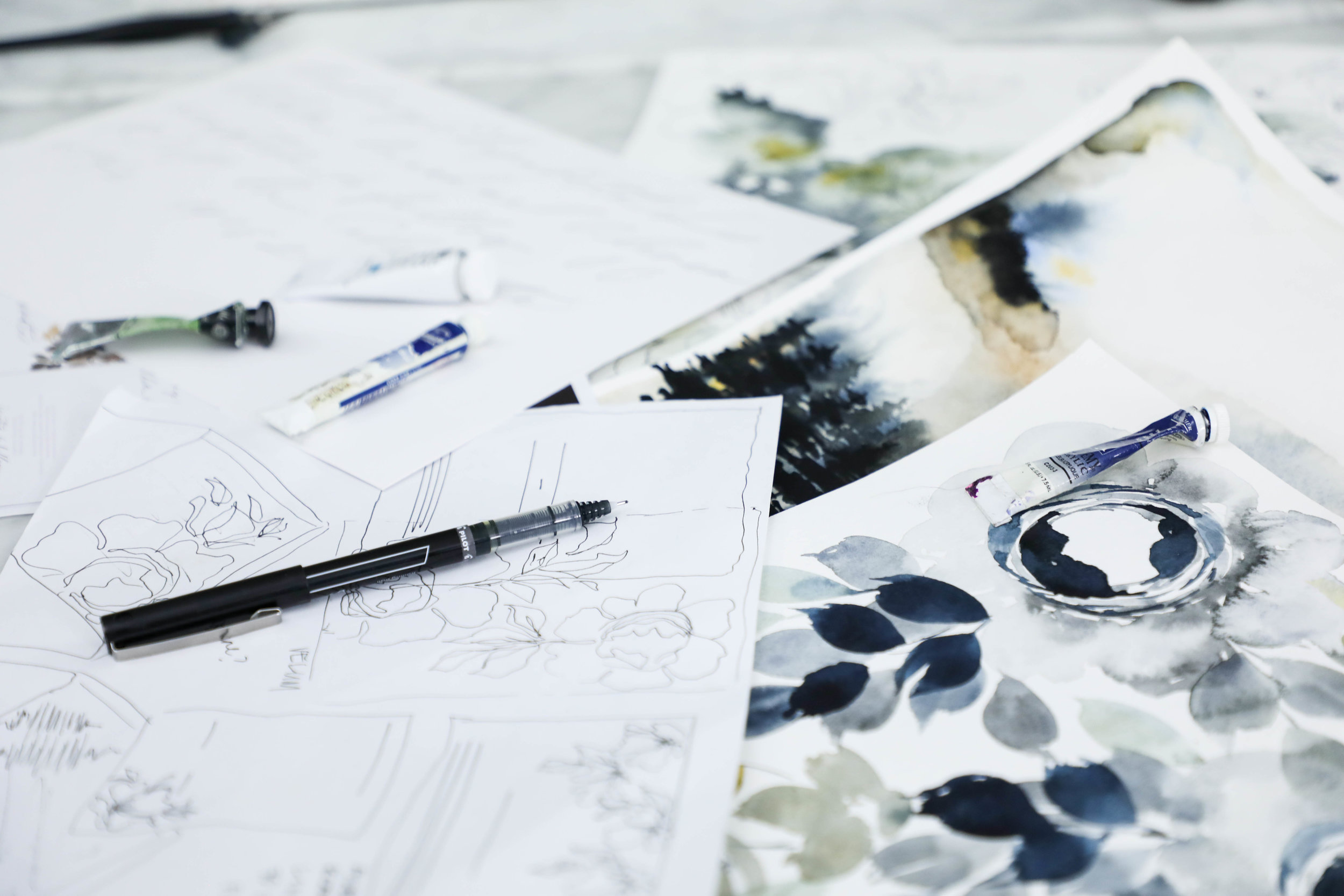
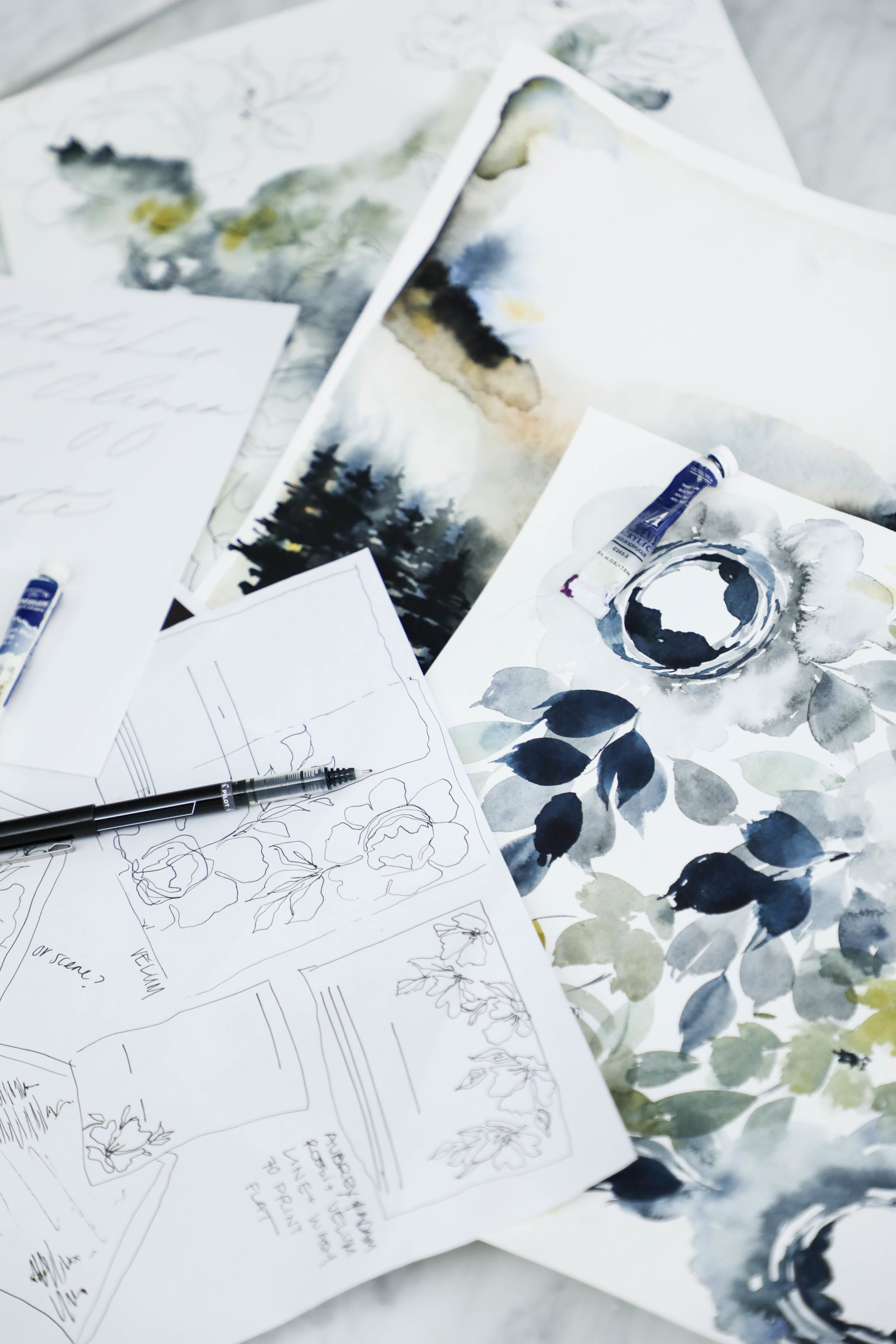
Aubrey and Adam were married at a gorgeous chalet in Courchevel, France and came to us with some specific ideas in mind. They wanted to incorporate ochre into the design, but dit not want the overall look and feel to be summery and cheerful, but moody and modern. They came to us specifically because of our use of original artwork and lettering designed for each client. As with all our clients, we began the process with a sketch, detailing out our overall ideas for their suite, mixing media and multiple styles of artwork.
We love beginning with a sketch for several reasons:
It helps a client envision the overall look and feel by putting thoughts onto visual mediums
It allows the client to visualize how we see the art moving from one piece to another throughout the suite. We rarely do pieces that all match exactly, but vary the art across multiple elements of the invitation suite.
It creates a point from which we can create and generate all the artwork. As artists and creators, we avoid redoing repetitious work, which consumes a massive amount of time and energy. We want to create your artwork once and do it correctly the first time, rather than missing the mark. This is where the sketch comes in.
We can make adjustments to the art while the art is still theoretical to allow for more time during the proofing rounds and on assembly details.
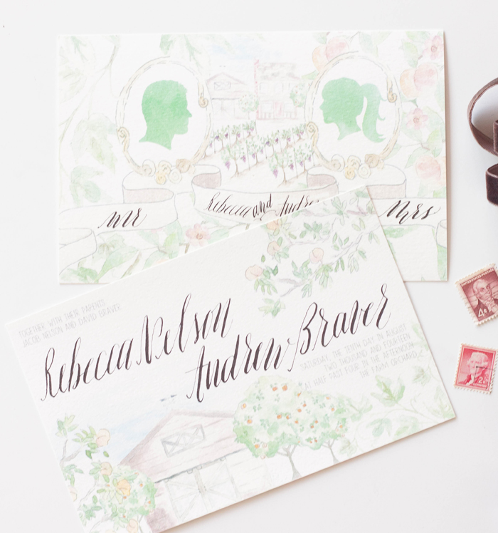
shown here: the final pieces of artwork used in the printed pieces of the suite, generated from our original sketch

Behind the Scenes
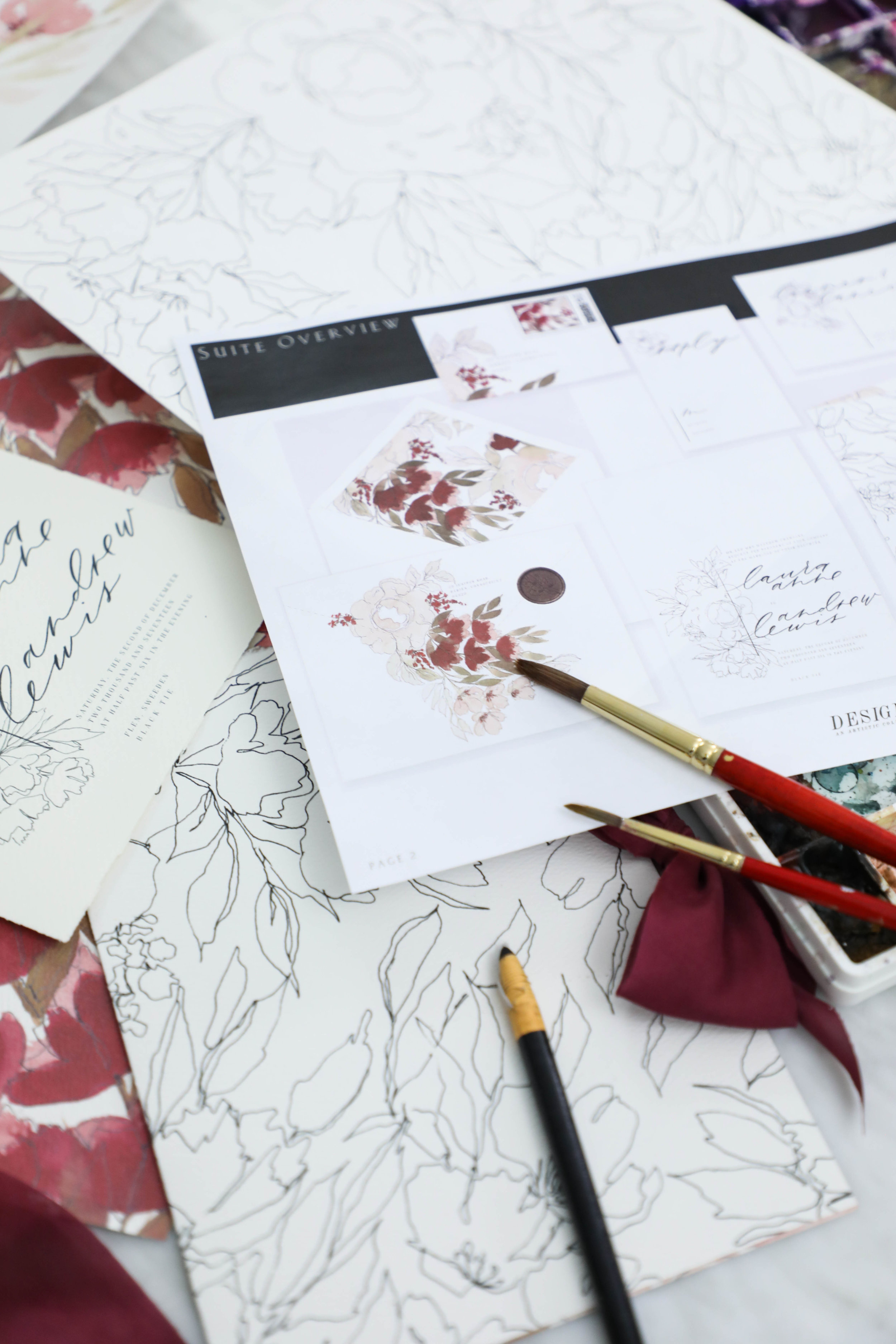
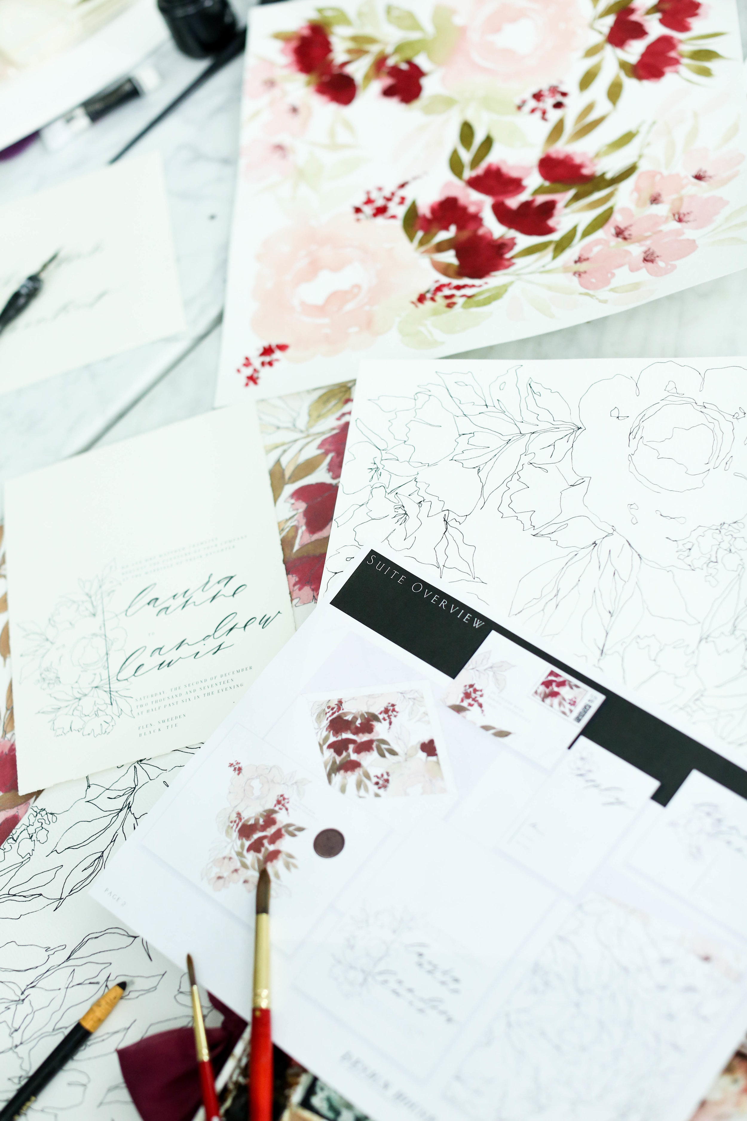
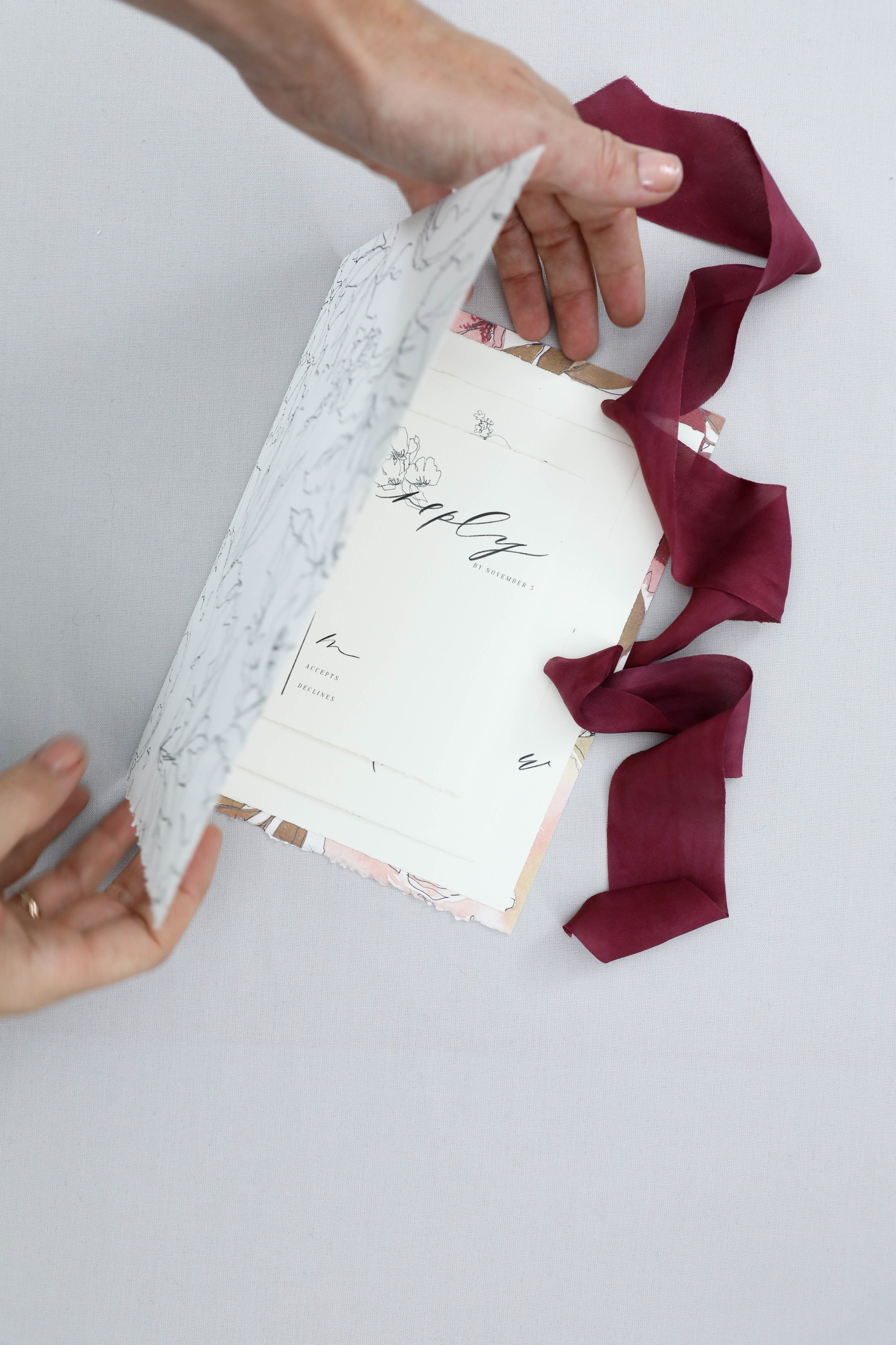
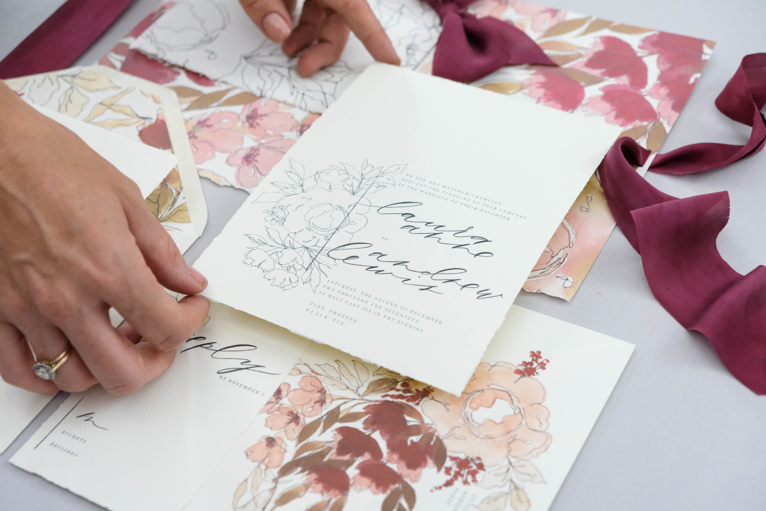
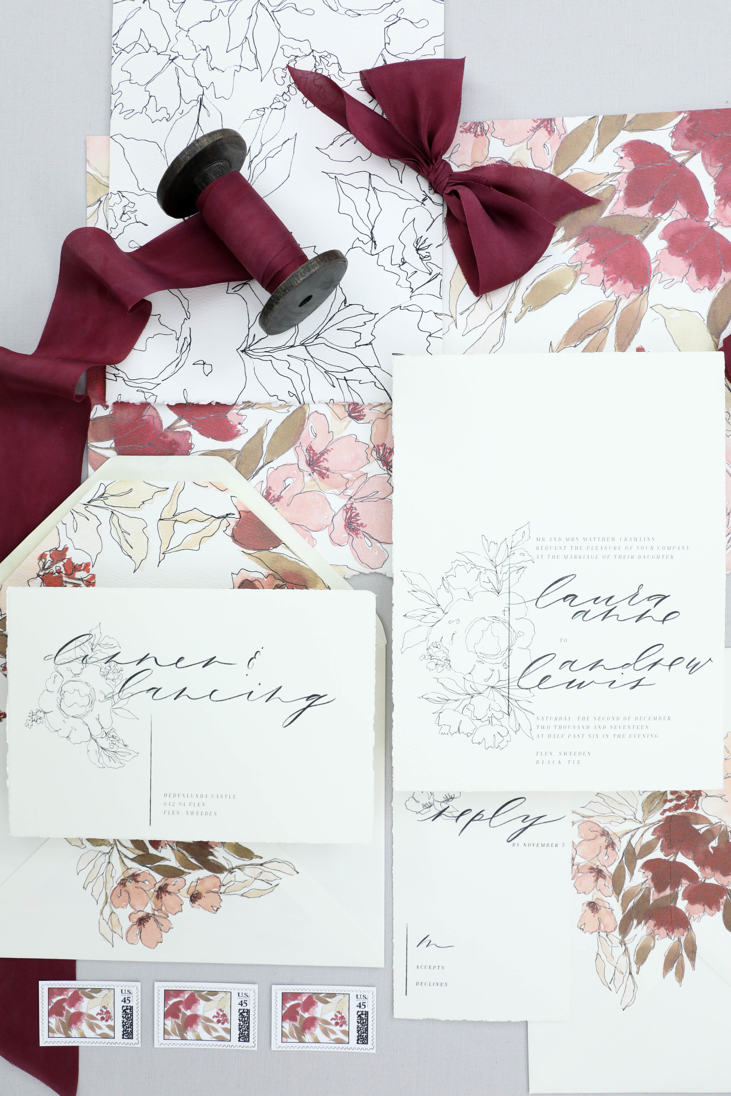
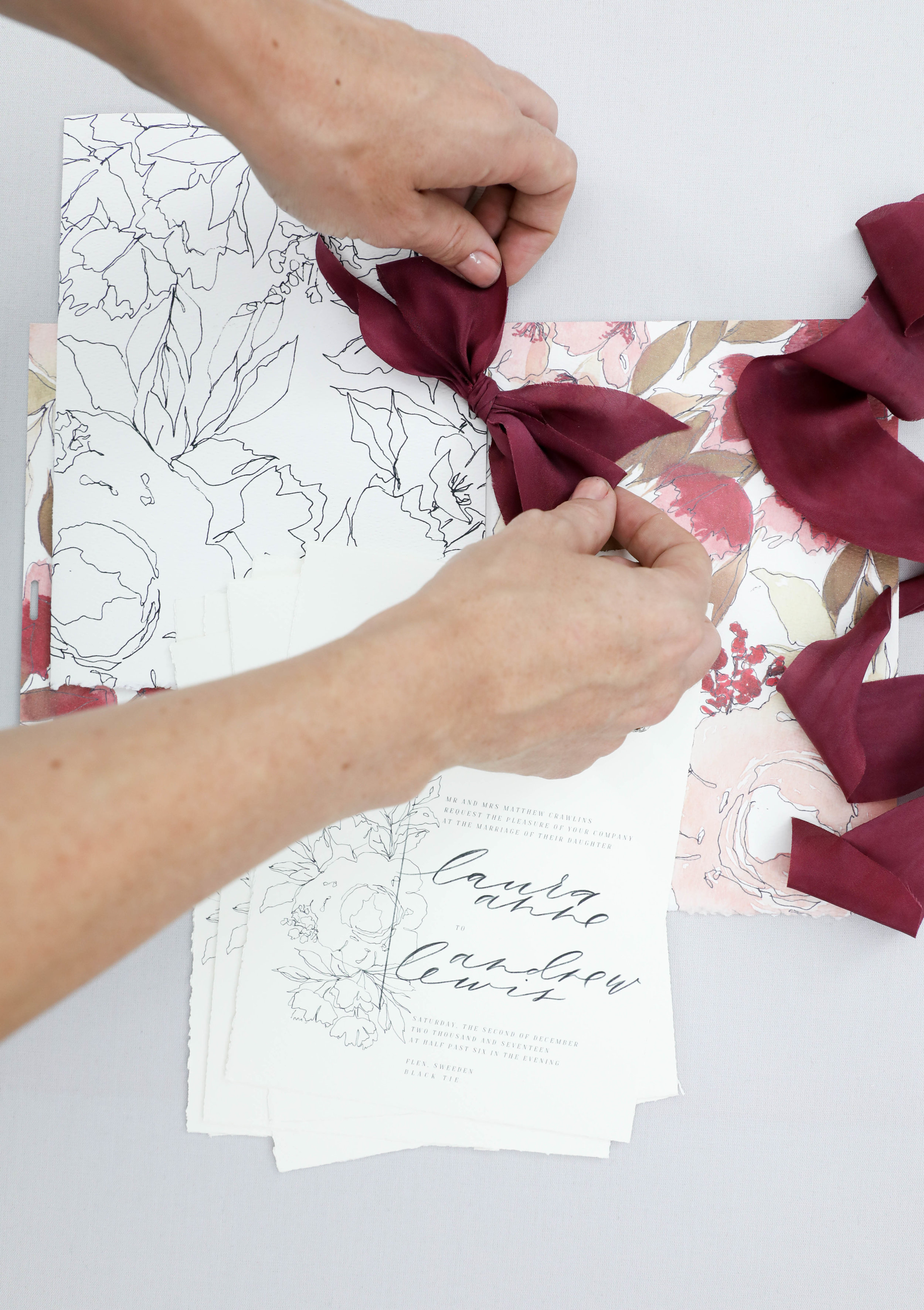
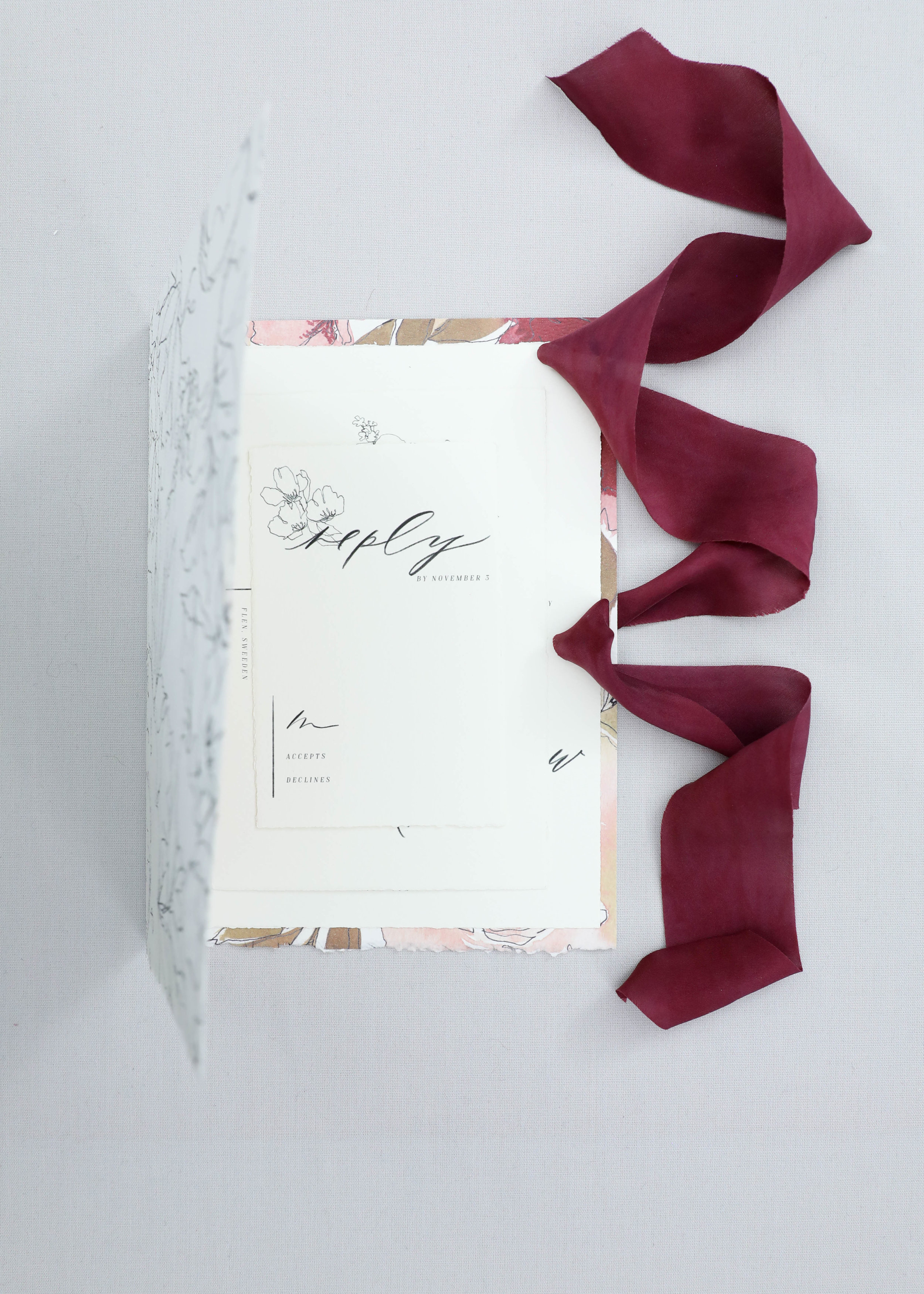
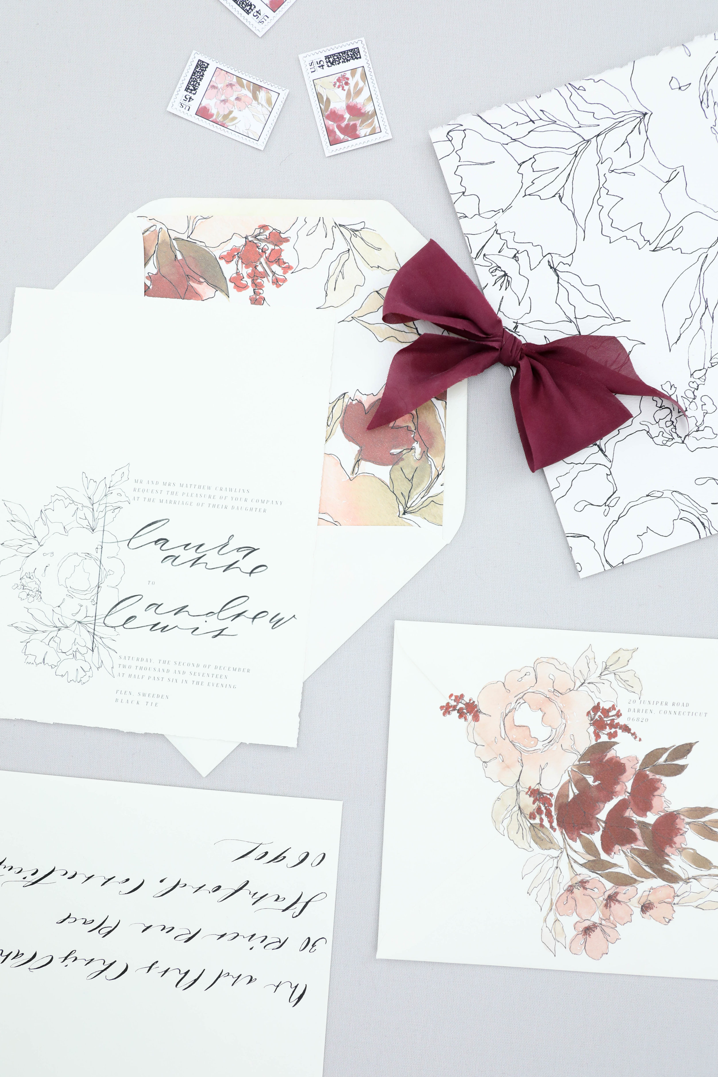
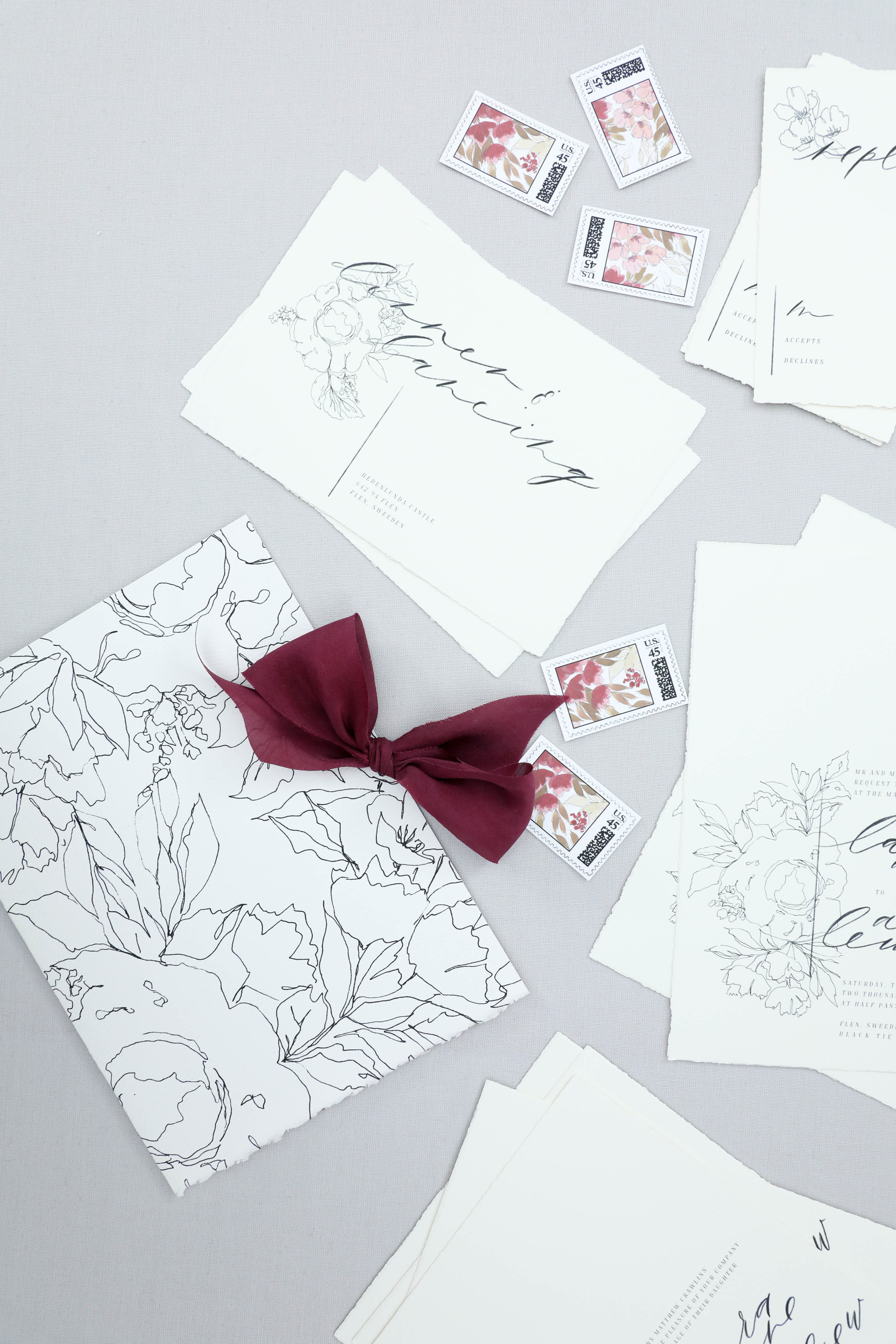
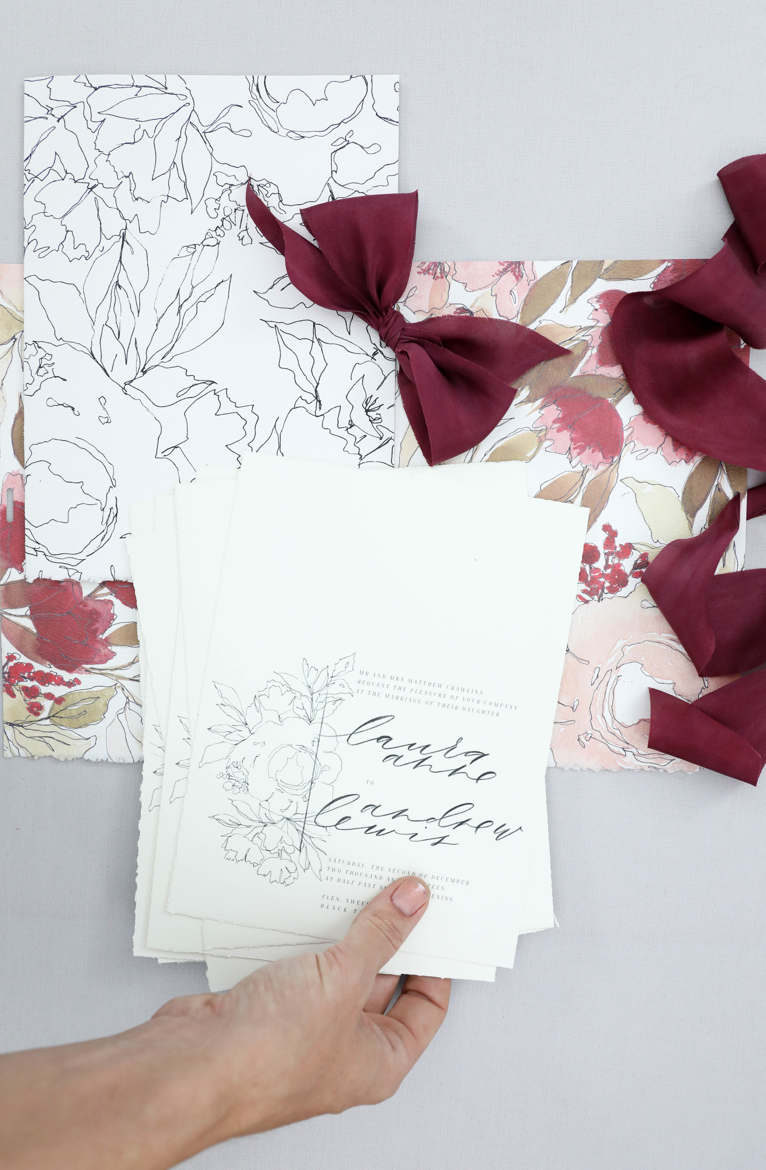
Laura was having a winter wedding and wanted to echo the tones of the season without having a Christmas wedding. We worked with her florist and gown designer to incorporate the same floral types as her bouquet and the applique on her gown to create the floral pattern. The outlined line botanicals of her invitation was a wonderful match for the lace on her gown as well.
We first begin working with a client by creating a sketch incorporating their ideas and the vision we have for their pieces. From that sketch, we create all the artwork and work into their proof.
The photos below show Laura's proof, the original artwork that was used to create her design, as well as a few of her printed pieces.
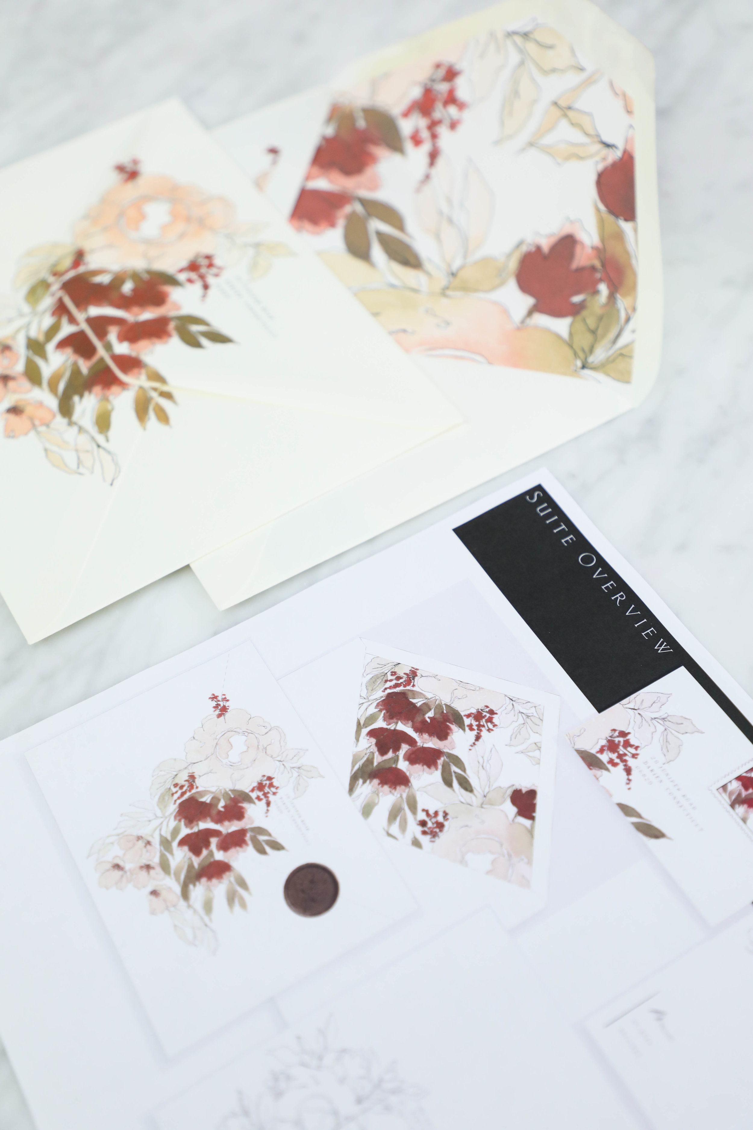
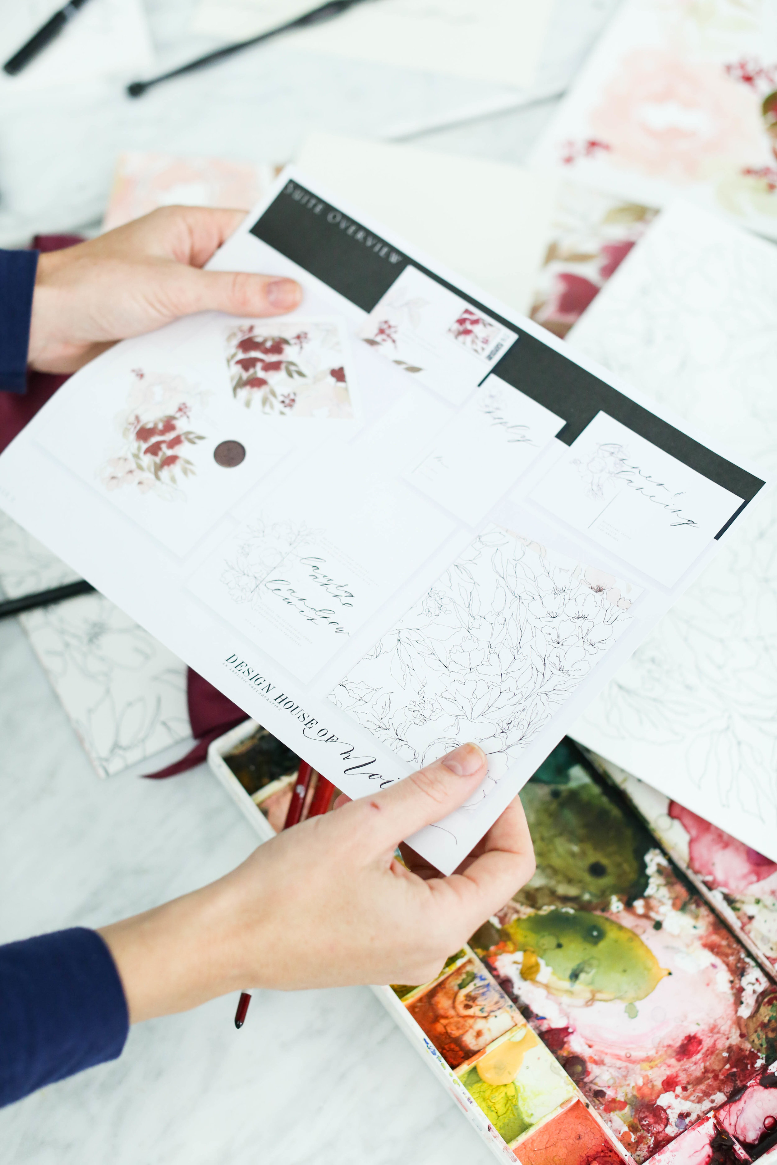
Printed Pieces
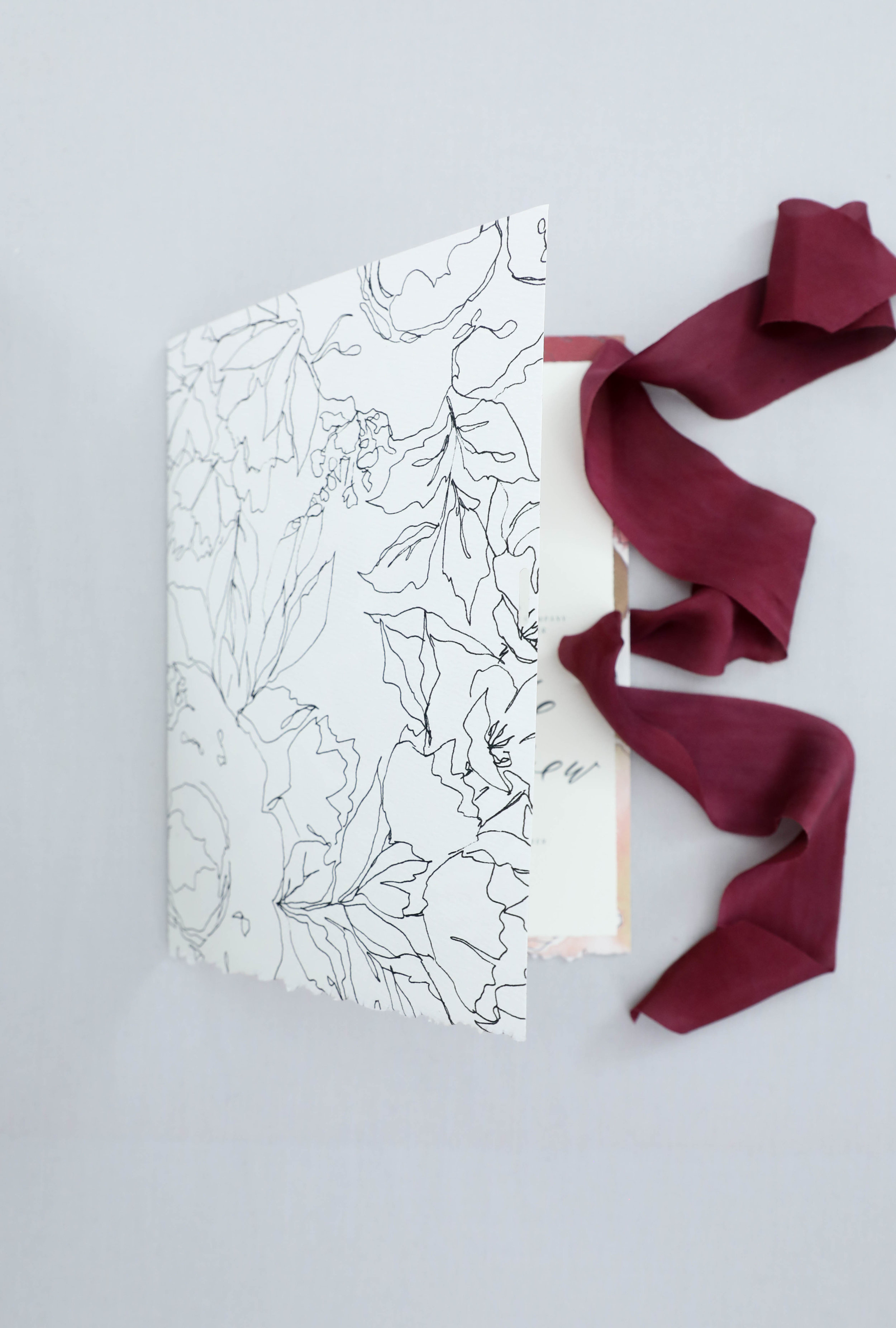
Her final pieces were on the larger size and tucked into a custom printed folder. The folder was printed with the simple line botanicals pattern on the outside, and the full color artwork on the inside. All of the invitation pieces were tucked inside and it was tied shut with a burgundy silk ribbon and mailed in an envelope lined with a combined artwork and line botanicals and printed with blooms.
We kept the invitations simple with line botanicals to let the artwork on the folder be the focal point.
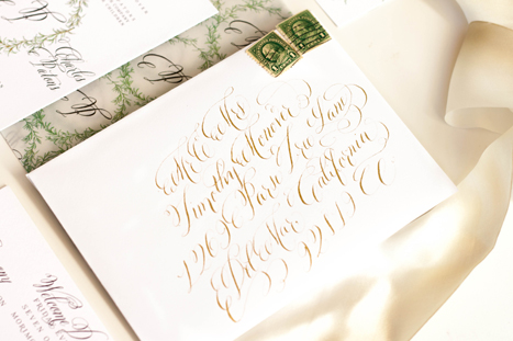
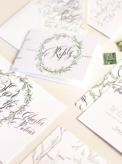
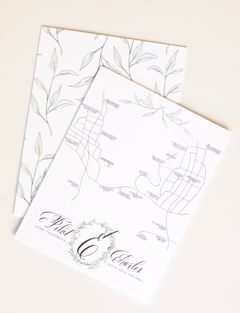
I loved working on this suite...hand drawn rosemary and sage, with touches of gold. The suite was designed around the wedding's venue, hosted at the Carneros Inn in Napa, California. We wanted to incorporate the feeling of the countryside and farm-to-table without leaning too far into the "winery" look and feel of things.
I always choose a group of descriptors for a design, whether its a wedding, invitation, or a home. For this suite, we choose: organic, rustic, elegant, easy, airy, herbal, farm to table, calligraphic,


I created a laurel from sketched and painted rosemary to incorporate through several pieces in the suite as well as their monogram. We then used it on the invitation, backer, velum wrap, save the date, front of the reply card, table numbers and the monogram on their hand drawn map. The other darling little design element of this suite that I really loved was the idea of taping herbs to a page and jotting their names on the tape...I really haven't any clue where the idea came from, I just thought it was a creative way of using the pieces. The "taped herbs" were used as backers for several of the pieces and also along the bottom of the reception card.
after the suite was printed, we had each piece run with gold foil to add little bits of gold sparkle into the watercolor elements. We decided against doing gold for the letter as we liked the look of the heavy black contrast. Naturally, all the envelopes were addressed in gold calligraphy ink.


we get asked a lot about the process we go through when creating custom invitations... starting from scratch always creates a lengthy process no mater what you're creating, and custom wedding invitations are no exception.
our process is different from most for a few reasons - one, we're calligraphers. two, we're artists and three, we're graphic designers. add those three factors together, and you get a unique take on paper products.
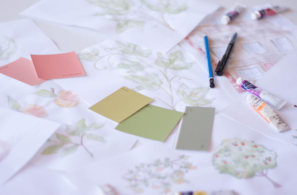
let us walk you through our process a bit ... when working with a new bespoke invitaion client, the first thing we do is hammer out some of their ideas, what pieces they would like, and what the overall look and feel will be. this usually starts with sketches, rough notes and some scribbles...like so...

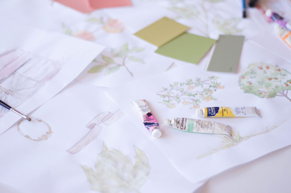
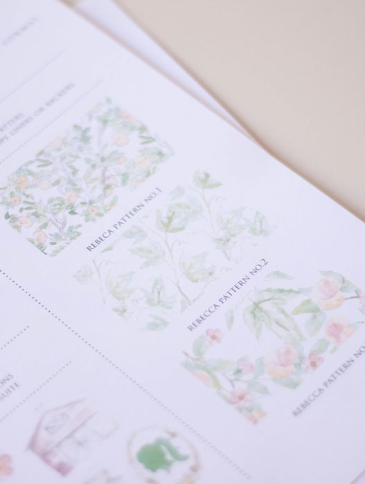
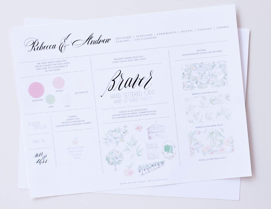
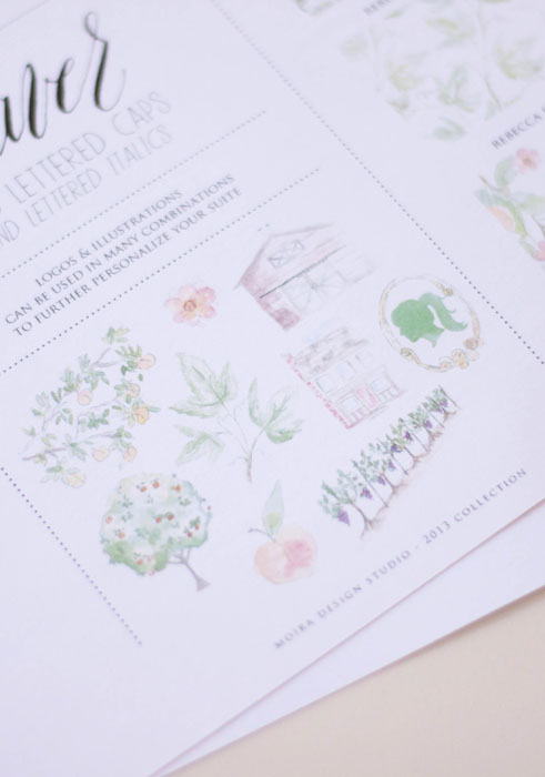
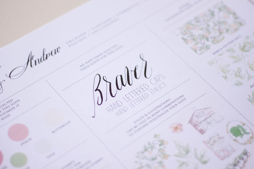
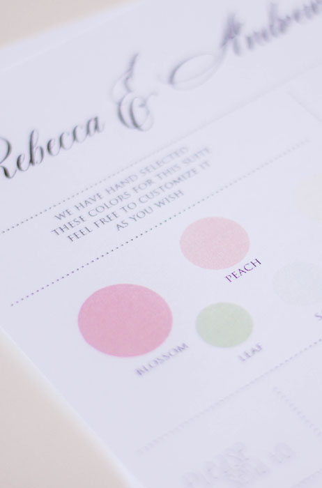
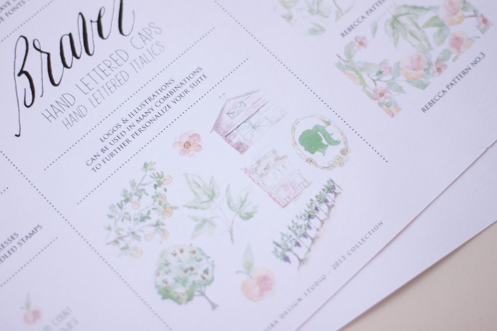
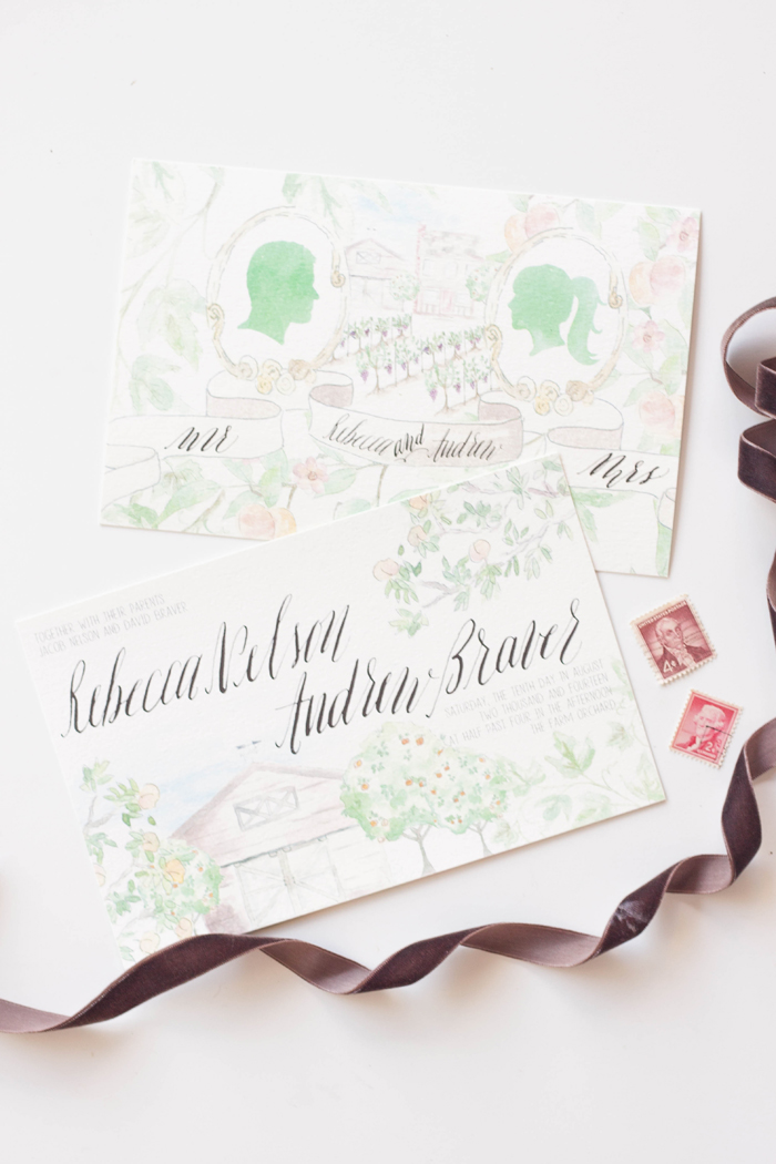
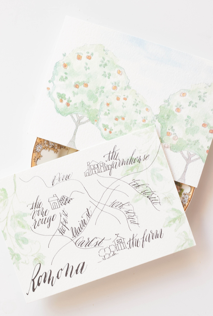
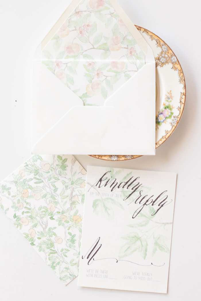
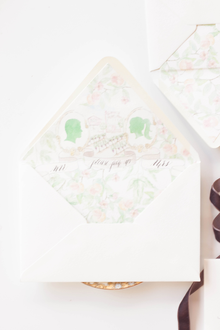
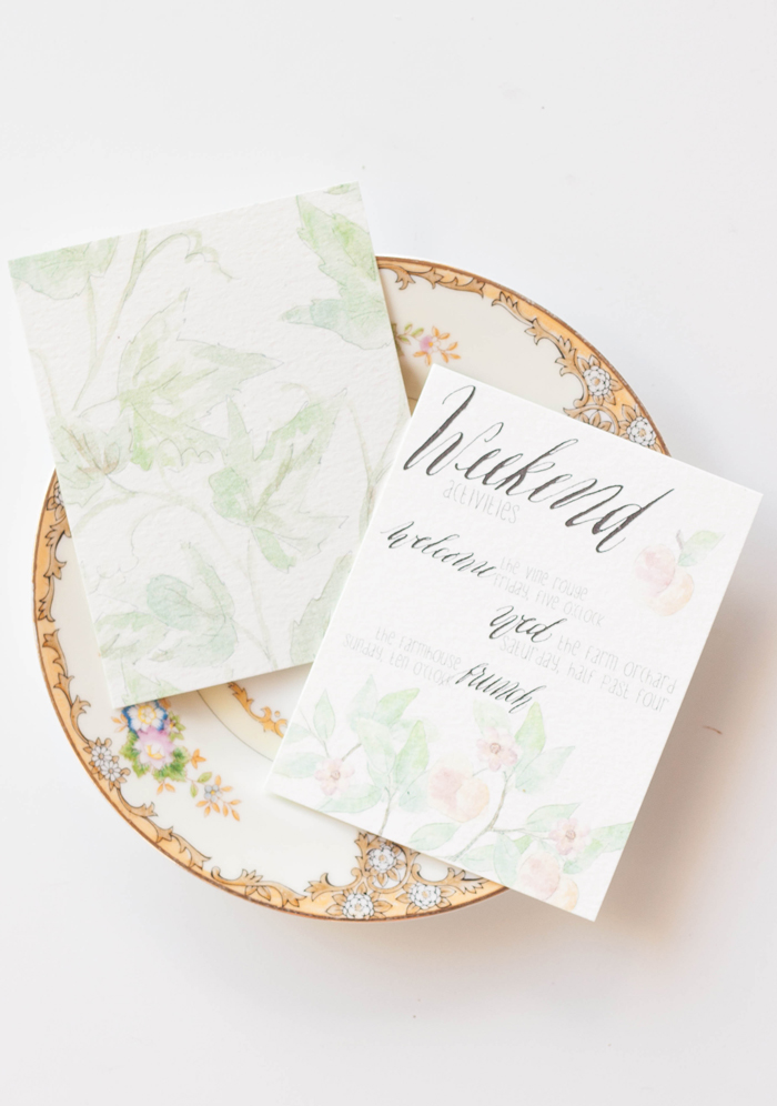
these sketched sheets are the basis for our design. we review color palettes, design inclusions, potential assembly ideas, etc. for this particular suite, we're pulling out peaches, blushes, pinks, greens and ivories. the design elements included in this suite will be peach blossoms, peach trees, orchards, some grape vines, grape leaves (no actual grapes) and the barn and farmhouse where the reception will take place. the client also likes silhouette portraits, which we'll try get on the design somewhere. at this point, we really get a feel for the overall formality of the event as well.
the next step is to start creating some artwork. we begin with sketches, then depending on the look we're going for, their either inked and then painted, or just painted. for this suite, i first sketched, then inked using rough lines rather than a hard outline. i wanted the watercolor to be fair in color, so i used the light ink lines to help define the elements a bit more. here, i ended up with about 8 pages of elements.

now comes the fun part - the painting or illustrating. since we use a lot of mixed media, this could be watercolor, gouache, colored pencil, ink, or acrylic. by this point, we've really narrowed down what a client is looking for. sometimes this includes doing a rough design board if we need to narrow things down a bit more before we move into the paint stage. since this stage is the most time consuming, we try to not end up painting too many more elements than what we'll actually be using.
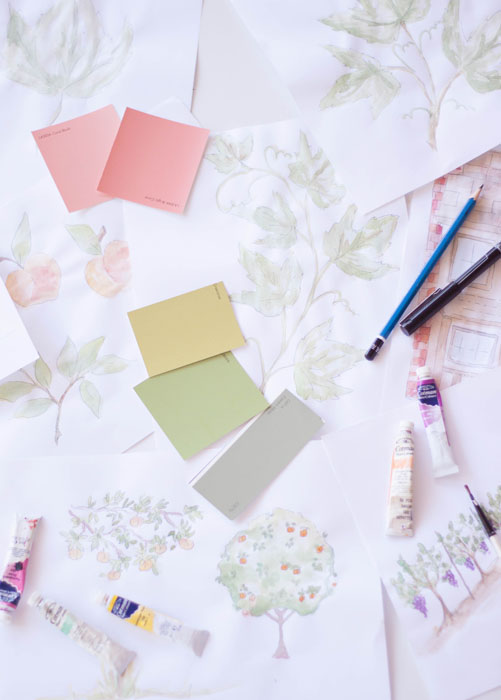
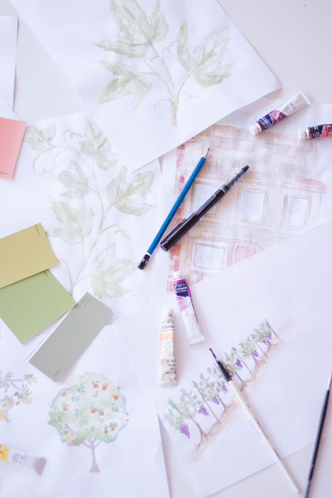
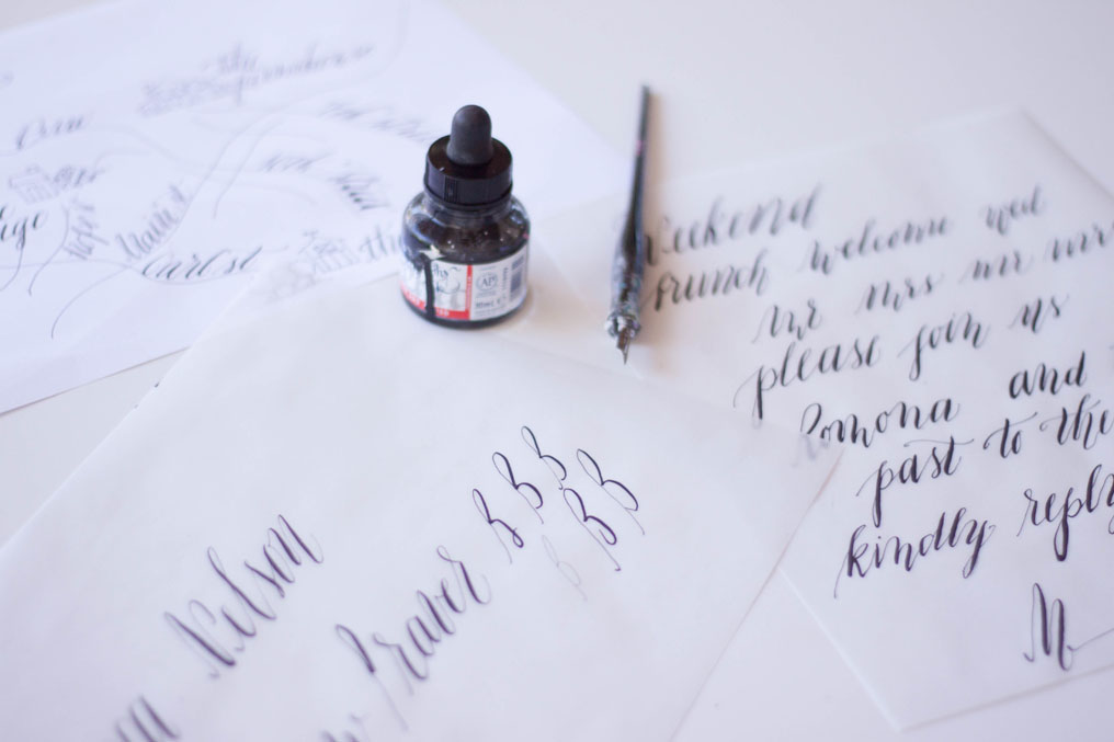
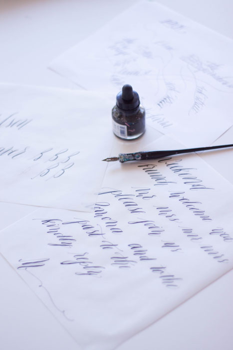
we then march right into the lettering. since we're also calligraphers, most of our work includes some sort of hand lettering or calligraphy. we do all our calligraphy as master copy work, then using a scanner, applique the calligraphy onto the design and reproduce the work as one print. we use the same process for our artwork.
from here, we create a design board. we LOVE using design boards; they're an excellent way to visually put all our elements in one place and convey the overall look and feel. a client can see all their artwork, patterns, fonts, and other options all listed out at once. we use these design boards to decide what elements go where, what patterns we'll put on which pieces, what the envelope liners will be, etc.

once our design board is in place, and all our elements have been approved by the client, we move into our proofing. we create invitation suites different from a lot of design companies out there - each piece in the suite is often quite different from the next and sometimes showing just a single piece doesn't convey the entire suite accurately. we usually create a couple invitation layout options, but select our favorite to create several pieces in the suite so the client can see how we plan on using elements from one piece to another. we also print the back sides of all our pieces, adding even more details and available space for elements and design.
our process and technique does set us apart, and the end result is truly a completely bespoke invitation, extremely unique to each client. this is where the hashtag #ilovemyjob comes in!