A Custom Toile Pattern for a DC Wedding - Colors
I love getting a project where I get to work with a ton of colors! Granted, the shortages we’re seeing throughout the paper industry right now didn’t make it easy, but I was up for the challenge.
We wanted to go with spring pastels without feeling too much like an Easter church service. I selected very specific shades, including a cool pink, medium rosy purple, spring green, pale blue, and a distinctive shade of cornflower blue.


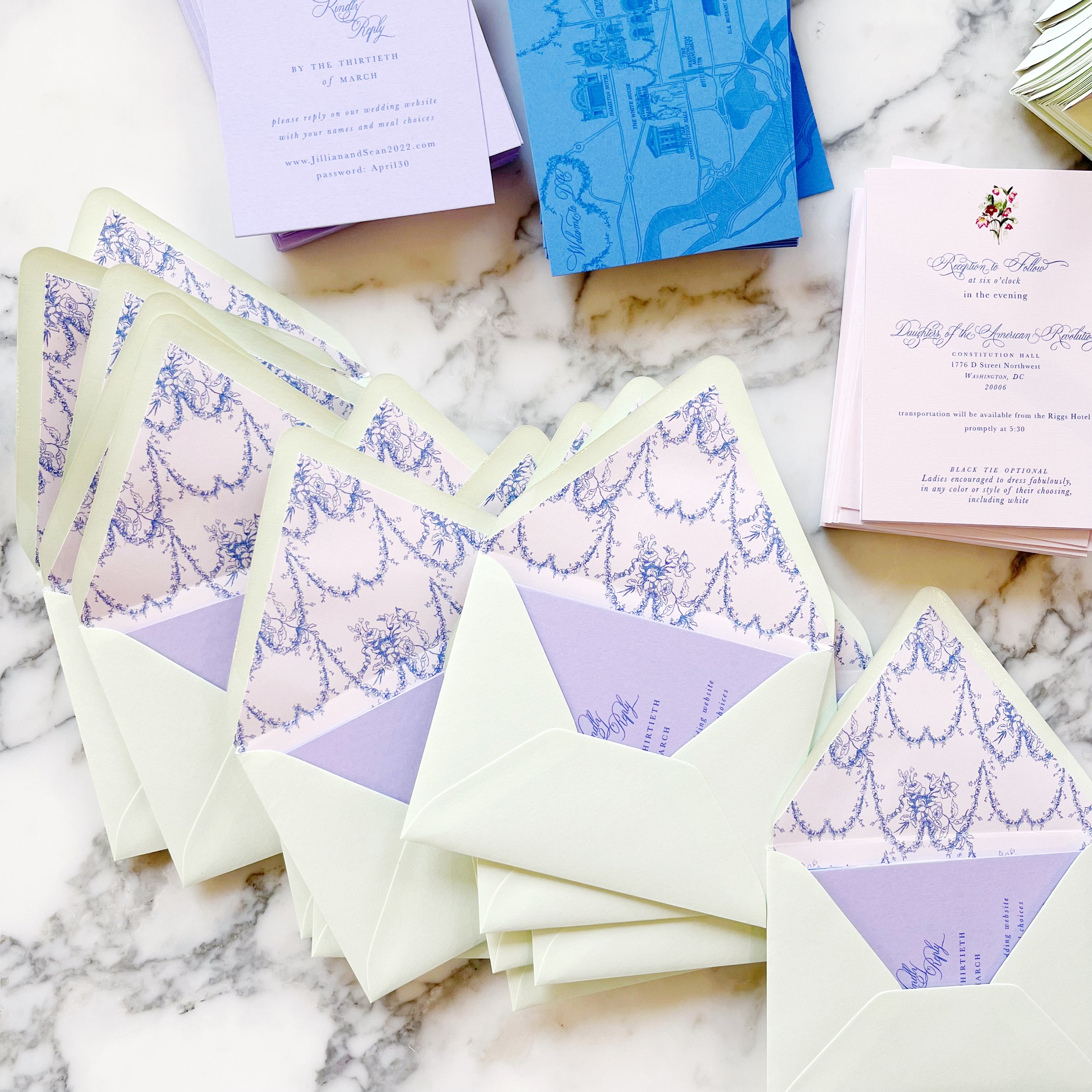


A Custom Toile for a Historic DC wedding
Washington, D.C.
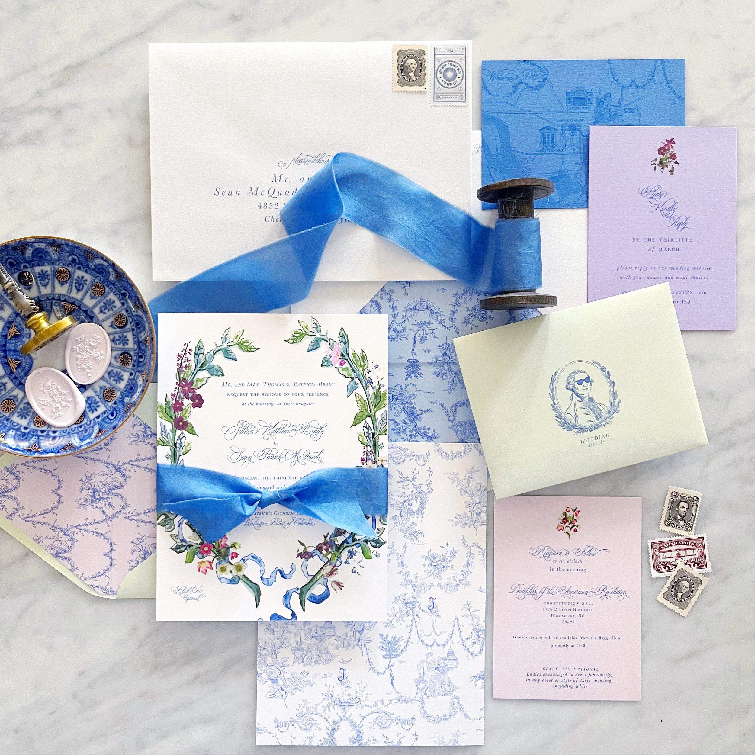
When I created the toile, I also created individual pieces that could be used in a variety of placements throughout her design. The envelope liner was created from floral festoons from the overall pattern, and we highlighted George Washington in his sunglasses on the front of the enclosure envelopes.
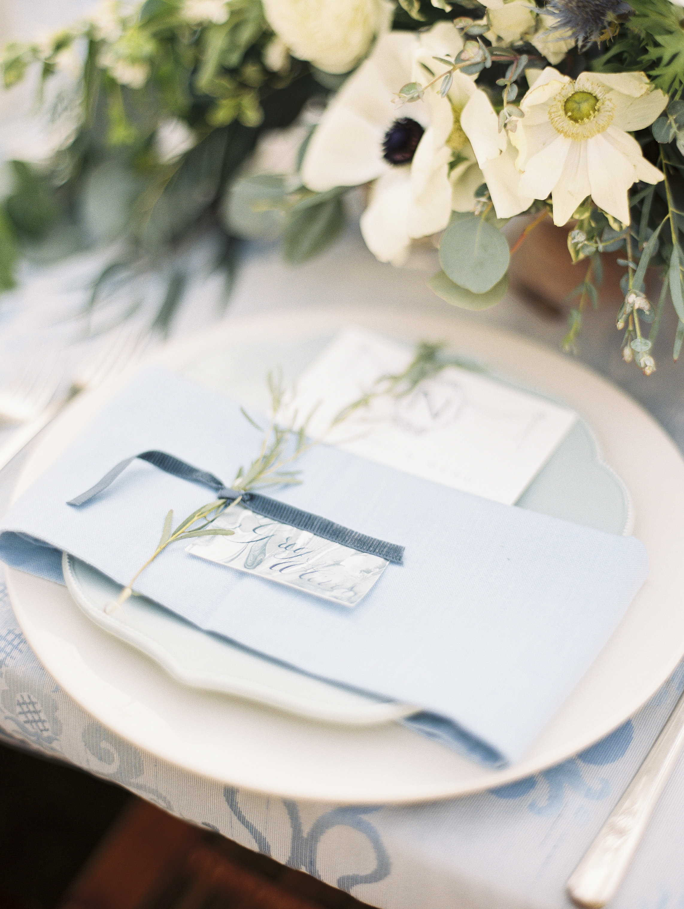
We opted for a colored version of her laurel for the invitation itself, and repeated the same style for her placecards. Vintage style postage was a must and we did a custom dye for her silk ribbon to perfectly match her blue.
Each envelope was sealed with a pale pink wax seal with a bouquet from her toile pattern.
Bright and Summery Bridal Shower Invitations - The Wax Seal
I love the wax seal details of this design!
I selected a pale blue to complement the more subtle colors of this design. As an added detail, we added some dried rose petals and a saturated pink to the wax.

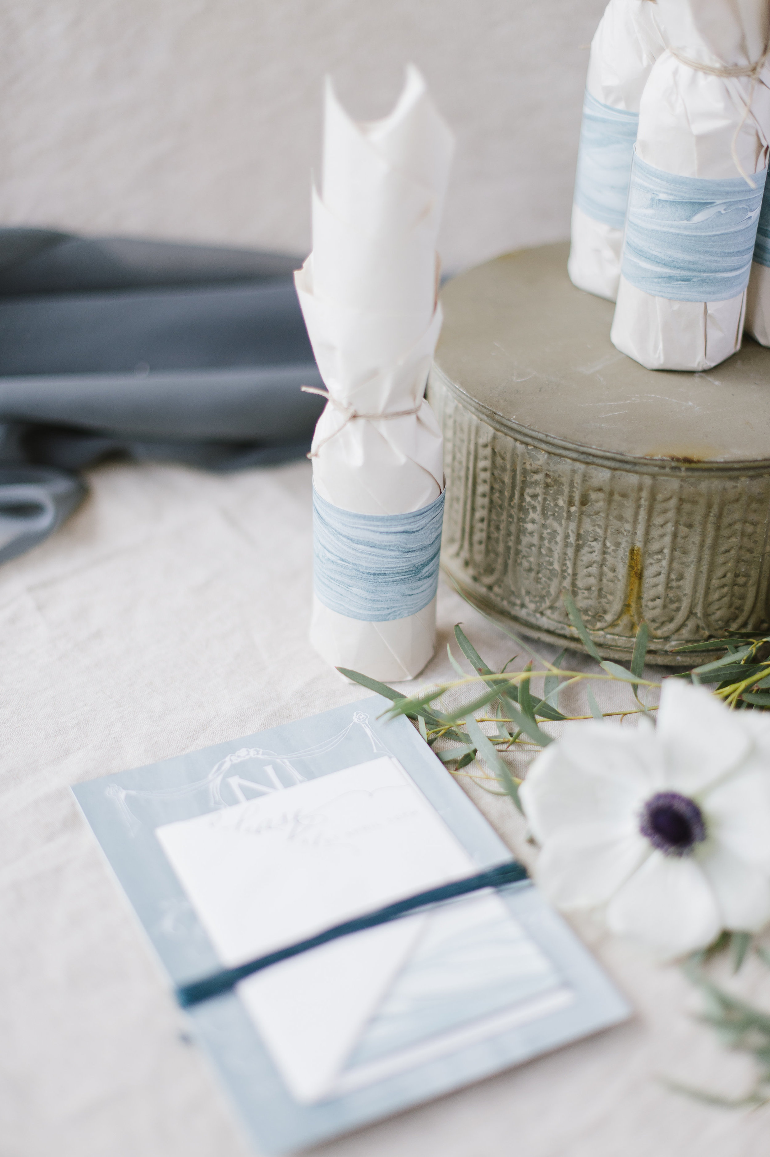
Chinoiserie Blue Wedding Invitations - Envelopes
Envelopes…always my favorite part of an invitation suite. A commonly neglected and always unexpected design element….

This suite featured two different pieces of artwork on the envelope liners, as well as artwork printed on both the reply envelope as well as the mailing envelope. Naturally, we selected blue postage to compliment the overall aesthetic.


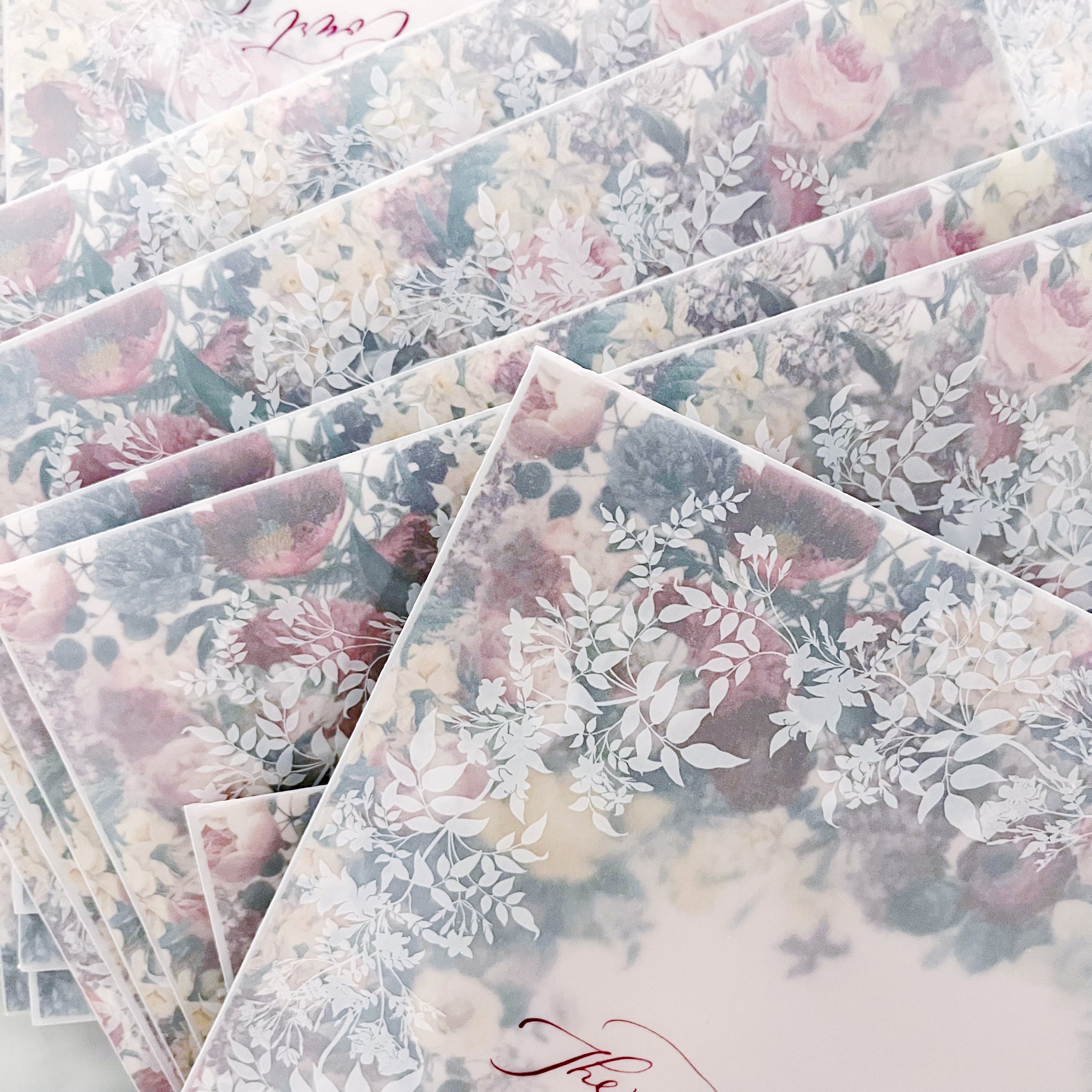
Botanical Baby Shower Invitations - The Envelopes
I’ve worked with vellum envelopes before, obviously, but this project was a little bit different. Vellum is a beautiful material to work with and I love how nicely it juxtaposes as a complimentary texture to so many other materials. Since I knew we would be using the woodgrain paper for both the invitation and insert, I loved the semi-transparency of the vellum to contrast against that. But here’s the thing…you can see through the vellum. So the question always is how do you protect the privacy of the invitation as it goes through the post? Whatever material is chosen, it also needs to support the guest addresses, meaning that it either needs to be dark enough to support a light address or the other way around.
Examples of how to circumvent this would be to do a vellum wrap in a pattern or a custom tissue paper - I typically like to use custom printed tissue paper with a complimentary pattern that we’ve designed to match the suite. For this project, we didn’t have the turnaround time for custom tissue, so that option was out. A vellum wrap was also out because the envelopes I selected were Marques size - 7.25 square - which means a vellum wrap would need to be at least 15” to wrap all the way around. Vellum prints on a laser printer (yes, I know you can get inkjet vellum, but I have a strong preference for how the ink sits on top using a laser) and my printer maxes out at 12”…so that option was also not available.
So what’s left?
Using the back of the invite and the envelope liner! The envelope liner obviously shows when the guest opens the envelope, but there’s nothing saying that I can’t print both sides so one shows through the envelope and shows when the envelope is opened, so that’s what we did. I matched the heavy pattern for the backs of the invitations and the back of the envelope liner so it created a consistent and cohesive pattern front to back, which I LOVED.
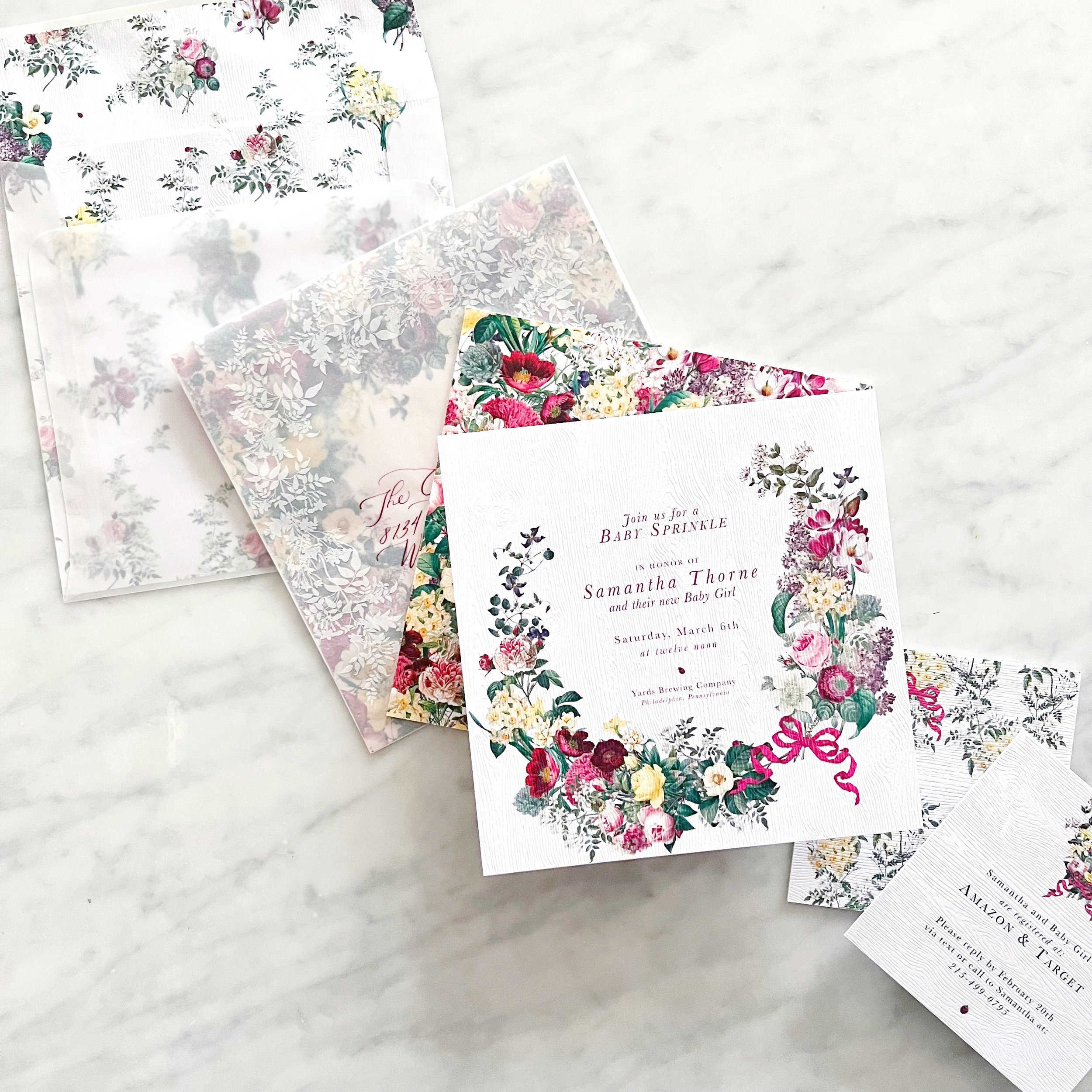
OI course, I didn’t stop there - I also wanted artwork on the outside of the envelope to overlap with what showed through from the envelope liner.


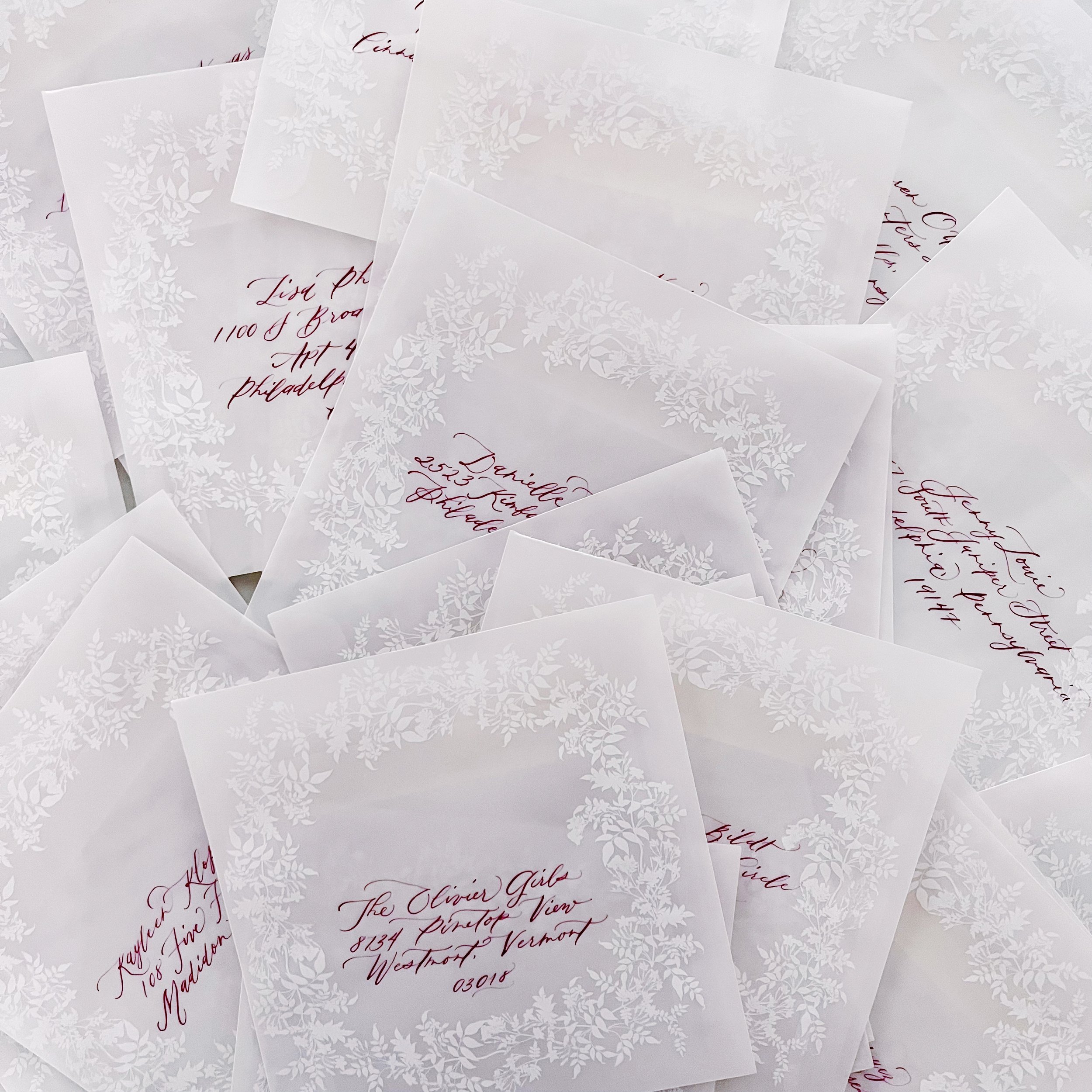
Calligraphy in a deep burgundy and modern style topped them off!
I specifically designed the envelope liner to have a negative space to frame the calligraphy, making it not only the focal point, but also easier to read.
Custom Designed Envelopes
How much more exciting is it to get a beautiful envelope in the mail rather than just a plain white one??
We have two sets of envelopes on the print table this week.
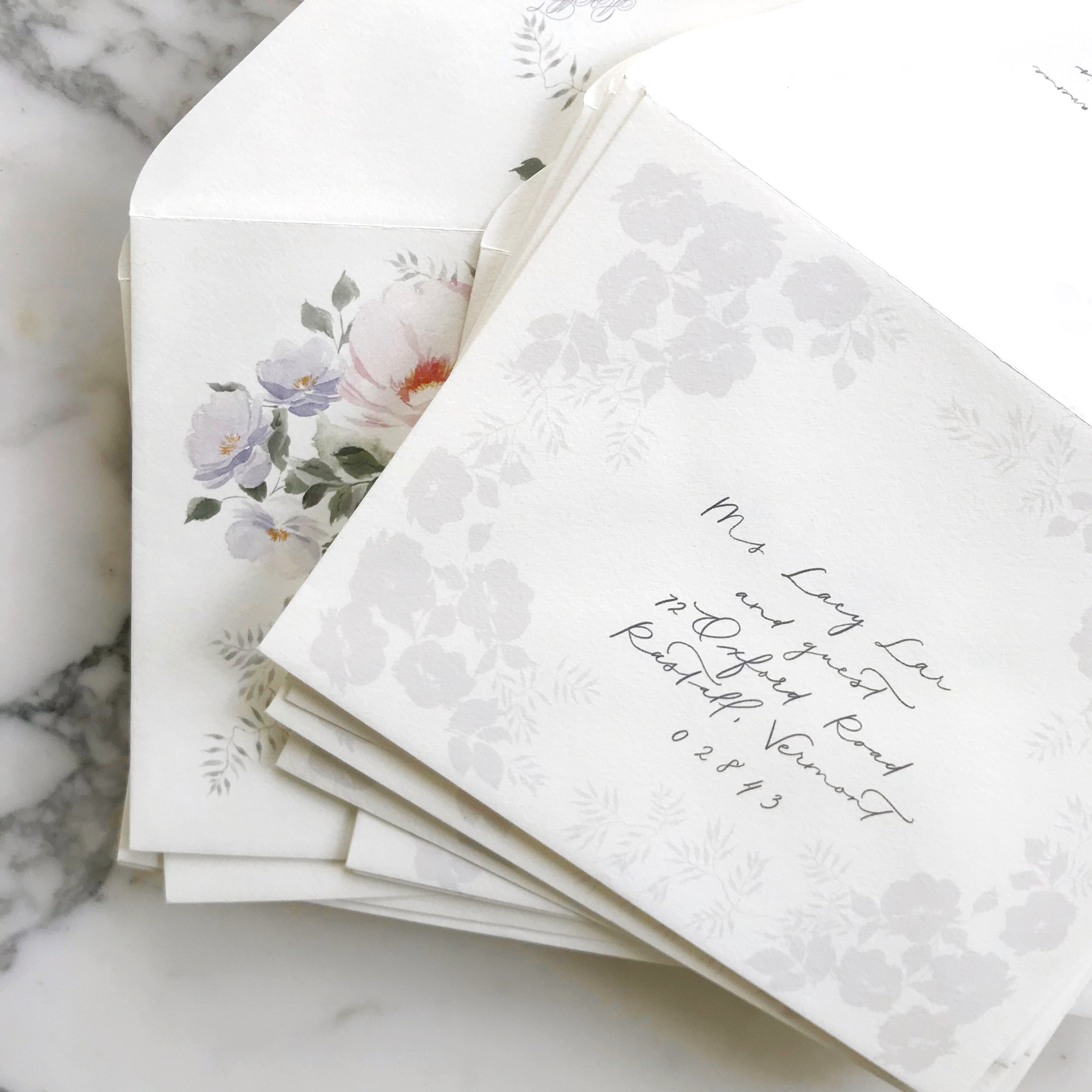
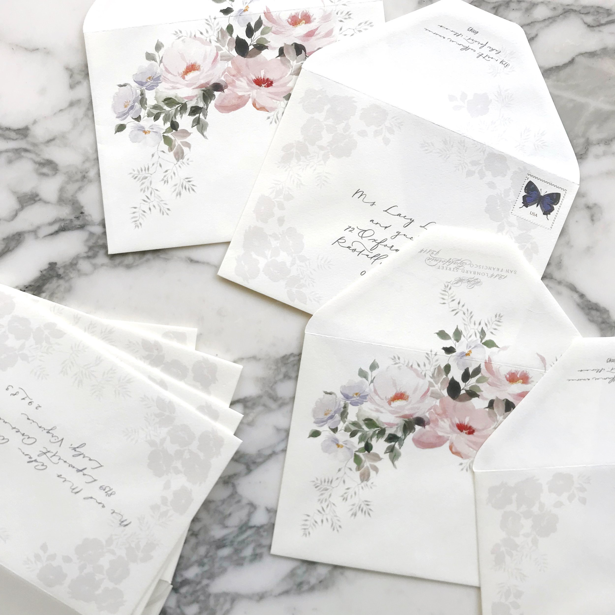
The first is a modern take on florals in pale lavender, designed with florals and vines surrounding the address.
The second is a garden suite with roses in pale purples, blush, and jasmine vines asymmetrically on the envelope.
Sneak Peek - Art Nouveau Wedding Invitations
Romantic, pale, textured, unexpected, handmade paper, tactile, art nouveau
an invitation suite for a wedding at:
Glen Foerd Mansion | Philadelphia, Pennsylvania
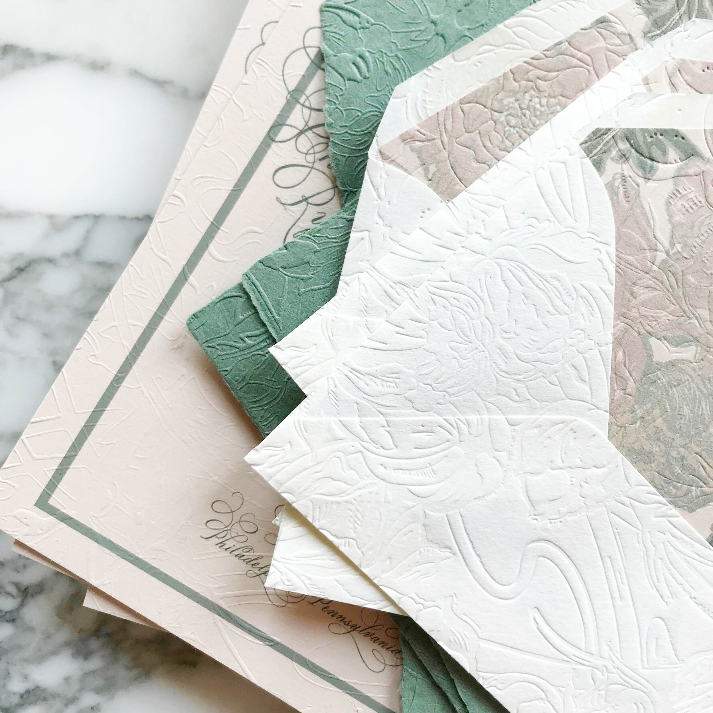
pale shades of nude and sage, with classic art nouveau texture and artwork, saturated with heavy texture emobossed onto pillowy soft papers.
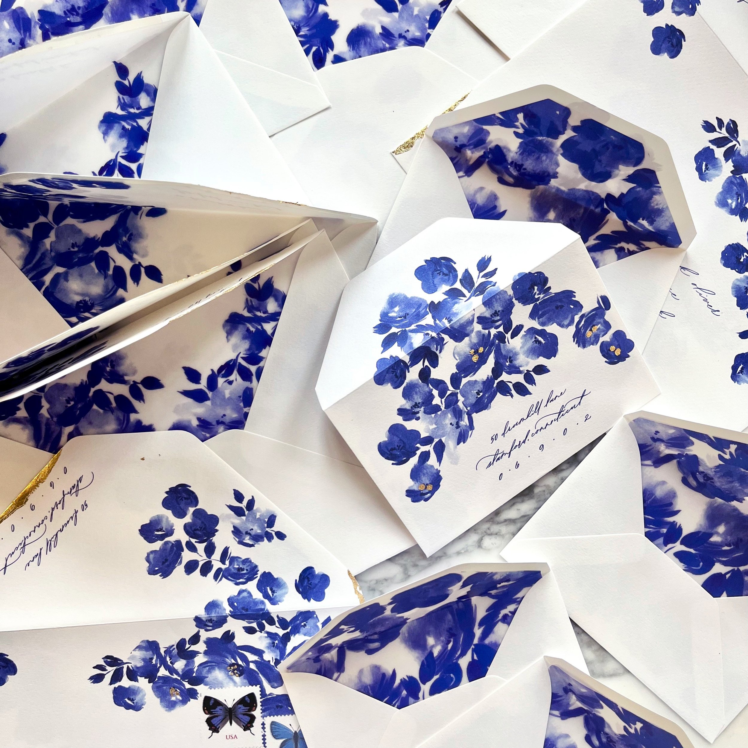
Spring Rose Garden Invitation Suite Reveal
See our spring rose garden wedding invitation suite in action as we unveil it on our YouTube Channel!
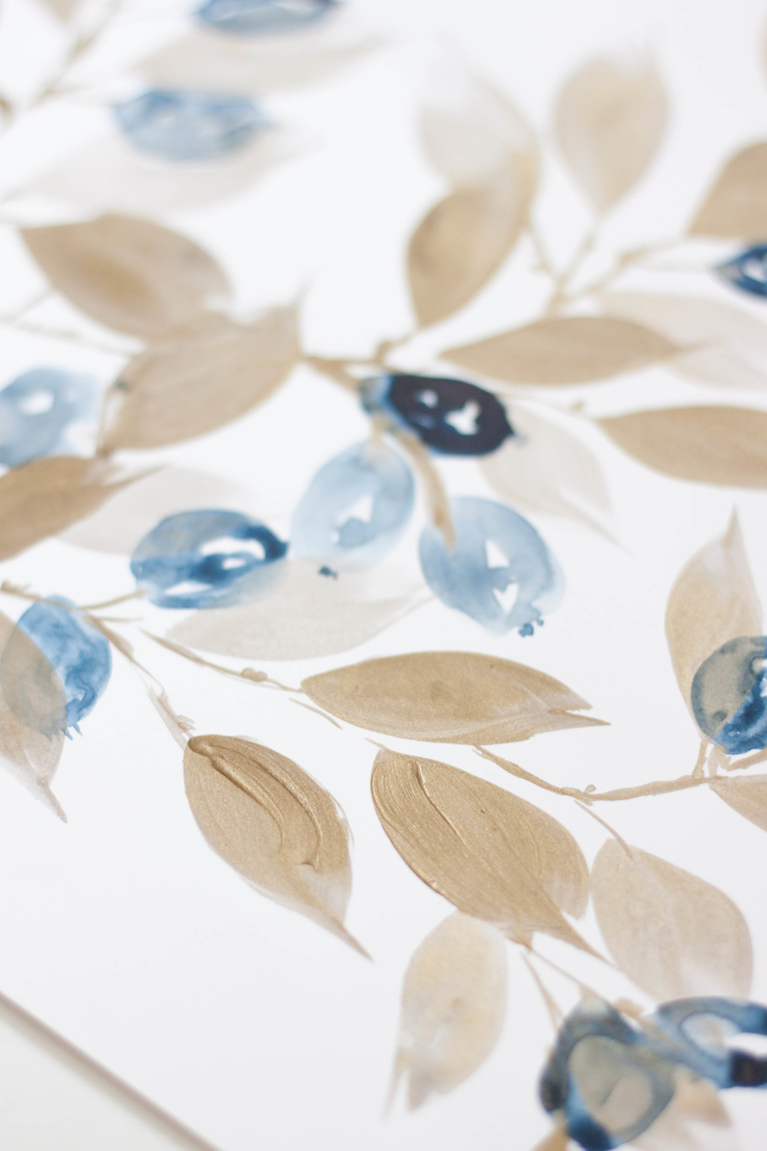
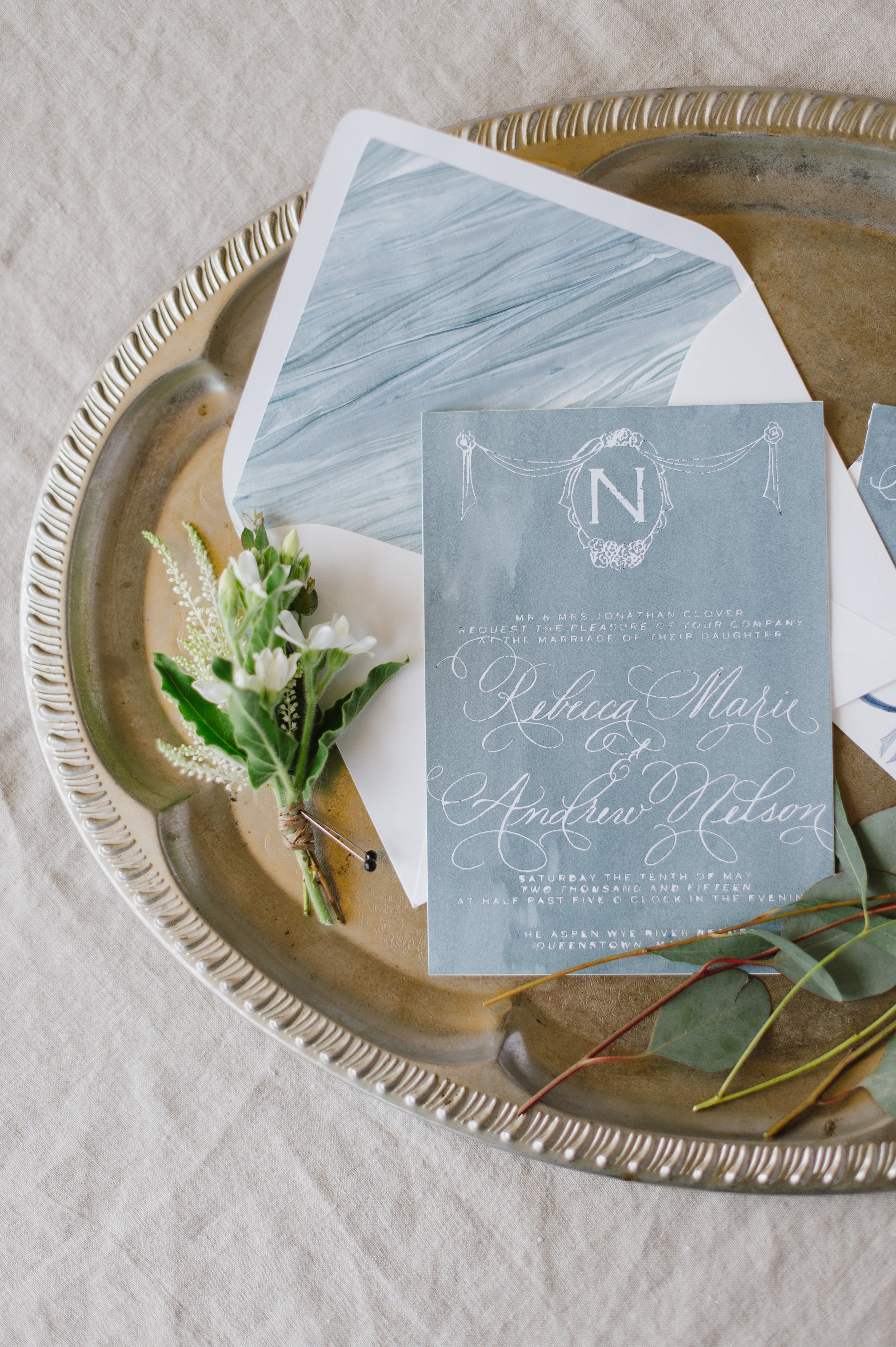
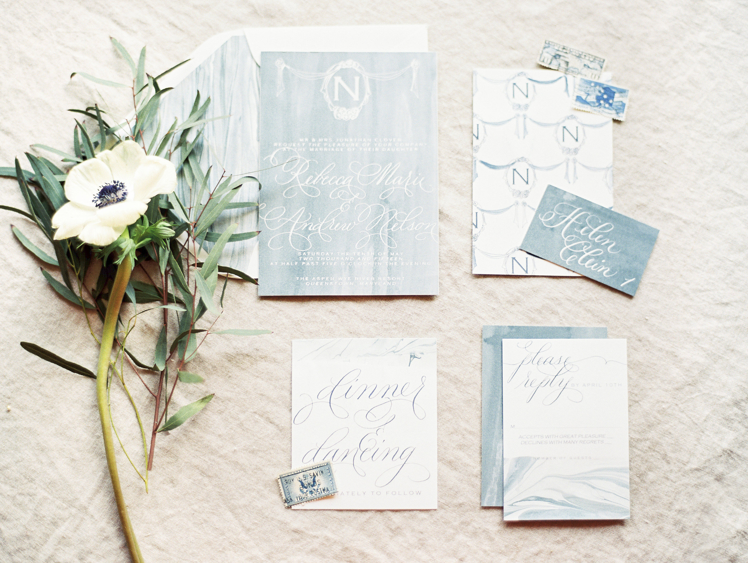
Roses and forget-me-nots were the focal point for this spring wedding invitation suite. I loved the pairing of white ink on blue pops of some more modern interest.

Watercolor and Masking Fluid
I’ve been playing around with watercolor and masking fluid lately, trying to find a good combination of product and paper.
After many trials and errors, I think I have found a combo that I like! See it in action in the time-lapse I posted on our YouTube!

Watercolor White Peonies

We have a new painting up on our YouTube this week! Watercolor and white flowers are always a challenge, so I’ve been practicing with this perfect specimen of a white tree peony. Who wants a gorgeous white peony invitation suite??
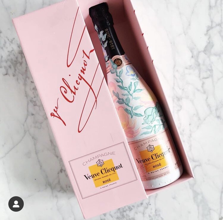
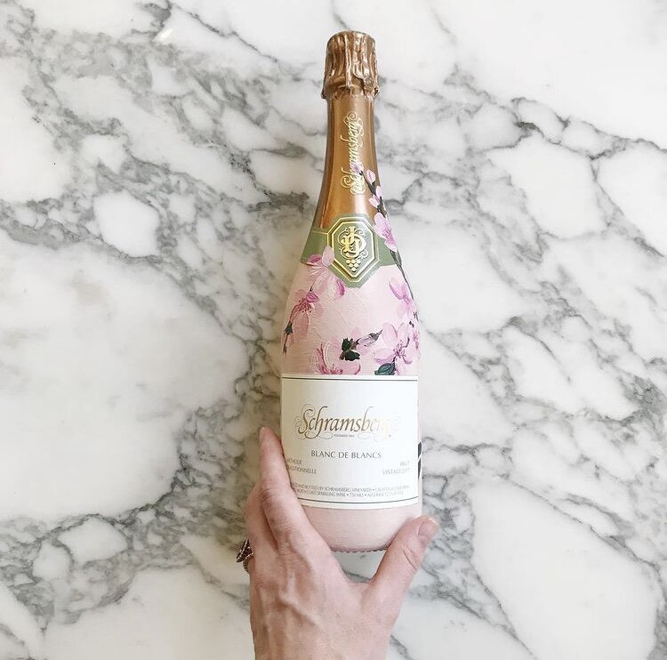
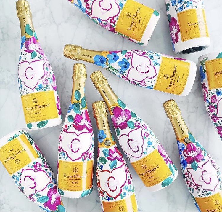
Hand Painted Custom Champagne Bottles
Hand-painted champagne bottles are the perfect custom touch for a gift for your bridal party or adorn your bar for an eye catching detail for your guests.
For these particular projects, each bottle was hand-painted to match the bride’s invitation suites with bright fuchsia blooms and cherry blossoms or pale blues and blushes.
Join me on YouTube channel for a brief video featuring some of our painted work.
If you’re interested in commissioning bottles from us, let us know!

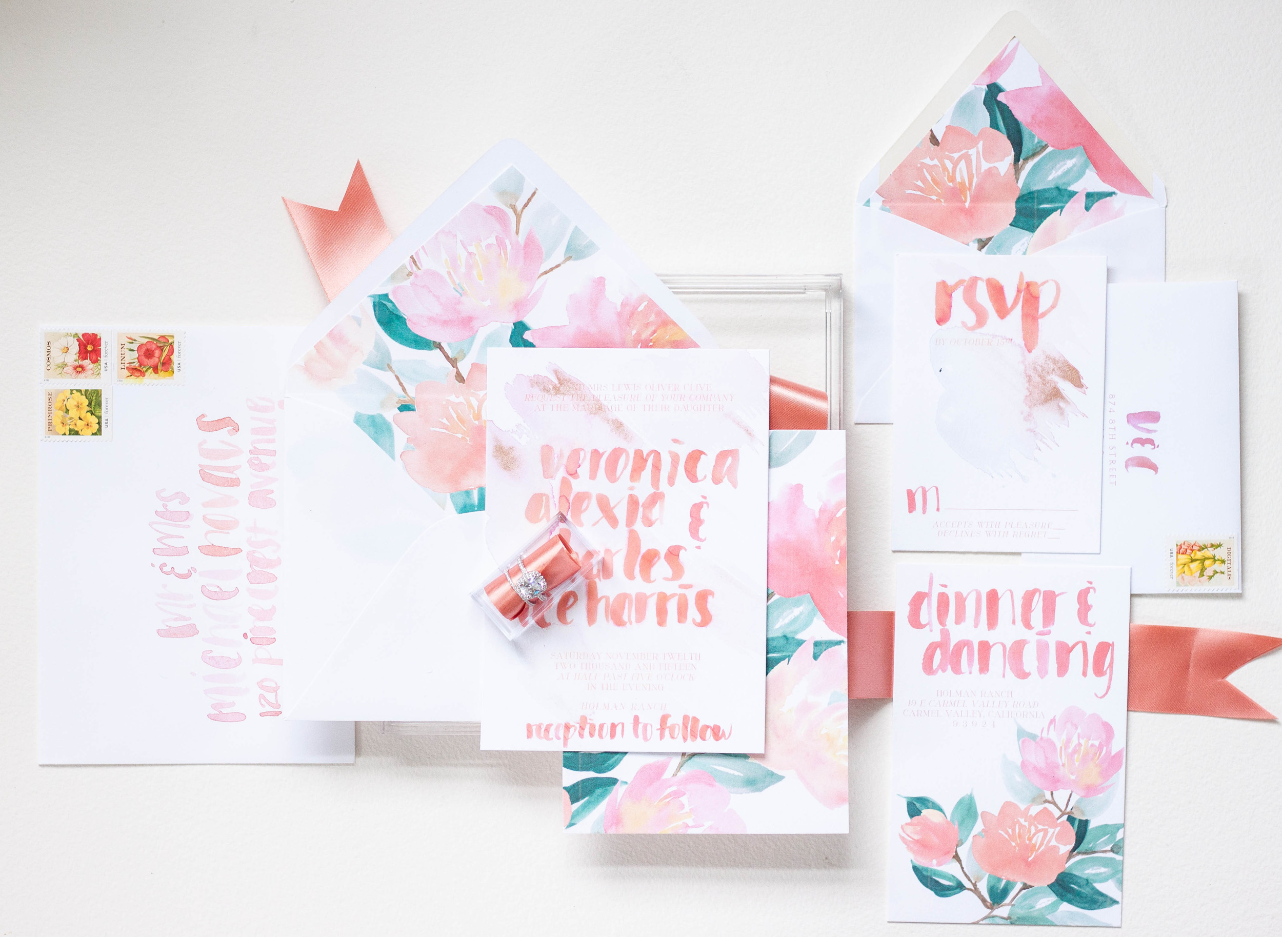
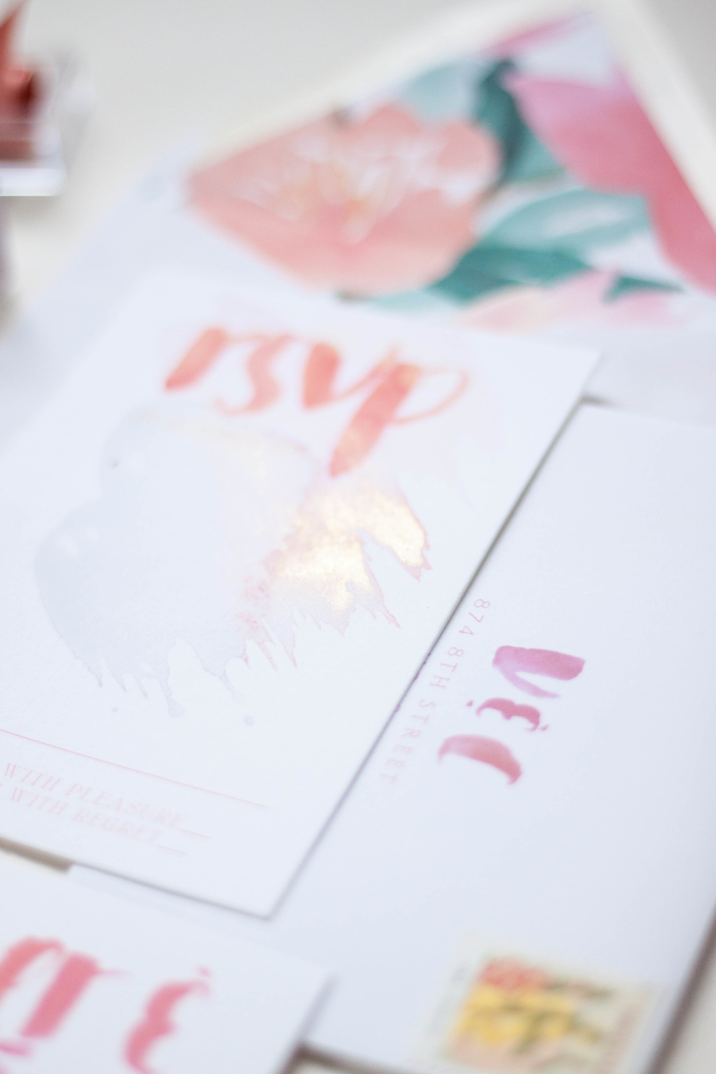
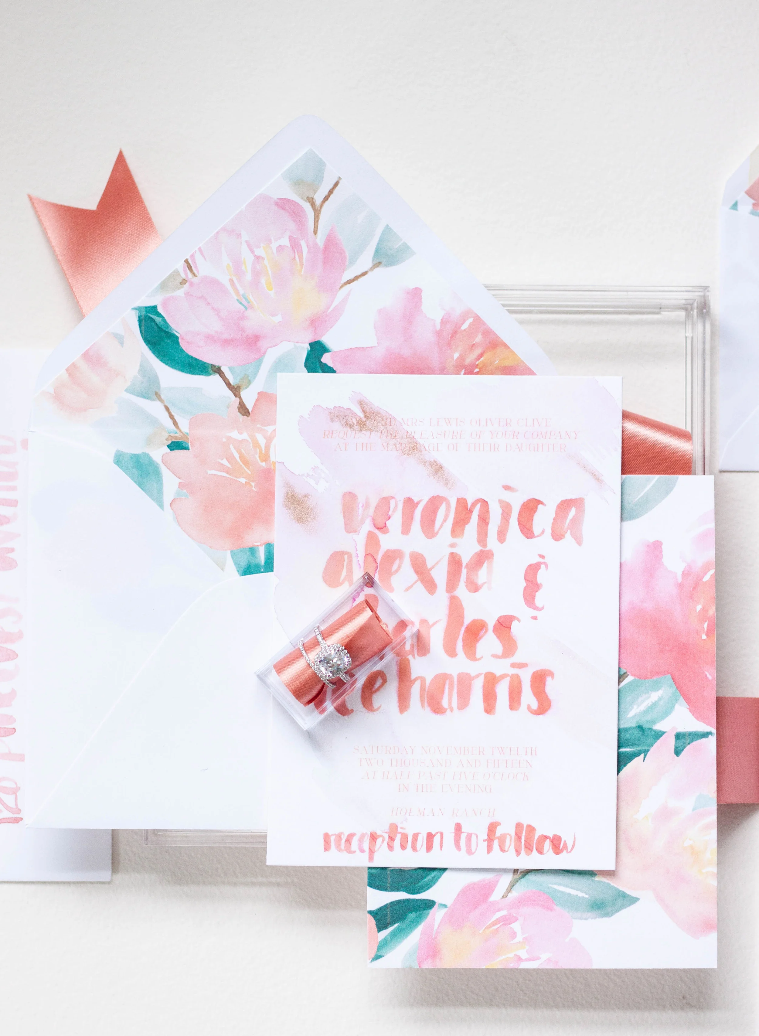
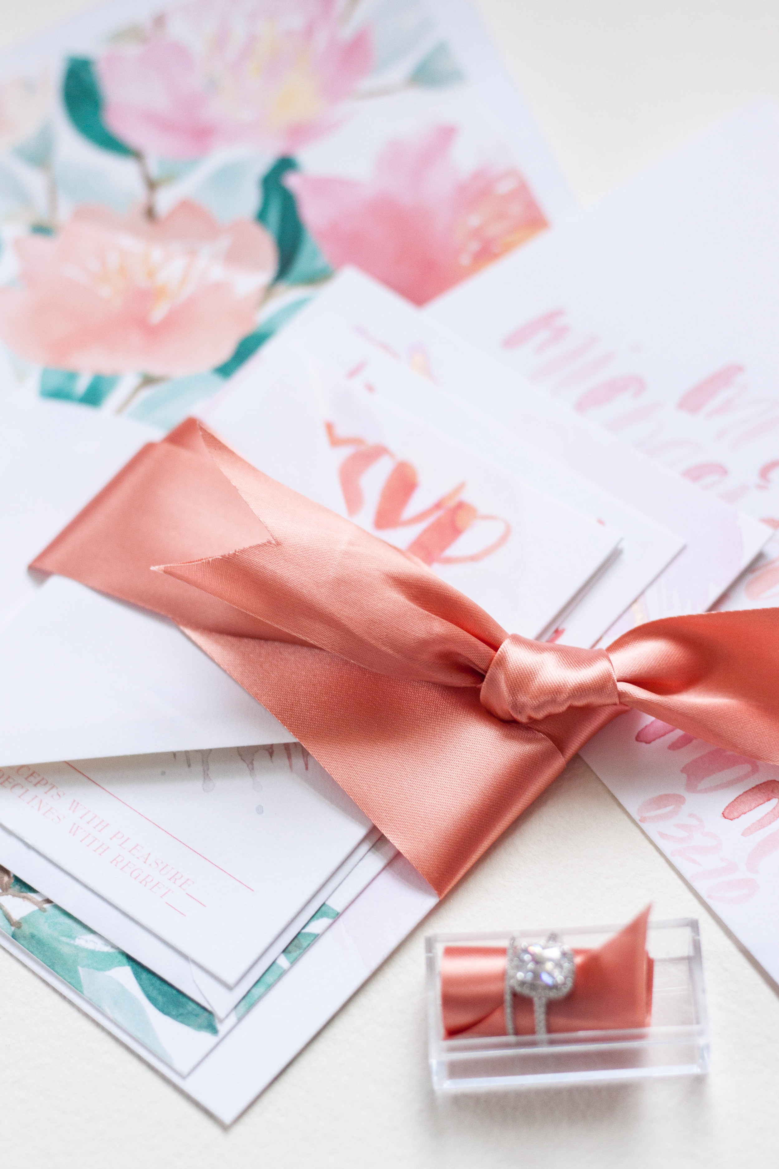
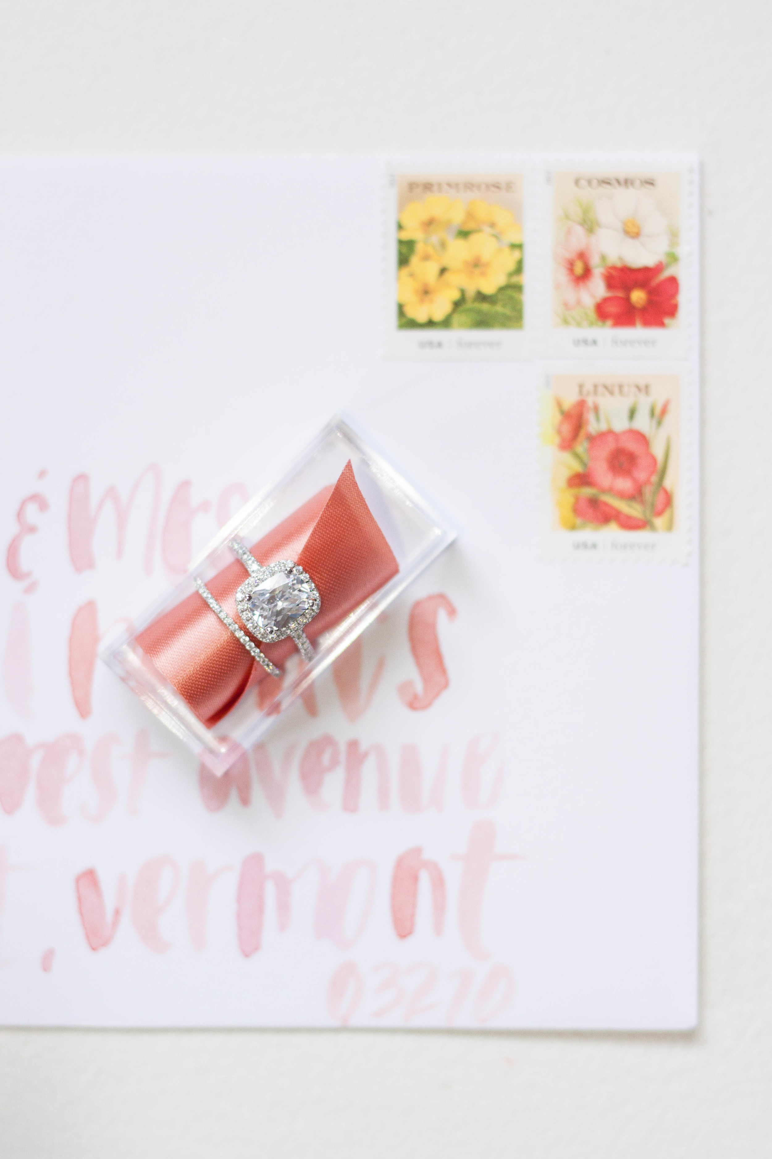
Bespoke | Veronica & Charles

These invitations were created for the Oh So Inspired Retreat held in Sonoma, California last fall. We wanted to create something fun, bright, bold and playful with touches of rose gold and shades of peaches and pinks.
The invitations were kept on the simple side, with bold lettering gracing the front. Behind the lettering, I did a pale watercolor wash of pale pink and dropped in just a touch of rose gold. The backs of the invitations were printed in the bold pattern, adding interest and color to the simple invitation design.
I completely love the envelope design with the envelopes lined in the bold print. Each envelope was addressed in the same bold, heavy brush lettering. The carefully selected stamps are reprints of vintage seed packets and the colors were perfect! The small reply card was printed with the couple's address with their initials in the same bold brush style.


Featured | Style me Pretty
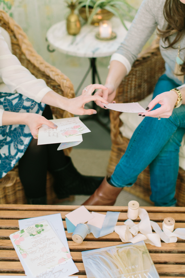
One of my favorite clients (I say 'favorite' but all my clients are pretty fricken awesome!), Miss Jess Galfo, fashion blogger of Dressed by Jess and blogger bride at Style Me Pretty met up with her completely fab event designer to have a sit down recently to chat about style, paper, and all details weddings! Paige from Gilded Lily Events is working with Jess on her wedding design, and I have the pleasure of creating her paper pieces for her. They cozied up in Paige's darling office to pour over paper options, printing methods and wedding details. The lovely afternoon was then shot by Love & Light Photography and was featured on Style Me Pretty today! Jess turned the tables a bit and put on her hat as blogger and picked Paige's brain a bit about owning a wedding design company and working with clients. Check out her full interview the rest of the gallery
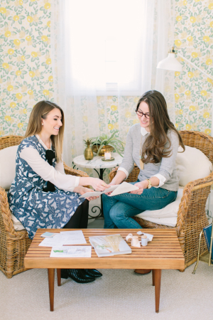
From Paige:
There are plenty of ways to showcase your personality on your wedding day, but what elements are the most important?
I truly believe that love is in the details. However, couples can easily get weighed down by all of these “little” things. I like to remind brides-to-be that it is important to really zoom in on the areas that will make the most impact. If you think back on a picture of a wedding that you loved, you probably didn’t notice everything that was going on around it. Focus on what is the most important and highlight it. For an overall beautiful, cohesive look, I believe the flowers and paper goods are the most important elements. They carry the wedding day story and are usually the first and last thing that your guests will take note of.
Invitations are the guests’ first peek at the formality of the wedding along with the type of event being thrown. How can brides keep them creative, yet cohesive?
Save the Dates and invitations are the first connections that your guests will have with your wedding and it sets the tone for what to expect for your day. Before you send out your invitations, make sure you have a good idea of the color palette and key design elements that you are going to use throughout your wedding day. Custom invitations are the way to go and are not just a luxury item. Be clear with your graphic designer or artist of what you want and how they can work within your budget to make your invitation dreams come true.
Check out more from Paige on Style Me Pretty!


Original Artwork | Monochormatic
I've been playing around with painting in a single color, adjusting tones and shadows to give depth and contrast. I recently did two pieces in shades of grey and black (and apparently blue. I'm not actually sure where the blue came from, I can only think that there was a tiny bit mixed in the palette with the black - it wasn't noticeable until it had dried!)
I finished these two commissioned pieces last week - they measure 15x11 and are painted on Arches cold press watercolor paper and will be finished with a deckled edge before being shipped off to their new owners!
You can also see a bit of Paige's invitation artwork below the black and white.

Announcement | Original Artwork
About a month or two ago, I started doing something that may seem pretty straight forward, but I had never thought of before (it was a bit of a 'duh' moment). I started creating artwork for no other reason than creation and practice. As an artist, it's actually a bit of a conundrum. I personally know that I have a hard time sitting down and just creating something without any guidelines or parameters. I never know what to paint - or to paint at all. I could sketch, but what would I sketch??
So a began letting color be my parameters and not worrying too much about what I actually painted. I also started letting the watercolor behave as watercolor should, and not worrying so much about it being "perfect". I allowed the paints to bleed together, the reds play into the greens and the blush into blue.
A funny thing happened - the more I practiced, the better I saw my work getting. Shocking, right? Who knew that practice improved one's skills!
Another unexpected thing happened - when I started posting my latest work on social media, I received much higher praise/likes/accolades than normal! My most liked post on instagram EVER was a bronze gouache leaf painting! I was somewhat (totally. I was totally) blown away!
So every other day or so I sit down to create something for the fun of it, but now I have a whole pile of gorgeous watercolor artwork. What will I do with all this artwork?
Well, after several requests, I've decided to sell it! They're my babies, but my walls are full and they need to go to good homes.

So as we welcome 2016, I have launched the first round of artwork for sale. Each piece is unique and original, so if there's a piece you love, snap it up before someone else does! And don't forget to check back for new pieces to be added!
To celebrate the launch, I've also added a free printable to celebrate 2016! Find it in the shop, download and don't forget to share how you use it with #moiraart

Featured | Bayside Workshop


Vendors: Photography: Natalie Franke // Styling: Kruse & Vieira Events // Florals: Intrigue Designs // Invite Suite & Paper Goods & lettering for table: Design House Of Moira // Calligraphy: Poppy & Scooter // Linens: BBJ Linens // Rentals: Select Event Group // Cake: Wildflour Fine Baking Co.// Welcome Basket: Marigold & Grey // Hair & Makeup: Behind The Veil // Gown: Kate McDonald Bridal // Tux: The Black Tux
Free Printable | Taurus Cocktail

CITRUS SMASH
Yields one cocktail
2 oz top shelf gin
1-2 tangerine peels
1⁄2 oz simple syrup
1⁄2 oz lemon juice
1oz soda
Instructions: Muddle tangerine peels and simple syrup in flat-surfaced glass. Add gin, lemon juice, and top with soda. Serve on the rocks.

Enjoy a free printable of the Citrus Smash cocktail here!
Free Printable | Scorpio Cocktail

BLACKBERRY MINT JULEP
Yields one cocktail
3 oz blackberry bourbon (instructions below)
4-6 fresh mint leaves
Small pinch of raw sugar
1⁄2 oz soda
Instructions: Muddle mint and sugar in a flat-surfaced glass, add crushed ice, soda, and top with bourbon.

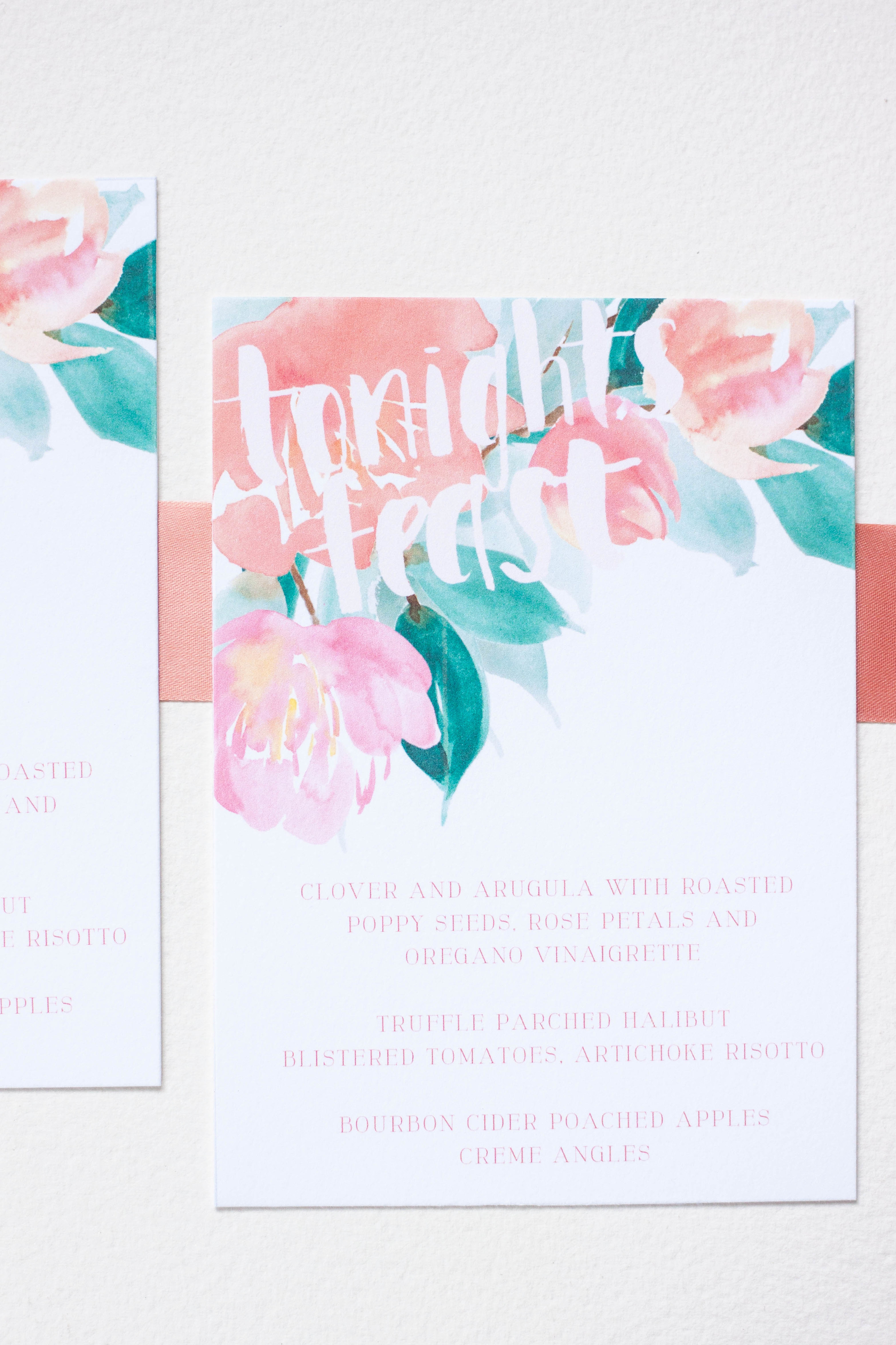
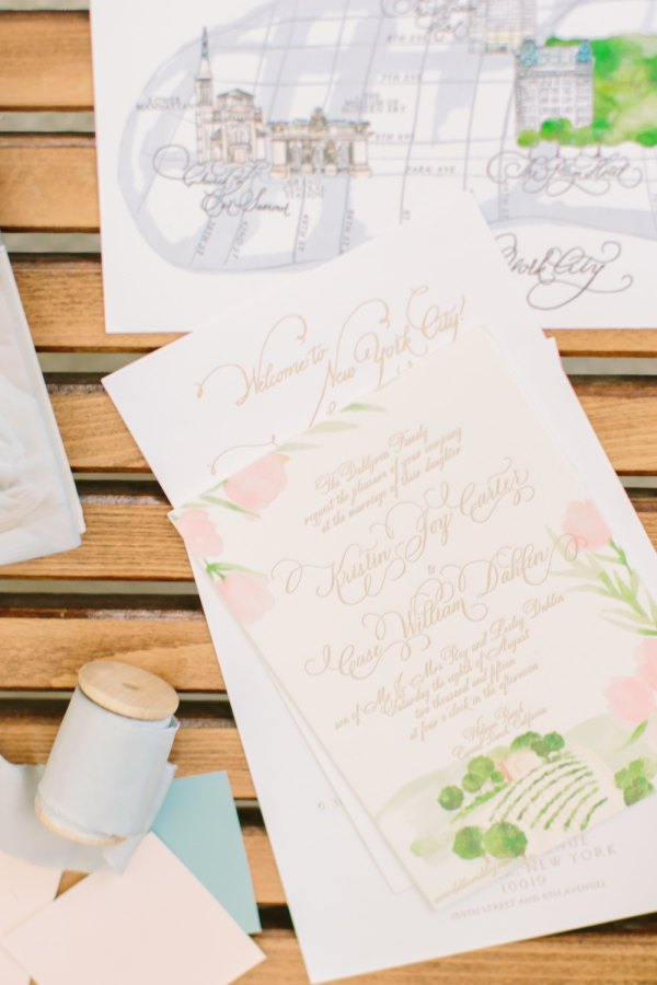
Real Wedding | at the press!
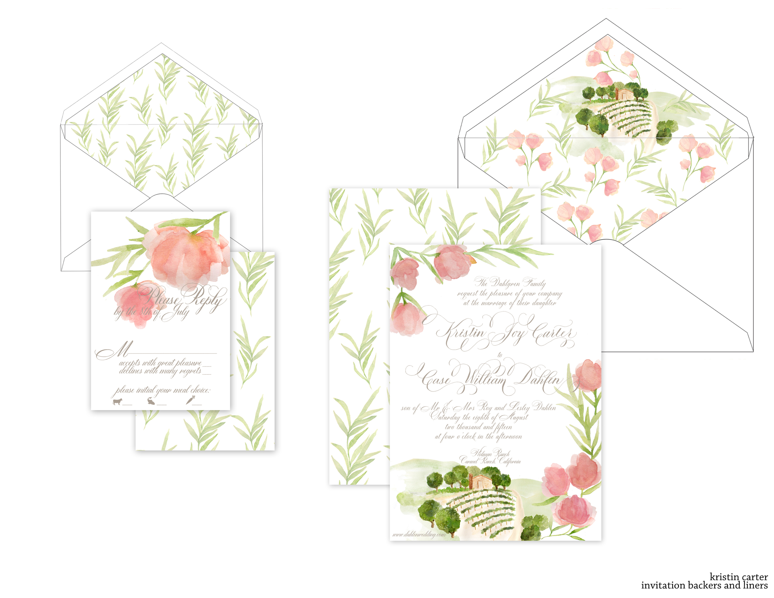
It's always such a pleasure to work with amazing event designers, so when Simone from Soirees by Simone reached out to me, I couldn't want to get started. Her lovely bride, Kristin, was getting married at Holman Ranch in Carmel Ranch, California. We knew that we wanted to tie in the venue itself, as well as the floral types that will be used in her reception decor and bouquet.
We began with several sketches of how the artwork would fall to give me some guidance, and once the sketches were finished, I moved on to the artwork and invitations proofs.

For this suite, we are combining letterpress and flatprint, digitally printing the artwork and then pressing the lettering over it. All the envelopes have been addressed in matching taupe ink and the suite is almost ready for the mail!