Botanical Baby Shower Invitations - The Envelopes
I’ve worked with vellum envelopes before, obviously, but this project was a little bit different. Vellum is a beautiful material to work with and I love how nicely it juxtaposes as a complimentary texture to so many other materials. Since I knew we would be using the woodgrain paper for both the invitation and insert, I loved the semi-transparency of the vellum to contrast against that. But here’s the thing…you can see through the vellum. So the question always is how do you protect the privacy of the invitation as it goes through the post? Whatever material is chosen, it also needs to support the guest addresses, meaning that it either needs to be dark enough to support a light address or the other way around.
Examples of how to circumvent this would be to do a vellum wrap in a pattern or a custom tissue paper - I typically like to use custom printed tissue paper with a complimentary pattern that we’ve designed to match the suite. For this project, we didn’t have the turnaround time for custom tissue, so that option was out. A vellum wrap was also out because the envelopes I selected were Marques size - 7.25 square - which means a vellum wrap would need to be at least 15” to wrap all the way around. Vellum prints on a laser printer (yes, I know you can get inkjet vellum, but I have a strong preference for how the ink sits on top using a laser) and my printer maxes out at 12”…so that option was also not available.
So what’s left?
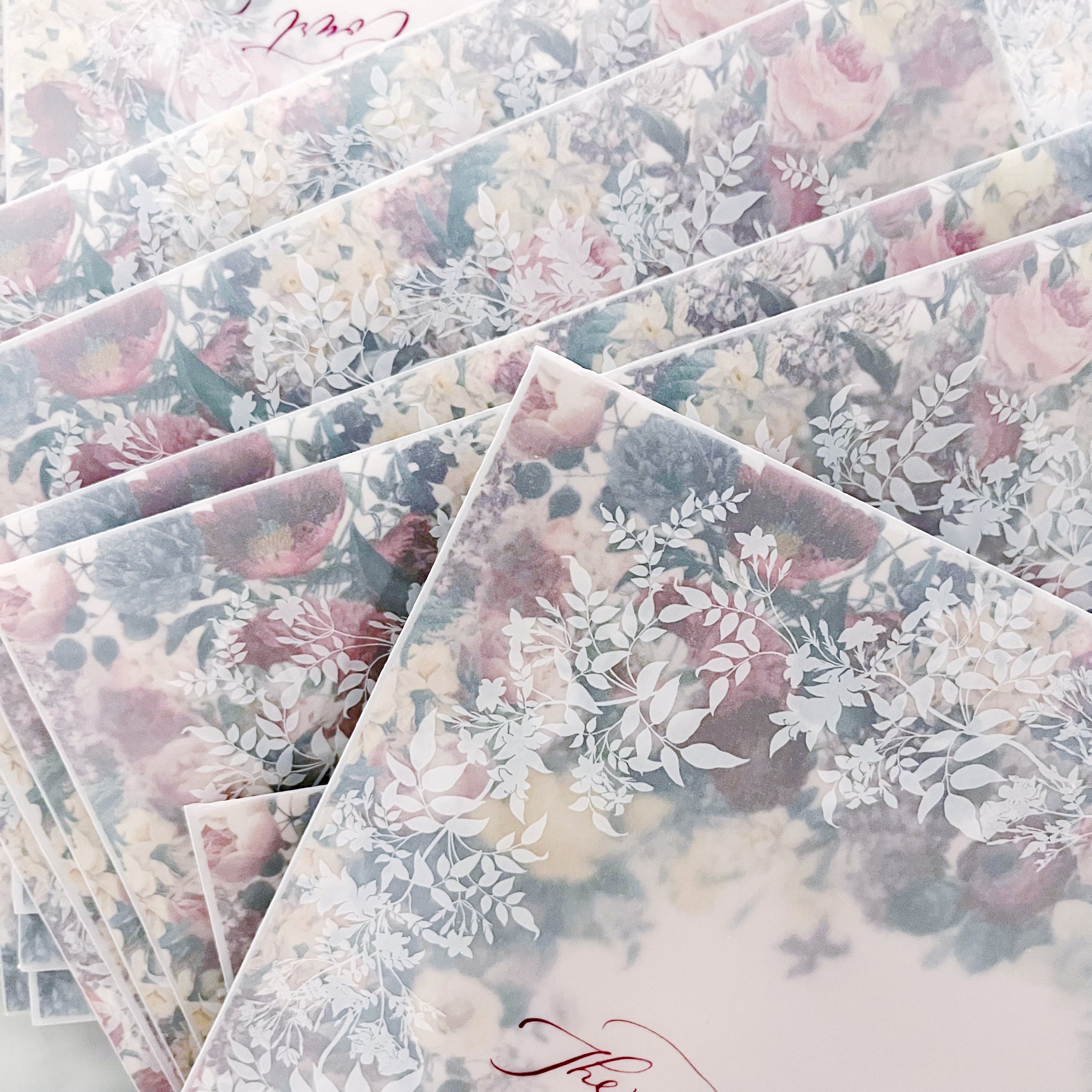
Using the back of the invite and the envelope liner! The envelope liner obviously shows when the guest opens the envelope, but there’s nothing saying that I can’t print both sides so one shows through the envelope and shows when the envelope is opened, so that’s what we did. I matched the heavy pattern for the backs of the invitations and the back of the envelope liner so it created a consistent and cohesive pattern front to back, which I LOVED.
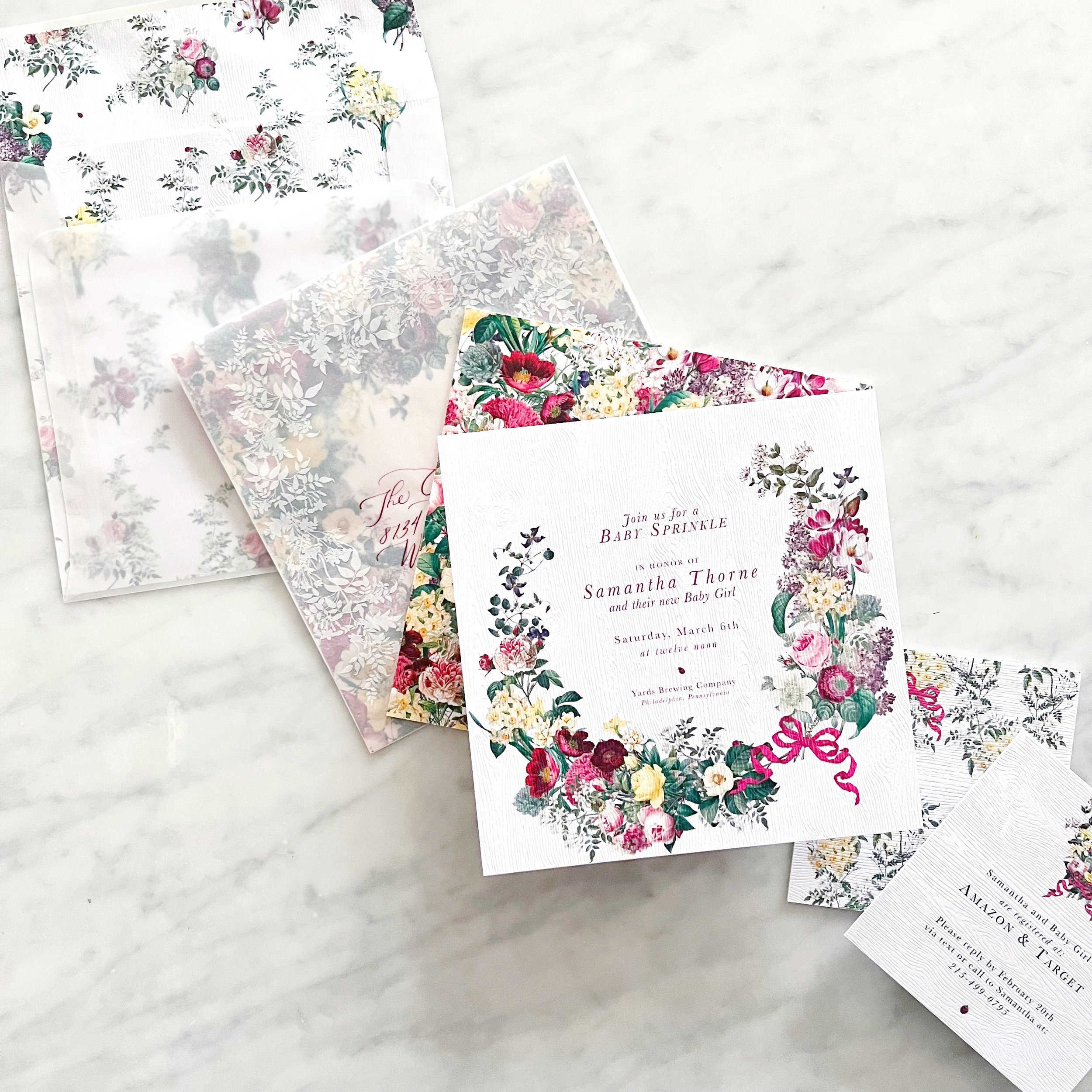
OI course, I didn’t stop there - I also wanted artwork on the outside of the envelope to overlap with what showed through from the envelope liner.


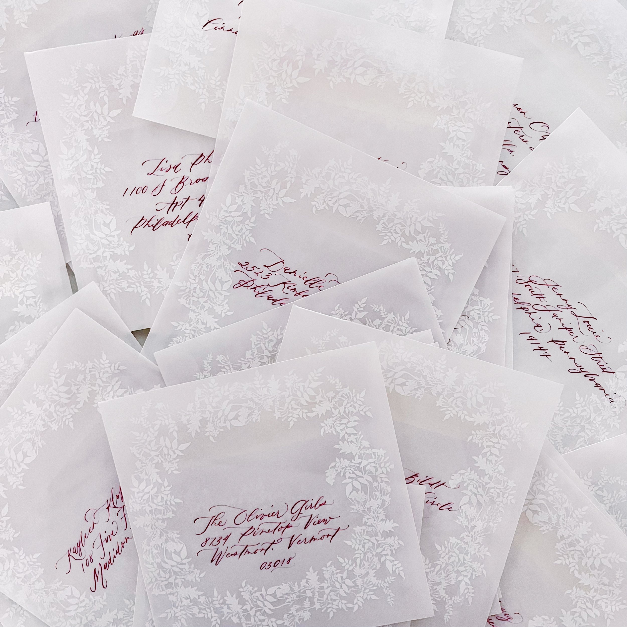
Calligraphy in a deep burgundy and modern style topped them off!
I specifically designed the envelope liner to have a negative space to frame the calligraphy, making it not only the focal point, but also easier to read.