I love these envelope liners designed for a breathtaking wedding at the Ojai Valley Inn. Vines climb up these custom liners in white ink with an embossed pattern of climbing vines over the top.

Lake Como, Italy
Vintage, saturated, floral, elegant
Our amazing bride, Alexandra, requested two things….a bold, saturated, monochromatic color palette, and florals. We were all over that. I also added touches of rose gold foil and calligraphy throughout the suite to elevate the overall formality of her Black Tie wedding in Italy.
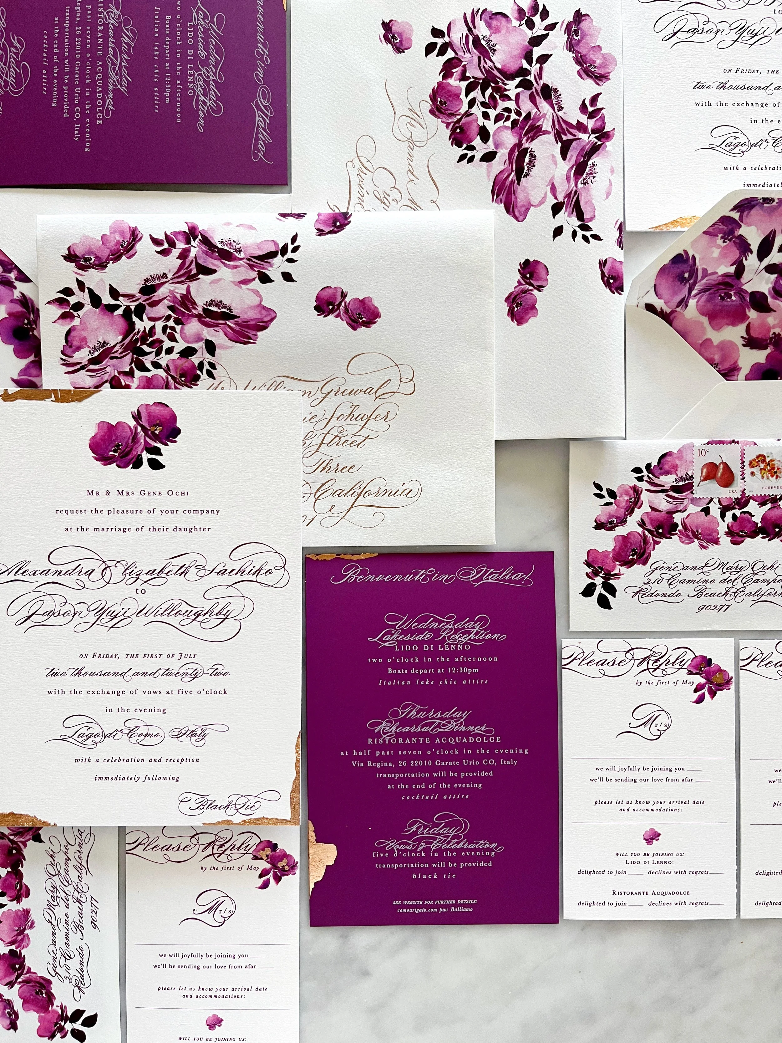
We had two different envelope liners for this project - one featured the overall toile pattern that we created for the bride, and the second was a sweeping, romantic pattern created from some of the floral festoons pulled from the main toile pattern.

Washington, D.C.
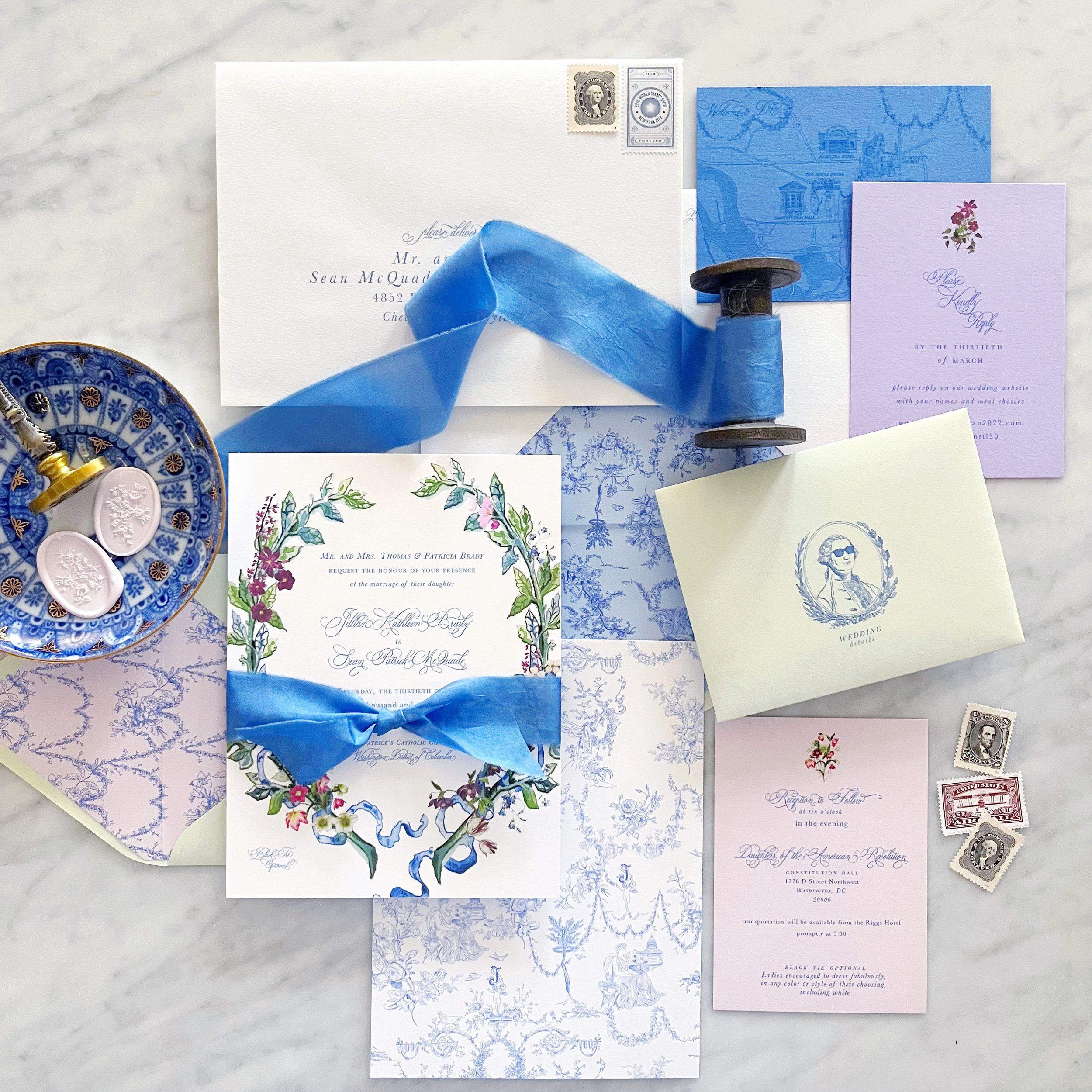
When I created the toile, I also created individual pieces that could be used in a variety of placements throughout her design. The envelope liner was created from floral festoons from the overall pattern, and we highlighted George Washington in his sunglasses on the front of the enclosure envelopes.
We opted for a colored version of her laurel for the invitation itself, and repeated the same style for her placecards. Vintage style postage was a must and we did a custom dye for her silk ribbon to perfectly match her blue.
Each envelope was sealed with a pale pink wax seal with a bouquet from her toile pattern.
So vibrant and colorful! This custom bridal shower invitation is perfect for a summer garden party!
I can’t wait to show you the details!

Newport | Rhode Island

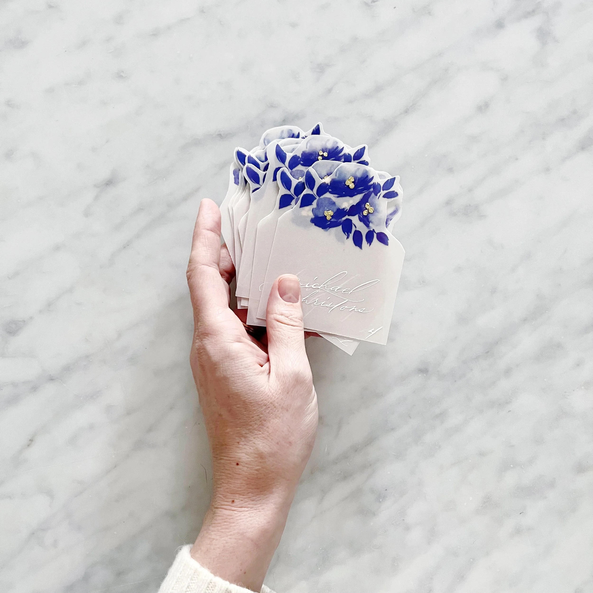
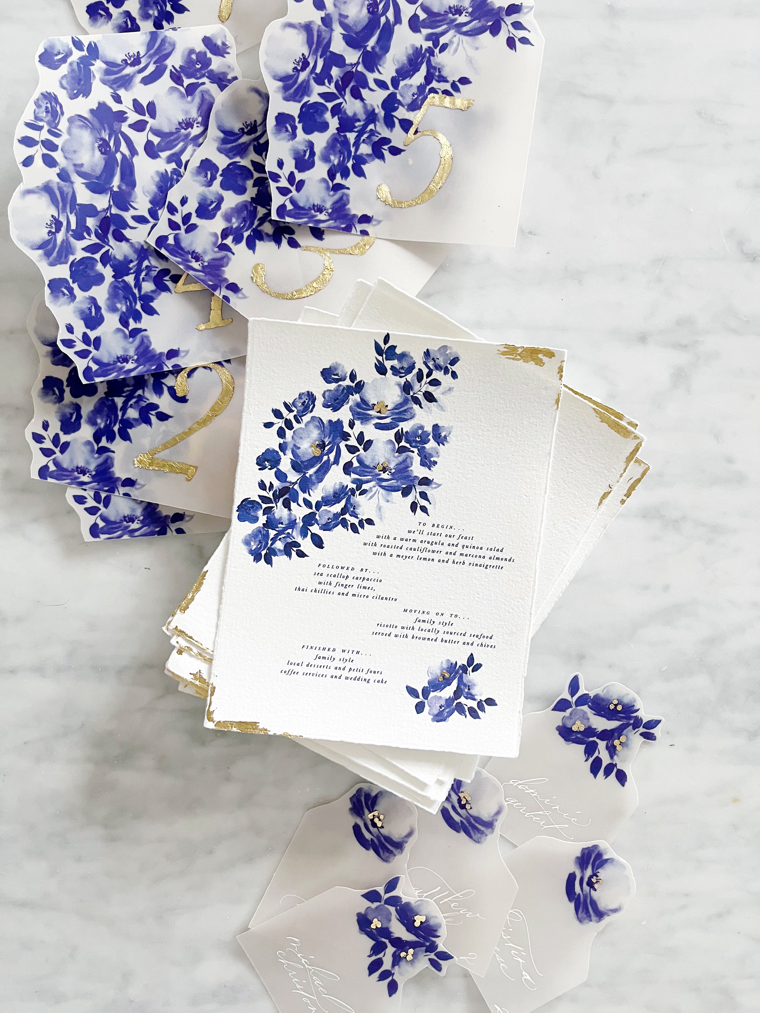
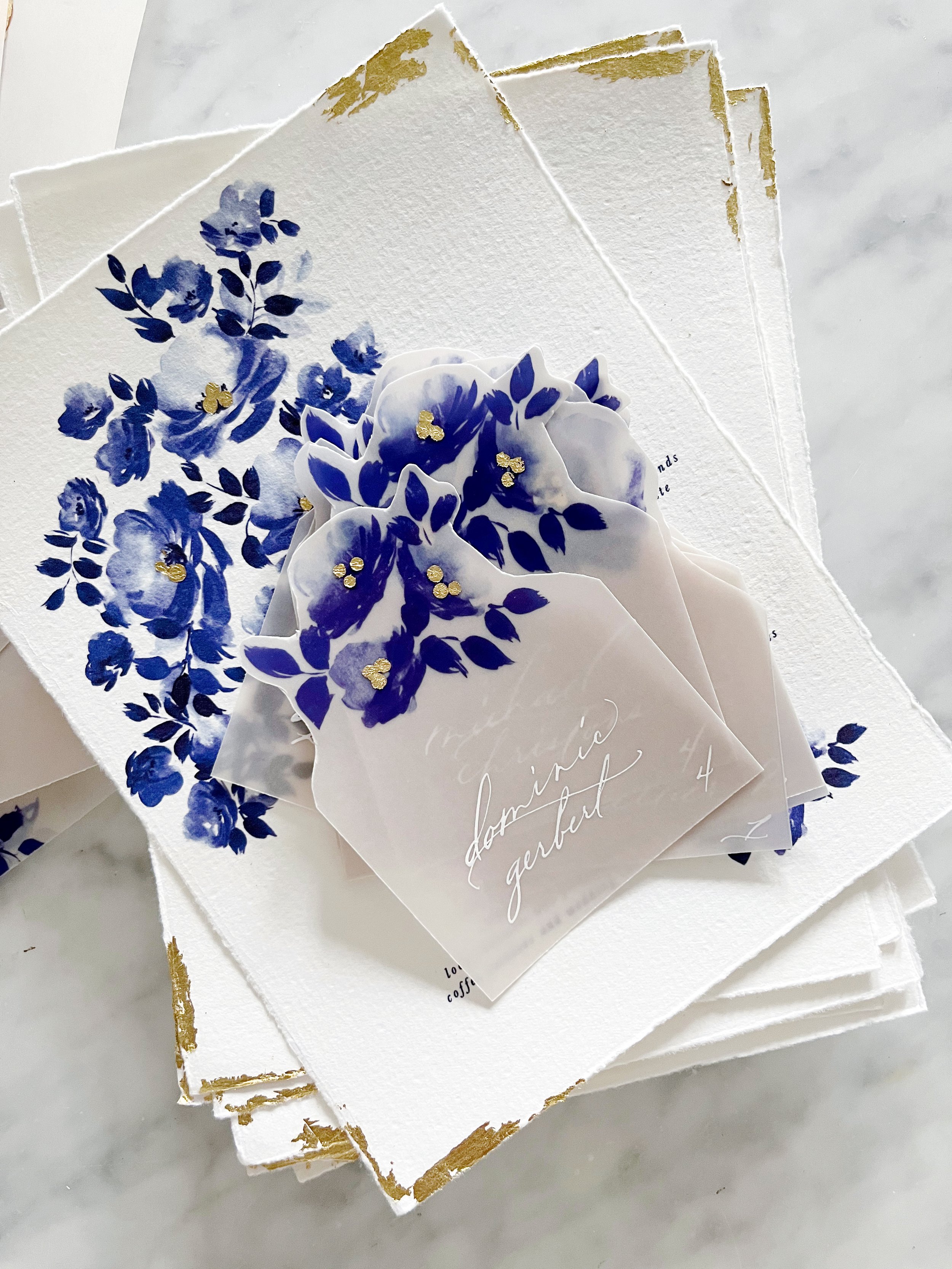
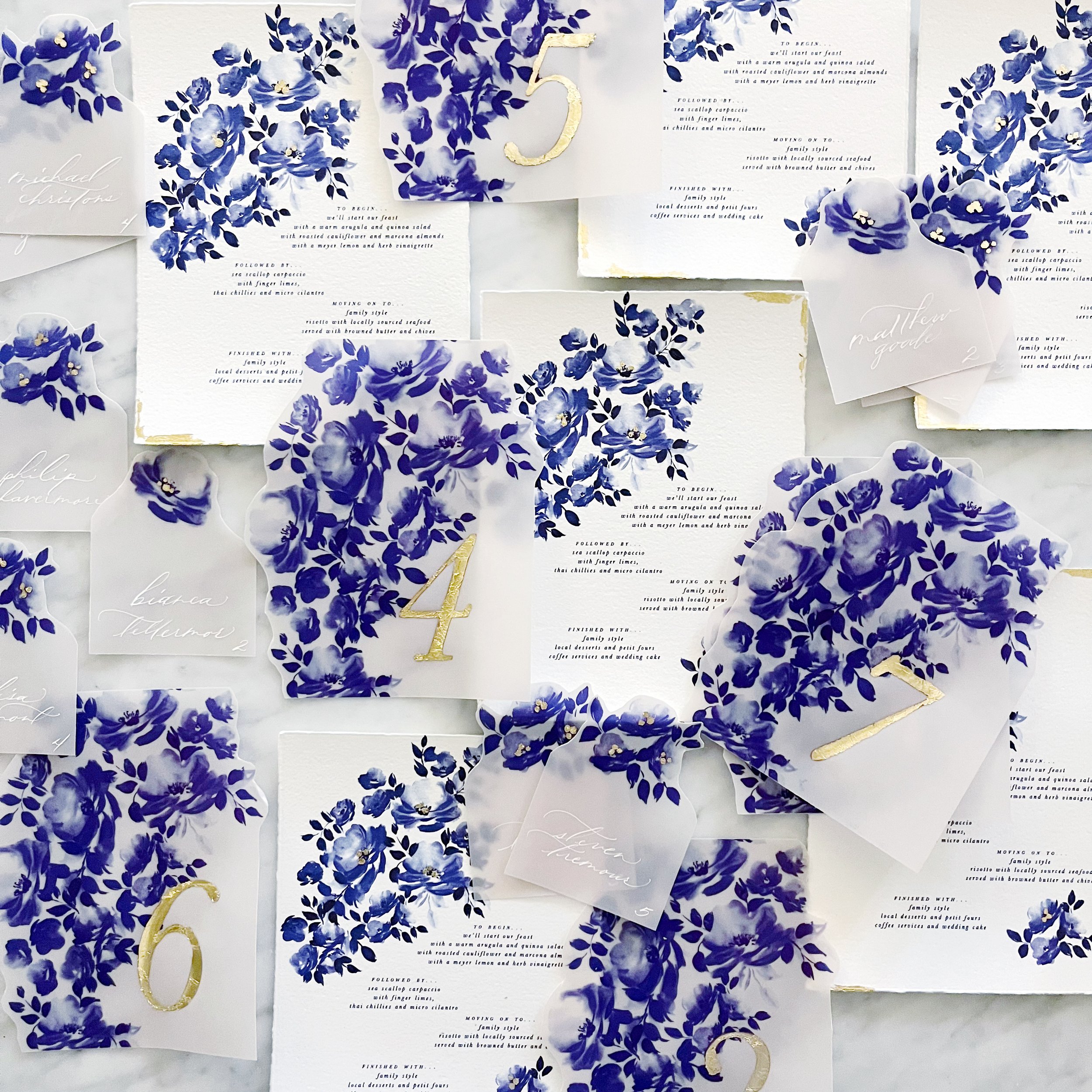
We have some lovely details for the custom designs we’re finishing up for a beautiful wedding in Newport.
We created two different designs for the escort cards to use as meal indicators, and each card had a cluster of gold gilding at the centers of their blooms.

We continued the gilding on the table numbers, which were all gilded by hand.


Likewise, our menus had gilded details in the flower clusters and along the edges of the white handmade paper that coordinated with the invitation suite design.


You know I’m always a huge fan of incorporating the style of the postage into the design of the envelope and overall aesthetic and this suite is an unusual one. Since I know this client personally, she asked if I had any postage that I wanted to burn through (think ancient forever stamps), and I was like….welll….actually….
I have been hoarding leftover custom postage for years. Back in the day when we were able to design custom postage to match an invitation suite, I would order it for clients but then have the half-finished sheets leftover and they’ve just been sitting in my postage box. I can definitely see a consistency in my aesthetic over the years since so much of the postage matches!
So that’s what we used on this suite. Since the envelopes are not only heavy, they’re large and square, I knew I would need a decent amount of postage for each one. Since all the postage I was using was in different custom denominations depending on what the original project dictated, the postage for these baby shower invitations is all over the place! As long as it was enough to get them to their destination!


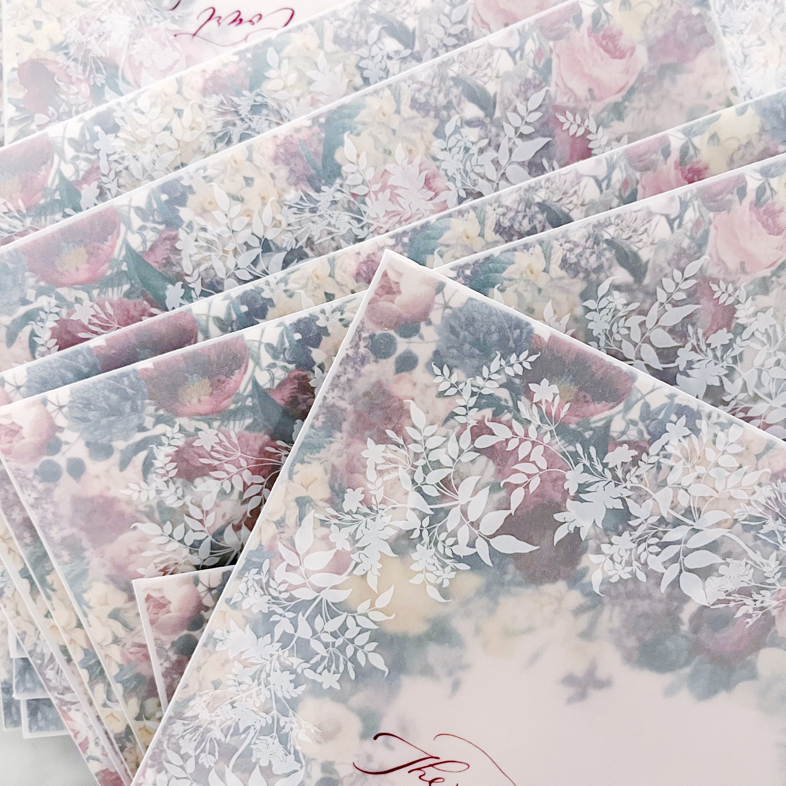
I’ve worked with vellum envelopes before, obviously, but this project was a little bit different. Vellum is a beautiful material to work with and I love how nicely it juxtaposes as a complimentary texture to so many other materials. Since I knew we would be using the woodgrain paper for both the invitation and insert, I loved the semi-transparency of the vellum to contrast against that. But here’s the thing…you can see through the vellum. So the question always is how do you protect the privacy of the invitation as it goes through the post? Whatever material is chosen, it also needs to support the guest addresses, meaning that it either needs to be dark enough to support a light address or the other way around.
Examples of how to circumvent this would be to do a vellum wrap in a pattern or a custom tissue paper - I typically like to use custom printed tissue paper with a complimentary pattern that we’ve designed to match the suite. For this project, we didn’t have the turnaround time for custom tissue, so that option was out. A vellum wrap was also out because the envelopes I selected were Marques size - 7.25 square - which means a vellum wrap would need to be at least 15” to wrap all the way around. Vellum prints on a laser printer (yes, I know you can get inkjet vellum, but I have a strong preference for how the ink sits on top using a laser) and my printer maxes out at 12”…so that option was also not available.
So what’s left?
Using the back of the invite and the envelope liner! The envelope liner obviously shows when the guest opens the envelope, but there’s nothing saying that I can’t print both sides so one shows through the envelope and shows when the envelope is opened, so that’s what we did. I matched the heavy pattern for the backs of the invitations and the back of the envelope liner so it created a consistent and cohesive pattern front to back, which I LOVED.
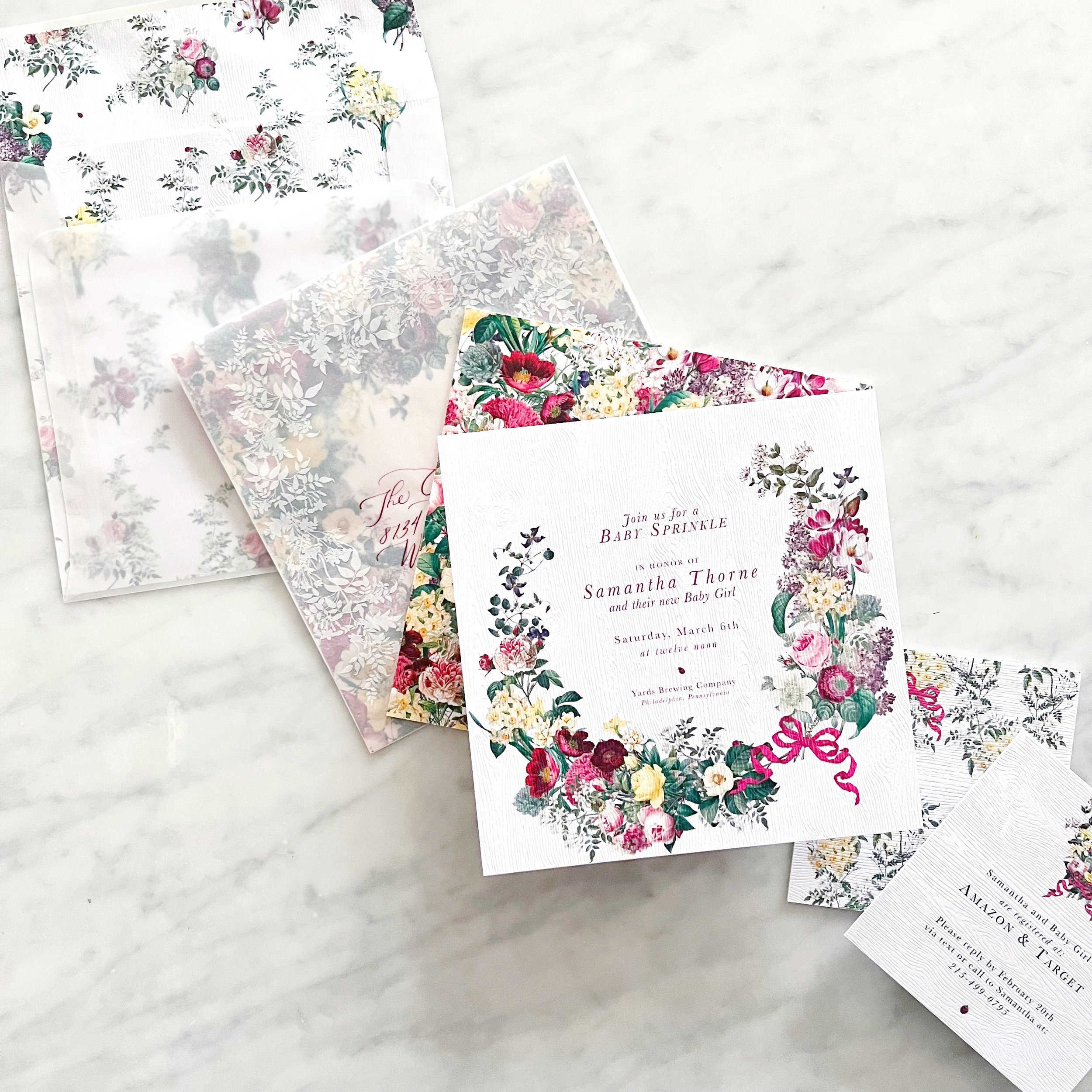
OI course, I didn’t stop there - I also wanted artwork on the outside of the envelope to overlap with what showed through from the envelope liner.


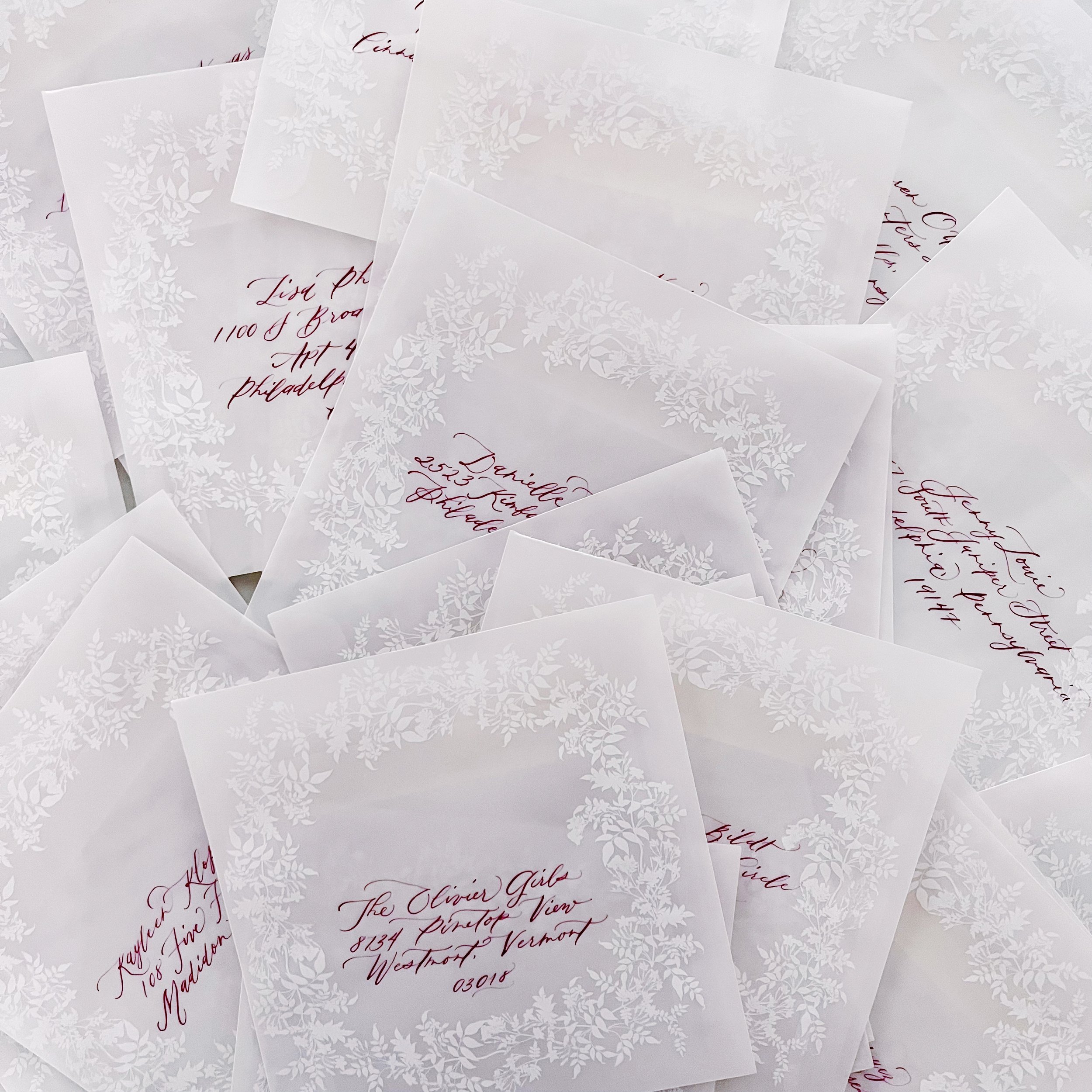
Calligraphy in a deep burgundy and modern style topped them off!
I specifically designed the envelope liner to have a negative space to frame the calligraphy, making it not only the focal point, but also easier to read.
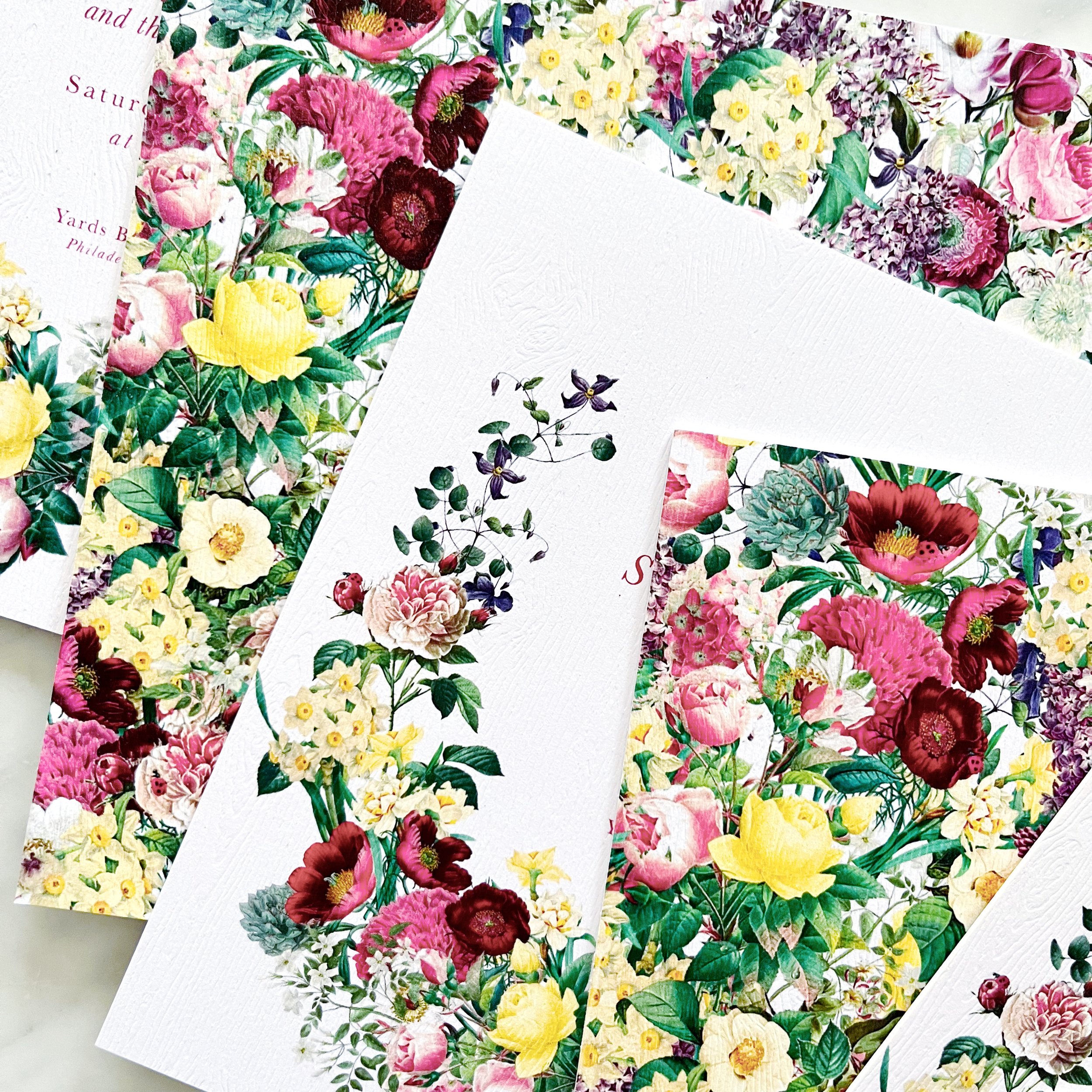
Botanical | Feminine | Natural | Textural | Ladybugs
Philadelphia, Pennsylvania


I wanted to take up the botanical vibe up a notch by using a woodgrain paper rather than the expected white. I love how subtle the woodgrain is, but it adds so much to the overall interaction as the guests open their envelopes. I love the idea of rewarding the guests for looking further and interacting deeper with an invitation.
Each invitation is incredibly thick, coming in at about 350lb so they feel so incredible in your hands.


We also designed the backs of each of the pieces to feature a pattern created from the same artwork. I specifically wanted something very impactful on the back of the invitation because I knew it would show through the vellum envelope and I wanted it to be heavy enough to not be subtle.


It’s always so much fun to work on a project locally and get to present paper types and proofs in person, and that’s just what I got to do with our momma-to-be here in Philadelphia. I can’t wait to show you the rest of this gorgeous botanical baby shower invitation!