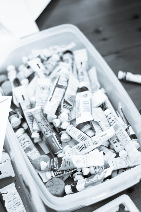
Digitizing calligraphy used to be part of my job that I loathed. I found it tedious and unpleasant and felt like my time could be better spent doing literally anything. These days, I find it slightly more cathartic.
A few steps: The first thing I do before I even get to this stage is do a sample sheet of calligraphy for my clients. I don't maintain a universal sample sheet for several reasons - first is that I don't want to be locked into any handful of calligraphy styles, and my styles tend to evolve fairly quickly (which also means I don't want to do a new calligraphy sheet once a month). I also want the client to see what their names will look like in each style, so the list of options I provide to them is of their actual names.
Another trick is that I don't give them all the options in the world. We've discussed their style and overall look and feel, and I put together a list based on that. If they're doing a modern affair, I'm not going to show them Spencerian or super flourished Copperplate. I also don't present clients with font selections that are really close to one another - I can tell the difference, but usually, a client can't. I show them a handful of fonts that are all very different from one another.
Ok, so that was all before I even get to writing. Once I have a selected calligraphy style from the client, I do all their spot calligraphy (also note that at this point, I've also completed and they've approved their sketch, so I know where the calligraphy will be needed so I can avoid needing to go back and do more). We then scan, adjust our levels, and correct any mistakes or bumps (ahhhem....too much coffee...oh let's be real, it's not coffee, it's Redbull).
Once we have all out lines smoothed out, I cut apart each line or section and label each layer. I then start a lettering file that I name VERY SPECIFICALLY as _Client Name LETTERING. This places the file at the top of the client folder and the ALL CAPS makes it really easy to spot. We do the same with our ARTWORK and PRINT files which makes everything really easy to see when I'm putting together proofs and dropping lettering and artwork into a million files.
I hope these tips for a professional calligrapher as well as showing you a small example of what's it's like being a working artist and will be useful to you. If you enjoy my artwork and crave more glimpses behind the scenes, please subscribe to my channel and hit the like button. Also, please leave a comment on the video with questions and requests.
Design House of Moira on the Web:
Instagram - www.instagram.com/designhouseofmoira
Websites - www.designhouseofmoira.com | www.designhouseprepschool.com

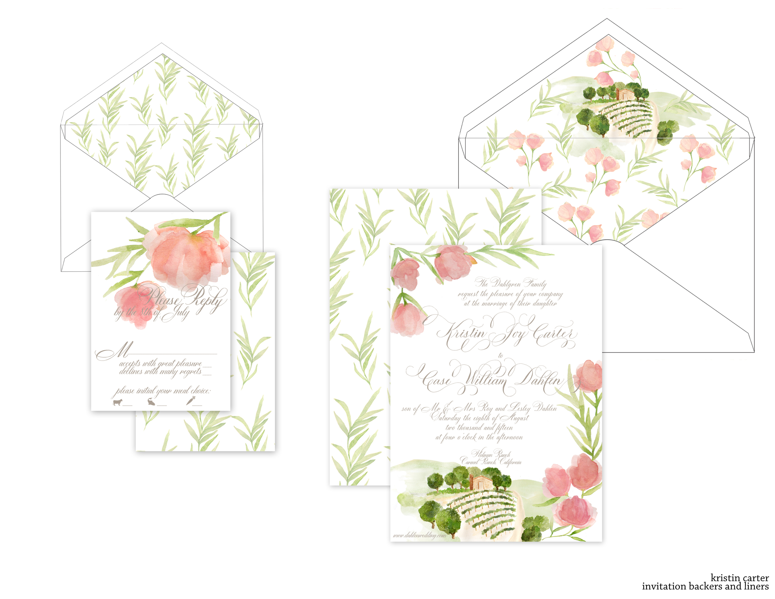
It's always such a pleasure to work with amazing event designers, so when Simone from Soirees by Simone reached out to me, I couldn't want to get started. Her lovely bride, Kristin, was getting married at Holman Ranch in Carmel Ranch, California. We knew that we wanted to tie in the venue itself, as well as the floral types that will be used in her reception decor and bouquet.
We began with several sketches of how the artwork would fall to give me some guidance, and once the sketches were finished, I moved on to the artwork and invitations proofs.

For this suite, we are combining letterpress and flatprint, digitally printing the artwork and then pressing the lettering over it. All the envelopes have been addressed in matching taupe ink and the suite is almost ready for the mail!
Both with full invitation suites and branding suites, I like to do a board like this...they're a wonderful visual tool for brides as well as business owner to see all of their design elements and color palette in one place. Plus I think they look so pretty!

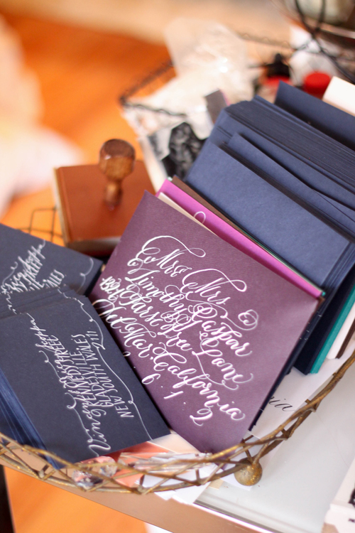
There are always lots of projects going on around the studios. At the moment, the Philadelphia studio is working with Bespoke Letterpress in Australia on some envelopes in white ink on navy, and we're just starting a project with white ink on aubergine. I know I'm not alone in finding calligraphy beautiful, but sometimes I just love observing the simple beauty of works in progress...
Part of our process is amassing several bespoke invitation suites, all their artwork and sketches, and shooting them all at once for the website, the blog, and any submissions pieces. This process involves paper, calligraphy, envelopes, liners, cameras, many hands (making for lighter work), step ladders, and coffee. Around here, we drink almond milk lattes.
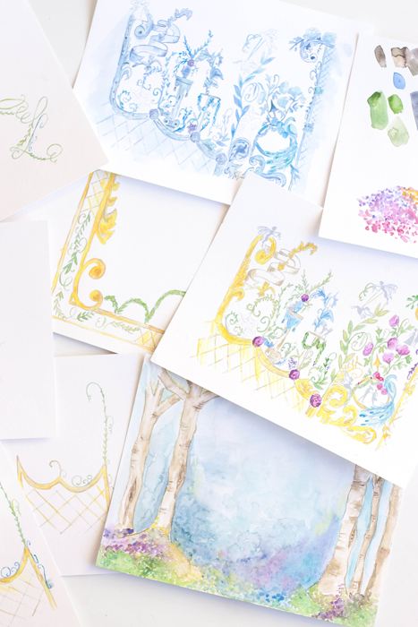
Today we have some background on the Midsummer Night's Dream suite we created for a photoshoot with Absolutely Events. You know me, I start with my sketches of all the different pieces and ideas and move onto the art pieces. This was a tough one; I knew the idea I wanted to work with and it just didn't turn out the way I wanted...I redid the artwork twice and still ended up reworking all the pieces digitally.


The artwork for this one was on the complicated side. I wanted to incorporate the design elements of a chinoiserie or antique damask and how different little scenes were depicted and layered. I also wanted a "fairy hallow" with shades of blues and purples.
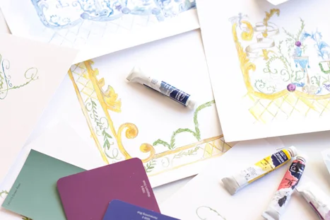
I then put paint to paper, filled everything with shades of yellows, purples, blues and greens...and I hated it and did the entire thing over again in shades of blues.


Whenever I begin a new design, there are a few very important steps. First, determining the look and feel of the event and making sure the lines of communication are open between the designer and the client. That may seem like a given, but seeing how much time we spend on artwork, its nice to only have to do it once!
For this suite, we started with our descriptors - organic, farm to table, green, airy, light, elegant, formal. We knew we wanted to incorporate rosemary, sage, a hand drawn map, bits of gold, and very formal cursive. The next step I take is to sketch out the entire suite. I do this for a few reasons - one, it really helps me determine what art piece I'll need, what spot calligraphy will be needed where, what pieces we're actually going to be working on and it also helps the client see the overall look and feel and how the artwork will flow from one piece to another (which can be difficult to communicate otherwise). These sketches are exactly what I show to a client as we work through the process - they aren't very clean or pretty, but the communicate the general idea.

After the sketch is done, I begin working on sketching out the artwork. Depending on the overall look and feel, sometimes I go straight to watercolor or whatever our chosen color medium is. In this case, I purposely chose to ink everything first to bring in an element of black.


Like all our designs, we start with some sketches. This one was particularly in need of a layout since I knew there would be quite a few elements and characters in play. By sketching it out, I have a better idea of where I can use what elements, how the pieces translate from the invitation all the way through to the menus and placecards, as well as I have a better understanding of what elements will need to be created.
From the sketches, I started created the artwork with pencil and paper, then went back through and inked it all in. This was a case that i wanted to leave some of the lines visible, so I choose to use ink rather than just leaving the pencil.


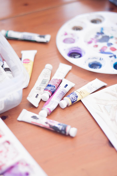
...then comes the mess. Im grateful that I have enough space that I can get out all my toys and leave them out if need be. I started painting these in last night and finished them this morning.


We're working on creating an invitation suite for Angie of Absolutely Events based on Shakespeare's A Midsummer Nights Dream. Its one of my favorite pieces from Shakespeare (along with The 12th Night). However, it lends itself to a few conundrums...this massive list of characters and elements, for example. I sketched out all my pieces already (pics to come, of course) and I new I wanted to include trees, a fairly hallow, and .... something else. I wanted to create some sort of pattern to include all the different characters, with vines, leaves, flowers, fairies, spider webs, etc. I used the base idea of a chinoirsier or toile to blend all the elements together.
Since I knew that would be the most difficult design, so thats where I started. I first sketched it, then inked it in. From there, I'll scan it into the computer and clean up any pen skips or mistakes, then print it out and add paint.