Creating a Client's Sketch
Hang out with us on our YouTube channel as we put together a sketch for a client!
Digitizing Calligraphy - Creative Process with Clients
Walking through our creative process when selecting, writing, digitizing, and using calligraphy in a custom invitation suite.
Digitizing calligraphy used to be part of my job that I loathed. I found it tedious and unpleasant and felt like my time could be better spent doing literally anything. These days, I find it slightly more cathartic.
A few steps: The first thing I do before I even get to this stage is do a sample sheet of calligraphy for my clients. I don't maintain a universal sample sheet for several reasons - first is that I don't want to be locked into any handful of calligraphy styles, and my styles tend to evolve fairly quickly (which also means I don't want to do a new calligraphy sheet once a month). I also want the client to see what their names will look like in each style, so the list of options I provide to them is of their actual names.
Another trick is that I don't give them all the options in the world. We've discussed their style and overall look and feel, and I put together a list based on that. If they're doing a modern affair, I'm not going to show them Spencerian or super flourished Copperplate. I also don't present clients with font selections that are really close to one another - I can tell the difference, but usually, a client can't. I show them a handful of fonts that are all very different from one another.
Ok, so that was all before I even get to writing. Once I have a selected calligraphy style from the client, I do all their spot calligraphy (also note that at this point, I've also completed and they've approved their sketch, so I know where the calligraphy will be needed so I can avoid needing to go back and do more). We then scan, adjust our levels, and correct any mistakes or bumps (ahhhem....too much coffee...oh let's be real, it's not coffee, it's Redbull).
Once we have all out lines smoothed out, I cut apart each line or section and label each layer. I then start a lettering file that I name VERY SPECIFICALLY as _Client Name LETTERING. This places the file at the top of the client folder and the ALL CAPS makes it really easy to spot. We do the same with our ARTWORK and PRINT files which makes everything really easy to see when I'm putting together proofs and dropping lettering and artwork into a million files.
I hope these tips for a professional calligrapher as well as showing you a small example of what's it's like being a working artist and will be useful to you. If you enjoy my artwork and crave more glimpses behind the scenes, please subscribe to my channel and hit the like button. Also, please leave a comment on the video with questions and requests.
Design House of Moira on the Web:
Instagram - www.instagram.com/designhouseofmoira
Websites - www.designhouseofmoira.com | www.designhouseprepschool.com

Copy of Creative Process | Behind the Scenes
Once we have our sketch finalized and our lettering style selected, we begin creating the artwork that will be included in the invitation suite.
It is our goal and part of our business philosophy that we never want a client to feel limited or concerned that their design won’t be everything they had hoped because they’re limited on how much artwork they can have created for them.
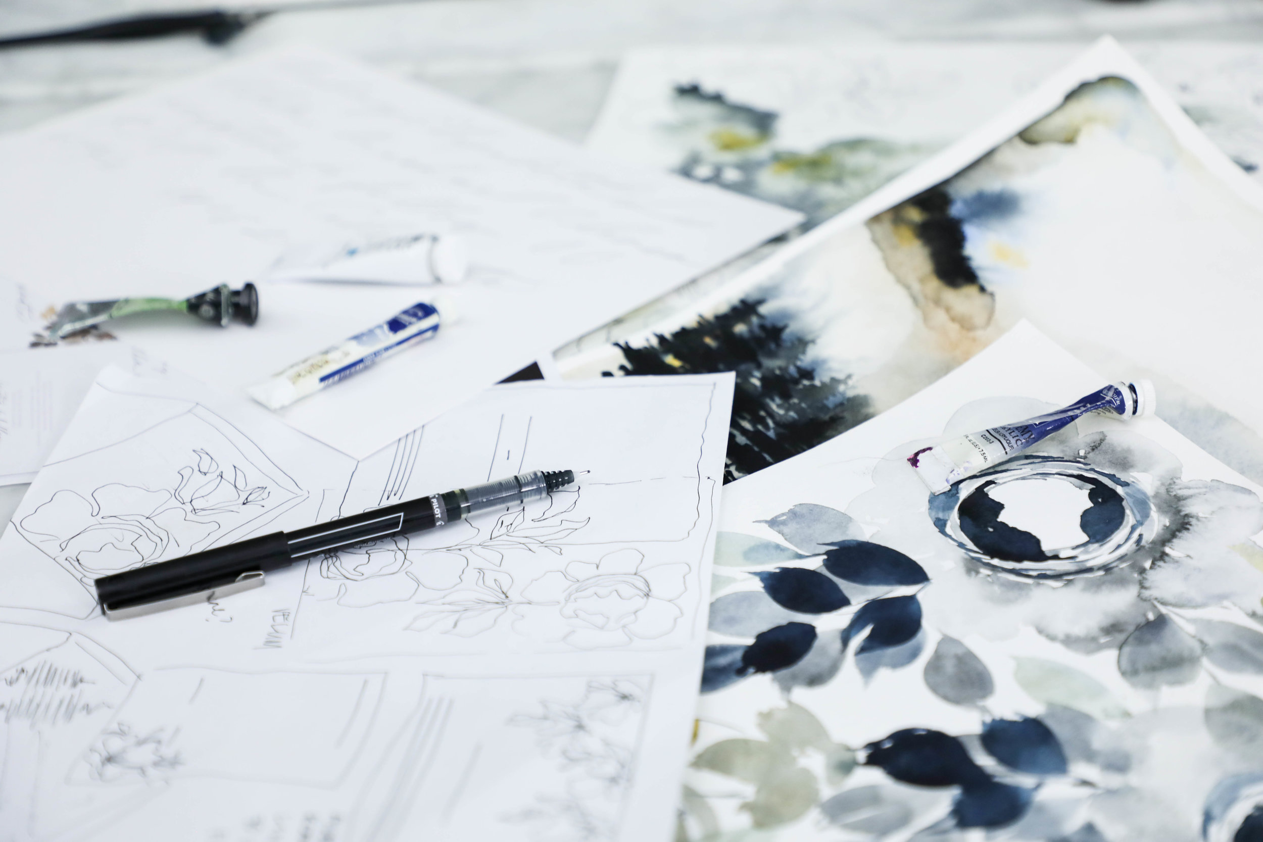
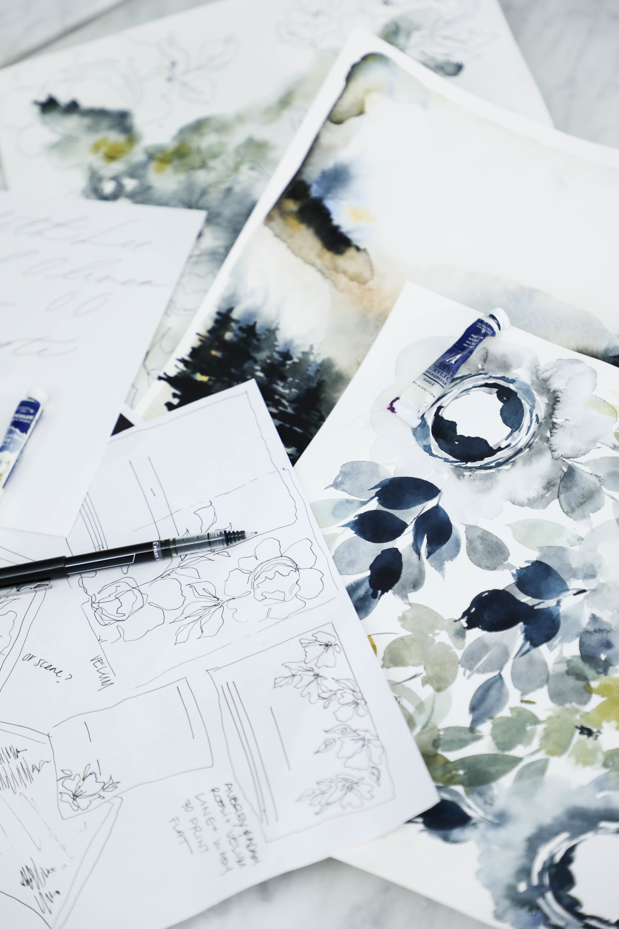
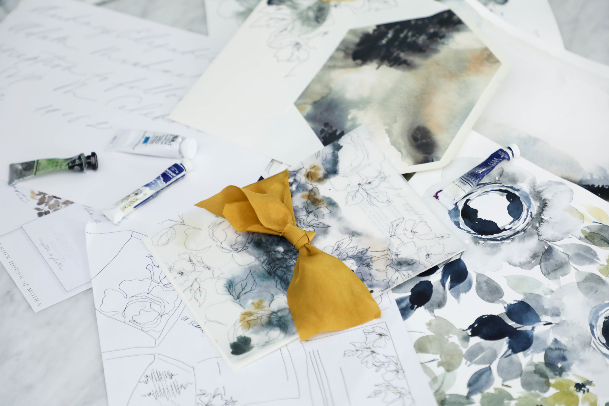
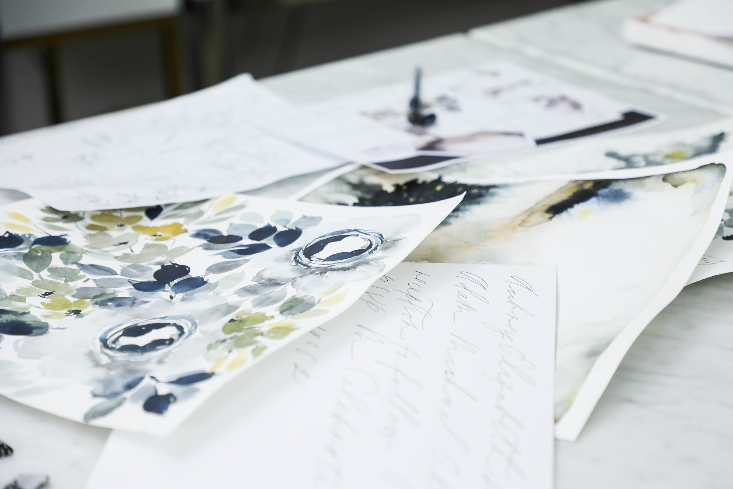
All of our projects include unlimited artwork, regardless of what type of artwork it is. For this suite, we had a watercolor floral pattern, two watercolor wash patterns, a modern landscape piece, and line botanicals.
This is the longest portion of our process without contact with our client. Once they’ve approved the sketch and calligraphy style, we set about creating all the artwork, scanning it into the computer, digitizing the artwork and calligraphy, and getting it ready for their design.
The proof is the next step in the process and is also the next thing the client sees after the sketch (unless they follow us on instagram, in that case, they’ve seen the entire creative process along the way as their design comes to life!).

Aubrey & Adam
Courchevel, France
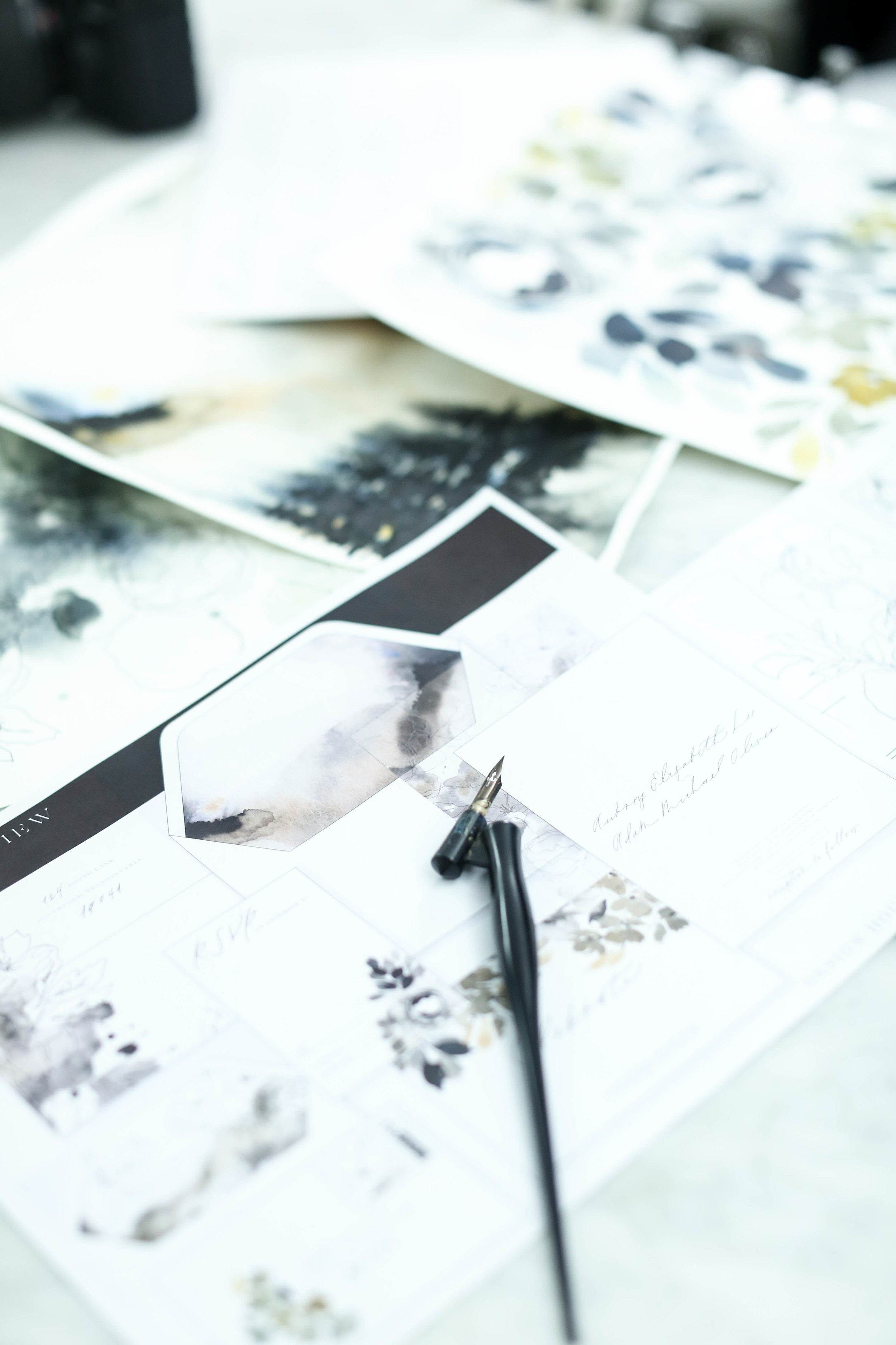
The proofs shows the overall layout of the suite, as well as each individual piece. A proof is usually about 9 pages long, but can get up to 14 if the suite includes several additional pieces.
I personally love the proofing point in the process. It’s the first point that the client sees their sketch come to life in full color.
Similar to artwork, we do not limit how many proofing rounds each client is allowed. We want the design to be perfection, and we’ll tweak it as much as needed.
Two to three rounds tends to be the average, so that is how we timeline out the clients project. If more rounds are needed, we always make sure to keep an eye on our mail date, since that will get pushed back based on how long proofing takes.

Creative Process | Behind the Scenes
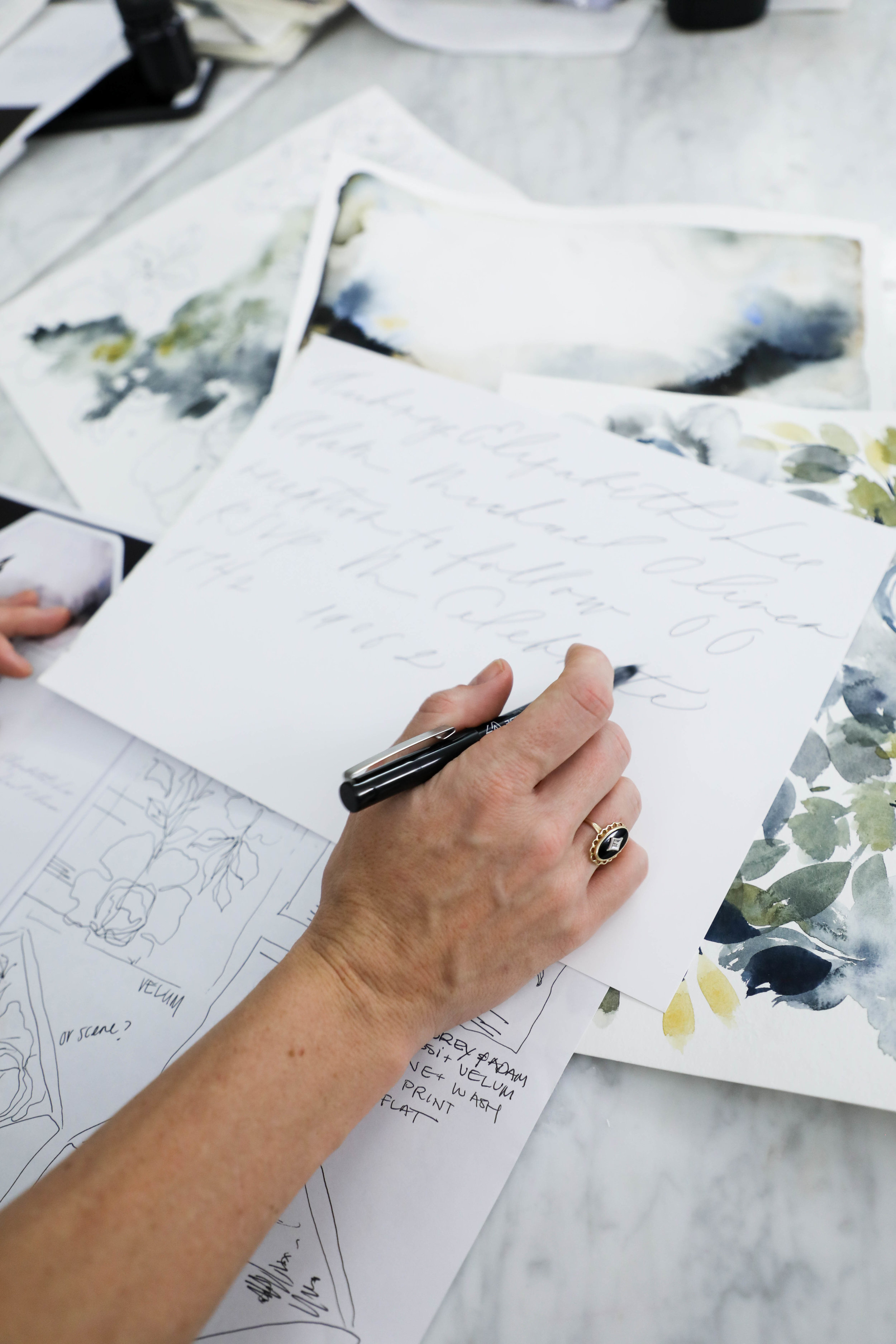
Following the sketch, we create a sheet of lettering and calligraphy samples for our clients to review. We based the styles we provide on the couple’s overall style and the formality of the wedding as well as any personal preferences. Our calligraphy styles are not a generic sheet we give to each client, but created individually for each project. We also prefer to show calligraphy styles shows in the couple’s names, since seeing one’s own name is so much more exciting than seeing a generic style name.
For Aubrey, we created a calligraphy sample sheet with six styles. We knew she preferred minimal and modern, so we showed several variations of that style.
Aubrey selected a delicate monoline style for her lettering. We liked the minimal visual impact it had, while still being interesting and unique.
Sometimes we nail the style on the first try and sometimes it takes some tweaking. For Aubrey, she loved it right away.
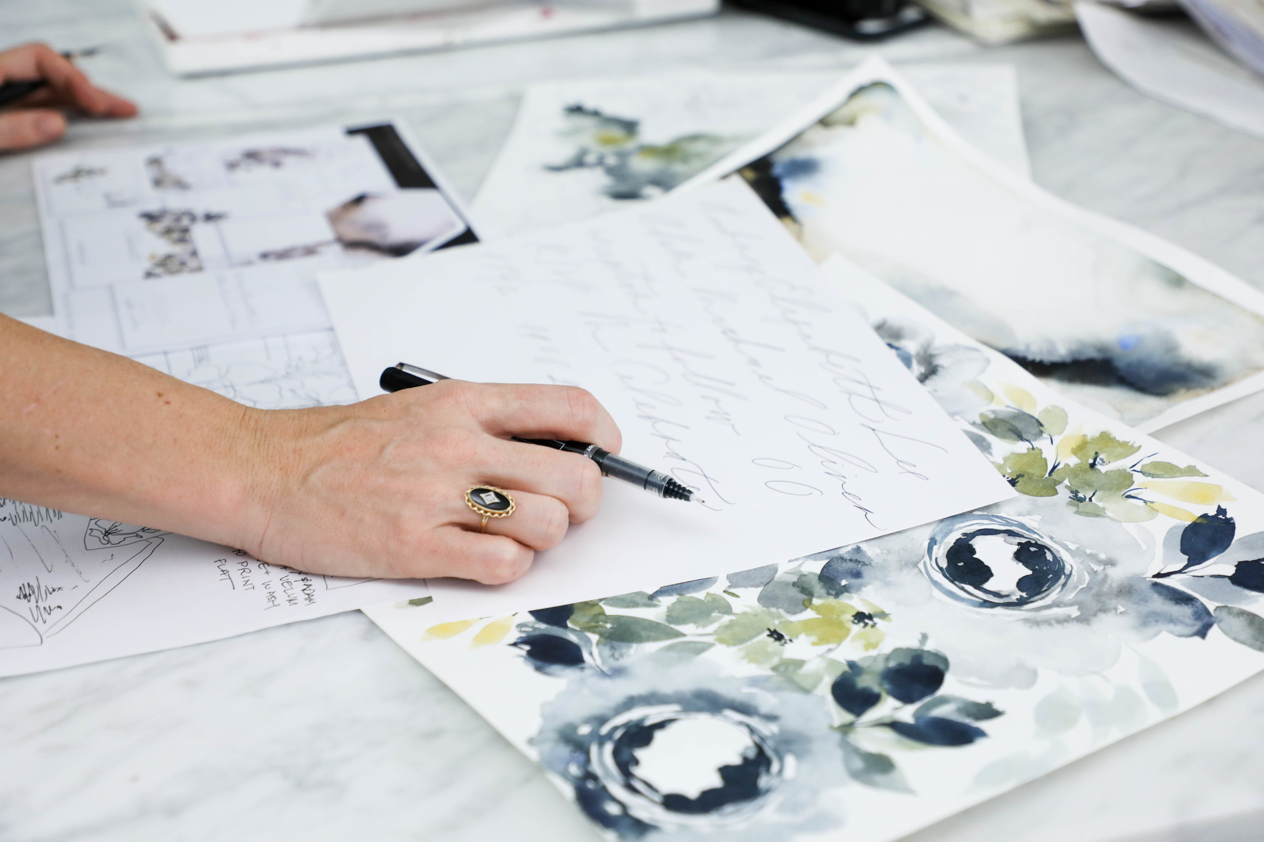
Once we’ve selected the style, the Design House team sits down to see where in the sketch the calligraphy falls and what words or phrases we’ll need for the design. Once we have a list of what needs to be written, we write their lettering or calligraphy out by hand.
Aubrey & Adam
Courchevel, France
Creative Process | Behind the Scenes

Aubrey & Adam
Courchevel, France
Aubrey and Adam were married at a gorgeous chalet in Courchevel, France and came to us with some specific ideas in mind. They wanted to incorporate ochre into the design, but dit not want the overall look and feel to be summery and cheerful, but moody and modern. They came to us specifically because of our use of original artwork and lettering designed for each client. As with all our clients, we began the process with a sketch, detailing out our overall ideas for their suite, mixing media and multiple styles of artwork.
We love beginning with a sketch for several reasons:
It helps a client envision the overall look and feel by putting thoughts onto visual mediums
It allows the client to visualize how we see the art moving from one piece to another throughout the suite. We rarely do pieces that all match exactly, but vary the art across multiple elements of the invitation suite.
It creates a point from which we can create and generate all the artwork. As artists and creators, we avoid redoing repetitious work, which consumes a massive amount of time and energy. We want to create your artwork once and do it correctly the first time, rather than missing the mark. This is where the sketch comes in.
We can make adjustments to the art while the art is still theoretical to allow for more time during the proofing rounds and on assembly details.
shown here: the final pieces of artwork used in the printed pieces of the suite, generated from our original sketch